Design Creating Instant Impressions on People
Design creating instant impressions on people is all about that crucial first glance – the split-second judgment that shapes perceptions. We’re talking about the psychology behind those initial reactions, how visual elements like color, typography, and imagery work their magic, and the power of composition to guide the eye. This isn’t just about aesthetics; it’s about understanding how design can influence emotions, build trust, and ultimately, leave a lasting impact.
From understanding the cognitive processes behind first impressions to mastering design principles for maximum impact, we’ll explore how to craft visuals that resonate deeply. We’ll delve into case studies, analyzing successful and unsuccessful designs to uncover the secrets behind their effectiveness (or lack thereof). Get ready to unlock the power of design and learn how to create unforgettable experiences!
The Psychology of First Impressions
Forming a first impression is a rapid, almost automatic process, deeply ingrained in our cognitive makeup. It’s a survival mechanism, allowing us to quickly assess potential threats or opportunities in our environment. This initial judgment, however, is often based on limited information and can be significantly influenced by a variety of factors, leading to both accurate and inaccurate perceptions.
Understanding the psychology behind these initial judgments is crucial for effective communication and interaction.
First impressions are crucial, especially in the visual world. A well-designed thumbnail or intro sequence can hook viewers instantly, and that’s why understanding video marketing is key. Check out this awesome guide on getting it on with youtube to learn how to make your videos visually compelling. Ultimately, strong design translates to more engagement, reinforcing the power of first impressions.
Cognitive Processes in Forming Initial Judgments
The formation of a first impression involves several interconnected cognitive processes. Our brains employ heuristics, or mental shortcuts, to rapidly process incoming sensory information. These heuristics allow us to make quick judgments based on readily available cues, rather than engaging in extensive analysis. Confirmation bias, the tendency to seek out and interpret information confirming pre-existing beliefs, further shapes our perception, reinforcing our initial impression even in the face of contradictory evidence.
This rapid processing often happens unconsciously, influencing our subsequent interactions without our full awareness.
Visual Elements’ Influence on Immediate Perceptions
Visual elements play a dominant role in shaping first impressions. Physical appearance, including facial features, attire, and body language, instantly conveys information about a person’s personality, social status, and trustworthiness. For example, someone dressed in a sharp suit might be perceived as competent and professional, while someone in casual clothing might be seen as more relaxed or approachable.
The environment also contributes; a person in a cluttered office might be perceived as disorganized, while someone in a clean, well-organized space might be seen as meticulous. These visual cues are processed almost instantaneously, forming a significant portion of our initial judgment.
Impact of Nonverbal Cues on Instant Impressions
Nonverbal cues, such as facial expressions, posture, and tone of voice, profoundly influence first impressions. A warm smile and open posture generally signal friendliness and approachability, while a frown or crossed arms might suggest hostility or defensiveness. Similarly, a confident tone of voice can project authority and competence, whereas a hesitant or nervous tone might convey insecurity. These nonverbal signals often communicate more effectively than words, especially during initial encounters, as they are less susceptible to conscious manipulation.
Misinterpretations of nonverbal cues can lead to significant errors in judgment.
Effects of Positive and Negative First Impressions
Positive first impressions create a favorable bias, making us more likely to view subsequent interactions positively. We are more inclined to give the benefit of the doubt, overlook minor flaws, and engage in more open and collaborative communication. Conversely, negative first impressions lead to a negative bias, making us more critical and less receptive. We are more likely to focus on negative aspects, interpret ambiguous behavior negatively, and engage in less constructive interactions.
Overcoming a negative first impression requires significant effort and positive experiences to counteract the initial bias.
Hypothetical Scenario Illustrating First Impression Formation
Imagine meeting a new colleague, Sarah, at a company mixer. Sarah is dressed in a stylish but professional outfit, smiles warmly, makes direct eye contact, and introduces herself with a confident handshake. Her body language is open and relaxed, and her tone of voice is friendly and engaging. These positive visual and nonverbal cues immediately create a favorable impression.
Conversely, if Sarah were slumped in a chair, avoided eye contact, spoke in a monotone voice, and was dressed in disheveled clothing, the initial impression would likely be significantly less positive, regardless of her actual personality or capabilities. This illustrates how quickly and powerfully our brains process these cues to form a first impression.
Design Elements for Instant Impact: Design Creating Instant Impressions On People
Source: medium.com
Creating a design that leaves a lasting first impression requires a deep understanding of visual communication. It’s not just about aesthetics; it’s about strategically using design elements to evoke specific emotions and guide the viewer’s eye, ultimately shaping their perception of your brand or message. This involves a careful consideration of color, typography, imagery, and overall design style.
Color Palettes and Emotional Response
Color psychology plays a crucial role in instant impact. Different colors trigger distinct emotional responses. For instance, blues often convey calmness and trustworthiness, making them ideal for corporate websites or healthcare brands. Reds, on the other hand, are associated with energy and excitement, often used in fast-food advertising or gaming. Greens represent nature and growth, while yellows suggest optimism and joy.
A well-chosen color palette can immediately communicate the essence of a brand or product without the need for words. For example, a calming blue and green palette for a spa website immediately communicates relaxation and tranquility, while a vibrant red and yellow palette for a children’s toy website conveys playfulness and energy. Understanding these associations allows designers to create a subconscious connection with the target audience.
Typography for Readability and Impact
Typography is more than just choosing a font; it’s about selecting typefaces that enhance readability and reflect the brand’s personality. Serif fonts (like Times New Roman) often project a sense of tradition and sophistication, while sans-serif fonts (like Arial or Helvetica) appear modern and clean. The font size, weight (boldness), and spacing also significantly impact readability and visual appeal.
Legibility is paramount; a poorly chosen font can hinder comprehension and create a negative first impression. Conversely, a well-chosen font can enhance the overall aesthetic and communicate a specific tone. For instance, a bold, sans-serif font might be used for a technology company to convey innovation and modernity, whereas a more delicate serif font might be appropriate for a luxury brand to convey elegance and refinement.
Imagery and First Impressions
Images are powerful tools for creating instant impressions. High-quality, relevant visuals immediately capture attention and convey information more effectively than text alone. The choice of imagery should align with the overall message and brand identity. For example, using professional photography for a corporate website projects credibility and sophistication, while using vibrant illustrations might be more suitable for a children’s website.
The composition, lighting, and subject matter of the image all contribute to the overall impact. A poorly chosen or low-quality image can detract from the design and leave a negative impression, while a striking and relevant image can immediately grab attention and leave a positive lasting impact. Think of the iconic Apple logo – simple, memorable, and instantly recognizable.
Design Styles and Their Impact
The following table compares different design styles and their impact on initial perceptions:
| Style | Color Palette | Typography | Image Style |
|---|---|---|---|
| Minimalist | Neutral tones, often with a single accent color | Clean sans-serif fonts, ample white space | Simple, high-quality photography or illustrations |
| Modern | Bold colors, geometric patterns | Modern sans-serif fonts, strong visual hierarchy | Clean lines, abstract imagery |
| Vintage | Muted tones, earthy colors | Serif fonts, distressed textures | Vintage photography, faded textures |
| Rustic | Earthy tones, natural textures | Handwritten fonts, informal styles | Natural landscapes, close-up shots of textures |
The Role of Composition and Layout
Creating a design that makes an instant impression isn’t just about choosing the right colors or fonts; it’s about how those elements are arranged and presented. Composition and layout are the unsung heroes of impactful design, silently guiding the viewer’s eye and shaping their perception of your work. A well-composed design feels intuitive and harmonious, while a poorly composed one can be confusing and frustrating, instantly undermining your message.
Visual Hierarchy Directs Attention
Visual hierarchy is the arrangement of elements in a design to guide the viewer’s eye through the information in a specific order. This is crucial for conveying your message effectively. By strategically using size, color, contrast, and placement, you can prioritize key elements and ensure they are noticed first. For instance, a larger, bolder headline will naturally draw more attention than smaller body text.
Similarly, using contrasting colors can highlight important information, making it stand out from the background. Without a clear visual hierarchy, viewers may struggle to understand the intended message, leading to a missed opportunity for a strong first impression.
Whitespace Contributes to Clarity and Impact
Whitespace, or negative space, is the empty area surrounding design elements. Contrary to popular belief, it’s not wasted space; rather, it’s a powerful tool for enhancing clarity and impact. Whitespace provides breathing room, preventing elements from feeling cluttered and overwhelming. It allows the eye to rest, making it easier to process information. Effective use of whitespace improves readability, increases visual appeal, and ultimately strengthens the overall impact of your design.
Consider the difference between a densely packed page of text and one with generous margins and spacing between paragraphs – the latter is far more inviting and easier to read.
Effective Strategies for Visual Balance and Proportion
Visual balance refers to the distribution of visual weight within a design. There are two main types: symmetrical (formal) and asymmetrical (informal). Symmetrical balance creates a sense of stability and formality, often used in logos and corporate branding. Asymmetrical balance, on the other hand, uses different visual weights to achieve a sense of dynamic energy and visual interest.
Proportion relates to the relative size and scale of elements within the design. The golden ratio (approximately 1:1.618) is often cited as an aesthetically pleasing proportion, but finding the right proportions depends on the overall design and the message being conveyed. A poorly proportioned design can appear unbalanced or awkward, detracting from the overall impact.
Comparison of Layout Approaches
Different layout approaches, such as grid-based layouts, asymmetrical layouts, and modular layouts, each have their own strengths and weaknesses in creating strong first impressions. Grid-based layouts offer structure and order, ensuring consistency and readability. Asymmetrical layouts provide a more dynamic and less predictable feel, which can be particularly effective for designs aiming for a modern or edgy look. Modular layouts use repeating modules to create a cohesive and scalable design.
The choice of layout approach should depend on the specific needs of the design and the overall message you want to convey. A grid-based layout might be suitable for a website focused on information delivery, while an asymmetrical layout might be better suited for a more creative or artistic project.
Design Mockups Demonstrating Compositional Impact
Let’s consider a few mockups illustrating how different compositional choices affect the first impression:
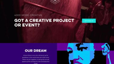
- Mockup 1: Description: A website landing page with a large hero image dominating the top half, a concise headline below, and a call to action button at the bottom. Impact on First Impression: Clean, modern, and immediately conveys the key message. The large image grabs attention, while the clear hierarchy guides the user to the call to action.
- Mockup 2: Description: A poster with cluttered text and images, all competing for attention. Impact on First Impression: Overwhelming and confusing, failing to convey a clear message. The lack of visual hierarchy makes it difficult to know where to look first.
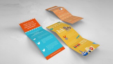
- Mockup 3: Description: A brochure with a balanced asymmetrical layout, using whitespace effectively to separate sections and highlight key information. Impact on First Impression: Visually appealing and easy to navigate. The balanced composition and whitespace create a sense of professionalism and sophistication.
Case Studies
Source: ytimg.com
Analyzing successful and unsuccessful designs provides invaluable insights into the principles of effective visual communication. By examining specific examples, we can understand how design choices directly impact the viewer’s initial perception and overall experience. This allows us to learn from both triumphs and failures, refining our own design approach.
Airbnb’s Homepage Design: A Successful Example
Airbnb’s homepage consistently delivers a strong positive first impression. The design effectively leverages high-quality photography showcasing diverse and aspirational travel experiences. The color palette is predominantly bright and airy, employing natural tones and pops of vibrant color from featured listings. This creates a feeling of warmth, openness, and adventure. Typography is clean and modern, using a clear and legible sans-serif font for body text, balanced with a slightly bolder font for headings and calls to action.
The layout is clean and uncluttered, employing a grid system to organize content logically and intuitively. Large, captivating images dominate the page, drawing the viewer’s eye and immediately communicating the platform’s core value proposition: unique and memorable travel experiences. The strategic use of whitespace further enhances readability and prevents the page from feeling overwhelming. The overall effect is sophisticated yet approachable, immediately conveying trust and inspiring a desire to explore.
A Failed Website Redesign: An Analysis of Ineffective Design
Imagine a website for a financial institution that uses a jarring color scheme of bright neon green and electric blue. The typography is a chaotic mix of different fonts and sizes, making the text difficult to read and understand. The layout is cluttered and disorganized, with overlapping elements and a confusing hierarchy of information. Images are low-resolution and poorly chosen, failing to create any sense of trust or professionalism.
The overall effect is disorienting and unsettling, actively repelling users instead of inviting them to explore. This failure stems from a lack of cohesive design principles. The jarring color palette evokes anxiety rather than trust, the inconsistent typography is visually unpleasant and hinders readability, and the chaotic layout creates a sense of disorder and unreliability. The poor quality images further contribute to a negative impression, suggesting a lack of attention to detail and professionalism.
This stark contrast with Airbnb’s design highlights the importance of carefully considered design choices in creating a positive first impression.
Creating Memorable Designs
Creating a memorable design isn’t just about aesthetics; it’s about crafting an experience that resonates with the viewer long after they’ve seen it. It requires a strategic blend of visual appeal, emotional connection, and a touch of the unexpected. This involves understanding how to leverage elements of surprise, the power of storytelling, and the importance of achieving a harmonious balance between beauty and memorability.
The key to creating a truly memorable design lies in understanding the psychology behind what makes something stick in people’s minds. This goes beyond simply creating something visually appealing; it’s about creating something that is both aesthetically pleasing and emotionally engaging. It’s about leaving a lasting impression that transcends the fleeting nature of online interactions.
Incorporating Elements of Surprise and Novelty
Introducing unexpected elements is a powerful technique to capture attention and create memorability. This could involve using unconventional color palettes, unexpected typography choices, or surprising interactions within the design itself. Think of a website that unexpectedly animates elements when a user scrolls, or a print advertisement that uses a playful, unexpected visual metaphor to communicate its message. The goal is to break through the visual clutter and create a moment of intrigue that encourages further engagement.
Utilizing Storytelling and Narrative
Storytelling is a fundamental aspect of human connection, and it can be incredibly effective in creating memorable designs. By weaving a narrative into your design, you can create a deeper emotional connection with your audience. This might involve using a series of images to tell a story, crafting a compelling headline that sets the scene, or incorporating visual metaphors that convey a deeper meaning.
The more engaging the story, the more likely the design will be remembered.
Balancing Aesthetics and Memorability, Design creating instant impressions on people
The most memorable designs often strike a balance between aesthetic appeal and impactful messaging. A beautiful design that lacks substance is easily forgotten, just as a powerfully informative design that is visually unappealing will struggle to connect. The ideal is a design that is both visually stunning and effectively communicates its message, leaving a lasting positive impression. This balance is achieved through careful consideration of color palettes, typography, imagery, and the overall composition of the design.
Memorable Design Concept: A Children’s Book Cover
Imagine a children’s book cover titled “The Whispering Woods.” The cover features a dark, whimsical forest scene, predominantly using deep greens, purples, and blues, creating a mysterious atmosphere. A single, silhouetted child stands in the foreground, gazing into the woods, creating a sense of curiosity and adventure. The typography is playful yet elegant, using a script font for the title, “The Whispering Woods,” and a bold sans-serif font for the author’s name.
The layout is simple, with the title prominently displayed at the top, the illustration taking up the majority of the space, and the author’s name subtly placed at the bottom. The color palette, combined with the mysterious illustration and elegant typography, creates a sense of wonder and intrigue, making it a memorable and engaging cover design that instantly draws the reader in.
The silhouette of the child is slightly off-center, adding a touch of asymmetry that prevents the design from feeling too static or predictable. The use of subtle textures in the background, suggestive of leaves and bark, further enhances the immersive quality of the design, making it visually rich and stimulating.
Ultimate Conclusion
Source: behance.net
Ultimately, creating designs that leave an instant impression is about more than just looking good; it’s about understanding the human element. By thoughtfully combining psychology, design principles, and strategic composition, you can craft visuals that not only grab attention but also connect with your audience on a deeper level. Remember, that first impression is often the only impression you get, so make it count!
Key Questions Answered
How long does it take to form a first impression?
Research suggests it can happen in as little as a few seconds, sometimes even less than a tenth of a second!
Can I change a negative first impression?
It’s challenging, but not impossible. Consistent positive interactions and demonstrable value can gradually shift perceptions.
What’s the role of color psychology in design?
Color evokes strong emotional responses. Understanding color theory allows you to strategically use colors to create specific feelings and associations.
How important is whitespace in design?
Whitespace is crucial for readability and visual clarity. It helps to organize elements and prevent a cluttered look, making the design more digestible and impactful.
