Colour Combinations for Website Design
Colour combinations for website design are more than just aesthetics; they’re the silent architects of user experience and brand identity. The right palette can evoke emotion, guide the eye, and ultimately, boost conversions. Think of it as painting a digital masterpiece – each hue carefully chosen to create the perfect mood and message. This exploration delves into the fascinating world of color theory and its practical application in web design, covering everything from understanding color psychology to mastering color harmony and accessibility.
We’ll unravel the secrets behind effective color palettes, examining different harmonies (complementary, analogous, triadic, and more), and how they translate into successful website designs. We’ll also explore how color impacts different website types, from e-commerce giants to personal blogs, and discuss the crucial role of color contrast for accessibility. Get ready to unlock the power of color and transform your website’s visual appeal!
Introduction to Website Color Schemes
Choosing the right color scheme for your website is far more than just a matter of aesthetics; it’s a crucial design element that significantly impacts user experience and brand perception. Color psychology plays a vital role, influencing how visitors feel about your site, how they interact with it, and ultimately, whether they convert into customers. Understanding the power of color is key to creating a website that is both visually appealing and effective.Color directly affects user experience by influencing mood, readability, and overall site usability.
A poorly chosen color palette can lead to eye strain, decreased readability, and a confusing user interface. Conversely, a well-planned color scheme can create a harmonious and intuitive experience, guiding users effortlessly through your site’s content and encouraging engagement. Furthermore, color is intrinsically linked to brand perception. It helps establish your brand identity, conveying specific messages and emotions associated with your company values and offerings.
Consistent use of brand colors across all platforms reinforces brand recognition and builds trust with your audience.
Warm and Cool Color Palettes and Their Emotional Associations
The selection of a warm or cool color palette significantly shapes the overall feel and message of a website. Warm colors, generally associated with energy and excitement, tend to evoke feelings of warmth, comfort, and happiness. Conversely, cool colors often project calmness, sophistication, and trust. The following table highlights these differences:
| Color Palette | Example Colors | Emotional Association | Suitable for |
|---|---|---|---|
| Warm | Reds, Oranges, Yellows | Energy, excitement, warmth, comfort, happiness | Food blogs, gaming websites, children’s websites |
| Cool | Blues, Greens, Purples | Calmness, sophistication, trust, serenity, professionalism | Corporate websites, healthcare websites, technology companies |
| Warm (Muted) | Dusty rose, burnt orange, mustard yellow | Nostalgia, earthiness, approachability, vintage feel | Vintage shops, handcrafted goods, rustic-style websites |
| Cool (Muted) | Desaturated blues, sage greens, lavender | Tranquility, elegance, understated luxury, calm focus | Spa websites, luxury brands, mindfulness apps |
Exploring Color Harmonies
Source: graphicmama.com
Choosing the right color palette is crucial for effective website design. A harmonious color scheme enhances user experience, strengthens brand identity, and improves overall visual appeal. Understanding color harmonies, based on the principles of color theory, is key to achieving this. This section explores different color harmony types and how to utilize them effectively.
Color theory provides a framework for understanding how colors interact and create specific visual effects. By applying these principles, designers can create palettes that are pleasing to the eye and communicate the desired message effectively. Mastering these harmonies allows for the creation of visually stunning and impactful websites.
Complementary Color Harmonies
Complementary colors sit opposite each other on the color wheel. They offer high contrast and visual excitement, making them ideal for creating attention-grabbing designs. However, using them in equal proportions can be overwhelming; careful balance is crucial.
- Example 1: #007bff (Bright Blue) and #ff0000 (Red). This classic combination offers strong contrast, perfect for highlighting call-to-action buttons against a blue background, for example. The blue provides a sense of trust and calm, while the red demands attention.
- Example 2: #28a745 (Green) and #dc3545 (Red). This combination, often seen in website design that utilizes green for success and red for alerts, creates a visually striking contrast to alert users to critical actions or messages.
Analogous Color Harmonies
Analogous colors are located next to each other on the color wheel. They create a sense of harmony and tranquility, often resulting in a more subtle and sophisticated look. This palette is easy on the eyes and works well for creating a calming and cohesive design.
- Example 1: #007bff (Bright Blue), #0099cc (Sky Blue), #66b3ff (Light Blue). This serene combination evokes a feeling of peace and openness. It’s ideal for websites focusing on relaxation or serenity, such as spas or travel agencies.
- Example 2: #f57c00 (Orange), #ff9800 (Dark Orange), #ffa000 (Amber). These warm, earthy tones create a welcoming and inviting atmosphere, suitable for food blogs, cafes, or businesses emphasizing warmth and hospitality.
Triadic Color Harmonies
Triadic harmonies utilize three colors equally spaced on the color wheel, forming an equilateral triangle. They provide a vibrant and balanced palette, offering a greater variety of color than analogous schemes but still maintaining visual harmony.
- Example 1: #007bff (Bright Blue), #ff0000 (Red), #ffff00 (Yellow). This primary color combination is bold and energetic. It’s well-suited for websites targeting a younger audience or conveying a playful, vibrant brand identity. However, it requires careful balance to avoid being overly stimulating.
- Example 2: #28a745 (Green), #f57c00 (Orange), #dc3545 (Red). This combination offers a balanced contrast of warm and cool colors, suitable for a website that needs to communicate a sense of energy and trust simultaneously.
Using a Color Wheel to Generate Harmonious Palettes
A color wheel is an invaluable tool for exploring color harmonies. By selecting a base color and identifying its complements, analogous neighbors, or triadic counterparts, you can quickly generate a balanced and aesthetically pleasing palette. Many online tools and software programs offer interactive color wheels, allowing for experimentation and fine-tuning of color values. Experimentation is key; try different combinations and observe how they interact to find the perfect palette for your project.
Remember to consider the context of your website and the message you want to convey when selecting your colors.
Color Combinations for Different Website Purposes
Choosing the right color palette is crucial for website success. Different industries and website goals benefit from distinct color schemes that evoke specific emotions and resonate with their target audience. Understanding these nuances can significantly impact user engagement and conversion rates. Let’s explore how color palettes vary across different website types.
E-commerce vs. Blog Color Palettes: A Comparison
E-commerce websites and blogs, while both aiming to engage users, have different primary goals. E-commerce sites prioritize conversions – driving sales. Therefore, their color palettes often focus on stimulating action and creating a sense of urgency. Think bold, vibrant colors that draw attention to calls-to-action (CTAs) and product images. Blogs, on the other hand, generally aim to build community and share information.
Their color schemes often lean towards calming, sophisticated palettes that promote readability and a sense of trust. While bright accents can be used strategically, the overall feel is typically more subdued than an e-commerce site. For example, a fashion e-commerce site might use bright pinks and bold oranges to highlight sales and new arrivals, whereas a lifestyle blog might opt for a muted palette of greens and creams to create a peaceful and inviting atmosphere.
Color Combinations for Different Website Niches
The following table showcases suitable color combinations for various website niches. Remember that these are suggestions; the best color palette will depend on your specific brand identity and target audience.
| Website Niche | Primary Color | Secondary Color | Accent Color |
|---|---|---|---|
| Technology | Deep Blue (#002D62) | Grey (#808080) | Bright Teal (#008080) |
| Food | Warm Orange (#FFA500) | Creamy Beige (#F5F5DC) | Deep Red (#8B0000) |
| Fashion | Elegant Black (#000000) | Rose Gold (#B76E79) | Soft Pink (#FFB6C1) |
| Travel | Sky Blue (#87CEEB) | Sandy Brown (#F4A460) | Deep Green (#006400) |
Impact of Color Choice on Trustworthiness and Professionalism
Color psychology plays a significant role in shaping user perception. Certain colors are inherently associated with trust and professionalism. For instance, blue is often perceived as reliable, trustworthy, and secure, making it a popular choice for financial institutions and corporate websites. Green conveys stability and growth, while darker shades of grey can communicate sophistication and authority. Conversely, overly bright or jarring colors can undermine trustworthiness and appear unprofessional.
A website with a chaotic color scheme might be perceived as unreliable or poorly designed. Conversely, a well-coordinated palette using established color theory principles can significantly enhance a website’s credibility and professionalism. For example, a law firm website using navy blue and gold projects confidence and trustworthiness, while a website for a children’s toy company might use brighter, more playful colors, sacrificing some perceived professionalism for approachability.
Accessibility and Color Contrast
Source: visme.co
Choosing colors for your website isn’t just about aesthetics; it’s crucial for accessibility. Poor color contrast can make your website unusable for people with visual impairments, significantly impacting their online experience. Prioritizing accessibility ensures inclusivity and a positive user experience for everyone.Color contrast is the difference in brightness between text and its background. Sufficient contrast makes text legible and easily distinguishable, regardless of visual acuity.
This is governed by Web Content Accessibility Guidelines (WCAG), specifically WCAG 2.1 Success Criterion 1.4.3: “Contrast (Minimum)”. These guidelines define minimum contrast ratios to ensure adequate readability. Failing to meet these standards can lead to legal issues and damage your brand reputation.
WCAG Guidelines and Contrast Ratios
WCAG recommends a minimum contrast ratio of 4.5:1 for normal text and 3:1 for large text (18pt or 14pt bold). These ratios are calculated based on the luminance of the foreground and background colors. Higher contrast ratios are generally preferred for better readability and accessibility. Understanding and applying these guidelines is essential for creating inclusive and user-friendly websites.
Examples of Color Combinations with Adequate Contrast
It’s important to choose color combinations that meet or exceed the WCAG contrast ratio guidelines. Here are some examples of color pairs that provide sufficient contrast for text and background:
- Black text on a white background (#000000 on #FFFFFF): This classic combination offers excellent contrast (21:1 ratio).
- White text on a dark blue background (#FFFFFF on #000080): This provides a strong contrast (21:1 ratio), suitable for night mode or dark themes.
- Dark grey text on a light grey background (#333333 on #EEEEEE): This combination offers a decent contrast (4.54:1 ratio), meeting the minimum requirement for normal text.
Note that these are just examples, and many other color combinations can achieve the required contrast ratios. It is crucial to always test your chosen combinations.
Testing Color Contrast Using Online Tools
Several free online tools can help you quickly and accurately assess the contrast ratio of your color combinations. These tools save time and ensure you meet accessibility standards. Using these tools is a best practice, even if you are confident in your color choices.
- WebAIM’s Contrast Checker: This popular tool allows you to input hex codes or color names for both foreground and background colors, instantly providing the contrast ratio. It clearly indicates whether the combination meets WCAG guidelines.
- Color Contrast Checker by Lea Verou: Another excellent tool that offers similar functionality to WebAIM’s, providing the contrast ratio and WCAG compliance status. It also allows you to test different text sizes.
Regularly testing your color combinations using these tools is a simple yet crucial step in ensuring your website remains accessible to everyone. Prioritizing accessibility is not only ethically responsible but also benefits your website’s overall user experience and reach.
Creating a Color Palette for a Website
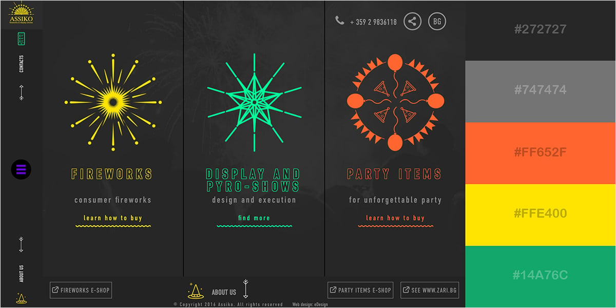
Source: visme.co
Choosing the right color palette is crucial for a successful website. It’s more than just aesthetics; your color choices directly impact user experience, brand perception, and even conversion rates. A well-thought-out palette reinforces your brand identity and guides the user’s eye, creating a cohesive and engaging online experience. This process involves careful consideration of your brand, target audience, and the overall message you want to convey.A successful color palette is built strategically, not randomly.
It’s a process that blends art and science, combining intuitive feelings with practical considerations. We’ll explore a step-by-step approach to building a palette that resonates with your brand and effectively communicates with your audience.
Step-by-Step Color Palette Creation
Developing a website color palette requires a methodical approach. First, define your brand’s personality and the feeling you want to evoke. Are you aiming for sophistication, playfulness, trustworthiness, or something else entirely? Then, consider your target audience. What colors resonate with them?
Finally, research color psychology to understand the connotations of different hues. Once you have a clear understanding of these elements, you can start selecting your colors. The process can be iterative, refining your choices as you go.
Mood Board Creation
A mood board is a visual representation of your color palette and its intended emotional impact. It’s a crucial step in the process, allowing you to visualize how your colors work together and to make adjustments as needed. For example, imagine a mood board for a sustainable clothing brand. It might include swatches of earthy greens and browns, representing nature and eco-consciousness.
Alongside these, you might include images of lush forests and recycled materials, further emphasizing the brand’s values. A text description might include phrases like “earthy,” “organic,” “natural,” and “sustainable,” connecting the visual elements to the brand’s core message. The overall effect should be calming, trustworthy, and environmentally conscious. A tech startup, on the other hand, might use vibrant blues and greens, alongside imagery of futuristic technology and fast-paced urban scenes, conveying innovation and dynamism.
The descriptive text might include terms like “innovative,” “dynamic,” “tech-forward,” and “efficient.”
Tools and Resources for Color Palette Generation and Testing
Choosing the right tools can significantly streamline the process of creating and testing your color palettes. Several excellent resources are available to assist you.
- Adobe Color (formerly Kuler): This web-based tool offers a variety of color schemes based on different harmony rules, allowing you to explore different options and create custom palettes. It provides tools to adjust color values and export your palette in various formats.
- Coolors: A popular choice, Coolors allows you to generate random palettes and lock colors you like while keeping others random. This is great for finding unexpected combinations.
- Paletton: This tool focuses on color harmony, offering various color schemes based on different principles. It allows you to fine-tune color values and view how the palette looks in different contexts.
- Colorzilla: This browser extension allows you to quickly pick colors from any website or image. This is extremely useful for inspiration and to ensure consistency.
These tools provide a range of functionalities, from generating random palettes to fine-tuning existing ones, ensuring you find the perfect color scheme for your website. Remember to test your chosen palette on different devices and backgrounds to ensure it looks consistent across all platforms.
Case Studies of Effective Website Color Use: Colour Combinations For Website Design
Choosing the right color palette is crucial for a website’s success. Effective color use can significantly improve user experience, build brand recognition, and ultimately drive conversions. Let’s examine some real-world examples to illustrate the power of thoughtful color selection.
Analyzing successful websites reveals common strategies for color implementation. Understanding these strategies can help you create a visually appealing and effective website of your own. We will explore examples from different industries, highlighting both the color choices and their impact on the overall user experience and brand identity. The key takeaway is that color is not just about aesthetics; it’s a powerful tool for communication and engagement.
Choosing the right colour combinations for your website design is crucial for attracting viewers, and that extends to your YouTube presence too! To really nail your brand’s visual identity, check out this awesome guide on getting it on with YouTube – it’ll help you understand how your website colours should translate to your video thumbnails and channel art for a cohesive brand experience.
Consistent colour palettes across all platforms are key to building a strong brand identity.
Spotify’s Brand Identity Through Color
Spotify utilizes a predominantly green color scheme, but not just any green. Their shade is a vibrant, yet calming, slightly darker green that evokes feelings of freshness and energy. This color choice aligns perfectly with their brand identity – a dynamic and engaging platform for music discovery. They cleverly use subtle variations of green throughout their website and app, creating a cohesive and consistent brand experience.
The contrast with white and black text provides excellent readability and avoids overwhelming the user. This careful balance of vibrancy and calmness contributes to a user-friendly and immersive platform.
Mailchimp’s Playful and Approachable Color Palette
Mailchimp’s website is known for its playful and approachable design, reflected in its color palette. They use a variety of bright, yet balanced, colors, often incorporating shades of pink, orange, and blue. These colors project a friendly and welcoming personality, in line with their mission of making email marketing easier for everyone. The strategic use of these colors across different elements of the website creates a consistent visual language that reinforces their brand’s playful yet professional image.
The color choices effectively communicate the brand’s personality and make the user experience more engaging and less intimidating.
A Comparison: Two E-commerce Competitors
Let’s consider two hypothetical e-commerce competitors selling sustainable clothing. Company A uses earthy tones—muted greens, browns, and creams—to emphasize its commitment to nature. This palette creates a sense of calm and trustworthiness. Company B, in contrast, uses brighter, bolder colors—such as deep blues and sunny yellows—to convey a sense of vibrancy and optimism. While both approaches are valid, Company A’s palette better resonates with its target audience seeking eco-friendly products, suggesting reliability and naturalness.
Company B’s choice might attract a younger demographic who value energetic and optimistic branding.
Key Elements of Successful Color Choices, Colour combinations for website design
The successful implementation of color schemes relies on several key factors. Firstly, understanding your target audience is paramount. Colors evoke different emotions and associations in different demographics. Secondly, aligning your color choices with your brand identity is crucial. Your colors should communicate your brand’s personality and values.
Finally, ensuring sufficient color contrast for accessibility is essential. Poor color contrast can make a website difficult for users with visual impairments to navigate. The combination of thoughtful color selection, alignment with brand identity, and attention to accessibility ensures a positive and inclusive user experience.
Advanced Color Techniques
Taking your website design to the next level involves mastering advanced color techniques that go beyond basic harmonies. These techniques allow for greater visual depth, improved user experience, and a more memorable brand identity. By strategically employing gradients, overlays, and thoughtful color placement, you can create a website that’s not only aesthetically pleasing but also highly effective.Gradients and color overlays add depth and visual interest to otherwise flat designs.
They can create a sense of movement, highlight specific elements, and even subtly guide the user’s eye. Careful consideration of the colors used, their transition points, and the overall context is key to successful implementation.
Using Gradients to Create Visual Interest
Gradients, the smooth transitions between two or more colors, offer a dynamic alternative to solid color blocks. A well-chosen gradient can add a sense of depth and sophistication to a design. For example, a subtle gradient on a background can create a sense of atmosphere, while a more vibrant gradient can be used to draw attention to a call-to-action button.
The key is to choose colors that complement each other and create a visually appealing transition. Avoid jarring contrasts that can be distracting or overwhelming. Consider using gradients sparingly, as overuse can detract from the overall design.
Employing Color Overlays for Emphasis
Color overlays are semi-transparent colors layered over images or other design elements. They can subtly alter the mood or create a focal point. Imagine a website featuring stunning photography; a slightly darkened, muted overlay could enhance the mood and ensure readability of superimposed text. Alternatively, a vibrant, translucent overlay can draw attention to a specific area, such as a product image or a key piece of information.
The level of transparency needs careful consideration; too opaque, and it obscures the underlying image; too transparent, and the effect is negligible.
Guiding User Attention Through Color
Color is a powerful tool for directing user attention and improving navigation. By using contrasting colors, you can highlight important elements like calls to action or navigation menus. For example, a bright, contrasting button on a more muted background immediately draws the user’s eye. Similarly, using a distinct color for navigational links ensures that users can easily find their way around the site.
Consistency in color usage for navigational elements is crucial for usability.
Examples of Innovative Color Techniques
One example of innovative color use is the website of a renowned design agency. They employ a subtle, almost imperceptible gradient across their homepage, creating a sense of depth and sophistication without being distracting. The effect is understated elegance, complementing their brand image perfectly. Another example can be found on an e-commerce site specializing in handcrafted goods. They use vibrant color overlays on their product images to highlight specific details or create a mood consistent with their brand.
The overlays are carefully chosen to enhance the product photography, rather than detract from it. A third example is a travel website that utilizes a series of color blocks to visually segment different sections of the site, improving navigation and user experience. Each block uses a color associated with a specific travel destination, adding a playful and informative element to the design.
Outcome Summary
Mastering colour combinations for website design is a journey, not a destination. It’s about understanding the psychology behind color, applying color theory principles, and always prioritizing accessibility. By thoughtfully choosing your palette, you can create a website that not only looks stunning but also resonates deeply with your audience, enhancing user experience and strengthening your brand identity. So, experiment, iterate, and watch your website blossom into a visual masterpiece!
Answers to Common Questions
What are some common color psychology mistakes to avoid?
Overusing bright colors, ignoring accessibility guidelines (poor contrast), and choosing colors that clash with your brand identity are common pitfalls.
How can I find my brand’s ideal color palette?
Start by defining your brand’s personality and target audience. Then, use color tools and mood boards to explore palettes that align with your brand’s essence.
Are there free tools to help with color selection and contrast checking?
Yes! Many free online tools exist for generating color palettes and checking contrast ratios, such as Coolors and WebAIM’s Color Contrast Checker.
How important is color consistency across my website?
Extremely important! Inconsistent color use can confuse users and weaken your brand’s visual identity. Maintain a consistent palette throughout your site.

