Converting Maximum Customers Website Design
Converting maximum customers in your website design isn’t about luck; it’s a strategic blend of understanding user behavior, optimizing design elements, and continuously iterating based on data. This post dives deep into the key principles that transform a website from a simple online presence into a powerful customer acquisition machine.
We’ll explore how to craft a user journey map that pinpoints pain points and identifies areas for improvement. We’ll discuss the power of A/B testing different layouts, CTA placements, and navigation menus to see what truly resonates with your audience. We’ll also cover the crucial role of visual elements – high-quality images, strategic color psychology, and clear typography – in driving engagement and conversions.
Finally, we’ll delve into the importance of tracking key metrics and using data-driven insights to continuously refine your website’s performance.
Understanding User Behavior on Your Website
Optimizing your website for maximum conversions hinges on a deep understanding of how users interact with your platform. By mapping their journey and addressing pain points, you can significantly improve your conversion rates. This involves analyzing data, observing user patterns, and employing effective design strategies. Understanding user behavior is not just about tracking clicks; it’s about empathizing with the user’s experience and identifying areas for improvement.
User Journey Mapping
A user journey map visually represents the steps a user takes while interacting with your website, from initial contact to final conversion (e.g., purchase, sign-up). For a website aiming for maximum conversions, the map should highlight key touchpoints and potential obstacles. A typical map might show a user arriving via a search engine, navigating to a product page, adding items to a cart, proceeding to checkout, and finally completing the purchase.
Each step should be meticulously analyzed for potential friction. For example, a long or confusing checkout process could significantly deter users. A well-designed journey map allows you to identify these friction points and implement solutions.
Common Pain Points and Solutions
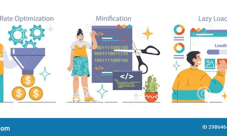
Users encounter various pain points that hinder conversion. Slow loading times are a major culprit, leading to high bounce rates. Solutions include optimizing images, leveraging browser caching, and using a Content Delivery Network (CDN). Confusing navigation can also frustrate users, resulting in lost conversions. A clear, intuitive site structure with a prominent search bar can alleviate this.
Poor mobile responsiveness is another significant issue; users expect a seamless experience across all devices. A responsive design that adapts to different screen sizes is crucial. Finally, a lack of clear calls to action (CTAs) can leave users unsure of what to do next. Strategic placement and compelling design of CTAs are essential.
Website Layouts and Conversion Rates
Single-page websites present all information on a single scroll, simplifying navigation but potentially overwhelming users with too much content. They can be effective for simple products or services but may struggle with complex offerings. Multi-page websites, conversely, offer a more structured approach, allowing for detailed information on individual pages. However, they may require more navigation and potentially lead to higher bounce rates if not designed properly.
The choice depends on the complexity of your content and target audience. For instance, a landing page promoting a single product would likely benefit from a single-page design, while an e-commerce store would likely require a multi-page layout.
Call-to-Action (CTA) Placement and Design Effectiveness
The placement and design of CTAs directly impact conversion rates. A well-placed, visually appealing CTA can significantly boost conversions. Below is a table comparing different CTA approaches. Note that conversion rates are estimates based on industry benchmarks and can vary widely depending on the specific website and audience.
| CTA Placement | CTA Design | Conversion Rate (estimated) | User Feedback |
|---|---|---|---|
| Above the fold, prominent position | Clear, concise text; visually appealing button | 5-10% | Positive: Noticeable and easy to find. Negative: Can feel intrusive if overused. |
| End of content, within a summary section | Strong action verb; clear benefit statement | 3-7% | Positive: Effective for users who have engaged with content. Negative: Users may not reach this point. |
| Sidebars (on multi-page sites) | Smaller, less intrusive buttons; relevant to page content | 1-3% | Positive: Non-intrusive, good for supplementary calls to action. Negative: Often overlooked. |
| Pop-ups (used sparingly) | Time-sensitive offer; clear benefit; easy close option | 2-5% (highly variable) | Positive: Effective for capturing attention. Negative: Can be annoying if overused or poorly implemented. |
Optimizing Website Design for Conversions
Website design isn’t just about aesthetics; it’s a strategic process directly impacting your conversion rates. A well-designed website guides users seamlessly towards desired actions, whether it’s making a purchase, signing up for a newsletter, or requesting a quote. This involves understanding user behavior and optimizing design elements to encourage conversions.
Effective website design for conversions hinges on several key principles, from strategic use of whitespace to a mobile-first approach. By focusing on these aspects, businesses can significantly improve their bottom line.
Effective Website Designs Prioritizing Conversion
Several successful websites exemplify the principles of conversion-focused design. Consider the landing pages of companies like Dropbox or Mailchimp. Dropbox’s landing page often features a concise value proposition (“Store and share your files online with Dropbox”), accompanied by a prominent call-to-action button (“Sign Up Free”). This clear and simple design eliminates distractions and focuses the user’s attention on the core offering.
Similarly, Mailchimp’s landing pages utilize clean visuals, strong headlines, and a clear path to sign-up, effectively guiding users towards conversion. The common thread is a minimalist aesthetic that prioritizes clarity and user experience. The design choices emphasize simplicity and directness, minimizing cognitive load on the user and maximizing the likelihood of conversion.
Whitespace and Visual Hierarchy for Guiding Users, Converting maximum customers in your website design
Whitespace, often overlooked, plays a crucial role in guiding users. It provides visual breathing room, preventing the page from feeling cluttered and overwhelming. Effective use of whitespace creates a clear visual hierarchy, leading the user’s eye naturally towards the most important elements – typically, the call-to-action (CTA). For example, strategically placed whitespace can highlight a product image or a key benefit, drawing the user’s attention and encouraging interaction.
Visual hierarchy is further enhanced through the use of size, color, and font weight to emphasize crucial information. A larger headline, bolder font, or contrasting color can immediately draw attention to the CTA, making it more likely to be clicked.
Mobile Responsiveness and Mobile-First Design
Mobile responsiveness is no longer optional; it’s essential. A significant portion of website traffic now originates from mobile devices. A website that isn’t optimized for mobile will likely suffer from poor user experience and low conversion rates. A mobile-first design approach prioritizes the mobile experience, ensuring the website functions flawlessly on smaller screens before adapting it for larger ones.
This approach simplifies the design process, focusing on essential elements and ensuring a streamlined user experience across all devices. The result is a more intuitive and user-friendly website that boosts conversions across all platforms.
Homepage Layout Focused on Maximizing Conversions
A high-converting homepage needs a clear value proposition, a strong call to action, and visually appealing design. Imagine a homepage with a large hero image showcasing the product’s key benefit. Below the hero image, a concise headline clearly articulates the value proposition. This is followed by three to four key features presented with compelling visuals and short, descriptive text.
A prominent, visually distinct CTA button is placed strategically, encouraging immediate action. The layout should be clean and uncluttered, with a clear visual hierarchy guiding the user’s eye towards the CTA. This approach ensures the user understands the product’s value and is motivated to take the next step. For example, the hero image could show a happy customer using the product, immediately establishing trust and credibility.
Improving Website Navigation and User Experience (UX)
Website navigation is the unsung hero of conversions. A poorly designed navigation system can frustrate users, leading them to abandon your site before they even find what they’re looking for. Conversely, intuitive navigation guides users seamlessly through your website, increasing engagement and boosting conversion rates. This section explores common navigation pitfalls, the positive impact of excellent UX, and practical steps to optimize your website’s navigation for maximum conversions.
Common Navigation Issues Leading to High Bounce Rates
Poor website navigation frequently results in high bounce rates and lost conversions. Issues like a cluttered menu with too many options, inconsistent internal linking, lack of a clear sitemap, and missing or poorly placed search functionality all contribute to user frustration and ultimately, lost sales. For example, a website with a deeply nested menu structure forces users to click through multiple pages to find the information they need.
This increases the likelihood of them giving up and leaving the site altogether. Similarly, inconsistent internal linking – where links lead to broken pages or unexpected locations – disorients users and undermines their trust in the site.
Impact of Intuitive Website Navigation on User Satisfaction and Conversion
Intuitive website navigation is directly correlated with higher user satisfaction and increased conversion rates. When users can easily find what they need, they’re more likely to spend more time on your site, explore different pages, and ultimately complete a desired action, such as making a purchase or filling out a contact form. A well-organized navigation system creates a positive user experience, fostering trust and encouraging repeat visits.
Consider Amazon’s website: its clean, intuitive navigation allows users to quickly locate products, compare items, and proceed to checkout with minimal effort. This streamlined experience contributes significantly to their high conversion rates.
A/B Testing Different Navigation Menus to Improve Conversion Rates
A/B testing is crucial for optimizing website navigation. This involves creating two versions of your navigation menu – version A (your current menu) and version B (a modified version) – and presenting each to different segments of your audience. By tracking key metrics such as bounce rate, time on site, and conversion rate, you can determine which version performs better.
- Define your goals: Clearly identify the specific metrics you want to improve (e.g., reduce bounce rate by 10%, increase conversion rate by 5%).
- Create variations: Design alternative navigation menus, experimenting with different structures, placements, and labeling.
- Implement the test: Use A/B testing software to randomly display each version to your website visitors.
- Analyze the results: Monitor the key metrics for each variation and identify the winning version based on your defined goals.
- Implement the winning version: Once you’ve identified the superior navigation design, implement it across your website.
UX Best Practices for Enhanced Website Usability and Conversions
Several UX best practices contribute to improved website usability and higher conversion rates. These include incorporating clear visual cues, such as breadcrumbs to show users their location within the site, and using micro-interactions, like subtle animations or feedback messages, to provide immediate responses to user actions. A well-designed search bar is also essential, enabling users to quickly locate specific information.
Furthermore, consistent use of typography, color schemes, and visual elements creates a cohesive and professional look and feel, enhancing user experience. For instance, using clear and concise labels on menu items, along with intuitive icons, helps users understand the content behind each link without requiring them to click.
Leveraging Visual Elements for Conversions
Website design isn’t just about functionality; it’s about creating an engaging and memorable experience that drives conversions. Visual elements play a crucial role in achieving this, influencing user behavior and ultimately, your bottom line. By carefully selecting and implementing high-quality images, videos, colors, and typography, you can significantly improve your website’s conversion rate.High-quality images and videos significantly enhance user engagement and boost conversion rates.
Think about the impact of a crisp, professional product photograph versus a blurry, amateurish one. The former immediately conveys quality and trust, making the product more appealing. Similarly, a short, compelling video demonstrating a product’s features can be far more effective than a wall of text. Imagine a website selling handcrafted jewelry; instead of just showing static images, a video showcasing the artisan’s meticulous process adds a personal touch and builds trust.
For a SaaS company, a short explainer video demonstrating the software’s functionality could dramatically increase sign-ups compared to static screenshots. The key is to use visuals that are relevant, high-resolution, and emotionally resonant.
High-Quality Images and Videos Increase Engagement and Conversion Rates
Using high-resolution images and professionally produced videos directly impacts user experience and conversion rates. High-quality visuals communicate professionalism and build trust. A website selling luxury goods, for instance, would benefit immensely from showcasing products with studio-quality photography, highlighting details and textures that entice the viewer. Conversely, a website selling camping gear might use action shots of people enjoying the outdoors with the product, evoking a sense of adventure and excitement.
The choice of imagery should always align with the brand and target audience. Videos, particularly short, engaging ones, can significantly increase dwell time and conversion rates. Think of a website selling software; a concise video demonstration of the software’s key features and benefits can significantly outperform static screenshots.
Color Psychology in Website Design
Color psychology is the study of how colors affect human behavior and emotions. By strategically using colors, you can influence customer behavior and drive conversions. For example, blue often evokes feelings of trust and security, making it a popular choice for financial institutions and technology companies. Green is often associated with nature and health, making it suitable for environmentally conscious brands or health-related businesses.
Red is a powerful color that can stimulate excitement and urgency, often used in calls to action. However, overuse can be overwhelming. A well-designed website uses color strategically, creating a cohesive and impactful visual experience. Consider a website for a yoga studio; a calming palette of greens, blues, and earth tones would create a sense of serenity and peace, reflecting the brand’s values.
Effective Typography Improves Readability and User Experience
Typography plays a critical role in readability and overall user experience. Choosing the right fonts, sizes, and spacing can significantly impact how easily users can read and understand your website’s content. Legible fonts are essential, avoiding overly stylized or difficult-to-read options. Proper hierarchy through headings and subheadings is crucial for guiding users through the information. Sufficient spacing between lines and paragraphs improves readability, preventing a cluttered and overwhelming appearance.
For example, a website focused on legal services would benefit from using clean, classic fonts that convey professionalism and trustworthiness, while a website for a children’s toy store might employ playful, rounded fonts to appeal to its target audience. The key is to select fonts that are both aesthetically pleasing and highly readable.
Mood Board: Ideal Visual Style for High Conversion Rate Website
Imagine a mood board for a website selling sustainable, ethically sourced clothing. The overall aesthetic would be clean, minimalist, and natural. The color palette would feature calming earth tones – muted greens, browns, and creams – accented with pops of a vibrant, yet natural, color like a deep teal or terracotta. High-quality product photography would showcase the clothing’s texture and detail, using natural light and simple backgrounds.
The typography would be clean and modern, using a sans-serif font for body text and a slightly more elegant serif font for headings, conveying both sophistication and approachability. The overall feel would be calming, trustworthy, and aspirational, reflecting the brand’s commitment to sustainability and ethical practices. This visual style aims to resonate with environmentally conscious consumers who value quality and authenticity.
Analyzing and Iterating on Website Performance: Converting Maximum Customers In Your Website Design
Source: googleusercontent.com
Building a high-converting website isn’t a one-time event; it’s an ongoing process of refinement. Understanding how your website performs and iterating based on data is crucial for maximizing your return on investment. This involves consistently tracking key metrics, analyzing trends, and making data-driven design changes.Website analytics provide the roadmap for continuous improvement. By understanding which areas of your site are performing well and which need attention, you can make strategic changes that directly impact your conversion rates.
This iterative process, fueled by data and user feedback, is essential for long-term success.
Key Metrics for Tracking Website Conversions
Effective tracking is the foundation of successful website optimization. Several key metrics provide insights into user behavior and conversion rates. Monitoring these metrics allows for informed decisions about design and functionality improvements.
- Bounce Rate: This metric indicates the percentage of visitors who leave your website after viewing only one page. A high bounce rate suggests problems with your content, design, or landing page experience. For example, a bounce rate of 70% on a product page indicates significant usability issues requiring attention.
- Conversion Rate: This is the percentage of visitors who complete a desired action, such as making a purchase, signing up for a newsletter, or filling out a contact form. A low conversion rate signals areas for improvement in the user journey. For instance, a conversion rate of 2% on an e-commerce site suggests significant room for optimization.
- Time on Site: This metric measures the average duration visitors spend on your website. A longer time on site generally indicates engaging content and a positive user experience. Conversely, a short time on site might suggest a lack of engaging content or poor navigation.
- Pages per Visit: This metric reflects the average number of pages a visitor views during a single session. A higher number suggests better site navigation and engaging content that keeps visitors exploring. For example, a low pages-per-visit number may suggest a lack of internal linking or poor site architecture.
Using Website Analytics to Identify Areas for Improvement
Tools like Google Analytics provide detailed insights into user behavior on your website. By analyzing the data gathered from these tools, you can pinpoint areas for improvement.Analyzing traffic sources, user demographics, and page performance data can illuminate user preferences and pain points. For example, if you notice a high bounce rate on a specific landing page, you can investigate the page’s design, content, and calls to action to identify potential issues.
Similarly, if you find that users are abandoning their shopping carts frequently, you might consider implementing a more user-friendly checkout process.
Interpreting A/B Test Results for Optimization
A/B testing is a crucial method for optimizing website design. By creating two versions of a page (A and B) with slight variations, you can determine which version performs better in terms of conversion rates.
A well-designed A/B test isolates a single variable to accurately assess its impact.
Analyzing the results involves comparing key metrics like conversion rates, bounce rates, and click-through rates between the two versions. The version that performs better informs the next iteration of the design. For example, if version B has a significantly higher conversion rate than version A, you would implement the changes made in version B.
Converting maximum customers hinges on a killer website design; it’s your digital storefront, after all! But don’t underestimate the power of video marketing – check out this awesome guide on getting it on with YouTube to boost your reach. A well-designed site paired with a strong YouTube presence? That’s a recipe for serious customer conversion.
Developing a Plan for Continuous Improvement
Website optimization is an ongoing process. A plan for continuous improvement involves regularly reviewing website analytics, incorporating user feedback, and conducting A/B tests.This iterative process, combining data analysis with user feedback, allows for consistent refinement and improved conversion rates over time. Regularly scheduled reviews of your analytics and user feedback mechanisms should be a core component of your website maintenance plan.
For example, a monthly review of key metrics coupled with quarterly user surveys will ensure that your website remains optimized for conversion.
Last Recap
Source: dreamstime.com
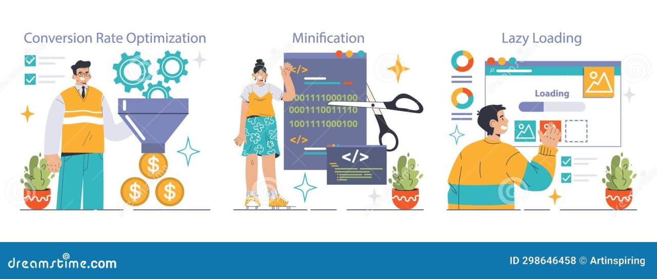
Ultimately, converting maximum customers through your website design is an ongoing process. It requires a deep understanding of your target audience, a commitment to continuous improvement, and a willingness to adapt and experiment. By leveraging the strategies Artikeld in this post, you can create a website that not only attracts visitors but also effectively converts them into loyal customers. Remember, it’s not just about building a beautiful website; it’s about building a profitable one.
FAQ Resource
What’s the most important element of a high-converting website?
While all elements are interconnected, understanding and addressing your target audience’s needs is paramount. A website that doesn’t resonate with its users will struggle to convert, regardless of its aesthetic appeal.
How often should I A/B test my website?
Regular A/B testing is crucial. The frequency depends on your resources and the scale of your changes, but aim for at least a few tests per quarter to continuously optimize.
What if my A/B test results are inconclusive?
Inconclusive results are common. Ensure your test has run long enough with sufficient traffic, and consider refining your hypotheses or testing methodology.
How can I track my website’s conversion rate effectively?
Use analytics tools like Google Analytics to track key metrics such as bounce rate, conversion rate, time on site, and goal completions. Define your conversion goals clearly to get meaningful data.

