Cooking a Visual Identity Branding Deliciousness
Cooking a visual identity is more than just pretty pictures; it’s about crafting a brand that resonates with food lovers on a visceral level. Think of it as the secret ingredient that elevates a simple recipe into a culinary masterpiece. This post dives deep into the process of building a captivating visual identity for your cooking brand, from logo design to website aesthetics and beyond.
We’ll explore everything from choosing the perfect color palette to developing a unique brand story that connects with your audience on an emotional level.
We’ll unpack the key elements of a successful visual identity, offering practical advice and real-world examples to inspire you. Whether you’re launching a new food blog, creating a recipe app, or designing packaging for your gourmet sauces, this guide provides the tools you need to create a visual identity that’s as delicious as the food it represents.
Defining the Visual Identity
Crafting a compelling visual identity for a cooking brand requires a thoughtful approach, encompassing logo design, color palettes, and typography to effectively communicate the brand’s essence and resonate with its target audience. The goal is to create a visual language that instantly evokes feelings of deliciousness, creativity, and perhaps even a touch of warmth and comfort, depending on the brand’s desired personality.The visual identity should be more than just aesthetically pleasing; it should be strategically designed to reflect the brand’s values and attract its ideal customer.
A well-defined visual identity will be consistent across all platforms, from website design to social media presence, ensuring a cohesive and memorable brand experience.
Logo Design
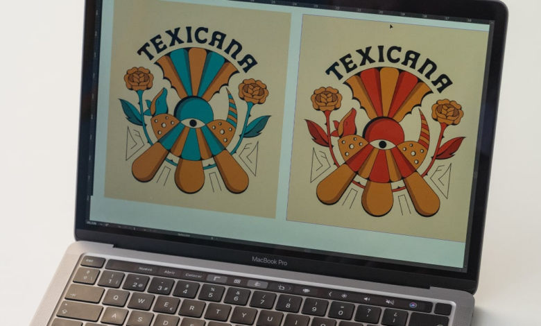
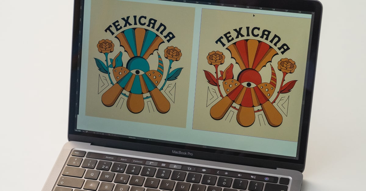
The logo should be the cornerstone of the visual identity, acting as a visual shorthand for the entire brand. For a cooking brand, a logo could incorporate elements like a stylized whisk, a cooking pot, or even a cleverly designed fork and knife. Consider a logo that is both simple and memorable, easily recognizable at various sizes, and adaptable to different applications (e.g., website favicon, social media profile picture, printed materials).
For example, a minimalist logo featuring a single, elegantly drawn sprig of rosemary could evoke feelings of freshness and sophistication, while a more playful logo might depict a cartoon chef with a mischievous grin. The key is to choose a style that aligns with the overall brand personality and target audience.
Color Palette Mood Board
A carefully curated mood board showcases the color palettes that embody various cooking styles. The visual representation of these palettes provides a tangible guide for maintaining brand consistency.
Rustic Cooking: This style evokes feelings of home-cooked meals and traditional recipes. The color palette would likely feature warm, earthy tones such as deep reds, burnt oranges, browns, and creamy off-whites. Think of the colors found in a cozy farmhouse kitchen. Imagine a visual representation with swatches of terracotta, muted mustard yellow, and a deep forest green.
Modern Cooking: This style prioritizes clean lines, minimalist aesthetics, and sophisticated presentations. The color palette would incorporate sleek, neutral colors such as grays, whites, blacks, and perhaps a pop of a vibrant accent color like a deep teal or a bright coral. A mood board might feature images of sleek stainless steel appliances and minimalist kitchen designs. Visual swatches would include cool greys, crisp white, and a sharp black.
Vibrant Cooking: This style embraces bold flavors and bright presentations. The color palette would be energetic and lively, using bright, saturated colors such as sunny yellows, fiery reds, lush greens, and deep purples. A mood board would include images of colorful fruits and vegetables, along with vibrant table settings. Visual swatches might include a sunflower yellow, a deep magenta, and a bright lime green.
Typography Style
The choice of typography significantly impacts the brand’s personality and readability. A rustic cooking brand might benefit from a serif typeface that evokes a sense of tradition and timelessness, perhaps something with a slightly vintage feel. A modern cooking brand might opt for a clean, sans-serif typeface that conveys simplicity and sophistication. A vibrant cooking brand could utilize a more playful or even handwritten-style font to reflect its energetic nature.
Consistency in font choices across all brand materials is crucial for maintaining a unified visual identity. For example, a combination of a clean sans-serif font for headings and a slightly more decorative serif font for body text could create a balanced and visually appealing aesthetic. The key is to select typefaces that are legible, visually appealing, and consistent with the overall brand personality.
Branding and Messaging
Crafting a compelling brand identity for a cooking brand goes beyond just delicious recipes; it’s about weaving a narrative that resonates with your target audience. It’s about creating a feeling, a connection, and a promise. The right messaging, combined with a strong visual language, will solidify your brand’s position in the competitive culinary landscape. This involves understanding your audience and speaking directly to their needs and desires.
Defining the brand’s personality and voice is crucial. We need to consider not only what we’re selling (delicious food!), but also what values we’re representing. Are we about rustic simplicity, cutting-edge techniques, or perhaps a comforting familiarity? The answers to these questions will inform every aspect of our brand, from the tagline to the color palette.
Taglines for Different Audience Segments
A successful tagline is concise, memorable, and speaks directly to a specific target audience. Here are three taglines designed to resonate with different consumer groups:
- For the Busy Professional: “Weeknight Wonders: Delicious meals, simplified.” This tagline speaks to the need for convenience and ease without sacrificing taste.
- For the Passionate Home Cook: “Elevate Your Everyday: Recipes that inspire and delight.” This tagline appeals to those who enjoy cooking and want to improve their skills.
- For the Adventurous Foodie: “Unleash Your Inner Chef: Global flavors, bold creations.” This tagline targets those seeking culinary exploration and new experiences.
Visual Language and Brand Values
Visual language is the silent storyteller of your brand. It’s how you communicate your values without saying a word. For example, a brand focused on authenticity might use rustic textures, warm earthy tones, and handwritten fonts. Images of fresh, unprocessed ingredients would further reinforce this message. Conversely, a brand prioritizing innovation could employ sleek, modern designs, vibrant colors, and sharp, clean photography.
A focus on simplicity might be conveyed through minimalist design, a clean color palette (perhaps two or three core colors), and uncluttered layouts.
Brand Story
A strong brand story connects with consumers on an emotional level. It’s more than just a list of ingredients; it’s a narrative that explains the brand’s origins, its mission, and its values. For example, our brand story could be about a passionate chef who, after years of working in Michelin-starred restaurants, decided to share their culinary expertise with home cooks, making sophisticated techniques accessible and enjoyable.
The story could emphasize the chef’s commitment to using fresh, high-quality ingredients and their desire to inspire others to find joy in cooking. This personal touch creates a bond with the audience, making the brand more relatable and trustworthy.
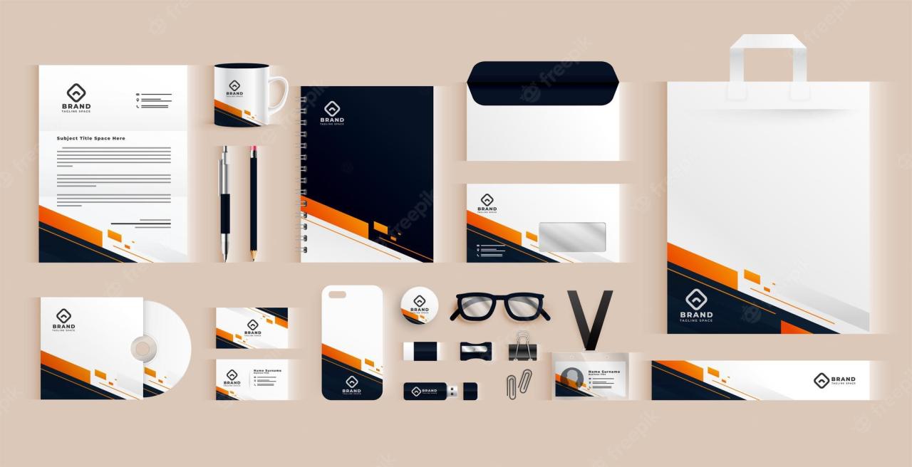
Application Across Platforms
Bringing a cohesive visual identity to life means ensuring consistency across all touchpoints. A strong visual language shouldn’t just look good on a website; it needs to resonate equally well on social media, packaging, and even within the user interface of a cooking app. This section explores how our carefully crafted visual identity translates across various platforms, showcasing its adaptability and strength.The core visual elements – a warm, inviting color palette featuring earthy tones and pops of vibrant color to represent fresh ingredients, a clean and modern typeface, and a consistent use of high-quality food photography – will form the foundation of our multi-platform strategy.
This consistency will build brand recognition and reinforce the feeling of trust and quality we aim to convey.
Crafting a killer visual identity for your brand is like cooking a delicious meal – it takes time, the right ingredients, and a dash of creativity. To really get your brand seen, though, you need to serve it up where people are hungry, and that’s where learning the ropes of getting it on with youtube comes in.
Mastering YouTube marketing helps your visually stunning brand recipe reach a wider audience, ensuring your delicious visual identity isn’t just cooked, but devoured!
Website Design
The website will serve as the central hub for our cooking brand. The homepage will feature a hero image showcasing mouthwatering food, styled with the established color palette and photography style. Navigation will be intuitive and user-friendly, with clear calls to action encouraging engagement. Internal pages will maintain the same visual consistency, ensuring a seamless user experience.
Imagine a website where each recipe page features a full-width image of the finished dish, accompanied by clear, concise instructions and high-quality photography of each step.
Social Media Presence
Social media platforms require a slightly different approach. While maintaining brand consistency, we’ll tailor our content to suit the individual platform’s style and audience. For Instagram, this means using high-quality, visually appealing food photography and short, engaging video clips showcasing quick cooking tips or recipe highlights. On platforms like Facebook, longer-form content, such as blog posts or recipe walkthroughs, will be more effective.
Consistent use of our logo, color palette, and fonts across all social media profiles is crucial for brand recognition. Think of vibrant Instagram stories showcasing behind-the-scenes moments in the kitchen, or Facebook posts sharing user-generated content featuring dishes made using our recipes.
Packaging Design
The packaging for any potential cooking products (e.g., spice blends, sauces) will reflect the same clean, modern aesthetic. The primary color palette will be prominent, with the logo clearly displayed. High-quality images of the product will be featured, and minimal text will keep the design uncluttered and visually appealing. For example, a spice blend packaging might feature a close-up image of the spices, accompanied by a simple description of their flavor profile and suggested uses.
The overall effect should be both informative and visually striking, encouraging consumers to pick up the product.
Cooking App User Interface
The cooking app will prioritize usability and a visually appealing interface. The app’s color scheme will mirror the brand’s palette, and the typography will remain consistent. High-quality images and videos of recipes will be prominently featured. The app’s layout should be intuitive and easy to navigate, allowing users to quickly find recipes, create shopping lists, and save their favorites.
For example, the recipe browsing screen might display recipe cards with large, appealing images, and a clear categorization system. The recipe viewing screen could incorporate step-by-step video instructions alongside written directions, and an interactive shopping list feature. The overall feel should be modern, clean, and user-friendly, reflecting the brand’s commitment to quality and ease of use.
Effective Use of Visual Elements in Cooking Videos, Cooking a visual identity
Effective cooking videos utilize a combination of techniques to engage viewers. High-quality close-up shots of ingredients being prepared create a sense of intimacy and excitement. Smooth transitions between shots maintain viewer interest. Clear, concise instructions overlayed on the video enhance understanding. Professional lighting and editing create a polished and appealing visual experience.
For instance, a video showcasing a pasta recipe might begin with a wide shot of the ingredients laid out, then transition to close-ups of the chef chopping vegetables and cooking the pasta, interspersed with shots of the finished dish. Text overlays could indicate cooking times and ingredient measurements. Music and sound effects add to the overall viewing experience.
Illustrations and Graphics
Creating a strong visual identity for a cooking-focused brand requires more than just a logo; it needs compelling illustrations and graphics to bring recipes and culinary concepts to life. These visuals should be consistent with the overall branding and messaging, enhancing the user experience and making the brand memorable. We’ll explore several illustrative styles and graphic elements to achieve this.
Illustrative Styles for Recipe Illustrations
Choosing the right illustrative style is crucial for setting the tone and aesthetic of your cooking brand. Different styles appeal to different audiences and evoke distinct feelings. Here are three distinct styles well-suited for recipe illustrations and website graphics:
- Photorealistic Style: This style aims for a highly detailed and realistic representation of food. Think vibrant, high-resolution images of dishes, with textures and colors accurately depicted. This style works well for showcasing the final product of a recipe, emphasizing its deliciousness and appeal. For example, a photorealistic image of a perfectly browned roast chicken with glistening skin would be highly effective in this style.
The challenge lies in maintaining consistency across images and ensuring the photography is high quality.
- Flat Style Illustrations: This style uses simplified shapes and bold colors, avoiding complex shading and textures. It’s characterized by its clean, modern look and is often used for icons, website graphics, and social media content. A flat-style illustration of a steaming bowl of soup with simple line work and bright colors would be easily recognizable and visually appealing. The advantage is its versatility and ease of use across different platforms.
- Watercolor Style Illustrations: This style evokes a feeling of warmth, homeliness, and handcrafted charm. Watercolor illustrations often feature soft edges, blended colors, and a slightly imperfect, organic look. Imagine a watercolor painting of fresh herbs and vegetables, with delicate brushstrokes and a slightly loose style. This style works particularly well for brands aiming for a rustic or artisanal feel.
Cooking Technique and Ingredient Icons
Icons are essential for creating a visually engaging and easily navigable website or app. A well-designed set of icons can quickly communicate cooking techniques or ingredients, improving the user experience. Consider these examples:
- Techniques: A whisk for whisking, a rolling pin for rolling dough, a knife for chopping, a spatula for flipping, a saucepan for simmering, an oven for baking.
- Ingredients: A wheat stalk for grains, an apple for fruits, a carrot for vegetables, a chicken leg for poultry, a fish for seafood, a chili pepper for spices.
These icons should be consistent in style and size, ideally using the chosen illustrative style (e.g., flat style, watercolor style) to maintain visual harmony across the brand.
Infographic Elements for Nutritional Information and Cooking Times
Visually presenting nutritional information and cooking times can make recipes more accessible and engaging. Using infographics makes this data easier to understand and digest than plain text.
- Nutritional Information: Use color-coded bars to represent macronutrients (proteins, carbohydrates, fats), clearly labeling each section. A circular infographic showing the percentage breakdown of each nutrient can also be effective. For example, a green bar could represent fiber, a red bar for sugar, and a yellow bar for fat.
- Cooking Times: A simple timeline graphic with clear visual markers for prep time, cook time, and total time would be easy to understand. Use different colors to distinguish each stage and ensure clear labeling. For instance, a blue bar for prep, a red bar for cooking, and a green bar indicating the total time.
These infographic elements should be visually appealing and easy to read, using clear fonts and a consistent color scheme. Simplicity is key; avoid overwhelming the user with too much information at once.
Color Psychology in Cooking
Source: techcrams.com
Color plays a surprisingly significant role in our perception and enjoyment of food. The hues we see on our plates influence our appetite, expectations, and even our taste experience. Understanding color psychology in cooking allows chefs and food stylists to manipulate these perceptions, creating visually appealing and ultimately more satisfying meals.Color palettes evoke specific emotions and associations. Warm colors like reds and oranges stimulate appetite and are often associated with comfort and energy.
Think of a vibrant tomato sauce or a fiery chili – these colors instantly suggest warmth and spice. Conversely, cool colors like blues and greens often evoke feelings of calmness and freshness. Imagine a refreshing cucumber salad or a vibrant green pesto – the coolness of the color visually mirrors the sensation of eating these dishes.
Color Use to Highlight Ingredients or Recipe Steps
Strategic color use can effectively guide the viewer through a recipe, highlighting key ingredients and crucial steps. For instance, in a recipe for a layered cake, using contrasting colors for each layer can make the visual instructions clearer. A bright yellow sponge layer next to a deep red berry filling will instantly make the layers stand out. Similarly, using a vibrant green to highlight fresh herbs in a recipe’s ingredient list immediately draws the eye to a key component.
This is particularly useful in visual recipes where the image is the primary means of conveying information.
Color in Different Culinary Traditions
Culinary traditions across the globe demonstrate diverse approaches to color in food presentation. Mediterranean cuisine often features vibrant colors – think of the bright reds of tomatoes and peppers, the deep greens of olives and basil, the sunny yellows of lemons. This palette reflects the region’s abundance of fresh produce and emphasizes the dishes’ natural vibrancy. In contrast, Japanese cuisine often utilizes a more subtle and understated color palette, with an emphasis on natural tones and seasonal ingredients.
The focus is often on texture and presentation, rather than bold, vibrant colors. The use of muted greens, browns, and whites in dishes like sushi showcases this aesthetic. Indian cuisine, on the other hand, showcases a riot of colors – from the fiery reds and oranges of curries to the vibrant greens of cilantro and the deep purples of eggplant.
This reflects the diverse range of spices and ingredients used in Indian cooking, creating a visually stimulating and flavorful experience.
Closure: Cooking A Visual Identity
Source: domestika.org
Creating a compelling visual identity for your cooking brand is a journey, not a destination. It requires careful consideration of your target audience, brand values, and the overall message you want to convey. By thoughtfully integrating logo design, photography, typography, and color psychology, you can craft a brand that not only looks amazing but also connects with your audience on a deeper level.
Remember, your visual identity is the first impression you make – make it count! So go forth, and cook up a visual identity that’s truly unforgettable.
Q&A
What’s the difference between a logo and a brand identity?
A logo is a single visual element (like a symbol or text), while a brand identity encompasses the entire visual and emotional experience associated with your brand. It includes your logo, color palette, typography, photography style, and overall messaging.
How much should I budget for visual identity design?
The cost varies widely depending on the complexity and scope of the project. Expect to invest a significant amount, as a well-designed identity is an investment in your brand’s long-term success.
How long does it take to create a visual identity?
The timeline depends on the project’s complexity and your collaboration with the designer. Allow ample time for brainstorming, design iterations, and feedback rounds. Expect a minimum of several weeks.
Do I need a professional designer for my cooking brand’s visual identity?
While DIY options exist, a professional designer brings expertise, experience, and a fresh perspective to the table. They can ensure your brand’s visual identity is cohesive, professional, and effective in communicating your message.