Top 5 Subtle and Practical Animations for Your Website
Top 5 subtle and practical animations for your website: Let’s face it, a static website can feel, well, static! But adding the right animations can transform your online presence, making it more engaging and user-friendly. We’re diving into five subtle yet powerful animation techniques that will elevate your website’s design without overwhelming your visitors. Get ready to add some delightful movement to your digital space!
From smooth parallax scrolling that adds depth to your pages to clever micro-interactions that provide satisfying feedback, these animations aren’t just about flashy visuals; they’re about enhancing the overall user experience. We’ll explore how to implement these animations effectively, focusing on best practices and avoiding common pitfalls. Think of it as adding a touch of magic to your website, one subtle animation at a time.
Top 5 Subtle and Practical Website Animations
Subtle animations, when implemented correctly, can significantly enhance a website’s appeal and user experience. They add a layer of visual interest and interactivity without being distracting or overwhelming. Well-executed subtle animations can guide users, provide feedback, and create a more engaging and memorable online experience. The key is to prioritize functionality and user experience over flashy effects.Subtle animations improve user experience by providing visual cues and feedback, making the website more intuitive and engaging.
For example, a subtle loading animation can reassure users that the site is working, while a smooth transition between pages creates a more seamless browsing experience. This improved experience can lead to increased user engagement and satisfaction, ultimately benefiting conversion rates and overall website performance.
Examples of Effective Subtle Animation Use
Many successful websites utilize subtle animations to great effect. Consider the subtle hover effects often seen on navigation menus, where menu items might subtly expand or change color on mouseover. This provides clear visual feedback to the user, indicating that the item is interactive. Similarly, many e-commerce sites use subtle animations to showcase product details, such as a smooth zoom effect when a user hovers over a product image, or a gentle fade-in animation for additional product information.
These animations enhance the user experience without being intrusive. Another excellent example is the use of subtle parallax scrolling effects, where background images move at a different speed than the foreground content, creating a sense of depth and enhancing the visual appeal of the website without sacrificing functionality. These animations create a visually pleasing and engaging experience for the user, making their interaction with the website more enjoyable and memorable.
Parallax Scrolling Effects
Parallax scrolling is a clever animation technique that adds depth and visual interest to websites by creating a sense of three-dimensionality. It works by moving background elements at a slower rate than foreground elements as the user scrolls, giving the illusion of depth and creating a more engaging user experience. This effect subtly guides the user’s eye through the page and enhances the overall aesthetic appeal.Parallax scrolling leverages the layered nature of website design.
Imagine a landscape; the mountains in the background move slowly as you walk, while trees and bushes closer to you move more quickly. Parallax mimics this, creating a similar sense of perspective and movement on a webpage. This depth perception makes the website feel more dynamic and immersive than a static page.
Creating a Simple Parallax Scrolling Effect
A basic parallax effect can be achieved using HTML, CSS, and a touch of JavaScript. The key is to create layers, each with a different scrolling speed. Here’s a simple example:“`html
“`This code creates a single parallax layer. To achieve a more complex effect, multiple layers would be needed, each with its own `background-attachment` and potentially JavaScript to adjust scrolling speed. Remember to replace `”background-image.jpg”` with the actual path to your image.
Parallax Scrolling Techniques, Top 5 subtle and practical animations for your website
There are several approaches to implementing parallax scrolling. The example above utilizes CSS’s `background-attachment: fixed;` property, a simple method suitable for basic effects. More advanced techniques involve JavaScript libraries or frameworks that provide finer control over scrolling speed and element positioning, allowing for more complex and sophisticated animations. These often offer features like easing functions to create smoother transitions and handle different browser compatibilities more effectively.
Choosing the right technique depends on the complexity of the desired effect and the developer’s familiarity with different tools.
Drawbacks of Overusing Parallax Scrolling
While parallax scrolling can enhance a website, overuse can lead to several drawbacks. Excessive parallax effects can be visually overwhelming and distracting, detracting from the content’s readability and overall user experience. Furthermore, it can significantly increase page load times, negatively impacting performance, particularly on mobile devices with slower processing capabilities. For example, a website with numerous parallax layers and high-resolution images could take a considerable time to load, leading to user frustration and potentially impacting rankings.
Finally, accessibility is a concern; some users with motion sensitivity may find excessive animation disorienting or even nauseating.
Loading Animations: Top 5 Subtle And Practical Animations For Your Website
Loading animations are more than just pretty visuals; they’re crucial for enhancing user experience. A well-designed loading animation can transform a frustrating wait into an engaging moment, improving user perception of your website’s speed and professionalism. A poorly designed one, however, can exacerbate the feeling of slow loading and leave a negative impression.Loading animations should be carefully considered within the context of your overall website design and branding.
They should complement your style, not clash with it. The key is to strike a balance between visual appeal and functionality, ensuring the animation doesn’t consume excessive resources and slows down the actual loading process.
Creative Loading Animation Ideas
The following are five creative loading animation ideas suitable for diverse website types. Consider your target audience and brand identity when selecting an appropriate style.
- Progress Ring/Circle: A classic and universally understood loading animation, this depicts a circle filling up gradually. It’s versatile and works well for various websites, offering a clean and modern look.
- Animated Logo: Integrate your logo into the loading animation. This can involve subtle pulsations, rotations, or transformations of your logo, reinforcing brand identity while users wait.
- Character Animation: For playful or more informal brands, a simple character animation—perhaps a mascot or icon—performing a small action (like bouncing or spinning) can add personality and engagement.
- Data Visualization: If your website involves data processing or analysis, a loading animation that visualizes this process (e.g., a graph filling up or nodes connecting) can be both informative and aesthetically pleasing.
- Geometric Patterns: Abstract geometric patterns that morph or transition can create visually interesting loading animations, especially for modern or minimalist websites. The animation could involve shapes shifting, rotating, or changing color.
Best Practices for Designing Loading Animations
Effective loading animations are both visually engaging and computationally efficient. Prioritizing these two aspects ensures a positive user experience without sacrificing performance.
- Keep it Simple: Avoid overly complex animations that require significant processing power. Simplicity is key for a smooth loading experience.
- Maintain Brand Consistency: The animation’s style and color palette should align with your website’s overall design and branding.
- Provide Feedback: The animation should clearly indicate that the website is loading and provide a sense of progress (where applicable).
- Test Across Devices: Ensure the animation renders correctly and performs smoothly across different browsers and devices.
- Optimize for Performance: Use lightweight assets (images, animations) and efficient coding techniques to minimize the animation’s impact on loading times.
Implementing a Smooth Loading Animation with CSS and JavaScript
A simple loading animation can be created using CSS and JavaScript. The following example demonstrates a basic loading spinner. Remember to adjust the styling to match your website’s design.
CSS (style.css):
.loader border: 16px solid #f3f3f3; /* Light grey – / border-top: 16px solid #3498db; /* Blue – / border-radius: 50%; width: 120px; height: 120px; animation: spin 2s linear infinite;@keyframes spin 0% transform: rotate(0deg); 100% transform: rotate(360deg);
HTML (index.html):
This CSS creates a rotating spinner. JavaScript could be used to show/hide this element based on the loading status of your page. More sophisticated animations would require more complex CSS and/or JavaScript.
Considering Loading Times When Designing Animations
The impact of animations on page load times cannot be overstated. While visually appealing animations enhance user experience, excessively large or complex animations can significantly slow down loading, negating any positive effect. Prioritize performance optimization techniques to ensure your animations don’t hinder your website’s speed. Using optimized images, minimizing file sizes, and leveraging efficient coding practices are essential.
Regularly testing your website’s loading speed using tools like Google PageSpeed Insights is crucial to identify and address any performance bottlenecks caused by animations.
Hover Effects
Source: googleusercontent.com
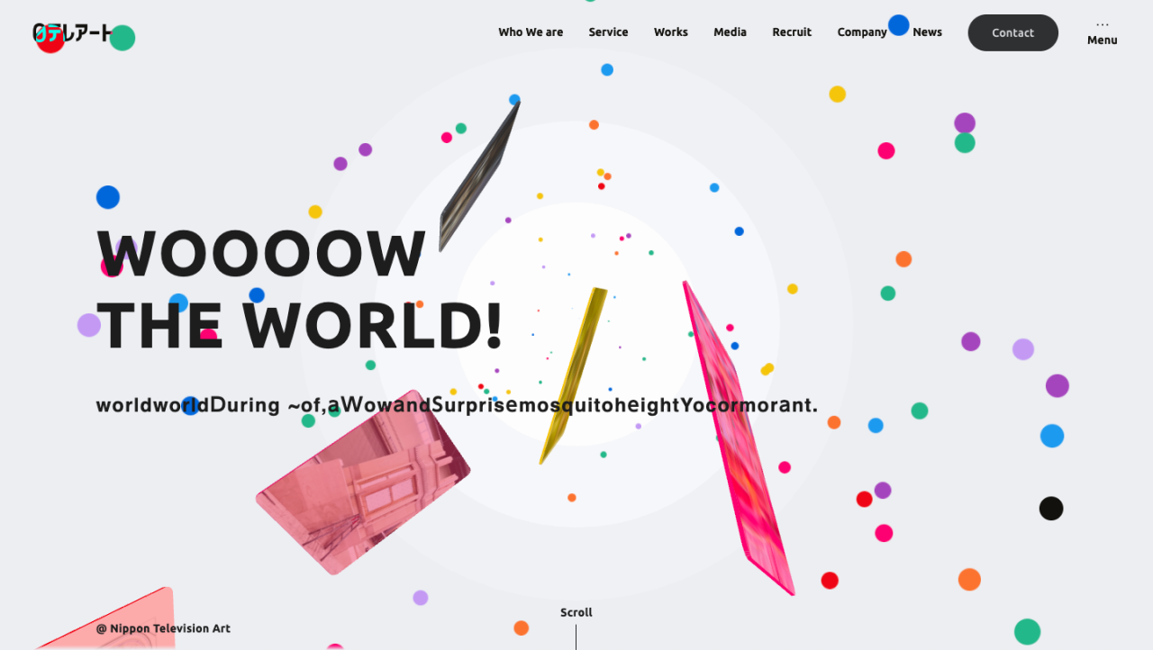
Hover effects add a touch of dynamism and interactivity to a website, subtly enhancing the user experience. They provide visual feedback to the user’s actions, making the site feel more responsive and engaging. Well-implemented hover effects can guide users’ attention and improve the overall usability of the site.
Subtle hover effects are key; overly flashy animations can be distracting and detract from the overall design. The goal is to provide clear visual cues without overwhelming the user. This section will explore three different types of subtle hover effects and their implementation using CSS, along with considerations for accessibility.
Three Types of Subtle Hover Effects
We’ll examine three distinct hover effect types: scale transformations, color shifts, and subtle border animations. These can be applied to images, buttons, and navigation elements to create a more interactive experience.
CSS Implementation of Hover Effects
The following table demonstrates the CSS code for each effect. Remember to adjust colors and values to match your website’s design.
| Effect Type | Element | CSS Code | Visual Description |
|---|---|---|---|
| Scale Transformation | Image |
.image-container img
  transition: transform 0.3s ease;

.image-container img:hover
  transform: scale(1.05);
|
On hover, the image subtly enlarges by 5%, creating a gentle zoom effect. |
| Color Shift | Button |
.button
  background-color: #4CAF50;
  transition: background-color 0.2s ease;

.button:hover
  background-color: #45a049;
|
The button’s background color darkens slightly on hover, providing clear visual feedback. |
| Subtle Border Animation | Navigation Link |
.nav-link
  border-bottom: 1px solid transparent;
  transition: border-bottom-color 0.2s ease;

.nav-link:hover
  border-bottom-color: #4CAF50;
|
A thin, colored border appears under the navigation link on hover, highlighting the active element. |
Effectiveness of Hover Effects in Improving User Engagement
Well-designed hover effects can significantly improve user engagement. The subtle visual feedback provided by these effects makes the website feel more responsive and interactive, encouraging users to explore and interact with different elements. For example, a subtle color change on a button can increase click-through rates by making the button appear more prominent and inviting.
Similarly, a subtle zoom on an image can encourage users to view the image in more detail.
Accessibility Considerations for Hover Effects
It’s crucial to consider accessibility when implementing hover effects. Users with motor impairments or those using assistive technologies might not be able to easily trigger hover effects. To mitigate this, ensure that the same functionality is available through keyboard navigation or other input methods. For instance, using focus styles (`:focus`) in addition to hover styles (`:hover`) ensures that keyboard users can experience the same visual feedback.
Clearly defined visual cues, even without hover, are also essential for users with visual impairments.
Micro-interactions
Source: digitalsilk.com
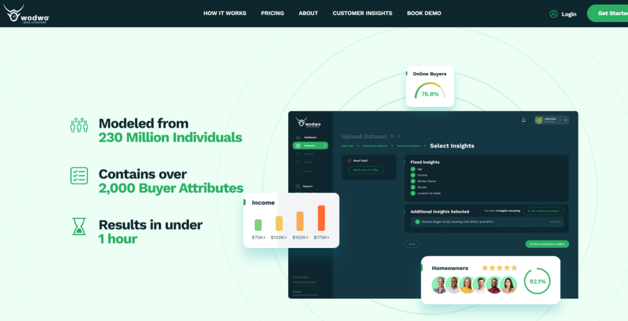
Micro-interactions are the small, often overlooked animations and feedback mechanisms that significantly impact a user’s experience on a website. They’re the subtle cues that confirm actions, provide feedback, and guide the user through the interface. These tiny details, when done well, can elevate a website from functional to delightful. Think of them as the website’s polite “thank yous” and reassuring nods.Micro-interactions improve the usability and intuitiveness of a website by providing clear and immediate feedback to user actions.
This reduces uncertainty and frustration, leading to a smoother and more enjoyable user experience. A well-designed micro-interaction can instantly communicate the status of a task, confirm an action, or guide the user to the next step. This clear communication reduces cognitive load and allows users to focus on the core tasks of the website.
Examples of Micro-interactions Enhancing User Feedback
Micro-interactions provide subtle yet powerful feedback. Here are five examples:
- Button Click Feedback: A subtle change in button color or a brief animation upon clicking confirms that the action has been registered. Imagine a button changing from a solid color to a slightly lighter shade for a tenth of a second after being clicked. This provides immediate visual confirmation without being distracting.
- Loading Indicators: A small, animated loading icon provides feedback while a page loads or data processes. This could be a simple spinner, a progress bar, or a more sophisticated animation, depending on the complexity of the task. The user is kept informed and reassured that the system is responding to their request.
- Form Field Validation: Real-time feedback as a user types into a form field, highlighting errors or providing suggestions. For instance, an email field might subtly change color to indicate a valid or invalid email address as the user types. This prevents errors and guides users toward correctly completing the form.
- Checkbox Selection: A simple checkmark appearing in a checkbox upon selection provides clear visual confirmation of the selection. This small animation offers a satisfying closure and prevents confusion about the status of the checkbox. The lack of it could lead to users repeatedly clicking to ensure their selection is registered.
- Tooltip Appearance: A tooltip appearing on hover over an element provides additional information or context. This micro-interaction aids in navigation and understanding. For example, a tooltip explaining the purpose of a less-obvious icon can make the interface significantly more intuitive.
Design Principles Behind Effective Micro-interactions
Effective micro-interactions are guided by several key principles:* Brevity: They should be concise and not overly complex or time-consuming.
Clarity
They should provide clear and unambiguous feedback.
Relevance
They should be relevant to the user’s action and context.
Consistency
They should be consistent in style and behavior across the website.
Subtlety
They should be subtle enough not to distract from the main content.
Implementing a Simple Micro-interaction with JavaScript
A simple example of a micro-interaction using JavaScript involves changing the button’s background color on hover. This demonstrates the basic concept. More complex interactions might involve CSS transitions and animations.
Here’s a simplified example:
<button id="myButton">Click Me</button><script>const button = document.getElementById('myButton');button.addEventListener('mouseover', () => button.style.backgroundColor = '#ddd';);button.addEventListener('mouseout', () => button.style.backgroundColor = '#fff';);</script>
This code changes the background color of the button to light gray on hover and back to white on mouseout. This simple example illustrates how a small piece of JavaScript can create a subtle yet effective micro-interaction.
Conclusion

Source: designyourwebsite.in
So, we’ve explored five subtle yet impactful animation techniques for websites: parallax scrolling, loading animations, hover effects, and micro-interactions. These animations, when implemented thoughtfully, can significantly enhance user experience, making navigation more intuitive and engaging. Remember, the key is subtlety; overuse can be jarring and detract from the overall website experience. The goal is to add polish and visual interest without distracting from the core content.
The Importance of User Experience in Website Design
Effective website design prioritizes user experience (UX). A positive UX leads to increased user engagement, higher conversion rates, and ultimately, a more successful online presence. Animations, when used correctly, contribute significantly to a positive UX. They can guide users through the site, provide visual feedback for interactions, and create a more memorable and enjoyable experience. Consider the impact of a smooth, visually appealing loading animation versus a stark, static screen; the former sets a positive tone and manages user expectations.
Similarly, well-executed hover effects can provide clear visual cues, improving site navigation and usability. A website that feels polished and well-designed inspires confidence and trust in the brand or information it presents.
Closure
So, there you have it – five subtle yet impactful animation techniques to breathe life into your website. Remember, the key is subtlety and purpose. Don’t overload your site with animations; instead, strategically incorporate them to enhance usability and engagement. By thoughtfully applying these techniques, you can create a more enjoyable and memorable experience for your visitors, leaving them with a positive lasting impression.
Now go forth and animate!
Essential Questionnaire
What are the accessibility considerations for animations?
Ensure animations don’t cause seizures (avoid flashing or rapidly changing elements), provide alternative text for animated content, and allow users to disable animations if needed.
How can I ensure my animations don’t slow down my website?
Optimize your animation code, use lightweight libraries, and test your website’s loading speed thoroughly. Consider using lazy loading for animations that appear below the fold.
Are there any free tools or resources to help me create animations?
Yes! Many free online tools and tutorials can help you create animations using CSS, JavaScript, or even animation software. Search for “free CSS animation generators” or “free JavaScript animation libraries” to find some great options.
