Creative Ideas and Tips to Design Your PowerPoint Presentation
Creative Ideas and Tips to Design Your PowerPoint Presentation: Let’s face it, PowerPoint presentations can be a snoozefest. But they don’t have to be! This isn’t about just slapping together some bullet points and hoping for the best. We’re diving deep into the art of visual storytelling, exploring how to transform your presentations from dull data dumps into dynamic, engaging experiences that actually captivate your audience.
Get ready to unlock your inner presentation guru!
We’ll cover everything from crafting killer opening slides that grab attention in seconds to mastering the subtle art of animation and the psychology of color palettes. We’ll even tackle the often-overlooked aspects like effective typography and the power of white space. Think of this as your ultimate guide to creating presentations that don’t just inform, but inspire.
Captivating Introductions
Source: slidemodel.com
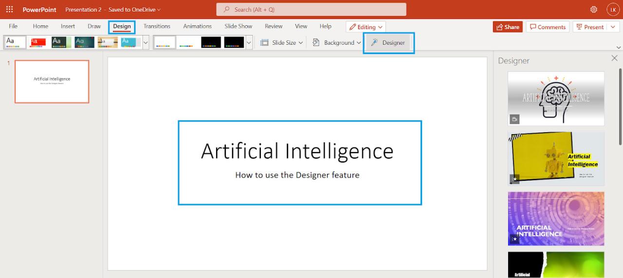
Your PowerPoint presentation’s opening slide is crucial; it’s your first impression and sets the tone for the entire presentation. A captivating introduction can hook your audience from the start, making them eager to hear more. Failing to grab their attention in those initial seconds can lead to disengagement and a less impactful presentation. The key is to create a slide that is visually striking and immediately communicates the core message of your presentation.A strong opening slide isn’t just about aesthetics; it’s about strategic communication.
Consider your audience and the overall message you want to convey. A slide that works wonders for a tech-savvy audience might fall flat with a group of academics. Therefore, tailoring your opening slide to resonate with your specific audience is paramount. This involves understanding their background, interests, and expectations.
Impactful Opening Slide Designs
Creating an impactful opening slide that grabs attention within five seconds requires careful planning. Here are three alternative opening slide designs, each targeting a different audience and utilizing different techniques:
- Design 1: A Bold Visual Metaphor for a Technical Audience. This design uses a single, high-quality image – perhaps a close-up of a complex circuit board, subtly overlaid with a key statistic relevant to the presentation’s topic. The statistic is presented as a large, easily digestible number. This approach leverages the technical audience’s appreciation for detail and data-driven insights. The circuit board visually represents the complexity of the topic, while the large statistic highlights a key takeaway.
The overall effect is clean, modern, and instantly intriguing.
- Design 2: A Concise Headline and Compelling Visual for a General Audience. This design features a striking image – perhaps a vibrant landscape or an evocative abstract piece – paired with a concise, impactful headline that immediately communicates the presentation’s central theme. The headline is large and bold, using strong verbs and active voice. The image should be visually appealing and relevant to the topic, creating an emotional connection with the audience.
This approach is straightforward and effective in grabbing the attention of a diverse audience.
- Design 3: An Intriguing Question and a Related Image for an Academic Audience. This design uses a thought-provoking question related to the presentation’s core argument, presented in a clean, minimalist font. The question is paired with a relevant image that subtly hints at the answer without giving it away. This approach stimulates intellectual curiosity and encourages the audience to actively engage with the material. The minimalist design respects the academic preference for clarity and substance over flashy visuals.
Visual Metaphors for Complex Topics
Visual metaphors are incredibly powerful tools for simplifying complex concepts and making them more accessible to your audience. Instead of overwhelming them with technical jargon or dense data, a well-chosen visual metaphor can create a memorable and easily understood analogy.For instance, explaining the concept of “supply and demand” in economics could be simplified using a visual metaphor of a seesaw.
The amount of supply is represented on one side, and demand on the other. The seesaw’s balance demonstrates how changes in either side affect the other, illustrating the dynamic interplay between supply and demand in a clear and intuitive manner. Similarly, the branching structure of a tree can be used to visually represent hierarchical organizational structures, making complex organizational charts more easily understood.
The key is to choose a metaphor that is both relevant to the topic and easily relatable to your audience. Avoid overly obscure or abstract metaphors that could confuse rather than clarify.
Visual Storytelling
PowerPoint presentations don’t have to be dry recitations of facts. They can be captivating narratives, drawing your audience in and leaving a lasting impression. Visual storytelling is the key, transforming data into a compelling journey that resonates with your viewers on an emotional level, far beyond the simple conveyance of information. This involves carefully crafting a narrative structure and choosing visual elements that amplify the story’s impact.Visual storytelling in PowerPoint hinges on a clear narrative arc.
Think of your presentation as a short film, with a beginning, middle, and end. For example, a presentation on the history of coffee could begin with the discovery of coffee beans, progress through its global spread and cultural impact, and conclude with its modern-day relevance. Each slide should contribute to this overarching narrative, building suspense, highlighting key moments, and ultimately delivering a satisfying conclusion.
The narrative should be logical and easy to follow, guiding the audience through the information seamlessly.
Visual Elements Enhancing Storytelling
The power of visual storytelling lies in strategically employing visual elements to support and enhance the narrative. Let’s consider how different elements can be used in our coffee presentation:A timeline infographic could visually represent the key historical moments in coffee’s journey, from its Ethiopian origins to its global dominance. This would use a horizontal line with labeled points representing significant events, dates, and locations, creating a clear chronological progression.
The visual impact would be a clean, easily digestible representation of the coffee’s history, emphasizing key periods and locations.High-quality images can evoke emotions and bring the story to life. An image of a bustling Ethiopian coffee ceremony, full of rich color and cultural detail, would immediately transport the audience to the heart of coffee’s origins. The visual impact would be one of cultural immersion and intrigue, making the history feel tangible and relatable.Charts can effectively illustrate key data points, such as global coffee production or consumption patterns over time.
A simple bar chart comparing coffee production across different countries could clearly showcase the global distribution of coffee production. The visual impact would be the clear and concise communication of complex data, allowing the audience to easily grasp important trends and comparisons.Icons can be used subtly to add visual interest and reinforce key concepts. For example, a coffee bean icon could consistently represent coffee throughout the presentation, providing visual consistency and a subconscious reminder of the central theme.
The visual impact would be an understated yet effective way to improve visual coherence and thematic unity.
A Textless Slide: The Coffee Revolution
Imagine a slide showcasing the moment when coffee became a global commodity. The visual elements could include:A world map with coffee-producing regions highlighted in a rich brown, gradually intensifying in color to represent the expansion of coffee cultivation over time. This would depict the global spread of coffee, visually showcasing its increasing popularity and influence.Superimposed images of bustling ports, merchant ships, and coffee houses from various historical periods.
This would create a sense of movement and global trade, illustrating the dynamic nature of coffee’s global spread.A subtle color gradient shifting from dark brown (representing the early days) to a lighter, more vibrant brown (representing its later growth), reinforcing the sense of expansion and evolution. This would provide a smooth visual transition reflecting the gradual growth and diversification of coffee trade and consumption.This textless slide would communicate the key moment in the narrative powerfully, relying solely on the visual elements to convey the story’s essence and emotional impact.
The visual impact would be a strong and memorable image, conveying the information concisely and powerfully.
Effective Use of Typography and Color
Choosing the right fonts and colors is crucial for creating a PowerPoint presentation that’s not only visually appealing but also highly effective in communicating your message. A well-designed presentation uses typography and color strategically to guide the viewer’s eye, enhance readability, and ultimately, leave a lasting impression. Poor choices, on the other hand, can lead to a confusing and unengaging experience.
This section will explore best practices for leveraging these elements to maximize the impact of your presentations.
Effective typography and color choices work in tandem. The right font can enhance readability, while a well-chosen color palette can evoke specific emotions and improve visual hierarchy. The key is to find a balance between aesthetics and functionality, ensuring your design is both beautiful and easy to understand.
Font Selection for Readability and Aesthetics
Selecting fonts involves considering both their aesthetic appeal and their readability. Serif fonts (like Times New Roman or Garamond), with their small flourishes at the ends of strokes, are often considered more traditional and suitable for longer blocks of text. Sans-serif fonts (like Arial or Helvetica), lacking these flourishes, tend to be cleaner and more modern, often preferred for headlines and shorter text segments.
The choice depends heavily on the overall tone and style of your presentation. Avoid using too many different fonts; stick to a maximum of two or three for consistency. Also, ensure sufficient font size to ensure readability for all audience members, especially those in the back of the room. Consider using a larger font size for headlines and a slightly smaller, but still easily readable, size for body text.
Font Pairing and Readability
The following table demonstrates the contrast and readability of different font pairings. Readability is subjective and can be affected by factors such as font size and screen resolution, but this table provides a general comparison. The scores are based on a subjective assessment considering factors like letter spacing, x-height (the height of lowercase ‘x’), and overall visual comfort.
| Font Pairing | Headline Font | Body Font | Readability Score (1-5, 5 being highest) |
|---|---|---|---|
| Pairing 1 | Open Sans | Roboto | 4 |
| Pairing 2 | Montserrat | Lato | 4.5 |
| Pairing 3 | Playfair Display | Georgia | 3.5 |
| Pairing 4 | Arial Black | Times New Roman | 3 |
Psychological Impact of Color Palettes
Color psychology plays a significant role in how your audience perceives your presentation. Different colors evoke different emotions and associations. For example, blue often conveys calmness and trustworthiness, while red can represent excitement or urgency. Green is often associated with nature and growth, while yellow can suggest happiness or optimism. A well-chosen color palette can enhance your message and create the desired mood.
For example, a presentation on a serious topic might benefit from a more subdued palette of blues and grays, while a presentation on a new product launch might use brighter, more energetic colors. Remember to maintain sufficient contrast between text and background colors for optimal readability. Avoid using too many colors; a limited palette generally leads to a cleaner and more professional look.
Consider accessibility for colorblind individuals by using sufficient color contrast and avoiding relying solely on color to convey information.
Data Visualization: Creative Ideas And Tips To Design Your Powerpoint Presentation
Data visualization is crucial for transforming complex datasets into easily digestible information within your PowerPoint presentation. A well-designed visual not only clarifies your data but also enhances audience engagement and understanding. Effective data visualization translates numbers into narratives, allowing your audience to grasp key insights quickly and remember them longer.
Choosing the right chart type is paramount. Different charts excel at conveying specific types of information. Let’s explore how to organize data and present it effectively using various visualization techniques.
Organizing Complex Data into a Clear Infographic
Consider this hypothetical dataset representing the sales figures (in thousands) for three product lines (A, B, C) over four quarters:
| Quarter | Product A | Product B | Product C |
|---|---|---|---|
| Q1 | 10 | 15 | 8 |
| Q2 | 12 | 18 | 10 |
| Q3 | 15 | 20 | 12 |
| Q4 | 18 | 25 | 15 |
This data can be effectively presented in an infographic using a combination of charts and visuals. For instance, a bar chart could show the sales for each product across the quarters, while a line chart could illustrate the sales trend over time for each product. A simple icon representing each product could add visual appeal and clarity. Finally, key figures, like total yearly sales for each product, could be highlighted with large, easily readable numbers.
The infographic would need a clear title and concise labels, making it easy for the audience to quickly grasp the main findings.
Comparison of Chart Types for the Same Dataset, Creative ideas and tips to design your powerpoint presentation
Let’s compare three chart types – bar chart, line chart, and pie chart – using the sales data above.
A bar chart is ideal for comparing the sales of different products across quarters. Each product would have a separate bar for each quarter, allowing for easy visual comparison of performance across the time period.
A line chart is best suited for showcasing trends over time. Each product line would have its own line, demonstrating the sales growth or decline across the four quarters. This highlights the overall sales trajectory for each product.
A pie chart would be less effective for this data. While it could show the overall market share of each product for a single quarter, it wouldn’t effectively communicate the sales trends across the four quarters. Using a pie chart for this dataset would obscure the temporal aspect of the sales data.
Slide Design Incorporating Charts and Visuals
To effectively communicate key findings from a hypothetical research study on the impact of social media marketing on brand awareness, a slide could combine a bar chart and relevant visuals. The bar chart would compare brand awareness levels (measured as a percentage) before and after a social media campaign across different age demographics. Accompanying the chart, icons representing different age groups (e.g., a stylized image for young adults, middle-aged adults, and seniors) could be used to improve visual appeal and clarity.
A brief summary of the key finding (e.g., “Social media campaign increased brand awareness by X% among young adults”) could be included in concise, easily readable text. The color scheme should be consistent and visually appealing, enhancing the overall impact of the slide. The overall design should prioritize clarity and readability, ensuring the key findings are immediately apparent to the audience.
Creating Engaging Animations and Transitions
PowerPoint presentations can easily become static and boring if not injected with a bit of visual dynamism. Animations and transitions, when used judiciously, can significantly enhance audience engagement and comprehension. However, the key is subtlety and purpose; overdoing it can lead to a distracting and unprofessional presentation. Let’s explore how to harness the power of animation and transitions effectively.Animations and transitions should serve to highlight key information, guide the viewer’s eye, and create a sense of visual flow.
They should never overshadow the content itself. Think of them as visual cues that support, rather than distract from, your message. A well-placed animation can emphasize a crucial statistic, draw attention to a compelling image, or simply add a touch of elegance to your presentation. Similarly, a smooth transition can help maintain the audience’s focus and create a seamless experience as you move between slides.
Subtle Animations for Emphasis
Subtle animations, such as a gentle fade-in or a slight zoom effect, can be incredibly effective in drawing attention to important details without being jarring. For instance, imagine a bullet point appearing one at a time as you discuss each item, or a key statistic smoothly scaling up to emphasize its significance. Avoid flashy animations like spinning objects or overly complex effects; these can quickly become distracting and detract from your message.
Think clean, simple, and purposeful. A good rule of thumb is to use animations sparingly – only where they genuinely add value to the presentation. For example, revealing a chart element by element can help the audience follow your explanation more easily. Alternatively, a subtle highlight effect can draw attention to specific data points within a graph, reinforcing your key takeaway.
Effective Transitions for Smooth Flow
Transitions between slides should be equally understated. Opt for clean and simple transitions like fades or wipes. These create a professional and seamless flow between slides, ensuring the audience isn’t jolted out of their engagement. Avoid overly complex or distracting transitions, such as those with elaborate effects or jarring movements. Consistency is key; select a few preferred transitions and stick with them throughout your presentation.
Using the same transition style consistently helps maintain a sense of unity and professionalism. A sudden shift to a completely different transition style can disrupt the visual flow and distract your audience.
The Downsides of Overusing Animations and Transitions
Overusing animations and transitions is a common mistake that can severely undermine the effectiveness of a presentation. Excessive animation can create a chaotic and overwhelming visual experience, making it difficult for the audience to focus on your message. Imagine a slide crammed with elements all moving independently, with flashy transitions between each slide – this creates visual noise and actively hinders comprehension.
The audience will be too busy trying to decipher the visual chaos to process the actual content. Similarly, an overuse of transitions can create a sense of disjointedness and break the flow of your presentation. The constant shifting between slides can be distracting and prevent your audience from fully absorbing the information presented. For instance, a presentation filled with rapid cuts and abrupt transitions can leave the audience feeling disoriented and frustrated.
Remember, the goal is to enhance, not overwhelm, your audience.
Slide Design Best Practices
Source: pinimg.com
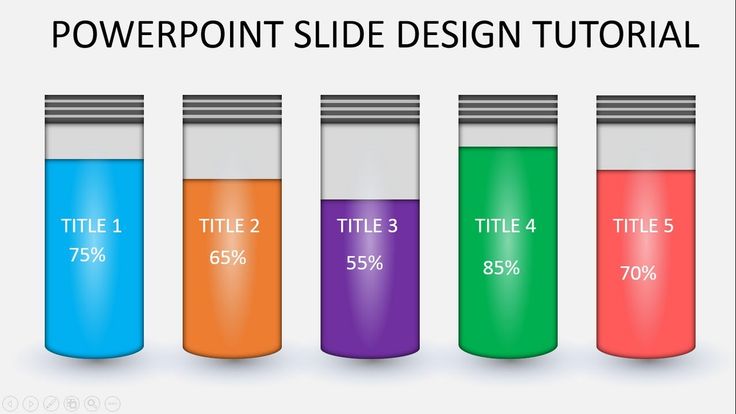
Crafting a visually appealing and effective PowerPoint presentation hinges on understanding and applying slide design best practices. Beyond captivating content and engaging animations, the fundamental principles of visual design significantly impact how your audience receives and retains your message. A well-designed slide isn’t just aesthetically pleasing; it’s a crucial tool for clear communication.Effective slide design is all about guiding the viewer’s eye through the information presented.
This is achieved through the strategic application of visual hierarchy.
Visual Hierarchy and its Application
Visual hierarchy is the arrangement of elements on a slide to prioritize information and guide the viewer’s eye. It dictates what the audience sees first, second, and so on, ensuring a clear and focused message. We achieve this through several techniques:
- Size: Larger elements naturally draw more attention. Use larger font sizes for headlines and key takeaways, and smaller sizes for supporting details.
- Color: Bright, contrasting colors attract the eye more than muted tones. Use a vibrant color for your main points and a more subdued palette for background and supporting text.
- Placement: Elements placed centrally or at the top of the slide tend to be noticed first. Strategic positioning guides the reader’s flow through the content.
- Whitespace: Strategic use of white space (empty space) creates visual breathing room, separating elements and improving readability. We will explore this further in a subsequent section.
- Typography: Using different font weights (bold, italic) and styles (headings, body text) helps to visually separate and categorize information.
By carefully considering these elements, you can create a visual flow that leads the audience through your presentation in a logical and engaging manner. For example, a slide showcasing sales figures might use a large, bold chart as the central element, with smaller text explaining the key findings.
Design Elements to Avoid
Certain design choices can detract from the professionalism and clarity of your presentation. Avoiding these pitfalls is crucial for effective communication.
- Cluttered Slides: Overloading slides with too much text and visuals overwhelms the audience and hinders comprehension. Keep it concise and focused.
- Inconsistent Fonts and Colors: Using too many different fonts or clashing colors creates a disjointed and unprofessional look. Stick to a consistent style guide.
- Low-Resolution Images: Pixelated or blurry images detract from the overall quality of the presentation. Always use high-resolution images.
- Excessive Animations and Transitions: While animations can be effective, overuse can be distracting and annoying. Choose animations that enhance your message, not detract from it.
- Poorly Chosen Color Palettes: Color choices significantly impact readability and mood. Avoid combinations that cause eye strain or create a jarring effect. Consider using color palettes designed for accessibility.
A presentation with these elements will likely distract from your message and make it difficult for your audience to follow along.
Effective Use of White Space
White space, also known as negative space, is the empty area around and between elements on a slide. It’s not simply “empty”; it’s a powerful design tool. Properly utilizing white space improves readability and enhances the visual appeal of your presentation.Consider these examples:Imagine a slide with a single, large image centered, surrounded by ample white space. This creates a clean, uncluttered look that allows the image to breathe and command attention.
In contrast, imagine the same image crammed into a corner, surrounded by text. The visual impact is significantly diminished, and the message becomes lost in the visual clutter. Another example would be a slide with bullet points; generous spacing between each point and ample margins around the text block make the information easy to digest and visually appealing. The absence of white space would lead to a dense and overwhelming presentation.
A well-balanced use of white space allows the audience to easily focus on the key elements and absorb the information more effectively.
Illustrations and Visuals
PowerPoint presentations thrive on visual communication. While words convey information, compelling visuals amplify the message, making it memorable and easily digestible. Choosing the right illustrations and visuals is crucial for transforming a good presentation into a truly captivating one. The right image can communicate a complex idea in a fraction of the time it would take with text alone.Effective use of visuals isn’t just about adding pretty pictures; it’s about strategically selecting images and icons that enhance understanding and reinforce your key points.
This section explores how to leverage the power of visuals to elevate your presentations.
Illustrating Innovation
A powerful image illustrating innovation could depict a single, bright light bulb emerging from a cluster of dim, fading bulbs. The bright bulb represents the innovative idea, standing out from the established norms (the dim bulbs). Its vibrant glow symbolizes the energy and impact of the new concept, contrasting sharply with the fading light of the older, less effective approaches.
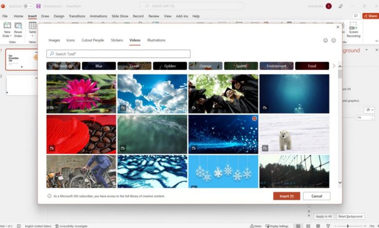
Crafting killer PowerPoint presentations? Think beyond bullet points! Incorporate strong visuals and a clear narrative, remembering that engaging your audience is key. To really boost your presentation’s impact, consider how you can leverage video, perhaps by learning some tricks from this great resource on getting it on with youtube to create short, impactful clips.
Then, integrate those videos seamlessly into your slides for a dynamic and memorable presentation.
The overall composition emphasizes the breakthrough nature of innovation, showcasing its transformative potential and ability to outshine the status quo. The symbolic meaning lies in the stark contrast: innovation is not just an improvement, but a radical shift towards something brighter and more effective.
Using Icons and Symbols for Clarity
Icons and symbols are incredibly effective tools for simplifying complex information and improving comprehension. Consider a presentation on cybersecurity. Instead of lengthy explanations of different threat types, using icons representing malware (a virus symbol), phishing (an email with a lock icon), and denial-of-service attacks (a broken network cable icon) would instantly communicate the concepts to the audience. The visual shorthand allows viewers to quickly grasp the key threats without getting bogged down in technical jargon.
This technique is particularly useful for presenting data or processes, allowing for quicker information processing and increased audience engagement. Well-chosen icons can act as visual cues, reinforcing your verbal explanations and making the information more memorable.
Comparing Data Visualizations
Let’s imagine we need to represent the same data point: a 25% increase in sales. Here are three different visuals and a comparison of their effectiveness:
First, a simple bar chart showing the sales figures for two periods – before and after the increase. This is straightforward and easily understood, offering a clear visual representation of the growth. However, it might lack the impact of more dynamic visuals.
Second, a pie chart depicting the proportion of sales before and after the increase. While accurate, this might be less effective in quickly conveying the 25% increase, as it requires more cognitive processing to determine the difference between the two segments.
Third, a visually appealing infographic that combines a rising graph line with a percentage increase annotation. This visualization dynamically shows the growth trend while clearly highlighting the 25% increase. It is potentially the most effective option because it combines the clarity of a graph with the direct communication of the percentage change, providing both a visual representation of the trend and a concise statement of the key result.
The choice of visual should always be tailored to the specific data and the desired message.
Interactive Elements
PowerPoint presentations don’t have to be one-way streets. Injecting interactivity can transform a passive experience into an engaging dialogue with your audience, boosting retention and leaving a lasting impression. Interactive elements aren’t just about flashy animations; they’re about creating a dynamic learning environment.Interactive elements cleverly woven into your presentation can significantly increase audience engagement. By actively involving your audience, you foster a more dynamic and memorable experience.
This goes beyond simply presenting information; it’s about creating a conversation.
Examples of Interactive Elements
Several tools readily available within PowerPoint or through add-ins can dramatically enhance audience participation. These tools allow for real-time feedback and create a more collaborative atmosphere.
- Polls: Simple polls using PowerPoint’s built-in features or add-ins like Mentimeter allow you to quickly gauge audience understanding or opinions on specific topics. For example, after explaining a complex concept, a quick multiple-choice poll can immediately reveal if the audience grasped the key takeaways. The results can be displayed directly on the slide, providing immediate feedback and fostering a sense of community.
- Quizzes: Short quizzes, again using PowerPoint’s features or external tools, can test knowledge retention and provide a fun, low-stakes way to reinforce learning. A quick true/false quiz after a section on historical events, for instance, would provide immediate feedback on comprehension. The results can be used to adjust the pace or depth of subsequent sections.
- Q&A Sessions (integrated): While not strictly an “element,” strategically placed slides with prompts encouraging questions, or even a designated Q&A slide with a live poll for question submission, can smoothly integrate audience participation into the flow of the presentation.
Seamless Integration of Interactive Elements
The key to successful interactive elements is seamless integration. Avoid disrupting the presentation’s flow by using them strategically and sparingly.Consider the following:
- Timing: Introduce interactive elements at natural breaks in the presentation, such as after a major concept or section. Don’t interrupt the narrative flow with constant interruptions.
- Relevance: Ensure the interactive element directly relates to the content being presented. Avoid using them just for the sake of it.
- Clarity of Instructions: Clearly explain the purpose and instructions for each interactive element. Make it easy for the audience to participate.
- Time Management: Allocate sufficient time for audience participation. Don’t rush the process.
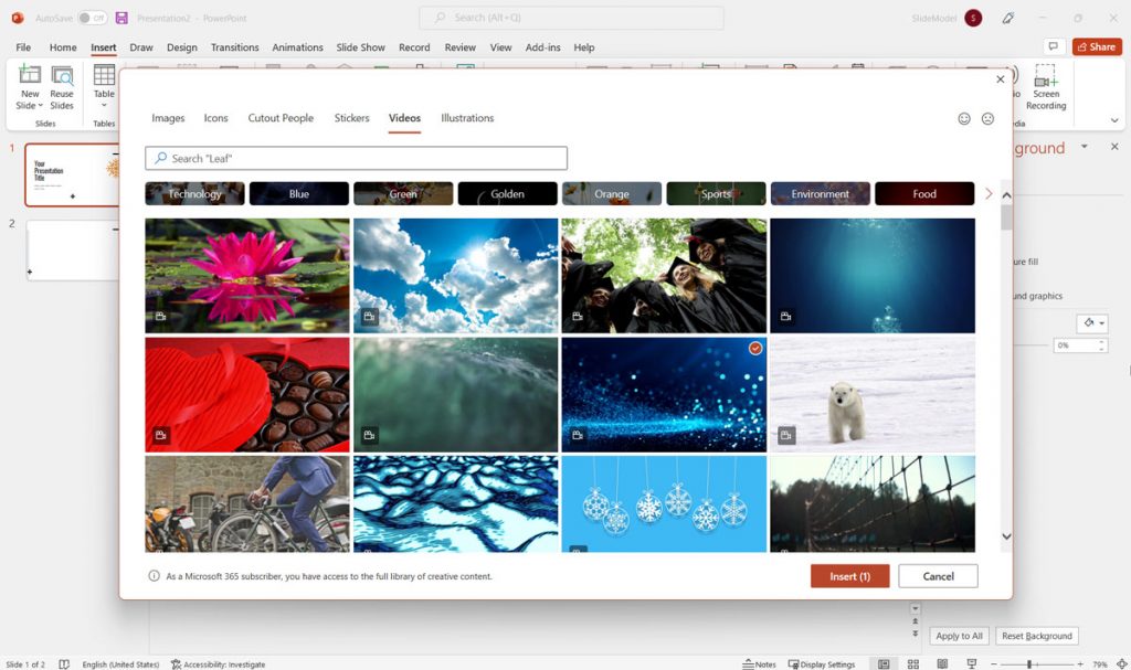
Using Embedded Videos to Enhance Presentations
Videos can significantly enhance your presentations by adding visual interest, showcasing real-world examples, or illustrating complex concepts. However, ensure the videos are high-quality, relevant, and appropriately sized.
- Short and Sweet: Keep embedded videos concise and focused on a single, clear message. Long videos can lose audience attention.
- High-Quality Video and Audio: Poor quality video or audio will detract from the overall presentation. Ensure your videos are professionally produced and easily audible.
- Relevance to Content: The video should directly support the content of your presentation and enhance, not distract from, the message.
- Testing: Always test embedded videos before your presentation to ensure they play smoothly and correctly.
Final Summary
Source: slidemodel.com
So, there you have it – a whirlwind tour through the world of captivating PowerPoint presentations! Remember, the key is to tell a story, not just present data. By focusing on visual storytelling, smart design choices, and a touch of creativity, you can transform your presentations from mundane to memorable. Go forth and create presentations that not only inform but also leave a lasting impression.
Happy presenting!
Essential Questionnaire
What’s the best software to create engaging animations for PowerPoint?
PowerPoint itself offers a decent range of animation options. However, for more advanced animations, consider exploring tools like Adobe After Effects (for professional-level effects) or simpler animation software like Animaker or Vyond.
How can I ensure my presentation is accessible to everyone?
Prioritize high color contrast, use clear and concise language, and provide alt text for all images. Consider using larger fonts and simpler layouts. Check your presentation’s accessibility using built-in accessibility checkers in PowerPoint or online tools.
How do I handle nerves before a big presentation?
Practice, practice, practice! Rehearse your presentation multiple times, ideally in front of a test audience. Deep breathing exercises and mindfulness techniques can also help calm nerves. Remember, it’s okay to be nervous – it means you care!


