CRO for Web Design Lucky Orange
CRO for web design Lucky Orange: Unlocking website optimization’s secrets! This isn’t your average dry guide; we’re diving deep into how Lucky Orange’s powerful tools – heatmaps, session recordings, and form analytics – can transform your website from a pretty picture to a high-converting machine. Prepare to ditch guesswork and embrace data-driven design decisions that actually boost your bottom line.
We’ll cover everything from designing killer landing pages based on heatmap data to identifying and squashing those pesky friction points that are stopping users from converting. Get ready to learn practical strategies, see real-world examples, and even build your own A/B tests to see the results firsthand. Let’s make your website a conversion powerhouse!
CRO Strategies for Web Design Using Lucky Orange
Optimizing your website for conversions is crucial for any online business. Lucky Orange, with its suite of website analytics tools, provides invaluable data to pinpoint areas for improvement and significantly boost your conversion rates. By leveraging heatmaps, session recordings, and form analytics, you can gain deep insights into user behavior and implement data-driven CRO strategies. This post will explore how to effectively use Lucky Orange’s features to enhance your web design and improve your conversion rate optimization (CRO) efforts.
Landing Page Optimization Using Heatmaps
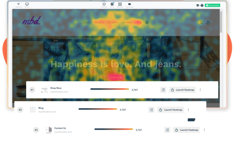
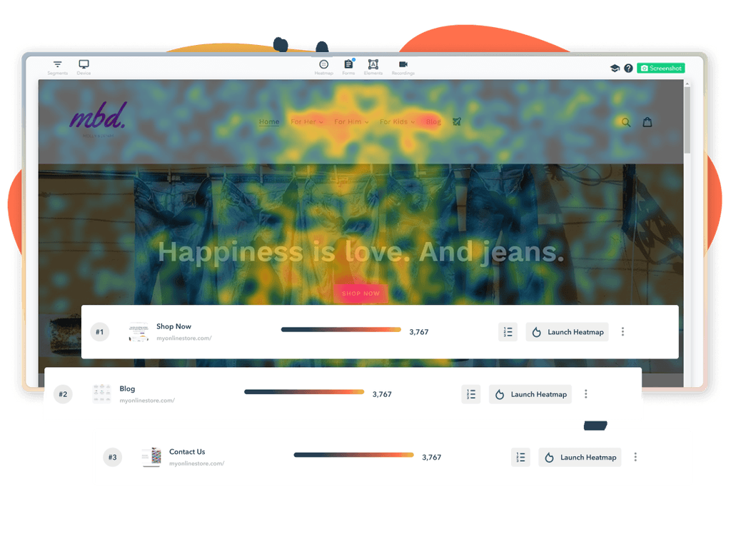
Lucky Orange’s heatmaps visually represent user interactions on your website, revealing where users click, scroll, and hover. This data is invaluable for designing high-converting landing pages. For example, imagine a landing page promoting a software subscription. A heatmap might reveal that users are consistently ignoring the primary call-to-action (CTA) button, while focusing heavily on an unrelated image. This indicates a design flaw.
By redesigning the page to emphasize the CTA and de-emphasize the distracting element, you can significantly improve conversions.
| Variation | Heatmap Findings | Conversion Rate | Notes |
|---|---|---|---|
| Original Landing Page | Low click-through rate on CTA button; high engagement with secondary image. | 2% | Users were distracted by the image and ignoring the main call to action. |
| Variation A (CTA Button Resized and Repositioned) | Increased clicks on the CTA button; reduced engagement with the secondary image. | 4% | Improved visual hierarchy focused attention on the main action. |
| Variation B (Secondary Image Removed) | Significant increase in CTA clicks; even distribution of user attention. | 5% | Eliminating the distraction led to a substantial improvement in conversions. |
| Variation C (CTA Button with Stronger Call to Action) | Highest click-through rate on CTA button; significant reduction in bounce rate. | 7% | More compelling messaging improved user engagement and resulted in the highest conversion rate. |
Session Recording Analysis for CRO
Session recordings allow you to watch actual user sessions on your website, providing a detailed understanding of their journey. This offers a qualitative perspective that complements the quantitative data from heatmaps. Analyzing these recordings can reveal usability issues, friction points, and unexpected user behaviors that heatmaps alone might miss.Three distinct CRO strategies using session recordings include: identifying and fixing navigation problems, optimizing the checkout process, and understanding user engagement with specific content elements.
For example, watching recordings might show users struggling to find a particular piece of information, indicating a navigation problem that needs to be addressed. Similarly, observing users abandoning their shopping carts during checkout highlights areas for improvement in the checkout flow, such as simplifying the process or improving form design. Finally, reviewing how users interact with specific content can reveal whether it is effectively communicating its message and achieving its intended purpose.
Form Analytics for Friction Point Identification, Cro for web design lucky orange
Lucky Orange’s form analytics provide granular data on user interactions with forms on your website. This data includes completion rates, drop-off points, and individual field performance. By analyzing this data, you can identify specific friction points that prevent users from completing forms, such as confusing questions, overly long forms, or technical issues. Addressing these friction points, through simplification, improved design, and error handling, can significantly increase form completion rates and overall conversions.
For instance, if form analytics reveal a high drop-off rate at a specific field, it suggests that the field itself is problematic and requires review. This might involve rewording the question, providing clearer instructions, or adjusting the input type.
Integrating Lucky Orange with Web Design Tools
Source: behance.net
Lucky Orange, a powerful session recording and heatmap tool, significantly enhances website optimization efforts when integrated effectively with your web design workflow and other analytics platforms. Understanding its strengths relative to other tools and mastering its integration with popular website builders is key to unlocking its full potential. This section delves into these crucial aspects, providing practical guidance for maximizing your website’s performance.
While several session recording tools exist, Lucky Orange distinguishes itself through its user-friendly interface and comprehensive feature set specifically tailored for CRO. Tools like Hotjar offer similar functionalities, but Lucky Orange often scores higher in terms of ease of use, especially for users less familiar with advanced analytics. Other tools might focus more on specific aspects, like scroll depth analysis, while Lucky Orange provides a more holistic view.
The choice depends on your specific needs and budget, but Lucky Orange’s intuitive design makes it a strong contender for web designers.
Lucky Orange Integration with Wix
Integrating Lucky Orange with Wix, a popular website builder known for its drag-and-drop interface, is straightforward. The process involves adding a snippet of JavaScript code provided by Lucky Orange to your Wix site’s header. This code allows Lucky Orange to track user sessions and generate heatmaps. Wix offers detailed documentation on adding custom code, and Lucky Orange’s support section provides clear instructions tailored to Wix.
The process generally takes just a few minutes and doesn’t require extensive technical knowledge. Once the code is added, your Lucky Orange account will begin recording user sessions on your Wix site.
Lucky Orange Integration with WordPress
Integrating Lucky Orange with WordPress, the most popular CMS globally, is also relatively simple, though the method differs slightly depending on whether you’re using a managed WordPress hosting provider or self-hosting. For self-hosted WordPress sites, you’ll typically add the Lucky Orange JavaScript snippet to your theme’s header.php file or use a plugin designed to manage header scripts. Many WordPress plugin repositories offer plugins specifically designed to streamline this integration, offering a more user-friendly alternative to directly editing theme files.
Managed WordPress hosts often provide an easier method, typically involving adding the code via the host’s control panel. This reduces the risk of accidentally modifying core WordPress files. Regardless of the method, after the code is added, Lucky Orange begins tracking your website’s visitor sessions.
Combining Lucky Orange and Google Analytics for Enhanced Optimization
Using Lucky Orange data in conjunction with Google Analytics significantly enhances your website optimization strategy. Google Analytics provides valuable high-level data like traffic sources and conversion rates, while Lucky Orange offers granular insights into user behavior. By combining these datasets, you gain a more comprehensive understanding of why users are (or aren’t) converting. For example, Google Analytics might show a high bounce rate from a specific landing page.
Lucky Orange can then revealwhy* users are bouncing – perhaps confusing navigation, slow loading times, or unclear calls to action are visible in the session recordings. This combined approach allows for data-driven decisions and more effective optimization efforts. This synergy allows for a more nuanced understanding of user experience and facilitates targeted improvements.
Analyzing User Behavior with Lucky Orange Data
Source: framerusercontent.com
Lucky Orange provides a powerful suite of tools to understand how users interact with your website. By analyzing session recordings, heatmaps, and scroll depth data, you can identify areas for improvement and optimize your design for better conversion rates. This analysis moves beyond simple analytics; it provides a window into the actual user experience, revealing the unspoken frustrations and unexpected behaviors that impact your bottom line.
User Flow Visualization Based on Session Recordings
Imagine a visual representation of a typical user journey. The diagram starts with the homepage, represented by a large square. From there, arrows branch out, showing the different paths users take. A thick arrow leads to the “Products” page, indicating high traffic. A thinner arrow points to the “About Us” page, showing lower traffic.
However, the most striking feature is a significant drop-off after the “Products” page, with only a small percentage of users proceeding to the “Cart” page. This illustrates a major bottleneck in the conversion funnel, highlighting the need for improvements on the product pages or a clearer call to action guiding users toward the shopping cart. Another significant drop-off occurs from the “Cart” page to the “Checkout” page, suggesting potential issues with the checkout process itself, such as confusing forms or a lack of payment options.
This visual representation, derived from Lucky Orange’s session recordings, allows for the immediate identification of critical areas needing attention.
Common User Behavior Patterns Revealed by Heatmaps
Lucky Orange heatmaps reveal three common user behavior patterns with significant implications for web design. First, a concentration of clicks on a specific area of a page, such as a prominently placed call-to-action button, indicates successful engagement. However, a lack of clicks in areas containing crucial information, like product descriptions or pricing, signals a design flaw needing attention. Second, a high concentration of mouse movements around a specific element but with minimal clicks suggests confusion or difficulty in interacting with that element.
For example, if users hover over a navigation link frequently but don’t click, the link might be poorly designed or difficult to find. This could indicate the need for a more prominent placement or clearer visual cues. Third, areas with little to no heatmap activity suggest overlooked or irrelevant content. This could indicate the need for content removal, repositioning, or a complete redesign of that section.
Interpreting Scroll Depth Data for Content Optimization
Scroll depth data, provided by Lucky Orange, reveals how far users scroll down a page before disengaging. A low average scroll depth indicates that users are not fully engaging with the content presented. For instance, if most users only scroll halfway down a blog post, it might be too long or the information isn’t engaging enough to hold their attention.
Conversely, a high average scroll depth indicates strong engagement. This information allows for data-driven decisions about content length and placement. For example, if key information is placed low on the page, and the scroll depth data shows users don’t reach it, it needs to be repositioned higher for better visibility. By carefully analyzing this data, you can optimize content length and placement to improve user engagement and ultimately conversion rates.
For example, a landing page with a high scroll depth but low conversion rates might indicate that the call to action is positioned too far down the page, requiring repositioning to a more prominent location higher up.
Optimizing my website’s conversion rate with tools like Lucky Orange’s CRO features for web design is a constant learning process. I recently found that understanding YouTube analytics, as outlined in this fantastic guide on getting it on with youtube , really helped me grasp user behavior patterns. This knowledge directly informs how I structure my landing pages and A/B test different elements within Lucky Orange, ultimately improving my CRO efforts.
Improving Web Design Based on Lucky Orange Insights: Cro For Web Design Lucky Orange
Lucky Orange provides a wealth of data that goes far beyond simple analytics. By understanding how users interact with your website – their clicks, scrolls, and even their frustration points – you can make data-driven design decisions that significantly improve conversion rates and overall user experience. This isn’t about guessing what works; it’s about seeing exactly what’s happening and adapting accordingly.
Let’s dive into how you can leverage Lucky Orange’s insights to refine your web design and create a more effective online presence.
Call-to-Action Button Variations Based on Clickmap Data
Clickmaps in Lucky Orange visually represent where users are clicking on your pages. Analyzing these heatmaps allows you to identify areas of high and low engagement, which is invaluable for optimizing CTAs. By understanding where users are naturally drawn to click, you can strategically place your CTAs for maximum impact. Here are three CTA variations based on hypothetical clickmap data:
- Variation 1: Prominent Placement in High-Traffic Area. If your clickmap shows a high concentration of clicks around your hero image, a CTA button subtly integrated within or directly below the image could significantly increase engagement. This leverages existing user focus and minimizes extra steps to conversion. The button design would be visually complementary to the hero image, maintaining a cohesive aesthetic.
- Variation 2: Strategic Placement in Scroll Path. If the clickmap reveals a common scroll stopping point mid-page, a CTA button strategically placed at this point can capture users before they scroll further or leave the page. This variation might utilize a slightly different design, perhaps with more prominent text and contrasting colors, to break the visual flow and attract attention.
- Variation 3: A/B Testing Based on Low-Engagement Areas. If a specific section of your page receives minimal clicks, a strategically placed CTA button, with a different design and message, could be A/B tested to re-engage users. This could involve a bolder design, a more compelling offer, or even a different call to action itself, depending on the content of the low-engagement section.
Key Web Design Elements Improvable with Lucky Orange Data
Lucky Orange’s comprehensive data allows for targeted improvements across your website. Focusing on these key areas can yield significant results:
By systematically analyzing user behavior through Lucky Orange’s features, you can pinpoint areas of friction and optimize for a smoother, more effective user journey.
- Navigation Menu: Analyze clickmaps and session recordings to identify navigation issues. Are users struggling to find what they need? Are certain menu items underperforming? Adjusting menu structure, labeling, or placement based on these insights can significantly improve user flow.
- Form Design: Session recordings reveal user struggles with forms. Are users abandoning forms due to complexity or unclear instructions? Lucky Orange’s data can help identify the exact points of friction, allowing you to simplify the form, improve labeling, or adjust the form’s placement.
- Content Hierarchy: Heatmaps show which parts of your content receive the most attention. Is your most important information clearly highlighted? Reorganizing content based on user engagement can improve comprehension and conversion.
- Page Load Speed: While Lucky Orange doesn’t directly measure load speed, session recordings can reveal frustration stemming from slow loading times. Users abandoning the page before it fully loads is a clear indicator to optimize page performance.
- Call-to-Action Placement and Design: As previously discussed, clickmaps and session recordings are crucial for optimizing CTA placement and design. Lucky Orange’s data enables A/B testing to determine which CTA variations are most effective.
Utilizing Lucky Orange Feedback Tools for Qualitative Data
Lucky Orange offers feedback tools like surveys and polls that gather valuable qualitative data, complementing the quantitative insights from heatmaps and session recordings.
This combination of data provides a holistic understanding of user experience, allowing for more comprehensive and effective design improvements.
- Post-Session Surveys: These surveys can ask users about their overall experience, identifying pain points and areas for improvement that might not be apparent from quantitative data alone. For example, a survey could ask users to rate their ease of navigation or satisfaction with the information presented.
- In-Page Feedback Forms: These forms allow users to provide immediate feedback on specific parts of the page. For instance, a form placed near a complex form could ask users about their experience filling it out, providing valuable context to quantitative data on form abandonment.
- Targeted Polls: Polls can be used to gather quick insights on specific features or content. For example, a poll could be used to gauge user interest in a new product or service, informing design decisions about product placement and messaging.
Case Studies
Lucky Orange isn’t just a tool; it’s a key to unlocking significant improvements in website performance. Let’s dive into some real-world examples of how businesses have leveraged Lucky Orange’s capabilities to boost conversions and enhance user experience. These case studies illustrate the power of data-driven design decisions.
E-commerce Website Conversion Rate Optimization
An online retailer of handcrafted jewelry, “ArtisanGems,” experienced a frustratingly low conversion rate on their e-commerce website. Using Lucky Orange’s session recordings, they identified a major pain point: a confusing checkout process. Many users abandoned their carts at the payment gateway due to unclear instructions and a lack of progress indicators. ArtisanGems used this insight to implement several changes.
First, they redesigned the checkout page, simplifying the form and adding clear progress bars. They also included more prominent FAQs and a live chat option to address immediate customer queries. Secondly, they A/B tested different button colors and placements to optimize for clicks. These changes, guided by Lucky Orange’s data, resulted in a 20% increase in conversion rates within three months.
The improved checkout process reduced cart abandonment and streamlined the purchasing journey, leading to a substantial improvement in sales.
Addressing a Usability Issue: Improved Navigation
“TechSolutions,” a provider of IT services, noticed a high bounce rate on their services page. Lucky Orange’s heatmaps revealed that users were struggling to find the specific services they needed. The website’s navigation was cluttered and unintuitive, leading to user frustration and early exits. By analyzing session recordings alongside heatmaps, TechSolutions pinpointed the problematic areas. They redesigned the navigation menu, using clear and concise labels, and implemented a more intuitive hierarchical structure.
They also added prominent search functionality to allow users to quickly find the information they were looking for. The result was a significant decrease in bounce rate and an increase in engagement on the services page, demonstrating how understanding user navigation patterns directly improves user experience.
Resolving a Conversion Bottleneck: Streamlining the Contact Form
A lead generation company, “LeadMagnet,” observed a low conversion rate on their contact form. Lucky Orange revealed that many users were abandoning the form before submission due to a lengthy and complex form. The form requested unnecessary information, leading to user frustration and abandonment. Using Lucky Orange’s form analytics, LeadMagnet identified the specific fields that were causing the most friction.
They simplified the form, removing unnecessary fields and making it more concise. They also A/B tested different form layouts and designs to optimize for completion rates. This streamlined approach significantly improved the conversion rate of their contact form, generating a considerable increase in qualified leads. The reduction in form fields reduced user effort and increased the likelihood of form completion.
Final Wrap-Up
So, there you have it – a deep dive into leveraging Lucky Orange for serious website optimization. Remember, the key is consistent analysis and iterative improvement. Don’t be afraid to experiment, analyze the data, and refine your design based on what your users are actually doing on your site. By using Lucky Orange’s tools effectively, you can transform your website into a conversion machine and watch your results soar.
Now go forth and optimize!
Query Resolution
What if Lucky Orange shows conflicting data compared to Google Analytics?
Don’t panic! This is common. Google Analytics provides a broad overview, while Lucky Orange offers granular user behavior insights. Look for areas of overlap to pinpoint true issues. Sometimes, GA may miss specific user interactions that Lucky Orange highlights.
How much does Lucky Orange cost?
Lucky Orange offers various pricing plans, so it’s best to check their website for the most up-to-date information. Pricing usually depends on the number of websites you need to track and the features you require.
Is Lucky Orange suitable for all website platforms?
Lucky Orange integrates with most popular platforms, including WordPress, Wix, and Shopify. However, it’s always wise to check their compatibility list before committing to a plan.
Can I use Lucky Orange for A/B testing?
While Lucky Orange doesn’t have a built-in A/B testing tool, its heatmaps and session recordings provide invaluable data to inform your A/B testing strategies on other platforms. You can use its insights to guide your variations and measure their effectiveness.