Crucial Psychological Concepts in Graphic Design
Crucial psychological concepts in graphic design aren’t just buzzwords; they’re the secret sauce behind truly effective visuals. Understanding how our brains process information—from Gestalt principles to color psychology—is key to creating designs that not only look good but also resonate deeply with the viewer. This post dives into the fascinating intersection of psychology and design, exploring how these concepts can elevate your work from good to unforgettable.
We’ll unpack the power of Gestalt principles in creating visually appealing compositions, explore how cognitive load theory impacts user experience, and delve into the emotional impact of color choices. We’ll also examine the psychology of branding, the importance of visual hierarchy, and the nuances of typography and readability. Get ready to unlock the secrets to crafting designs that truly connect with your audience!
Gestalt Principles in Design
Gestalt principles are fundamental to effective visual communication. Understanding how our brains perceive and organize visual information is crucial for creating designs that are not only aesthetically pleasing but also easily understood and engaging for the user. By applying these principles, designers can guide the viewer’s eye, create a sense of order, and ultimately improve the overall user experience.
Gestalt psychology emphasizes that the whole is greater than the sum of its parts. Our perception isn’t simply a collection of individual elements; instead, we actively organize and interpret those elements to create a meaningful whole. This inherent human tendency is what the Gestalt principles explain and leverage in design.
Gestalt Principles and Their Impact on Visual Communication and User Experience
The five core Gestalt principles – proximity, similarity, closure, continuity, and figure/ground – significantly impact how users interact with and interpret a design. Proximity creates visual grouping, making related elements appear connected. Similarity uses consistent visual attributes to group items, enhancing understanding. Closure helps us perceive incomplete shapes as complete, fostering engagement. Continuity guides the eye along smooth paths, creating visual flow.
Understanding crucial psychological concepts in graphic design, like Gestalt principles and color psychology, is key to creating effective visuals. This knowledge is directly applicable to creating compelling YouTube content, as highlighted in this great article on getting it on with youtube , where you can learn how to apply these principles to your thumbnails and video edits.
Ultimately, mastering these concepts will elevate your designs and boost your YouTube success.
Finally, figure/ground relationships define the focal point against a background, controlling attention and hierarchy. Mastering these principles leads to designs that are clear, intuitive, and aesthetically satisfying.
Examples of Gestalt Principles in Successful Graphic Design Projects
Numerous successful design projects demonstrate the effective application of Gestalt principles. For instance, a website navigation menu using proximity groups related links together, improving usability. A corporate logo employing similarity uses consistent shapes and colors to build brand recognition. A minimalist poster leveraging closure uses implied lines and shapes to create a strong visual impact. A magazine layout employing continuity guides the reader’s eye through the pages smoothly.
And a product packaging design utilizing figure/ground makes the product stand out clearly against the background. These examples showcase how Gestalt principles can be applied across various design disciplines to enhance communication and user experience.
Comparison of Gestalt Principles and Their Applications
| Gestalt Principle | Description | Application in Design | Example |
|---|---|---|---|
| Proximity | Elements placed close together are perceived as a group. | Grouping related items in a website navigation menu, creating visual hierarchy in a layout. | A website navigation bar where menu items are grouped closely together. |
| Similarity | Elements that share visual characteristics (shape, color, size) are perceived as a group. | Creating a consistent brand identity through the use of similar fonts, colors, and imagery. | A series of icons in an app using the same style and color palette. |
| Closure | Our minds tend to complete incomplete shapes or figures. | Creating logos with implied shapes, using negative space effectively. | The WWF panda logo, where the panda is recognizable even though it’s not fully depicted. |
| Continuity | The eye tends to follow lines or curves. | Creating visual flow in a website layout, guiding the user’s eye through the content. | A website layout with a clear visual path created through the use of lines and shapes. |
| Figure/Ground | The relationship between a focal point (figure) and its background (ground). | Highlighting a product on a package, creating a clear focal point in a composition. | A product label where the product name and image stand out clearly against the background. |
Logo Demonstrating Similarity
This logo uses three similar, slightly overlapping circles in varying shades of blue to represent a technology company. The similarity in shape and color creates a sense of unity and cohesion, instantly communicating a sense of interconnectedness and teamwork. The slight variations in shade add visual interest without disrupting the overall feeling of similarity.
Logo Demonstrating Figure/Ground, Crucial psychological concepts in graphic design
This logo features a stylized bird silhouette created using negative space within a circle. The bird (figure) is clearly distinguishable against the circular background (ground). The design leverages the principle of figure/ground to create a memorable and impactful visual, where the negative space is just as important as the positive space in conveying the logo’s message. The simplicity of the design ensures that the logo is easily recognizable and scalable for various applications.
Cognitive Load Theory and Design
Cognitive Load Theory (CLT) is a crucial framework for understanding how people process information. It posits that our working memory has a limited capacity, meaning we can only handle a certain amount of information at once. This directly impacts design, as overloaded users struggle to understand and interact effectively with a product or interface. Effective design, therefore, aims to minimize cognitive load, allowing users to focus on the task at hand rather than deciphering the design itself.Understanding how CLT influences design decisions is vital for creating user-friendly interfaces.
The theory suggests that designers should strive to present information in a clear, concise, and easily digestible manner, reducing the mental effort required for comprehension. This applies particularly to information architecture, where clear navigation and logical grouping of content are key, and to visual complexity, where visual clutter and unnecessary elements should be avoided. A design’s success is often directly correlated to its ability to manage cognitive load effectively.
Strategies for Minimizing Cognitive Load in Design
Minimizing cognitive load is paramount for effective design. By strategically applying these techniques, designers can create interfaces that are intuitive, easy to navigate, and ultimately, more successful in achieving their intended purpose.
- Chunking Information: Breaking down large amounts of information into smaller, manageable chunks makes it easier for users to process. For example, instead of presenting a long list of features, group them into logical categories with clear headings.
- Prioritizing Information: Highlighting the most important information through visual cues like size, color, or placement ensures that users focus on what matters most. Less important information can be de-emphasized or placed in a less prominent position.
- Using Visual Hierarchy: Establishing a clear visual hierarchy guides the user’s eye through the design, leading them naturally to the most important elements. This can be achieved through variations in font size, weight, color, and spacing.
- Simplifying Visual Complexity: Reducing visual clutter by removing unnecessary elements and using a consistent visual style creates a cleaner, more easily digestible design. This avoids overwhelming the user with too much visual information.
- Employing White Space: Strategic use of white space (or negative space) creates visual breathing room, making the design less cluttered and easier to scan. It helps separate elements and improve readability.
High-Cognitive-Load vs. Low-Cognitive-Load Design Example
Consider a website selling electronics. A high-cognitive-load design might feature a cluttered homepage with flashing banners, multiple competing calls to action, and a chaotic arrangement of product images and text. Navigation might be confusing, with inconsistent labeling and unclear links. The user would struggle to find the information they need, feeling overwhelmed by the visual noise and inconsistent design language.In contrast, a low-cognitive-load design would present a clean and organized homepage.
Product categories would be clearly defined and easily accessible. High-quality product images would be accompanied by concise and informative descriptions. Navigation would be intuitive and consistent, allowing users to easily find what they are looking for. The overall visual style would be simple and consistent, reducing visual clutter and enhancing readability. The user experience would be significantly more positive and efficient.
The difference lies in the deliberate effort to minimize unnecessary cognitive processing, focusing instead on clear communication and efficient information delivery.
Color Psychology and its Effects
Color is more than just aesthetics; it’s a powerful tool that significantly influences our emotions, perceptions, and behaviors. Understanding color psychology allows designers to strategically employ color palettes to evoke specific feelings, enhance brand identity, and guide user experience. This understanding is crucial for creating designs that are not only visually appealing but also psychologically effective.
The Psychological Impact of Different Colors
Color’s impact stems from its inherent associations and cultural connotations. These associations are often deeply ingrained, influencing our subconscious reactions. For instance, warm colors like red and orange are often associated with energy and excitement, while cool colors like blue and green are linked to calmness and tranquility. However, these associations can vary across cultures, so careful consideration is essential.
The following table summarizes the common psychological responses associated with different colors:
| Color | Emotional Response | Brand Associations | Examples |
|---|---|---|---|
| Red | Energy, excitement, passion, urgency, danger | Fast food, sports, action | Coca-Cola’s red logo, emergency vehicles |
| Orange | Enthusiasm, creativity, warmth, playfulness | Food, beverages, children’s products | Nickelodeon’s orange logo, Fanta |
| Yellow | Happiness, optimism, energy, caution | Fast food, toys, transportation | McDonald’s golden arches, school buses |
| Green | Nature, growth, calmness, harmony, freshness | Environmental organizations, health products | Whole Foods Market, Starbucks logo |
| Blue | Trust, calmness, security, stability, peace | Technology, finance, healthcare | Facebook, Twitter, many corporate logos |
| Purple | Luxury, royalty, creativity, mystery, wisdom | Beauty products, luxury brands | Cadbury, Hallmark |
| Pink | Femininity, romance, sweetness, gentleness | Beauty products, children’s products | Victoria’s Secret, Barbie |
| Black | Power, sophistication, elegance, mystery, mourning | Luxury goods, fashion | Chanel, Yves Saint Laurent |
| White | Purity, cleanliness, simplicity, peace, sterility | Healthcare, technology, minimalism | Apple, many minimalist websites |
| Gray | Neutrality, sophistication, balance, formality | Luxury, technology, corporate | Many corporate websites, high-end fashion |
Effective Use of Color in Branding and Design
Many brands successfully leverage color psychology to reinforce their brand identity and connect with their target audience.
“The color red is often used in fast food branding to stimulate appetite and create a sense of urgency,” says a leading marketing expert. This is because red is associated with energy and excitement, prompting consumers to make quick decisions.
Apple’s consistent use of white and silver in their product design and marketing conveys a sense of simplicity, elegance, and innovation. This minimalist approach aligns perfectly with their brand’s image of sleek and user-friendly technology.
Examples of Color Palettes Targeting Specific Emotional Responses
Here are three distinct color palettes designed to evoke specific emotional responses:
Palette 1: Excitement (Red, Orange, Yellow)
This palette uses vibrant, warm colors to create a feeling of energy and enthusiasm. Red provides a sense of urgency, orange adds warmth and playfulness, and yellow boosts optimism. This palette is ideal for brands targeting younger audiences or promoting products related to entertainment and adventure.
Palette 2: Calmness (Blue, Green, Light Gray)
This palette employs cool and soothing colors to create a sense of peace and tranquility. Blue promotes trust and stability, green evokes nature and harmony, and light gray adds a touch of sophistication and neutrality. This palette is perfect for brands associated with relaxation, wellness, or nature-related products.
Palette 3: Trust (Blue, Green, Beige)
This palette aims to inspire confidence and reliability. Blue establishes trust and stability, green adds a touch of natural calmness and growth, while beige provides a sense of warmth and approachability. This palette is suitable for financial institutions, healthcare providers, or other businesses where trustworthiness is paramount.
Typography and Readability
Source: co.uk
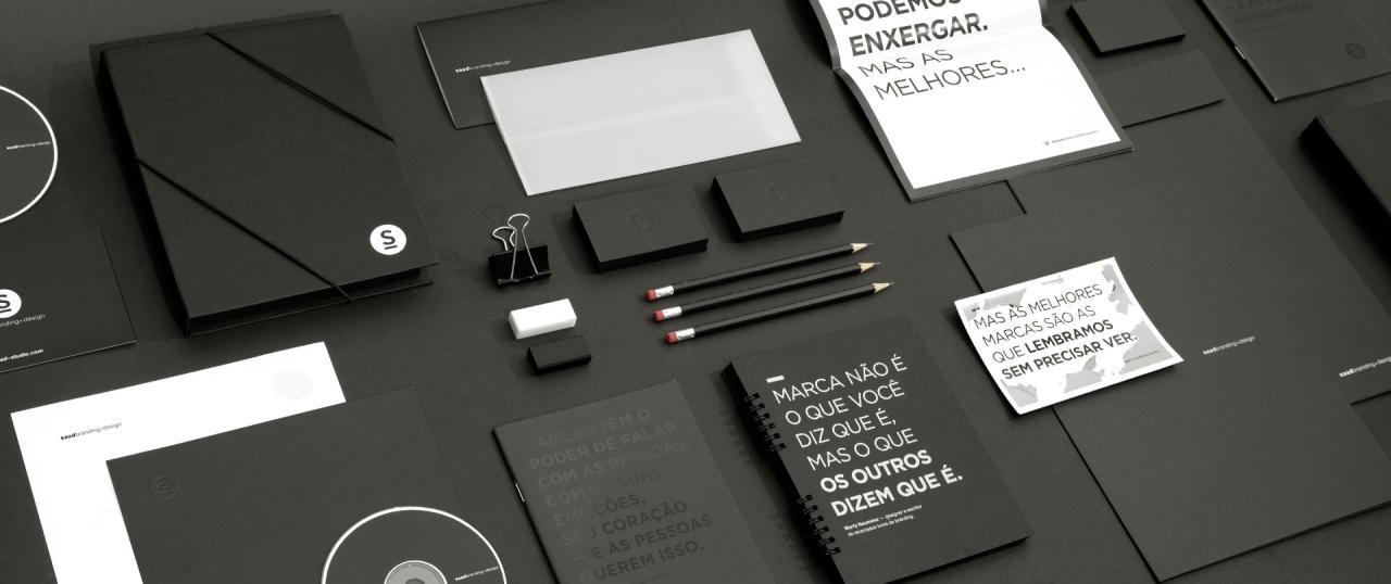
Typography, often overlooked, is a crucial element in graphic design. It’s not just about choosing a pretty font; it’s about ensuring your message is clear, engaging, and easily digestible for your audience. Readability directly impacts the user experience and the effectiveness of your design. A poorly chosen typeface can lead to frustration, hindering comprehension and ultimately, defeating the purpose of your design.Effective typography hinges on several key factors, all working in concert to create a visually appealing and easily readable text block.
These factors interact, influencing each other to either enhance or detract from overall readability. Ignoring even one can significantly reduce the effectiveness of your design.
Factors Influencing Readability
Font choice, size, spacing, and contrast are all fundamental to readability. The right font evokes the desired mood and tone, while appropriate sizing ensures legibility, particularly for different screen sizes and viewing distances. Consistent spacing between letters (kerning), words (tracking), and lines (leading) contributes to a clean and uncluttered appearance, enhancing the reading flow. Finally, sufficient contrast between the text color and the background ensures the text stands out clearly, minimizing eye strain.
For instance, using a light grey font on a white background would be difficult to read, while a dark font on a light background offers significantly better contrast and readability.
Serif and Sans-Serif Fonts: A Comparison
Serif fonts, characterized by small decorative strokes (serifs) at the ends of their letterforms, often project a more traditional, classic, and sometimes formal feel. They can be highly legible in larger sizes, particularly in print media, as the serifs aid in guiding the eye along the lines of text. Times New Roman and Garamond are classic examples. Sans-serif fonts, lacking these serifs, appear cleaner, more modern, and often more suitable for digital displays.
They tend to be more legible at smaller sizes and are frequently used in website design and user interfaces. Helvetica and Arial are widely used sans-serif fonts. The psychological impact differs; serifs can feel more authoritative or trustworthy, while sans-serif fonts can project a sense of modernity and minimalism. The choice depends heavily on the context and the desired message.
Guidelines for Choosing Appropriate Typography
Selecting the right typography requires careful consideration of your target audience and the message you wish to convey. A mismatch can undermine your design’s impact.
- Consider your audience: Are you targeting a younger demographic who appreciate modern aesthetics, or an older audience who might prefer a more classic and easily readable font? The age and technological proficiency of your audience significantly influences font selection.
- Define your message: A playful font might suit a children’s book, while a more serious and formal font would be appropriate for a legal document. The tone and style of your message should dictate your typographic choices.
- Maintain consistency: Using too many different fonts can create a chaotic and unprofessional look. Stick to a limited palette of fonts, typically two or three at most, to maintain visual harmony.
- Prioritize readability: Always prioritize readability over aesthetics. A beautiful font that is difficult to read is ultimately ineffective. Test your typography on different devices and screen sizes to ensure consistent readability.
- Ensure sufficient contrast: The contrast between your text and background should be significant enough to prevent eye strain and ensure easy reading. Use a contrast checker tool to ensure your choices meet accessibility standards.
- Experiment and iterate: Don’t be afraid to experiment with different font combinations and settings. Iterate and refine your choices until you achieve the optimal balance between aesthetics and readability.
Visual Hierarchy and Attention
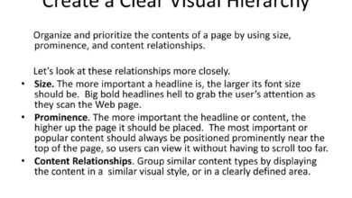
Visual hierarchy is the arrangement of elements on a page to guide the viewer’s eye and control the order in which information is processed. It’s a fundamental principle in design, directly impacting user experience and the effectiveness of communication. A well-designed visual hierarchy ensures that important information is easily noticed and understood, while less crucial details are subtly presented, preventing cognitive overload.
Essentially, it dictates the narrative flow of the design, influencing how users interpret and interact with the content.Visual hierarchy leverages psychological principles of perception to create a clear path for the viewer’s gaze. By strategically manipulating visual cues, designers can control attention and ensure key messages are effectively communicated. This process isn’t arbitrary; it’s based on predictable human responses to visual stimuli, ensuring that the design achieves its intended purpose.
Size as a Determinant of Visual Hierarchy
Size is perhaps the most obvious and powerful tool for establishing visual hierarchy. Larger elements naturally draw more attention than smaller ones. Imagine a webpage announcing a sale. The largest element might be the headline proclaiming “50% OFF!” in a huge, bold font. This immediately grabs the viewer’s attention, communicating the most important message first.
Smaller text underneath might detail the terms and conditions, or list specific sale items. The hierarchy is clear: the sale itself is the primary focus. This leverages our inherent tendency to notice larger objects first, a fundamental aspect of visual perception.
Color and Contrast in Guiding Attention
Color and contrast are equally vital in directing the viewer’s gaze. Bright, saturated colors inherently stand out against a muted background. For instance, a website promoting a new product might use a vibrant, contrasting color for the product image and call-to-action button, making them instantly noticeable against a more subdued color palette. This uses the psychological principle of figure-ground relationship, where the contrasting element (the figure) clearly separates itself from the background.
The high contrast creates a visual pop, guiding the eye directly to the key information.
Strategic Placement and Visual Hierarchy
The placement of elements also significantly impacts visual hierarchy. Elements positioned centrally or at the top of a page are typically seen first. Consider a website’s navigation menu. It’s usually placed at the top or along the side, ensuring easy access and immediate visibility. This is based on the principle of proximity; elements closer to the viewer’s field of vision are processed more quickly.
Similarly, placing important information above the fold (the portion of the webpage visible without scrolling) ensures immediate visibility.
Designing a Webpage Layout Using Visual Hierarchy Principles
Let’s imagine designing a landing page for a new software application. The primary goal is to get users to download a free trial. Using visual hierarchy principles, we’d structure the page as follows:A large, high-quality image of the software in action would dominate the top half of the page, immediately engaging the user. Below this, a concise headline (“Streamline Your Workflow with [Software Name]”) in a large, bold font would communicate the core benefit.
A brief, compelling subheading would elaborate on this benefit, followed by three to four bullet points highlighting key features. These bullet points would be visually distinct (perhaps with icons) and easy to scan. Finally, a prominent, brightly colored “Download Free Trial” button would be strategically placed, urging the user to take the desired action. The overall color scheme would be carefully considered to enhance contrast and readability, ensuring that the key elements stand out against the background.
This design leverages size, color, contrast, and placement to guide the user’s eye through the most important information, culminating in the desired call to action. The psychological effect is to create a smooth and intuitive user experience, leading to a higher conversion rate.
The Psychology of Branding

Source: pikpng.com
Branding isn’t just about creating a logo; it’s about crafting a deep psychological connection with the consumer. A successful brand taps into our emotions, desires, and aspirations, forging a lasting relationship built on trust and loyalty. This is achieved through a careful understanding and application of psychological principles in design and marketing.Effective branding leverages the power of association, creating positive feelings and memories linked to the brand.
This involves carefully selecting visual elements, messaging, and even the brand experience to evoke specific emotions and build a strong brand personality.
Brand Trust and Loyalty Building Techniques
Building trust and loyalty is crucial for long-term brand success. Designers employ various psychological techniques to achieve this. For example, consistent brand messaging across all platforms reinforces recognition and familiarity, leading to increased trust. Using testimonials and social proof creates a sense of validation and encourages potential customers to believe in the brand’s claims. Furthermore, transparent and ethical business practices, even if not directly reflected in the visual design, contribute significantly to building long-term trust.
A consistent brand experience, both online and offline, reinforces the positive associations and fosters loyalty.
Hypothetical Brand Identity: “Aura”
A Sustainable Skincare Line
A Sustainable Skincare Line
Let’s imagine a new sustainable skincare line called “Aura.” The brand aims to convey natural purity, efficacy, and a sense of calm.The logo would feature a stylized leaf, subtly incorporating a circular element to represent wholeness and completeness. The leaf’s design would be clean and minimalist, avoiding overly complex details, to reflect the natural and uncluttered essence of the products.
The typeface would be a clean, modern sans-serif font like Lato or Open Sans, evoking a sense of sophistication and approachability. The color palette would center around soft greens and earthy browns, with accents of a calming light blue. Green represents nature and growth, while brown suggests earthiness and stability. The light blue adds a touch of serenity and calmness.
The overall effect is intended to communicate natural purity, trustworthiness, and a sense of relaxation. The packaging would use recycled and recyclable materials, further reinforcing the brand’s commitment to sustainability, which is a key aspect of its identity and a significant factor in building consumer trust with ethically conscious consumers. This visual consistency across all touchpoints reinforces the brand’s message and values, fostering a sense of familiarity and trust.
User Experience (UX) and User Interface (UI) Design
Effective UX/UI design hinges on a deep understanding of human psychology. It’s not just about making something look pretty; it’s about creating a seamless and enjoyable experience that aligns with users’ cognitive abilities and expectations. By applying psychological principles, designers can craft interfaces that are intuitive, efficient, and ultimately, satisfying.The core of effective UX/UI design lies in understanding and applying principles of cognitive psychology, such as minimizing cognitive load, leveraging Gestalt principles for visual clarity, and understanding how users form mental models of the system.
A well-designed interface anticipates user needs, guides them effortlessly through tasks, and provides clear feedback at every step. This reduces frustration and increases user satisfaction, leading to higher engagement and loyalty.
Intuitive Design and User Satisfaction
Intuitive design directly impacts user satisfaction by minimizing the cognitive effort required to complete tasks. For example, a well-designed e-commerce website will have a clear and prominent shopping cart icon, easily accessible product search functionality, and a straightforward checkout process. This reduces the mental load on the user, allowing them to focus on the task of shopping rather than struggling to navigate the interface.
Conversely, a poorly designed website with confusing navigation, hidden features, and a cumbersome checkout process will lead to user frustration and potentially abandoned purchases. The contrast between these two scenarios highlights the crucial role of intuitive design in shaping user experience.
Example of Intuitive Design: A Simple Mobile Banking App
Consider a mobile banking app designed with simplicity and ease of use as primary goals. The home screen features three large, clearly labeled buttons: “Check Balance,” “Transfer Funds,” and “Pay Bills.” Each button uses a visually distinct icon that instantly communicates its function, aligning with Gestalt principles of proximity and similarity. The color scheme is calming and uncluttered, avoiding overwhelming visual stimuli.
Upon selecting “Transfer Funds,” the user is presented with a simple form with clearly labeled fields for recipient details and transfer amount. Real-time feedback, such as a confirmation message upon successful transfer, provides a sense of control and reduces uncertainty. This app design minimizes cognitive load by presenting only essential information at each stage, employing clear visual cues, and providing immediate feedback, ultimately contributing to a positive user experience.
The choice of large, easily tappable buttons caters to the limitations of touchscreens and potential issues with dexterity, reflecting an understanding of human factors. The app avoids unnecessary animations or distractions, focusing on core functionality, reducing cognitive load and enhancing efficiency. The app’s design is based on the principle of minimizing cognitive load, ensuring a simple and easy-to-understand user experience.
The intuitive design leads to increased user satisfaction and reduced frustration, fostering trust and encouraging frequent use.
Outcome Summary: Crucial Psychological Concepts In Graphic Design
Mastering the crucial psychological concepts in graphic design isn’t just about aesthetics; it’s about understanding the human element. By leveraging these principles, you can create designs that are not only visually stunning but also deeply engaging and effective. Remember, it’s about more than just pretty pictures; it’s about crafting experiences that resonate on a subconscious level. So go forth, armed with this knowledge, and create designs that leave a lasting impression!
FAQ Summary
What’s the difference between serif and sans-serif fonts?
Serif fonts (like Times New Roman) have small decorative strokes at the ends of letters, often perceived as more traditional and formal. Sans-serif fonts (like Arial) lack these strokes, appearing cleaner and more modern. The choice depends on the desired feel and readability.
How can I use color psychology to evoke trust?
Blues and greens generally inspire feelings of trust and calmness. Consider using shades of these colors in your designs, particularly for brands focused on reliability and security.
Why is visual hierarchy important?
Visual hierarchy guides the viewer’s eye, ensuring they see the most important information first. It improves comprehension and reduces cognitive load by prioritizing key elements through size, color, and placement.
How can I reduce cognitive load in my designs?
Minimize clutter, use clear visual cues, break down complex information into smaller chunks, and ensure good readability. Prioritize simplicity and intuitive navigation.
