
Digital Color Management Tools Mastering Color Accuracy
Digital color management tools are essential for anyone working with digital images and designs. Imagine this: you painstakingly craft the perfect artwork, only to find the colors wildly different on your screen, your printer, and your client’s monitor. Frustrating, right? That’s where mastering digital color management comes in, ensuring consistent, accurate color reproduction across all devices and workflows.
This isn’t just about aesthetics; it’s about ensuring your vision is faithfully represented, whether it’s a stunning website, a vibrant print, or a breathtaking photograph.
This post delves into the world of digital color management, exploring core concepts like color spaces (sRGB, Adobe RGB, and more!), color profiles, and gamut mapping. We’ll examine various software options, compare their features, and guide you through implementing a streamlined color management workflow. Get ready to ditch those frustrating color inconsistencies and achieve the vibrant, accurate colors you deserve!
Introduction to Digital Color Management
Source: dribbble.com
In today’s digital world, accurate color reproduction is paramount. Whether you’re a graphic designer crafting a marketing campaign, a photographer perfecting a portrait, or a filmmaker editing a movie, the ability to consistently and reliably represent color is crucial for achieving the desired impact and maintaining brand consistency. Inaccurate color can lead to misinterpretations, lost sales, and ultimately, a compromised final product.The challenge lies in the inherent inconsistencies across different devices and workflows.
A color that looks vibrant on your monitor might appear dull on a printer, or even different on another monitor with a different color profile. This inconsistency stems from variations in how devices capture, process, and display color. Each device has its own unique color gamut – the range of colors it can reproduce – and its own way of interpreting color data.
Different file formats, software applications, and printing methods further complicate the process, leading to unpredictable color shifts.
The Importance of Accurate Color Reproduction in Digital Media
Accurate color reproduction is essential for maintaining visual consistency across various platforms. For example, a company’s logo should appear the same on its website, marketing materials, and social media channels. Inconsistent color can lead to a diluted brand identity and a lack of professionalism. Furthermore, in fields like photography and filmmaking, accurate color is crucial for conveying the intended mood and atmosphere.
A wedding photographer, for instance, needs to ensure the colors in their photos accurately reflect the event’s ambiance, while a filmmaker must ensure that the color grading in their movie aligns with the intended emotional impact. Incorrect color can lead to a significant loss of artistic integrity and impact.
Challenges of Inconsistent Color Across Devices and Workflows
Inconsistencies arise from a multitude of sources. Different devices (monitors, printers, scanners) have different color spaces and color gamuts. A monitor calibrated for sRGB might display colors differently than a monitor calibrated for Adobe RGB. The color profiles embedded in digital images also play a significant role; if these profiles are missing or incorrect, colors can be significantly altered during display or printing.
Furthermore, the lighting conditions in which the images are viewed further affect perceived color accuracy. Finally, the various software applications used in the digital workflow (image editing, design software, etc.) may interpret and process color data differently, leading to further inconsistencies.
Benefits of Implementing a Digital Color Management System
Implementing a digital color management (DCM) system offers several key advantages. A DCM system provides a standardized framework for color reproduction, minimizing the variations between devices and workflows. This leads to increased predictability and control over the final color output. It allows for consistent color across different stages of production, from image capture to printing, ensuring that the final product matches the designer’s or photographer’s vision.
Furthermore, it streamlines the workflow by reducing the time and effort spent on color correction and adjustments. Ultimately, a robust DCM system enhances efficiency and reduces the risk of costly errors due to color inconsistencies. A well-implemented system leads to higher quality outputs, improved client satisfaction, and a more professional image for businesses.
Core Concepts of Color Management
Color management is the process of ensuring consistent color reproduction across different devices and workflows. Understanding its core concepts is crucial for anyone working with digital images, from photographers and graphic designers to web developers and printers. This section delves into the fundamental building blocks of effective color management.
Color Spaces
Color spaces are mathematical models that define a range of colors. They specify how colors are represented numerically, allowing devices to communicate and interpret color data consistently. Different color spaces offer varying gamuts – the range of colors they can represent. A larger gamut means a wider range of colors, but also potentially greater challenges in accurate reproduction across different devices.
Some common color spaces include sRGB, Adobe RGB, and ProPhoto RGB. sRGB is a widely used standard for web and screen displays, offering a relatively small but universally compatible gamut. Adobe RGB provides a larger gamut, better suited for professional print work. ProPhoto RGB boasts the largest gamut of the three, encompassing a significantly wider range of colors, ideal for high-end printing and image editing where maximum color fidelity is paramount.
However, its vast gamut means that many colors within it might not be reproducible on standard devices.
Color Profiles
Color profiles are files that contain information about a specific color space. They act as a translator, describing how a device (like a monitor, printer, or scanner) interprets and reproduces colors. These profiles are essential for accurate color transformation. Without profiles, the same digital image could appear drastically different on different devices due to variations in their color rendering capabilities.
A color profile maps the device’s color space to a standard color space (like sRGB or Adobe RGB), allowing software to accurately convert colors between devices. For instance, a monitor profile tells the computer how the monitor displays colors, enabling accurate on-screen representation. Similarly, a printer profile details how the printer renders colors, leading to more accurate prints.
Gamut Mapping
Gamut mapping is the process of translating colors from one color space to another, specifically when the source color space has a wider gamut than the destination color space. Since the destination device cannot reproduce all the colors in the wider gamut, gamut mapping strategies are used to find the “closest” representable color. Several methods exist, each with trade-offs in terms of color accuracy and visual impact.
For example, clipping simply discards colors outside the destination gamut, potentially leading to significant color shifts. Other methods, such as perceptual mapping, prioritize preserving the visual appearance of the image, even if it means sacrificing some color accuracy. Choosing the right gamut mapping strategy depends on the specific application and the priorities of the user. A photographer aiming for faithful reproduction might favor a method that minimizes color shifts, while a web designer might prioritize maintaining visual consistency across various screens.
Types of Digital Color Management Tools

Source: datacolor.com
Digital color management (DCM) tools are essential for anyone working with color in a digital environment, ensuring consistency across different devices and workflows. These tools range from simple profile viewers to sophisticated software suites capable of complex color transformations and calibrations. Understanding the different types available helps you choose the best solution for your specific needs and budget.
Categorization of Digital Color Management Software
Digital color management software can be broadly categorized into dedicated applications and plugins integrated within design applications. Dedicated applications offer comprehensive color management capabilities, often including profiling, calibration, and conversion tools. Plugins, on the other hand, integrate directly into existing design software, providing color management functionalities within the familiar user interface. This integration streamlines the workflow for users already comfortable with their chosen design software.
Examples of Popular Color Management Software
Several popular software options cater to various needs and skill levels. For instance, ColorSync Utility (macOS) is a built-in tool offering basic color profile management, ideal for users needing simple profile management. On the other hand, X-Rite i1Profiler is a dedicated application that provides advanced profiling and calibration capabilities, perfect for professionals requiring precise color control.
Many design applications, such as Adobe Photoshop and Illustrator, incorporate their own color management engines and tools. These integrated tools are convenient but often lack the extensive features of dedicated color management applications. Finally, plugins like Color Finale offer extended color grading capabilities, usually aimed at video and film post-production.
Comparison of Digital Color Management Tools
Choosing the right color management tool depends on your needs, technical skills, and budget. The following table compares some popular options:
| Name | Key Features | Target User | Pricing Model |
|---|---|---|---|
| ColorSync Utility (macOS) | Basic profile management, device calibration | Home users, casual digital artists | Included with macOS |
| X-Rite i1Profiler | Advanced profiling, calibration, color transformation | Professional photographers, printers, designers | One-time purchase |
| Adobe Photoshop (integrated) | Color management engine, profile selection, color conversion | Graphic designers, photographers, web designers | Subscription |
| Color Finale | Advanced color grading, LUT management, color space conversion | Video editors, filmmakers | One-time purchase or subscription |
Workflow Integration and Implementation: Digital Color Management Tools
Successfully integrating color management into your digital design workflow requires a systematic approach. It’s not a one-time fix, but rather a continuous process of calibration, profiling, and careful attention to detail throughout the entire project lifecycle. Ignoring color management can lead to costly reprints, client dissatisfaction, and ultimately, a damaged professional reputation. This section Artikels a practical workflow and best practices to ensure consistent color across all stages.
Implementing a robust color management system involves a series of steps, from initial image capture to final output. A well-defined workflow ensures color accuracy and consistency, minimizing discrepancies between different devices and software. This reduces the need for extensive color corrections later in the process, saving both time and resources.
Step-by-Step Workflow for Implementing Color Management
This step-by-step guide provides a practical approach to integrating color management into a typical design process. Each step is crucial for maintaining color accuracy and consistency across various devices and software.
- Profile Your Devices: Begin by profiling your monitor, scanner, printer, and any other relevant devices. This involves using a colorimeter or spectrophotometer to measure the device’s color output and generate a profile file (e.g., .icc or .icm). Accurate profiles are essential for accurate color representation.
- Image Capture and Management: When capturing images (scanning or shooting photos), ensure your camera or scanner is properly calibrated and uses a suitable color space (e.g., Adobe RGB or ProPhoto RGB for wider gamut). Assign the correct color profile to the images immediately after capture to prevent color shifts.
- Software Setup: Configure your design software (Photoshop, Illustrator, InDesign, etc.) to use color management. This typically involves selecting a working color space (e.g., Adobe RGB) and ensuring that color management is enabled in the software preferences. The working space should be consistent across all projects.
- Color Profile Assignment: Assign the correct color profiles to all images and documents used in your project. This is critical for ensuring that the software interprets the colors correctly. Mismatched profiles can lead to significant color shifts.
- Proofing and Soft Proofing: Before sending files to print, use soft proofing to simulate how the colors will appear on the final output device. This allows for adjustments to be made before printing, avoiding costly errors. Soft proofing utilizes the printer’s color profile to predict the final printed colors.
- Output and Final Review: When sending files for print, ensure the correct color profile is embedded or specified. This ensures that the print shop can accurately interpret the color data. A final review before printing is crucial to catch any unforeseen color discrepancies.
Creating and Assigning Color Profiles
Color profiles are essential for consistent color reproduction across different devices. Creating and assigning them correctly is a critical step in effective color management.
Creating a color profile usually involves using specialized hardware (colorimeter or spectrophotometer) and software. The process measures the color output of a device and generates a mathematical representation of its color characteristics. This profile is then used by the operating system and software to translate color data between devices. Assigning a profile to an image or document involves selecting the appropriate profile from the software’s color management options.
So you’ve mastered digital color management tools, ensuring your images pop on screen, right? But getting your amazing videos noticed requires a solid YouTube strategy, and that’s where learning from getting it on with youtube comes in handy. After all, even the best color-graded footage needs a great platform to shine, so mastering YouTube promotion is just as crucial as mastering your digital color management tools.
Best Practices for Consistent Color Across the Workflow
Maintaining consistent color requires attention to detail at each stage. Following these best practices minimizes color variations and ensures accurate reproduction.
- Use a consistent working color space throughout your workflow. Adobe RGB is a popular choice for its wide gamut.
- Always assign color profiles to images and documents. Don’t rely on default settings.
- Regularly calibrate your monitor to ensure accurate color representation.
- Use soft proofing to simulate the final output before printing.
- Communicate with your printer about color management and provide them with the necessary color profiles.
- Store images in lossless formats (e.g., TIFF) to preserve color information.
- Maintain a controlled environment to minimize the effects of ambient light on color perception.
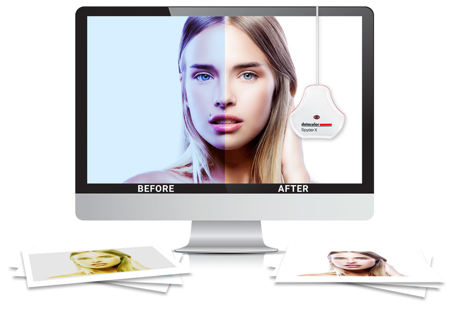
Color Calibration and Profiling
Accurate color reproduction is the cornerstone of successful digital color management. Without properly calibrated devices and accurate color profiles, the colors you see on your screen will likely differ significantly from the colors printed or displayed on other devices. This discrepancy can lead to costly reprints, frustrated clients, and ultimately, a less-than-professional final product. Calibration and profiling bridge this gap, ensuring consistency across your entire workflow.Color calibration and profiling involve adjusting your monitor and other output devices (printers, plotters) to match a known standard, and then creating a profile that describes the device’s unique color characteristics.
This profile acts as a translator, allowing software to accurately convert digital color data into the specific colors your device can reproduce. The process isn’t a one-time fix; regular calibration and profile updates are crucial to maintain color accuracy over time as devices age and conditions change.
Monitor Calibration
Monitor calibration involves adjusting the monitor’s settings (brightness, contrast, white point, gamma) to match a specific color standard, typically using a colorimeter or spectrophotometer. These devices measure the light emitted from the monitor and compare it to the target standard. Software then adjusts the monitor’s settings to minimize the difference. The process typically involves using specialized software that guides the user through the steps and provides feedback on the accuracy of the calibration.
For example, using a Datacolor SpyderX Pro, one might calibrate their monitor to achieve a D65 white point and a gamma of 2.2, common standards in the graphic design industry. This ensures that the colors displayed on the screen are a close representation of the intended colors.
Printer Profiling
Creating a printer profile is a more involved process than calibrating a monitor. It requires a device called a spectrophotometer, which measures the color produced by the printer under specific conditions (paper type, ink, etc.). Specialized software then uses this data to generate a color profile – a mathematical description of the printer’s color gamut and how it translates digital color data into physical ink on paper.
This profile is then used by the software to accurately convert digital colors into instructions for the printer. For example, creating a profile for a specific brand and type of photo paper will significantly improve the accuracy of color reproduction in photo prints, ensuring that the final print closely matches the on-screen preview.
Importance of Regular Calibration and Profile Updates, Digital color management tools
Over time, the characteristics of monitors and printers can drift. Factors like ambient lighting, aging components, and ink variations can all affect color accuracy. Regular calibration (at least monthly for monitors, and as needed for printers depending on usage) and profile updates ensure that your color reproduction remains consistent and accurate. Failing to do so can result in subtle but noticeable color shifts over time, leading to inconsistencies between different print runs or between the on-screen preview and the final output.
Regular maintenance, therefore, is key to maintaining a high level of color accuracy throughout your workflow.
Advanced Color Management Techniques
Mastering basic color management is just the first step. This section delves into more sophisticated techniques that allow for greater control and accuracy in achieving consistent color across different media and workflows. These advanced methods are crucial for professionals seeking high-quality, predictable results.
Accurate color reproduction is paramount, particularly in professional contexts. Understanding and applying these advanced techniques will significantly improve your ability to achieve the intended color in your final output, regardless of the medium.
Soft Proofing and Predicting Printed Output
Soft proofing simulates the appearance of your design on a specific printing device or paper type without actually printing it. This crucial pre-press step allows for the evaluation and correction of color discrepancies before committing to a costly print run. Soft proofing software uses color profiles to translate the colors on your screen to their predicted appearance in print.
For example, a designer working on a high-impact brochure might use soft proofing to identify potential color shifts from their monitor’s RGB color space to the CMYK color space of the printing press. By making adjustments during soft proofing, they can ensure the final printed brochure matches their vision. Accurate soft proofing relies heavily on having well-calibrated monitors and accurate ICC profiles for both the monitor and the printer.
Discrepancies between the soft proof and the final print are often due to inaccuracies in these profiles or limitations of the printing process itself.
Managing Spot Colors
Spot colors, such as Pantone colors, are premixed inks that provide consistent, specific colors regardless of the printing device. Managing these colors requires careful attention to their interaction with other colors in the design. A common issue is achieving accurate color matching between spot colors and process colors (CMYK). This requires precise color conversion and often involves using a dedicated spot color library and carefully specifying the color values within your design software.
For instance, a corporate logo might use a specific Pantone color for branding consistency. The designer needs to ensure this Pantone color is accurately represented across all print materials and online applications, potentially requiring custom color profiles and careful attention to color separations.
Color Management in Specialized Fields
Color management plays a vital role in various specialized fields. The specific techniques and challenges vary depending on the medium and intended outcome.
The application of color management differs significantly depending on the field. The following list highlights some key differences and specific challenges.
- Photography: Photographers use color management to ensure consistent color reproduction across different displays and printing methods. Accurate color profiles for cameras, monitors, and printers are essential. They also employ techniques like white balance adjustments and color grading to achieve desired aesthetic effects. For example, a wedding photographer would utilize color profiles to ensure that the colors in their images are accurately reproduced in both online galleries and printed albums.
- Printing: Printers rely heavily on color management to maintain consistency across different print jobs and devices. They use sophisticated color profiling and calibration techniques to achieve accurate color reproduction and minimize variations. A large-scale commercial printer, for instance, would use a sophisticated color management system to ensure consistent color across multiple presses and different paper stocks.
- Web Design: Web designers face the challenge of displaying colors consistently across different browsers, devices, and operating systems. They utilize color management techniques to ensure that the colors on their website appear as intended to the widest possible audience. For example, a website designer creating a corporate website would utilize color profiles and color management software to ensure that the brand colors appear consistently across various browsers and devices.
Troubleshooting Common Color Management Issues
Color management, while powerful, isn’t always a smooth ride. Implementing a robust color workflow can sometimes lead to unexpected results, causing frustration and potentially impacting the quality of your final output. Understanding the common pitfalls and how to resolve them is crucial for achieving consistent and accurate color reproduction across different devices and stages of your workflow. This section focuses on identifying and resolving common color management problems.Color shifts, banding, and inaccurate color rendering are among the most frequently encountered issues.
These problems can stem from various sources, including incorrect profile assignments, device miscalibration, or flaws in the color management system itself. Effective troubleshooting requires a systematic approach, starting with identifying the symptoms and then systematically eliminating possible causes. Let’s dive into some specific examples and solutions.
Color Shifts Between Devices
Color shifts occur when the same image appears different on various devices (monitor, printer, etc.). This is often due to a mismatch between the color profiles assigned to each device. For example, an image might look vibrant on your calibrated monitor but dull when printed because the printer profile doesn’t accurately represent the monitor’s color gamut. To resolve this, ensure that all devices have correctly installed and assigned color profiles that are compatible with each other and the color space of your image.
Verify the profile’s accuracy through regular calibration and profiling. Recalibrating your monitor and printer, and ensuring consistent color spaces throughout the workflow (e.g., using sRGB or Adobe RGB consistently) are essential steps.
Color Banding
Color banding manifests as distinct steps or bands of color in smooth gradients, rather than a smooth transition. This typically happens when the image’s color depth is too low to accurately represent the subtle color variations. For instance, an 8-bit image might show banding where a 16-bit image would display a smooth gradient. To mitigate banding, increase the bit depth of your image files if possible.
Using a wider gamut color space can also help, as it provides more color options and reduces the likelihood of banding. Employ techniques like dithering (a process that adds noise to simulate more colors) can sometimes help, but it’s generally best to avoid it by working with higher bit-depth images.
Incorrect Color Rendering
Incorrect color rendering occurs when colors appear significantly different from the intended result. This could be due to several factors, including an outdated or incorrectly installed color profile, a miscalibrated device, or even a faulty monitor. For example, a deep blue might appear more greenish or a vibrant red might look muted. A systematic approach is needed: first, verify the accuracy of the color profiles.
Then, check for device calibration issues; a poorly calibrated monitor or printer will inevitably lead to incorrect color rendering. Finally, consider software issues; ensure your color management software is correctly configured and up-to-date.
Common Errors and Solutions
Understanding the root cause of color discrepancies is vital. The following list Artikels common errors and their solutions.
- Problem: Colors appear washed out or dull on print. Solution: Check printer profile accuracy, ensure sufficient ink levels, and verify print settings (e.g., color mode, paper type).
- Problem: Colors on screen differ significantly from printed output. Solution: Verify color space consistency (e.g., sRGB for web, Adobe RGB for print), recalibrate monitor and printer, and double-check profile assignments.
- Problem: Color banding is visible in gradients. Solution: Increase image bit depth (e.g., from 8-bit to 16-bit), use a wider gamut color space, and consider using a higher-quality printer.
- Problem: Specific colors are consistently inaccurate. Solution: Investigate the color profile for errors, recalibrate the relevant device, and check for software conflicts.
- Problem: Unexpected color shifts occur after image editing. Solution: Ensure consistent color spaces throughout the editing process, and avoid mixing different color management systems.
Future Trends in Digital Color Management
The field of digital color management is constantly evolving, driven by advancements in display technology and a growing demand for more accurate and consistent color reproduction across various devices and workflows. New technologies are pushing the boundaries of what’s possible, leading to significant changes in how we approach color management in the future. This evolution will necessitate the development of more sophisticated and adaptable color management tools.The increasing prevalence of high-dynamic range (HDR) displays and wider color gamuts is reshaping the landscape of digital color.
These advancements, coupled with the rise of new color spaces, are creating both exciting opportunities and significant challenges for color management professionals. Understanding these trends is crucial for staying ahead in the ever-changing world of digital color.
HDR Displays and Wider Color Gamuts
HDR displays offer significantly increased brightness, contrast, and color depth compared to standard dynamic range (SDR) displays. This translates to a more vibrant and realistic image, closer to what the human eye can perceive. Wider color gamuts, such as Adobe RGB and DCI-P3, encompass a broader range of colors than the sRGB standard, allowing for a richer and more nuanced color palette.
The combination of HDR and wider color gamuts presents a challenge for color management, as existing tools and workflows need to adapt to handle the expanded color space and increased dynamic range. For example, a photographer working with HDR images needs software capable of accurately managing the metadata associated with the higher dynamic range, ensuring consistent color across different HDR displays.
Impact on Digital Color Workflows
The adoption of HDR and wider color gamuts will necessitate changes in various aspects of digital color workflows. Color calibration and profiling will become even more critical to ensure accurate color reproduction across different devices. Workflows will need to be adapted to handle the increased data volume associated with HDR images and videos. Creative professionals will need to learn new techniques and strategies for working with these expanded color spaces to maximize the potential of HDR displays and wider color gamuts.
For instance, a graphic designer working on a website designed for HDR displays will need to ensure the colors are accurately represented and optimized for the target display technology, potentially using different color profiles for different HDR display types.
Advancements in Color Management Tools
Future color management tools will need to be more sophisticated and adaptable to handle the complexities of HDR and wider color gamuts. This includes support for new color spaces, improved algorithms for color conversion and rendering, and more robust profiling capabilities. The tools will likely integrate more closely with other software applications to streamline workflows and simplify color management tasks.
We can expect advancements in automated profiling and calibration systems, potentially incorporating AI to optimize color accuracy and consistency across various devices. For example, imagine software that automatically profiles a new HDR monitor and adjusts the color settings of other connected devices to maintain consistent color reproduction across the entire workflow.
Final Wrap-Up
Successfully navigating the world of digital color management is key to delivering consistent and high-quality results. From understanding color spaces and profiles to mastering software tools and calibrating your equipment, the journey might seem daunting at first. But by following the steps Artikeld above and embracing best practices, you can confidently achieve color accuracy across all your projects. Remember, consistent color is not just a technical detail; it’s a crucial element in ensuring your creative vision shines through.
So, embrace the power of digital color management and unlock the full potential of your digital creations!
Quick FAQs
What’s the difference between sRGB and Adobe RGB?
sRGB is a smaller color space, ideal for web use, while Adobe RGB offers a wider gamut, better for print.
Do I need to calibrate my monitor regularly?
Yes! Monitor calibration drifts over time. Recalibrate every few months for consistent color.
How do I choose the right color management software?
Consider your budget, skill level, and specific needs (photo editing, print design, etc.) when selecting software.
What is gamut compression?
Gamut compression maps colors outside your device’s range into a reproducible space, preventing clipping or unexpected shifts.