Everything is in the Fonts A Book for Beginners
Everything is in the fonts a book for beginners – Everything is in the Fonts: A Book for Beginners dives headfirst into the often-overlooked world of typography and its crucial role in book design. Forget boring textbooks – we’re going to explore how different fonts evoke emotions, impact readability, and ultimately, shape the reader’s experience. We’ll journey from understanding basic font families like serifs and sans-serifs to mastering the art of choosing the perfect font for your next novel, children’s story, or even a textbook.
Get ready to unlock the power of the perfect typeface!
This isn’t just about picking pretty letters; it’s about understanding the subtle nuances that transform a collection of words into a captivating narrative. We’ll delve into the practical aspects, covering font size, leading (line spacing), and kerning (letter spacing), showing you how these elements work together to create a visually appealing and easily readable book. We’ll even explore how different fonts can be used for headers, body text, and captions to create a clear visual hierarchy.
By the end, you’ll be equipped to make informed font choices that elevate your book design from good to truly unforgettable.
Introduction to Typography in Book Design
Typography, the art and technique of arranging type, plays a crucial role in shaping a book’s overall impact. More than just pretty letters, typography directly influences how readers perceive a book’s message, its tone, and even its genre. A well-chosen typeface can enhance readability, create a specific mood, and contribute significantly to a book’s visual appeal, while a poor choice can lead to frustration and a negative reading experience.The importance of typography in conveying a book’s message and tone cannot be overstated.
Font choices directly impact the reader’s emotional response. A serif typeface like Garamond, for instance, often evokes a sense of tradition, elegance, and sophistication, making it suitable for classic literature or historical fiction. In contrast, a sans-serif typeface like Helvetica, with its clean lines and modern feel, might be preferred for contemporary novels or non-fiction works requiring a straightforward, accessible style.
The right font can subtly guide the reader’s emotional journey through the narrative.
Font Styles and Their Emotional Impact
Different font styles evoke distinct emotional responses. Consider the difference between a playful script font like Edwardian Script ITC, which might be used for children’s books or whimsical romances, and a bold, gothic typeface like Blackletter, often associated with mystery, horror, or fantasy. The weight of the font – light, regular, bold, black – also contributes to the overall feeling.
A light typeface can feel airy and delicate, while a black typeface projects authority and strength. The x-height (the height of lowercase letters) also influences readability and perceived tone; a larger x-height is generally considered more legible.
Font Choices and Readability
Choosing fonts that prioritize readability is paramount. Factors such as font size, leading (the space between lines), kerning (the space between individual letters), and tracking (the space between words) all affect how easily the text can be read. A cramped, poorly spaced page can lead to eye strain and fatigue, hindering the reader’s enjoyment. Legibility is also impacted by the font’s design; fonts with clear, distinct letterforms are generally easier to read than those with ornate or overly stylized characters.
For example, Times New Roman, with its classic serif design, is often praised for its readability, while more decorative fonts might be less suitable for large blocks of text.
Font Choices and Visual Appeal
Beyond readability, typography contributes significantly to a book’s visual appeal. The overall aesthetic of the page, including the font choice, can enhance the reader’s experience. Consistent use of a particular typeface and size throughout the book creates a unified and professional look. Conversely, inconsistent or jarring font choices can distract the reader and detract from the overall presentation.
The use of different fonts for headings, chapter titles, and body text can create visual hierarchy and improve navigation. For example, a bold sans-serif font might be used for chapter titles to stand out against the body text set in a more subtle serif typeface. Careful consideration of these visual elements contributes to a book’s overall design and marketability.
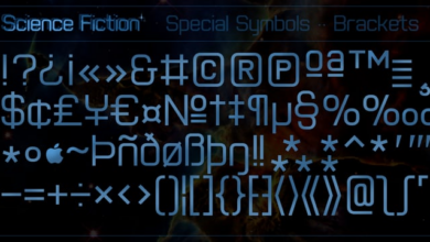
Font Families and Their Characteristics
Choosing the right font family is crucial in book design. The typeface significantly impacts readability, establishes the book’s tone, and contributes to its overall aesthetic appeal. Understanding the different families and their characteristics is key to making informed design decisions. This section explores serif and sans-serif fonts, along with other notable families, and how their variations in weight, width, and style influence the final product.
Serif and Sans-serif Fonts: A Comparison, Everything is in the fonts a book for beginners
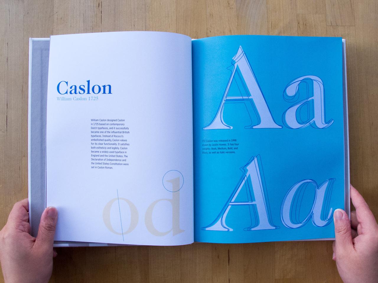
Serif fonts, characterized by small decorative strokes (serifs) at the ends of letterforms, often evoke a sense of tradition and formality. They’re generally considered more legible in large blocks of text, making them popular for body text in novels and academic publications. Examples include Times New Roman, a classic serif font known for its readability, and Garamond, a more elegant and refined serif option.
Conversely, sans-serif fonts lack these serifs, presenting a cleaner, more modern look. They are often preferred for headings, subheadings, and shorter text segments where clarity and impact are paramount. Helvetica and Arial are prime examples of widely used sans-serif fonts known for their neutrality and versatility. The choice between serif and sans-serif depends heavily on the book’s genre and intended audience.
A historical novel might benefit from the classic feel of a serif font, while a contemporary thriller might be better suited to the modern feel of a sans-serif.
Characteristics of Various Font Families
Beyond the basic serif/sans-serif distinction, numerous other font families exist, each with its unique personality. Roman fonts, like Times New Roman or Garamond, are characterized by their upright, balanced letterforms and are often associated with classicism and readability. Gothic fonts, such as Blackletter or Fraktur, feature angular, heavily ornamented letterforms. Their strong visual presence makes them suitable for titles or decorative elements, but they are generally less legible for extended reading.
Script fonts, mimicking handwriting styles, such as Edwardian Script or Brush Script, offer a personalized, often elegant touch. They are well-suited for titles, chapter headings, or short quotes, but prolonged reading in script fonts can be challenging. The choice of font family should always align with the book’s genre and overall aesthetic.
Impact of Font Weight, Width, and Style
Font weight refers to the thickness of the typeface, ranging from light to bold. Weight can be used to create hierarchy and emphasis within the text. Bold headings stand out, while lighter weights are ideal for body text to ensure readability. Font width describes how horizontally compressed or expanded the letters are. Condensed fonts save space, while extended fonts can create a more spacious feel.
Font style encompasses variations like italics, small caps, and condensed versions. Italics can indicate emphasis or titles, while small caps provide a subtle variation for headings or captions. Careful consideration of weight, width, and style is essential for creating a balanced and visually appealing book design. For example, using a bold sans-serif for chapter titles and a lighter serif for body text creates a clear visual hierarchy and enhances readability.
A consistent and considered application of these elements ensures a harmonious and professional final product.
Choosing Fonts for Different Book Genres
Source: behance.net
Selecting the right font is crucial for book design; it significantly impacts readability and the overall aesthetic, subtly influencing how readers perceive the story or information presented. A poorly chosen font can hinder comprehension, while a well-chosen one enhances the reading experience and strengthens the book’s brand identity. The genre significantly guides this selection process.
Font Choices Across Genres
The following table compares suitable fonts for various book genres, considering factors like readability, genre conventions, and the desired emotional impact. Remember that these are suggestions, and individual preferences and design aesthetics will play a role in the final choice.
| Genre | Font Family | Weight | Justification |
|---|---|---|---|
| Fiction (e.g., Romance) | Garamond, Baskerville, Times New Roman | Regular to Light | Justified or Left-aligned |
| Non-Fiction (e.g., History) | Times New Roman, Palatino, Georgia | Regular | Justified |
| Children’s Books | Comic Sans MS (with caution), Arial, Gill Sans | Regular to Bold | Left-aligned |
| Textbooks | Arial, Calibri, Times New Roman | Regular | Justified |
Fonts Conveying Specific Emotions
Font choice can subtly evoke specific emotions. For example, a serif font like Garamond might suggest elegance and classicism, fitting for a romance novel. In contrast, a more angular and modern sans-serif font like Futura might suit a science fiction or thriller. For mystery novels, fonts with a slightly more mysterious and less legible appearance (within reason) might be considered.
Gothic fonts might suggest horror, but often readability is sacrificed. Experimentation and considering the target audience are key here. For instance, the use of a playful font in a children’s book is expected, whereas a serious academic textbook would benefit from a more traditional and legible font.
Fonts to Avoid and Their Reasons
Certain fonts are generally unsuitable for book design due to readability issues or their inherent stylistic clash with the genre.
Here are some examples:
- Comic Sans MS (in most genres): While suitable for some children’s books, its informal style is generally inappropriate for adult fiction, non-fiction, or academic texts. Its playful nature clashes with the serious tone often expected in these genres.
- Papyrus: Often overused and perceived as cliché, Papyrus lacks the elegance and sophistication required for many book genres. Its informal appearance and readability issues make it unsuitable for most projects.
- Impact: This font is too bold and lacks subtlety. It’s primarily used for headlines and short bursts of text, not entire books. Its readability is poor for large blocks of text.
- Extremely ornate or highly stylized fonts: These fonts, while visually striking, often sacrifice readability. The reader’s experience should be prioritized above all else, so legibility should be the main concern.
Font Size, Leading, and Kerning
Choosing the right font size, leading, and kerning is crucial for creating a book that’s both visually appealing and easy to read. These three elements work together to determine the overall readability and aesthetic impact of your typography. Getting them right can mean the difference between a book that’s a pleasure to read and one that causes eye strain and frustration.The interplay between font size, leading, and kerning is a delicate dance.
Font size establishes the base size of your characters, leading dictates the vertical space between lines, and kerning fine-tunes the horizontal spacing between individual letter pairs. Improper balance can lead to cramped, visually overwhelming pages or conversely, excessively airy and spacious ones, both hindering readability.
Font Size and Book Formats
Appropriate font sizes vary significantly depending on the book format and target audience. For instance, a paperback novel might use a 10-12 point font size for the body text, allowing for comfortable reading in print. Larger font sizes, around 12-14 points, are often preferred for children’s books or books with large illustrations. Ebooks, on the other hand, offer the reader more control over font size, so a slightly smaller base size (perhaps 9-11 points) might be suitable, allowing users to enlarge the text as needed.
Accessibility considerations, such as dyslexia-friendly fonts and larger point sizes, should always be a priority. For example, a large-print edition of a novel might use a 16-point or larger font.
Adjusting Leading for Improved Readability
Leading, or line spacing, directly impacts readability. Too little leading results in cramped lines, making the text feel dense and difficult to follow. Conversely, excessive leading creates overly spacious lines that can disrupt the visual flow and make the text seem less engaging. A general guideline is to set leading slightly larger than the font size. For example, a 12-point font might use 14-point leading.
However, this is just a starting point, and the optimal leading will depend on the specific font and design. Experimentation and careful review are key. Consider using a leading value that’s approximately 120-150% of the font size for a comfortable reading experience. For instance, with a 10pt font, a leading of 12pt (120%) would be a good starting point.
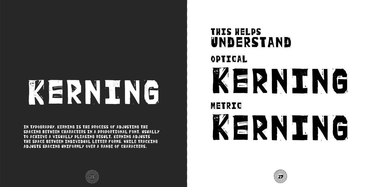
Kerning for Enhanced Visual Balance
Kerning refers to the adjustment of space between individual letter pairs. Certain letter combinations, such as “AV” or “To”, naturally have more space between them than others. Kerning allows for fine-tuning this spacing to improve the visual balance and consistency of the text. While many modern fonts have automatic kerning, manual adjustments might be necessary for optimal results, especially with unusual letter pairings or stylistic choices.
Overly tight kerning can make words appear cramped and difficult to read, while overly loose kerning can create an uneven and unprofessional appearance. The goal is to achieve a consistent and aesthetically pleasing spacing across the entire text. Careful examination of the text at various zoom levels is crucial for effective kerning.
Working with Headers, Body Text, and Captions
Source: behance.net
Choosing the right fonts for headers, body text, and captions is crucial for creating a visually appealing and easily readable book. A well-defined typographic hierarchy guides the reader’s eye, emphasizing important information and creating a consistent design throughout the book. This involves selecting fonts that complement each other, considering their weight, style, and overall aesthetic to create a harmonious and effective visual presentation.
Font Selection for Headers, Body Text, and Captions: A Style Guide
This style guide Artikels best practices for font selection, ensuring readability and visual hierarchy. The key is to create contrast without sacrificing visual harmony. Different font weights and styles can be used to differentiate the elements, but maintaining a consistent family or at least a visually compatible pairing is crucial for cohesiveness.
Headers: Headers should be easily distinguishable and immediately grab the reader’s attention. Consider using a bolder weight or a slightly larger size than the body text. Serif fonts can work well for headers, lending a sense of authority and tradition, while sans-serif fonts can offer a more modern and clean feel. The typeface chosen should reflect the overall tone and genre of the book.
Body Text: Body text should be highly legible and comfortable to read for extended periods. Prioritize readability over stylistic flair. Serif fonts are generally preferred for long blocks of text due to their x-height and serifs which aid in guiding the eye along the lines, but well-chosen sans-serif fonts can also be highly effective, especially for modern genres. The font size and leading (line spacing) are critical factors for ensuring readability.
Captions: Captions provide context and information for images and figures. They should be easily identifiable yet subordinate to the main text. A lighter weight or smaller size than the body text is often appropriate. Using the same font family as the body text maintains consistency, creating visual unity across the entire book. Consider a slightly different style (italic, for example) to subtly distinguish captions from the main text.
Examples of Effective Font Pairings
Effective pairings often involve using a serif font for body text and a sans-serif or a bolder weight of the serif font for headers. This provides a clear visual hierarchy and a pleasing contrast.
Example 1 (Traditional): Body Text: Times New Roman (serif); Headers: Garamond Bold (serif); Captions: Times New Roman Italic (serif). This combination creates a classic and sophisticated look, ideal for historical fiction or academic texts.
Example 2 (Modern): Body Text: Open Sans (sans-serif); Headers: Roboto Bold (sans-serif); Captions: Open Sans Light Italic (sans-serif). This pairing offers a clean, modern aesthetic suitable for contemporary novels or technical manuals.
So, I’ve been deep diving into “Everything is in the Fonts,” a book for beginners, and it’s amazing how much typography impacts design. I’m even thinking about applying some of these principles to my YouTube channel – you should check out this great guide on getting it on with YouTube for some tips on visual branding. Back to fonts though, I’m particularly fascinated by how subtle font choices can drastically change a project’s overall feel.
Example 3 (Playful): Body Text: Playfair Display (serif); Headers: Montserrat Bold (sans-serif); Captions: Playfair Display Italic (serif). This pairing demonstrates how contrasting styles can be used effectively, creating a unique and visually interesting book. This could be suitable for children’s literature or creative non-fiction.
Illustrative Examples of Font Usage
Source: templatesjungle.com
Typography is the unsung hero of book design. The right font choices can elevate a book from merely readable to truly captivating, while the wrong choices can create a jarring and unpleasant reading experience. Let’s explore how different fonts contribute to the overall aesthetic and communicative impact of various book types.
Book Cover Font Examples
Effective book cover design hinges on immediate visual communication. Font selection plays a crucial role in conveying genre, tone, and target audience. Consider these examples:
- Example 1: A Thriller Novel. Imagine a cover featuring a stark, sans-serif font like Futura in bold, all caps, and a large size (around 72pt). The title, “NIGHTFALL,” might be positioned prominently, while the author’s name is rendered in a much smaller, lighter weight Futura (around 18pt). This creates a sense of urgency and mystery, fitting for a thriller. The starkness of the sans-serif and the size contrast emphasize the dramatic title.
- Example 2: A Romance Novel. The cover of a romance novel might utilize a script font like Edwardian Script ITC, perhaps with slight embellishments, for the title. A size of around 48pt would be appropriate, creating a sense of elegance and romance. The author’s name, in a simpler serif font like Garamond (14pt), provides a counterpoint of readability and sophistication.
- Example 3: A Fantasy Novel. For a fantasy novel, a more ornate font like Blackletter might be used for the title, potentially incorporating decorative elements. The font size could be around 60pt, with the author’s name in a complementary serif font like Trajan Pro (16pt). This combination evokes a sense of old-world magic and adventure.
Interior Book Spread Font Examples
The interior font choices should prioritize readability and consistency. Different genres call for slightly different approaches.
- Example 1: Fiction Novel. A novel might employ a highly readable serif font like Garamond or Times New Roman for the body text (around 11pt). Leading (line spacing) of around 13pt would ensure comfortable reading. Chapter headings could be set in a slightly bolder weight of the same font (14pt), providing clear visual separation.
- Example 2: Non-Fiction Book. A non-fiction text, such as a biography, might utilize a sans-serif font like Gill Sans (10pt) for the body text with 12pt leading. This provides a clean and modern feel. Subheadings could be set in bold (12pt) for improved visual hierarchy and to guide the reader through the information. The use of a sans-serif font in this context offers a sense of objectivity and clarity, which is desirable for factual material.
- Example 3: Children’s Book. A children’s book might employ a playful and easily legible font like Comic Sans (though a more modern alternative is often preferred) or a custom-designed font that aligns with the illustrations. The font size would be larger (around 14pt or more), with generous leading (around 18pt) to aid younger readers. The font should be bold enough for easy reading.
Impact of Font Weight on Highlighting Information
Consider this paragraph: “The study revealed significant findings. Increased physical activity correlated with a noticeable reduction in stress levels. This suggests a strong link between exercise and mental well-being. However, further research is needed to determine the precise mechanisms involved.” The use of bold weight for “Increased physical activity” immediately draws the reader’s eye to the key finding of the study, making the most important information instantly clear.
This simple technique significantly enhances readability and comprehension.
Final Wrap-Up
So, there you have it – a beginner’s journey into the fascinating world of typography and its impact on book design. We’ve explored the importance of font choices in conveying tone and emotion, examined various font families and their characteristics, and learned how to effectively utilize font size, leading, and kerning. Remember, the right font isn’t just about aesthetics; it’s about enhancing readability and creating a seamless reading experience for your audience.
Now go forth and create stunning books!
Detailed FAQs: Everything Is In The Fonts A Book For Beginners
What’s the difference between serif and sans-serif fonts?
Serif fonts have small decorative strokes at the ends of their letters (like Times New Roman), while sans-serif fonts don’t (like Arial). Serifs generally improve readability in large blocks of text.
How do I choose the right font size for my book?
It depends on the book format and target audience. Larger sizes are generally better for children’s books or books with large print, while smaller sizes are suitable for adult fiction.
What are some common font-related mistakes to avoid?
Using too many different fonts, choosing illegible fonts, and neglecting proper kerning and leading are common pitfalls.
Where can I find free fonts for my book project?
Websites like Google Fonts offer a wide selection of free, high-quality fonts.