Flat Design Strikes Again A Modern Revival
Flat design strikes again, proving its enduring appeal in the ever-evolving world of visual design. From its minimalist origins to its current resurgence, this style continues to captivate designers and users alike. We’ll explore its history, current trends, and lasting impact on user experience and branding, looking at how it’s adapted and evolved across various platforms.
This post dives deep into the reasons behind flat design’s comeback, analyzing its strengths and weaknesses. We’ll examine successful implementations, discuss future possibilities, and even peek into potential design concepts that blend flat design with other exciting styles. Get ready for a visual journey through the fascinating world of flat design!
The Evolution of Flat Design
Source: idseducation.com
Flat design, with its minimalist aesthetic and focus on functionality, has undergone a fascinating evolution, shifting from a niche style to a dominant force in the digital landscape and beyond. Its journey reflects broader changes in technology, user preferences, and design philosophy.
Early forms of flat design can be traced back to the limitations of early computing technology. The need for efficiency in rendering graphics on low-resolution screens naturally led to simplified visuals. The Swiss Style of graphic design, prominent in the mid-20th century, with its emphasis on clean typography, grids, and a rejection of ornamentation, laid important groundwork. Designers like Josef Müller-Brockmann and Armin Hofmann championed this approach, prioritizing clarity and readability above all else.
Flat Design Versus Skeuomorphism
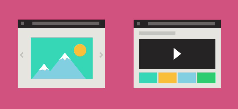
Understanding flat design requires contrasting it with skeuomorphism, a design approach that mimics the appearance of real-world objects. This comparison highlights the key differences in philosophy and execution.
| Design Style | Characteristics | Examples | Pros/Cons |
|---|---|---|---|
| Flat Design | Minimalist, two-dimensional, uses simple shapes and colors, avoids gradients and shadows, emphasizes typography and whitespace. | Early versions of Windows 8 apps, many modern websites and mobile interfaces, Google’s Material Design. Imagine a simple, colorful icon representing a calendar app, without any attempt to visually resemble a physical calendar. | Pros: Clean, modern, fast loading times, accessible. Cons: Can feel impersonal, lack of visual depth can make navigation less intuitive for some users. |
| Skeuomorphism | Mimics the appearance of real-world objects, utilizes textures, gradients, shadows, and realistic details to create a sense of familiarity. | Early versions of Apple’s iOS interface (e.g., the iBooks app resembling a real bookshelf), the notepad app mimicking a physical notepad with realistic textures and shadows. | Pros: Intuitive, familiar, creates a sense of realism and tangibility. Cons: Can be visually cluttered, slow loading times, may not be consistent across different devices and platforms. |
The Resurgence of Flat Design
While flat design existed earlier, its resurgence in the late 2000s and early 2010s was significant. Several factors contributed to this renewed popularity.
The rise of mobile devices and high-resolution screens played a crucial role. The limitations of early screens that necessitated skeuomorphism were no longer a constraint. Furthermore, the increasing demand for fast-loading websites and apps favored the simpler visuals and reduced file sizes associated with flat design. Simultaneously, a shift towards minimalist aesthetics in broader design trends influenced the adoption of flat design across various platforms.
The introduction of design languages like Google’s Material Design provided a framework and set of guidelines, making it easier for designers to implement flat design principles consistently.
Analyzing Current Trends in Flat Design
Flat design, once a revolutionary departure from skeuomorphism, continues to evolve, adapting to new technological advancements and user preferences. While the core principles remain—minimalism, clean lines, and a focus on functionality—subtle shifts in style and application are constantly emerging. This exploration delves into some of the key trends currently shaping the landscape of flat design.
Neumorphism and Soft UI
Neumorphism, a subtle blend of flat design and skeuomorphism, adds depth and dimension through the use of soft shadows and subtle gradients to create the illusion of buttons and elements being slightly raised or recessed. This technique adds a touch of realism while maintaining the clean aesthetic of flat design. Soft UI, a related trend, utilizes similar techniques but often employs softer, more pastel color palettes, creating a gentler, more approachable feel.
Applications range from mobile app interfaces, enhancing usability and visual appeal, to website design, where it can create a sense of depth and hierarchy without overwhelming the user. For example, imagine a button that appears slightly raised from the background, subtly indicating interactivity without the need for heavy Artikels or textures. This technique enhances the overall user experience by providing visual cues that are both subtle and effective.
Geometric Shapes and Bold Color Palettes, Flat design strikes again
While minimalism remains central, a resurgence of bold geometric shapes and vibrant color palettes is evident. This trend moves away from overly muted color schemes, embracing striking contrasts and unexpected combinations to create visually impactful designs. Think of websites featuring bold, geometric backgrounds interspersed with vibrant icons and typography. This approach is particularly effective in branding and marketing materials, allowing for a stronger visual identity and increased memorability.
The use of geometric shapes also helps to create a sense of order and structure, guiding the user’s eye through the design. This approach can be seen in the branding of many modern technology companies, where clean lines and bold colors communicate a sense of innovation and modernity.
Micro-interactions and Animations
While flat design traditionally emphasizes simplicity, the incorporation of subtle micro-interactions and animations is increasingly common. These small, contextual animations provide feedback to user actions, enhancing engagement and usability. For instance, a subtle loading animation or a gentle bounce when a button is pressed can significantly improve the user experience. This doesn’t contradict the core principles of flat design; instead, it enhances them by adding a layer of visual feedback without cluttering the interface.
Many popular mobile applications effectively utilize this technique, creating a more dynamic and responsive experience. The key here is restraint—animations should be subtle and purposeful, enhancing rather than distracting from the overall design.
Adaptation Across Digital Platforms
Flat design’s adaptability is a key reason for its continued popularity. Its clean lines and minimalist aesthetic translate seamlessly across various platforms, from responsive websites to mobile apps and even smartwatches. The principles of simplicity and clarity are universally applicable, ensuring consistency across different screen sizes and resolutions. This consistency is crucial for maintaining brand identity and user experience.
A well-designed flat design system can easily adapt to different screen sizes and resolutions, ensuring a consistent and user-friendly experience across all platforms.
Flat design strikes again, this time with a minimalist approach to YouTube channel art. I’m experimenting with cleaner lines and bold colors, inspired by the awesome tips I picked up from this fantastic guide on getting it on with YouTube. The result? A more modern, engaging look, proving once more that flat design is still a powerful tool for visual communication.
Successful Brand Implementations
Many brands successfully leverage flat design. Consider the minimalist approach of Google’s Material Design, characterized by its clean typography, bold color accents, and use of subtle shadows. This design language is consistent across all their products, creating a cohesive and recognizable brand identity. Similarly, Apple’s iOS design language utilizes a simplified flat design approach, prioritizing functionality and ease of use.
Their focus on clean lines and intuitive navigation has made their products globally successful. These examples showcase how a well-executed flat design strategy can contribute to brand recognition and user satisfaction.
The Impact of Flat Design on User Experience
Flat design, with its minimalist aesthetic and emphasis on functionality, has significantly influenced user experience (UX) across various digital platforms. Its impact, however, is complex and multifaceted, presenting both advantages and disadvantages depending on the context and implementation. While often lauded for its clean look and improved performance, a critical examination reveals its strengths and weaknesses in usability and accessibility.Flat design’s impact on usability is largely determined by its effective use of visual hierarchy and clear information architecture.
The absence of skeuomorphism, the imitation of real-world objects, forces designers to rely on strong typography, color contrast, and strategic whitespace to guide users intuitively. When executed well, this results in a streamlined, efficient interface. However, poorly implemented flat design can lead to ambiguity, making it difficult for users to understand the functionality of elements or navigate the interface effectively.
The lack of visual cues, such as gradients or shadows, can hinder intuitive interaction, especially for users unfamiliar with the design conventions.
Usability and Accessibility Considerations in Flat Design
Effective usability in flat design hinges on careful consideration of visual hierarchy and clear affordances. Visual hierarchy guides the user’s eye to the most important information first, using techniques like size, color, and placement. Affordances, on the other hand, communicate how an element should be interacted with. For example, a button should clearly indicate that it’s clickable.
In flat design, this is often achieved through subtle visual cues like a slight change in color on hover or the use of clear labels. Accessibility is equally crucial. Sufficient color contrast between text and background is essential for users with visual impairments. Furthermore, appropriate keyboard navigation and screen reader compatibility are vital for inclusive design.
Failure to address these aspects can severely limit the usability of a flat design interface for a significant portion of the user base. For example, a button with insufficient color contrast against its background would be difficult for someone with low vision to identify.
Effectiveness of Flat Design in Different Contexts
Flat design’s effectiveness varies across different contexts. In e-commerce, it can contribute to a clean, modern aesthetic, showcasing products effectively. However, the lack of visual depth might make it challenging to convey the texture or feel of products, particularly those that rely heavily on tactile qualities, such as clothing or furniture. Social media platforms often benefit from flat design’s simplicity, prioritizing speed and efficiency in information consumption.
The clean interface facilitates quick scrolling and effortless navigation through content. Conversely, applications requiring complex interactions or conveying nuanced information might find flat design less suitable. A medical application, for example, might need more visual cues to help users understand complex procedures or data.
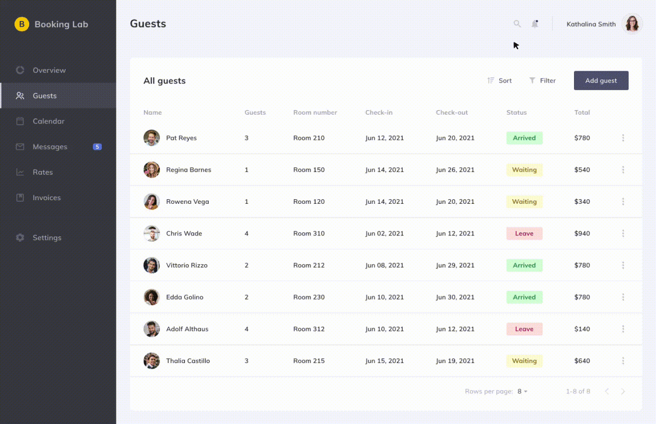
Design of a Flat Design Navigation Bar
This navigation bar uses a horizontal layout with five primary sections: Home, Products, About, Contact, and Blog. Each section is represented by a simple text label in a clean sans-serif font (e.g., Open Sans or Roboto) with a consistent size and weight. The background color is a light gray (#f2f2f2), providing a neutral backdrop. The text color is a dark gray (#333333), offering sufficient contrast.
On hover, each section’s background subtly changes to a slightly darker shade of gray (#d3d3d3), providing clear visual feedback. No underlines or other decorative elements are used, maintaining the minimalist aesthetic. The overall effect is a clean, uncluttered, and easily navigable bar, prioritizing clarity and ease of use. The design choices emphasize simplicity and functionality, aligning with core flat design principles.
The consistent typography, color palette, and hover effect ensure visual consistency and intuitive user interaction.
Flat Design and its Relationship to Branding
Flat design, with its minimalist aesthetic and focus on functionality, has become a significant player in the branding landscape. Its clean lines and bold use of color can powerfully communicate a brand’s personality and values, contributing significantly to recognition and memorability in a crowded marketplace. However, effectively leveraging flat design in branding requires careful consideration, as its inherent simplicity can present challenges in conveying complex messages or establishing strong emotional connections.Flat design’s contribution to brand identity rests on its ability to create a consistent and easily recognizable visual language.
The simplicity inherent in the style allows for easy scalability across various platforms and media, ensuring brand consistency regardless of the application. This consistency reinforces brand recognition and builds familiarity with consumers. Furthermore, the use of bold colors and unique typography can help a brand stand out from competitors and establish a distinct visual identity. However, the minimalist nature of flat design can sometimes limit its ability to communicate intricate details or evoke strong emotional responses, demanding creative solutions to overcome these limitations.
Effective Use of Flat Design in Branding
The successful application of flat design in branding hinges on a deep understanding of the brand’s core values and target audience. A thoughtful approach ensures the visual elements are not only aesthetically pleasing but also effectively communicate the brand’s message. It’s about striking a balance between simplicity and impact. Below are some examples of brands that have skillfully utilized flat design to enhance their brand image.
- Dropbox: Dropbox’s branding effectively uses a simple, iconic blue and white color scheme with a clean, minimalist logo. This straightforward design communicates reliability and ease of use, aligning perfectly with the service’s function. The simplicity ensures the brand is easily recognizable across various platforms, from desktop applications to mobile interfaces. The overall effect is a brand that feels modern, trustworthy, and accessible.
- Spotify: Spotify’s branding uses a vibrant green color and a unique typeface to create a youthful and energetic brand identity. The simple, flat design of their logo and app icons reflects the ease and accessibility of their music streaming service. The color choice conveys a sense of vibrancy and positivity, appealing to a younger demographic. The flat design ensures consistency across their platforms and merchandise, creating a strong and unified brand presence.
- Stripe: Stripe’s branding employs a sophisticated and professional aesthetic. Their logo, featuring a simple, stylized stripe, is clean and memorable. The color palette, typically featuring shades of blue and gray, projects a sense of reliability and stability, important qualities for a financial technology company. This understated elegance, characteristic of flat design, conveys professionalism and trust, essential for building confidence in their services.
Future Directions of Flat Design

Source: glints.com
Flat design, despite its minimalist aesthetic, has shown remarkable resilience and adaptability. Its core principles of simplicity and clarity continue to resonate with designers and users alike. However, the future of flat design isn’t about stagnation; rather, it’s about evolution and integration with emerging trends and technologies. We can expect to see a more nuanced and dynamic approach to flat design, moving beyond its purely two-dimensional origins.The next phase of flat design will likely involve a sophisticated interplay of texture, subtle depth, and animation, all while maintaining its core principles of clean lines and uncluttered interfaces.
Technological advancements, such as improved screen resolutions and processing power, will allow for more complex visual effects without sacrificing performance or accessibility. This will lead to a more engaging and visually rich experience, even within the constraints of flat design’s minimalist ethos.
Merging Flat Design with Other Styles
The rigid separation between design styles is increasingly blurring. We’re already seeing the successful integration of flat design elements with other styles, creating hybrid approaches that leverage the strengths of each. For instance, the subtle use of neumorphism, with its soft shadows and micro-interactions, can add depth and visual interest to a flat design without compromising its clean aesthetic.
Similarly, incorporating carefully considered 3D elements can create focal points and enhance visual hierarchy without overwhelming the overall minimalist feel. This merging of styles allows designers to achieve a more layered and sophisticated visual language.
A Hypothetical Future Flat Design Concept: The “Adaptive UI”
Imagine a mobile banking application. The interface is predominantly flat, using a calming palette of blues and greens. However, key elements, such as account balances and transaction summaries, subtly “pop” using micro-interactions and subtle gradients. These elements aren’t overtly 3D, but they possess a gentle depth, hinting at a third dimension. When a user interacts with a specific transaction, for instance, a minimal 3D animation unfolds, providing a contextual visual representation of the transaction – perhaps a small, animated graph showing the money transfer. The overall aesthetic remains clean and uncluttered, but the subtle use of animation and depth adds a layer of engagement and clarity, enhancing the user experience. The app dynamically adjusts its layout and visual elements based on the user’s device and screen size, seamlessly adapting to various contexts while maintaining a consistent visual language. This “adaptive UI” prioritizes accessibility and usability across all platforms, demonstrating the potential of a future-forward flat design.
Final Summary

Source: blogspot.com
So, flat design isn’t just a fleeting trend; it’s a design philosophy that keeps adapting and innovating. Its simplicity and versatility make it a powerful tool for creating clean, user-friendly interfaces across various platforms. Whether you’re a seasoned designer or just starting out, understanding flat design’s principles and applications is crucial for creating effective and engaging digital experiences.
The future of flat design looks bright, filled with exciting possibilities and creative explorations. Let’s see what the next iteration brings!
Expert Answers: Flat Design Strikes Again
Is flat design suitable for all brands?
While versatile, flat design might not suit every brand. Brands needing to convey luxury or complex emotions might find it limiting.
How can I make flat design feel less sterile?
Use vibrant colors, subtle textures, and clever use of whitespace to add personality and warmth without sacrificing the core principles of flat design.
What are the limitations of flat design?
Flat design can sometimes lack depth and visual hierarchy, potentially impacting usability if not implemented carefully. It can also be challenging to convey complex information effectively.