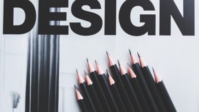
Graphic Design Project Ideas for Portfolio
Graphic design project ideas for portfolio: Building a killer portfolio is crucial for any aspiring graphic designer. This isn’t just about showcasing your skills; it’s about telling a story, demonstrating your versatility, and ultimately, landing your dream job. This post dives into generating creative project ideas, developing strong concepts, and presenting your work in a way that truly captivates potential clients and employers.
We’ll explore diverse styles, from minimalist logos to vibrant social media campaigns, ensuring your portfolio reflects your unique talent and potential.
We’ll cover everything from brainstorming initial concepts and refining your design process to creating compelling case studies and understanding current design trends. Get ready to transform your portfolio from a simple collection of work into a powerful tool that opens doors to exciting opportunities. Let’s get started!
Brainstorming Design Project Ideas
Building a strong graphic design portfolio requires a diverse range of projects showcasing your skills and versatility. The key is to select projects that challenge you creatively and demonstrate your proficiency across different design disciplines. This process involves brainstorming diverse ideas, carefully considering their complexity and the skills they’ll highlight, and then selecting projects that best represent your capabilities and aspirations.
Below are ten unique graphic design project ideas, offering a blend of styles and applications, ideal for inclusion in a portfolio. Remember to choose projects that genuinely excite you, as your passion will shine through in the final product.
- Branding Identity for a Fictional Coffee Shop: Develop a complete brand identity, including logo design, color palette, typography, and brand guidelines.
- Website Redesign for a Local Charity: Revamp an existing website, focusing on improved user experience and visual appeal.
- Book Cover Design: Design a captivating book cover that accurately reflects the genre and tone of a chosen novel.
- Poster Series for a Music Festival: Create a series of eye-catching posters promoting a fictional music festival.
- Packaging Design for a New Product: Design packaging for a new product, considering factors like target audience and shelf appeal.
- Infographic on Climate Change: Create an informative and visually engaging infographic on a relevant topic.
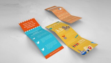
- Social Media Campaign for a Small Business: Design social media graphics and assets for a cohesive marketing campaign.
- Motion Graphics for a Short Video: Create short, engaging motion graphics for a video, showcasing animation skills.
- Typography-Focused Poster: Design a poster that emphasizes the power and beauty of typography.
- Logo Design Challenge: Participate in a logo design competition (online or local) to test your skills and gain exposure.
Project Idea Comparison
The table below compares five of the aforementioned project ideas based on complexity, time commitment, and skills demonstrated. This analysis helps in prioritizing projects based on your current skill level and available time.
| Project Idea | Complexity | Time Estimate (Hours) | Skills Demonstrated |
|---|---|---|---|
| Branding Identity for a Fictional Coffee Shop | Medium | 40-60 | Logo design, branding, typography, color theory |
| Website Redesign for a Local Charity | High | 80+ | Web design, UX/UI, visual hierarchy, responsive design |
| Book Cover Design | Medium | 20-40 | Typography, illustration (potentially), image selection |
| Infographic on Climate Change | Medium | 30-50 | Data visualization, information design, typography |
| Logo Design Challenge | Low-Medium | 10-30 | Logo design, concept development, client communication (if applicable) |
Typography-Focused Project Elaboration, Graphic design project ideas for portfolio
Three projects from the list above particularly highlight typography skills and their impact on visual communication. Effective typography is crucial for conveying meaning and creating a desired mood or atmosphere.
- Book Cover Design: The selection and arrangement of fonts directly impact the perceived genre and tone of a book. For example, a fantasy novel might utilize a bold, stylized font, while a romance novel might opt for a more elegant and delicate typeface. Careful consideration of kerning, tracking, and leading is also vital for readability and aesthetic appeal.
Imagine a cover using a classic serif font like Garamond for a historical fiction novel, contrasting sharply with a modern sans-serif like Futura for a science fiction counterpart.
- Typography-Focused Poster: This project allows for extensive experimentation with various typefaces, exploring their visual properties and emotional impact. The poster could showcase different font pairings, demonstrating an understanding of contrast, harmony, and hierarchy. One could use a display font as a headline, paired with a more readable body font for supporting text. For instance, a playful script font could be paired with a clean sans-serif font for a contrast of styles, emphasizing specific words or phrases.
- Branding Identity for a Fictional Coffee Shop: The choice of typography for a brand identity is critical in establishing the brand’s personality. A rustic coffee shop might benefit from a handcrafted font, while a modern café might use a sleek sans-serif. Consistency in font usage across all brand materials (logo, packaging, website) is essential for maintaining brand recognition and a cohesive visual identity.
For instance, using a custom-designed logo font, and extending the feel of that font into other materials (like the menu) creates a memorable brand experience.
Developing Project Concepts

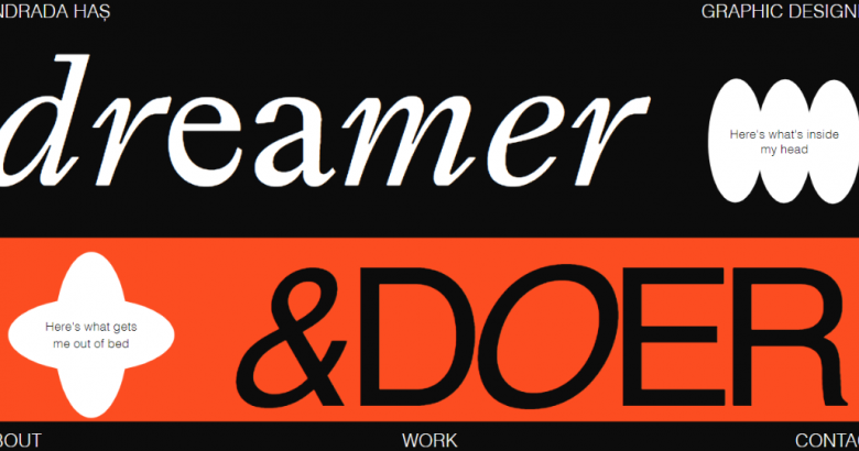
Source: framerusercontent.com
Taking the initial brainstorming session to the next level involves fleshing out those exciting ideas into concrete project concepts. This stage is crucial for clarifying the direction and ensuring a successful final product. It’s where the abstract notions transform into tangible visuals and well-defined plans.This section delves into two of my brainstormed projects: a minimalist poster series for a local coffee shop and a vibrant, illustrated children’s book.
We’ll explore detailed concept sketches, design processes, and color palettes, demonstrating the careful consideration that goes into every aspect of the design.
Concept Sketches and Project Descriptions
The first step in developing a project is creating detailed concept sketches. These sketches serve as a visual roadmap, helping to refine the initial ideas and explore different design possibilities. They allow for quick iteration and experimentation before committing to a final design. For the coffee shop poster series, I envisioned a series of three posters, each featuring a single, high-quality photograph of coffee beans, a cup of coffee, or the barista’s hands crafting latte art.
The mood would be calm, sophisticated, and inviting, targeting a young professional audience who appreciate quality coffee and minimalist aesthetics. The design elements would include a sans-serif typeface, a muted color palette, and clean lines. The children’s book, conversely, would be bursting with bright colors and whimsical illustrations. The target audience is young children (ages 3-6), and the mood would be playful and engaging.
The design would incorporate bold shapes, playful typography, and a narrative driven by a charming story about a friendly squirrel.
Design Process Artikel: Coffee Shop Poster Series
The design process for the coffee shop poster series will follow these stages:
1. Research & Mood Board
Gathering inspiration images and defining the visual style. This would involve collecting images of coffee, coffee shops, and minimalist design.
2. Sketching & Concept Development
Creating initial sketches to explore different layout options and visual approaches. This stage will involve multiple iterations of the layout, typography, and imagery.
3. Typography Selection
Choosing appropriate fonts that align with the minimalist aesthetic. This may involve testing different font pairings and sizes to ensure readability and visual harmony.
4. Image Selection & Retouching
Selecting high-quality photographs and refining them through retouching to enhance their visual appeal and consistency. This could involve adjustments to color, contrast, and sharpness.
5. Layout & Mockup
Arranging the chosen images and text to create a visually appealing and informative layout. Creating mockups to visualize the posters in their intended environment.
6. Final Artwork & Presentation
Producing high-resolution final artwork suitable for printing and creating a professional presentation showcasing the design process and final product.
Color Palette Rationale
For the coffee shop poster series, the color palette would be muted and earthy, emphasizing natural tones. I would use shades of brown, beige, and cream as the base colors, with accents of deep green or burgundy to add a touch of sophistication. This palette evokes feelings of warmth, comfort, and natural elegance, aligning perfectly with the coffee shop’s brand identity.In contrast, the children’s book would utilize a vibrant and playful palette.
Bright, saturated colors like sunny yellow, sky blue, vibrant green, and cheerful orange would be used extensively. These colors are known to stimulate a child’s imagination and create a sense of joy and excitement, perfectly complementing the whimsical illustrations and engaging narrative. The color palette would also incorporate some softer pastels to balance the brightness and provide visual respite.
Illustrating Design Solutions
Source: cloudfront.net
This section showcases the application of design principles through the creation of various design assets for hypothetical clients. Each project demonstrates a different design style and approach, highlighting the versatility and adaptability of my design skills. The focus is on conveying clear messaging, creating visually appealing designs, and effectively communicating the brand identity of each fictional client.
Coffee Shop Logo Concepts
Three distinct logo concepts were developed for a fictional coffee shop, each reflecting a different design style: modern, vintage, and minimalist. The goal was to explore how different aesthetic approaches could effectively represent the same core business.
- Modern Logo: This logo features a stylized coffee bean icon formed from geometric shapes, utilizing a bold, sans-serif typeface for the coffee shop name. The color palette is vibrant and contemporary, using deep blues and bright oranges to evoke feelings of energy and modernity. The overall design is clean and impactful, aiming for a sophisticated and memorable visual.
- Vintage Logo: This logo employs a hand-drawn style coffee cup and bean illustration, paired with a serif typeface reminiscent of early 20th-century typography. The color palette consists of muted browns, creams, and a deep red, evoking a sense of nostalgia and tradition. The design aims to create a feeling of warmth and comfort, suggesting a classic coffee shop experience.
- Minimalist Logo: This logo features a single, abstract coffee cup icon, rendered in a simple, almost symbolic form. A clean, thin sans-serif typeface is used for the coffee shop name. The color palette is limited to a single color (a deep brown) on a white background, maintaining a clean and uncluttered aesthetic. The design prioritizes simplicity and elegance, communicating sophistication and understated style.
Eco-Friendly Clothing Brand Website Mockups
Mockups were created for the homepage and a landing page for a hypothetical eco-friendly clothing brand. The design emphasizes a clean and visually appealing layout, prioritizing user experience and clear communication of the brand’s values.
Homepage: The homepage features high-quality photography showcasing the clothing line, interspersed with concise text highlighting the brand’s commitment to sustainability and ethical production. The visual hierarchy guides the user’s eye to key calls to action, such as “Shop Now” and “Learn More.” A muted color palette, featuring natural tones, reinforces the brand’s eco-conscious image. The navigation is intuitive and user-friendly, ensuring easy access to all website sections.
Landing Page: The landing page focuses on a specific product or promotion. Large, compelling imagery dominates the page, accompanied by concise, persuasive text highlighting the product’s unique features and benefits. Clear calls to action are prominently displayed, encouraging immediate purchase or engagement. The design maintains consistency with the homepage in terms of color palette and branding elements, creating a cohesive user experience.
Social Media Posts for a Fictitious Restaurant
Three social media posts were designed for a fictional restaurant, each employing a different visual approach to promote its menu items. The target audience and marketing strategy varied for each post.
- Post 1 (Target Audience: Young Adults): This post features a vibrant, eye-catching image of a signature dish, using bright, bold colors and dynamic composition. Short, catchy text highlights the dish’s key ingredients and encourages user engagement through questions like “What’s your favorite dish?” This post aims to generate excitement and build brand awareness among a younger demographic.
- Post 2 (Target Audience: Families): This post uses a warm, inviting image showcasing a family-friendly meal, employing soft lighting and a homely aesthetic. The text emphasizes value and convenience, highlighting family meal deals and promoting a sense of togetherness. This post aims to attract families and position the restaurant as a suitable choice for family dining.
- Post 3 (Target Audience: Foodies): This post features a high-quality, close-up image of a gourmet dish, showcasing intricate details and appealing textures. The text uses sophisticated language, highlighting the dish’s unique ingredients and culinary techniques. This post aims to appeal to food enthusiasts and position the restaurant as a culinary destination.
Presenting Design Work
Source: cloudfront.net
So, you’ve brainstormed, developed, and illustrated your amazing design solutions. Now comes the crucial part: showcasing your hard work in a way that truly captivates potential clients or employers. A well-structured and visually appealing portfolio is your key to success. Let’s dive into how to present your design work effectively.
Portfolio Website Structure
A well-organized portfolio website is essential for easy navigation and a positive user experience. Think of it as a curated exhibition of your best work. Here’s a suggested structure:
- Homepage: A concise introduction with a captivating hero image showcasing your best work and a clear call to action (e.g., “View My Work”). It should immediately communicate your design style and expertise.
- About Me: A brief, engaging personal statement highlighting your background, skills, and design philosophy. Keep it concise and focused on your unique selling points.
- Work/Projects: The core of your portfolio. Each project should have its own dedicated page with detailed case studies (more on this below).
- Contact: Clear and accessible contact information, including email, phone number (optional), and links to your social media profiles (if relevant).
- Blog (Optional): A space to share design insights, thoughts, and updates. This adds a personal touch and showcases your ongoing engagement with the design community.
Portfolio Cover Page Design
The cover page is your first impression – make it count! Imagine a cover page featuring a striking, abstract composition using vibrant gradients of teal and magenta. These colors are currently trending and represent creativity and energy. Overlaid on the gradient is a minimalist, sans-serif font displaying your name and a short, impactful tagline like “Crafting Visual Experiences.” The overall design is clean and uncluttered, reflecting a modern and sophisticated aesthetic.
The color choices reflect a bold yet refined personality, while the simple typography ensures readability and professionalism. The abstract elements hint at the creative process and visual complexity of the projects within.
Case Study Presentation Approaches
Presenting your case studies effectively is crucial. Here are three different approaches:
- The Chronological Approach: This method presents the project’s journey from initial brief to final deliverable. Each step is documented with visuals (sketches, wireframes, mockups, final designs) and a concise description of the design decisions made at each stage. This provides a comprehensive understanding of the design process and highlights problem-solving skills.
- The Problem/Solution Approach: This focuses on the problem addressed and the creative solution implemented. Begin by clearly outlining the challenge, followed by a detailed explanation of your design solution, highlighting the key design choices and their rationale. This approach emphasizes the effectiveness of your design thinking.
- The Feature-Focused Approach: This highlights specific design features or elements. If a project involved a particularly innovative use of typography, illustration, or animation, this approach allows you to showcase these aspects in detail. Each feature is presented with supporting visuals and explanations, demonstrating your mastery of specific design techniques.
Exploring Different Design Styles
Graphic design styles are constantly evolving, reflecting societal shifts and technological advancements. Understanding and mastering diverse styles is crucial for any designer aiming for versatility and creative expression. This exploration will delve into three distinct styles – Minimalist, Grunge, and Art Deco – comparing their characteristics and showcasing their application in various projects. We’ll also examine current design trends and their potential portfolio applications, and finally, illustrate the practical application of Gestalt principles in design.
A Comparison of Minimalist, Grunge, and Art Deco Styles
Minimalist design prioritizes simplicity and functionality. It utilizes a limited color palette, often monochromatic, and emphasizes clean lines, open space, and a focus on essential elements. A successful minimalist logo, for example, might consist of a single, bold icon and a concise typeface. Conversely, Grunge design embraces a raw, imperfect aesthetic. It features distressed textures, rough brushstrokes, and a deliberately chaotic arrangement of elements.
Think of a concert poster using heavily textured fonts and ripped paper imagery. Art Deco, on the other hand, is characterized by geometric patterns, bold colors, and luxurious ornamentation. Its symmetrical compositions and stylized forms evoke a sense of elegance and sophistication, as seen in posters from the 1920s and 30s featuring stylized geometric figures and vibrant colors. These three styles, while vastly different, demonstrate the range of visual communication possibilities.
Current Graphic Design Trends and Portfolio Applications
Five current graphic design trends offer exciting opportunities for portfolio projects. First, the resurgence of retro styles, specifically 80s and 90s aesthetics, allows for playful experimentation with bold colors, geometric shapes, and nostalgic fonts. A portfolio piece could feature a reimagined vintage product packaging design. Second, the emphasis on inclusivity and diversity is reflected in the use of diverse imagery and models, challenging traditional representations and promoting a more representative visual landscape.
This could be applied in a campaign promoting inclusivity. Third, the trend towards sustainability is influencing design choices, with a focus on eco-friendly materials and minimalist approaches to reduce waste. A project focusing on packaging for eco-friendly products would showcase this trend. Fourth, the continued dominance of bold typography showcases the power of type to convey messages and establish brand identity.
Building a killer graphic design portfolio can be tough, but showcasing your skills in a unique way is key. One avenue to explore is creating eye-catching thumbnails and channel art for YouTube; check out this great guide on getting it on with YouTube for inspiration. These projects demonstrate your abilities in branding and visual communication, perfect additions to your portfolio and a great way to show your versatility.
A poster design heavily featuring custom typography would demonstrate this. Finally, the rise of motion graphics and animation provides opportunities to create dynamic and engaging visual experiences. An animated logo or short explainer video would highlight this skill.
Gestalt Principles in Design
Gestalt principles, derived from psychology, describe how humans visually perceive and organize information. Their application in design enhances visual harmony and communication effectiveness. For instance, the principle of proximity groups elements based on their closeness, creating visual units and improving readability. In a website layout, closely spaced elements might represent a related section. The principle of similarity uses similar visual characteristics (shape, color, size) to group elements, facilitating quick understanding.
A grid-based layout using the same font style and color across all sections exemplifies this. The principle of closure encourages the viewer to complete incomplete shapes, fostering engagement and intrigue. A logo utilizing negative space to create a recognizable shape perfectly demonstrates this. The principle of continuity leads the eye along lines and curves, creating a sense of flow and guiding the viewer’s attention.
A navigation bar with continuous lines directing the user’s gaze is a clear application. Finally, the principle of figure-ground relationships establishes a clear distinction between the main focus (figure) and the background (ground). A poster with a strong contrast between the main image and the background effectively utilizes this principle. The effective use of these principles contributes to a visually pleasing and easily understandable design.
Concluding Remarks: Graphic Design Project Ideas For Portfolio
Creating a standout graphic design portfolio requires careful planning, creative execution, and a strategic approach to presentation. By brainstorming diverse project ideas, developing strong concepts, and showcasing your work effectively, you’ll build a portfolio that not only highlights your skills but also tells your unique design story. Remember, your portfolio is your visual resume—make it count! So, go forth, create amazing projects, and watch your design career flourish.
Key Questions Answered
What if I lack experience for high-complexity projects?
Focus on smaller, simpler projects that still showcase your skills. Proficiency in even basic design principles is valuable. Consider volunteering your services for local businesses to gain experience.
How many projects should I include in my portfolio?
Aim for a selection that showcases your range and best work, typically 8-12 pieces. Quality over quantity is key.
What’s the best way to present my process?
Showcasing your design process through case studies demonstrates your problem-solving skills. Include initial sketches, revisions, and the final product. Explain your design choices and the rationale behind them.
Should I include personal projects in my portfolio?
Absolutely! Personal projects demonstrate initiative and passion. They can fill gaps in your professional experience and showcase your unique style.