How to Create an Infographic
How to create infographic – How to create an infographic? It’s a question many ask, especially when faced with the daunting task of transforming complex data into something visually engaging and easily digestible. Creating a killer infographic isn’t about magic; it’s about strategy, planning, and the right tools. This post dives into the nitty-gritty, guiding you through each step, from choosing the perfect software to sharing your masterpiece online.
Get ready to unlock your inner data visualization guru!
We’ll cover everything from brainstorming and sketching your initial ideas to selecting the perfect color palettes and fonts that will make your infographic pop. We’ll also explore different types of visualizations, showing you how to choose the right chart or graph to best represent your data. Finally, we’ll walk you through the optimization and sharing process, ensuring your infographic reaches the widest possible audience.
Let’s get started!
Choosing the Right Tools and Software
Creating stunning infographics requires the right tools. The software you choose will significantly impact your workflow, the final product’s quality, and even your overall design process. Selecting the appropriate software depends on your skill level, budget, and the complexity of your infographic projects.
Infographic Creation Tools: A Comparison
Choosing the right infographic software is crucial for efficiency and a polished final product. Here’s a comparison of five popular options, considering their features, pricing, and ideal use cases.
| Tool Name | Key Features | Pricing | Best Use Case |
|---|---|---|---|
| Canva | User-friendly interface, drag-and-drop functionality, vast template library, collaboration features, integration with other design tools. | Free plan with limited features; paid plans starting at a low monthly/annual fee. | Beginners, quick projects, social media graphics, marketing materials. |
| Adobe Illustrator | Vector-based editing, precise control over design elements, extensive customization options, industry-standard software. | Part of the Adobe Creative Cloud subscription; relatively expensive monthly/annual fee. | Professionals, complex infographics, detailed illustrations, high-quality print designs. |
| Piktochart | Intuitive interface, various infographic templates, data visualization tools, collaboration features, presentation options. | Free plan with limited features; paid plans with varying levels of access to features and templates. | Business professionals, data-heavy infographics, presentations, reports. |
| Visme | Combines infographic creation with presentation and video editing capabilities; offers various templates and design elements. | Free plan with limited features; paid plans offer more templates, features, and storage. | Marketing teams, educators, individuals needing versatile design solutions. |
| Easel.ly (now Creately) | Simple drag-and-drop interface, focuses on ease of use, suitable for basic infographics and presentations. | Free plan with limited features; paid plans offer more templates and features. | Beginners, quick and simple infographics, students. |
Free vs. Paid Infographic Software
The decision between free and paid infographic software hinges on your needs and budget.Free software offers a great entry point, allowing you to experiment and learn the basics. However, they often come with limitations, such as restricted features, fewer templates, and watermarks on the final product. For example, a free Canva account might limit access to certain design elements or fonts.
This can restrict creative freedom and the overall quality of the infographic.Paid software typically offers a more comprehensive feature set, higher-quality templates, and more advanced design tools. The absence of watermarks and greater control over customization are significant advantages. However, the cost can be a considerable factor, particularly for individuals or small businesses. Consider the cost-benefit ratio before committing to a paid subscription.
For instance, the investment in Adobe Illustrator might be justified for a professional graphic designer, but may be excessive for someone creating occasional infographics.
Software Compatibility and Design Preferences, How to create infographic
Choosing software compatible with your existing file formats and design preferences is essential for a smooth workflow. If you regularly work with specific file types (e.g., AI, PSD, SVG), ensure your chosen software supports them seamlessly to avoid conversion issues and potential loss of quality. Furthermore, consider your design style and aesthetic preferences. Some software might lean towards a more minimalist aesthetic, while others offer more ornate and detailed options.
Selecting a tool that aligns with your vision will streamline the design process and ensure the final infographic reflects your intended style. For example, if you prefer a clean and modern look, Canva’s vast selection of templates might be more suitable than the more intricate design options offered by Adobe Illustrator.
Creating Engaging Visuals
Source: slidesgo.com
Infographics are all about visual communication. No matter how insightful your data is, if it’s not presented in a visually appealing and easily digestible way, your audience will likely lose interest. Creating engaging visuals is key to the success of any infographic. This involves careful selection of images, icons, a harmonious color palette, and clear typography.
High-Quality Images and Icons
Choosing the right visuals is crucial for enhancing the infographic’s impact. Poor-quality images or irrelevant icons can detract from the overall message and make your infographic look unprofessional. Here are five tips to help you select the best visuals:
- Resolution Matters: Always use high-resolution images (at least 300 DPI) to prevent pixelation when the infographic is printed or viewed on a large screen. Low-resolution images will appear blurry and unprofessional.
- Relevance is Key: Ensure your images and icons directly relate to the data or information being presented. Avoid using images simply for aesthetic purposes if they don’t contribute to the overall understanding.
- Consider Licensing: Use only royalty-free images or images you have the rights to use. Using copyrighted images without permission can lead to legal issues.
- Maintain Consistency: Use a consistent style for your images and icons. Mixing drastically different styles can create a disjointed and unprofessional look.
- Vector Graphics for Scalability: For icons and illustrations, opt for vector graphics (SVG, EPS) as they can be scaled to any size without losing quality, unlike raster images (JPEG, PNG).
Color Palettes and Typography
The strategic use of color and typography significantly impacts the readability and overall aesthetic appeal of your infographic. A well-chosen color palette can evoke specific emotions and guide the viewer’s eye, while clear typography ensures easy comprehension of the information.
For example, a warm color palette might be suitable for a food-related infographic, creating a feeling of comfort and appetite. Conversely, a cool color palette might be more appropriate for a technology-related infographic, conveying a sense of professionalism and innovation. Typography should be legible and consistent, using a clear and easy-to-read font for body text and a bolder font for headings.
Example Color Palettes
Here are three color palettes suitable for different infographic topics:
- Technology Infographic: A palette using blues (#29ABE2, #0077B6, #004C70), grays (#D3D3D3, #808080), and a vibrant accent color like a bright teal (#008080) creates a clean, modern, and professional feel. This palette targets a tech-savvy audience, conveying trustworthiness and innovation.
- Finance Infographic: A palette incorporating greens (#558B2F, #8FBC8F, #98FB98) and blues (#4682B4, #64B5F6, #ADD8E6) suggests stability and growth. Accents of gold (#FFD700) can add a touch of luxury and sophistication. This palette is aimed at a financially-minded audience, implying security and prosperity.
- Health Infographic: A palette using calming greens (#A7D1AB, #6F98A8, #508578), light blues (#B0E0E6, #ADD8E6, #87CEEB), and soft oranges (#FFDAB9, #FFE4C4, #F5DEB3) conveys a sense of wellness and tranquility. This palette is intended to be approachable and reassuring for a health-conscious audience.
Writing Compelling Content: How To Create Infographic
Crafting compelling content for your infographic is crucial; it’s the glue that binds your visuals together and ensures your message resonates with the viewer. Without well-written text, even the most stunning visuals will fall flat. Remember, your goal is to inform, not overwhelm. Keep your text concise, impactful, and easy to digest at a glance.Your text should act as a supporting cast to your visual storytelling, highlighting key takeaways and providing context.
Avoid lengthy explanations; instead, use short, powerful sentences that convey your points quickly and efficiently. Think of each sentence as a mini-headline, grabbing the reader’s attention and drawing them into the next visual element.
Data Visualization Selection and Application
Choosing the right type of data visualization is essential for effective communication. Different visualizations excel at highlighting different aspects of your data. The wrong choice can lead to confusion or misinterpretation.
| Visualization Type | Best Use Case | Example | Potential Pitfalls |
|---|---|---|---|
| Bar Chart | Comparing discrete categories or groups. | Comparing sales figures across different product lines over a year. Imagine a chart with product names on the horizontal axis and sales amounts represented by bar heights. Longer bars represent higher sales. | Overcrowding if too many categories are included; difficult to show precise values for very close bars. |
| Line Graph | Showing trends or changes over time. | Illustrating the growth of a company’s revenue over five years. The x-axis would represent the years, and the y-axis the revenue. A line connecting the data points would show the trend. | Can be difficult to interpret with multiple lines; may obscure minor fluctuations. |
| Pie Chart | Showing proportions or percentages of a whole. | Representing the market share of different brands in a specific industry. Each slice of the pie would represent a brand’s percentage of the market. | Difficult to compare small slices accurately; can be visually cluttered with too many categories. |
| Map | Showing geographical data or distribution. | Displaying the prevalence of a disease across different regions of a country. Different colors could represent varying levels of incidence. | Can be difficult to read if there’s too much data or overlapping information; requires clear legend. |
Clear and Consistent Labeling
Clear and consistent labeling is paramount for infographic readability. Every chart, graph, map, and image should have a clear title that succinctly describes its content. Axes on charts and graphs need to be clearly labeled with units of measurement. Legends should be easy to understand and visually distinct from the main graphic. Using a consistent font, size, and color scheme across all labels will enhance the overall visual appeal and clarity of your infographic.
So you’re wondering how to create an infographic that pops? Think about your target audience – and where they hang out online. A killer infographic can really boost your views, especially if you’re smart about promotion. Check out this guide on getting it on with youtube to learn how to maximize your reach. Once you’ve got your YouTube strategy nailed, you can focus on crafting infographics that perfectly complement your videos and attract new subscribers.
Avoid jargon or technical terms unless your target audience is highly specialized. A well-labeled infographic eliminates ambiguity and ensures your message is easily understood.
Optimizing and Sharing Your Infographic
Creating a stunning infographic is only half the battle. To truly maximize its impact, you need to optimize it for various platforms and strategically share it to reach your target audience. This involves understanding how different platforms handle visuals and tailoring your approach accordingly. Let’s dive into the specifics.
Optimizing for Different Platforms
Optimizing your infographic for different platforms ensures it looks its best and is easily accessible wherever it’s shared. This means considering file size, dimensions, and even the context of the platform.
- Websites: For websites, aim for a high-resolution PNG or JPG. Consider embedding the infographic directly into your blog post or page, ensuring it’s responsive (adapts to different screen sizes). Also, include alt text for accessibility and purposes. Alt text should concisely describe the infographic’s content.
- Social Media: Social media platforms have varying image size recommendations. For instance, Instagram might favor square or vertical formats, while LinkedIn might prefer horizontal ones. Always check the platform’s guidelines before uploading. Compress your image to a reasonable size to ensure fast loading times.
- Presentations: When incorporating your infographic into a presentation (like PowerPoint or Google Slides), ensure it’s high-resolution enough to look crisp when projected on a large screen. You might need to adjust the size and format to fit the slide dimensions. Consider using a PDF version to preserve formatting and quality.
- Email Marketing: When sharing via email, use a smaller, optimized version to avoid slowing down load times. Consider linking to a higher-resolution version on your website for those who want a closer look.
Best Practices for Sharing on Social Media
Each social media platform has its nuances. Understanding these nuances is key to maximizing engagement.
Effective social media sharing involves more than just uploading your infographic. Consider crafting engaging captions, using relevant hashtags, and tagging influencers or relevant accounts. Running targeted ads can also boost visibility.
- Facebook: Post your infographic with a compelling caption summarizing its key takeaways. Use relevant hashtags to reach a wider audience. Consider boosting the post for increased visibility. Engage with comments and questions.
- Twitter: Share a shortened URL linking to your infographic with a concise and attention-grabbing tweet. Use relevant hashtags and mention relevant accounts. Keep your tweet brief to avoid character limits.
- Instagram: Create visually appealing stories and posts showcasing sections of your infographic. Use engaging captions and relevant hashtags. Run contests or giveaways to encourage engagement. Utilize Instagram’s shopping features if applicable.
- LinkedIn: Share your infographic as a post, focusing on professional insights and data presented. Use relevant hashtags and mention industry professionals or companies. Engage with comments and answer questions.
- Pinterest: Optimize your infographic for Pinterest by creating a visually appealing vertical format. Use descriptive s in your title and description. Create multiple pins showcasing different sections of your infographic.
Pre-Publishing Checklist
Before hitting that “publish” button, take a moment to review these key aspects.
- Accuracy of Data and Information: Double-check all facts, figures, and sources for errors. Verify that all data points are accurate and correctly represented.
- Visual Consistency: Ensure your color palette, fonts, and overall design remain consistent throughout the infographic.
- Readability and Clarity: Review the infographic for any confusing elements or unclear text. Ensure the information is easy to understand at a glance.
- File Size and Resolution: Check that the file size is optimized for the target platform(s) and that the resolution is high enough for clear viewing.
- Accessibility: Include alt text for images and ensure the infographic is accessible to people with disabilities. Consider color contrast for readability.
- Legal Considerations: If you’ve used any external sources or images, ensure you have the necessary permissions and have properly cited them.
Final Wrap-Up
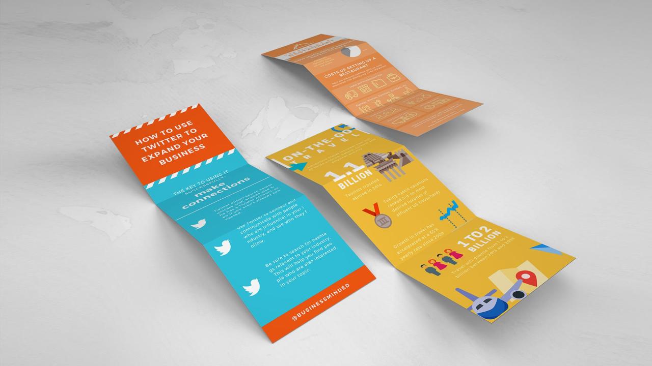
Source: canva.com
So, there you have it! Creating a compelling infographic isn’t as intimidating as it might seem. By following these steps, focusing on clear communication, and choosing the right tools, you can transform data into a visually stunning and informative piece. Remember, practice makes perfect. The more infographics you create, the more confident and creative you’ll become. Now go forth and visualize!
Answers to Common Questions
What file formats should I save my infographic in?
Save your infographic in high-resolution formats like PNG or JPG for web use and PDF for print. Consider SVG for scalability if you need to resize without losing quality.
How can I ensure my infographic is accessible to everyone?
Use sufficient color contrast, clear and concise fonts, and alt text for images to make your infographic accessible to people with visual impairments.
Where can I find free, high-quality images and icons?
Explore websites like Unsplash, Pexels, and Pixabay for royalty-free images and icons. Always check the license before using them.
How long should it take to create an infographic?
The time it takes varies greatly depending on complexity. Simple infographics might take a few hours, while more complex ones could take several days or even weeks.
