How to Create Moodboards A Step-by-Step Guide
How to create moodboards? It’s more than just pinning pretty pictures; it’s about crafting a visual narrative that breathes life into your ideas. Think of it as a secret weapon for designers, artists, and anyone who wants to bring their vision to life. This guide will walk you through the entire process, from initial brainstorming to the final polished product, revealing the secrets to creating mood boards that truly resonate.
We’ll explore different types of mood boards – digital and physical – discovering the best tools and techniques for each. You’ll learn how to gather inspiration, arrange your elements like a pro, and even incorporate text and other details to elevate your mood board to the next level. Get ready to unleash your inner creative genius!
Defining Mood Boards
Mood boards are visual representations of ideas and concepts, acting as a crucial tool for designers and creatives across various fields. They serve as a central point of reference, guiding the creative process and ensuring consistency in the overall aesthetic and feel of a project. Think of them as a visual brainstorming session, captured and refined for future reference and collaboration.Mood boards help to clarify a design direction early on, preventing costly mistakes and wasted time later in the process.
By collating images, textures, colors, and even text samples, they create a tangible expression of the desired atmosphere, style, and overall message. This visual cohesion is invaluable in ensuring that all aspects of a project – from color palettes to typography – work harmoniously together.
Types of Mood Boards
The method of creating a mood board can vary widely depending on personal preference and the project’s requirements. Digital and physical mood boards both offer unique advantages.Digital mood boards, created using software like Pinterest, Canva, or even simple image editing programs, offer flexibility and ease of sharing. Collaborators can easily access and contribute to a digital mood board, making it ideal for team projects.
The ability to quickly rearrange and refine elements also contributes to its efficiency. For instance, a digital mood board for a website redesign might incorporate screenshots of competitor sites, color swatches, and examples of desired typography.Physical mood boards, on the other hand, provide a tactile experience that can be particularly beneficial for brainstorming and initial ideation. They can be created using corkboards, poster boards, or even scrapbooks, allowing for a more hands-on approach to gathering and arranging materials.
A physical mood board for an interior design project might include fabric swatches, paint chips, magazine clippings, and even small physical objects that represent the desired style and ambiance.
Key Elements of Effective Mood Boards
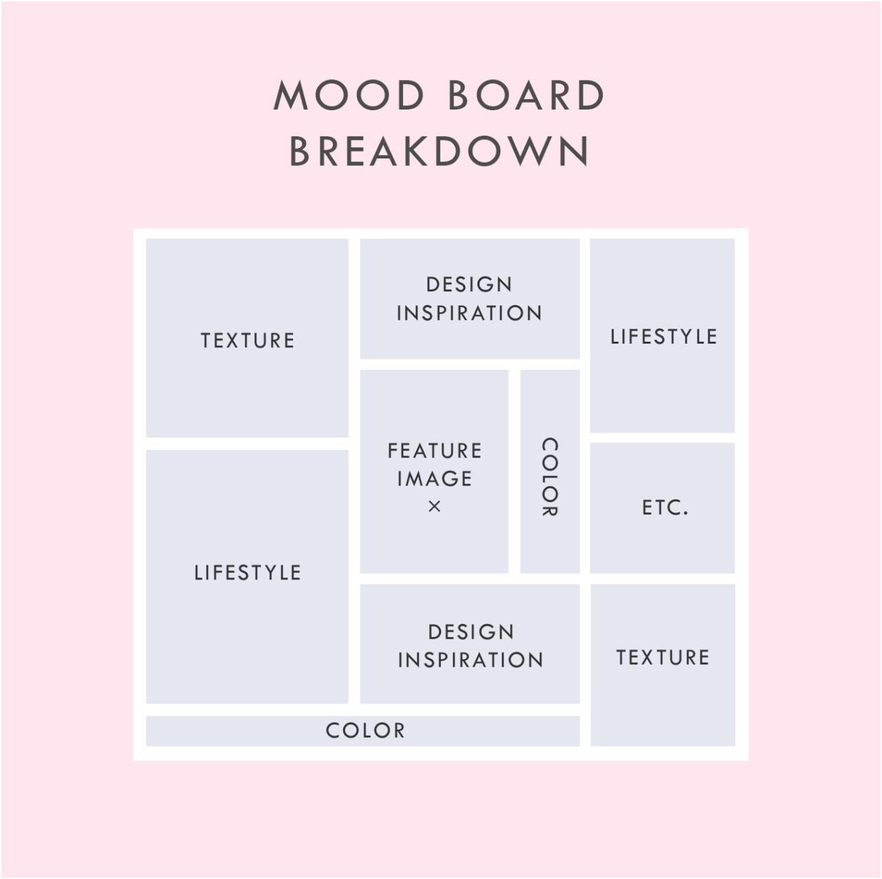
Several key elements contribute to the effectiveness of a mood board. A well-crafted mood board is more than just a collection of pretty pictures; it tells a story and conveys a clear message.A cohesive theme is paramount. The images, colors, and textures should work together to create a unified visual narrative. Without a clear theme, the mood board becomes disjointed and fails to effectively communicate its purpose.
For example, a mood board for a calming spa should feature soft colors, natural textures, and images evoking tranquility, while a mood board for a high-energy sports brand would employ vibrant colors, dynamic imagery, and perhaps even textured materials that suggest movement.Careful selection of imagery is also critical. Images should be high-quality and visually appealing, directly reflecting the desired mood and style.
The use of diverse imagery – from photographs and illustrations to textures and patterns – can add depth and complexity to the mood board, making it more engaging and informative. Avoid including irrelevant or distracting elements; each element should contribute to the overall message.Finally, effective mood boards often include textual elements. s, quotes, or even short descriptions can further clarify the intended mood and concept.
These textual elements act as anchors, reinforcing the visual message and adding another layer of meaning to the board.
Gathering Inspiration
Source: pinimg.com
Creating a compelling mood board starts with a rich wellspring of inspiration. This isn’t about randomly collecting pretty pictures; it’s about actively seeking out visual elements that resonate with your core theme and evoke the desired mood. The process involves brainstorming, strategic sourcing, and thoughtful organization.The initial phase focuses on defining the project’s essence. What feeling, concept, or story are you trying to convey?
Think beyond s; explore the underlying emotions and associations. For example, if your mood board is for a new cafe, consider not just “coffee,” but the feelings associated with it: warmth, comfort, community, perhaps a touch of sophistication or rustic charm. This deeper understanding guides your search for relevant visuals.
Brainstorming and Identifying Core Themes
Effective brainstorming techniques can unlock a wealth of ideas. Mind mapping, where you visually branch out from a central theme, can be particularly helpful. Start with your core concept and let your thoughts flow freely, noting down words, phrases, and even initial image ideas. Another useful approach is research. Think about words that describe the mood, style, or subject matter and use them as search terms in online image databases.
This will expose you to a wide variety of visual interpretations of your theme. For instance, if your theme is “modern minimalist living,” your s could include “clean lines,” “neutral palettes,” “geometric patterns,” “natural materials,” and “uncluttered spaces.” These s will lead you to a diverse range of visual examples.
Collecting Images, Textures, and Color Palettes
Once you have a clearer idea of your core themes, it’s time to actively collect visual materials. The internet is an invaluable resource. Websites like Pinterest, Behance, Dribbble, and Instagram are brimming with inspiring imagery. Consider also magazines, books, and even your own personal photographs. Don’t limit yourself to just images; textures are crucial for adding depth and tactile qualities.
You can find texture images online, or even create your own by scanning fabric swatches, wood grains, or other textured surfaces. Similarly, paying attention to color palettes is essential. Note down specific color combinations you encounter in your research, using color palette generators or noting down hex codes to ensure accuracy when recreating them. For a mood board about “tropical getaway,” you might collect images of lush greenery, turquoise water, sandy beaches, vibrant flowers, and perhaps some images depicting relaxed individuals enjoying the scenery.
You could also include textures of woven fabrics, smooth wood, and rough sand. The color palette might focus on various shades of turquoise, sandy beige, sunny yellow, and deep greens.
Organizing Collected Materials
With a collection of images, textures, and color palettes, organization becomes key. Creating digital folders for each category (images, textures, colors) is a simple yet effective method. Within these folders, you can further sub-categorize by theme or visual element. For example, within the “images” folder, you could create subfolders for “architecture,” “nature,” “people,” and “objects.” This systematic approach ensures that you can easily locate specific elements when building your mood board.
Alternatively, a physical mood board might involve pinning images and swatches onto a corkboard, arranging them by theme or color. The key is to find an organizational system that works best for your workflow and allows for easy access to your collected materials.
Choosing Your Medium
So, you’ve gathered your inspiration and defined the mood you’re aiming for. Now comes the fun part: deciding how you’ll bring your vision to life! The choice between a digital or physical mood board significantly impacts the process and the final result. Each method offers unique advantages and disadvantages, so let’s weigh them up.The decision to create a digital or physical mood board depends heavily on your personal preferences, the project’s scope, and the tools available to you.
Both methods have their own strengths and weaknesses, and understanding these will help you choose the best approach for your needs.
Digital Mood Boards: Advantages and Disadvantages
Digital mood boards offer flexibility and ease of editing. You can easily rearrange elements, experiment with different layouts, and share your work instantly with collaborators. Software allows for precise control and organization, making it ideal for large or complex projects. However, the reliance on technology introduces potential drawbacks. A software crash could result in lost work, and the digital format might lack the tactile and immediate satisfaction of a physical board.
Furthermore, the screen’s display can sometimes misrepresent colours accurately.
Digital Mood Board Tools and Software
Several excellent tools are available for creating digital mood boards. Popular choices include Pinterest, which allows for quick and easy collection of images and links; Adobe Photoshop or Illustrator, offering sophisticated image manipulation and design capabilities; Canva, a user-friendly platform ideal for beginners; and Miro, a collaborative online whiteboard perfect for teamwork. The best choice depends on your technical skills and the level of customization required.
For instance, Canva’s drag-and-drop interface is perfect for someone new to digital design, while Photoshop offers much greater control over individual elements for experienced users. Consider the specific features offered by each platform— some might integrate directly with stock photo websites, others offer advanced typography options, etc.
Physical Mood Boards: Advantages and Disadvantages
Physical mood boards offer a tangible and immediate experience. The act of physically arranging images and materials can be a very intuitive and creative process, fostering a deeper connection with the project. They also avoid the potential issues of software crashes or display inaccuracies. However, physical boards are less flexible than digital ones; rearranging elements can be time-consuming, and sharing them with others requires physical transport or high-quality digital photography.
Physical boards can also be bulky and difficult to store, especially if large.
Physical Mood Board Materials and Techniques
Creating a physical mood board involves gathering a variety of materials. This could include magazine clippings, fabric swatches, paint chips, photographs, sketches, and even natural elements like leaves or stones. A large corkboard, foam board, or even a wall can serve as your base. You can use pushpins, glue, tape, or even sewing techniques to secure your chosen elements.
The arrangement is entirely up to you; you can create a structured grid or a more free-flowing, organic composition. Consider the overall aesthetic you’re trying to achieve – a clean and minimalist design might call for a carefully curated selection of elements, while a more eclectic style could incorporate a wider range of materials and textures. The possibilities are endless!
Incorporating Text and Other Elements: How To Create Moodboards

Source: nngroup.com
Mood boards aren’t just about pretty pictures; they’re about communicating a complete visual narrative. To achieve this, incorporating text and other elements is crucial. These additions provide context, emphasize key ideas, and add layers of meaning to your overall design concept. Think of it as adding the finishing touches to a painting – the details that elevate it from good to great.Adding text and other elements elevates a simple collection of images into a powerful communication tool.
Strategic use of typography, physical samples, and annotations helps clarify your vision and makes the mood board more effective for conveying your ideas.
Typography and Text Elements
Typography plays a vital role in setting the tone and hierarchy of your mood board. Consider the fonts you use carefully. A playful script might suit a whimsical design, while a bold sans-serif font could convey modernity and sophistication. Don’t overcrowd your board with text; instead, use short, impactful phrases, s, or even single words to highlight key themes or feelings.
For instance, if your mood board is for a new coffee shop, you might use a handwritten font for the words “Cozy,” “Community,” and “Aroma,” placed strategically near images of comfortable seating, people chatting, and steaming coffee cups. Alternatively, for a corporate branding mood board, clean, modern sans-serif fonts paired with concise statements like “Professional,” “Innovative,” and “Trustworthy” would be more appropriate.
The font choice should directly reflect the overall aesthetic you’re aiming for.
Incorporating Swatches, Samples, and Physical Materials
Adding physical elements gives your mood board a tactile and more engaging quality. Imagine including fabric swatches for texture, paint chips for color palettes, or even small samples of materials like wood or stone to showcase the desired aesthetic. For example, a mood board for a new line of clothing could include actual fabric swatches in various textures and colors, alongside images of runway models and relevant inspirational imagery.
Similarly, a mood board for interior design could incorporate small tiles, wood samples, and wallpaper swatches to give a more realistic representation of the final product. This adds a three-dimensional element that can’t be replicated digitally. Remember to arrange these physical samples thoughtfully, ensuring they complement, rather than clutter, the overall visual composition.
Annotations and Descriptions
Annotations and descriptions provide valuable context and deeper meaning to your mood board. They allow you to explain your choices, highlight key inspirations, and elaborate on specific details. For instance, you might annotate an image of a particular building with notes about its architectural style or the specific colors used in its facade. Similarly, you could add short descriptions next to images explaining why they resonate with your overall concept.
Keep annotations concise and focused. Use them to tell a story and highlight the “why” behind your selections. This helps to solidify your vision and ensure that others understand your design intentions clearly.
Refining and Finalizing Your Mood Board
Creating a mood board is an iterative process. The initial collage is just the beginning; the real magic happens when you refine and finalize your vision, ensuring it effectively communicates your intended message. This stage is crucial for transforming a collection of images into a cohesive and impactful visual statement.
Refining your mood board involves critically evaluating its composition, color harmony, and overall visual impact. This isn’t just about making things look pretty; it’s about ensuring the board effectively conveys the intended mood, theme, or concept. Think of it as editing a photograph – you need to fine-tune elements to achieve the best possible result.
So you’re diving into mood board creation? It’s all about visual storytelling, right? To really nail your aesthetic, think about your target audience – understanding that is key, just like learning how to optimize your videos as explained in this great guide on getting it on with youtube. Once you’ve defined your audience, you can confidently gather images and textures that resonate, building a mood board that truly speaks to them.
Evaluating Composition and Visual Impact
Effective composition is key to a compelling mood board. Consider the arrangement of your elements. Are they balanced? Does your eye naturally flow across the board, taking in all the important details? Experiment with different layouts – try grouping similar elements together, creating visual pathways, or using whitespace strategically to draw attention to key pieces.
A cluttered mood board can be overwhelming, while a poorly arranged one may fail to convey its message. For instance, if you’re designing a mood board for a calming spa, a chaotic arrangement would contradict the intended feeling. A balanced arrangement, with soft colors and a deliberate flow, would be much more effective.
Adjusting Color Palettes and Visual Elements
Harmonizing your color palette is vital for creating a unified mood. If your chosen images have clashing colors, you might need to adjust them digitally. You can desaturate overly bright colors, subtly alter hues to create a more cohesive feel, or even create a custom color palette using a tool like Adobe Color or Coolors.co and then adjust the images to better fit the selected palette.
Similarly, if some elements visually dominate others, consider resizing or repositioning them to achieve a better balance. For example, if a large, vibrant image overwhelms the rest of your board, try scaling it down or using a less saturated version.
Mood Board Review Checklist
Before presenting your mood board, take a moment to review it using this checklist:
A final review ensures your mood board is polished and ready for its intended purpose. This is your last chance to catch any inconsistencies or areas needing improvement.
- Cohesion: Does the overall mood and style feel consistent across all elements?
- Balance: Is the arrangement balanced, avoiding visual clutter or emptiness?
- Clarity: Does the board clearly communicate the intended message or theme?
- Color Harmony: Are the colors harmonious and consistent with the intended mood?
- Visual Hierarchy: Are the most important elements appropriately emphasized?
- Technical Quality: Are the images clear, sharp, and of consistent quality?
- Overall Impact: Does the board create the desired emotional response?
Mood Board Examples and Styles
Mood boards are incredibly versatile tools, used across various creative fields to visualize concepts and communicate ideas effectively. Their appearance and content vary wildly depending on the project’s needs and the designer’s aesthetic preferences. Let’s explore some examples and styles to illustrate their diverse applications.
The visual style of a mood board can dramatically influence its impact. A minimalist mood board might utilize a limited color palette and a clean layout, conveying a sense of sophistication and restraint. Conversely, a maximalist mood board might be bursting with color, texture, and diverse elements, reflecting a more energetic and eclectic approach. The choice of style is inherently linked to the project’s overall aesthetic and the message the designer wishes to communicate.
Fashion Mood Boards, How to create moodboards
Fashion mood boards typically showcase fabrics, colors, textures, and silhouettes to represent a particular collection or design concept. Imagine a mood board for a Spring/Summer collection featuring lightweight linen fabrics in pastel shades of lavender, mint green, and blush pink. Images of flowing dresses, delicate jewelry, and blooming flowers might be incorporated, alongside swatches of the chosen fabrics and inspirational imagery from nature, like sun-drenched landscapes or botanical illustrations.
The overall feeling would be airy, romantic, and fresh, perfectly encapsulating the essence of the collection.
Interior Design Mood Boards
Interior design mood boards often incorporate a wider range of elements, including paint swatches, fabric samples, images of furniture, flooring options, and even architectural details. A mood board for a modern minimalist living space might feature images of sleek, contemporary furniture, clean lines, neutral color palettes (think greys, whites, and natural wood tones), and textural elements like concrete or exposed brick.
The overall effect would be one of calm, understated elegance. Conversely, a mood board for a bohemian-style bedroom might include vibrant textiles, eclectic patterns, natural materials, and images evoking a sense of warmth and comfort.
Graphic Design Mood Boards
Graphic designers use mood boards to establish a visual direction for branding projects, websites, or marketing campaigns. For a tech startup, a mood board might feature images of futuristic technology, clean geometric shapes, bold typography, and a limited color palette of blues, grays, and whites. This would convey a sense of innovation, professionalism, and reliability. In contrast, a mood board for a children’s book might incorporate bright, playful colors, whimsical illustrations, and hand-drawn elements to communicate a feeling of fun, creativity, and imagination.
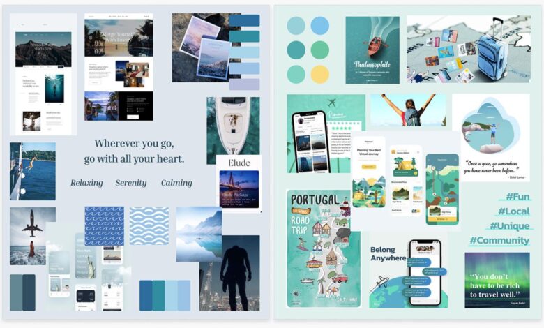
A Color Palette Mood Board: Serenity Now
This mood board focuses on a calming palette of blues, greens, and creams. We’ll imagine it as a collection of images and textures. First, several shades of blue – a deep navy, a soft sky blue, and a teal – are represented through paint swatches or fabric samples. These are complemented by images of a tranquil ocean scene, a lush green forest, and a field of wildflowers.
Cream-colored elements, like a knitted blanket or a textured wall, add a sense of warmth and softness. The emotional impact of this palette is one of peace, tranquility, and rejuvenation. The blues evoke a sense of calm and stability, while the greens represent growth and renewal. The creams add a touch of comfort and familiarity, creating an overall feeling of serenity and escape.
The absence of jarring or overly bright colors reinforces this sense of quietude.
Using Mood Boards Effectively
Mood boards are more than just pretty pictures; they’re powerful tools that can significantly impact the success of any creative project. Used effectively, they act as a central hub for communication, guiding design choices and ensuring everyone remains on the same page, from initial concept to final product. This section explores how to leverage the full potential of your mood board throughout the project lifecycle.
A well-constructed mood board serves as a visual shorthand, conveying complex ideas and intentions concisely. This is particularly valuable when collaborating with clients or team members who may not share the same design vocabulary. It provides a shared understanding of the project’s aesthetic direction, tone, and overall feeling, fostering smoother communication and reducing the likelihood of misunderstandings.
Mood Boards as Communication Tools
Using a mood board to communicate with clients or collaborators streamlines the design process. It allows for a visual dialogue, replacing lengthy explanations with a clear, easily digestible representation of your vision. Presenting a mood board early in the process enables clients to actively participate in shaping the project’s direction, fostering buy-in and reducing the risk of costly revisions later.
For example, a client reviewing a mood board for a new website might immediately identify a color palette they dislike or a style element that doesn’t align with their brand identity. This immediate feedback allows for adjustments early on, saving time and resources. Regular updates of the mood board throughout the project further maintain this crucial visual dialogue.
Guiding Design Decisions
A mood board acts as a constant reference point throughout the project, ensuring design decisions remain consistent with the initial vision. Each element—color, texture, typography, imagery—serves as a guide, preventing design drift and maintaining a cohesive aesthetic. For instance, a graphic designer working on a branding project can refer to their mood board to select fonts, colors, and imagery that resonate with the established mood and style.
Similarly, a website developer can use the mood board to guide the selection of website elements, such as background images, button styles, and overall layout. The mood board helps keep the project on track, avoiding inconsistencies and ensuring a unified final product.
Maintaining and Updating Mood Boards
A mood board isn’t a static document; it’s a living, breathing representation of the project’s evolution. As the project progresses, new ideas emerge, and refinements are made. Therefore, regularly updating the mood board is crucial. This might involve adding new images or text, refining the color palette, or adjusting the overall layout. A simple and effective method is to use a digital mood board, allowing for easy additions and edits.
Version control can be implemented to track changes and revert to previous iterations if necessary. This ensures the mood board remains a relevant and accurate reflection of the project at each stage, facilitating ongoing communication and decision-making. For instance, if new research reveals a trending color scheme that better fits the project, the mood board can be quickly updated to reflect this change, ensuring the design remains current and relevant.
Final Summary
Creating a mood board is a journey of visual storytelling, a process that allows you to externalize your ideas and communicate them effectively. Whether you’re a seasoned designer or a complete beginner, mastering the art of mood board creation can significantly enhance your creative process and project outcomes. So go forth, gather your inspiration, and create mood boards that not only reflect your vision but also inspire those around you.
Happy creating!
Key Questions Answered
What’s the difference between a digital and physical mood board?
Digital mood boards are created using software and offer easy editing and sharing. Physical mood boards use tangible materials and offer a more tactile and hands-on experience.
How long does it take to create a mood board?
The time varies depending on complexity, but a simple mood board can be created in a few hours, while more complex ones might take a day or more.
Can I use a mood board for personal projects?
Absolutely! Mood boards are a fantastic tool for any project, big or small, personal or professional, helping to organize your thoughts and visualize your goals.
Where can I find inspiration for my mood board?
Everywhere! Explore Pinterest, Instagram, magazines, nature, museums, and even your own personal collections for inspiration.