How to Create PowerPoint Presentations Pitching as an Art
How to create the powerpoint presentation pitching as an art? It’s more than just slapping together slides; it’s about crafting a compelling narrative that resonates with your audience. Think of it as storytelling, but with bullet points and visuals. This post dives deep into transforming your presentations from mundane to mesmerizing, exploring everything from color psychology to mastering the art of concise communication.
We’ll unpack the secrets to designing presentations that not only inform but also inspire action. From understanding the psychology of color and typography to structuring your content for maximum impact, we’ll cover it all. Get ready to elevate your presentations from good to unforgettable!
Understanding the Art of Persuasive Presentation Design
PowerPoint presentations, when done well, are more than just a slideshow; they’re a powerful tool for communication and persuasion. Mastering the art of persuasive presentation design involves understanding visual communication principles, crafting a compelling narrative, and tailoring your style to your audience. This goes beyond simply listing bullet points; it’s about creating a memorable and impactful experience.
Key Principles of Visual Communication in PowerPoint Presentations
Effective visual communication hinges on clarity, consistency, and visual appeal. Avoid overwhelming your audience with too much text. Instead, prioritize concise bullet points, impactful imagery, and a clear visual hierarchy. Use a consistent font, color palette, and design style throughout the presentation to maintain a professional and cohesive look. Whitespace is crucial; don’t overcrowd slides.
Think of each slide as a single, focused message, contributing to the overall narrative. High-quality images and graphics are essential; they add visual interest and help illustrate your points effectively. Consider using charts and graphs to present data in a clear and easily digestible format.
Creating a Narrative Arc that Engages the Audience
A compelling presentation follows a clear narrative arc, much like a good story. It begins with a captivating introduction that grabs the audience’s attention and establishes the central theme. The body of the presentation develops the theme, building momentum and providing evidence to support your claims. This requires a logical flow, transitioning smoothly between points. Use storytelling techniques to connect with your audience on an emotional level; relatable anecdotes and examples make your message more memorable and impactful.
Finally, a strong conclusion summarizes your key points and leaves a lasting impression. Think of the overall structure as a journey, guiding your audience from point A to point B in a clear and engaging way.
Examples of Presentations that Effectively Utilize Visual Storytelling, How to create the powerpoint presentation pitching as an art
While specific examples require access to copyrighted material, we can consider hypothetical scenarios. Imagine a presentation on climate change: instead of just presenting statistics, the presentation might start with a powerful image of a melting glacier, then progress to charts illustrating rising sea levels, interspersed with photos of affected communities. The narrative would build from the visual impact to the statistical evidence, culminating in a call to action.
Similarly, a presentation on a new product could begin with a problem statement illustrated with a relatable scenario, followed by a visual demonstration of the product solving the problem, and ending with testimonials and customer success stories. The key is to use visuals to tell a story, not just to display information.
Comparison of Presentation Styles and Audience Suitability
The choice of presentation style significantly impacts audience engagement. Different styles cater to different needs and preferences.
Mastering the art of a killer PowerPoint pitch involves more than just bullet points; it’s about storytelling. Think of your presentation as a mini-movie, building suspense and excitement. To really nail that visual impact, check out this awesome resource on maximizing your video presence, getting it on with youtube , as understanding video engagement can help you translate that energy into your slides.
Then, bring those video techniques back to your presentation design, creating a truly memorable pitch.
| Style | Audience | Strengths | Weaknesses |
|---|---|---|---|
| Traditional Bullet Point | Formal, Academic | Clear, Concise, Easy to Follow | Can be Monotonous, Less Engaging |
| Visual Storytelling | General Audience, Less Technical | Memorable, Engaging, Emotionally Connecting | Requires Strong Visuals, More Time-Consuming to Create |
| Data-Driven | Analytical, Business Professionals | Provides Concrete Evidence, Supports Claims with Data | Can be Overwhelming if Not Presented Clearly |
| Interactive | Engaged, Participatory Audiences | Increases Audience Involvement, Enhances Understanding | Requires Technical Proficiency, May Not Be Suitable for All Audiences |
Mastering Visual Elements
PowerPoint presentations aren’t just about the words; they’re about the overall visual experience. Mastering the visual elements – color, typography, and imagery – is crucial for creating a presentation that not only conveys your message but also captivates your audience and leaves a lasting impression. A well-designed presentation speaks volumes before you even utter a word.
Color Psychology and Audience Perception
Color choices are far from arbitrary; they evoke specific emotions and associations. Understanding color psychology allows you to subtly influence your audience’s perception of your message. For example, blues often convey trust and stability, making them ideal for corporate presentations or those focused on financial data. Greens represent growth and nature, suitable for presentations on sustainability or environmental issues.
Reds, on the other hand, can evoke urgency or excitement, but overuse can be overwhelming. Consider your presentation’s theme and desired emotional response when selecting your color palette. A consistent and thoughtfully chosen color scheme enhances professionalism and visual harmony. Remember to also consider accessibility, choosing colors with sufficient contrast for readability.
Typography and Font Selection for Readability and Visual Appeal
Typography plays a pivotal role in presentation readability and overall aesthetic appeal. Choosing the right fonts is essential for ensuring your message is easily digestible and visually pleasing. Stick to a maximum of two fonts – one for headings and another for body text – to maintain consistency. Serif fonts (like Times New Roman or Garamond) are often preferred for body text due to their readability, while sans-serif fonts (like Arial or Helvetica) are generally better suited for headings because of their cleaner, more modern look.
Font size should be large enough to be easily read from a distance, and sufficient spacing between lines (leading) and characters (kerning) improves readability. Avoid overly decorative or unusual fonts that can hinder comprehension.
Image Selection and Usage for High Impact
High-quality images are invaluable in enhancing the visual appeal and memorability of your presentation. They should be relevant to your message, high-resolution, and professionally presented. Avoid using blurry, pixelated, or low-resolution images; they detract from your presentation’s credibility.
- Image 1: A Diverse Team Collaborating This image should depict a group of people from various backgrounds working together on a project, showcasing teamwork and collaboration. The emotional impact is one of unity, inclusivity, and shared success. The viewer feels inspired by the collective effort and positive energy.
- Image 2: A Graph Showing Positive Growth This image could be a visually appealing bar chart or line graph demonstrating upward trending data. The emotional impact is one of optimism, progress, and achievement. The viewer feels encouraged by the demonstrated success and positive trajectory.
- Image 3: A Close-up of a Person’s Focused Expression This image should show someone deeply engaged in their work, conveying concentration and dedication. The emotional impact is one of seriousness, professionalism, and commitment. The viewer feels inspired by the individual’s dedication and feels a sense of trust in the presented information.
Common Typography Mistakes to Avoid
Choosing the right typography is key to creating a professional and engaging presentation. Here are five common mistakes to avoid:
- Using too many different fonts.
- Choosing illegible fonts.
- Using insufficient font size.
- Ignoring proper kerning and leading.
- Overusing all-caps text.
Crafting Compelling Content and Structure

Source: slidesharecdn.com
Creating a PowerPoint presentation that truly captivates your audience goes beyond just pretty visuals; it demands a well-structured narrative that keeps them engaged from start to finish. A strong presentation structure ensures clarity, reinforces your message, and ultimately, persuades your audience. This section focuses on building that compelling narrative through effective content and structure.
Structuring a Presentation for Maximum Impact
The structure of your presentation is crucial for delivering a clear and impactful message. Think of it as telling a story with a beginning, middle, and end. A common and effective structure involves starting with a compelling introduction that grabs the audience’s attention and clearly states your main point. The body should then logically develop your argument, presenting supporting evidence and addressing potential counterarguments.
Finally, a strong conclusion summarizes your key points and leaves a lasting impression. Consider using a narrative arc, building suspense and anticipation to maintain audience engagement throughout. For instance, you might start with a problem, present your solution, and then showcase the benefits. This clear progression helps your audience follow along and understand your message.
Delivering a Powerful Presentation
The design of your PowerPoint slides is only half the battle. A truly compelling presentation hinges on your ability to connect with your audience on a human level, transforming a static slideshow into a dynamic, engaging experience. Mastering stage presence isn’t about innate charisma; it’s a skill honed through practice and a conscious understanding of effective communication techniques.
Techniques for Maintaining Audience Engagement
Maintaining audience engagement requires a multi-pronged approach. It’s about creating a dynamic interaction, not just delivering a monologue. Start by captivating your audience from the very beginning; a strong opening anecdote, a thought-provoking question, or a visually stunning image can instantly grab attention. Throughout your presentation, vary your pace and tone to keep things interesting. Incorporate pauses for emphasis, use humor appropriately, and don’t be afraid to tell a relevant personal story to build rapport.
Encourage audience participation through polls, Q&A sessions, or interactive exercises. Remember, a presentation is a conversation, not a lecture.
The Importance of Body Language, Vocal Delivery, and Eye Contact
Your body language speaks volumes. Stand tall with good posture, use deliberate hand gestures to emphasize points, and move naturally across the stage. Avoid fidgeting or pacing nervously; these habits distract from your message. Vocal delivery is equally crucial. Vary your intonation to avoid a monotonous drone, project your voice clearly to reach everyone in the room, and speak at a pace that’s easy to follow.
Maintain consistent eye contact with different members of the audience; this creates a personal connection and shows you’re engaged with them. Avoid reading directly from your slides; instead, use them as visual aids to support your spoken words.
Strategies for Handling Questions and Objections
Handling questions and objections professionally is a hallmark of a confident presenter. First, listen attentively to the question before responding. If you don’t know the answer, admit it honestly and offer to find out the information later. If faced with an objection, acknowledge the validity of the concern and address it directly, providing evidence or data to counter the point.
Maintain a calm and respectful demeanor, even when facing challenging questions. Remember, handling objections effectively can strengthen your credibility and demonstrate your expertise.
Common Presentation Pitfalls and Solutions
Effective presentation delivery requires avoiding common pitfalls that can derail your message.
- Pitfall: Reading directly from slides. Solution: Use the slides as visual aids, focusing on delivering your message conversationally.
- Pitfall: Lack of eye contact. Solution: Consciously make eye contact with different audience members throughout your presentation.
- Pitfall: Monotonous delivery. Solution: Vary your pace, tone, and volume to maintain audience engagement.
- Pitfall: Ignoring audience questions or objections. Solution: Actively solicit questions and address them thoughtfully and respectfully.
- Pitfall: Going over the allotted time. Solution: Practice your presentation beforehand to ensure you stay within the time constraints. Develop a concise and focused message.
Using PowerPoint Effectively: How To Create The Powerpoint Presentation Pitching As An Art
Source: pikbest.com
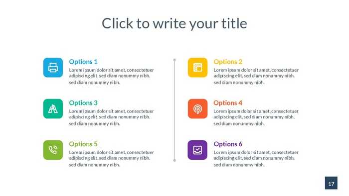
PowerPoint, while seemingly simple, offers a wealth of tools beyond basic bullet points and text. Mastering these advanced features can transform your presentation from mundane to memorable, provided they’re used judiciously. Overusing flashy effects can be distracting, while strategic implementation enhances engagement and understanding. The key is thoughtful integration, always prioritizing clarity and impact over mere visual spectacle.
Animations and Transitions
Animations and transitions, when used sparingly and purposefully, can guide the audience’s eye and emphasize key information. For example, a subtle fade-in effect for a data point on a chart can draw attention to a significant increase or decrease. Conversely, a jarring, rapid transition between slides can disrupt the flow and confuse the audience. Consider using animations to reveal bullet points sequentially, allowing your audience to process each point before moving on, rather than bombarding them with all information at once.
Overuse of elaborate animations, such as flying text or spinning objects, should be avoided as they quickly become distracting and detract from the core message. A simple, consistent transition style (like a subtle fade) is often the most effective.
Multimedia Integration
Integrating multimedia elements like videos, audio clips, and images can greatly enhance a presentation’s impact. A short video demonstrating a product or service is far more engaging than a lengthy verbal description. Similarly, incorporating relevant audio clips can add emotional depth or provide context. However, remember that multimedia should complement, not replace, your core message. Ensure all multimedia is high-quality, relevant, and seamlessly integrated into the presentation’s flow.
Avoid lengthy videos or low-resolution images, as these can detract from the overall experience. Always test multimedia beforehand to ensure it plays correctly and doesn’t cause technical issues during the presentation.
Maintaining Brand Identity
Consistency in branding is crucial for creating a professional and memorable presentation. Use the same fonts, colors, and logo throughout your slides to establish a cohesive visual identity. This reinforces your brand’s image and helps create a sense of professionalism. Maintaining a consistent color palette, for example, ensures a visually pleasing presentation and improves readability. Choose fonts that are both legible and reflect your brand’s personality.
Using your company logo consistently on each slide strengthens brand recognition and reinforces your professional image.
Creating Effective Charts and Graphs
PowerPoint offers various chart and graph options to present data clearly and concisely. Choose the chart type that best represents your data; a bar chart is ideal for comparing categories, while a line chart shows trends over time. Keep charts simple and easy to understand; avoid cluttering them with excessive data or overly complex designs. Use clear labels and legends, and ensure that the visual representation accurately reflects the data.
For instance, a pie chart effectively shows proportions of a whole, while a scatter plot helps identify correlations between variables. Always ensure that the data is accurately represented and easy to interpret.
Sample PowerPoint Slide Design
Consider a slide with a large, high-quality image occupying approximately two-thirds of the space. The image should be relevant to the presentation’s topic and visually striking, yet not distracting. The remaining one-third of the slide would contain a concise, impactful headline in a large, easily readable font. Below the headline, a brief, bullet-pointed summary of key takeaways, using a smaller but still legible font.
The use of ample whitespace allows the information to breathe and prevents visual clutter. This design utilizes the principle of visual hierarchy, guiding the audience’s eye first to the image, then the headline, and finally to the bullet points. The clean layout emphasizes readability and visual appeal. The color palette would consist of the brand’s primary color for the headline, a neutral background color, and the image’s inherent colors, creating a visually harmonious and professional slide.
Final Wrap-Up
Mastering the art of PowerPoint presentation pitching isn’t about mastering software; it’s about mastering communication. By understanding the principles of visual storytelling, leveraging the power of design, and honing your delivery, you can transform your presentations into persuasive masterpieces. Remember, a great presentation isn’t just about the slides; it’s about the connection you forge with your audience. So go forth, create, and captivate!
Essential Questionnaire
What’s the best software besides PowerPoint for creating presentations?
Google Slides is a strong free alternative, offering excellent collaboration features. Keynote (Mac) provides a more visually focused experience.
How can I overcome stage fright when presenting?
Practice, practice, practice! Rehearse your presentation multiple times, ideally in front of a small audience for feedback. Deep breathing exercises can also help calm nerves before you begin.
How do I handle difficult questions from the audience?
Acknowledge the question, take a moment to formulate your response, and if you don’t know the answer, admit it honestly and offer to follow up later.
What are some free resources for high-quality images?
Unsplash and Pexels offer vast libraries of royalty-free images perfect for presentations.
