Best Fonts for Brochures A Designers Guide
Best fonts for brochures? It’s more than just picking pretty letters; it’s about crafting a visual experience that resonates with your audience and perfectly reflects your brand. The right font can make your brochure memorable, easily readable, and ultimately, effective. Choosing the wrong one? Well, let’s just say it could lead to a brochure that gets tossed in the recycling bin faster than you can say “kerning.” Let’s dive into the world of typography and discover how to make your brochures shine.
This post explores everything from serif vs. sans-serif fonts to understanding font pairings and creating a visual hierarchy that’s both aesthetically pleasing and highly readable. We’ll cover different font styles suited for various target audiences, ensuring your message connects with the right people. We’ll even touch on accessibility, making sure your brochure is inclusive and easy to read for everyone.
Introduction to Brochure Font Selection
Choosing the right fonts for your brochure is crucial; it’s more than just aesthetics. The fonts you select significantly impact how your message is received, influencing both readability and the overall perception of your brand. A well-chosen font can elevate your brochure from a simple information sheet to a compelling and memorable piece of marketing material, while a poor choice can hinder communication and damage your brand’s image.Font selection directly affects how easily readers can process the information presented.
Legibility is paramount; a difficult-to-read font will frustrate readers and lead to them skimming or abandoning your brochure altogether. Conversely, a clear and easily readable font enhances comprehension and encourages engagement. Beyond readability, fonts also contribute heavily to brand identity. Serif fonts, for instance, often convey a sense of tradition and sophistication, while sans-serif fonts can project a modern and minimalist feel.
The right font choice reinforces your brand’s personality and helps build a consistent visual identity across all your marketing materials.
Examples of Effective Font Choices in Brochures
Several successful brochures demonstrate the power of thoughtful font selection. Consider a high-end jewelry brochure. Imagine it using a classic serif font like Garamond for the main body text, creating an air of elegance and luxury. The headings might be set in a slightly bolder serif font, like Didot, for emphasis without disrupting the overall refined aesthetic. This combination effectively communicates the brand’s premium positioning.
In contrast, a brochure for a tech startup might utilize a clean, modern sans-serif font like Helvetica or Open Sans for both body and headings. This creates a sense of innovation and simplicity, aligning with the brand’s image. The consistent use of a single sans-serif font family across different sizes and weights maintains a unified and visually appealing look, emphasizing the company’s technological focus.
Another example would be a travel brochure showcasing adventurous destinations. A font like Montserrat, with its geometric shapes and clean lines, could create a feeling of excitement and modernity, reflecting the adventurous nature of the travel experiences. The contrast between a bold, slightly condensed font for headlines and a more relaxed, slightly wider font for body text provides visual interest without sacrificing readability.
These examples illustrate how careful font selection contributes to the overall success of a brochure by aligning the visual presentation with the brand’s message and target audience.
Classifying Brochure Fonts by Style
Source: behance.net
Choosing the right font for your brochure is crucial for conveying your brand’s message effectively. The visual impact of your font directly influences how readers perceive your product or service. Understanding different font categories and their characteristics helps you make informed decisions that enhance your brochure’s overall design.Selecting the appropriate font style depends heavily on the message and brand image you wish to project.
Different styles evoke different feelings and suit various purposes. A playful script might be perfect for a children’s toy brochure, while a bold sans-serif could be ideal for a tech company. This section will explore the main font categories and their applications in brochure design.
Serif Fonts
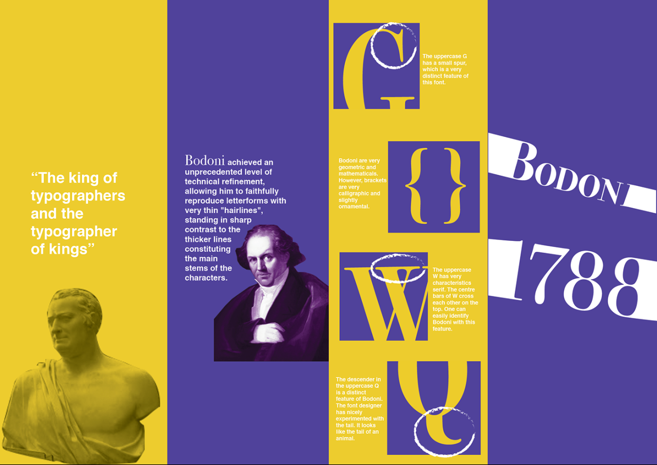
Serif fonts are characterized by small decorative strokes, or “serifs,” at the ends of their letterforms. These fonts often convey a sense of tradition, sophistication, and readability, making them suitable for brochures that aim for a classic or elegant feel. They are generally preferred for body text due to their improved readability, especially in longer passages.
| Font Name | Font Category | Example Use Case | Visual Description |
|---|---|---|---|
| Times New Roman | Serif | High-end fashion brochure, luxury travel brochure | Classic, elegant, and highly readable with its consistent serifs. Provides a timeless and sophisticated feel. |
| Garamond | Serif | Fine art brochure, historical society brochure | Similar to Times New Roman but with more delicate serifs, giving it a more refined and graceful appearance. |
| Georgia | Serif | Book brochure, literary magazine brochure | A highly legible serif font, optimized for screen readability, yet maintaining a traditional feel. |
Sans-serif Fonts
Sans-serif fonts lack the decorative strokes found in serif fonts. They are often perceived as modern, clean, and minimalist. Sans-serif fonts are highly versatile and work well for both headlines and body text, particularly in brochures targeting younger audiences or those focusing on contemporary designs.
| Font Name | Font Category | Example Use Case | Visual Description |
|---|---|---|---|
| Arial | Sans-serif | Corporate brochure, technology brochure | A clean, simple, and highly versatile font, often used for its neutrality and readability. |
| Helvetica | Sans-serif | Modern art brochure, minimalist design brochure | Known for its geometric precision and clean lines, conveying a sense of professionalism and sophistication. |
| Open Sans | Sans-serif | Website brochure, contemporary design brochure | A highly legible and versatile sans-serif font, designed for both print and web use, conveying a friendly and approachable feel. |
Script Fonts
Script fonts mimic handwriting, often featuring flowing, connected letterforms. They are best used sparingly in brochures, primarily for headlines or accents, as large blocks of script text can be difficult to read. Script fonts add a touch of elegance, personality, or a handwritten feel.
| Font Name | Font Category | Example Use Case | Visual Description |
|---|---|---|---|
| Edwardian Script ITC | Script | Wedding invitation brochure, boutique hotel brochure | Elegant and formal script font with a classic feel, ideal for conveying luxury and sophistication. |
| Great Vibes | Script | Cafe brochure, bakery brochure | Casual and friendly script font, conveying a relaxed and approachable atmosphere. |
Display Fonts
Display fonts are decorative and attention-grabbing fonts. They are typically used for headlines, titles, or short text segments rather than body copy. Their unique and often unconventional designs make them ideal for adding visual interest and emphasizing key information.
| Font Name | Font Category | Example Use Case | Visual Description |
|---|---|---|---|
| Impact | Display | Bold and attention-grabbing headlines in various brochures | A strong, high-contrast sans-serif font, perfect for making a statement. |
| Bebas Neue | Display | Modern and edgy headlines in brochures for tech companies or fashion brands | A condensed sans-serif font with a bold and geometric style, giving a modern and stylish look. |
Choosing Fonts Based on Target Audience
Selecting the right font for your brochure isn’t just about aesthetics; it’s about effectively communicating with your target audience. Different demographics respond to various font styles in unique ways, influencing how they perceive your brand and message. Understanding this connection is crucial for designing a brochure that resonates and achieves its intended purpose.
Font Choice and Demographic Response
Font styles evoke specific feelings and associations. For example, a playful script font might appeal to a younger audience, while a clean, modern sans-serif font could resonate more with professionals. Older demographics might prefer fonts with high readability, avoiding overly stylized or thin typefaces. Consider the visual literacy and preferences of your target audience when making your selection.
A serif font, like Times New Roman, often conveys a sense of tradition and authority, while a sans-serif font, like Arial, projects a modern and clean image. A handwritten or script font can add a personal touch, suitable for a boutique or artisan brand. The key is aligning the font’s personality with the message and the audience’s expectations.
Font Choice and Brand Identity
Your font choice significantly contributes to your overall brand identity. Consistency in font selection across all your marketing materials reinforces brand recognition and strengthens your brand image. A luxury brand might opt for an elegant serif font, while a tech startup might choose a minimalist sans-serif. The font should reflect your brand values and personality, conveying the message you want to communicate about your company or product.
For instance, a playful, hand-drawn font might be suitable for a children’s toy company, while a bold, geometric font could be perfect for a construction company. The font should complement your logo and overall design aesthetic, creating a cohesive and memorable brand experience.
Example Brochure Layouts for Different Audiences
Let’s illustrate this with three example brochure layouts targeting different demographics:
Brochure 1: Targeting Young Adults (18-25)
This brochure, advertising a new line of sustainable clothing, uses a bold, playful sans-serif font like Bebas Neue for headlines. The body text employs a more readable sans-serif like Open Sans. The overall design incorporates bright colors and dynamic imagery. The bold headlines grab attention, while the body text ensures readability. The color palette and imagery support the brand’s focus on sustainability and youthful energy.
Brochure 2: Targeting Professionals (30-50)
This brochure, showcasing financial investment services, uses a clean, modern serif font like Garamond for headlines and a legible sans-serif like Lato for the body text. The design is sophisticated and minimalist, using a neutral color palette and high-quality photography. The serif font adds a touch of sophistication and trustworthiness, while the sans-serif ensures readability of detailed financial information.
The overall design projects an image of professionalism and reliability.
Brochure 3: Targeting Seniors (65+)
This brochure, promoting a senior living community, uses a highly legible serif font like Georgia for both headlines and body text. The font size is larger than in the previous examples to enhance readability. The design is clean and uncluttered, using a calming color palette and simple imagery. The larger font size and clear, uncluttered layout cater to the visual needs of the target audience.
The serif font’s familiarity adds to its readability and creates a sense of comfort and tradition, suitable for a senior living environment.
Font Pairing for Brochures: Best Fonts For Brochures
Source: imagecube.com
Choosing the right fonts for your brochure is crucial for creating a visually appealing and effective design. But selecting a single font isn’t always enough; effective font pairing elevates your design to a professional level, enhancing readability and creating a cohesive brand identity. Mastering font pairing is about understanding how different typefaces complement each other, creating visual harmony, and guiding the reader’s eye through the information.Font pairing involves selecting two or more fonts that work well together, creating a balanced and visually appealing design.
The key is to select fonts with contrasting yet complementary characteristics. Too much similarity can lead to a monotonous design, while too much contrast can create visual chaos. The goal is to find a sweet spot that enhances the brochure’s message and brand personality. Consider factors like font weight, style (serif vs. sans-serif), and x-height (the height of lowercase letters) when pairing fonts.
Successful Font Pairings and Their Visual Impact
Several successful font pairing strategies exist, each offering a unique visual impact. A common approach involves pairing a serif font (with decorative flourishes on the letterforms) with a sans-serif font (clean and minimalist). This combination often works well because it offers a balance of formality and modernity. Conversely, pairing two sans-serif fonts with varying weights (light and bold) can create a modern and sophisticated look.
Experimenting with different combinations helps you find what best suits your brand and message.
Examples of Effective Font Pairings, Best fonts for brochures
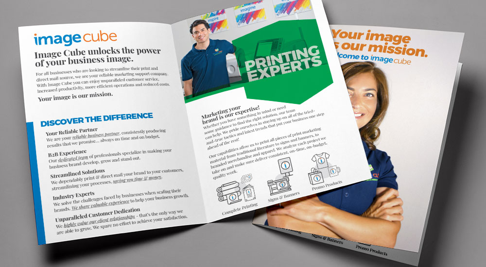
- Playfair Display (serif) and Open Sans (sans-serif): Playfair Display, with its elegant serifs, adds a touch of sophistication and classic appeal. Open Sans, a clean and highly legible sans-serif, provides excellent readability for body text. This pairing works because the elegant Playfair Display is used for headings, while the easy-to-read Open Sans is used for body text. The contrast in style and weight creates visual interest without being jarring.
- Lora (serif) and Montserrat (sans-serif): Lora, a transitional serif font, offers a slightly more modern feel than Playfair Display, while still maintaining elegance. Montserrat, a geometric sans-serif, provides a contemporary and clean counterpoint. This pairing is versatile and works well for various brochure styles.
- Roboto (sans-serif) and Roboto Condensed (sans-serif): This pairing demonstrates the effectiveness of using different weights and widths within the same font family. Roboto, in a bold weight, could be used for headings, while Roboto Condensed, in a lighter weight, is suitable for body text. The consistency in style maintains a cohesive look, while the variation in weight adds visual hierarchy.
- Merriweather (serif) and Raleway (sans-serif): Merriweather, with its humanist serif design, offers a friendly and approachable feel. Raleway, a geometric sans-serif, provides a modern and clean counterpoint. The combination works well for brochures targeting a younger or more casual audience.
- Times New Roman (serif) and Arial (sans-serif): This classic pairing, while perhaps less trendy, remains reliable for its readability and widespread accessibility. Times New Roman, a traditional serif, provides a sense of authority and formality. Arial, a ubiquitous sans-serif, ensures excellent readability for body text. This pairing is suitable for more traditional or formal brochures.
Font Size and Hierarchy in Brochure Design
Source: behance.net
Creating a visually appealing and easily readable brochure hinges on effective use of font size and hierarchy. A well-structured hierarchy guides the reader’s eye, emphasizing key information and creating a clear path through the content. Without it, your brochure risks becoming a jumbled mess, losing its impact and potentially confusing your audience. Proper font size selection ensures comfortable reading, even for those with visual impairments.
Visual hierarchy in design uses size, weight, color, and spacing to direct attention. In brochure design, this is primarily achieved through font size variations. Larger sizes command attention, while smaller sizes provide supporting details. This creates a visual flow, leading the reader from the most important information to the supporting details. Consider the importance of each piece of information when selecting its font size.
Headings should be significantly larger than subheadings, and subheadings should be larger than body text. This clear distinction is crucial for easy navigation and comprehension.
Establishing a Clear Visual Hierarchy with Font Sizes and Weights
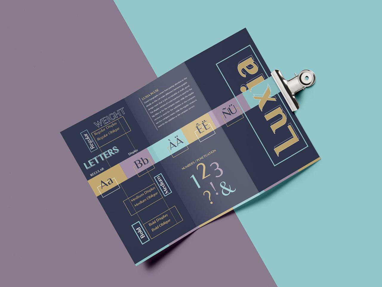
The key to creating a successful visual hierarchy lies in establishing a clear relationship between different elements. This is accomplished by using a range of font sizes and weights. For example, a bold, extra-large headline (e.g., 36pt) immediately grabs the reader’s attention. A slightly smaller, but still prominent, subheading (e.g., 24pt) then introduces a specific topic. The body text (e.g., 10-12pt) provides detailed information supporting the subheading.
Finally, captions or smaller notes (e.g., 8pt) can provide additional context. Using variations in font weight (bold, regular, italic) further enhances the hierarchy, adding emphasis where needed.
Imagine a brochure promoting a new coffee shop. The headline, “Experience the Perfect Cup,” would be the largest and boldest font. Subheadings, such as “Our Specialty Coffees” or “Delicious Pastries,” would be noticeably smaller but still larger than the body text describing each coffee or pastry. The body text would use a consistent size and weight, ensuring readability.
Finally, any small print, such as the address or contact information, would be the smallest size.
Sample Brochure Layout with Font Size Hierarchy
Let’s envision a two-page brochure for a fictional eco-tourism company called “Green Trails Adventures.”
Page 1:
Headline (36pt, Bold): Explore Untouched Nature with Green Trails Adventures
Subheading (24pt, Bold): Unforgettable Experiences Await
Body Text (12pt, Regular): [Paragraph describing Green Trails Adventures and their commitment to sustainable tourism. Includes high-quality images of nature scenes.]
Subheading (24pt, Bold): Our Featured Tours
Body Text (12pt, Regular): [Brief descriptions of three different tours, each with a smaller subheading (14pt, Bold) for each tour title. Includes captivating images of each tour.]
Caption (8pt, Italic): Images courtesy of [Photographer’s Name]
Page 2:
Headline (24pt, Bold): Plan Your Adventure Today
Subheading (14pt, Bold): Contact Us
Body Text (12pt, Regular): [Contact information: Phone number, email address, website URL, and physical address.]
Subheading (14pt, Bold): Special Offers
Body Text (12pt, Regular): [Details of any current promotions or discounts.]
Caption (8pt, Italic): Green Trails Adventures – Committed to Sustainable Tourism
Accessibility Considerations for Brochure Fonts
Designing brochures that are visually appealing is crucial, but equally important is ensuring they are accessible to everyone, including individuals with visual impairments. Choosing the right fonts significantly impacts readability and comprehension, making accessibility a key consideration in the design process. Ignoring accessibility not only excludes a portion of your potential audience but also risks damaging your brand’s reputation.
Readability is paramount for effective communication. Poor font choices can lead to eye strain, headaches, and difficulty in understanding the brochure’s content. This is especially true for people with conditions like dyslexia, low vision, or other visual impairments. Accessible fonts are designed with specific characteristics that maximize readability and minimize strain, ensuring that your message reaches everyone.
Fonts Known for High Readability and Accessibility
Selecting fonts with high contrast, clear letterforms, and consistent spacing is vital for accessibility. Fonts specifically designed with readability in mind often feature open letterforms, preventing characters from blending together. This is especially important for individuals with low vision or those who struggle with visual processing. Some examples of fonts commonly recommended for accessibility include:
Arial: A classic sans-serif font, Arial is widely available and known for its clean, legible design. Its consistent stroke weight and clear letterforms make it easy to read, even at smaller sizes. The simplicity of its design reduces visual clutter and aids in overall readability.
Choosing the best fonts for brochures is crucial for a professional look; readability is key, after all! But don’t forget about your online presence – check out this awesome guide on getting it on with youtube to boost your brochure’s reach. A well-designed YouTube video can complement your print materials beautifully, so choosing the right fonts for both is a smart strategy.
Verdana: Similar to Arial, Verdana is a sans-serif font designed for on-screen readability. It features a slightly wider character spacing and slightly heavier stroke weights compared to Arial, further improving readability, especially on digital screens. This is beneficial for individuals with low vision who might struggle with smaller or closely spaced characters.
Open Sans: This open-source sans-serif font offers excellent readability across various screen sizes and resolutions. Its clear letterforms and even spacing contribute to a comfortable reading experience. Its popularity is also a benefit as it is widely available and therefore less likely to cause issues for individuals using assistive technologies.
Calibri: A modern sans-serif typeface, Calibri has a more contemporary feel while still maintaining good readability. Its slightly rounded letterforms contribute to a less stark appearance compared to some other sans-serif options, without sacrificing clarity. It’s widely used in Microsoft Office, making it readily available to a large audience.
Impact of Font Choice on Readers with Visual Impairments
For readers with visual impairments, font choice can be the difference between understanding the information and struggling to decipher the content. Poor font choices can exacerbate existing difficulties, potentially leading to frustration and exclusion. For example, fonts with thin strokes or overly decorative elements can be extremely difficult to read for someone with low vision. Similarly, fonts with closely spaced letters can make it hard to distinguish individual characters.
Conversely, fonts with clear, well-defined letterforms, sufficient spacing between letters and lines (leading), and good contrast against the background color dramatically improve readability for those with visual impairments. Consider the use of bold fonts for headings and important information, as this enhances visual clarity and improves the overall accessibility of the brochure. A good rule of thumb is to ensure a high contrast ratio between the text color and the background color, making it easier to discern letters and words, particularly for those with low vision or color blindness.
Illustrative Examples of Font Usage in Brochures
Let’s dive into some real-world examples of how different font choices impact the overall feel and message of a brochure. We’ll examine the font style, weight, and size, and how these contribute to the effectiveness of the design. Remember, the key is selecting fonts that align perfectly with the brand and the target audience.
A Modern Tech Startup Brochure
This brochure, designed for a new software company specializing in AI-powered solutions, utilizes a clean, minimalist aesthetic. The primary font is “Open Sans,” a sans-serif typeface known for its readability and modern feel. Open Sans is used in a regular weight for body text (size 10pt) and a bold weight for headings (size 16pt). Accent colors are used sparingly, creating a sophisticated and professional look.
The choice of Open Sans reflects the company’s innovative and forward-thinking approach. Its clean lines and excellent readability ensure the information is easily digestible, while the use of bold for headings creates visual hierarchy and guides the reader’s eye. The overall effect is one of professionalism, trustworthiness, and technological expertise.
A Rustic Farm-to-Table Restaurant Brochure
In contrast, a brochure for a rustic farm-to-table restaurant employs a completely different approach. The primary font here is “Playfair Display,” a serif typeface with elegant flourishes, lending itself to a more traditional and sophisticated feel. Playfair Display is used in a bold italic weight for the restaurant’s name (size 24pt) and a lighter weight for the body text (size 12pt).
A secondary font, a simpler sans-serif like “Lato,” is used for supporting information like pricing and contact details.
Playfair Display’s elegant serif style evokes a sense of tradition and quality, perfectly aligning with the farm-to-table concept. The italic weight for the restaurant name adds a touch of personality, while the lighter weight for the body text maintains readability without overwhelming the design. The pairing with Lato provides a subtle contrast, ensuring the brochure is both visually appealing and easy to read.
A Vibrant Children’s Activity Center Brochure
For a children’s activity center, a playful and engaging design is crucial. This brochure uses “Comic Sans MS” (though this is generally discouraged for professional contexts, its use here is intentional) for headings (size 18pt, bold) and a more legible sans-serif font like “Arial” (size 10pt) for body text. Bright colors and playful illustrations further enhance the overall effect.
While generally avoided for professional designs, Comic Sans MS is surprisingly effective here. Its playful nature perfectly reflects the target audience. Paired with the more readable Arial, it creates a balance between visual appeal and clear communication, making the brochure fun and accessible for parents and children alike. However, it is important to note that this is a niche case; for most professional applications, more sophisticated font choices are preferred.
Ending Remarks
Designing a brochure is a balancing act between aesthetics and functionality. Finding the best fonts for your brochure isn’t just about picking your favorites; it’s a strategic decision that impacts how your message is received. By understanding the nuances of typography, considering your target audience, and prioritizing readability, you can create a brochure that’s not only beautiful but also highly effective.
So, go forth and create brochures that leave a lasting impression – one perfectly chosen font at a time!
FAQ Section
What’s the difference between serif and sans-serif fonts?
Serif fonts have small decorative strokes at the ends of their letters (like Times New Roman), while sans-serif fonts don’t (like Arial). Serifs generally offer better readability in larger blocks of text, while sans-serif fonts often appear cleaner and more modern.
How many fonts should I use in a brochure?
Generally, sticking to two or three fonts is best – one for headings, one for body text, and maybe a third for accents. Too many fonts can make your brochure look cluttered and confusing.
What font size is best for body text in a brochure?
A good rule of thumb is to use a body text size between 9-12 points, depending on the font and the overall design. Always prioritize readability!
Where can I find free fonts for my brochure?
Websites like Google Fonts and DaFont offer a vast selection of free fonts. Just be sure to check the license before using them commercially.
