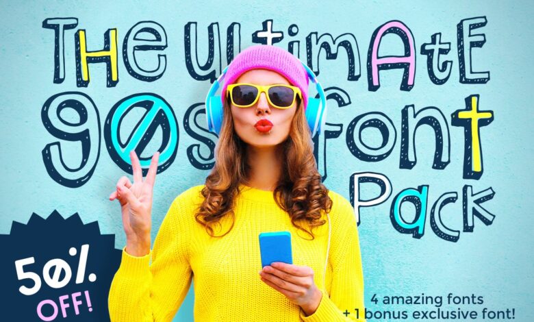
Inspiring Free and Premium 90s Fonts
Inspiring free and premium 90s fonts: Who doesn’t love a blast from the past? That totally rad decade is back, baby, and it’s brought its iconic typography with it! From chunky pixel fonts reminiscent of arcade games to sleek, geometric sans-serifs that scream “futuristic,” 90s fonts are experiencing a major revival. This post dives deep into the world of these nostalgic typefaces, exploring the reasons behind their resurgence, examining the differences between free and premium options, and showing you how to use them to create designs that are totally groovy.
We’ll cover everything from identifying key 90s font characteristics (think bold serifs, playful spacing, and vibrant color palettes) to exploring where to find the best free and premium options. We’ll even look at how these fonts can elevate your logo designs, posters, and websites, adding a touch of that unmistakable 90s flair. Get ready to unleash your inner graphic designer and channel your favorite decade!
Popularity and Trends of 90s Fonts
The resurgence of 90s aesthetics isn’t just a fleeting trend; it’s a full-blown revival impacting various design sectors, from fashion and music to graphic design and web development. This renewed interest has significantly boosted the popularity of 90s-inspired fonts, both free and premium options, reflecting a broader cultural nostalgia and a desire for playful, distinctive typography.The popularity of 90s fonts stems from several factors.
Firstly, the era’s bold and often unconventional typographic choices offer a refreshing contrast to the more minimalist styles that have dominated recent years. Secondly, 90s fonts often evoke a sense of playful irony and a less serious, more approachable aesthetic. This aligns perfectly with current trends favoring authenticity and self-expression. Finally, the readily available digital resources, including numerous free and premium font collections, have made it easier than ever to incorporate this style into modern designs.
Stylistic Differences Between Free and Premium 90s-Inspired Fonts
While both free and premium 90s-inspired fonts aim to capture the essence of the era, noticeable differences exist in their quality, features, and overall design sophistication. Free fonts often provide a basic interpretation of 90s styles, sometimes lacking the nuanced details and extensive character sets found in premium options. Premium fonts, on the other hand, generally offer higher-quality rendering, broader glyph support (including ligatures and stylistic alternates), and more comprehensive licensing options suitable for commercial projects.
This translates to a more polished and professional look, justifying the higher price point.
Key Characteristics of 90s Fonts
Several key characteristics define a “90s font.” These include bold Artikels, exaggerated proportions, playful distortions, and a vibrant color palette often associated with the era. The use of gradients and drop shadows was also common, contributing to the distinctive three-dimensional effect often seen in 90s designs. The following table highlights these characteristics through examples of both free and premium fonts:
| Font Characteristic | Free Font Examples | Premium Font Examples | Notable Differences |
|---|---|---|---|
| Bold Artikels & Exaggerated Proportions | Pixelated fonts like “Press Start 2P” (reminiscent of arcade games), some variations of Impact | Fonts like “Righteous” (Google Fonts), custom-designed fonts with more refined curves and details | Premium fonts often have smoother curves and more refined details, avoiding the pixelated or overly simplistic look common in free options. |
| Playful Distortions & 3D Effects | Fonts with slight distortions or bevel effects, often found in free font packs | Fonts designed with sophisticated 3D effects and subtle distortions, offering greater control and customization. | Premium fonts offer more subtle and sophisticated distortions, integrating seamlessly with modern design aesthetics, whereas free options may appear more crude or dated. |
| Vibrant Color Palettes | Many free fonts work well with the bright, saturated colors typical of the 90s. | Premium fonts are often designed with color palettes in mind, offering greater versatility and integration with branding guidelines. | The difference lies mainly in the versatility and suitability for professional applications. Premium fonts are designed to integrate better with brand guidelines. |
| Gradients and Drop Shadows | Free fonts can be easily modified to include gradients and drop shadows using design software. | Premium fonts might include variations with built-in gradients or offer better support for applying these effects. | Premium fonts often provide more refined control over the application of gradients and shadows, leading to a more polished final product. |
Design Elements of Inspiring 90s Fonts: Inspiring Free And Premium 90s Fonts
Source: pinimg.com
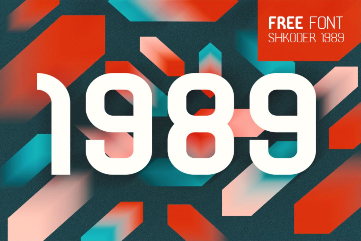
The 90s saw a vibrant explosion of graphic design, and its fonts reflect this perfectly. Moving beyond the more formal styles of previous decades, 90s fonts embraced a playful, sometimes chaotic, yet undeniably memorable aesthetic. This was achieved through a unique combination of design elements that, even today, continue to inspire and influence contemporary typography.
Several key design elements contributed to the distinctive look of inspiring 90s fonts. These elements, when combined, created a visual language that perfectly captured the spirit of the era – a blend of technological advancement and a youthful, rebellious energy. Understanding these elements is key to appreciating the lasting impact of 90s typography.
Serif and Sans-serif Usage
The use of serifs (small decorative strokes at the ends of letters) and sans-serif (without serifs) fonts varied greatly throughout the 90s. While some fonts retained the classic elegance of serifs, many embraced the clean, modern lines of sans-serif designs. The choice often depended on the intended use. Serif fonts were sometimes used for more formal applications, while sans-serif fonts were favored for their readability and modernity in digital interfaces and playful designs.
This flexibility allowed for a wide range of stylistic expressions.
Thickness and Weight Variations
Thickness, or weight, played a crucial role in shaping the visual impact of 90s fonts. Bold, heavy weights were frequently used to create a sense of impact and energy, reflecting the dynamism of the decade. Conversely, thinner weights offered a sense of delicacy and sophistication. The skillful combination of thick and thin strokes within a single font often resulted in a visually interesting and dynamic design.
Think of the iconic condensed fonts used in video game titles or grunge-inspired designs – they exemplified this bold use of weight.
Letter Spacing and Kerning
Letter spacing (tracking) and kerning (adjusting the space between individual letter pairs) were often manipulated to create unique visual effects. Wider tracking could convey a sense of openness and airiness, while tighter tracking could create a more compact and energetic feel. Precise kerning was sometimes less of a priority in 90s designs, contributing to a more hand-crafted, less polished aesthetic – a look that now feels distinctly retro and charming.
This sometimes uneven spacing added to the overall informal and expressive nature of many 90s fonts.
Color Palettes
The color palettes associated with 90s fonts were as diverse and expressive as the fonts themselves. Vibrant, sometimes clashing, colors were frequently employed, reflecting the bold and experimental nature of the decade.
The classic “neon” palette, featuring bright pinks, greens, blues, and yellows, is instantly recognizable as a 90s staple.
Another popular choice was a more subdued palette, incorporating muted pastels and earth tones, often seen in grunge-inspired designs. This contrasted sharply with the brighter palettes, showcasing the range of styles within the era.
So I’ve been digging around for inspiring free and premium 90s fonts lately – you know, that retro vibe is totally back! I even found some amazing resources while researching, which led me to this awesome article on getting it on with youtube and how to use fonts effectively in your video thumbnails. It’s all about that visual appeal, right?
Anyway, back to those killer 90s fonts – I’ll share my favorites soon!
Acidic colors, like bright lime green and electric purple, were also heavily used, particularly in rave culture-inspired designs.
Hypothetical 90s-Inspired Font: “Retrograde”
Imagine a font called “Retrograde.” It’s a sans-serif font with a slightly condensed character width, giving it a dynamic and energetic feel. It features subtly rounded corners on the letterforms, softening the otherwise sharp lines. The weight is medium, offering a balance between readability and visual impact. The overall aesthetic is playful yet sophisticated, drawing inspiration from both the clean lines of early computer graphics and the bold energy of 90s rave culture.
“Retrograde” would be ideal for use in video game titles, logos for clothing brands targeting a younger demographic, and posters for events with a retro theme. Its versatility would allow it to be used in both digital and print applications, adapting seamlessly to different contexts.
Free vs. Premium 90s Fonts
Choosing between free and premium 90s fonts can significantly impact your project. The decision hinges on factors like budget, project scope, and licensing needs. Understanding the differences is key to making the right choice. This section delves into the specifics of free and premium 90s fonts, comparing their licensing, availability, and suitability for different projects.
Licensing Restrictions of Free and Premium 90s Fonts
Free 90s fonts typically come with usage restrictions. These restrictions often limit commercial use, requiring attribution to the creator, or prohibiting modifications. Premium fonts, conversely, usually offer broader commercial licenses, allowing for greater flexibility in usage and often including extended support from the font creator. The specific terms of each license vary widely, so it’s crucial to read the license agreement before using any font.
Ignoring these restrictions can lead to legal complications.
Sources for Free and Premium 90s Fonts
Numerous online platforms offer both free and premium 90s fonts. Free fonts can be found on websites like Google Fonts, Font Squirrel, and DaFont. These sites curate collections of free fonts with varying licenses. For premium fonts, consider platforms such as Creative Market, MyFonts, and Font Bundles. These platforms offer a wider variety of high-quality fonts with extensive commercial licenses, often bundled at discounted prices.
Always check the licensing terms before downloading and using any font.
Advantages and Disadvantages of Using Free vs. Premium Fonts
The choice between free and premium fonts involves weighing several factors.
Here’s a table summarizing the advantages and disadvantages:
| Feature | Free Fonts | Premium Fonts |
|---|---|---|
| Cost | Free | Paid (often offering various pricing tiers) |
| Licensing | Often restricted for commercial use; may require attribution. | Generally broader commercial licenses; often includes extended usage rights. |
| Quality | Can vary significantly; may lack advanced features or support. | Usually higher quality; often includes extensive glyph sets, kerning, and support. |
| Uniqueness | May be widely used, reducing originality. | More likely to be unique, offering a distinctive design aesthetic. |
| Support | Limited or no support from the creator. | Often includes access to customer support and updates. |
Examples of Free 90s Fonts
Here are three examples of free 90s-inspired fonts, highlighting their unique features:
- Pixel Operator: This font emulates the pixelated aesthetic of early computer graphics. Its chunky, retro style is perfect for projects aiming for a distinctly nostalgic feel. Its limited character set might be a drawback for extensive text.
- Atomic Age: This font captures the bold, geometric style popular in 1990s design. Its clean lines and strong letterforms lend themselves well to headlines and branding projects. The font’s consistent weight across characters contributes to its readability.
- Cyberpunk: This font embodies the futuristic, slightly dystopian feel often associated with 90s cyberpunk aesthetics. Its sharp angles and unique character designs offer a distinct visual appeal, particularly suited for projects emphasizing a futuristic or technological theme. Its unconventional letterforms may require careful consideration of readability.
Examples of Premium 90s Fonts
Three premium 90s-inspired fonts, showcasing their distinctive qualities:
- Retrograde: (Hypothetical example) This font boasts a highly refined, vector-based design, offering smooth curves and exceptional kerning. Its extensive glyph set includes stylistic alternates and ligatures, providing designers with increased control over typographic details. The premium license allows for commercial use without restrictions.
- Neon Dreams: (Hypothetical example) This font captures the vibrant energy of 90s rave culture. Its bold, slightly distorted letterforms and inclusion of various stylistic elements, such as drop shadows and gradients, allow for dynamic and expressive typography. The font’s extensive character set includes numerous symbols and accented characters.
- Grunge Revival: (Hypothetical example) This font incorporates the rough, textured aesthetic of 90s grunge design. Its distressed letterforms and subtle variations in weight create a raw, authentic feel. The font’s versatility makes it suitable for a range of applications, from logos to posters. The inclusion of multiple weights enhances its design flexibility.
Applications and Use Cases for 90s Fonts
Source: theme-junkie.com
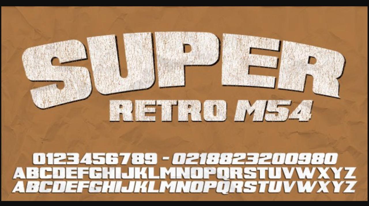
s fonts, with their distinctive retro aesthetic, offer a unique opportunity to inject personality and nostalgia into a wide range of design projects. Their versatility allows them to be used effectively across various mediums, from digital interfaces to print materials, creating a strong visual impact and conveying specific brand messages. The key lies in understanding the nuances of each font and selecting the one that best aligns with the project’s goals and target audience.
The effective use of 90s fonts depends on a thoughtful consideration of the overall design context. Pairing them with complementary imagery, color palettes, and layout choices is crucial for achieving a cohesive and impactful result. Overusing or misusing these fonts can lead to a cluttered or dated look, so careful planning is essential.
Logo Design with 90s Fonts
s fonts can breathe new life into logo design, lending a retro-futuristic or playful vibe depending on the chosen typeface. For instance, a tech startup might utilize a clean, geometric sans-serif font reminiscent of early computer interfaces, evoking a sense of innovation and technological prowess. Imagine a logo for a fictional company called “PixelPushers,” featuring a bold, condensed sans-serif font in a vibrant teal color, set against a clean white background.
The simplicity of the font and color choice allows the logo to be easily recognizable and memorable. Conversely, a vintage clothing brand could leverage a more playful, rounded font with a slight pixelated effect, suggesting a sense of nostalgia and retro-cool. Visualize a logo for a fictional vintage clothing store named “Retro Threads,” using a font similar to “Press Start 2P,” with a slightly faded, distressed effect, evoking a feeling of authenticity and timeless style.
The font’s slightly imperfect quality adds to the vintage charm.
Poster and Print Design Incorporating 90s Fonts
The bold and often playful nature of 90s fonts makes them ideal for posters and other print materials. A vibrant poster design for a retro-themed music festival could feature a bold, pixelated font reminiscent of arcade games, paired with bright neon colors and geometric shapes. Imagine a poster advertising “Synthwave Sunset,” a fictional music festival, with the title rendered in a pixelated font resembling those found in classic arcade games.
The font’s bold, chunky characters are complemented by a backdrop of swirling neon colors and dynamic geometric shapes, creating a visually stimulating and energetic design that immediately communicates the festival’s theme. For a different approach, a minimalist poster for an art exhibition could utilize a clean, sans-serif 90s font, creating a sense of sophistication and modernism. This could feature a sleek, sans-serif font, similar to “Impact,” printed in a muted color on a textured paper, showcasing a refined and contemporary aesthetic that contrasts with the retro font choice.
Website Design and User Interface (UI) with 90s Inspired Typography
While not always appropriate for the entire website, strategically placed 90s fonts can add a unique touch to website design. Consider using them for headlines, buttons, or call-to-action elements to draw attention and create visual interest. A website for a fictional online magazine dedicated to 90s culture could incorporate a bold, condensed sans-serif font for headings, such as “90s Nostalgia,” creating a strong visual anchor.
The body text would utilize a more readable font, but the headline’s font choice immediately establishes the magazine’s theme and target audience. Conversely, a website for a modern design agency might use a more subtle 90s-inspired font for accents, such as in navigation menus or button labels, adding a touch of retro flair without overwhelming the overall design.
Impact of Font Choice on Brand Identity, Inspiring free and premium 90s fonts
The choice of 90s font significantly impacts a brand’s identity and messaging. A playful, rounded font might communicate fun and approachability, while a bold, geometric font could project a sense of strength and innovation. A carefully chosen font can reinforce a brand’s personality and create a memorable visual identity. Consider a fictional brand of energy drinks called “Hyperdrive.” Using a sharp, angular, and condensed 90s font like “Orbitron” in its logo and marketing materials communicates speed, energy, and a futuristic feel, perfectly aligning with the brand’s intended image.
Conversely, a brand of handcrafted soaps called “Lavender Lane” might utilize a softer, more rounded 90s font to convey a sense of calmness, tradition, and natural ingredients.
Choosing the Appropriate 90s Font
Selecting the right 90s font requires careful consideration of several factors, including the project’s purpose, target audience, and overall design aesthetic. Analyzing the font’s weight, style, and readability is crucial to ensure it effectively communicates the intended message without sacrificing usability. It is also vital to consider the font’s licensing and accessibility to ensure legal compliance and inclusivity.
The Future of 90s-Inspired Typography
The resurgence of 90s aesthetics isn’t just a fleeting trend; it’s a testament to the enduring appeal of bold design choices and a playful spirit. As we move forward, 90s-inspired fonts will continue to evolve, shaped by both their nostalgic roots and the ever-changing landscape of contemporary design. We can expect to see a fascinating interplay between retro revival and modern innovation.The influence of current design trends, such as maximalism and the ongoing fascination with digital art and glitch aesthetics, will undoubtedly impact the evolution of 90s fonts.
We’re seeing a move away from minimalist designs in many areas, and this will likely translate into bolder, more experimental 90s-inspired typefaces. The increasing popularity of generative design and AI tools will also play a significant role, potentially leading to the creation of entirely new font styles that are both retro-inspired and technologically advanced.
Innovative Applications of 90s Fonts in Emerging Design Fields
s fonts, with their inherent energy and versatility, are perfectly positioned to thrive in several emerging design fields. Their bold character lends itself well to the vibrant world of motion graphics and animation, where they can add a distinct retro flair to video games, animated shorts, and even corporate branding videos. The playful, sometimes slightly chaotic, nature of many 90s fonts aligns seamlessly with the expressive style of web3 and metaverse design, offering a nostalgic yet futuristic touch to digital spaces.
Furthermore, their unique aesthetic can add a layer of personality and authenticity to augmented reality (AR) and virtual reality (VR) experiences, helping to create immersive and engaging environments. The application of these fonts is only limited by the designer’s imagination.
Potential New 90s-Inspired Font Styles
The next few years promise a fascinating evolution of 90s-inspired typography. Several distinct styles are likely to emerge, building upon the existing trends but pushing the boundaries of design.
- Cyberpunk Retro: This style will blend the gritty aesthetic of cyberpunk with the playful energy of 90s fonts. Expect sharp angles, distorted glyphs, and a heavy use of neon-inspired color palettes. Think of a typeface that evokes the feeling of a futuristic arcade game from the 90s. Imagine a font where the letters themselves seem to glitch and shimmer, adding a dynamic and almost holographic effect.
- Y2K Glitchcore: Taking inspiration from the anxieties and aesthetic of the year 2000, this style will emphasize digital distortion and visual glitches. Expect broken pixels, unexpected kerning, and a general sense of controlled chaos, all while maintaining a recognizably 90s feel. This font could utilize techniques like pixelation and color banding to create a uniquely nostalgic and slightly unsettling effect.
- Neo-Grotesque with a 90s Twist: A modern take on classic grotesque typefaces, this style will incorporate elements like rounded corners, subtly exaggerated x-heights, and a playful use of color gradients reminiscent of early computer graphics. Think of a clean, functional typeface with just a hint of 90s whimsy. The result would be a versatile font that feels both contemporary and nostalgic.
- Hand-Drawn Digital: This style will embrace the imperfect charm of hand-drawn lettering but with a distinctly digital twist. Expect variations in stroke weight, playful flourishes, and a slightly rough, almost unfinished look. The font would appear hand-drawn but retain a crispness suggesting digital enhancement, evoking the early days of digital art programs.
- 3D Retrofuturism: This style will incorporate 3D effects and perspective into 90s-inspired fonts. Expect extruded letters, beveling, and other techniques that create a sense of depth and dimensionality, echoing the early explorations of 3D graphics in the 90s. Think of a typeface that could be used in a retro-futuristic video game or a science fiction film poster.
Conclusion
Source: graphicdome.com
So, there you have it – a deep dive into the wonderfully weird and wonderfully wonderful world of 90s fonts! Whether you’re a seasoned designer or just starting out, incorporating these retro typefaces can add a unique and undeniably cool touch to your projects. Remember to consider the licensing, explore the vast resources available both free and premium, and most importantly, have fun experimenting with the styles that best capture the essence of the decade.
Let’s all embrace the nostalgia and create something truly awesome!
Question & Answer Hub
What’s the difference between a serif and a sans-serif 90s font?
Serif fonts have small decorative strokes at the ends of their letters (think Times New Roman), while sans-serif fonts don’t (like Arial). 90s fonts can utilize both, with sans-serif being more common for a futuristic feel and serifs for a more classic retro vibe.
Where can I find inspiration for using 90s fonts?
Pinterest, Behance, and Dribbble are great places to find visual inspiration. Search for “90s design,” “retro design,” or “90s typography” to see how professionals are using these fonts.
Are there any legal issues I should be aware of when using free fonts?
Always check the license of any free font before using it commercially. Some free fonts have restrictions on their use, so it’s crucial to understand the terms before incorporating them into your projects.
