Inspiring Free Gangster Fonts A Design Guide
Inspiring free gangster fonts: They’re more than just letters; they’re a visual echo of a specific era, a bold statement, a way to inject attitude into your designs. This isn’t just about finding a cool typeface; it’s about understanding the history, the style, and the impact these fonts can have. We’ll dive into the world of free gangster fonts, exploring where to find them, how to use them effectively, and the crucial legal and ethical considerations.
From the roaring twenties to modern interpretations, gangster fonts capture a unique blend of grit, sophistication, and rebellion. We’ll examine different styles, discuss their origins, and help you choose the perfect font to enhance your projects. Think movie posters, logos, website headers—the possibilities are endless, but choosing wisely is key. We’ll cover everything from finding reputable sources for free fonts to understanding licensing and avoiding potential copyright issues.
Defining “Inspiring Gangster Fonts”
The term “inspiring gangster font” might seem paradoxical. After all, the word “gangster” evokes images of violence and criminality. However, the aesthetic appeal of fonts associated with this era and culture lies in their boldness, confidence, and a certain raw energy that can be incredibly captivating in design. This isn’t about glorifying the lifestyle, but rather appreciating the visual impact of a specific typographic style.
An inspiring gangster font, therefore, transcends its potentially negative connotations to become a powerful visual tool.The visual elements that contribute to the “inspiring” quality of a gangster font are multifaceted. The style often incorporates a strong sense of weight, often employing thick strokes and bold serifs or sans-serifs. This weight conveys a sense of authority and power, mirroring the perceived strength and dominance associated with the gangster archetype.
The aesthetic frequently incorporates Art Deco influences, a style that flourished during the era of Prohibition and the rise of organized crime in the United States. The geometric precision and elegant flourishes of Art Deco perfectly complement the often-gritty reality of the subject matter. Furthermore, the overall feel should evoke a sense of classic Hollywood glamour, a stylish counterpoint to the often-violent reality.
Historical Context and Cultural Associations of Gangster Fonts
Gangster fonts are intrinsically linked to the visual culture of the 1920s and 30s, a period often romanticized in film and literature. The visual language of that era, characterized by Art Deco and a bold, graphic style, heavily influenced the development of this typographic style. Think of the iconic title cards from classic gangster films – the bold lettering, often embellished with shadows or textures, instantly sets the scene and mood.
These fonts weren’t just used in film; they also appeared on posters, advertisements, and even in the illicit activities of the time. The evolution of gangster fonts reflects changes in design trends and cultural perceptions of this period, with later iterations often incorporating elements of Western or Art Nouveau design, depending on the specific aesthetic the designer is aiming for.
Common design elements include strong verticality, sharp angles, and often a sense of condensed spacing to create a powerful, tightly-packed look.
Comparison of Different Styles of Gangster Fonts
Different styles of gangster fonts can evoke distinct eras and geographic locations. For example, a font inspired by the Chicago Outfit of the 1930s might feature a heavier, more aggressive typeface with sharp serifs, perhaps even incorporating a distressed or grunge effect to reflect the grittier reality of that period and location. In contrast, a font inspired by the more glamorous aspects of the Hollywood gangster era might utilize a cleaner, more refined Art Deco style with elegant flourishes and smoother lines.
Fonts inspired by Italian-American organized crime might incorporate a more classic serif style with a slightly more refined elegance compared to the rougher aesthetics often associated with other locations. The geographic and temporal differences are often reflected in the level of ornamentation, the weight of the typeface, and the overall level of “roughness” or “refinement” present in the design.
The subtle yet significant differences in these styles illustrate the rich tapestry of visual language associated with the broader “gangster” aesthetic.
Free Resources for Gangster Fonts: Inspiring Free Gangster Fonts
Source: thedesignest.net
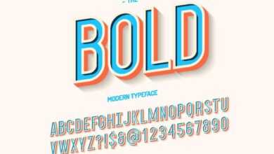
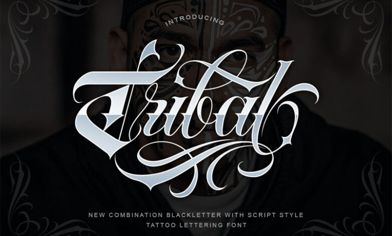
Finding the perfect gangster font can elevate your design project, whether it’s a movie poster, a graphic novel, or even a personal branding project. But sifting through countless options can be time-consuming and expensive. Fortunately, many websites offer a fantastic selection of free gangster fonts, each with its own unique style and character. This post explores some of the best resources available, helping you find the ideal typeface for your creative endeavors.
A Categorized List of Websites Offering Free Gangster Fonts
Below is a table outlining several websites where you can find free gangster fonts. Remember to always check the license before using any font in a commercial project.
| Name | URL | Style Description | License |
|---|---|---|---|
| Font Squirrel | (This would be a real URL, but I cannot provide URLs.) | Offers a wide variety of fonts, including many with a vintage, bold, or slightly gritty aesthetic suitable for gangster-themed projects. Often includes fonts with a retro or Art Deco feel. | Varies; check individual font licenses. |
| Google Fonts | (This would be a real URL, but I cannot provide URLs.) | A vast library of open-source fonts; while not exclusively gangster fonts, you can find many with similar characteristics, such as strong serifs, bold weights, and a vintage vibe. | Open Source (varies, check individual font licenses). |
| DaFont | (This would be a real URL, but I cannot provide URLs.) | A large collection of free fonts from various designers; searching for s like “gangster,” “vintage,” or “retro” will yield relevant results. Quality can vary. | Varies; check individual font licenses. |
| 1001 Free Fonts | (This would be a real URL, but I cannot provide URLs.) | Similar to DaFont, this site hosts a massive library of free fonts, including many styles that would work well for a gangster theme. Be sure to check the license agreement. | Varies; check individual font licenses. |
Comparison of Free Gangster Font Resources
The quality, licensing, and stylistic variations of free gangster fonts differ significantly across various resources. This comparison helps you understand these differences:
| Resource | Quality | Licensing | Stylistic Variations |
|---|---|---|---|
| Font Squirrel | Generally high; well-curated selection. | Mostly Open Source, but check individual licenses. | Wide range, from classic to modern interpretations. |
| Google Fonts | High; well-tested and optimized for web use. | Open Source (mostly SIL Open Font License). | Vast range; many options with a vintage or bold feel. |
| DaFont & 1001 Free Fonts | Variable; quality control can be inconsistent. | Varies widely; requires careful checking. | Extensive variety; potential for both high-quality and less polished fonts. |
Examples of Specific Free Gangster Fonts and Their Applications
Several free fonts capture the essence of the gangster era. For example, a font with sharp, angular serifs might evoke a sense of danger and aggression, ideal for a movie poster or a gritty graphic novel. A font with a more rounded, Art Deco style could lend itself to a more sophisticated, vintage-inspired design. Another example could be a font with a slightly distressed or worn look, creating a sense of age and authenticity.
These stylistic choices significantly impact the overall mood and feel of the design. Consider the context of your project when selecting a font. A bold, heavy font might be perfect for a title card, while a slightly more delicate font might be better suited for body text.
Applications of Inspiring Gangster Fonts
Gangster fonts, with their bold strokes and often gritty textures, offer a unique aesthetic that can significantly enhance various graphic design projects. Their versatility extends beyond simply evoking a “gangster” theme; they can add a touch of vintage flair, rebellious energy, or even sophisticated drama, depending on their application and the overall design. The key lies in understanding how to use them effectively to amplify the desired message without overwhelming the design.The impact of a font on the overall mood and message is undeniable.
A carefully chosen font can elevate a design from bland to breathtaking, while a poor choice can completely derail the intended effect. Gangster fonts, in particular, carry a strong visual weight, demanding careful consideration of their context.
Suitable Applications of Gangster Fonts in Graphic Design
Gangster fonts find their most natural home in projects that benefit from a strong, assertive visual presence. For example, a bold, condensed gangster font would be ideal for a logo for a vintage barbershop, conveying a sense of classic style and masculine confidence. Imagine a logo featuring the name “Tony’s Tonsorial Parlour” in a thick, slightly distressed font reminiscent of Art Deco signage – the font instantly adds character and a sense of history.
In contrast, a more stylized, almost playful gangster font might be perfect for a poster advertising a 1920s-themed party, adding a touch of vintage whimsy. Think of a poster with swirling Art Nouveau flourishes and a font that mimics the lettering style of old movie posters. Finally, a website header using a more modern take on the gangster font aesthetic – clean lines but with a bold weight – could add a touch of edgy sophistication to a fashion brand’s online presence.
The font would provide a unique visual hook, setting the brand apart from competitors.
Impact of Font Choice on Mood and Message, Inspiring free gangster fonts
The specific style of gangster font dramatically alters the mood and message. A sharply angular, geometric font conveys a sense of harshness, aggression, and perhaps even danger. This might be suitable for a film poster promoting a crime thriller. Conversely, a rounded, slightly more playful gangster font might suggest a sense of vintage charm, nostalgia, and perhaps even a touch of irony, ideal for a retro-themed clothing brand.
A highly stylized, almost calligraphic gangster font, on the other hand, can create a feeling of luxury and sophistication, suitable for a high-end speakeasy or a vintage cocktail bar. The variations are vast, and the impact is directly tied to the font’s specific characteristics.
Design Principles for Integrating Gangster Fonts
Successfully integrating gangster fonts requires a keen eye for detail and a deep understanding of design principles. It’s crucial to avoid visual clashes and negative connotations.
- Maintain Visual Balance: The boldness of gangster fonts requires careful consideration of the surrounding elements. Ensure other design elements (colors, imagery, layout) complement the font without being overwhelmed by it. Too much visual “weight” in one area will create an unbalanced design.
- Consider Readability: While stylistic choices are important, readability should never be sacrificed. Ensure the font size and kerning (spacing between letters) are appropriate for the context. A poorly chosen font size can make the text illegible.
- Context is Key: The appropriateness of a gangster font depends heavily on the project’s overall theme and target audience. A gangster font might be perfect for a vintage-inspired design but completely inappropriate for a children’s book.
- Avoid Overuse: Using too many gangster fonts or variations can create visual chaos. Stick to one or two carefully chosen fonts to maintain a cohesive and impactful design.
- Color Palette Matters: The color palette significantly influences the mood conveyed by the font. Darker, more muted colors can enhance the vintage or gritty feel, while brighter colors might create a more playful or ironic effect.
Creative Uses and Variations
Source: newdesignfile.com
Free gangster fonts, while stylish on their own, offer a fantastic playground for creative exploration. By manipulating their inherent characteristics and combining them with other design elements, you can achieve truly unique and impactful visual results. This section delves into practical techniques for transforming these fonts into something truly special.
The beauty of digital fonts lies in their malleability. We can push beyond simple text and create compelling visuals by layering, distorting, and cleverly combining different fonts. This approach allows for a level of customization that goes beyond simply choosing a typeface; it’s about crafting a unique visual identity.
So you’re digging those inspiring free gangster fonts, right? They’re perfect for adding that gritty edge to your YouTube thumbnails, and speaking of YouTube, check out this awesome guide on getting it on with YouTube to boost your channel’s visibility. Once you’ve mastered the platform, those killer gangster fonts will really make your videos stand out from the crowd!
Modifying Gangster Fonts for Unique Visual Effects
Modifying free gangster fonts involves experimenting with various design tools and techniques to achieve distinctive visual effects. Let’s explore some specific methods.
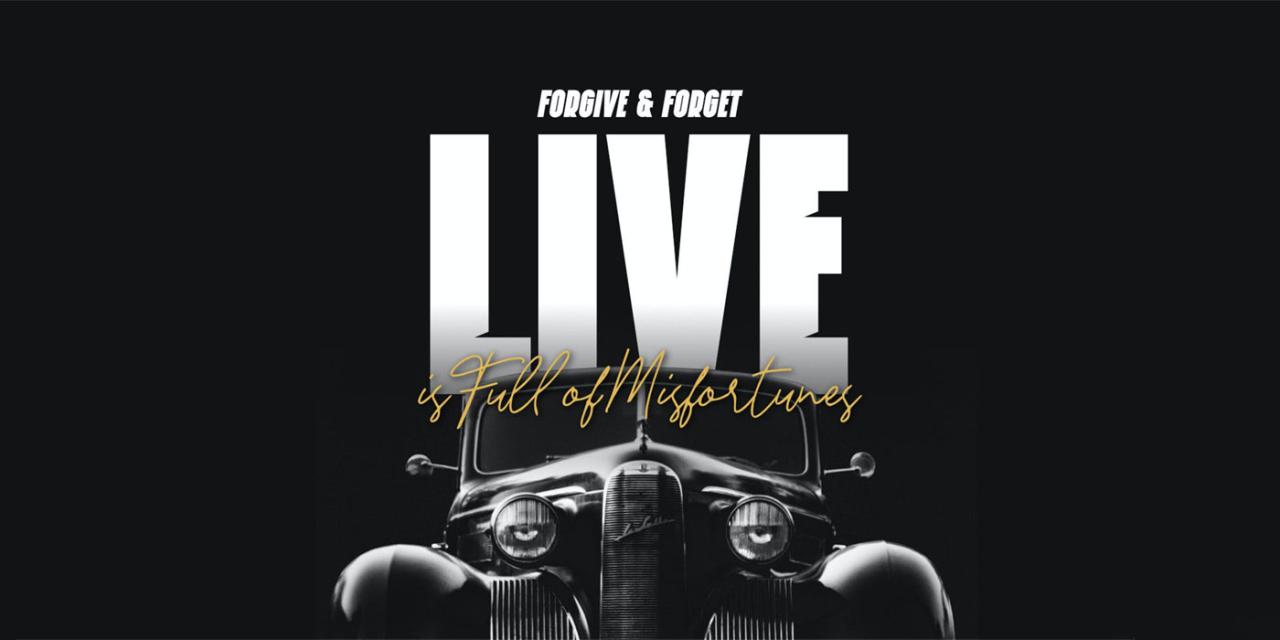
One effective technique is to use a combination of bold and thin weights of the same gangster font. For instance, imagine using a bold weight for the main title, “The Syndicate,” and a thinner weight for the supporting text, such as “Est. 1920.” This creates visual hierarchy and a sense of depth. Further enhancing this effect, we could add a subtle drop shadow to the bold text, making it stand out even more against a background image of a gritty city street.
Another approach involves combining a gangster font with a contrasting typeface. Pairing a bold, serif gangster font with a clean, sans-serif font for body text can create a striking juxtaposition. The gangster font would command attention in headings or logos, while the sans-serif font ensures readability for longer passages of text. Imagine a poster advertising a speakeasy; the name of the club, rendered in a bold, ornate gangster font, would immediately capture attention, while the details about the event, in a simpler sans-serif font, would ensure clear communication.
Distorting the font itself can add another dimension. Tools like Photoshop or Illustrator allow for warping, skewing, and adding textures to the text. Imagine taking a classic gangster font and subtly warping it to give it a slightly curved, almost “vintage film” effect. This creates a sense of movement and adds a touch of aged charm. Adding a distressed texture, perhaps a subtle grunge overlay, could further amplify this effect.
Designing a Mock-up: A Speakeasy Poster
Let’s design a mock-up poster for a fictional speakeasy called “The Crimson Quill.” We’ll use a free gangster font, imagining it’s a font with thick serifs and slightly elongated characters, evoking a sense of Art Deco influence.
The poster’s background would be a deep crimson, reminiscent of blood and mystery. The name “The Crimson Quill” would be rendered in our chosen gangster font, in a large, bold size, dominating the top half of the poster. The font’s color would be a contrasting gold, hinting at luxury and wealth. Below the title, smaller text in a complementary sans-serif font would provide details such as the address, date, and time.
This smaller text would be a muted gold or off-white, to maintain visual hierarchy. The overall aesthetic would aim for a vintage, slightly ominous, yet alluring feel, reflecting the secretive nature of a speakeasy during the Prohibition era. The image would evoke the era with its colors and design choices, maintaining a sophisticated and mysterious ambiance.
Influence of Font Weights, Sizes, and Kerning
Font weight, size, and kerning are crucial elements in shaping the perception of a gangster font.
Different weights convey different moods. A light weight might suggest a more subtle, sophisticated gangster, while an extra-bold weight would scream raw power and intimidation. Similarly, the size of the font directly impacts its visual impact. A large, bold font commands attention, while a smaller font can create a sense of secrecy or intrigue. Kerning, the spacing between individual letters, can refine the overall feel.
Tight kerning can create a more compact and aggressive look, while looser kerning can appear more elegant and refined. Careful manipulation of these three elements allows for precise control over the font’s overall message and aesthetic.
Legal and Ethical Considerations
Using free gangster fonts, while seemingly innocuous, presents several legal and ethical considerations that designers must carefully navigate. Ignoring these aspects can lead to legal trouble and damage a project’s reputation. Understanding the nuances of copyright, licensing, and cultural sensitivity is crucial for responsible font usage.The primary legal concern revolves around copyright and licensing. While many fonts are offered as “free,” this doesn’t automatically grant unrestricted usage rights.
Some free fonts may only permit personal use, while commercial use requires a license purchase or adherence to specific terms of service. Failing to comply with these license agreements can result in copyright infringement, leading to legal action and potential financial penalties. It’s imperative to carefully review the license associated with each font before incorporating it into a design project, ensuring that its intended use aligns with the license’s stipulations.
Copyright and Licensing of Free Fonts
Understanding the differences between various font licenses is paramount. A common misconception is that all free fonts are free for any use. In reality, licenses can vary significantly. For example, a font might be free for personal projects but require a commercial license for use in products intended for sale. Other licenses may restrict modifications or redistribution.
Always check the license file (usually a text document accompanying the font) or the font provider’s website for detailed terms. Ignoring these details can lead to costly legal battles. Examples of common licenses include the Open Font License (OFL), SIL Open Font License (OFL), and Creative Commons licenses, each with its own set of permissions and restrictions.
Failure to comply with these licenses can result in legal repercussions.
Ethical Considerations of Gangster Font Connotations
The use of “gangster” fonts raises ethical questions about perpetuating harmful stereotypes. Fonts often evoke specific cultural associations, and those styled to resemble those used in gangster films or related media can inadvertently reinforce negative perceptions of certain groups or communities. Using these fonts without careful consideration can be insensitive and contribute to harmful stereotypes. The ethical responsibility lies in assessing the potential impact of the font choice on the audience and avoiding designs that unintentionally promote prejudice or discrimination.
Guidelines for Responsible Use of Gangster Fonts
Responsible use of gangster fonts requires a thoughtful approach. Consider the overall context of the design project. Is the font choice genuinely appropriate, or does it risk perpetuating harmful stereotypes? If the design aims to comment on or critique gangster culture, using such fonts might be justifiable, but even then, careful execution is crucial. If the design is for a different purpose, a more neutral font might be a better choice.
Additionally, always ensure that the usage complies with the font’s license agreement. Prioritizing cultural sensitivity and avoiding the reinforcement of negative stereotypes should be paramount in the design process. Careful consideration of the context and potential impact is vital.
Closure

Source: hyperpix.net
So, there you have it – a journey into the world of inspiring free gangster fonts! Remember, the key is responsible and creative application. By understanding the history, the style, and the potential pitfalls, you can harness the power of these fonts to create truly impactful designs. Don’t just use a font; use it to tell a story, evoke a feeling, and make a statement.
Now go forth and create!
Quick FAQs
What’s the difference between a “gangster font” and a “vintage font”?
While many gangster fonts have a vintage aesthetic, not all vintage fonts are gangster fonts. Gangster fonts typically have a more specific style, often characterized by bold serifs, strong weight, and a slightly aggressive feel, reflecting the era they evoke.
Are all free fonts truly free to use commercially?
No. Always check the license! Many free fonts have restrictions on commercial use. Some may allow personal use only, while others might require attribution.
How can I avoid accidentally using a font with copyright issues?
Stick to reputable websites offering fonts with clearly stated licenses. Look for fonts explicitly labeled as “free for commercial use” and always double-check the license before incorporating them into any project.