Lettering Styles That Will Diversify Your Designs
Lettering styles that will diversify your designs are more than just fonts; they’re the visual voice of your brand, the silent storytellers in your creations. From the classic elegance of serif typefaces to the bold modernity of sans-serif, and the playful expressiveness of script and display fonts, the right lettering can transform a simple design into a captivating masterpiece.
Choosing the perfect style isn’t just about aesthetics; it’s about communicating effectively, building brand identity, and leaving a lasting impression. This post dives deep into the world of lettering, exploring diverse styles, their applications, and how to combine them for visually stunning results.
We’ll journey through classic styles like serifs and sans-serifs, examining their historical context and modern applications. Then, we’ll venture into the exciting realm of contemporary trends, including hand-lettering and experimental geometric styles. We’ll uncover the secrets of combining different lettering styles harmoniously, mastering the principles of typography to create visual unity and impact. Finally, we’ll explore the practical application of these styles across various media, from print to digital design and even motion graphics, equipping you with the knowledge and tools to create truly unique and diverse designs.
The Power of Diverse Lettering Styles
Lettering is more than just words on a page; it’s a powerful visual element that significantly impacts the overall aesthetic and effectiveness of any design. A diverse approach to lettering styles, moving beyond a single font choice, unlocks a world of creative possibilities, allowing designers to craft visually engaging and emotionally resonant pieces. The strategic use of varied fonts and lettering techniques enhances brand identity, improves readability, and ultimately, strengthens communication.The impact of diverse lettering styles is multifaceted.
Consider a logo design: using a bold, sans-serif font for the company name might convey modernity and efficiency, while a delicate script font for a tagline could add a touch of elegance and sophistication. This contrast creates visual interest and reinforces different aspects of the brand’s personality. Similarly, in a website design, using a clear, legible serif font for body text enhances readability, while employing a playful display font for headings can capture attention and add personality.
This careful selection of contrasting styles enhances the user experience and ensures the message is effectively conveyed.
Choosing Appropriate Lettering Styles for Different Design Contexts
Selecting the right lettering style is crucial for effective design. The context dictates the appropriate style. For instance, a formal invitation would benefit from elegant serif fonts or sophisticated calligraphy, while a children’s book might use playful, rounded fonts. A minimalist poster design might employ a single, impactful sans-serif font, while a complex infographic could utilize a range of fonts to categorize and highlight different data points.
The key is to ensure that the chosen lettering styles align with the overall tone, message, and target audience of the design. Incongruent font choices can lead to a jarring and unprofessional final product.
Exploring Classic Lettering Styles
Source: dreamstime.com
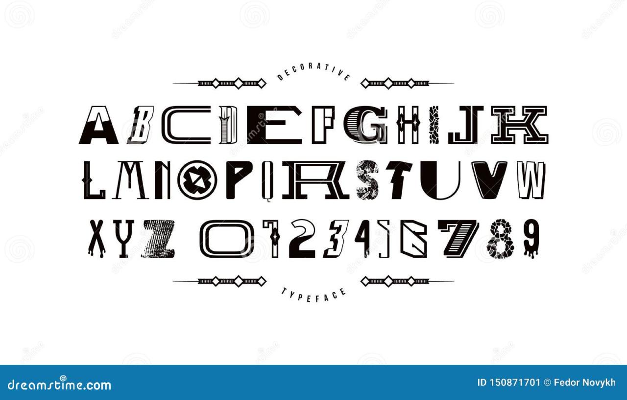
Choosing the right lettering style can significantly impact the overall feel and effectiveness of your design. From the elegant sophistication of serif fonts to the clean modernity of sans-serif, and the expressive flair of script and display typefaces, understanding the characteristics of each style is key to creating visually compelling and communicative designs. This exploration delves into the classic lettering styles, highlighting their unique qualities and applications.
Serif Typefaces
Serif typefaces are characterized by small decorative strokes, or “serifs,” at the ends of their letterforms. These serifs contribute to a sense of tradition, readability, and often, a more formal or classic feel. The added detail of serifs can improve readability, especially in larger blocks of text, as the serifs guide the eye along the lines. They are frequently used in body text for books, newspapers, and magazines.
Examples of popular serif typefaces include Times New Roman, a workhorse known for its readability and versatility; Garamond, appreciated for its elegant and refined appearance; and Georgia, a serif designed specifically for on-screen readability. Times New Roman’s classic and dependable nature makes it suitable for formal documents and publications, while Garamond’s more delicate serifs lend themselves to high-end branding and invitations.
Georgia, with its slightly wider letterforms, excels in digital applications where readability is paramount.
Sans-Serif Typefaces
Sans-serif typefaces, lacking the decorative serifs, project a clean, modern, and often minimalist aesthetic. Their simple, unadorned forms are well-suited for contemporary designs, headlines, and digital interfaces where clarity and impact are crucial. Sans-serif fonts are often perceived as more modern and straightforward than their serif counterparts, making them ideal for websites, signage, and branding associated with technology or innovation.
Examples include Helvetica, a ubiquitous and highly versatile sans-serif; Arial, a widely accessible and easily readable alternative; and Futura, known for its geometric forms and futuristic feel. Helvetica’s neutral and versatile nature allows it to adapt to a wide range of design contexts. Arial provides excellent readability, particularly in digital environments. Futura’s geometric structure gives it a distinctly modern and technological aesthetic, making it a popular choice for tech companies and contemporary branding.
Script and Display Typefaces: A Comparison
Script and display typefaces offer distinct visual characteristics and applications. Script typefaces mimic handwriting, offering a personal and often elegant touch. Display typefaces, on the other hand, are highly stylized and often used for headlines, logos, and short bursts of text where visual impact is paramount. They are rarely used for large blocks of text due to their lower readability.
| Typeface Style | Characteristics | Applications | Examples |
|---|---|---|---|
| Serif | Small decorative strokes at the ends of letterforms; traditional, readable, formal | Body text, books, newspapers, formal documents | Times New Roman, Garamond, Georgia |
| Sans-serif | Clean, modern, minimalist; lacks serifs; highly legible in digital contexts | Headlines, websites, signage, branding | Helvetica, Arial, Futura |
| Script | Mimics handwriting; elegant, personal, flowing | Invitations, logos, branding requiring a personal touch, watermarks | Edwardian Script ITC, Brush Script MT, Pacifico |
| Display | Highly stylized; decorative; used for visual impact; low readability for large blocks of text | Headlines, logos, short bursts of text | Impact, Trajan Pro, Blackoak |
Modern and Experimental Lettering Styles
The world of lettering is constantly evolving, pushing boundaries and embracing new technologies and artistic expressions. Beyond the classic styles, a vibrant landscape of modern and experimental lettering thrives, influencing everything from branding to fine art. This exploration delves into the exciting trends shaping this dynamic field, highlighting their impact on design and offering practical advice on their effective implementation.Modern and experimental lettering styles are characterized by a playful rejection of traditional constraints, embracing asymmetry, unconventional forms, and digital manipulation.
This departure from the classical allows for a wider range of emotional expression and a more personalized connection with the audience. The rise of digital tools has also played a crucial role, empowering designers to create unique and complex letterforms that would have been impossible to achieve through traditional methods.
Emerging Lettering Trends: Hand-Lettering and Custom Typography
Hand-lettering, with its unique imperfections and personal touch, continues to be a dominant force. The handcrafted quality brings a sense of authenticity and warmth that resonates strongly with audiences. Custom typography, on the other hand, takes this personalization a step further. Designers are increasingly creating bespoke typefaces tailored to specific projects, allowing for unparalleled control over the visual identity and messaging.
This approach ensures a truly unique and memorable brand identity, far beyond the limitations of pre-existing fonts. The combination of hand-lettering’s organic feel and custom typography’s precision allows for incredible flexibility and creative expression.
The Impact of Geometric and Unconventional Lettering Styles on Design
Geometric lettering, with its clean lines and precise forms, brings a sense of order and sophistication. The structured nature of geometric styles lends itself well to minimalist designs, conveying professionalism and modernity. In contrast, unconventional lettering styles—often characterized by distortion, asymmetry, and unexpected forms—inject a sense of playfulness, energy, and even rebellion. These styles can be incredibly effective in capturing attention and conveying a unique brand personality, particularly for brands targeting younger demographics or those aiming for a bold, disruptive image.
The juxtaposition of geometric precision and unconventional freedom offers designers a powerful toolset for creating visually compelling and emotionally resonant designs.
Incorporating Modern Lettering Styles into Design Projects
Effectively incorporating modern lettering styles requires careful consideration of the overall design context and the desired emotional impact. Here are three examples illustrating different approaches:
Image Description 1: A logo design featuring a geometric sans-serif typeface with subtle gradients. The typeface is clean and modern, evoking feelings of professionalism and sophistication. The use of gradients adds a touch of visual interest without compromising the overall sense of order and minimalism. This style would be ideal for a technology company or a high-end brand aiming for a sleek and contemporary image. The emotional impact is one of trust, reliability, and innovation.
Image Description 2: A poster design featuring hand-lettered script with playful flourishes and a vibrant color palette. The script is dynamic and expressive, conveying a sense of energy and excitement. The use of bright colors further amplifies this feeling, creating a visually stimulating and memorable design. This style would be well-suited for a music festival, a children’s book, or any project requiring a fun and engaging visual language. The emotional impact is one of joy, creativity, and spontaneity.
Image Description 3: A website banner incorporating a custom typeface with distorted and unconventional letterforms. The typeface is bold and attention-grabbing, creating a sense of intrigue and edginess. The unconventional forms challenge traditional expectations, adding a layer of visual complexity and personality. This style would be appropriate for a fashion brand, an art gallery, or any project aiming for a unique and memorable visual identity. The emotional impact is one of boldness, creativity, and individuality.
Combining Lettering Styles for Visual Harmony
Successfully blending different lettering styles is a key skill for any designer aiming to create visually engaging and impactful work. It’s about more than just throwing different fonts together; it’s about understanding the underlying principles of typography and using them to create a cohesive and harmonious whole. Mastering this skill allows you to elevate your designs from simply readable to truly memorable.The principles of typography, such as contrast, proximity, alignment, repetition, and whitespace, are crucial when combining lettering styles.
Contrast, for example, can be achieved by pairing a bold serif typeface with a delicate script, creating visual interest and hierarchy. Proximity groups related elements together, preventing visual clutter when using multiple styles. Alignment ensures a clean and organized look, while repetition of certain stylistic elements can unify diverse fonts. Finally, strategic use of whitespace provides breathing room and prevents the design from feeling overwhelming.
Ignoring these principles can lead to a chaotic and unprofessional outcome.
Examples of Successful Combinations
Several classic pairings demonstrate the power of combining contrasting lettering styles to achieve visual harmony. Imagine a wedding invitation using a formal serif typeface like Garamond for the main text, providing a sense of elegance and tradition. This could be paired with a playful, handwritten script for the couple’s names, injecting a personal and romantic touch. The contrast in styles works beautifully, with the serif providing stability and the script adding a touch of whimsy.
Another successful combination might be using a geometric sans-serif like Futura for headings, conveying modernity and clarity, alongside a more organic, hand-drawn style for body text, introducing a unique texture and personality. The geometric precision of the sans-serif complements the handcrafted feel of the hand-drawn lettering, resulting in a balanced and sophisticated design. The key is to choose styles that complement each other, rather than clash.
Hypothetical Project: A Coffee Shop Menu
Let’s design a menu for a trendy coffee shop, showcasing the effective combination of three different lettering styles.
- Step 1: Headline – Bold Sans-serif (e.g., Montserrat): We’ll use a bold, clean sans-serif like Montserrat for the coffee shop’s name at the top. This font choice conveys modernity and simplicity, fitting the trendy coffee shop aesthetic. The weight and clean lines ensure high readability even from a distance.
- Step 2: Coffee Item Names – Playful Script (e.g., Pacifico): For the names of the coffee drinks (e.g., “Caramel Macchiato,” “Iced Latte”), a playful script font like Pacifico will add a touch of charm and personality. The slightly irregular lines create a hand-crafted feel, making the menu feel more inviting and less corporate.
- Step 3: Descriptions and Prices – Clean Serif (e.g., Lora): The descriptions of the drinks and their prices will be set in a clean, easily readable serif font like Lora. This provides a contrast to the playful script, ensuring readability without overwhelming the design. The serif style adds a touch of sophistication and balances the overall aesthetic.
The rationale behind this combination is to create a hierarchy of information. The bold sans-serif immediately grabs attention, the playful script adds character to the menu items, and the serif provides clear and concise information. The overall effect is a visually appealing and well-organized menu that reflects the coffee shop’s brand identity. The contrast between the styles creates visual interest without sacrificing readability.
Lettering Styles and Their Applications Across Different Media
Source: textstudio.com
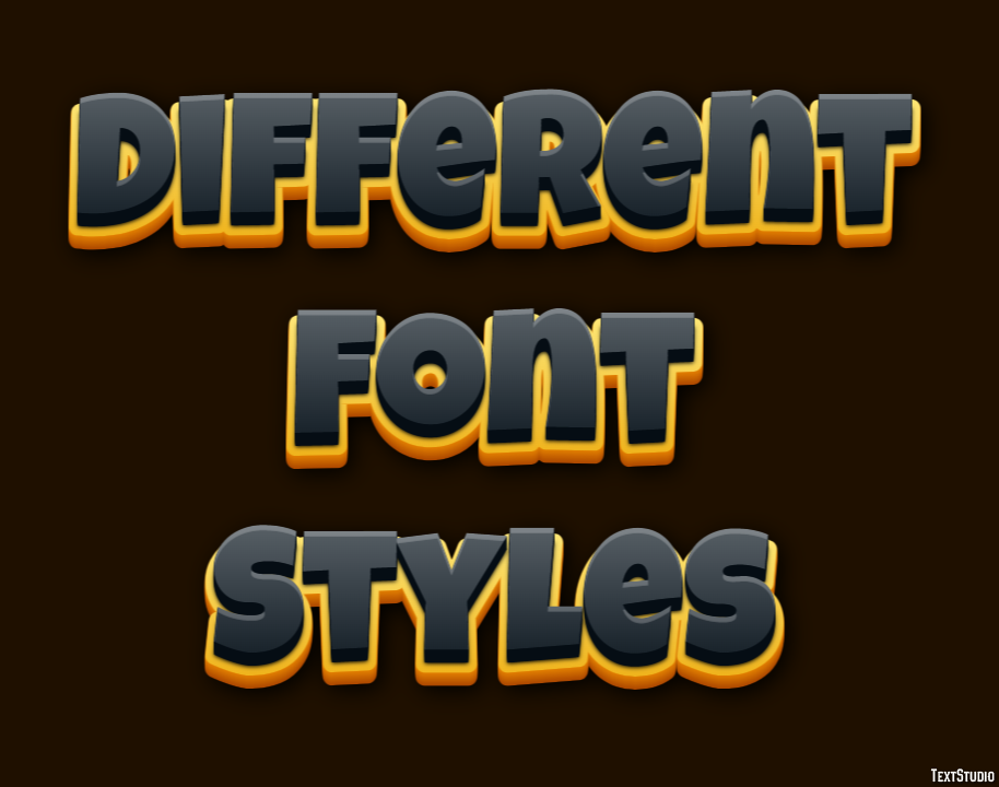
The versatility of lettering extends far beyond mere aesthetics; the choice of lettering style significantly impacts how a message is received and interpreted across various media. From the subtle elegance of a serif typeface in a high-end brochure to the bold, playful strokes of a hand-drawn font on a social media post, the right lettering style can make or break a design’s effectiveness.
Understanding how different styles translate across print, digital, and motion graphics is crucial for any designer aiming for impactful communication.
Lettering Styles in Print Design
Print design, encompassing materials like brochures and posters, often benefits from the tactile and visual richness that print offers. Serif typefaces, with their delicate flourishes, often lend an air of sophistication and tradition, making them ideal for high-end brochures or corporate materials. Sans-serif fonts, clean and modern, provide a more contemporary feel, suitable for posters promoting events or showcasing products with a minimalist aesthetic.
Display fonts, characterized by their unique and often decorative styles, can add a strong visual punch, particularly effective in headlines or short, impactful statements on posters. Consider, for example, a travel brochure featuring a delicate serif typeface for body text, paired with a bold sans-serif font for headings, and a decorative display font for the company logo. This layered approach creates visual hierarchy and enhances the overall message.
Lettering Styles in Digital Design
Digital design, including websites and user interfaces (UIs), demands a different approach to lettering. Readability is paramount in this context. Sans-serif fonts are generally preferred for body text on websites and UIs due to their clean lines and improved readability on screens. However, strategically placed serif fonts can add visual interest and create a sense of hierarchy.
The use of custom-designed or web-safe fonts plays a crucial role in brand consistency and user experience. For example, a website for a tech company might utilize a clean, geometric sans-serif font for the main body text, while employing a more playful, rounded sans-serif for call-to-action buttons. This contrast enhances usability and aligns with the brand’s modern aesthetic.
Lettering Styles in Motion Graphics and Animation
Motion graphics and animation offer unique opportunities for lettering to take center stage. The dynamic nature of these mediums allows for experimentation with lettering styles and animations that are impossible in static print or digital design. Here, the choice of font style is intrinsically linked to the overall mood and message of the animation. A hand-drawn font might be used to convey a playful or whimsical tone, while a bold, geometric sans-serif could be used to create a sense of energy and dynamism.
The animation itself can also transform the lettering, with letters growing, shrinking, morphing, or even appearing as three-dimensional objects. For instance, a promotional video for a children’s product might use a bouncy, hand-drawn font that animates with playful movements, while a corporate explainer video might use a sleek, minimal sans-serif font that appears and transitions smoothly to maintain a professional and clean feel.
Tools and Techniques for Creating Diverse Lettering
Creating diverse and compelling lettering styles requires a blend of artistic skill and the right tools. This isn’t just about picking up a pen; it’s about understanding the possibilities offered by both traditional and digital methods, and how to leverage them to achieve unique visual effects. The right tools can unlock your creativity and allow you to explore a vast range of styles, from elegant script to bold, geometric designs.
The world of lettering is incredibly versatile, offering a wide spectrum of tools and techniques to help you craft unique and expressive styles. Whether you prefer the tactile experience of hand-lettering or the precision of digital design, there’s a perfect approach waiting to be discovered. This exploration will delve into the specific tools and methods used by lettering artists, highlighting the strengths of each and offering a practical guide to creating your own distinctive style.
Software and Tools for Digital Lettering, Lettering styles that will diversify your designs
Digital tools offer unparalleled control and flexibility for creating and manipulating lettering styles. Popular software options include Adobe Illustrator, Photoshop, and Procreate. Illustrator, known for its vector-based capabilities, allows for precise scaling and editing without loss of quality, ideal for creating clean, crisp lettering for logos and branding. Photoshop, with its raster-based approach, is excellent for creating textured effects, adding details, and experimenting with various blending modes.
Procreate, a powerful iPad app, offers a more intuitive, painter-like experience, perfect for digital calligraphy and expressive lettering. Beyond the major players, many other programs offer lettering capabilities, each with its unique strengths. For example, Affinity Designer provides a strong alternative to Illustrator, while Autodesk Sketchbook offers a simpler, more sketch-focused interface. The choice of software ultimately depends on your personal preference, artistic style, and project requirements.
Hand-Lettering and Digital Calligraphy Techniques
Hand-lettering, the art of drawing letters, relies on the artist’s skill and the chosen tools. Different pens, pencils, and brushes create unique textures and strokes. Experimenting with various nibs and pressure allows for dynamic variations in line weight and style. Fine-liner pens are perfect for precise, detailed work, while brush pens offer more expressive, calligraphic strokes. Digital calligraphy mimics the fluid movements of traditional calligraphy using a stylus and digital drawing software.
The pressure sensitivity of the stylus allows for realistic variations in line weight, replicating the nuances of a brush or dip pen. This method offers the benefit of easy correction and experimentation, without the need for messy ink or expensive supplies.
Exploring different lettering styles is a fantastic way to add personality and visual interest to your designs; it’s all about finding your unique voice! To really level up your skills and reach a wider audience, check out this awesome guide on getting it on with youtube , which can help you showcase your lettering work. Once you’ve mastered the platform, you’ll be able to share your creative lettering styles with the world and inspire others.
Creating a Unique Lettering Style Using Adobe Illustrator
This step-by-step guide demonstrates how to create a unique lettering style using Adobe Illustrator. We’ll focus on creating a geometric sans-serif font with a distinctive angular feel.
Step 1: Sketching and Planning. Start by sketching your letterforms on paper. Focus on the overall shape and the unique angular characteristics you want to incorporate.
Step 2: Creating the Vector Shapes. Import your sketch into Illustrator. Using the Pen Tool, trace over your sketch, creating clean vector shapes for each letter. Pay attention to the angles and precise points of each letterform.
Step 3: Refining and Consistency. Adjust the shapes to ensure consistency in thickness and angles across all letters. Use the direct selection tool to fine-tune individual points and curves.
Step 4: Adding Details and Texture. Experiment with adding subtle details, such as small notches or extensions to the letterforms. Consider adding a subtle texture using a pattern or gradient.
Step 5: Exporting and Application. Once you are satisfied with your design, export your lettering as a font file (OTF or TTF) using a font creation software or service. You can then use your custom font in various design projects.
Conclusive Thoughts
Mastering diverse lettering styles is a journey of creativity and visual communication. By understanding the nuances of different typefaces and the principles of typography, you can unlock a world of design possibilities. From classic elegance to modern boldness, the right lettering style can elevate your projects and leave a lasting impression. So, experiment, explore, and let your designs speak volumes through the power of carefully chosen lettering.
User Queries: Lettering Styles That Will Diversify Your Designs
What’s the difference between serif and sans-serif fonts?
Serif fonts have small decorative strokes (serifs) at the ends of their letters, giving them a more traditional and often formal feel. Sans-serif fonts lack these strokes, appearing cleaner and more modern.
How do I choose the right font for my logo?
Consider your brand’s personality and target audience. A classic brand might suit a serif font, while a modern tech company might opt for a sans-serif. Ensure readability and memorability are key factors.
Where can I find free fonts for my projects?
Websites like Google Fonts and Font Squirrel offer a vast selection of free, high-quality fonts for both personal and commercial use.
What are some good resources for learning hand-lettering?
Online courses on platforms like Skillshare and Udemy, along with YouTube tutorials and practice, are excellent resources for learning hand-lettering.

