Simple Google Slides Themes A Design Guide
Simple Google Slides themes: They sound boring, right? Wrong! Clean, minimalist designs are actually incredibly powerful. Think about it: a well-designed, uncluttered slide lets your content shine, avoids distracting visuals, and keeps your audience focused on your message. This isn’t about blandness; it’s about strategic simplicity – a powerful tool for any presenter.
We’ll explore how to find, create, and adapt simple Google Slides themes for various presentation types. From business reports to engaging lectures, we’ll cover the essential design elements, helpful resources, and practical tips to make your presentations impactful and memorable. Get ready to ditch the visual clutter and embrace the power of simplicity!
Defining “Simple Google Slides Themes”
Simplicity in Google Slides themes isn’t just about minimalism; it’s about creating a presentation that’s clean, easy to read, and allows the content to shine. A simple theme prioritizes clarity and effectiveness over visual complexity, ensuring the audience focuses on the message, not the design.Simple Google Slides themes prioritize readability and content delivery. They avoid overwhelming the audience with excessive visual elements, instead focusing on creating a clean and organized presentation that effectively communicates the intended message.
This approach enhances audience engagement and comprehension by minimizing distractions.
Visual Elements in Simple Themes
The visual elements of a simple Google Slides theme are carefully chosen to enhance readability and maintain a consistent aesthetic. Typically, these themes utilize a limited color palette—often consisting of two or three complementary colors, maybe a primary color and its variations, along with a neutral color like white, gray, or black. Font choices are usually limited to one or two easy-to-read fonts, such as Arial, Calibri, or Roboto, avoiding overly decorative or stylized fonts that could hinder readability.
Layout structures are generally clean and uncluttered, often employing a consistent grid system to ensure visual balance and consistency across all slides. For example, a simple theme might use a consistent header and footer layout across all slides, with consistent spacing and alignment.
Comparison with Complex Themes
Simple themes stand in stark contrast to more complex themes, which often feature busy backgrounds, multiple fonts, and a wide range of colors. While complex themes can be visually striking, they can also be distracting and difficult to read, particularly for large amounts of text. Simple themes, on the other hand, provide a clean canvas that allows the content to take center stage.
Consider a presentation on financial data: a simple theme with clear charts and minimal visual clutter will allow the audience to easily digest the information, while a complex theme might obscure the key data points.
Benefits of Simple Themes for Various Presentation Types
The benefits of using simple themes extend across a variety of presentation types. For business presentations, a simple theme projects professionalism and credibility, allowing the data and arguments to speak for themselves. In educational settings, simple themes improve comprehension and retention by minimizing distractions. Even creative presentations, such as portfolio showcases, can benefit from simple themes by providing a clean backdrop that highlights the work itself.
For example, an architect presenting a building design would benefit from a simple theme that allows the building renderings to stand out without competing visual elements. The clarity and focus provided by a simple theme ensures the audience remains engaged and receptive to the information being presented.
Finding and Utilizing Simple Google Slides Themes
Finding the perfect Google Slides theme can significantly impact the overall presentation’s effectiveness. A simple, clean theme allows your content to shine without distracting visuals. This means focusing on readability and clarity, rather than flashy animations or complex layouts. Let’s explore how to find and implement these effective themes.
Locating Simple Google Slides Themes
There are several avenues to explore when searching for simple Google Slides themes. The most straightforward approach is to utilize Google Slides’ built-in templates. These are readily accessible within the application itself, offering a curated selection of pre-designed themes, many of which are minimalist and easy to customize. Beyond Google’s offerings, numerous third-party websites specialize in providing high-quality, downloadable Google Slides themes.
These websites often categorize their themes, making it easier to find simple options. Some even offer free themes, while others operate on a subscription or pay-per-download model.
Effective Search and Filtering Techniques
Successfully locating simple themes requires strategic searching and filtering. When using the built-in Google Slides template library, utilize the search bar and filter options. Enter s like “minimalist,” “clean,” “simple,” or “professional” to narrow your results. For third-party websites, look for similar filtering options. Many websites allow you to filter themes by color palette, style, and layout complexity.
Reading theme descriptions carefully is also crucial; pay attention to s like “minimal design,” “clean typography,” and “uncluttered layout” to ensure the theme aligns with your simplicity criteria.
Resources for High-Quality Simple Themes
Several reputable sources offer a wide array of simple and high-quality Google Slides themes. While I can’t provide URLs, many design marketplaces and template websites feature extensive collections. Additionally, some independent designers and design blogs share free and premium themes, often showcasing their work on platforms like Behance or Dribbble. Searching these platforms for “minimalist Google Slides themes” or similar terms will yield relevant results.
Finally, remember to check the reviews and ratings of themes before downloading, as this helps ensure quality and compatibility.
Applying a Google Slides Theme
Applying a chosen theme to your Google Slides presentation is a straightforward process. First, open your Google Slides presentation. Then, navigate to the “Theme” menu. This is typically found in the toolbar, though the exact location might vary slightly depending on the Google Slides version. If using a built-in theme, select it directly from the menu’s options.
For a downloaded theme, you’ll likely need to import it. This usually involves clicking an “Import Theme” or similar option within the “Theme” menu and then selecting the downloaded theme file. Once the theme is applied, your slides will automatically adopt the new design, including fonts, colors, and layouts. You can then further customize individual slides as needed.
Creating Custom Simple Google Slides Themes

Source: slidesgo.com
Designing your own Google Slides theme allows for complete control over the visual presentation of your slides, ensuring a consistent and professional look. This is particularly useful when you need a theme that perfectly matches your brand or the specific needs of a presentation. Creating a simple theme, however, requires careful consideration of key design elements to avoid visual clutter and maintain a clean aesthetic.
The process of building a custom simple theme involves a strategic approach to color palettes, typography, and imagery. It’s about choosing the right elements and then using Google Slides’ tools to refine and implement them effectively. This allows for a highly personalized presentation that reflects your style while maintaining clarity and readability.
Designing a Custom Simple Theme from Scratch
Creating a theme from scratch involves starting with a blank canvas and thoughtfully building upon it. This process allows for maximum customization but demands a more thorough understanding of design principles. Begin by selecting a core color palette – typically two to three colors, one primary and one or two accent colors – that complement each other and align with your presentation’s purpose.
Next, choose a legible and easily readable font. Avoid using more than two fonts – one for headings and one for body text. Finally, consider the use of imagery. If included, images should be high-quality, relevant, and minimally distracting. Remember, simplicity is key.
Essential Design Elements for Simple Themes
Several key design elements are crucial when crafting a simple Google Slides theme. Careful consideration of these elements ensures a visually appealing and effective presentation. Ignoring them can lead to a cluttered and unprofessional-looking result.
Simple Google Slides themes are a lifesaver for quick presentations, right? But sometimes you need to elevate your game, especially if you’re showcasing your work. That’s where creating engaging YouTube content comes in; check out this awesome guide on getting it on with YouTube to learn how to make killer videos. Then, use those polished video stills as stunning visuals in your simple Google Slides themes – instant upgrade!
- Color Schemes: Limit your palette to two to three colors for a clean look. Consider using a color palette generator to ensure harmony and visual appeal. A good example is a dark grey background with a bright teal accent color for headings and highlights.
- Typography: Choose one or two easily readable fonts. Use a sans-serif font like Roboto or Open Sans for body text and a slightly bolder sans-serif or a serif font for headings. Avoid overly decorative or difficult-to-read fonts.
- Imagery: If using images, keep them high-quality, relevant, and minimal. Large, distracting images can detract from your message. Instead, consider using subtle background images or small, strategically placed icons.
Modifying Existing Themes for Simplicity
Google Slides offers a range of pre-built themes that can be easily modified to achieve a simpler look. Start by selecting a theme with a relatively clean layout. Then, begin by modifying the color palette. Remove unnecessary colors, focusing on two to three that complement each other. Next, adjust the typography.
Replace any overly decorative fonts with cleaner, more legible alternatives. Finally, minimize or remove any distracting background images or patterns. The goal is to streamline the theme, removing unnecessary elements to highlight your content.
Essential Design Elements Table
This table summarizes the key elements and their application in a simple theme.
| Element | Description | Example | Application in a Simple Theme |
|---|---|---|---|
| Color Scheme | The palette of colors used throughout the presentation. | Dark grey background, teal accents | Use a limited palette (2-3 colors) for consistency and visual clarity. |
| Typography | The fonts used for headings and body text. | Roboto (body), Montserrat (headings) | Choose legible, easy-to-read fonts. Avoid more than two fonts. |
| Imagery | Images, icons, or illustrations used in the presentation. | Subtle background image, minimal icons | Use high-quality, relevant images sparingly to avoid visual clutter. |
| Layout | The arrangement of text and images on each slide. | Consistent spacing, clear hierarchy | Maintain a consistent layout with ample white space for readability. |
Simple Theme Application Across Different Presentation Types
Source: pinimg.com
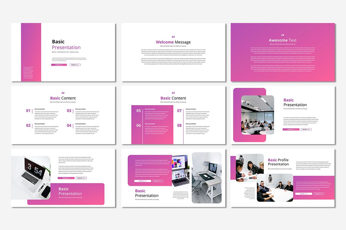
Adapting a simple Google Slides theme for diverse presentation needs is key to maintaining a professional and consistent brand while effectively communicating your message. A well-chosen simple theme provides a solid foundation that can be tailored to suit various contexts, from formal business reports to engaging educational lectures. The challenge lies in balancing simplicity with the specific visual requirements of each presentation type.The core principle is to maintain visual consistency while adapting elements to match the presentation’s purpose and audience.
A minimalist theme, for example, might employ a clean sans-serif font and a limited color palette. However, the specific shades of those colors, the choice of charts and graphs, and even the layout itself can be subtly adjusted to reflect the context.
Adapting Simple Themes for Different Presentation Purposes
A simple theme’s versatility shines through its adaptability. For a business report, you might emphasize data visualization with clear, concise charts and graphs, using a more formal color palette like navy blue and gray. In contrast, an educational lecture could benefit from a brighter, more playful color scheme and the incorporation of relevant images or icons to enhance engagement and understanding.
A marketing pitch might use bolder colors and more dynamic layouts to capture attention and highlight key selling points. The core theme remains consistent – clean fonts, ample white space – but the supporting elements are carefully chosen to resonate with the target audience and presentation objective.
Challenges in Maintaining Simplicity While Incorporating Specific Content Requirements, Simple google slides themes
Maintaining simplicity while fulfilling content demands can be tricky. For instance, a complex dataset might require intricate charts that could clash with a minimalist aesthetic. The solution lies in careful selection and design of visuals. Instead of overwhelming the slide with detailed information, consider summarizing key data points or using interactive elements to delve deeper upon request. Similarly, integrating numerous images or videos requires mindful curation to prevent a cluttered look.
Prioritizing high-quality, relevant visuals and maintaining consistent spacing are crucial to avoid visual overload.
Techniques for Ensuring Readability and Visual Appeal Across Different Presentation Contexts
Readability and visual appeal are paramount. High contrast between text and background is essential, regardless of the presentation type. This means choosing font colors that stand out clearly against the chosen background color. Furthermore, maintaining a consistent font family and size across all slides improves readability and creates a unified look. Visual hierarchy – using headings, subheadings, and bullet points effectively – helps guide the audience’s eye and ensures that key information is easily accessible.
White space, often overlooked, is crucial for creating a clean and uncluttered appearance. Strategic use of whitespace improves readability and allows the information to breathe.
Best Practices for Adapting Simple Themes to Different Audiences and Presentation Goals
- Prioritize clarity and conciseness: Avoid overwhelming the audience with too much information on a single slide.
- Tailor the color palette to the context: Use bolder colors for marketing pitches and more subdued tones for business reports.
- Select appropriate visuals: Choose images and icons that are relevant, high-quality, and consistent with the overall aesthetic.
- Maintain consistent branding: Use your organization’s logo and color scheme consistently across all presentations.
- Consider the audience’s background and expectations: Adapt your language and visual style to resonate with your target audience.
- Test and refine: Before presenting, review your slides carefully and make adjustments as needed to ensure readability and visual appeal.
Illustrative Examples of Simple Google Slides Themes
Simple Google Slides themes are powerful tools for effective communication. By focusing on clean layouts and minimal design elements, they ensure your message remains the focal point. Let’s explore three distinct examples to illustrate their versatility and impact.
Theme 1: Modern Minimalism
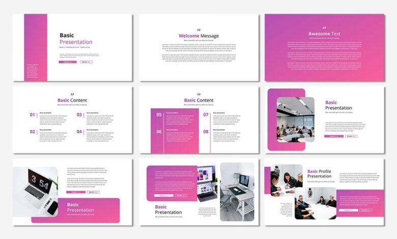
This theme employs a predominantly white background with subtle gray accents. The color palette is limited to variations of white, light gray, and a single accent color, perhaps a muted teal or a soft blue. Typography is clean and modern, using a sans-serif font like Open Sans or Roboto for body text and a slightly bolder version for headings.
The overall visual style is uncluttered and airy, creating a professional and sophisticated feel. Images, if used, are high-quality and kept to a minimum, allowing ample white space to breathe. This theme is ideal for conveying a message of professionalism, clarity, and trustworthiness, making it suitable for business presentations, reports, or proposals. Further customization could involve adjusting the accent color to match brand guidelines or incorporating a subtle texture for added visual interest without sacrificing the minimalist aesthetic.
For example, a very faint linen texture in the background could add warmth without being distracting.
Theme 2: Warm and Inviting
This theme utilizes a warmer color palette, featuring creamy beige or light tan backgrounds, accented with soft browns and oranges. The typography is slightly more relaxed, perhaps using a serif font like Garamond or Lato for body text, and a complementary sans-serif for headings to maintain readability. The visual style is approachable and friendly, suggesting comfort and approachability. This theme could incorporate hand-drawn elements or subtle textures to further enhance its warmth.
It’s perfect for presentations related to community events, family gatherings, or presentations focused on building rapport and connection. Customization could include the addition of subtle pattern overlays, such as a delicate floral motif or a faint watercolor wash, to further amplify the welcoming feel, or the use of a custom-designed icon set to match the theme’s tone.
Theme 3: Bold and Energetic
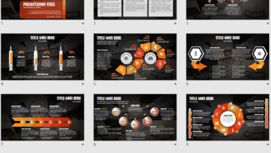
This theme takes a more dynamic approach, using a dark gray or navy background with bright accent colors like a vibrant orange, lime green, or sunny yellow. The typography is strong and impactful, employing a bold sans-serif font like Montserrat or Poppins for headings and a slightly lighter weight for body text to maintain readability. The overall visual style is energetic and modern, creating a sense of excitement and innovation.
Images should be sharp and high-contrast to further emphasize the bold aesthetic. This theme is well-suited for presentations on technology, innovation, or any topic requiring a high-energy approach. Further customization might involve incorporating geometric shapes or gradients to enhance the visual dynamism or using custom illustrations that align with the presentation’s message, maintaining the energy level while adding specific visual details.
Final Conclusion
Mastering simple Google Slides themes isn’t just about aesthetics; it’s about effective communication. By prioritizing clarity and focusing on your core message, you can create presentations that resonate with your audience. Whether you’re using a pre-made theme or designing your own, remember that less is often more. So, go forth and create presentations that are both beautiful and impactful!
FAQ Guide
Can I use simple themes for complex topics?
Absolutely! Simplicity enhances clarity. Focus on strong visuals and concise text to convey even the most complex information effectively.
Where can I find free simple Google Slides themes?
Google Slides offers built-in templates. Many free options are also available through searching online, but always check licensing before using.
How do I ensure my simple theme is accessible?
Use sufficient color contrast, legible fonts, and avoid overly small text. Consider the needs of viewers with visual impairments.
What if my simple theme feels too basic?
Subtle additions like high-quality images or custom icons can add visual interest without compromising the overall simplicity.
