Best PowerPoint Templates for Scientific Presentations
Best PowerPoint templates for scientific presentations are more than just pretty slides; they’re the key to unlocking clear, concise, and compelling communication of your research. Crafting a scientific presentation can feel daunting, juggling complex data with the need for visual appeal. But fear not! This post dives deep into finding the perfect template, exploring features, data visualization techniques, and even incorporating multimedia elements to make your next presentation a knockout.
We’ll cover everything from choosing the right color palette to ensuring accessibility for all viewers. Think of this as your ultimate guide to transforming your scientific findings into a presentation that not only informs but also captivates your audience. Get ready to ditch the boring slides and embrace the power of visual storytelling!
Introduction to Scientific Presentation Design
Crafting a compelling scientific presentation isn’t just about showcasing your research; it’s about effectively communicating its significance to your audience. A well-designed presentation translates complex data into easily digestible information, fostering understanding and sparking engagement. Poor design, however, can lead to confusion and ultimately, a failure to convey your key findings.Effective scientific presentations hinge on a few key elements.
First, a clear and concise narrative is paramount. Your presentation should tell a story, guiding the audience logically through your research methodology, results, and conclusions. Second, visual aids are crucial for enhancing understanding and retention. Graphs, charts, and images should be carefully selected and meticulously designed to complement your narrative, not distract from it. Finally, the overall aesthetic should be professional and consistent, reflecting the rigor and credibility of your scientific work.
Visual Clarity and Conciseness in Scientific Data Presentation
Visual clarity is the cornerstone of effective scientific communication. Overly complex graphs or charts laden with unnecessary data points can overwhelm the audience and hinder comprehension. Instead, prioritize simplicity and focus on highlighting the most crucial data points. Conciseness is equally important; each slide should present a single, focused message. Avoid cluttering slides with excessive text or visual elements.
A well-designed figure, for instance, should immediately communicate its key message without requiring lengthy explanations. Consider using clear and consistent color schemes, appropriate font sizes, and a clean layout to maximize readability. For example, a bar chart comparing the effectiveness of three different treatments should use distinct colors for each treatment, clear labels for the axes, and a concise title that summarizes the key finding.
Common Pitfalls in Scientific Presentation Design
Several common pitfalls can significantly undermine the effectiveness of a scientific presentation. One frequent error is using excessive text on slides. Slides should serve as visual aids, complementing, not replacing, your spoken presentation. Overly dense text blocks are difficult to read and will likely cause the audience to lose focus. Another common mistake is the use of inappropriate visuals.
Images or charts that are poorly designed, low-resolution, or irrelevant to the content can detract from your presentation’s overall impact. For example, using a blurry microscopic image or a chart with illegible labels can make your presentation appear unprofessional and diminish the credibility of your findings. Finally, inconsistent formatting, such as varying font sizes or colors throughout the presentation, creates a disorganized and unprofessional appearance.
A consistent design throughout your presentation helps maintain the flow and clarity of your message.
Review of Popular PowerPoint Template Features
Choosing the right PowerPoint template can significantly impact the effectiveness of your scientific presentation. A well-designed template not only enhances the visual appeal but also improves clarity and comprehension, making your complex data easier for the audience to grasp. Let’s delve into some popular options and their features.
Comparison of Popular Scientific PowerPoint Templates
Selecting a template involves weighing various features against your specific needs and presentation style. Below is a comparison of three popular choices, highlighting their strengths and weaknesses.
Finding the best PowerPoint templates for scientific presentations can be a game-changer, making complex data more accessible and engaging. But once you’ve crafted that perfect presentation, why not share it with a wider audience? That’s where learning to leverage video platforms like YouTube comes in, check out this helpful guide on getting it on with youtube to boost your reach.
After all, a stunning presentation deserves a stunning online presence, and the right templates are key to both.
| Template Name | Key Features | Pros | Cons |
|---|---|---|---|
| Enliven (Example Template – features may vary based on version) | Pre-designed slide layouts for various data types (charts, graphs, tables), consistent color palettes, professional typography, customizable animations. | Visually appealing, easy to customize, wide range of layouts for different data presentation needs, good for large datasets. | Might feel generic if not customized significantly, some features may require a paid subscription for full access. |
| SciencePowerPoint (Example Template – features may vary based on version) | Focus on data visualization, specific layouts for scientific diagrams and illustrations, integration with scientific software, high-resolution graphics. | Excellent for presentations heavily reliant on visuals and diagrams, optimized for scientific data representation, potentially includes features for exporting high-quality images for publications. | Steeper learning curve compared to simpler templates, might require specific software integration, may not be suitable for presentations with less emphasis on visuals. |
| Minimalist Science (Example Template – features may vary based on version) | Clean and uncluttered design, emphasis on readability, limited animations, customizable color palettes, basic chart and graph layouts. | Highly readable, avoids visual distractions, allows for clear focus on data, easy to customize to match branding. | May lack the advanced features of more comprehensive templates, limited layout options might restrict creativity, may not be suitable for presentations with a lot of data. |
Pre-designed Templates vs. Custom Designs
The decision to use a pre-designed template or create a custom design hinges on several factors. Pre-designed templates offer convenience and consistency, ensuring a professional look and feel without extensive design effort. However, they might lack the unique branding or specific layout requirements needed for a truly unique presentation. Custom designs offer complete creative control, enabling perfect alignment with branding and specific data visualization needs, but they require significantly more time and design expertise.
For instance, a researcher with limited design skills might find a pre-designed template much more efficient, whereas a design-savvy researcher might prefer the complete creative freedom of a custom design to reflect their unique research style.
The Role of Color Palettes and Typography
Effective use of color palettes and typography is crucial for enhancing the readability and visual appeal of scientific data. A well-chosen color palette improves data differentiation, guides the audience’s eye, and enhances the overall aesthetic. For example, using a color-blind friendly palette ensures accessibility for all viewers. Similarly, clear and legible typography, using appropriate font sizes and styles, ensures that all text is easily readable, even from a distance.
Avoid overly decorative fonts, which can distract from the data. A simple, professional typeface like Arial or Calibri is often a good choice for scientific presentations, prioritizing readability over stylistic flourishes.
Data Visualization Techniques in Scientific Presentations: Best Powerpoint Templates For Scientific Presentations
Effective data visualization is crucial for conveying complex scientific findings clearly and concisely. A well-designed visual can instantly communicate patterns, trends, and relationships that would be lost in pages of text. Choosing the right chart type and adhering to best practices are key to creating impactful scientific presentations.Data visualization isn’t just about aesthetics; it’s about communicating information accurately and efficiently.
Poorly designed visuals can lead to misinterpretations, while well-designed visuals can enhance understanding and engagement. This section will explore several effective methods for visualizing scientific data, focusing on chart selection and best practices for design.
Bar Charts for Comparing Categories
Bar charts are ideal for comparing discrete categories. For example, a bar chart could effectively show the relative abundance of different species in an ecosystem. Imagine a bar chart with “Species A,” “Species B,” and “Species C” on the horizontal axis and the number of individuals counted on the vertical axis. Each species would be represented by a bar whose height corresponds to its abundance.
A descriptive caption might read: “Relative Abundance of Three Plant Species in a Temperate Forest Ecosystem (n=100 samples).” The use of clear labels, a concise title, and appropriate scaling ensures data clarity. Avoid cluttered charts by limiting the number of categories displayed.
Line Graphs for Showing Trends Over Time
Line graphs excel at displaying trends and changes over a continuous variable, most often time. A classic example would be charting the growth of a bacterial population over several hours. The horizontal axis would represent time (in hours), and the vertical axis would represent the population size (e.g., colony-forming units). The line connecting the data points would clearly illustrate the growth pattern.
A caption could state: “Growth ofE. coli* Bacteria Culture Over 8 Hours at 37°C.” Consistent units and clear axis labels are crucial for interpretation.
Scatter Plots for Showing Relationships Between Variables
Scatter plots are powerful tools for visualizing the relationship between two continuous variables. For instance, a scatter plot could show the correlation between temperature and enzyme activity. Each point on the graph would represent a single measurement, with temperature on the x-axis and enzyme activity on the y-axis. A clear trend (positive, negative, or no correlation) can be easily observed.
The caption could read: “Correlation Between Temperature (°C) and Enzyme Activity (µmol/min).” Adding a trendline can further highlight the relationship.
Best Practices for Creating Visually Compelling Data Visualizations
Several best practices contribute to effective data visualization. First, choose the appropriate chart type based on the type of data and the message you want to convey. Second, use clear and concise labels for axes, data points, and the entire chart. Third, select a visually appealing color scheme that enhances readability and avoids distracting elements. Fourth, maintain a consistent style throughout the presentation to ensure visual harmony.
Finally, keep the charts clean and uncluttered, focusing on the essential information. Overly complex charts can be overwhelming and detract from the message. Simplicity is key to effective communication.
Incorporating Multimedia Elements
Multimedia significantly enhances scientific presentations, transforming static data into engaging narratives. Effective use of images, videos, and animations can clarify complex concepts, improve audience comprehension, and ultimately, make your presentation more memorable. However, careful selection and integration are crucial to avoid distracting from the core scientific message.Visuals should not only be aesthetically pleasing but also scientifically accurate and relevant.
Poorly chosen or low-quality multimedia can undermine your credibility and confuse your audience. Therefore, a strategic approach to incorporating multimedia is paramount.
High-Quality Visual Selection Guidelines
Selecting high-quality visuals requires careful consideration of several factors. Images should be high-resolution to avoid pixelation when projected onto a large screen. Videos should be professionally produced, with clear audio and concise messaging. Animations should be smooth and informative, avoiding unnecessary complexity or distracting effects. The content of all visuals must accurately reflect the data and conclusions presented in your presentation.
Avoid using images or videos that are misleading, overly simplistic, or irrelevant to your topic. For example, using a generic stock photo of a brain when discussing a specific neurological process would be inappropriate. Instead, use a scientifically accurate diagram or microscopic image relevant to your research.
Resources for Royalty-Free Images and Videos, Best powerpoint templates for scientific presentations
Finding appropriate visuals for scientific presentations can be challenging, but several reliable resources offer royalty-free options. These resources provide access to high-quality images and videos that are legally permissible for use in academic and professional contexts.
- Public domain images: Websites like Wikimedia Commons host a vast collection of images and videos that are in the public domain, meaning they are free to use without restriction.
- Creative Commons licensed media: Many platforms, such as Flickr and Unsplash, offer images and videos under Creative Commons licenses. These licenses allow for various levels of reuse, but it’s crucial to check the specific license terms before using any material.
- Stock photo and video websites with royalty-free options: Sites like Pexels, Pixabay, and others offer large libraries of royalty-free images and videos, often categorized for easy searching. While some may require attribution, many offer free use without restrictions.
- Scientific databases and journals: Many scientific journals and databases offer high-quality images and videos related to research publications. Check the copyright and usage policies of each database before using any material.
Remember to always attribute the source of your visuals appropriately, respecting the copyright and licensing agreements. Improper use of copyrighted material can have serious consequences.
Structuring a Scientific Presentation
Source: amazonaws.com
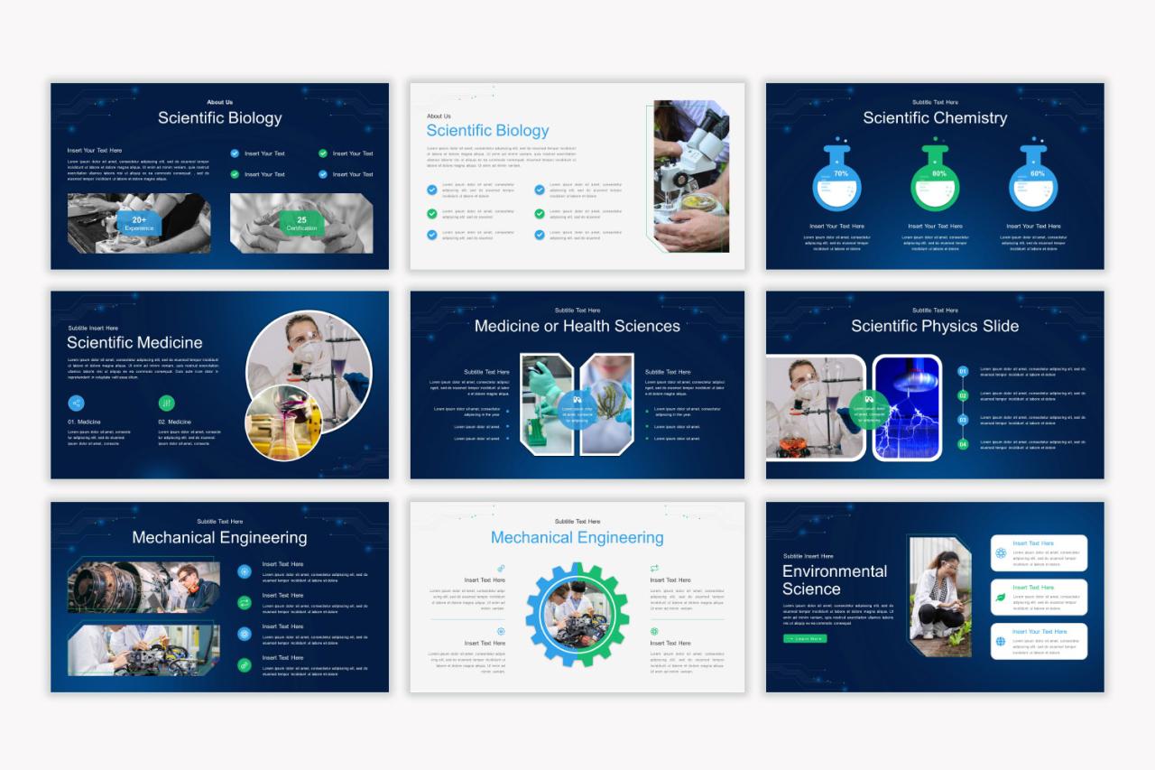
Crafting a compelling scientific presentation involves more than just compiling data; it requires a clear and logical structure to guide your audience through your research. A well-structured presentation ensures your key findings are understood and remembered, leaving a lasting impact. This involves careful consideration of content flow and visual aids.A typical scientific presentation follows a standard structure: Introduction, Methods, Results, Discussion, and Conclusion.
Each section plays a crucial role in conveying your research effectively. Let’s examine how to structure each section and design corresponding PowerPoint slides.
Sample Scientific Presentation Structure
This example focuses on a hypothetical study investigating the effects of a new fertilizer on plant growth. Introduction (Slide 1): This slide sets the stage. It begins with a captivating title (“Enhancing Plant Growth with Novel Fertilizer X”), followed by a concise background on the problem (e.g., the limitations of existing fertilizers). Then, it clearly states the research objective (e.g., to evaluate the efficacy of Fertilizer X on plant height and yield) and briefly Artikels the presentation’s structure.
A visually appealing image of healthy plants could enhance this slide. The slide uses a bold title font, clear bullet points for objectives, and a high-quality image to maintain visual appeal. Methods (Slide 2-3): This section details the experimental design. Slide 2 could describe the experimental setup: type of plants used, control group versus experimental group, and the fertilizer application method.
Slide 3 would then explain the data collection process: measurements taken (plant height, yield), frequency of measurements, and any statistical analyses employed. Simple diagrams or flowcharts would visually clarify the experimental design. A table summarizing the experimental groups and conditions would enhance clarity. Results (Slide 4-6): This section presents the findings. Slides 4 and 5 would showcase the data using appropriate graphs and charts.
For example, a bar graph comparing plant height between the control and experimental groups and a line graph showing yield over time. Slide 6 might present key statistical findings (e.g., p-values, effect sizes) in a clear and concise manner. The use of consistent color schemes, clear axis labels, and error bars (where appropriate) is crucial for data clarity.
Discussion (Slide 7-8): This section interprets the results in the context of existing literature. Slide 7 explains the significance of the findings, comparing them to previous research. It addresses potential limitations of the study and suggests areas for future research. Slide 8 might explore the implications of the findings for practical applications, such as agricultural practices. This section uses bullet points to highlight key interpretations and implications.
Conclusion (Slide 9): This slide summarizes the key findings and their implications. It restates the main objective and concisely summarizes the results, emphasizing their significance. A strong concluding statement leaves a lasting impression on the audience. This slide uses a bold font for the concluding statement and a simple, visually appealing design.
PowerPoint Slide Layout for Effective Support
Each section requires a tailored layout. The Introduction should have a bold title, concise background, clear objectives, and a visually appealing image. Methods and Results sections benefit from clear diagrams, tables, and graphs. The Discussion section needs space for interpretation and comparison with existing research. The Conclusion should be brief, impactful, and visually striking.
Maintaining a consistent design theme throughout is essential.
Using Transitions and Animations to Guide the Audience
Transitions between slides should be smooth and logical, avoiding jarring changes. Simple transitions like fade or slide are generally preferred for scientific presentations. Animations should be used sparingly and only to highlight key information, avoiding distracting or overwhelming effects. For example, you might animate bullet points to appear one at a time, or use a subtle animation to draw attention to a key data point on a graph.
The goal is to guide the audience’s attention, not to entertain them.
Accessibility and Inclusivity
Creating accessible and inclusive scientific presentations is crucial for ensuring that your research reaches the widest possible audience. A presentation that’s difficult to understand or access excludes individuals with disabilities and limits the potential impact of your work. This section focuses on strategies to make your presentations welcoming and understandable for everyone.Designing presentations with accessibility in mind not only benefits those with disabilities but also enhances the experience for all viewers.
Clear, concise language, well-structured content, and thoughtful use of visuals benefit everyone, regardless of their learning style or background. By prioritizing accessibility, you create a more engaging and impactful presentation.
Alt Text for Images and Visual Elements
Effective alt text is essential for making your presentations accessible to individuals with visual impairments who rely on screen readers. Alt text should concisely describe the image’s content and purpose within the presentation. It shouldn’t just repeat the caption; instead, it should convey the meaning and importance of the visual to the overall message. For example, instead of “Graph showing data,” a more effective alt text would be “Line graph illustrating the correlation between temperature and enzyme activity, showing a peak activity at 37 degrees Celsius.” This detailed description provides context and meaning for those who cannot see the image.
Similarly, for complex figures or diagrams, provide a detailed caption and alt text that explains the key elements and their relationships. Remember to keep alt text brief yet informative, aiming for a balance between conciseness and completeness.
Strategies for Visual Impairment Accessibility
Beyond alt text, several strategies enhance accessibility for visually impaired audiences. Using high contrast between text and background colors improves readability. Avoid using color alone to convey information; use patterns, shapes, or text labels as well. Ensure sufficient font size and clear, simple fonts for optimal readability. For example, using Arial or Calibri in a size 18 or larger is generally recommended for on-screen presentations.
Consider providing a handout with larger fonts and detailed captions for images. Furthermore, the use of clear and consistent visual hierarchy (headings, bullet points, etc.) is essential for organizing the information and making it easy to navigate. These strategies make presentations more accessible for individuals with low vision or other visual impairments.
Inclusive Design for Diverse Learning Styles
Scientific presentations should cater to diverse learning styles. Incorporate a variety of media, including text, images, audio, and video, to engage different learning preferences. Use clear and concise language, avoiding jargon or overly technical terms unless your audience is highly specialized. Provide visual aids such as charts, graphs, and diagrams to supplement your verbal explanations. Breaking down complex information into smaller, digestible chunks also aids comprehension.
For instance, instead of presenting a dense paragraph of results, break it down using bullet points or a table to highlight key findings. This multifaceted approach ensures that the information is accessible and engaging for a wide range of learners.
Best Practices for Delivering a Scientific Presentation
Source: amazonaws.com
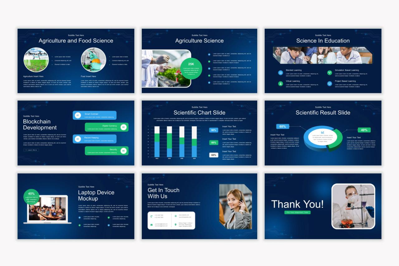
Crafting a compelling scientific presentation goes beyond just having impressive visuals and data; it’s about effectively communicating your research to your audience. A confident and engaging delivery is crucial for ensuring your message resonates and leaves a lasting impact. This involves more than just reading slides; it’s about connecting with your audience on a personal level and making your complex information accessible and understandable.Effective delivery hinges on several key aspects, including confident body language, clear articulation, and skillful audience engagement.
A well-structured presentation, coupled with a practiced delivery, significantly improves the audience’s comprehension and overall experience. This section delves into the techniques for achieving this.
Confidence and Engagement Techniques
Projecting confidence is paramount. This starts with thorough preparation. Knowing your material inside and out allows you to speak with authority and respond naturally to questions. Maintain eye contact with different members of the audience to foster a connection and gauge their understanding. Vary your tone and pace to keep the presentation dynamic and prevent monotony.
Use natural hand gestures to emphasize points and appear more approachable. Incorporating pauses strategically can add emphasis and allow the audience time to process information. Enthusiasm is contagious; let your passion for the subject shine through. Consider practicing in front of a mirror or friends to get comfortable with your delivery. A confident posture, standing tall with relaxed shoulders, also contributes to a professional and engaging presentation.
Handling Questions and Audience Concerns
Addressing questions effectively is crucial. Begin by actively listening to the question, ensuring complete understanding before responding. If you don’t know the answer, it’s perfectly acceptable to say so honestly. Offer to follow up with the information later or suggest a relevant resource. Frame your responses clearly and concisely, avoiding jargon whenever possible.
Anticipate potential questions beforehand and prepare concise answers. For challenging questions, acknowledge the validity of the concern before presenting your perspective or data-backed response. Maintain a respectful and professional demeanor even when faced with challenging or critical questions. Consider framing your answers in the context of your overall presentation narrative, reinforcing key findings and conclusions.
The Importance of Practice
Rehearsing your presentation is not merely recommended; it’s essential. Practicing helps identify areas needing improvement, such as pacing, clarity, and transitions. It allows you to refine your delivery, ensuring a smooth and coherent flow. Timing is crucial; practice will help you stay within the allocated time. Practicing helps build confidence and reduces the likelihood of nerves affecting your performance.
Try practicing in front of a test audience to receive constructive feedback and identify areas for improvement. Record yourself to analyze your body language, tone, and overall presentation style. Multiple practice sessions are key to achieving a polished and confident delivery. Consider using different settings to simulate the presentation environment.
End of Discussion
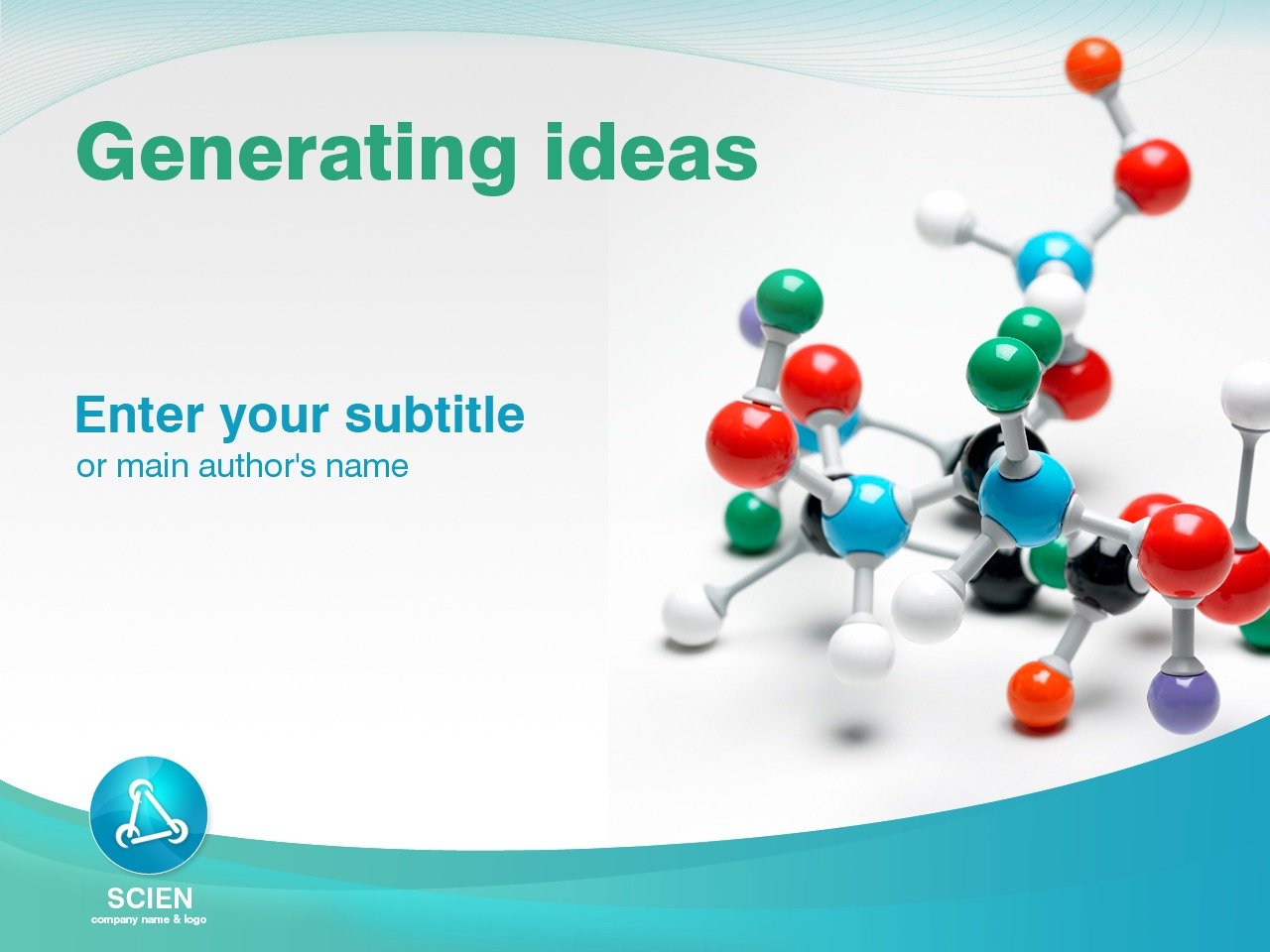
Source: tmimgcdn.com
Creating impactful scientific presentations doesn’t have to be a headache. By leveraging the right PowerPoint templates, mastering data visualization, and incorporating multimedia elements thoughtfully, you can transform complex information into a compelling narrative. Remember, a well-designed presentation isn’t just about showcasing your data; it’s about connecting with your audience and leaving a lasting impression. So, go forth and create presentations that truly shine!
Questions Often Asked
What file formats are usually compatible with scientific presentation templates?
Most templates support .pptx (PowerPoint), but some might also offer .potx (PowerPoint template) or even export options for PDF or image formats.
How can I ensure my presentation is visually accessible to colorblind individuals?
Use sufficient color contrast between text and background, avoid relying solely on color to convey information, and consider using a colorblind-friendly palette. Tools and resources are available online to help check your color combinations.
Are there free PowerPoint templates suitable for scientific presentations?
Yes, many websites offer free templates, but be sure to check the license to ensure you’re allowed to use them for your specific purpose. Quality can vary, so preview thoroughly before committing.
How much animation is too much in a scientific presentation?
Keep animations subtle and purposeful. Overuse can distract from your message. Focus on smooth transitions and highlighting key data points, rather than flashy effects.
