Menu Designs That Stand Out Create a Stunning Menu
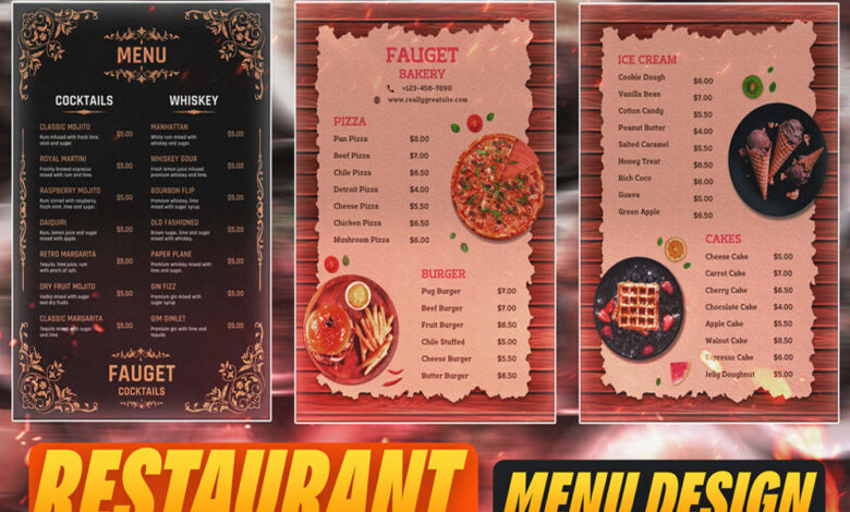
Menu designs that stand out aren’t just about pretty pictures; they’re about crafting an experience. Think about it: a visually appealing menu can elevate a simple meal into a memorable occasion, subtly influencing customer choices and creating a lasting impression. From the strategic use of whitespace to the psychology of color, every element plays a vital role in creating a menu that truly captivates.
This post dives deep into the art of menu design, exploring the key elements that transform an ordinary menu into a masterpiece.
We’ll explore how visual hierarchy, typography, color palettes, imagery, and even interactive elements can be strategically employed to create menus that not only inform but also entice. We’ll examine both print and digital menus, highlighting the unique design opportunities each format offers. Get ready to unlock the secrets to designing menus that are as delicious as the food they represent!
Visual Hierarchy and Layout: Menu Designs That Stand Out
Designing a visually appealing and user-friendly menu requires careful consideration of visual hierarchy and layout. A well-structured menu guides the user’s eye effortlessly, making it easy to find desired items. This involves strategic use of typography, spacing, and a consistent grid system.
Visual Hierarchy with Typography
Effective visual hierarchy is achieved by using different font sizes, weights, and colors to emphasize important menu items. Larger, bolder fonts draw attention to main categories, while smaller, lighter fonts can be used for sub-items. Color can further enhance this hierarchy; for instance, using a contrasting color for the main headings can make them stand out. The following table demonstrates a sample menu structure using this approach:
| Category (Large, Bold) | Item 1 (Medium, Regular) | Item 2 (Medium, Regular) | Price (Small, Light) |
|---|---|---|---|
| Appetizers | Bruschetta | Caprese Salad | $8 |
| Main Courses | Spaghetti Carbonara | Chicken Parmesan | $15 |
| Desserts | Tiramisu | Cannoli | $7 |
White Space and Negative Space
White space, or the empty space around elements, is crucial for readability and visual appeal. It prevents the menu from feeling cluttered and allows the eye to rest. Negative space, a specific type of white space, is the space between design elements. Effective use of both creates a clean, uncluttered, and professional look. For example, a menu with ample white space around each item will be easier to read than one where items are crammed together.
Think of a minimalist menu design – its effectiveness often stems from its strategic use of negative space.
Impact of Grid Systems
Grid systems provide structure and consistency in menu design. Column-based grids, for instance, allow for easy organization of items into logical columns, improving readability. Modular grids, on the other hand, utilize a repeating module to create a visually harmonious layout. Both approaches ensure a consistent visual flow, making the menu more user-friendly. A column-based grid is particularly effective for menus with many items, while a modular grid is better suited for menus with a more visual or graphic focus.
Consider a restaurant menu with images – a modular grid could help align those images neatly.
Comparison of Layout Options
Different layout options have their own advantages and disadvantages. The choice depends on the context and the number of menu items.
| Layout Option | Advantages | Disadvantages | Best Suited For |
|---|---|---|---|
| Horizontal | Simple, easy to scan | Can become long and unwieldy with many items | Short menus, quick-service restaurants |
| Vertical | Suitable for long menus, easy to read | Can feel less visually engaging | Extensive menus, fine-dining restaurants |
| Accordion | Space-saving, allows for detailed descriptions | Can be less intuitive for users unfamiliar with the format | Menus with many categories and sub-categories, websites |
Typography and Font Selection
Choosing the right typeface for your menu is crucial; it directly impacts readability, brand identity, and the overall dining experience. A well-chosen font can elevate your menu from a simple list of dishes to a sophisticated and memorable piece of design, while a poor choice can leave your customers struggling to decipher your offerings. The font should complement your restaurant’s style and atmosphere, creating a cohesive and appealing visual identity.
Font selection isn’t just about aesthetics; it’s about functionality. Legibility is paramount. Customers shouldn’t have to squint to read the menu. The chosen font should be clear and easy to read, even in low-light conditions. Consider the age range of your typical customer; older patrons might require larger, clearer fonts.
The overall effect should be one of effortless readability, enhancing the dining experience rather than hindering it.
Font Pairings for Effective Menu Design
Effective font pairings create visual harmony and hierarchy. Using two fonts – one for headings and another for body text – is a common and successful strategy. It provides visual distinction between different levels of information. For example, a classic pairing could be a clean sans-serif font like Open Sans for body text, paired with a more elegant serif font like Merriweather for headings.
This combination offers readability and a touch of sophistication. Another strong pairing might be Lato (sans-serif) for the body and Playfair Display (serif) for headings; this offers a modern yet slightly more formal feel. The key is to choose fonts with contrasting styles yet complementary weights and aesthetics, avoiding clashes that hinder readability.
Menu Design Example Using Playfair Display and Lato
Imagine a menu for a high-end Italian restaurant. We’ll use Playfair Display for headings and Lato for body text. Playfair Display, with its elegant serifs, lends an air of sophistication and tradition, perfectly aligning with the restaurant’s theme. Its slightly more formal appearance makes it ideal for highlighting section titles like “Antipasti,” “Primi Piatti,” and “Dolci.” Lato, a clean and modern sans-serif font, provides excellent readability for the descriptions of each dish and their prices.
Its neutral style allows the food descriptions to stand out without competing with the font itself. The contrast between the two fonts establishes a clear visual hierarchy, guiding the customer’s eye through the menu effortlessly. The weight of Playfair Display would be bolder for headings, while Lato would be a lighter weight for the body, maintaining a clear distinction.
Serif vs. Sans-Serif Fonts in Menu Design
Serif fonts, characterized by small decorative strokes at the ends of letters (like Times New Roman or Garamond), often project a sense of tradition, elegance, and sophistication. They can be highly readable in larger sizes, but in smaller sizes, the serifs can sometimes clutter the text, reducing readability. Sans-serif fonts (like Arial or Helvetica), lacking these strokes, appear cleaner and more modern.
They tend to be easier to read on screens and in smaller sizes, making them suitable for menus with dense text or smaller print. The choice between serif and sans-serif depends largely on the restaurant’s brand and the overall aesthetic it aims to create. A modern bistro might opt for a sans-serif font, while a classic steakhouse might favor a serif.
Font Characteristics for Optimal Menu Readability
The visual appeal and readability of a menu are significantly influenced by several font characteristics. Careful consideration of these elements ensures a positive customer experience.
Choosing appropriate font weight, size, and spacing is crucial. Heavier weights are generally better for headings to draw attention, while lighter weights are suitable for body text to improve readability. Font size should be large enough for easy reading, especially for older customers or those with visual impairments. Adequate letter and word spacing prevents text from appearing cramped and improves readability.
Line spacing (leading) also plays a vital role. Sufficient spacing between lines reduces visual fatigue and makes the menu less visually overwhelming. A well-balanced combination of these elements creates a visually pleasing and easily digestible menu.
Color Palette and Branding
Menu design isn’t just about listing dishes; it’s about crafting a visual experience that resonates with your brand and entices customers. Color plays a pivotal role in achieving this, influencing mood, perception, and ultimately, sales. A well-chosen palette can subtly communicate your brand’s personality and elevate the overall dining experience.Effective color palettes in menu design go beyond simple aesthetics.
They tap into the psychology of color, leveraging its power to evoke specific emotions and associations. For instance, warm colors like reds and oranges stimulate appetite and create a sense of energy and excitement, often used in fast-casual or family-friendly restaurants. Conversely, cool colors such as blues and greens project calmness and sophistication, frequently seen in upscale dining establishments.
Examples of Effective Color Palettes and Their Psychological Impact
The success of a color palette hinges on its ability to align with the brand’s identity and target audience. Consider the vibrant, playful palette of a children’s restaurant, contrasting sharply with the muted elegance of a fine-dining establishment. A fast-food chain might opt for bold, contrasting colors to grab attention, while a café might favor a more subdued, earthy palette to create a relaxing atmosphere.For example, a fast-casual Mexican restaurant might use a palette of sunny yellows, fiery oranges, and deep reds to evoke warmth, energy, and a sense of authentic Mexican cuisine.
The vibrancy stimulates appetite, and the warmth creates a welcoming atmosphere. In contrast, a high-end seafood restaurant might utilize a cool palette of blues, greens, and silvers, suggesting freshness, sophistication, and a tranquil ocean environment. This palette creates a sense of luxury and calm, aligning perfectly with the upscale dining experience.
Menu Design Reflecting Brand Identity
Let’s imagine a brand: “The Cozy Kettle,” a tea room specializing in artisanal teas and delicate pastries. Their brand identity is built around comfort, warmth, and a sense of refined simplicity. Their menu design would reflect this through a color palette centered around soft, muted tones. Imagine a creamy off-white background, accented with gentle shades of beige, blush pink, and a deep teal for headings and dividers.
These colors evoke feelings of relaxation, tranquility, and sophistication, aligning perfectly with the tea room’s overall aesthetic and brand message. The use of a delicate script font would further enhance the feeling of elegance and refinement.
Three Menu Designs with Different Color Schemes, Menu designs that stand out
To illustrate the impact of different color schemes, let’s design three menus for a fictional Italian restaurant, “Bella Notte.”
| Menu Design | Color Scheme | Visual Impact |
|---|---|---|
| Menu 1 | Warm (reds, oranges, yellows) | Creates a vibrant, energetic, and inviting atmosphere. Suggests warmth and a homely Italian feel, potentially emphasizing hearty dishes. |
| Menu 2 | Cool (blues, greens, grays) | Projects a sophisticated, elegant, and perhaps more modern feel. Could highlight lighter, fresher dishes, creating a sense of refinement. |
| Menu 3 | Monochromatic (shades of brown) | Offers a rustic, traditional, and potentially more upscale feel. Could be used to emphasize the quality of ingredients and the authenticity of the cuisine. Different shades of brown could create visual interest and depth. |
Highlighting Menu Items with Color
Color can be strategically employed to draw attention to specific menu items or sections. For instance, daily specials could be highlighted with a bolder color, such as a vibrant green or a rich gold, against the menu’s base color. Similarly, vegetarian or vegan options could be designated with a specific color, like a light sage green, for easy identification.
Using color consistently across the menu enhances readability and helps guide the customer’s eye to key information.
Imagery and Illustration
Source: cloudinary.com
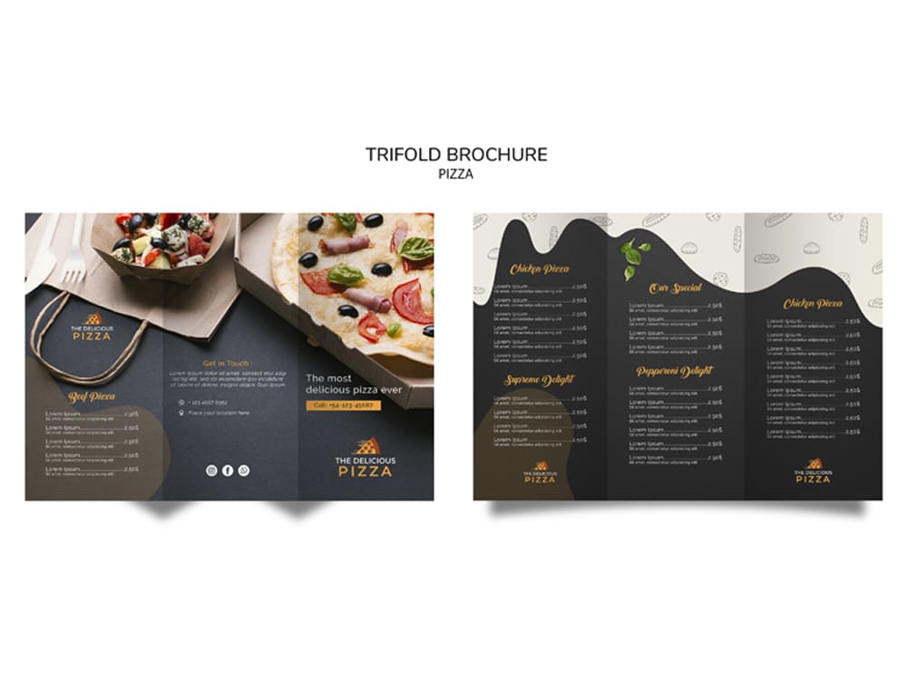
A restaurant menu is more than just a list of dishes; it’s a visual narrative that sets the tone and expectation for the dining experience. Effective use of imagery and illustration is crucial in creating a menu that not only informs but also entices and inspires. High-quality visuals can elevate a menu from functional document to a captivating piece of marketing collateral.
High-Quality Food Photography
Food photography plays a pivotal role in showcasing the culinary offerings. Images should be vibrant, realistic, and mouthwatering, conveying the texture, taste, and overall appeal of each dish. The right photography can significantly impact a customer’s decision-making process.
- Image 1: A succulent grilled steak. The composition would feature the steak as the central focus, slightly angled to reveal its juicy interior. Natural light would be used to highlight the glistening surface and sear marks, creating a sense of warmth and richness. A few sprigs of rosemary and a drizzle of red wine reduction would add visual interest and enhance the sense of luxury.
- Image 2: A vibrant pasta dish. This image would showcase a colorful pasta primavera, with perfectly cooked vegetables and a light, creamy sauce. The composition would be slightly overhead, allowing the viewer to see the textures and individual ingredients. Bright, natural light would enhance the colors and create a feeling of freshness and vibrancy. A sprinkle of parmesan cheese would add a final touch of elegance.
- Image 3: A decadent dessert. This image would feature a rich chocolate lava cake, with a molten center oozing out. The composition would focus on the texture contrast—the smooth, glossy surface against the slightly cracked edges and the flowing chocolate. Warm, ambient lighting would create a sense of indulgence and decadence. A dusting of powdered sugar and a scoop of vanilla ice cream would complete the visual appeal.
Illustrative Styles and Applications
Illustrations offer a unique way to personalize a menu and reflect the restaurant’s brand identity. They can be used to complement or even replace photography, offering a more stylized and artistic approach.
- Watercolor Illustrations: This style brings a delicate and romantic feel, perfect for restaurants with a charming or whimsical atmosphere. Delicate watercolor washes can depict ingredients, dishes, or scenes related to the restaurant’s theme.
- Line Art Illustrations: A minimalist and modern approach, line art illustrations create a clean and sophisticated look. They are ideal for restaurants that want to convey a sense of elegance and simplicity. The focus is on clean lines and shapes, highlighting the essence of the dish or ingredient.
- Vintage-Style Illustrations: This style evokes a sense of nostalgia and tradition, ideal for restaurants with a classic or historical theme. The illustrations could feature vintage-inspired imagery, such as old-fashioned lettering, sepia tones, and detailed drawings of dishes and ingredients.
Photography versus Illustrations
Photography and illustrations offer distinct advantages in menu design. Photography provides realism and visual appeal, showcasing the actual food. However, it can sometimes lack originality and might not always align with the restaurant’s brand aesthetic. Illustrations, on the other hand, offer more flexibility in style and branding, allowing for a unique and memorable visual identity. However, they can be less realistic and might not accurately represent the food’s appearance.
The choice between photography and illustrations depends on the restaurant’s specific brand and target audience.
Creating menu designs that stand out is all about grabbing attention, and that’s a skill that translates across platforms. Think about how you can make your menu visually appealing, just like crafting a killer YouTube thumbnail. To learn more about boosting your video presence, check out this great guide on getting it on with youtube. The principles of strong visuals and clear messaging are key, whether you’re designing a restaurant menu or a YouTube channel.
Ultimately, successful menu designs, like successful YouTube channels, are all about grabbing and keeping your audience’s attention.
Visual Styles for Restaurant Menus
Three distinct visual styles can be created using imagery and illustration.
- Minimalist Style: This style uses clean lines, simple typography, and a limited color palette (often monochromatic or featuring one or two accent colors). Imagery would be sparse, perhaps featuring one or two high-quality photographs of signature dishes, or simple line-art illustrations of key ingredients. The overall aesthetic is sophisticated and uncluttered.
- Rustic Style: This style uses warm, earthy tones, textured backgrounds (like wood grain or burlap), and handwritten or vintage-style typography. Imagery would feature close-up shots of rustic-style food, or illustrations in a watercolor or vintage style. The overall aesthetic is inviting and homely.
- Modern Style: This style incorporates bold colors, geometric shapes, and modern typography. Imagery would feature high-quality, stylized food photography or bold, graphic illustrations. The overall aesthetic is contemporary and eye-catching.
Interactive Elements and Design
Adding interactive elements to a menu design isn’t just about bells and whistles; it’s about creating a more engaging and informative experience for the customer. Think about it – a static menu is just a list of items, while an interactive one can tell a story, offer extra details, and even streamline the ordering process. This shift towards interactivity is crucial in today’s digital-first world, where customers expect more than just a simple presentation of food choices.Interactive elements can significantly elevate the menu experience, transforming it from a passive information source into an active engagement tool.
QR codes, animations, and other interactive features not only enhance visual appeal but also provide opportunities for richer storytelling and improved user navigation. This allows businesses to present their brand, food, and overall dining experience in a much more dynamic and memorable way.
QR Code Integration for Enhanced Menu Functionality
A well-designed QR code on a printed menu can seamlessly link to an online version offering expanded information, such as high-resolution images of dishes, detailed ingredient lists (including allergen information), customer reviews, or even a direct link to online ordering. For example, a restaurant could feature a stylish QR code on their printed menu, leading to a digital version with mouth-watering photos of each dish, along with descriptions that highlight the chef’s inspiration and preparation techniques.
The online menu could also include customer reviews, enhancing trust and social proof. Design considerations include placing the QR code prominently yet subtly, ensuring it’s easily scannable, and using a visually appealing design that complements the overall menu aesthetic. The online version should be responsive and optimized for various devices.
Animation and Subtle Transitions in Digital Menus
Animations and subtle transitions can significantly enhance user engagement and navigation within a digital menu. Imagine a digital menu where the images subtly fade in as the user scrolls, or where the selection of a dish triggers a short, tasteful animation highlighting its key ingredients. These elements add a layer of visual interest and help guide the user through the menu’s structure.
A restaurant might use a parallax scrolling effect, where the background image moves at a different speed than the foreground elements, creating a sense of depth and visual appeal. Subtle animations can also be used to indicate loading progress or to provide feedback when a user interacts with a menu item. The key is to keep the animations smooth, relevant, and not distracting; they should enhance, not overwhelm, the user experience.
Design Considerations: Print vs. Digital Menus
Printed menus offer a tactile experience and a sense of permanence. They are ideal for showcasing high-quality photography and sophisticated typography. However, they are static and lack the ability to incorporate interactive elements or easily update information. Digital menus, on the other hand, offer endless possibilities for interactivity, updates, and personalization. They can be easily updated with daily specials, seasonal changes, or even personalized recommendations based on user preferences.
However, digital menus require reliable technology and connectivity, and they may lack the tactile appeal of a printed menu. The choice between print and digital, or a hybrid approach, depends heavily on the restaurant’s brand identity, target audience, and technological capabilities. A high-end restaurant might opt for a beautifully printed menu complemented by a QR code leading to a digital version with supplementary information, while a fast-casual establishment might focus solely on a user-friendly digital menu accessible through tablets or a website.
Final Thoughts
Source: cloudinary.com
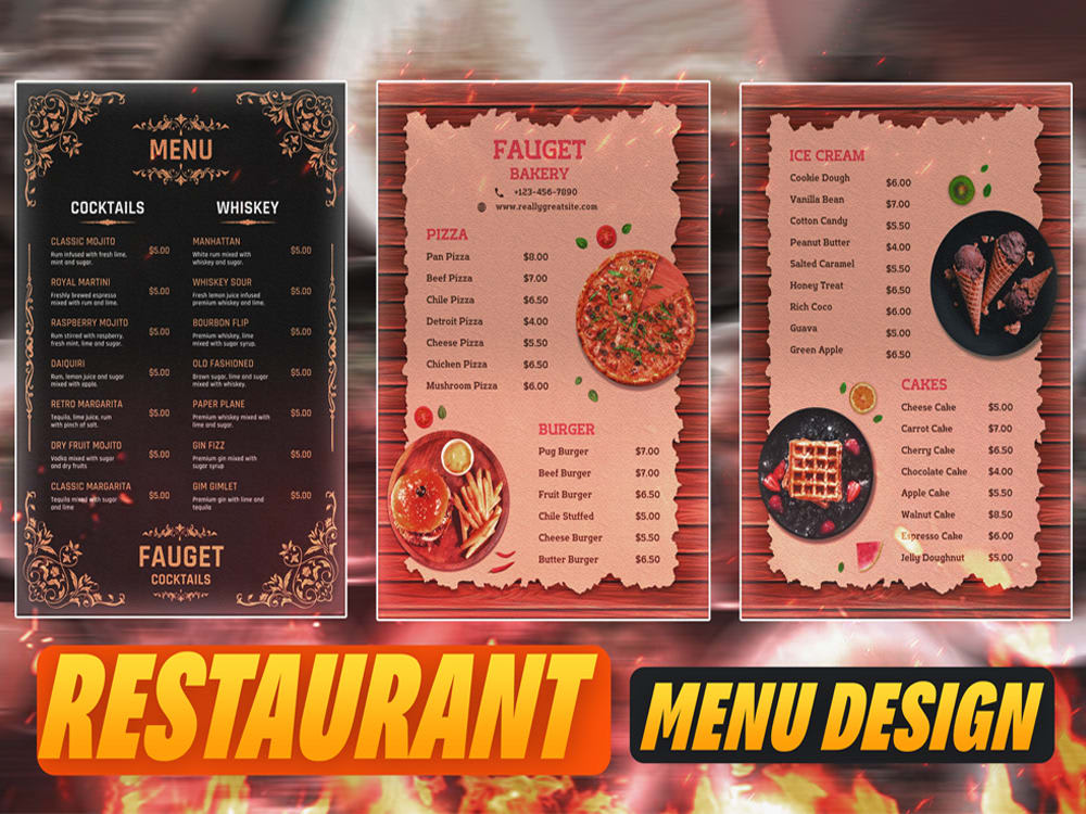
Designing a menu that stands out is a blend of art and science, a careful consideration of aesthetics and functionality. By understanding the power of visual hierarchy, typography, color psychology, and the strategic use of imagery and interactive elements, you can create a menu that not only showcases your offerings but also enhances the overall dining experience. Remember, a well-designed menu is more than just a list of dishes; it’s a powerful tool for building brand identity and driving sales.
So go forth, and create menus that leave a lasting impression!
FAQ Resource
What’s the best software for designing restaurant menus?
There’s no single “best” software. Popular choices include Adobe Photoshop, Illustrator, InDesign, and Canva, each offering different strengths depending on your skill level and design needs.
How much should I spend on menu design?
The cost varies greatly depending on complexity and designer fees. Simple DIY options are free, while professional designs can range from a few hundred to several thousand dollars.
How do I choose the right font for my menu?
Prioritize readability. Consider your brand’s personality and choose fonts that complement your overall aesthetic. Test different pairings to ensure they work well together.
How often should I update my menu design?
This depends on your business. Seasonal changes, new dishes, or a brand refresh are all good reasons to update your menu. Aim for at least an annual review.
