Mid Century Modern Graphic Design A Visual Journey
Mid century modern graphic design, a style born from post-war optimism and technological advancements, continues to captivate us with its clean lines, bold colors, and iconic typography. This era, roughly spanning the 1930s to the 1960s, witnessed a flourishing of creativity, resulting in a visual language that remains strikingly relevant today. From iconic logos to breathtaking posters, we’ll delve into the history, key players, and lasting impact of this influential design movement.
We’ll explore the core principles that define mid-century modern graphic design, examining the geometric forms, vibrant palettes, and distinctive typefaces that characterized the era. We’ll also uncover the stories behind the designers who shaped this aesthetic, highlighting their individual contributions and the lasting influence their work continues to exert on contemporary design.
Defining Mid-Century Modern Graphic Design
Source: behance.net
Mid-century modern graphic design, a style that flourished primarily from the 1930s to the 1960s, represents a fascinating intersection of artistic movements, technological advancements, and post-war societal shifts. It’s a style easily recognized, yet its nuances and influences deserve a closer look. This exploration will delve into its historical context, aesthetic principles, and lasting impact.
The period following World War II saw a surge in optimism and a desire for a fresh start. This societal mood heavily influenced the design aesthetic, moving away from the ornate styles of the past and embracing a cleaner, more functional approach. Influenced by movements like Bauhaus, De Stijl, and Art Deco, mid-century modern design championed simplicity, functionality, and a focus on the everyday.
The Historical Context of Mid-Century Modern Graphic Design
The key years for mid-century modern graphic design are generally considered to be the 1930s through the 1960s. The rise of the Bauhaus school in Germany (founded in 1919, though its influence peaked in the 1920s and 30s) significantly impacted the development of the style, emphasizing functionality and geometric forms. The post-war economic boom in the United States fueled a consumer culture eager for modern design, making it widely accessible and popularizing its distinctive features.
Swiss Style, also known as the International Typographic Style, which emerged in the 1950s, further refined the aesthetic with its emphasis on grid-based layouts and clean typography.
Core Aesthetic Principles of Mid-Century Modern Graphic Design
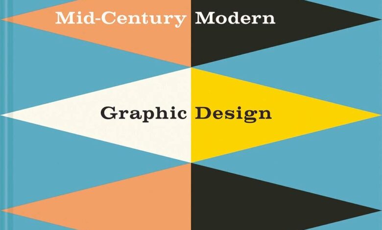
Mid-century modern graphic design is characterized by several core aesthetic principles. Geometry played a crucial role, with designers favoring clean lines, simple shapes, and often incorporating geometric patterns and grids into their layouts. Typography was equally important; sans-serif typefaces like Helvetica, Gill Sans, and Futura became staples, reflecting the style’s emphasis on clarity and readability. Color palettes were often restrained, utilizing a limited number of colors, frequently featuring earthy tones, muted pastels, and bold primary colors used strategically for emphasis.
The overall effect was one of balance, order, and sophistication.
Comparison with Preceding and Succeeding Design Styles
Mid-century modern design represented a distinct departure from the ornate Art Deco style of the 1920s and 30s and the more elaborate Victorian and Edwardian styles that preceded it. It rejected excessive ornamentation in favor of clean lines and functional forms. In contrast to the subsequent postmodern design movement, which embraced eclecticism and irony, mid-century modern maintained a strong sense of order and consistency.
Postmodern design often played with and subverted the very principles of mid-century modern.
The Impact of Technological Advancements
Technological advancements played a significant role in shaping mid-century modern graphic design. Improvements in printing technology, such as the development of offset lithography, allowed for greater precision, speed, and affordability in mass production. This made it possible to disseminate the style widely and make it accessible to a broader audience. The introduction of new materials, such as synthetic papers and inks, also contributed to the evolution of the style, expanding the possibilities for creative expression.
The development of phototypesetting further revolutionized typography, offering designers more control and flexibility in setting type.
Key Figures and Their Contributions

Source: tumblr.com
Mid-century modern graphic design wasn’t a monolithic movement; it was a vibrant tapestry woven from the threads of many talented individuals. These designers, working across various countries and contexts, shaped the visual landscape of the post-war era and continue to inspire contemporary practitioners. Their innovations in typography, layout, and the use of color fundamentally altered how we perceive and interact with visual communication.The unique styles and techniques employed by these mid-century masters stemmed from a confluence of factors: the rise of mass production, the influence of Swiss International Style, and a post-war optimism that embraced clean lines and functionality.
Many were also deeply engaged with the social and political currents of their time, infusing their work with a sense of purpose and social responsibility. This section will explore the contributions of some of the most influential figures, highlighting their individual styles and their lasting impact.
Paul Rand’s Corporate Identity and Logotype Design
Paul Rand, a giant of American graphic design, is renowned for his iconic corporate logos and branding systems. His work for IBM, UPS, and ABC, among others, exemplifies his masterful use of simple, geometric forms and bold color palettes to create instantly recognizable and enduring visual identities. Rand’s designs were not merely decorative; they were carefully crafted to communicate the essence of the brand, reflecting its values and aspirations.
For example, his IBM logo, a simple striped design, conveys a sense of stability and technological precision. His influence is still felt today; his minimalist approach continues to be a cornerstone of effective corporate branding.
Saul Bass’s Motion Graphics and Film Posters
Saul Bass transcended the boundaries of print design, making significant contributions to motion graphics and film poster design. His dynamic and often abstract film posters for Alfred Hitchcock, including
- Vertigo* and
- Psycho*, are instantly recognizable for their innovative use of typography and bold imagery. Bass’s motion graphics, particularly his title sequences for films like
- The Man with the Golden Arm* and
- Anatomy of a Murder*, redefined the possibilities of cinematic storytelling, demonstrating how visual language could enhance narrative. His work stands as a testament to the power of graphic design to enhance and even drive the narrative of a film.
Josef Müller-Brockmann’s Grid Systems and Swiss Style
Josef Müller-Brockmann was a key figure in the development of the Swiss Style, a design approach emphasizing clarity, objectivity, and functionality. His work epitomizes the principles of grid-based layouts, precise typography, and a restrained use of color. Müller-Brockmann’s meticulous attention to detail and his commitment to rational design principles influenced generations of graphic designers, establishing a framework for effective and visually appealing communication.
His book,
Grid Systems in Graphic Design*, remains a seminal text on the subject.
Key Designers, Works, and Stylistic Contributions
| Designer | Prominent Work(s) | Stylistic Contributions |
|---|---|---|
| Paul Rand | IBM logo, UPS logo, ABC logo | Minimalist corporate identity, geometric forms, bold color palettes |
| Saul Bass | Film posters for
|
Dynamic film posters, innovative motion graphics, abstract imagery |
| Josef Müller-Brockmann | Numerous posters, books, and publications;
|
Swiss Style, grid-based layouts, precise typography, restrained color palettes |
| Alvin Lustig | Book covers, posters, and other publications | Modernist design, expressive typography, innovative use of color and texture |
Typography in Mid-Century Modern Design
Mid-century modern graphic design, flourishing roughly from the 1930s to the 1960s, is characterized by a distinct visual language, and typography played a crucial role in shaping its aesthetic and conveying its messages. The period saw a shift away from ornate, highly decorative typefaces towards cleaner, more geometric styles that reflected the era’s emphasis on functionality and modernism.
The typefaces favored during this period were often highly legible and possessed a sense of understated elegance. They reflected the optimism and technological advancements of the post-war era, while also maintaining a sense of sophistication and refinement. This wasn’t simply about choosing a font; it was about carefully considering how typography could enhance the overall design and communicate the intended message effectively.
Characteristics of Commonly Used Typefaces
Several typeface characteristics defined the mid-century modern aesthetic. Geometric sans-serif fonts, such as Futura, Helvetica (although technically developed slightly later, its widespread adoption firmly places it within the mid-century modern sphere), and Gill Sans, were extremely popular. These fonts, with their clean lines and even spacing, projected a sense of order and modernity. Serif typefaces, while less prevalent than sans-serif options, were also used, often exhibiting a more restrained and less ornate style than their predecessors.
Examples include Times New Roman (though its peak popularity came slightly later) and Baskerville, chosen for their readability and classic feel. The overall effect was one of clarity and simplicity, prioritizing legibility and visual balance.
Typography’s Role in Conveying Mood and Message
Mid-century modern designers skillfully employed typography to create specific moods and communicate targeted messages. The clean lines of sans-serif fonts often conveyed a sense of optimism, progress, and technological advancement, perfectly aligning with the spirit of the time. Conversely, the use of a more restrained serif typeface might suggest a sense of sophistication, tradition, or even authority, depending on the context.
Consider the use of bold, condensed typefaces to emphasize a call to action, or the use of lighter weights for a more delicate or subtle message. The careful selection and manipulation of typography were key to effectively communicating the design’s intended purpose.
Comparison with Contemporary Typographic Trends
Contemporary typography exhibits a much broader range of styles than its mid-century counterpart. While clean sans-serif fonts remain popular, modern design incorporates a vast array of styles, including hand-drawn fonts, experimental typefaces, and a renewed interest in vintage and display typefaces. The digital age has also expanded the possibilities for typographic experimentation, leading to a more diverse and eclectic landscape.
However, the emphasis on legibility and visual hierarchy that characterized mid-century modern design continues to be relevant and influential today. The clean and uncluttered approach remains a valuable principle in contemporary design, demonstrating the enduring legacy of the mid-century aesthetic.
Examples of Mid-Century Modern Typography
To illustrate, let’s consider some examples using typical mid-century fonts. Imagine a travel poster:
Headline: EXPLORE THE AMERICAN WEST (Futura Bold)
Body Text: Discover breathtaking landscapes and unforgettable adventures. (Gill Sans Light)
Now, contrast this with a more sophisticated advertisement:
Headline: Introducing the Zenith Constellation (Baskerville Bold)
Body Text: The epitome of modern elegance. (Times New Roman)
These examples demonstrate how different typefaces can create distinct moods and cater to different design needs, reflecting the versatility of mid-century modern typography.
Color Palettes and Imagery
Source: saveca-artandpaper.com
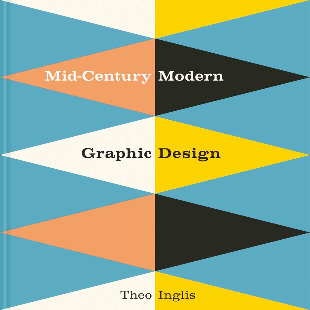
Mid-century modern graphic design wasn’t just about clean lines and functional typography; it was a vibrant explosion of color and evocative imagery, reflecting the optimism and dynamism of the post-war era. The palettes and illustrative styles used were integral to the movement’s unique aesthetic, conveying specific moods and messages that resonated deeply with the public.The color choices weren’t arbitrary; they were carefully selected to evoke particular feelings and enhance the overall message.
This deliberate use of color, combined with specific imagery, contributed significantly to the enduring appeal of mid-century modern design.
Prevalent Color Palettes, Mid century modern graphic design
Mid-century modern design frequently employed palettes characterized by their boldness and vibrancy, often featuring bold primary colors, along with softer pastels and earth tones. These palettes were frequently used in advertising, posters, and corporate branding to communicate a sense of modernity and optimism. One popular palette consisted of sunshine yellow, turquoise, and coral, reflecting the bright and optimistic mood of the time.
Another common combination involved deep greens, mustard yellows, and burnt oranges, evoking a sense of nature and warmth. The use of contrasting colors, like teal and burnt orange, created a striking visual impact, while analogous colors, such as various shades of green and blue, created a sense of harmony and tranquility.
Symbolic Meaning and Emotional Impact of Color Choices
The choice of a particular color palette wasn’t random; it carried significant symbolic weight. For instance, the use of bright, saturated colors like red and yellow often conveyed a sense of energy, excitement, and even urgency, frequently used in advertising to grab attention. Conversely, pastel shades like mint green and pale pink often communicated calmness, serenity, and a sense of sophistication.
Earth tones, such as browns, beiges, and olive greens, often grounded the design and suggested a connection to nature and stability. The strategic use of color was a powerful tool for influencing the viewer’s emotional response.
Common Imagery and Illustrative Styles
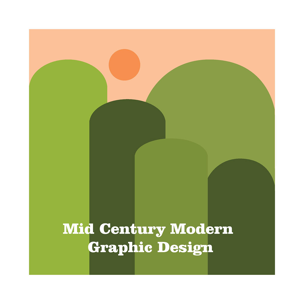
Mid-century modern graphic design is easily recognizable due to its distinctive imagery. Geometric shapes, such as circles, squares, and triangles, were frequently employed, often in abstract compositions, reflecting the era’s fascination with modernism and geometric abstraction. Nature-inspired motifs, including stylized flora and fauna, were also common, often rendered in a simplified, almost symbolic way. These designs frequently featured bold Artikels and flat colors, contributing to their clean and uncluttered aesthetic.
Abstract forms, often incorporating flowing lines and dynamic shapes, were used to suggest movement and energy, reflecting the optimism and dynamism of the post-war period. The overall effect was often one of playful sophistication, combining bold graphic elements with a sense of refined elegance.
Mock Poster Design
For my mock poster, I’d design an advertisement for a fictional mid-century modern furniture company. The poster would feature a large, stylized illustration of an armchair, rendered in a deep teal color against a background of a muted, burnt orange. The armchair itself would be depicted in a simplified, almost iconic style, emphasizing its clean lines and geometric form.
Geometric shapes in shades of sunshine yellow and pale pink would be subtly incorporated into the background, adding a touch of vibrancy without overpowering the main image. The company logo, a stylized representation of a house, would be placed in the bottom right corner, also in deep teal, creating a cohesive and visually appealing design. The typography would be a classic mid-century modern font, perhaps something resembling Gill Sans or Futura, using a limited color palette of teal and a slightly off-white to maintain visual harmony and reflect the era’s preference for clean, legible fonts.
The overall effect would aim for a sophisticated yet approachable aesthetic, perfectly encapsulating the spirit of mid-century modern design.
Applications and Examples Across Media: Mid Century Modern Graphic Design
Mid-century modern graphic design wasn’t confined to a single medium; its clean lines, bold typography, and vibrant color palettes found expression across a vast range of applications, shaping visual culture in profound ways. The adaptability of its core principles allowed designers to effectively communicate messages and create memorable visuals whether on a small scale, such as a matchbook cover, or a large one, such as a billboard.
This versatility is a testament to the enduring power and elegance of the style.The principles of asymmetry, geometric forms, and a focus on functionality were skillfully adapted to different media, resulting in a cohesive yet diverse body of work. Let’s explore some key examples across various platforms, examining how the design elements were employed to achieve specific communicative goals.
Examples of Mid-Century Modern Graphic Design Across Media
The following examples illustrate the versatility of mid-century modern design principles across diverse media. The shared aesthetic, while adapted to each medium’s specific constraints and opportunities, showcases the style’s enduring appeal and influence.
- Posters: Often utilizing bold sans-serif typography and vibrant, contrasting color schemes, mid-century modern posters frequently featured simplified, iconic imagery. Think of the iconic travel posters promoting national parks or airlines, featuring stylized landscapes and minimal text, effectively conveying a sense of adventure and escapism. The use of negative space further enhanced the impact of the message, creating a clean and uncluttered visual experience.
- Logos: Many corporate logos from this era reflect the design principles of the time, often employing geometric shapes, simple lines, and a limited color palette. These logos conveyed a sense of modernity, efficiency, and trustworthiness, reflecting the optimistic spirit of the post-war era. The clean lines and easy readability of these logos ensured they remained effective across various applications, from letterheads to signage.
- Book Covers: Mid-century modern book covers often featured striking typography, sometimes incorporating photographic elements or abstract designs. The designs were often bold and eye-catching, reflecting the content of the book while adhering to the principles of clean lines and balanced composition. The use of color was crucial, often signaling genre or tone.
- Advertisements: Mid-century modern advertising frequently employed a combination of strong imagery and concise copy. The emphasis was on clarity and impact, using bold colors and simplified illustrations to grab the viewer’s attention. The advertisements often reflected the societal values and trends of the time, promoting consumerism and technological advancements.
Detailed Analysis: A Travel Poster by Josef Müller-Brockmann
One striking example is Josef Müller-Brockmann’s poster for the Swiss National Tourist Office. This poster, likely created in the late 1950s or early 1960s, exemplifies the style’s precision and clarity. The design features a stark, geometric composition, using a grid system to arrange elements with precision. A simplified, almost abstract depiction of the Swiss Alps is placed centrally, rendered in shades of blue and white, creating a sense of calm and serenity.
The typography is clean and legible, utilizing a bold sans-serif typeface that echoes the poster’s overall geometric aesthetic. The limited color palette enhances the sense of order and simplicity, while the overall effect is both informative and visually captivating. The effectiveness of the poster lies in its ability to concisely convey the essence of Switzerland – its scenic beauty and peaceful atmosphere – through a minimal yet powerful visual language.
The poster’s success stems from its adherence to the principles of good design: clarity, simplicity, and visual impact. It is a testament to the enduring power of mid-century modern design principles in creating effective and memorable visuals.
The Legacy and Continued Influence
The enduring appeal of mid-century modern graphic design is undeniable. Its clean lines, functional aesthetics, and optimistic spirit continue to resonate with designers and consumers alike, leading to a significant resurgence in popularity in recent years. This renewed interest isn’t simply a nostalgic throwback; it represents a recognition of the timeless qualities and adaptable principles embedded within this design movement.
The style’s emphasis on clarity and functionality aligns perfectly with contemporary design trends, proving its lasting relevance in a constantly evolving digital landscape.The resurgence is fueled by a growing appreciation for simplicity and a rejection of overly complex or cluttered designs. Mid-century modern’s emphasis on functionality and intuitive user experience makes it a particularly appealing style in today’s fast-paced world.
This is evident in the widespread adoption of its key elements across various platforms and mediums, from branding and packaging to web design and illustration.
Contemporary Designers and Works Inspired by Mid-Century Modernism
Many contemporary designers actively draw inspiration from mid-century modern principles. For instance, the work of Jessica Hische, known for her playful yet sophisticated typography, often incorporates the bold, geometric forms and vibrant color palettes characteristic of the era. Similarly, designers like Stefan Sagmeister, with his bold use of color and playful compositions, often echoes the experimental and optimistic spirit of mid-century modern design.
The resurgence is also seen in the rise of independent studios and small businesses adopting mid-century inspired branding, demonstrating the style’s versatility and enduring appeal across diverse industries. This isn’t mere imitation; rather, it’s a creative dialogue, a reinterpretation of established principles within a contemporary context.
Mid-Century Modern Elements in Modern Branding and Marketing
Mid-century modern design elements are seamlessly integrated into contemporary branding and marketing strategies. The clean, sans-serif typography favored in the mid-century era, such as Helvetica and Futura, remains incredibly popular, offering readability and a sense of sophistication. Bold geometric shapes and patterns, often seen in logos and website layouts, add visual interest without overwhelming the viewer. The use of vibrant yet restrained color palettes, often featuring earthy tones combined with pops of brighter colors, creates a visually appealing and memorable brand identity.
Think of the logo of a successful tech company using a simplified geometric logo in a muted color palette – this directly mirrors the clean lines and uncluttered aesthetics of mid-century modern design. This style conveys a sense of both timelessness and modernity, appealing to a broad audience.
Evolution of a Design Element: The Geometric Logo
Imagine a simple, mid-century modern logo: a stylized arrow pointing upward, composed of two intersecting lines, a bold sans-serif typeface spelling out the company name beneath. The lines are thick, the colors are limited to two – a deep teal and a warm off-white. Now consider a contemporary interpretation of this logo. The arrow remains, but its lines are slightly softened, perhaps with subtle curves added to the edges.
Mid-century modern graphic design, with its clean lines and bold typography, always inspires me. I’ve been thinking about how to better showcase my own work, and I’m exploring new ways to connect with audiences, which led me to check out this great article on getting it on with youtube for promoting design. Learning how to use YouTube effectively could really boost my reach and allow more people to appreciate the timeless elegance of mid-century modern aesthetics.
The color palette might expand to include a gradient effect, adding depth and a touch of modern sophistication. The typeface might remain a sans-serif but adopt a slightly more contemporary variation, maintaining legibility while hinting at a more updated aesthetic. The overall effect is a logo that maintains the core geometric structure and optimistic energy of its mid-century predecessor while incorporating contemporary design sensibilities and techniques.
This evolution demonstrates the adaptability and enduring relevance of mid-century modern design principles.
Outcome Summary
Mid-century modern graphic design wasn’t just a fleeting trend; it was a cultural phenomenon reflecting a period of significant social and technological change. Its enduring appeal lies in its timeless elegance and its ability to convey a sense of optimism and sophistication. As we continue to see its influence in contemporary design, we can appreciate the enduring legacy of this vibrant and influential movement.
The clean lines, bold typography, and vibrant color palettes continue to inspire designers today, proving that great design truly transcends time.
Essential FAQs
What are some common typefaces used in mid-century modern design?
Helvetica, Futura, Gill Sans, and Times New Roman are just a few examples of the popular typefaces.
How did technology influence mid-century modern graphic design?
Advances in printing technology, such as offset lithography, allowed for greater color accuracy and more efficient mass production of printed materials.
Where can I find examples of mid-century modern graphic design today?
You can find inspiration in vintage posters, album covers, and advertisements, as well as in contemporary designs that draw inspiration from this era.
Is mid-century modern design still relevant today?
Absolutely! Its clean lines and bold aesthetic continue to inspire designers and resonate with audiences, demonstrating its timeless appeal.
