Minimal App Design Inspiration A Guide
Minimal app design inspiration: It’s everywhere, from the sleek elegance of a finance app to the effortless functionality of a productivity tool. But what exactly makes a minimalist app design truly effective? It’s more than just removing elements; it’s about thoughtful intentionality, prioritizing clarity and user experience above all else. This journey explores the core principles, techniques, and inspirational resources to help you craft minimalist apps that are both beautiful and incredibly user-friendly.
We’ll delve into color palettes, typography choices, and navigation systems, examining how these elements contribute to a cohesive and intuitive user experience. We’ll also explore the subtle art of micro-interactions and animations, and how they can enhance user feedback without overwhelming the design’s inherent simplicity. Prepare to be inspired by real-world examples and discover the power of less.
Defining Minimalist App Design
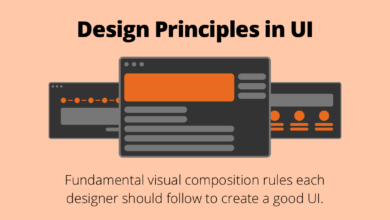
Minimalist app design is more than just a trendy aesthetic; it’s a deliberate approach to interface design prioritizing clarity, efficiency, and user focus. It strips away unnecessary elements, focusing on core functionality and a clean, uncluttered visual presentation. This approach aims to create an intuitive and enjoyable user experience by reducing cognitive load and enhancing ease of use.Core Principles of Minimalist App DesignMinimalist app design adheres to several key principles.
Firstly, it emphasizes simplicity and clarity, presenting information in a straightforward manner without overwhelming the user. Secondly, it utilizes a limited color palette, often sticking to a neutral base with one or two accent colors, creating a visually calming and consistent experience. Thirdly, whitespace (negative space) plays a crucial role, providing visual breathing room and improving readability.
Finally, effective typography and consistent visual hierarchy guide the user’s eye and enhance navigation. The overall goal is to create an intuitive and efficient user interface that requires minimal effort from the user to achieve their goals.Successful Minimalist AppsSeveral apps successfully exemplify minimalist design principles across various platforms. On iOS, the weather app “Carrot Weather” uses a clean interface with a focus on core information, supplemented by witty and engaging commentary.
On Android, “Simple Calendar” offers a distraction-free calendar view, prioritizing event display over complex features. On the web, “Notion” demonstrates how minimalism can be applied to a complex tool, maintaining a clean interface while providing extensive functionality. These examples showcase how minimalism doesn’t equate to a lack of features but rather a strategic prioritization and streamlined presentation of essential information.Benefits of Minimalist Design for User ExperienceAdopting a minimalist approach significantly improves the user experience.
The reduced visual clutter decreases cognitive load, making the app easier to understand and use. This leads to increased user engagement and satisfaction. A clean interface enhances readability and improves navigation, allowing users to quickly find what they need. Furthermore, the streamlined design often translates to faster loading times and improved performance, contributing to a more pleasant user experience.Trade-offs Between Minimalism and FunctionalityWhile minimalism offers significant benefits, it necessitates a careful balance between simplicity and functionality.
Stripping away too many features can leave the app feeling incomplete or frustrating for users. The challenge lies in identifying the core features essential to the app’s purpose and eliminating everything else. This requires careful consideration of user needs and a thorough understanding of the app’s functionality. It’s a delicate balancing act: sufficient features to meet user needs presented within a visually uncluttered and intuitive interface.
This requires a rigorous design process and thorough user testing to ensure the app remains both user-friendly and functional.
Color Palettes and Typography in Minimalist Apps

Source: pinimg.com
Finding inspiration for minimal app design can be tough, but sometimes the best ideas come from unexpected places. For example, thinking about the visual impact of a well-structured YouTube channel, like the ones discussed in this great article on getting it on with youtube , can really spark creativity. That clean, efficient aesthetic translates beautifully to app design, reminding us to prioritize clarity and user experience above all else.
Minimalist app design isn’t just about stripping away elements; it’s about a careful selection of what remains. Color palettes and typography play crucial roles in establishing the app’s mood, readability, and overall user experience. A well-chosen color scheme and typeface can enhance usability and create a sense of elegance and clarity, while poor choices can lead to confusion and visual fatigue.
This section explores how to master these elements in the context of minimalist design.
Color Palette for a Minimalist Finance App
A minimalist finance app needs a color palette that conveys trust, stability, and perhaps a touch of sophistication. Overly bright or jarring colors would be inappropriate. A suitable palette might include muted greens and blues, representing growth and security, complemented by a neutral gray or off-white for the background. Here’s a possible hex code combination:
- Background: #F8F9FA (Light Gray)
- Primary Color (e.g., for buttons and charts): #4CAF50 (Green)
- Secondary Color (e.g., for accents): #2196F3 (Blue)
- Text Color: #333333 (Dark Gray)
This palette provides sufficient contrast for readability while maintaining a calm and professional atmosphere, crucial for a finance app where users need to feel confident in the information presented.
Typography Choices in Minimalist Apps
Effective typography in minimalist apps prioritizes readability and visual harmony. Overly decorative or complex fonts can clash with the minimalist aesthetic. Clean, legible fonts with a consistent weight and spacing are preferred.Examples include using Roboto (Google’s open-source sans-serif font) for body text due to its high readability and versatility across various screen sizes. For headings, a slightly bolder version of the same font family or a complementary font like Open Sans, known for its clean lines and excellent legibility, could be used.
The rationale behind this choice is to maintain visual consistency and ensure a seamless reading experience.
Sans-serif vs. Serif Fonts in Minimalist Design
Sans-serif fonts, like Helvetica or Open Sans, are generally favored in minimalist design due to their clean, modern appearance and high readability on screens. They lack the small decorative strokes (serifs) found on serif fonts like Times New Roman or Garamond. Serif fonts, while elegant in print, can sometimes appear cluttered or less legible on digital displays, especially at smaller sizes.
However, a carefully chosen serif font can add a touch of sophistication to certain minimalist designs, particularly in headings or small text blocks, provided there’s enough contrast and spacing. The choice depends heavily on the overall design aesthetic and target audience.
Mood Board: Color Palettes for a Minimalist Productivity App
Imagine a mood board for a minimalist productivity app. It features three distinct color palettes:
- Palette 1: A calming and focused palette using shades of blue (#64B5F6, #2196F3, #1976D2) and a light gray background (#F5F5F5). This evokes a sense of tranquility and concentration. The image shows a swatch of each color, with a suggestion of how they might appear on app screens (e.g., a blue background with lighter blue buttons, gray text).
- Palette 2: A vibrant and energetic palette incorporating shades of green (#8BC34A, #4CAF50, #388E8E) and a white background (#FFFFFF). This palette suggests growth, freshness, and positive energy. The image displays similar swatches, showing the greens against white with a suggestion of how they might look on an app screen (e.g., a green progress bar, buttons in lighter shades of green).
- Palette 3: A neutral and sophisticated palette featuring shades of gray (#EEEEEE, #9E9E9E, #616161) and a light beige background (#FBE9E7). This palette exudes elegance and simplicity. The image would include swatches, suggesting use in an app interface, perhaps with gray buttons and subtle beige accents on a light gray background.
Each palette evokes a different feeling, showcasing the versatility of color in shaping the user experience. The choice will depend on the specific brand identity and desired user experience for the productivity app.
Layout and Navigation in Minimalist UI/UX
Minimalist app design prioritizes clarity and efficiency. This extends beyond aesthetics to encompass the underlying structure of the app’s layout and navigation. A well-designed minimalist app guides users intuitively through its features without overwhelming them with excessive information or complex interactions. This section explores key aspects of achieving this balance.
Navigation System for a Minimalist E-commerce App
A minimalist e-commerce app can effectively utilize a three-element navigation system: a home icon (representing the product catalog), a shopping cart icon (for viewing and managing items), and a user profile icon (for account management and settings). This approach avoids clutter while providing access to core functionalities. The home icon could lead to a visually appealing grid-based product display, while the cart icon would display a simple list of added items.
The user profile icon could open a streamlined settings menu with easily accessible options. This approach leverages simple, universally understood icons, reducing the need for lengthy textual labels.
Effective Use of Whitespace in Minimalist Apps
Whitespace, or the empty space around elements, is crucial in minimalist design. It improves readability by creating visual breathing room between text and UI components. In a minimalist e-commerce app, ample whitespace around product images and descriptions enhances their visual appeal and prevents a cluttered feel. Whitespace also aids in guiding the user’s eye, directing attention to important call-to-action buttons or key information.
Proper use of whitespace ensures that even complex information is presented in a clean and digestible manner. For example, a product detail page could use whitespace to separate product images, descriptions, and reviews, making each section easily scannable.
Comparison of Layout Approaches for Minimalist Design, Minimal app design inspiration
Card-based and grid-based layouts are popular choices for minimalist apps. Card-based layouts present information in individual, self-contained units, each containing a specific piece of information (like a product in an e-commerce app). This approach is ideal for showcasing diverse content with varying lengths, offering flexibility and visual appeal. Grid-based layouts, on the other hand, arrange information in a structured grid, typically suitable for displaying similar items (like a collection of photos or products).
This approach is excellent for creating a visually consistent and easily scannable layout, particularly for large datasets. The choice depends on the nature of the content; a news aggregator might prefer a card-based layout for varied article lengths, while a photo gallery benefits from a grid’s uniformity.
User Flow Diagram for a Minimalist Social Media App
A user flow diagram for a minimalist social media app would emphasize simplicity. The primary actions might include: (1) Login/Signup, (2) View Feed (showing posts in a clean, scrollable list), and (3) Create Post (a streamlined process with minimal input fields). The user flow would be linear, avoiding unnecessary steps or complex branching. For instance, creating a post could involve a single screen with fields for text and images, and a single “Post” button.
The user can easily navigate back to the feed after posting. The overall design aims for a straightforward, intuitive user experience, minimizing cognitive load and maximizing efficiency.
Micro-interactions and Animations in Minimalist Apps
Minimalist app design prioritizes simplicity and clarity. However, this doesn’t mean the experience should be devoid of personality or feedback. Subtle micro-interactions and animations can significantly enhance user engagement and understanding without compromising the clean aesthetic. They act as silent guides, providing visual cues that inform the user about the app’s response to their actions.Micro-interactions, in their essence, are small, focused animations or visual changes that respond directly to user input.
They’re not about flashy effects; rather, they’re about providing clear, immediate feedback, creating a sense of responsiveness, and subtly delighting the user. In minimalist design, this is crucial, as every element needs to serve a purpose and contribute to a seamless user experience.
Subtle Button Press Animation
A perfect example of a subtle animation for a button press in a minimalist app could be a slight change in color saturation. Imagine a button with a light gray background. Upon pressing, the background subtly darkens to a slightly deeper shade of gray for a fraction of a second before returning to its original color. This minimal shift provides visual confirmation that the button has been pressed without being jarring or distracting.
The animation could also include a very slight scaling effect, making the button appear to compress momentarily before returning to its original size. This added effect would provide additional visual feedback and enhance the sense of tactile response. The key is to keep the animation short, smooth, and unobtrusive.
Micro-interactions for Feedback
The use of micro-interactions is key to providing feedback without cluttering the interface. Instead of large, disruptive alerts or messages, subtle animations can communicate the app’s state effectively. For example, a subtle checkmark animation appearing next to a completed task in a to-do list, or a brief progress bar filling up during a file upload, provide immediate visual feedback without interrupting the user’s workflow.
The goal is to create a sense of responsiveness and confirmation without sacrificing the clean and uncluttered aesthetic of the minimalist design. Overly complex or lengthy animations would defeat the purpose of minimalism.
Visual Hierarchy and Animation Support
Visual hierarchy is essential in minimalist design. It guides the user’s attention to the most important information and actions. Animations can subtly support this hierarchy by drawing attention to specific elements. For instance, a slight pulse animation on a key call-to-action button can gently guide the user towards the primary interaction, while less important elements remain visually understated.
The key is to use animation sparingly and purposefully to highlight crucial information or actions without overwhelming the user. Animations should always enhance the user experience, never detract from it.
Micro-interactions for a To-Do List App
Let’s consider three distinct micro-interactions for a minimalist to-do list app:
1. Task Completion
When a user marks a task as complete, a subtle checkmark animation could appear next to the task item. This could be a simple fade-in effect, or a short, smooth animation of the checkmark drawing itself. The animation should be quick and unobtrusive, confirming the action without drawing excessive attention.
2. Task Addition
When a user adds a new task, the new item could smoothly slide into its position within the list. This provides visual feedback confirming the successful addition of the task. The animation should be smooth and visually pleasing, integrating seamlessly into the overall minimalist design.
3. Task Deletion
Upon deleting a task, the item could smoothly fade out of view. This provides a clean visual confirmation of the deletion, without leaving any lingering elements on the screen. The animation should be quick and subtle, avoiding any jarring or disruptive effects. The goal is to visually confirm the action without drawing unnecessary attention.
Illustrative Examples of Minimalist App Designs

Source: intelegain.com
Minimalist app design isn’t just about aesthetics; it’s about prioritizing functionality and user experience through clean interfaces and efficient navigation. By stripping away unnecessary elements, minimalist apps create a sense of calm and focus, allowing users to quickly accomplish their tasks. This section will explore several examples to highlight the key principles in action.
Minimalist App Design Examples
The following table compares three popular minimalist apps, showcasing their distinct approaches to design and user experience.
| App Name | Platform | Key Design Features | User Experience |
|---|---|---|---|
| Carrot Weather | iOS and Android | Simple, clean interface; use of bold typography; minimal color palette; focus on essential weather information; witty and engaging personality. | Intuitive and efficient; quick access to key weather data; pleasant and slightly humorous user interaction. |
| Google Calendar | iOS, Android, Web | Clean layout; color-coded events; clear visual hierarchy; minimal use of visual elements; intuitive navigation. | Easy scheduling and viewing of events; straightforward interface minimizes cognitive load; efficient task management. |
| Headspace | iOS and Android | Simple illustrations; calming color palette; focus on visual simplicity; minimal text; emphasis on audio experience. | Relaxing and calming; easy to navigate and use; minimal distractions promote mindfulness and focus. |
Visual Elements in a Successful Minimalist App: The Example of Carrot Weather
Carrot Weather excels at minimalist design. Its visual elements contribute significantly to its overall user experience. The app uses a bold, sans-serif typeface for clarity and readability, even at smaller sizes. Icons are simple, geometric, and easily recognizable, avoiding unnecessary detail. The color palette is limited, typically featuring a primary color (often a muted teal or similar) alongside shades of gray and white, creating a visually restful experience.
Buttons are understated, often appearing as simple text links rather than complex graphical elements. This simplicity ensures the focus remains on the weather information.
Use of Negative Space in Minimalist Apps
Negative space, or white space, is crucial in minimalist design. In apps like Headspace, the generous use of white space around illustrations and text creates a sense of calm and prevents visual clutter. This breathing room allows users to focus on the essential information without feeling overwhelmed. In Google Calendar, the white space between events prevents them from appearing crowded, making it easier to scan and understand the schedule.
This strategic use of negative space enhances readability and reduces cognitive load.
Maintaining Visual Consistency Across Screens
Visual consistency is key to a positive user experience. Minimalist apps often achieve this by using a consistent color palette, typography, and iconography across all screens. For example, the use of the same primary color and typeface throughout the app reinforces the brand identity and creates a sense of unity. Navigation elements, such as buttons and menus, maintain a consistent design language across different sections, ensuring users can easily navigate the app without feeling disoriented.
This consistent visual language makes the app feel more cohesive and user-friendly.
Inspiring Minimalist App Design Resources
Finding inspiration for minimalist app design can feel like searching for a needle in a haystack. The internet is awash with design examples, but truly minimalist and effective designs stand out for their clarity and purpose. Fortunately, several excellent resources exist to help guide your creative process and expose you to the best in minimalist app design.
To fuel your creative process and stay updated on the latest trends, actively engaging with online communities and resources is essential. This ensures your designs remain relevant and resonate with contemporary user expectations.
Websites and Blogs for Minimalist App Design Inspiration
Curated resources are invaluable for discovering high-quality examples and learning from established designers. The following websites and blogs consistently feature compelling minimalist app designs and insightful articles on the subject.
- Dribbble: While not exclusively dedicated to minimalist design, Dribbble boasts a vast library of high-quality design shots, many of which showcase minimalist aesthetics. Searching for terms like “minimalist app UI,” “clean UI,” or “flat design” yields a wealth of inspiration.
- Behance: Similar to Dribbble, Behance offers a platform for designers to showcase their work. The quality of work is generally high, and searching for relevant s reveals numerous minimalist app designs.
- UI Movement: This website focuses specifically on UI design and showcases a wide variety of styles, including many minimalist examples. They often feature articles and tutorials on minimalist design principles.
- Awwwards: This website features award-winning websites and apps, many of which employ minimalist design principles to create impactful user experiences. The site’s emphasis on quality ensures you’ll find only the best examples.
- UX Collective: While not solely focused on minimalism, UX Collective frequently publishes articles and case studies on minimalist UI/UX design, providing valuable insights into the underlying design thinking.
Minimalist App Design Case Study: The Calm App
The Calm app, a popular meditation and mindfulness app, exemplifies minimalist app design principles exceptionally well. Its success stems from its careful consideration of user needs and a commitment to a clean, uncluttered interface.
The app utilizes a calming color palette, primarily featuring soft blues, greens, and whites. Typography is simple and highly readable, using a clear sans-serif font. Navigation is intuitive and straightforward, guiding users seamlessly through the app’s features. Micro-interactions, such as subtle animations when selecting a meditation, are used sparingly but effectively to enhance the user experience without overwhelming the user.
The app’s overall design fosters a sense of peace and tranquility, directly aligning with its purpose. The minimalist approach avoids distractions, allowing users to focus on the core functionality of the app: guided meditations and relaxation exercises.
Current Trends in Minimalist App Design
Minimalist app design is constantly evolving, adapting to technological advancements and changing user expectations. Several key trends are currently shaping the field.
- Increased Use of Micro-interactions: While minimalism prioritizes simplicity, subtle animations and micro-interactions are increasingly used to provide feedback and enhance engagement without cluttering the interface. For example, a gentle animation might confirm a button press or indicate loading progress.
- Emphasis on Dark Mode: Dark mode is gaining popularity due to its aesthetic appeal and benefits for eye strain and battery life. Minimalist apps often embrace dark mode, enhancing the clean and uncluttered look.
- Focus on Accessibility: Modern minimalist design prioritizes accessibility, ensuring the app is usable by individuals with disabilities. This includes features like sufficient color contrast, clear typography, and keyboard navigation.
The Role of User Research in Minimalist App Design
User research plays a critical role in informing minimalist design choices. While minimalism strives for simplicity, it’s not about removing features arbitrarily. Instead, it’s about carefully considering which features are truly essential and eliminating anything that doesn’t directly contribute to the user’s goals.
Through user interviews, usability testing, and data analysis, designers can identify the core user needs and pain points. This understanding informs decisions about which features to prioritize and how to present them in the most efficient and intuitive way possible. A thorough understanding of the target audience is crucial for creating a minimalist design that is both aesthetically pleasing and highly functional.
Ending Remarks: Minimal App Design Inspiration

Source: tubikstudio.com
Creating truly minimalist app designs is a balancing act. It’s about stripping away the unnecessary while retaining core functionality and a delightful user experience. By understanding the principles of whitespace, thoughtful color palettes, and strategic use of micro-interactions, you can craft apps that are not only visually appealing but also intuitive and efficient. The journey to minimalist design is a journey of intentionality, and the rewards are apps that users will love to interact with.
Let the inspiration guide you!
Answers to Common Questions
What are some common mistakes to avoid in minimalist app design?
Over-simplifying to the point of functionality loss, neglecting accessibility, and inconsistent visual hierarchy are common pitfalls.
How can I ensure my minimalist app is accessible to users with disabilities?
Focus on sufficient color contrast, clear and concise text, and alternative text for images. Consider using assistive technology to test accessibility.
What’s the role of user testing in minimalist app design?
User testing is crucial for validating design choices and ensuring that the simplified interface remains intuitive and effective for the target audience.
How do I find inspiration for my own minimalist app design?
Explore design platforms like Dribbble and Behance, examine successful minimalist apps, and study design principles from reputable sources.