Must-Have Graphic Design Skills
Must have graphic design skills – Must-have graphic design skills go far beyond just knowing software; they encompass a deep understanding of design principles, visual communication, and technical proficiency. This isn’t just about making things look pretty; it’s about crafting effective visual solutions that communicate a message, build a brand, and engage an audience. We’ll explore the core skills every aspiring graphic designer needs to master, from foundational design principles to advanced software expertise and branding strategies.
This journey will take you through the essential elements of visual hierarchy, color theory, typography, and layout. We’ll delve into the practical application of software like Adobe Photoshop, Illustrator, and XD, providing you with a solid foundation in both creative and technical aspects. We’ll also examine the crucial role of branding, visual communication, and image creation in the modern design landscape, ensuring you’re well-equipped to tackle any creative challenge.
Foundational Design Principles

Source: googleusercontent.com
Mastering graphic design isn’t just about knowing the software; it’s about understanding the fundamental principles that guide effective visual communication. These principles act as the bedrock for any successful design project, ensuring clarity, impact, and aesthetic appeal. They help you create designs that are not only visually pleasing but also communicate your message effectively.
Visual Hierarchy
Visual hierarchy dictates the order in which the eye perceives elements within a design. It guides the viewer’s attention, ensuring they see the most important information first. This is achieved through techniques like size, contrast, color, and placement. A well-established visual hierarchy prevents visual clutter and ensures that the message is easily understood. For example, a website homepage might use a large, bold headline to draw attention to the main offer, followed by smaller subheadings and body text to provide supporting information.
Poor visual hierarchy, on the other hand, can lead to confusion and a frustrating user experience.
Balance, Contrast, and Unity
These three principles work together to create harmonious and effective designs. Balance refers to the visual weight distribution within a design. Symmetrical balance creates a formal, stable feel, while asymmetrical balance offers a more dynamic and informal look. Contrast uses differences in elements like color, size, shape, and texture to create visual interest and emphasize key information. Unity, achieved through consistency in elements like color palettes, typography, and imagery, creates a cohesive and visually appealing design.
A well-balanced design feels stable and pleasing to the eye, while effective contrast highlights important elements and unity ensures a consistent brand identity.
Color Theory in Design
Color theory is crucial for creating impactful and meaningful designs. Understanding the color wheel – including primary, secondary, and tertiary colors – allows for the creation of harmonious color palettes. Analogous color schemes (colors next to each other on the wheel) create a calm and cohesive feel, often used in branding and websites. Complementary color schemes (colors opposite each other) offer high contrast and visual excitement, ideal for attracting attention.
Triadic color schemes (three colors evenly spaced on the wheel) provide a balanced and vibrant palette, useful for illustrations and infographics. The effective use of color evokes emotions and guides the viewer’s experience, influencing their perception of the design. For example, warm colors like red and orange can evoke feelings of excitement and energy, while cool colors like blue and green can convey calmness and tranquility.
Gestalt Principles
The Gestalt principles describe how humans visually perceive and organize information. They are crucial for creating designs that are intuitive and easily understood. The following infographic illustrates these principles:
Imagine a simple infographic here. It would show several examples of the Gestalt principles. For example:
Proximity: Several circles grouped closely together would be visually perceived as a single unit, while the same circles spread far apart would be seen as individual elements.
Similarity: A collection of similarly shaped and colored squares would be seen as a group, distinct from nearby circles.
Closure: A partially incomplete shape, where the viewer’s mind completes the missing parts to form a recognizable whole (e.g., a circle with a small gap).
Continuity: A series of dots arranged in a slightly curved line would be perceived as a continuous line, rather than individual dots.
Figure/Ground: A simple black silhouette on a white background demonstrates how the viewer’s mind distinguishes the figure (silhouette) from the ground (background).
Common Fate: Several arrows pointing in the same direction would be perceived as a single unit moving in that direction.
Font Pairings and Readability
Choosing the right font pairings is essential for ensuring readability and creating a visually appealing design. Different font combinations create different moods and levels of readability.
| Font 1 | Font 2 | Effect | Readability |
|---|---|---|---|
| Arial | Times New Roman | Classic and formal | High |
| Helvetica | Garamond | Modern and elegant | High |
| Open Sans | Roboto | Clean and contemporary | Very High |
| Playfair Display | Lato | Stylish and versatile | Moderate (depending on size and context) |
Software Proficiency
So, you’ve grasped the foundational design principles – fantastic! Now let’s dive into the tools that bring those principles to life. Mastering design software is crucial for translating your creative vision into stunning visuals and functional interfaces. This section will explore essential features and workflows in Adobe Photoshop, Illustrator, and XD.
Adobe Photoshop: Image Manipulation Essentials
Photoshop is the undisputed king of raster graphics editing. Its power lies in its ability to manipulate pixel-based images with incredible precision. Essential features include layer management (allowing non-destructive editing), adjustment layers (for color correction and effects), various selection tools (for isolating specific areas), and a vast library of filters and effects. Mastering these tools allows for everything from basic retouching to complex photo manipulations and digital painting.
For example, using adjustment layers to correct color balance in a photograph is far superior to directly altering the image pixels, as it allows for non-destructive edits that can be easily tweaked or even reversed later. The selection tools are equally vital, enabling precise masking and isolation of elements within a complex image.
Creating a Vector Graphic in Adobe Illustrator: A Step-by-Step Guide
Illustrator, unlike Photoshop, works with vector graphics – images made of mathematical equations rather than pixels. This means the images can be scaled infinitely without losing quality. Let’s create a simple logo:
1. Shape Creation
Start by using the Ellipse Tool to create two overlapping circles. One slightly larger than the other.
2. Color and Fill
Select each circle and apply different fill colors.
3. Pathfinder Panel
Use the Pathfinder panel (Window > Pathfinder) to combine or subtract shapes, creating interesting effects. For example, use the “Minus Front” option to subtract the smaller circle from the larger one, creating a ring.
So you want to be a YouTube star? Killer graphic design skills are essential, from creating eye-catching thumbnails to designing engaging channel art. To really level up your game and learn how to optimize your YouTube presence, check out this awesome guide on getting it on with youtube ; it’ll help you understand how visuals directly impact your success.
Mastering these skills will make your channel stand out from the crowd, ultimately leading to more views and subscribers.
4. Type Tool
Add text using the Type Tool. Experiment with different fonts and sizes.
5. Grouping
Group all elements together (Select All, then Ctrl+G or Cmd+G) for easy manipulation.
6. Export
Save your artwork as an AI (Adobe Illustrator) file for editing, or as an SVG (Scalable Vector Graphics) or PDF for use on the web.
Designing a Responsive Website Layout with Adobe XD
Adobe XD is a powerful tool for designing user interfaces (UI) and user experience (UX). Its strength lies in its ability to create responsive designs that adapt seamlessly across different screen sizes. The process involves:
1. Artboards
Create multiple artboards representing different screen sizes (e.g., desktop, tablet, mobile).
2. Components
Design reusable components (buttons, navigation bars) to maintain consistency across the design.
3. Repeat Grid
Use the Repeat Grid tool to quickly duplicate elements, such as list items.
4. Prototyping
Connect artboards to create interactive prototypes, simulating user interactions.
5. Export
Export assets for developers to use in building the actual website. XD supports various export formats.
Raster vs. Vector Graphics: Key Differences and Applications
Three key differences between raster and vector graphics are:
1. Image Composition
Raster graphics are composed of pixels, while vector graphics are composed of mathematical paths.
2. Scalability
Raster images lose quality when scaled up, while vector images maintain quality at any size.
3. File Size
Raster files are generally larger than vector files, especially at high resolutions.Raster graphics are ideal for photographs and photorealistic illustrations, while vector graphics are better suited for logos, illustrations, and designs that need to be scaled without losing quality.
Essential Keyboard Shortcuts
Keyboard shortcuts significantly boost efficiency. Here are five essential shortcuts for each program:
Adobe Photoshop:
- Ctrl+Z (Cmd+Z): Undo
- Ctrl+S (Cmd+S): Save
- Ctrl+J (Cmd+J): Duplicate Layer
- Ctrl+T (Cmd+T): Free Transform
- Ctrl+Shift+Alt+S (Cmd+Shift+Option+S): Save for Web
Adobe Illustrator:
- Ctrl+Z (Cmd+Z): Undo
- Ctrl+S (Cmd+S): Save
- Ctrl+C (Cmd+C): Copy
- Ctrl+V (Cmd+V): Paste
- Ctrl+G (Cmd+G): Group
Adobe XD:
- Ctrl+Z (Cmd+Z): Undo
- Ctrl+S (Cmd+S): Save
- Ctrl+R (Cmd+R): Repeat Grid
- Spacebar: Pan
- A: Selection Tool
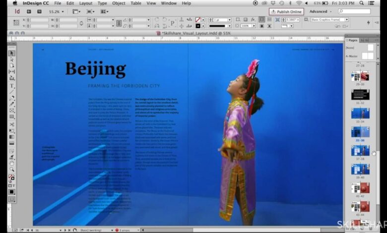
Typography and Layout
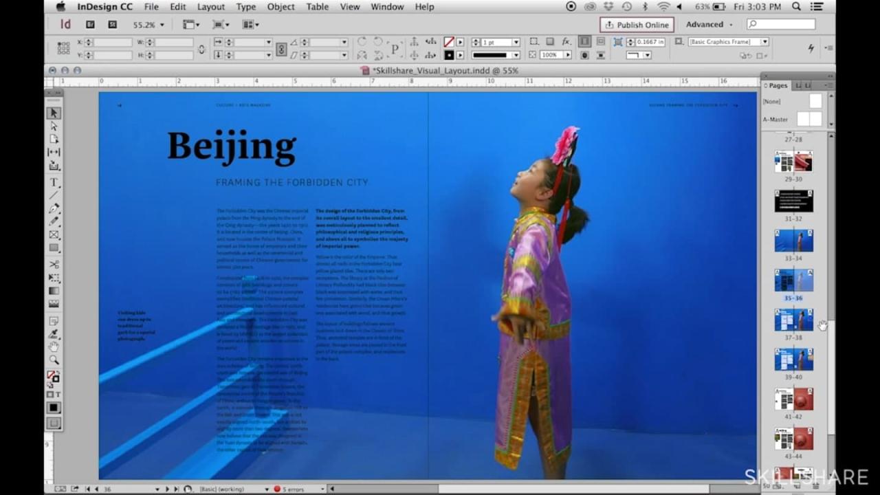
Source: skillshare.com
Typography and layout are the unsung heroes of good design. They’re the subtle details that elevate a visually appealing design from merely pleasant to truly effective. A well-chosen typeface and a thoughtfully planned layout not only enhance readability but also contribute significantly to a brand’s overall identity and message. Mastering these elements is crucial for any graphic designer.
Typography’s Impact on Readability and Brand Identity
The right typeface can make all the difference. Legibility is paramount; a poorly chosen font can lead to strained eyes and frustrated readers. Serif fonts (like Times New Roman or Garamond), with their small flourishes, are often preferred for body text due to their perceived ease of reading. Sans-serif fonts (like Arial or Helvetica), clean and minimalist, are often better suited for headlines and shorter text blocks, where clarity and impact are prioritized.
Beyond readability, typography directly influences brand perception. A playful script font might suit a bakery, while a bold geometric sans-serif might be perfect for a tech company. Consider the personality and values you want to convey—the font choice should reflect this. For instance, a luxury brand might use an elegant serif font, while a modern startup might opt for a sleek sans-serif.
Effective Use of Whitespace in Page Layouts
Whitespace, often overlooked, is a powerful design tool. It’s the empty space surrounding text and images, providing visual breathing room. Effective use of whitespace creates a sense of order and prevents a design from feeling cluttered or overwhelming. Consider the “negative space” as a positive element—it helps guide the viewer’s eye, emphasizes key elements, and enhances readability. For example, a website with generous margins and spacing between sections will feel more open and less cramped, improving user experience.
Conversely, a page crammed with content can be visually jarring and difficult to navigate. A good rule of thumb is to create a visual hierarchy by using more whitespace around less important elements and less around the most important ones.
Comparison of Different Layout Grids and Their Applications
Layout grids provide structure and consistency to a design. They act as a framework for arranging elements, ensuring visual harmony and balance. Several types of grids exist, each with its strengths and weaknesses. Column grids, for example, are commonly used in web design and print layouts, dividing the page into vertical columns to organize content. Modular grids use a repeating module to create a flexible and scalable design, often seen in branding and identity projects.
Hierarchical grids prioritize certain elements by giving them more visual weight and space, useful for showcasing key information. The choice of grid depends on the project’s requirements and the desired visual effect. A complex brochure might benefit from a modular grid, while a simple flyer might only need a basic column grid.
Single-Page Brochure Mock-up
Imagine a single-page brochure for a sustainable coffee company. The top third features a large, high-quality image of coffee beans, using a warm, inviting color palette. Below, a bold, sans-serif headline (“Ethically Sourced, Sustainably Grown”) is set in a large, readable font. The body text, describing the company’s commitment to sustainability and fair trade practices, is set in a legible serif font with ample line spacing.
A smaller section showcases the different coffee blends, using a clean, minimalist layout with bullet points and concise descriptions. Finally, contact information is placed at the bottom, neatly organized and easily accessible. The overall layout utilizes a balanced column grid, with ample whitespace to create a clean, modern aesthetic. The typography choices reinforce the brand’s commitment to quality and ethical practices.
Font Families and Their Suitability
The choice of font significantly impacts the overall aesthetic and readability of a design. Different font families are suitable for different purposes. Here’s a table illustrating a few examples:
| Font Family | Characteristics | Suitable for | Example |
|---|---|---|---|
| Times New Roman | Serif, traditional, highly legible | Body text, formal documents | Books, reports |
| Arial | Sans-serif, clean, modern | Headlines, short text blocks, websites | Websites, signage |
| Playfair Display | Serif, elegant, sophisticated | Headlines, logos, branding | Luxury brands, invitations |
| Open Sans | Sans-serif, versatile, highly legible | Body text, websites, user interfaces | Websites, applications |
Branding and Visual Communication
Branding and visual communication are inextricably linked. A strong brand isn’t just a logo; it’s a cohesive system of visual elements that communicate a company’s values, personality, and mission to its target audience. Effective visual communication ensures consistent brand recognition and fosters customer loyalty. This section delves into the key aspects of creating a compelling and memorable brand identity.
Color Palettes and Brand Identity
Color psychology plays a crucial role in shaping brand perception. Different colors evoke distinct emotions and associations. For example, blue often represents trust and stability, while red conveys energy and excitement. A well-chosen color palette should align with the brand’s personality and target audience. Consider the context; a calming palette might suit a spa, while vibrant colors could be ideal for a children’s toy company.
Consistency in color usage across all brand touchpoints—from the website to marketing materials—is essential for reinforcing brand recognition. Inconsistency can dilute the brand message and create confusion.
Developing a Consistent Brand Style Guide, Must have graphic design skills
A brand style guide serves as the bible for all visual communication efforts. It Artikels the brand’s visual identity, including logo usage, color palettes, typography, imagery style, and voice. The process of developing a style guide typically involves: defining the brand’s personality and target audience, selecting a color palette and typography, establishing logo usage guidelines (including minimum size and clear space), defining image styles (e.g., photography style, illustration style), and creating templates for various marketing materials.
This comprehensive document ensures consistency across all platforms and prevents brand dilution. Without a style guide, different designers or marketers might interpret the brand differently, leading to an inconsistent and ultimately weaker brand image.
Effective Logo Design Principles
Effective logos are memorable, versatile, and relevant to the brand they represent. Key principles include simplicity (easy to understand and remember), scalability (looks good at both small and large sizes), timelessness (avoids trends that quickly become dated), and originality (stands out from competitors). A strong logo should be easily recognizable, even in a small size, and communicate the essence of the brand’s identity.
It should also be versatile enough to work across different mediums, from business cards to website banners.
Logo Concepts for “InnovateTech”
InnovateTech is a fictional technology company specializing in innovative software solutions. Here are three logo concepts:
- Concept 1: A stylized “IT” monogram, with the “I” forming a upward-pointing arrow, symbolizing innovation and progress. The font is clean and modern, reflecting the company’s technological focus. The color scheme uses a deep blue for trust and stability, accented with a vibrant teal for innovation.
- Concept 2: An abstract design featuring interconnected nodes, representing connectivity and networking. The color palette uses shades of green to represent growth and technology. The overall aesthetic is minimalist and sophisticated.
- Concept 3: A simple, bold wordmark of “InnovateTech” in a custom sans-serif font. The font is designed to be both modern and easily legible. The color scheme utilizes a strong, confident grey, suggesting reliability and professionalism.
Mood Board for “SereneSpa”
SereneSpa is a fictional spa and wellness center aiming for a calming and luxurious atmosphere.
The mood board for SereneSpa would illustrate the brand’s visual identity.
- Color Palette: Soft pastels such as light greens, lavenders, and creams, accented with a deep teal for sophistication.
- Imagery: High-quality photographs of tranquil natural settings, such as flowing water, lush greenery, and soft lighting. Images should evoke feelings of peace and serenity.
- Typography: Elegant and flowing script fonts for headings, paired with a clean sans-serif font for body text. The typography should convey a sense of sophistication and calm.
- Textures: Soft, natural textures such as linen, wood, and stone. These textures can be incorporated into marketing materials to enhance the brand’s tactile appeal.
- Overall Aesthetic: Minimalist and elegant, with a focus on creating a sense of calm and tranquility.
Image and Icon Creation
Creating compelling visuals is crucial for success in graphic design, whether it’s for e-commerce, user interfaces, or branding. High-quality images and well-designed icons significantly impact user experience and brand perception. This section delves into the process of creating these essential visual elements.
High-Quality Product Images for E-commerce
Producing high-quality product images for e-commerce requires careful attention to detail and technical aspects. The goal is to present the product accurately and attractively, encouraging online sales. This involves using professional photography equipment or high-resolution smartphone cameras, ensuring proper lighting to minimize shadows and highlight product features, and employing image editing software to enhance colors, remove blemishes, and optimize the image for online display.
Backgrounds should be clean and uncluttered, focusing attention on the product itself. Multiple angles and close-ups can showcase the product’s details and features effectively. For example, a clothing retailer might showcase a garment from the front, back, and side, highlighting fabric texture and details. Jewelry retailers might use macro photography to display intricate details. Proper color correction is vital to ensure the online image accurately reflects the product’s real-world appearance.
Effective Use of Iconography in User Interface Design
Icons play a vital role in simplifying user interfaces and improving usability. Effective iconography uses universally understood symbols to represent actions or functions, reducing the need for lengthy text labels and improving navigation. For example, a shopping cart icon universally represents adding items to an online shopping cart. A magnifying glass typically indicates a search function. Effective icons are simple, memorable, and consistent in style throughout the interface.
They should be scalable without losing clarity and should integrate seamlessly with the overall design aesthetic. Poorly designed icons can lead to user confusion and frustration. Consider the difference between a clearly depicted “play” button and an abstract symbol that is difficult to interpret – the former is far more user-friendly.
Image Resolution and File Formats
Image resolution and file format are crucial factors influencing image quality and file size. Resolution, measured in pixels (ppi or dpi), determines the image’s sharpness and clarity. Higher resolution images produce sharper and clearer results, especially when viewed at larger sizes or printed. File format affects the image’s compression, size, and color capabilities. Choosing the right format is essential for optimizing image quality and file size for different applications.
For example, JPEG is suitable for photographs due to its high compression ratio, while PNG is better for images with sharp lines and text because it supports lossless compression. SVG is ideal for scalable vector graphics used in logos and illustrations.
Icon Design Examples
Below are descriptions of three icons representing abstract concepts:* Icon 1: Collaboration: This icon depicts two interconnected circles, partially overlapping. The circles are slightly different shades of blue, symbolizing the coming together of different perspectives or individuals. The overlapping area suggests the shared space of collaboration. The clean lines and simple form ensure easy readability across different sizes.* Icon 2: Innovation: This icon is a stylized lightbulb, but instead of a traditional bulb shape, it’s a more abstract, angular design.
The lines are sharp and dynamic, suggesting forward momentum and creativity. A subtle gradient from dark blue to light blue at the top suggests the spark of an idea.* Icon 3: Sustainability: This icon is a stylized leaf with three distinct sections, each a different shade of green. The leaf is slightly curved, representing growth and renewal. The different shades of green represent the diverse elements of a sustainable ecosystem.
The solid, grounded nature of the leaf suggests stability and longevity.
Comparison of Image File Formats
| File Format | Description | Uses | Pros | Cons |
|---|---|---|---|---|
| JPEG | Lossy compression | Photographs, images with smooth gradients | Small file size, widely supported | Loss of image quality with compression |
| PNG | Lossless compression | Images with sharp lines, logos, illustrations | High quality, supports transparency | Larger file size than JPEG |
| GIF | Lossless compression, supports animation | Simple animations, logos, small graphics | Small file size for simple images, animation support | Limited color palette (256 colors) |
| SVG | Vector graphic format | Logos, illustrations, scalable graphics | Scalable without loss of quality, small file size | Not suitable for photographic images |
Summary
Mastering graphic design is a continuous process of learning and refining your skills. By focusing on foundational principles, developing software proficiency, and understanding the power of visual communication, you’ll be well on your way to creating impactful and memorable designs. Remember that practice is key – experiment, iterate, and never stop exploring new techniques and approaches. The world of graphic design is constantly evolving, so embracing lifelong learning will be essential to your success.
User Queries: Must Have Graphic Design Skills
What’s the difference between raster and vector graphics?
Raster graphics are made of pixels (like JPEGs and PNGs) and lose quality when scaled up. Vector graphics are made of mathematical equations (like SVGs) and can be scaled infinitely without losing quality.
Which software is best for beginners?
Canva is a great user-friendly option for beginners, while Adobe Photoshop is industry standard but has a steeper learning curve.
How important is color theory?
Color theory is crucial for creating visually appealing and effective designs. Understanding color harmonies and their psychological impact is vital for conveying the right message.
Where can I find design inspiration?
Websites like Behance, Dribbble, and Pinterest are excellent resources for finding inspiration and seeing the work of other designers.