Muted Color Palettes Inspiration
Muted color palettes inspiration: Dive into the calming world of understated hues! We’ll explore how these palettes create sophisticated and serene designs, from websites to print materials and even interior spaces. Get ready to unlock the power of subtle shades and discover how they can elevate your creative projects.
This post unpacks the essence of muted color palettes, delving into their characteristics, psychological impact, and diverse sources of inspiration. We’ll explore practical applications across various design contexts, showcasing how these palettes can be tailored to different brands and aesthetics. Prepare to be inspired by stunning examples and learn how to create your own harmonious muted color schemes.
Defining Muted Color Palettes
Muted color palettes offer a sophisticated and calming aesthetic, a departure from the vibrancy often associated with bolder color choices. They are characterized by their subdued tones, created by adding gray or other neutral colors to bright hues, resulting in a softer, less intense visual impact. This makes them incredibly versatile for a wide range of design applications, from websites and branding to interior design and fashion.Muted color palettes are defined by their lower saturation and chroma.
Instead of bright, pure colors, they utilize desaturated versions, often incorporating gray, beige, or other neutrals to reduce the intensity. This creates a sense of harmony and balance, making them visually appealing and easy on the eyes. The result is a palette that feels more refined and less jarring than a vibrant palette.
Examples of Muted Color Palettes
Here are a few examples of muted color palettes using hexadecimal color codes. These examples showcase the range of possibilities within muted palettes, from cool and calming to warm and earthy.
- Palette 1 (Cool): #A7C4BC, #83A598, #608178, #3E5E5A, #1C3B38. This palette features desaturated blues and greens, evoking a feeling of tranquility and serenity.
- Palette 2 (Warm): #D2B48C, #A88765, #805E3E, #583517, #300C00. This palette uses muted browns and oranges, creating a warm and inviting atmosphere.
- Palette 3 (Neutral): #F2F2F2, #D9D9D9, #BDBDBD, #9E9E9E, #7E7E7E. This palette showcases a range of grayscale, offering a classic and versatile option.
Muted vs. Vibrant Palettes: A Comparison
Muted and vibrant palettes represent opposite ends of the color saturation spectrum. Vibrant palettes utilize high-saturation colors that are bold and attention-grabbing. Think bright reds, sunny yellows, and electric blues. These palettes are energetic and exciting, often used to convey enthusiasm or excitement. In contrast, muted palettes prioritize subtlety and sophistication.
They are calming and understated, creating a more relaxed and refined visual experience. The choice between a muted and vibrant palette depends entirely on the desired mood and message. A children’s toy brand might benefit from a vibrant palette, while a luxury jewelry brand might opt for a muted one.
Psychological Impact of Muted Colors in Design
Muted colors have a significant psychological impact on viewers. Their subdued nature promotes a sense of calm and tranquility. They are less likely to be overwhelming or distracting, making them ideal for designs where focus and clarity are crucial. This calming effect can reduce stress and anxiety, creating a more comfortable and inviting user experience. For example, muted palettes are often used in healthcare settings to create a soothing atmosphere.
Furthermore, the understated elegance of muted palettes can communicate sophistication and refinement, often associated with luxury brands. The reduced visual stimulation can also enhance readability and improve the overall user experience, especially in designs with substantial text content.
Sources of Muted Color Palette Inspiration: Muted Color Palettes Inspiration
Source: webflow.com
Finding the perfect muted color palette can feel like searching for a hidden gem. But inspiration is everywhere, if you know where to look! Muted palettes, with their subtle elegance and calming effect, can be found in the most unexpected places. Let’s explore some rich sources to spark your creative vision.
Nature as a Source of Muted Color Palettes, Muted color palettes inspiration
Nature provides a boundless source of muted color combinations. The soft hues found in natural landscapes often translate beautifully into design. Think of the delicate balance of colors in a misty dawn, the subtle variations in a rocky coastline, or the quiet beauty of a late autumn forest. These settings offer a wealth of inspiration for palettes that are both sophisticated and calming.
| Source | Color 1 | Color 2 | Color 3 |
|---|---|---|---|
| Misty Dawn | Soft Lavender | Pale Grey-Blue | Dusty Rose |
| Rocky Coastline | Stone Grey | Sandy Beige | Seafoam Green |
| Autumn Forest | Muted Olive Green | Burnt Sienna | Taupe |
Art as a Source of Muted Color Palettes
The world of art, from classical masterpieces to modern abstract works, offers a treasure trove of muted color schemes. Artists throughout history have skillfully employed muted tones to create depth, emotion, and visual harmony. Studying the color palettes of renowned painters can provide invaluable inspiration for your own projects. Consider the subdued elegance of a 17th-century Dutch still life or the subtle contrasts in a contemporary watercolor landscape.
| Source | Color 1 | Color 2 | Color 3 |
|---|---|---|---|
| Dutch Still Life | Warm Grey | Muted Yellow Ochre | Deep Brown |
| Contemporary Watercolor | Soft Teal | Pale Aqua | Silver Grey |
Architecture as a Source of Muted Color Palettes
Architectural design often incorporates muted color palettes to create a sense of timeless elegance and understated sophistication. From the weathered stones of ancient buildings to the contemporary facades of modern structures, architecture offers a rich source of inspiration. Observe the color combinations in historic buildings, noting the interplay of natural materials and carefully chosen paint tones.
| Source | Color 1 | Color 2 | Color 3 |
|---|---|---|---|
| Tuscan Farmhouse | Terracotta | Warm Beige | Olive Green |
| Modern Minimalist Building | Light Grey | Off-White | Charcoal Grey |
Fashion as a Source of Muted Color Palettes
High-fashion runways and street style photography are excellent resources for discovering current trends in muted color palettes. Designers often utilize subtle shades to create sophisticated and wearable looks. Analyzing the color combinations used in high-fashion garments can provide fresh perspectives and exciting new ideas for your own palette explorations.
| Source | Color 1 | Color 2 | Color 3 |
|---|---|---|---|
| Autumn/Winter Runway Collection | Dusty Rose | Camel Brown | Charcoal Grey |
| Street Style Photography | Stone Grey | Navy Blue | Cream |
Textiles and Fabrics as a Source of Muted Color Palettes
The textures and colors of fabrics, from vintage tapestries to contemporary upholstery, offer a wealth of muted color inspiration. The subtle variations in weave and dye create beautiful and complex color relationships. Examining the color combinations in antique textiles or modern fabric swatches can provide unexpected and inspiring palettes.
| Source | Color 1 | Color 2 | Color 3 |
|---|---|---|---|
| Vintage Tapestry | Deep Teal | Muted Gold | Burgundy |
| Modern Linen Fabric | Oatmeal | Sage Green | Powder Blue |
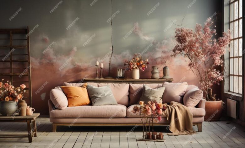
Applying Muted Color Palettes in Different Design Contexts
Source: freepik.com
Muted color palettes, with their inherent sophistication and calming effect, offer a versatile tool for designers across various mediums. Their understated elegance allows for a focus on content and imagery, creating a refined and memorable experience for the viewer. The effectiveness of a muted palette hinges on careful selection and strategic application within the specific design context.
Muted Color Palettes in Website Design
Websites utilizing muted color schemes often project a sense of professionalism and trustworthiness. The absence of jarring bright colors allows for a cleaner, more user-friendly interface, reducing visual fatigue and improving readability. Consider, for example, the websites of many financial institutions or high-end fashion brands. These often employ a palette of soft greys, muted blues, and subtle earth tones to create a feeling of stability and sophistication.
The visual hierarchy is carefully managed through variations in shade and saturation, guiding the user’s eye naturally towards key information. A website featuring a muted palette might use a slightly desaturated teal as a background, complemented by a slightly darker shade for text and navigational elements, and perhaps a warm, muted beige for call-to-action buttons. The overall effect is calming and elegant, allowing the content to take center stage.
Muted Color Palettes in Print Design
The application of muted palettes in print design, particularly for brochures and posters, offers a similar level of sophistication. A muted palette can elevate the perceived value of a product or service, particularly when paired with high-quality imagery and typography. Imagine a travel brochure featuring muted greens and blues, evocative of a serene landscape. The subtle color scheme creates a sense of tranquility and escapism, perfectly complementing the imagery of lush forests or tranquil beaches.
Similarly, a poster for a high-end art exhibition might utilize a muted palette of greys, creams, and deep browns, creating a sense of timeless elegance that aligns with the prestigious nature of the event. The impact is a design that feels refined and understated, yet still manages to be eye-catching and memorable.
Muted Color Palettes in Branding: Luxury vs. Everyday Products
The application of muted color palettes in branding varies significantly depending on the target market and the nature of the product. Luxury brands often leverage muted palettes to convey exclusivity and sophistication. Think of the understated elegance of many high-end fashion houses, often using a palette of deep navies, charcoal greys, or muted jewel tones to communicate a sense of timeless luxury.
I’ve been totally obsessed with finding the perfect muted color palettes lately – they’re so calming and sophisticated! I even started thinking about how to translate that aesthetic into my YouTube videos, which is why I’ve been digging into this awesome guide on getting it on with youtube to up my video game. Learning about video editing and color grading is helping me bring those muted tones to life on screen, making my videos even more visually appealing.
The limited color palette emphasizes quality and craftsmanship, subtly hinting at a higher price point. In contrast, brands marketing everyday products might use a muted palette to create a sense of calm and approachability. A company selling organic food products, for example, might use a palette of muted greens and browns to communicate naturalness and wholesomeness. While both approaches utilize muted palettes, the specific color choices and their application reflect the distinct brand identities and target audiences.
The contrast highlights the versatility of muted palettes in creating diverse brand identities, each conveying a specific message and aligning with its intended market.
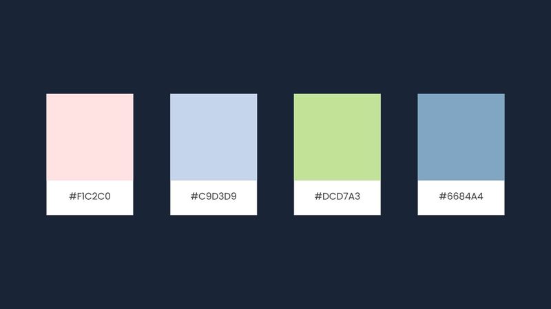
Creating Muted Color Palette Variations
Source: freepik.com
Let’s explore the exciting possibilities of manipulating muted color palettes to achieve different moods and aesthetics. Starting with a base palette, we can subtly shift hues and values to create entirely new feels, all while retaining that characteristic muted, sophisticated look. We’ll also examine how analogous and complementary color schemes can be effectively integrated into muted palettes.
Three Variations of a Muted Color Palette
Our base palette will consist of three muted colors: a dusty rose (#b2868c), a soft sage green (#a7b098), and a muted teal (#7fa2a4). Each variation will retain the core feeling of the original palette while introducing unique characteristics.
- Variation 1: Increased Saturation: This variation slightly increases the saturation of each color in the base palette. The dusty rose becomes a richer, deeper rose, the sage green takes on a slightly more vibrant hue, and the teal gains a touch of intensity. This variation maintains the muted quality but adds a bit more visual punch, making it suitable for designs needing a more energetic feel while still remaining sophisticated.
The resulting palette would be slightly more lively than the original, still avoiding bright, harsh tones.
- Variation 2: Lightened Values: Here, we lighten the value (brightness) of each color in the base palette. The dusty rose becomes a pale blush, the sage green transforms into a lighter, almost mint-like shade, and the teal lightens to a soft, almost aqua color. This variation is ideal for designs needing a softer, more airy and romantic feel. The muted quality is preserved, but the overall mood is brighter and more delicate.
- Variation 3: Darkened Values and Added Depth: This variation darkens the value of each color, adding a sense of mystery and sophistication. The dusty rose becomes a deeper, almost burgundy hue, the sage green deepens to a darker olive, and the teal transitions to a more navy-like shade. This creates a more dramatic and elegant palette, suitable for designs aiming for a more moody or luxurious atmosphere.
The muted aspect remains, but with a significant shift in perceived weight and mood.
Harmonious Muted Palette Using Analogous Colors
Analogous colors sit next to each other on the color wheel. For a harmonious muted palette, we can start with a muted blue-green (#6a8e93) as our base. Then, we can introduce a slightly warmer muted green (#82997f) and a cooler muted blue (#6c839a). These colors work together because their close proximity on the color wheel creates a natural visual flow and sense of unity.
The subtle differences in hue maintain visual interest without jarring contrast. The overall effect is calming and cohesive, ideal for designs requiring a sense of tranquility and sophistication.
Muted Color Palette Using a Complementary Color Scheme
Complementary colors sit opposite each other on the color wheel. For a muted complementary palette, let’s choose a muted orange (#b1876f) and a muted blue (#6b8ba8). The contrast between warm and cool tones creates visual interest and energy, but the muted quality of both colors prevents the contrast from being overwhelming or harsh. The muted orange provides warmth, while the muted blue offers a sense of calm.
This balance allows for a dynamic yet sophisticated design. The effect is a striking yet balanced palette, perfect for designs that require both visual appeal and a refined aesthetic. The contrast is noticeable but subtle, making it suitable for various design contexts where a touch of vibrancy is desired without sacrificing the sophisticated feel of a muted palette.
Illustrative Examples of Muted Color Palettes
Let’s dive into some specific examples of muted color palettes, exploring how different shades and their relationships can evoke distinct moods and atmospheres. These examples demonstrate the versatility of muted palettes across diverse design contexts.
Desert Sunset Palette
Imagine the sun dipping below the horizon in a vast desert landscape. This palette captures that feeling of warmth and stillness. The primary colors would be a dusty rose (#B2828D), a pale, sandy beige (#F2E9E4), a muted terracotta (#C78C7E), and a deep, shadowy indigo (#4A566E) for the approaching night. The dusty rose acts as a subtle highlight, reflecting the last rays of the sun.
The beige provides a neutral base, representing the expansive sand. The terracotta adds a touch of warmth and earthiness, mirroring the desert’s sun-baked tones. Finally, the indigo provides a grounding contrast, representing the deepening twilight. These colors work together to create a sense of calm and serenity, a feeling of quiet contemplation in the vastness of nature.
Rainy Forest Palette
A rainy day in a forest evokes a completely different atmosphere. This palette would lean towards cool, damp tones. Imagine a soft, desaturated green (#82A196) representing the lush foliage, muted by the rain. A misty gray (#A8B2B9) represents the overcast sky and the damp air. A deep, mossy green (#5B7062) adds depth and richness, suggesting the undergrowth.
Finally, a hint of a very pale, desaturated blue (#D0E0E3) could represent the distant sky peeking through the clouds, creating a subtle contrast and a feeling of openness within the dense forest. The overall mood is one of quiet introspection and peaceful contemplation, a sense of calm and mystery.
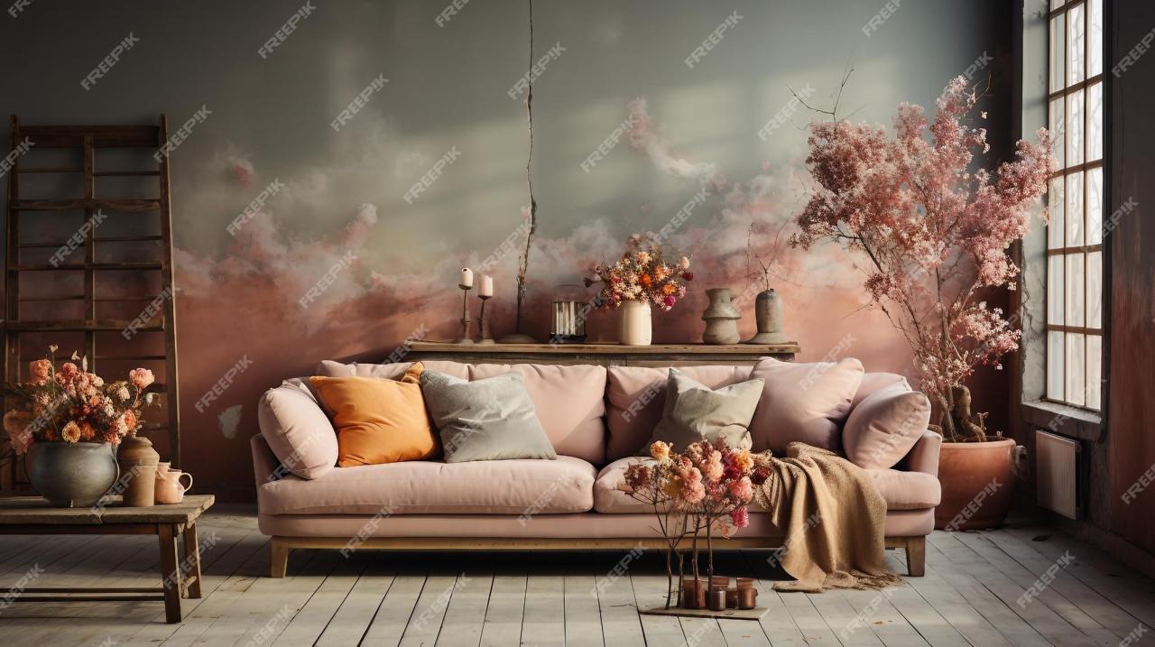
Minimalist Living Room Palette
This palette aims for a serene and sophisticated atmosphere suitable for a minimalist living room. The foundation is a warm, off-white (#F5F2E9) – a creamy, slightly textured white that avoids starkness. This is complemented by a light, dusty gray (#D0D3D4) used for larger surfaces like walls. A muted, earthy taupe (#A89F92) adds a touch of warmth and depth, possibly used for accent furniture or textiles.
Finally, a very dark charcoal gray (#3C3E40) is used sparingly as an accent color, perhaps in a frame or a small decorative element. The combination of these colors creates a calming and uncluttered space, promoting relaxation and a sense of understated elegance. The lack of vibrant or saturated colors keeps the focus on clean lines and simple forms, true to minimalist design principles.
Outcome Summary
From the serene beauty of a desert sunset to the quiet mood of a rainy forest, muted color palettes offer a versatile and impactful design tool. By understanding their characteristics and applying them thoughtfully, you can create visually appealing and emotionally resonant designs that truly resonate with your audience. So, go forth and experiment with the subtle magic of muted colors!
Quick FAQs
What are the best tools for creating muted color palettes?
Many tools can help! Adobe Color, Coolors, and Paletton are popular choices offering various features for exploring and generating color palettes. You can also use image editing software like Photoshop or GIMP to sample colors from inspiring images.
How do I know if a color is truly “muted”?
Muted colors typically have low saturation and a touch of gray, making them less vibrant and more subdued than their bright counterparts. They often feel softer and more calming.
Can muted palettes be used for branding?
Absolutely! Muted palettes can be incredibly effective for branding, particularly for luxury brands or those aiming for a sophisticated and timeless feel. They can communicate elegance, calmness, and trustworthiness.
Are muted palettes suitable for all design projects?
While versatile, muted palettes might not always be the best choice. For projects needing high energy or a strong visual punch, a more vibrant palette might be more appropriate. Consider the overall mood and message you want to convey.