Best Movie Poster Templates Design & Create
Best movie poster templates are more than just pretty pictures; they’re crucial storytelling tools. A killer poster can make or break a film’s success, instantly conveying genre, mood, and intrigue. We’ll dive deep into the art of movie poster design, exploring effective design choices, different template types, and the software you need to bring your vision to life.
Get ready to learn how to create posters that grab attention and leave a lasting impression!
From minimalist masterpieces to vibrant explosions of color, we’ll examine various styles and techniques used by professionals. We’ll cover everything from choosing the right fonts and color palettes to understanding the legal considerations of image usage and copyright. Whether you’re designing for an indie flick or a Hollywood blockbuster, this guide will equip you with the knowledge and resources you need to create stunning movie posters.
Defining “Best” Movie Poster Templates

Source: theme-junkie.com
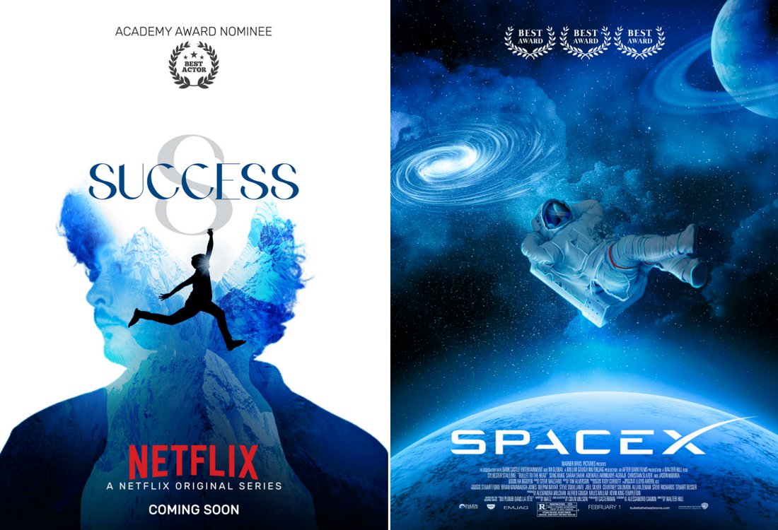
Defining what constitutes a “best” movie poster template is subjective, yet certain design principles consistently lead to highly effective results. A successful movie poster not only captures attention but also conveys the film’s genre, tone, and key elements, enticing viewers to learn more. This involves a careful balance of visual appeal and informative content, resulting in a compelling piece of marketing collateral.Effective movie posters communicate crucial information efficiently.
They must grab the viewer’s attention instantly, often within seconds. This necessitates a strong visual hierarchy, guiding the eye to the title, key actors, and release date. Moreover, the design should reflect the film’s overall style and tone, accurately representing the cinematic experience it promises.
Examples of Highly Effective Movie Poster Designs
Several iconic movie posters exemplify successful design choices. Consider the poster for
- The Shining*. Its minimalist design, featuring Jack Nicholson’s unsettling face against a stark, geometric background, perfectly captures the film’s chilling atmosphere. The limited color palette and strong typography create a memorable and impactful image. In contrast, the vibrant and chaotic poster for
- Pulp Fiction* uses a collage-like approach, showcasing its energetic and eclectic style through a busy yet organized composition. The bold colors and dynamic arrangement of characters and objects effectively communicate the film’s unique personality. The stark simplicity of the
- Drive* poster, with its minimalist aesthetic and striking color contrast, creates a powerful visual statement that reflects the film’s neo-noir atmosphere. The focus on the lead character’s face and the film’s title, set against a deep blue background, immediately conveys a sense of mystery and style.
Comparison of Different Design Styles in Successful Movie Posters
Successful movie posters employ a range of design styles, each tailored to the specific film. Minimalist posters, like that of
- Drive*, prioritize simplicity and impact, using limited elements to create a strong visual statement. Vibrant posters, such as the one for
- Pulp Fiction*, employ a diverse color palette and dynamic composition to reflect the film’s energy and excitement. Dark and moody posters, exemplified by
- The Shining*, utilize a restricted color palette and dramatic lighting to convey a sense of suspense and mystery. The choice of style is crucial, directly influencing the overall message and the target audience. The effectiveness of each style depends on its alignment with the film’s tone and target demographic. For instance, a vibrant design might be inappropriate for a horror film, while a minimalist approach might not be suitable for a high-energy action movie.
Key Elements of Visually Appealing and Informative Movie Posters
Several key elements contribute to a visually appealing and informative movie poster. A strong visual hierarchy is essential, guiding the viewer’s eye to the most important information, such as the title and key actors. Effective use of typography, including font choice and size, is crucial for readability and aesthetic appeal. The color palette should be carefully selected to reflect the film’s tone and genre.
High-quality imagery, whether photography or illustration, is essential for capturing attention and creating a lasting impression. Finally, the overall composition and layout should be balanced and visually pleasing, creating a cohesive and impactful design. The interplay of these elements creates a holistic design that is both aesthetically pleasing and effectively communicates the essence of the film.
Template Types and Their Applications
Choosing the right movie poster template is crucial for effectively communicating the film’s genre, tone, and target audience. A well-designed template can instantly grab attention and entice viewers to learn more. Different genres demand different visual approaches, and understanding these nuances is key to creating a successful poster.
Genre-Specific Movie Poster Templates
The genre of a film heavily influences the design choices for its poster. Horror films often utilize dark color palettes, unsettling imagery, and dramatic typography, while comedies might opt for brighter colors, playful fonts, and humorous illustrations. Action movies frequently feature dynamic compositions, showcasing fast-paced movement and powerful characters. Romance films, conversely, may employ softer colors, intimate imagery, and elegant typography.
The following table illustrates these differences:
| Horror | Comedy | Action | Romance |
|---|---|---|---|
| A dark, shadowy image of a menacing figure, perhaps partially obscured, with a stark, bold title in a gothic font. The color palette would be primarily dark reds, blacks, and grays. | A brightly colored image of the main characters in a humorous situation, possibly with exaggerated expressions or props. The font would be playful and lighthearted, perhaps with a quirky design. | A dynamic action shot, possibly a split-second moment of intense action, with the title in a strong, impactful font. The color palette might be vibrant and high-contrast, emphasizing speed and energy. | A softly lit image of two characters gazing at each other, perhaps silhouetted against a romantic backdrop. The font would be elegant and sophisticated, possibly using a script typeface. |
Independent Film vs. Studio Production Templates
Independent films and studio productions often differ significantly in their poster design approaches. Independent films frequently rely on minimalist designs, emphasizing evocative imagery and clever typography to convey the film’s unique voice and artistic vision. They often have smaller budgets and thus rely on creative solutions rather than expensive photography. Studio productions, on the other hand, typically utilize high-quality photography, often featuring the film’s stars prominently, and employ more visually striking and attention-grabbing designs, reflecting the larger marketing budgets available.
The difference often boils down to a more artistic and less commercial approach for independent films, compared to a more commercial and star-driven approach for studio productions. For example, an independent drama might feature a close-up of a single, expressive face against a muted background, whereas a major studio action movie might feature a crowded scene with explosions and the stars prominently displayed.
Example Movie Poster Designs
To further illustrate these principles, let’s consider three distinct poster designs:
Science Fiction Movie Poster
The science fiction poster would feature a dramatic, wide shot of a futuristic cityscape at night, possibly with a flying vehicle streaking across the sky. The city would be bathed in neon lights, creating a vibrant yet slightly dystopian atmosphere. The title would be bold and futuristic, using a sans-serif font with sharp angles and possibly some glowing effects. The color palette would consist of deep blues, purples, and neon greens and pinks.
The overall feeling would be one of both wonder and unease.
Documentary Movie Poster
The documentary poster would feature a compelling close-up photograph, possibly a portrait of a key subject or a detail from a significant event depicted in the film. The title would be clean and straightforward, using a simple, readable serif font. The color palette would be subdued and realistic, reflecting the documentary’s subject matter. The overall style would aim for authenticity and credibility.
For example, a documentary about the Amazon rainforest might feature a detailed photograph of a vibrant rainforest scene with the title written in a simple, earthy font.
Musical Movie Poster
The musical poster would showcase a dynamic and energetic image of the main characters, perhaps mid-song or dance, conveying the excitement and vibrancy of the musical. The title would be stylized and eye-catching, possibly using a script font with musical notes or other decorative elements incorporated. The color palette would be bright and cheerful, reflecting the upbeat nature of the genre.
Finding the best movie poster templates can really elevate your film’s marketing. But to actually get those posters seen by a wider audience, you need a strong online presence, which is where learning about effective YouTube strategies comes in handy – check out this guide on getting it on with YouTube to boost your reach. Once you’ve mastered YouTube, those killer movie poster templates will truly shine!
The overall design would be lively and engaging, inviting the viewer to experience the energy of the film.
Typography and Visual Hierarchy in Movie Poster Design: Best Movie Poster Templates
A movie poster isn’t just a picture; it’s a carefully constructed visual narrative designed to grab attention and communicate the essence of the film in a single glance. Typography and visual hierarchy are key elements in achieving this. The right font choices can evoke specific emotions and instantly set the tone, while a well-planned visual hierarchy guides the viewer’s eye, ensuring all crucial information is effectively conveyed.The skillful use of typography and visual hierarchy directly impacts a poster’s effectiveness.
A poorly chosen font can clash with the imagery, confusing the viewer and diluting the overall message. Conversely, a strong visual hierarchy ensures that the title, tagline, and key actors are immediately apparent, creating a clear and compelling narrative.
Font Selection and Tone
Font selection is crucial in establishing the mood and genre of a film. Serif fonts, with their small flourishes, often suggest classic or period pieces, lending an air of sophistication and timelessness. Consider a poster for a period drama like “Pride & Prejudice,” where a refined serif font would perfectly complement the elegant costumes and setting. In contrast, sans-serif fonts, clean and modern, are frequently used for science fiction, action, or thrillers, projecting a sense of speed, modernity, and sometimes even coldness.
Imagine a futuristic sci-fi film like “Blade Runner 2049″—a bold, geometric sans-serif font would perfectly encapsulate its dystopian atmosphere. Script fonts, with their flowing, handwritten appearance, can evoke romance, whimsy, or even a sense of mystery, depending on their specific style. A romantic comedy might benefit from a delicate script font, while a gothic horror film could use a more elaborate, gothic-style script to heighten the sense of dread.
Techniques for Creating Visual Hierarchy, Best movie poster templates
Effective visual hierarchy guides the viewer’s eye through the poster, ensuring key elements are noticed first. This is often achieved through size, contrast, and placement. The title, being the most important element, is typically the largest and most prominent. The tagline, supporting the title, follows in size and importance. Actor names and release dates are usually smaller, but still clearly visible.
Color contrast plays a crucial role; using a bright, contrasting color for the title against a darker background ensures it immediately catches the eye. Strategic placement is also vital; the title is often centered, while supporting elements are arranged around it in a balanced and logical manner. For instance, placing the main actor’s name prominently near the title reinforces their importance in the film.
The use of negative space, or empty space around elements, also contributes to visual hierarchy by allowing key elements to breathe and stand out.
Typography Styles for Different Film Genres
- Romantic Comedy: A delicate script font for the title, paired with a playful, slightly rounded sans-serif font for supporting text. This combination creates a lighthearted and romantic feel. Imagine a poster for “When Harry Met Sally,” where a flowing script title would complement the light and airy imagery.
- Horror: A sharp, angular sans-serif font or a gothic-style script for the title, often in a dark, ominous color. This creates a sense of tension and unease. A poster for “The Exorcist” might use a stark, almost aggressive sans-serif font to emphasize the film’s disturbing themes.
- Action/Thriller: A bold, condensed sans-serif font, often with strong vertical lines, for the title, conveying speed and intensity. Supporting text could use a more legible sans-serif for clarity. A poster for “Die Hard” would likely feature a bold, aggressive sans-serif font to convey the film’s high-octane action.
- Sci-Fi: A futuristic, geometric sans-serif font, sometimes with unusual letterforms or a slightly distorted appearance, to convey a sense of technology and otherworldliness. A poster for “2001: A Space Odyssey” might utilize a clean, futuristic sans-serif to reflect the film’s themes of technology and space.
Color Palette and Image Selection
Crafting a truly memorable movie poster hinges not just on a clever concept, but also on the masterful use of color and the strategic selection of imagery. The right combination can instantly communicate the film’s genre, tone, and even its underlying themes, captivating the audience at a glance and drawing them into the cinematic world you’re presenting. The interplay between color psychology and visual storytelling is crucial for effective poster design.Effective color palettes evoke specific emotional responses, subtly influencing the viewer’s perception of the film.
The choices made in image selection, in turn, support and enhance the message conveyed by the color scheme. Together, these elements create a cohesive and powerful visual narrative that transcends mere advertisement and becomes a work of art in itself.
Examples of Effective Color Palettes and Their Psychological Impact
Successful movie posters often employ color palettes that resonate deeply with the film’s genre and mood. For instance, the poster for “The Shining” famously uses a chilling combination of icy blues and deep, ominous blacks. The cold blue tones evoke a sense of isolation and dread, while the black adds to the film’s suspenseful atmosphere. This stark contrast perfectly captures the film’s unsettling atmosphere.
In contrast, a film like “Amelie” utilizes a vibrant palette of warm yellows, oranges, and soft pinks, creating a whimsical and charming visual experience that mirrors the film’s playful tone. The bright, saturated colors evoke feelings of joy, optimism, and a touch of whimsy. Similarly, the poster for “Mad Max: Fury Road” uses a fiery palette of oranges, reds, and browns to convey the post-apocalyptic wasteland setting and the intense action sequences.
The warm tones, often associated with danger and heat, perfectly complement the film’s gritty and violent aesthetic. These examples highlight how strategically chosen color palettes can significantly enhance the overall impact of a movie poster.
Methods for Selecting Compelling Imagery for Movie Posters
Selecting compelling imagery is paramount; it’s the visual hook that grabs attention and communicates the essence of the film. The process often begins with brainstorming key scenes, characters, or symbolic elements that encapsulate the story’s core message. Composition is key. The Rule of Thirds, for instance, can be used to create a visually balanced and engaging image.
A strong focal point, whether it’s a character’s face or a dramatic landscape, is crucial for drawing the viewer’s eye. Visual storytelling also plays a critical role; the image should hint at the plot or themes without giving away too much. A well-chosen image should immediately convey the genre and tone of the film, leaving the viewer intrigued and wanting to know more.
Consider the poster for “Jaws,” featuring a menacing fin cutting through the water – a single image that perfectly captures the film’s suspense and terror.
Designing a Color Palette and its Application in a Thriller Poster
Let’s design a color palette for a thriller poster. We’ll use a palette dominated by deep, saturated blues and contrasting pops of neon yellow. The deep blues represent mystery, suspense, and a sense of unease, evoking feelings of coldness and isolation. The neon yellow acts as a jarring counterpoint, symbolizing danger, unpredictability, and perhaps a crucial plot element or a character’s unsettling presence.
The contrast between the cool blues and the sharp yellow creates a visually arresting effect, immediately grabbing the viewer’s attention and setting a tense, suspenseful mood.This palette would be ideally suited for a thriller centered around a lone investigator pursuing a shadowy criminal organization. The deep blues would form the backdrop, representing the labyrinthine world of secrets and deceit the protagonist navigates.
The neon yellow could be used to highlight key elements: perhaps a close-up of the killer’s weapon, a crucial piece of evidence, or the character’s piercing gaze. The overall effect would be a poster that effectively communicates the film’s thrilling and suspenseful nature, drawing the viewer in with its striking visual contrast and powerful color symbolism.
Legal Considerations and Copyright

Source: windows.net
Creating stunning movie posters requires more than just artistic talent; it necessitates a thorough understanding of copyright law. Using copyrighted images, fonts, or even existing designs without permission can lead to costly legal battles and damage your reputation. This section will explore the legal aspects of incorporating various elements into your movie poster designs, ensuring your work remains both creative and legally sound.Protecting your creative work and avoiding infringement requires a proactive approach.
Understanding the legal landscape surrounding image usage, font licensing, and overall design elements is crucial for any designer. Ignoring these aspects can lead to serious consequences, from cease-and-desist letters to substantial financial penalties. This section will provide practical steps and examples to guide you through the process of legally sound movie poster creation.
Image Sourcing and Attribution
Properly sourcing images is paramount to avoid copyright infringement. Using images found freely on the internet without verifying their licensing status is risky. Many images are protected by copyright, even if they don’t have explicit watermarks. To avoid issues, always seek out images with clearly defined Creative Commons licenses (like CC0 for public domain images, or CC BY for attribution required) or purchase royalty-free images from reputable stock photo websites.
These websites typically offer licenses that grant you the right to use the images in your projects, often with different usage tiers based on the scale of your project. For example, a small independent film might require a less expensive license than a major studio release. Always carefully read the license terms before using any image. When using images requiring attribution, clearly indicate the source, usually in small text at the bottom of the poster or in the metadata if the poster is digital.
For instance, if you use an image from Unsplash under a CC0 license, you may not need attribution, but if you use an image from a site like Shutterstock, you will need to follow their attribution guidelines.
Font Licensing and Usage
Fonts, like images, are often protected by copyright. Using fonts without a valid license is a form of copyright infringement. Many free fonts are available online, but always verify the license before using them. Some free fonts allow for commercial use, while others may restrict usage to personal projects. Commercial fonts usually require a license purchase.
The license will specify the permitted uses (such as web, print, or both) and the number of projects or users allowed. For example, a single-user license might be suitable for an individual creating posters for a personal project, whereas a commercial license would be necessary for a studio using the font in multiple film posters. Failing to adhere to these license agreements can lead to legal action from the font foundry.
Always keep records of your font licenses to prove compliance.
Ensuring Compliance with Copyright Laws
To ensure compliance with copyright laws, maintain meticulous records of all sourced materials, including images and fonts. Keep copies of licenses, attribution details, and any communication with rights holders. When in doubt, always seek permission from the copyright holder. This is especially important when using images or fonts that are not explicitly labeled as free or royalty-free.
If you’re unsure about the copyright status of an image or font, err on the side of caution and seek alternative options or permission. Consider consulting with an intellectual property lawyer for advice on complex copyright issues. This proactive approach can save significant time, money, and legal headaches in the long run. Regularly review your poster designs to ensure ongoing compliance with licensing agreements, as terms and conditions can change over time.
End of Discussion

Source: wordtemplatesonline.net
Creating captivating movie posters is a blend of art and science, requiring a keen eye for design and a solid understanding of visual communication. By mastering the techniques discussed—from selecting impactful imagery and typography to understanding copyright laws—you can craft posters that not only attract viewers but also accurately represent the essence of your film. So, grab your design software, unleash your creativity, and start crafting movie posters that tell a story before the film even begins!
Key Questions Answered
What’s the ideal size for a movie poster?
The standard size is 27″ x 40″, but variations exist depending on the intended use (e.g., online, print).
Where can I find royalty-free images for my movie poster?
Websites like Unsplash, Pexels, and Pixabay offer a wide selection of high-quality, royalty-free images.
How important is the movie title in the poster design?
The title is paramount; it should be clear, legible, and visually integrated with the overall design. It’s often the first thing viewers see.
What if I don’t have graphic design experience?
Many user-friendly online tools and templates are available, even for beginners. Start with simple designs and gradually build your skills.


