Best Modern PowerPoint Templates Your Guide
Best modern PowerPoint templates aren’t just about pretty slides; they’re about crafting compelling narratives that resonate with your audience. This post dives deep into what makes a template truly “best,” exploring design aesthetics, functionality, and the crucial role of audience consideration. We’ll uncover the key features of modern templates, from slick animations to seamless chart integration, and show you where to find the perfect fit for your next presentation.
From minimalist designs perfect for conveying complex data to creative templates bursting with personality, we’ll cover a wide range of styles and explore how to customize them to reflect your unique brand identity. We’ll also touch upon crucial accessibility considerations to ensure your message reaches everyone. Get ready to transform your presentations from drab to fab!
Defining “Best” Modern PowerPoint Templates
Choosing the right PowerPoint template can significantly impact the effectiveness of your presentation. A well-designed template not only enhances visual appeal but also improves clarity and engagement, ultimately leading to a more successful presentation. But what constitutes a “best” modern PowerPoint template? It’s more than just aesthetically pleasing; it’s a blend of design, functionality, and user experience.
Criteria for Evaluating Modern PowerPoint Templates
Several key factors determine the quality of a modern PowerPoint template. These criteria go beyond simple visual attractiveness and delve into the practical aspects that contribute to a seamless and impactful presentation. A strong template should be adaptable, easy to customize, and enhance the message, not distract from it.
| Criterion | Minimalist Template | Corporate Template | Creative Template |
|---|---|---|---|
| Design Aesthetics | Clean lines, simple color palettes, ample white space. Example: A template featuring a single, bold typeface and subtle background texture. | Professional and sophisticated, often incorporating company branding elements. Example: A template with a dark, professional color scheme, subtle logos, and high-quality imagery. | Bold colors, unique typography, and unconventional layouts. Example: A template using vibrant colors, a playful font, and illustrations. |
| Functionality | Focus on clear information hierarchy and easy navigation. Includes basic charts and graphs. | Provides tools for presenting financial data, project timelines, and other business-related information. May include advanced chart options. | Offers creative layout options, unique transitions, and space for visual storytelling. |
| User Experience | Intuitive and easy to customize, even for users with limited design experience. | Well-organized master slides and placeholders for easy content insertion. | May require more design skills to customize effectively, but offers high creative potential. |
| Responsiveness | Adapts well to different screen sizes and resolutions. | Adapts well to different screen sizes and resolutions, maintaining a professional look. | Adapts well to different screen sizes and resolutions, preserving creative elements. |
The Importance of Target Audience Consideration
The selection of a PowerPoint template should always begin with a clear understanding of the target audience. A template suitable for a corporate board meeting might be entirely inappropriate for a group of college students. For example, a minimalist template, with its clean lines and simple design, might be perfect for a presentation to a tech-savvy audience focused on data, while a more creative template, with its bold visuals and unconventional layouts, might be more engaging for a younger audience.
Finding the best modern PowerPoint templates can be a game-changer for your presentations, especially when you’re aiming for that professional polish. To really boost your impact, though, consider how you’ll share your work; a killer presentation deserves a killer launchpad, which is why I recommend checking out this guide on getting it on with youtube to maximize your reach.
After all, even the best PowerPoint templates need a great platform to shine!
Conversely, a corporate template, emphasizing professionalism and structure, would be more appropriate for a formal business presentation. Failing to consider the audience can lead to a disconnect between the message and the receiver, diminishing the impact of the presentation.
Key Features of Modern PowerPoint Templates
So, you’ve decided to ditch those clunky, outdated PowerPoint templates and embrace the modern age. Excellent choice! But what exactly makes a modern PowerPoint template trulymodern*? It’s more than just a pretty picture; it’s about functionality, design innovation, and the overall impact on your audience. Let’s delve into the key features that elevate a template from “okay” to “outstanding.”Modern PowerPoint templates go beyond simple text boxes and bullet points.
They’re designed to help you create engaging and impactful presentations that leave a lasting impression. This involves a clever blend of sophisticated design and practical functionality. This isn’t just about aesthetics; it’s about enhancing the effectiveness of your communication.
Animation Capabilities, Best modern powerpoint templates
High-quality modern templates seamlessly integrate animation to enhance the visual narrative of your presentation. Animations are no longer clunky, distracting transitions; instead, they’re subtle and purposeful, guiding the viewer’s eye and emphasizing key information. Think of subtle entrance animations for bullet points, or a smooth zoom effect on a crucial chart. These subtle animations don’t distract but rather add a professional polish and improve audience engagement.
They can highlight key data points, introduce new concepts gradually, and generally make the presentation flow more smoothly and dynamically. For example, imagine a timeline where each event appears sequentially with a smooth fade-in animation, creating a clear and engaging visual representation of the historical progression.
Master Slide Functionality
Master slides are the unsung heroes of efficient PowerPoint design. They allow you to create a consistent look and feel across your entire presentation, saving you time and ensuring a professional appearance. By customizing the master slide, you can pre-set fonts, colors, logos, and even placeholders for recurring elements like page numbers or footers. This means you only need to make changes in one place, and the updates will automatically reflect across all slides.
This is particularly beneficial for longer presentations or those requiring a consistent brand identity. Imagine creating a corporate presentation with a consistent logo, font, and color scheme applied effortlessly across 50 slides – that’s the power of master slides.
Chart Integration
Data visualization is paramount in many presentations, and modern templates offer seamless integration with various chart types. Instead of relying on basic bar charts, modern templates provide options for visually appealing and informative charts, including interactive charts, 3D charts, and more. These charts aren’t just pretty; they are designed for clarity and understanding, making complex data easier to grasp for your audience.
For instance, a well-designed interactive pie chart can quickly illustrate market share percentages, making your presentation more compelling and easily digestible.
Innovative Design Elements
Modern templates often incorporate design elements that go beyond the standard. This helps to create a unique and memorable presentation.
- Custom Icons: Instead of generic clip art, high-quality templates utilize custom-designed icons that complement the overall aesthetic and enhance the visual appeal of bullet points or section headers. These icons help to convey meaning quickly and visually, improving comprehension.
- Unique Typography: Careful selection of fonts significantly impacts readability and the overall tone of your presentation. Modern templates typically use a combination of elegant and legible fonts, creating a balanced and professional aesthetic.
- Interactive Elements: Some modern templates incorporate interactive elements, such as hyperlinks, embedded videos, or even quizzes, to engage the audience and enhance information retention. These features transform the presentation from a passive viewing experience to an active learning opportunity.
These innovative design elements are not mere decorations; they are integral parts of a well-designed presentation that contribute to improved communication and audience engagement. A carefully chosen font enhances readability, while well-placed custom icons can instantly clarify complex information. Interactive elements help maintain audience attention and encourage participation.
Sources and Platforms for Finding Templates

Source: designshack.net
Finding the perfect PowerPoint template can feel like searching for a needle in a haystack. The sheer volume of options available online can be overwhelming. Fortunately, several reputable sources offer a wide variety of high-quality templates, catering to different needs and budgets. Understanding where to look and what to expect in terms of pricing and licensing is crucial for making an informed decision.
Navigating the world of PowerPoint templates requires a discerning eye. Knowing which platforms offer reliable, well-designed templates, and understanding the nuances of their pricing and licensing models, is key to finding the perfect fit for your presentation. This section will explore several reputable sources and compare their offerings to help you make the best choice.
Reputable Websites and Marketplaces for PowerPoint Templates
Several websites and marketplaces specialize in providing high-quality PowerPoint templates. These platforms often offer diverse styles, from minimalist designs to more elaborate, visually rich options. Choosing a reputable source ensures you’re getting a well-designed, professional-looking template, free from glitches or compatibility issues. Here are a few examples:
- Envato Elements: A subscription-based service offering a vast library of templates, graphics, and other creative assets.
- Creative Market: A marketplace featuring templates from independent designers, offering a wide range of styles and price points.
- Slidesgo: Provides a collection of free and premium PowerPoint templates with a focus on modern and visually appealing designs.
- TemplateMonster: A large marketplace offering a diverse selection of templates, including many PowerPoint options.
- Microsoft PowerPoint’s built-in templates: While not as extensive as dedicated template sites, Microsoft offers a selection of free templates directly within the PowerPoint application.
Pricing Models and Licensing Options
The cost and licensing associated with PowerPoint templates vary significantly depending on the platform and the specific template. Understanding these differences is crucial for budgeting and ensuring you have the necessary rights to use the template. The following table summarizes common pricing models and licensing options:
| Platform | Pricing Model | Licensing | Notes |
|---|---|---|---|
| Envato Elements | Subscription (monthly or annual) | Extended License (generally included with subscription) | Access to a vast library of templates for a fixed fee. |
| Creative Market | Individual purchases | Standard or Extended License (varies by template) | Pay-per-template; licensing options affect usage rights. |
| Slidesgo | Free and Premium options | Free templates often have usage restrictions; Premium offers broader rights. | Offers a mix of free and paid options with varying licensing terms. |
| TemplateMonster | Individual purchases | Standard or Extended License (varies by template) | Large selection; pricing and licensing vary greatly depending on the template. |
Advantages and Disadvantages of Free versus Paid Templates
The decision of whether to use a free or paid PowerPoint template depends on your specific needs and budget. Both options have their own sets of advantages and disadvantages.
Free Templates: Free templates are readily available, offering a cost-effective option for simple presentations. However, they often come with limitations such as fewer design options, less customization potential, and possible compatibility issues. They may also lack the professional polish of paid templates, potentially impacting the overall impression of your presentation.
Paid Templates: Paid templates generally offer higher quality designs, greater customization flexibility, and often include extended licensing options. They typically come with professional support and may offer unique features not found in free templates. The investment can be worthwhile for important presentations where a polished and professional look is crucial. However, the cost can be a significant factor for individuals or organizations with limited budgets.
Template Customization and Branding

Source: slidesalad.com
Choosing a PowerPoint template is only half the battle. The real magic happens when you tailor it to perfectly reflect your brand’s unique personality and message. A generic template, no matter how visually appealing, can feel impersonal and fail to connect with your audience. Effective branding through customization is key to creating presentations that are both professional and memorable.Customizing a template to match your brand involves a careful and strategic process of integrating your visual identity.
This includes consistent use of your brand’s color palette, fonts, and logo, ensuring a cohesive and professional presentation. Remember, the goal is not to drastically alter the template’s underlying structure, but rather to subtly infuse it with your brand’s essence. This approach maintains the template’s inherent design strengths while enhancing its impact with your unique brand identity.
Color Palette Implementation
Implementing your brand’s color palette is a crucial step in branding your PowerPoint template. Consistency is key; stick to the specific hex codes or color names defined in your brand guidelines. Most modern PowerPoint versions allow for easy color selection and application. You can typically adjust the colors of various elements, such as backgrounds, text, charts, and shapes, by selecting them and modifying their fill color in the formatting options.
For example, if your brand uses a primary color of #007bff (a vibrant blue) and a secondary color of #dc3545 (a bold red), you’d systematically replace the template’s default colors with these shades. This ensures a unified and recognizable visual experience for your audience. Avoid using too many colors; stick to your primary brand colors to maintain visual clarity and prevent a cluttered look.
Font Selection and Application
Your brand’s chosen fonts significantly impact the readability and overall aesthetic of your presentation. Again, consult your brand guidelines for the specific fonts to use – typically, a primary font for headings and a secondary font for body text. PowerPoint offers a wide selection of fonts, but only use those specified in your branding. Maintaining consistency across headings, body text, and other textual elements is vital for a professional appearance.
For instance, if your brand uses “Open Sans” for body text and “Montserrat” for headings, meticulously replace all default fonts with these options throughout your presentation. Be mindful of font sizes and weights; ensure readability without sacrificing visual appeal.
Logo Integration
Integrating your logo is the most direct way to brand your PowerPoint template. Begin by placing your logo on the master slide. This ensures it appears consistently on every slide. The logo’s placement should be subtle yet prominent, perhaps in a corner or header. Ensure the logo’s size and resolution are appropriate for the presentation format; a low-resolution logo will appear pixelated and unprofessional.
Also, maintain sufficient spacing around the logo to avoid cluttering the slide. Consider using a transparent background for your logo to seamlessly integrate it with the slide’s design. Remember, the logo is a powerful symbol of your brand; use it strategically to reinforce your identity without overpowering the content.
Replacing Placeholder Images and Text
Before you begin, gather all your brand-specific assets: high-resolution images, consistent text styles, and updated data points. This preparatory step will streamline the customization process. Start by replacing the placeholder images with your own high-quality visuals that reflect your brand’s aesthetic and messaging. Ensure the images are appropriately sized and formatted to avoid pixelation or distortion. Next, systematically replace all placeholder text with your actual content, maintaining the designated font styles and sizes to preserve the overall design harmony.
Pay close attention to the overall layout and ensure your text is easy to read and aligns with the design’s visual flow. Finally, review your entire presentation to ensure all branding elements are consistent and correctly implemented.
Visual Design Trends in Modern PowerPoint Templates: Best Modern Powerpoint Templates
Modern PowerPoint presentations are no longer just bullet points and clip art. The evolution of design aesthetics has dramatically impacted how we create and consume presentations, leading to a focus on visual clarity, engagement, and brand consistency. This shift is reflected in the prevalent design trends found in today’s best PowerPoint templates.
The key to a successful modern PowerPoint presentation lies in its ability to communicate information effectively and memorably. This requires more than just well-written content; it demands a visual language that resonates with the audience and enhances the message’s impact. Understanding and implementing current visual design trends is crucial for achieving this.
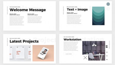
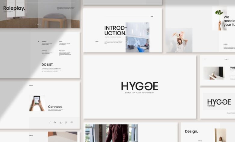
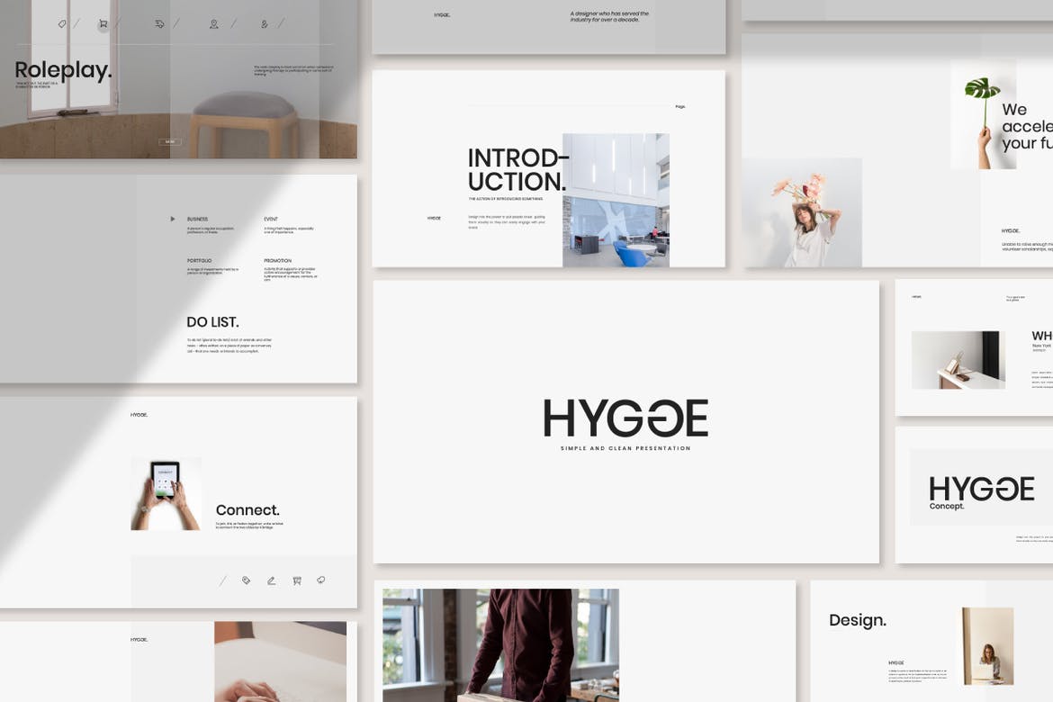
Flat Design and Minimalism
Flat design, characterized by its two-dimensional elements, clean lines, and absence of gradients and shadows, remains a cornerstone of modern template design. This approach prioritizes simplicity and readability, ensuring the content takes center stage. Minimalism complements this by strategically using whitespace to create visual breathing room and guide the viewer’s eye. The result is a presentation that’s both visually appealing and easy to follow.
Overly complex designs can distract from the message, while a clean, minimalist aesthetic allows the information to shine.
- Color palettes: Modern templates often employ muted, sophisticated color palettes, using a limited number of colors to maintain visual harmony and brand consistency. Think of a presentation for a tech company using shades of blues and grays, or a marketing presentation using a vibrant yet balanced combination of primary colors.
- Typography: Clean, legible fonts are paramount. Sans-serif fonts like Open Sans, Roboto, or Lato are frequently used for their readability and modern feel. A consistent font family across headings and body text enhances visual coherence.
- Whitespace: Strategic use of whitespace—empty space around text and images—creates visual hierarchy and prevents the presentation from feeling cluttered. Whitespace provides visual breathing room, allowing the audience to easily digest the information presented.
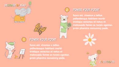
Geometric Shapes and Custom Illustrations
Geometric shapes and custom illustrations add visual interest and personality to modern PowerPoint templates without overwhelming the design. They can be used to create visual metaphors, highlight key information, or simply enhance the overall aesthetic appeal. The key is to use them purposefully and in moderation, ensuring they complement, rather than distract from, the core message.
- Geometric Shapes: Simple geometric shapes like circles, squares, and triangles can be used to create visually appealing layouts, emphasize key data points, or serve as containers for text and images. They offer a clean and modern look while adding a touch of visual sophistication.
- Custom Illustrations: Instead of relying on generic stock images, many modern templates incorporate custom illustrations that align with the presentation’s theme and brand identity. These illustrations are often flat, simple, and easily integrated into the overall design. A presentation about sustainable energy, for instance, might feature custom illustrations of wind turbines or solar panels.
- Color Gradients: Subtle color gradients can add depth and visual interest to otherwise flat designs, without detracting from the minimalist aesthetic. A carefully chosen gradient can subtly enhance the overall visual appeal of a presentation, creating a sophisticated and modern look.
Impact on Presentation Effectiveness
The visual design trends discussed above significantly impact the effectiveness of a presentation. A well-designed presentation, incorporating these elements, is more engaging, memorable, and persuasive. The use of flat design, minimalism, geometric shapes, and custom illustrations contributes to a cleaner, more professional look, ultimately making the presentation easier to follow and understand. The improved visual clarity enhances audience comprehension and retention, leading to a more impactful and successful presentation.
Accessibility Considerations in Template Design
Creating stunning PowerPoint presentations is only half the battle. The other half, and arguably the more important one, is ensuring your presentation is accessible to everyone, regardless of ability. An accessible design demonstrates inclusivity and ensures your message reaches the widest possible audience. Ignoring accessibility not only limits your reach but also undermines your commitment to creating truly impactful presentations.Designing accessible PowerPoint templates requires careful consideration of several key elements.
Primarily, this involves focusing on visual clarity and providing alternative text for non-textual elements. By adhering to accessibility best practices, you can ensure your presentations are usable and enjoyable for individuals with a wide range of disabilities, including visual, auditory, motor, and cognitive impairments.
Color Contrast Ratios
Sufficient color contrast is crucial for readability, particularly for individuals with low vision. Poor contrast makes text difficult or impossible to read. The Web Content Accessibility Guidelines (WCAG) recommend a minimum contrast ratio of 4.5:1 for normal text and 3:1 for large text (18pt or larger). Tools are available online to check contrast ratios, ensuring your text and background colors meet these standards.
For example, a dark blue background with light yellow text would likely fail this test, whereas black text on a white background easily passes. This applies to all text elements within the template, including headings, body text, and captions.
Font Choices
Selecting appropriate fonts significantly impacts accessibility. Sans-serif fonts like Arial, Calibri, or Verdana are generally easier to read than serif fonts (like Times New Roman) because their clean lines reduce visual clutter. Furthermore, choosing a font size that is large enough (at least 12pt for body text) ensures readability for people with visual impairments. Avoid overly stylized or decorative fonts that can be difficult to decipher.
Consistency in font choices across the entire template improves readability and overall presentation quality.
Alternative Text for Images
Images are an integral part of modern PowerPoint presentations, but they are inaccessible to screen reader users without alternative text (alt text). Alt text provides a textual description of the image, allowing screen readers to convey the image’s content to visually impaired users. Detailed and accurate alt text is essential; avoid generic descriptions like “image of a graph.” Instead, describe the graph’s key data points and their significance.
For example, instead of “image of a person,” write “a smiling woman in a business suit presenting at a conference.” This descriptive approach makes your presentation inclusive and understandable for everyone.
Keyboard Navigation
Ensuring the presentation is fully navigable using only a keyboard is vital for users with motor impairments. All interactive elements, such as buttons and hyperlinks, should be accessible and responsive to keyboard input. Testing the keyboard navigation thoroughly is essential to identify and rectify any issues. For instance, using the Tab key to move through elements should provide a logical sequence, not skipping over important content.
Captioning and Transcripts
For presentations including audio or video content, providing captions and transcripts is crucial for deaf or hard-of-hearing individuals. Accurate captions ensure that the audio information is accessible to everyone. Furthermore, a full transcript provides a text-based version of the audio, allowing for easier comprehension and searching. Consider providing these elements as part of the downloadable presentation materials, alongside the PowerPoint file itself.
Illustrative Examples of Best Practices
Source: theme-junkie.com
Let’s delve into specific examples showcasing how to leverage modern PowerPoint template features for impactful presentations. We’ll examine data visualization, narrative structure, and the strategic use of whitespace – key elements for creating visually appealing and easily digestible presentations.This section provides concrete examples of how to implement these best practices, using descriptive language to paint a picture of effective slide design.
Imagine these examples as blueprints for your own presentations.
Data Visualization in a Modern Template
Consider a slide analyzing quarterly sales figures. Instead of a dense table of numbers, a modern template would utilize a clean, minimalist design. Imagine a bar chart, using a muted color palette (perhaps shades of blue and grey for a corporate feel), clearly highlighting the growth or decline in sales across each quarter. The x-axis (quarters) is labeled concisely, and the y-axis (sales figures) uses clear, easily understood units (e.g., thousands of dollars).
The chart itself occupies approximately 60% of the slide, leaving ample whitespace around it. A short, impactful title, such as “Q1-Q4 Sales Performance,” is placed above the chart, while a concise summary of key findings (e.g., “Significant growth in Q3”) is placed below. The font is a clean sans-serif typeface like Open Sans or Roboto, ensuring readability.
This approach prioritizes clarity and visual impact, allowing the data to speak for itself without overwhelming the audience.
Compelling Narrative Structure
A compelling narrative uses visual elements to guide the audience through a story. Imagine a slide showcasing a company’s journey. The background could be a subtle gradient, creating a sense of movement. The main text area is divided into three distinct sections, each representing a key stage in the company’s journey (e.g., inception, growth, future). Each section features a relevant image (perhaps a photo of the founding team, a graph illustrating growth, and a futuristic image representing future goals).
These images are strategically placed, not overwhelming the text but adding visual interest and context. The text in each section uses a consistent font and style, maintaining a cohesive look. Arrows or other subtle visual cues could connect the sections, emphasizing the chronological flow of the narrative. This design choice helps the audience understand the company’s story not just through words, but through a visually engaging sequence.
Whitespace and Negative Space
Effective use of whitespace is crucial for readability and visual appeal. Consider a slide with a single, powerful image occupying the left half of the slide. The right half is intentionally left mostly blank, creating a significant amount of negative space. A short, impactful headline is placed within the whitespace, positioned to balance the image. This deliberate use of whitespace allows the image and headline to breathe, preventing the slide from feeling cluttered or overwhelming.
The contrast between the image and the empty space draws the viewer’s eye to the key elements, improving comprehension and creating a sophisticated, uncluttered look. This minimalist approach ensures that the message is clear and impactful.
Final Summary
Ultimately, the best modern PowerPoint template is the one that best serves your purpose and audience. By understanding the key features, design trends, and accessibility considerations, you can create presentations that are not only visually stunning but also highly effective. Remember to prioritize clear communication, impactful visuals, and a strong narrative to truly captivate your audience. So go forth, and create presentations that leave a lasting impression!
FAQ Summary
Can I use free PowerPoint templates for professional presentations?
While free templates can be a good starting point, paid templates often offer more features, better design quality, and unique designs, making them a safer bet for professional settings. Free templates might also have limited customization options.
What file formats are PowerPoint templates usually available in?
Most commonly, you’ll find PowerPoint templates in .pptx (PowerPoint 2007 and later) or .potx (PowerPoint template) formats.
How do I ensure my template is accessible to everyone?
Prioritize sufficient color contrast, use easily readable fonts, and provide alt text for all images. Avoid overly complex animations that could be distracting or inaccessible.
What are some common mistakes to avoid when choosing a template?
Avoid templates that are overly cluttered, use clashing colors, or have low-resolution images. Also, make sure the template’s style aligns with your brand and the context of your presentation.