Using Colour in Design A Creative Guide
Using colour in design is more than just picking pretty shades; it’s about understanding the psychology behind hues, mastering color theory, and ensuring accessibility for all. This journey delves into the fascinating world of color, exploring how different palettes evoke emotions, build brands, and even impact user experience. We’ll unravel the secrets of color harmony, navigate the complexities of different color models (RGB, CMYK, and HSV), and discover how to create inclusive and visually stunning designs.
Get ready to unlock the power of color!
From understanding the cultural nuances of color associations to mastering color contrast for accessibility, this guide will equip you with the knowledge and tools to confidently wield the power of color in your own projects. We’ll look at real-world examples, explore current trends, and even peek into the future of color palettes. So, whether you’re a seasoned designer or just starting out, let’s dive in and unlock the potential of color!
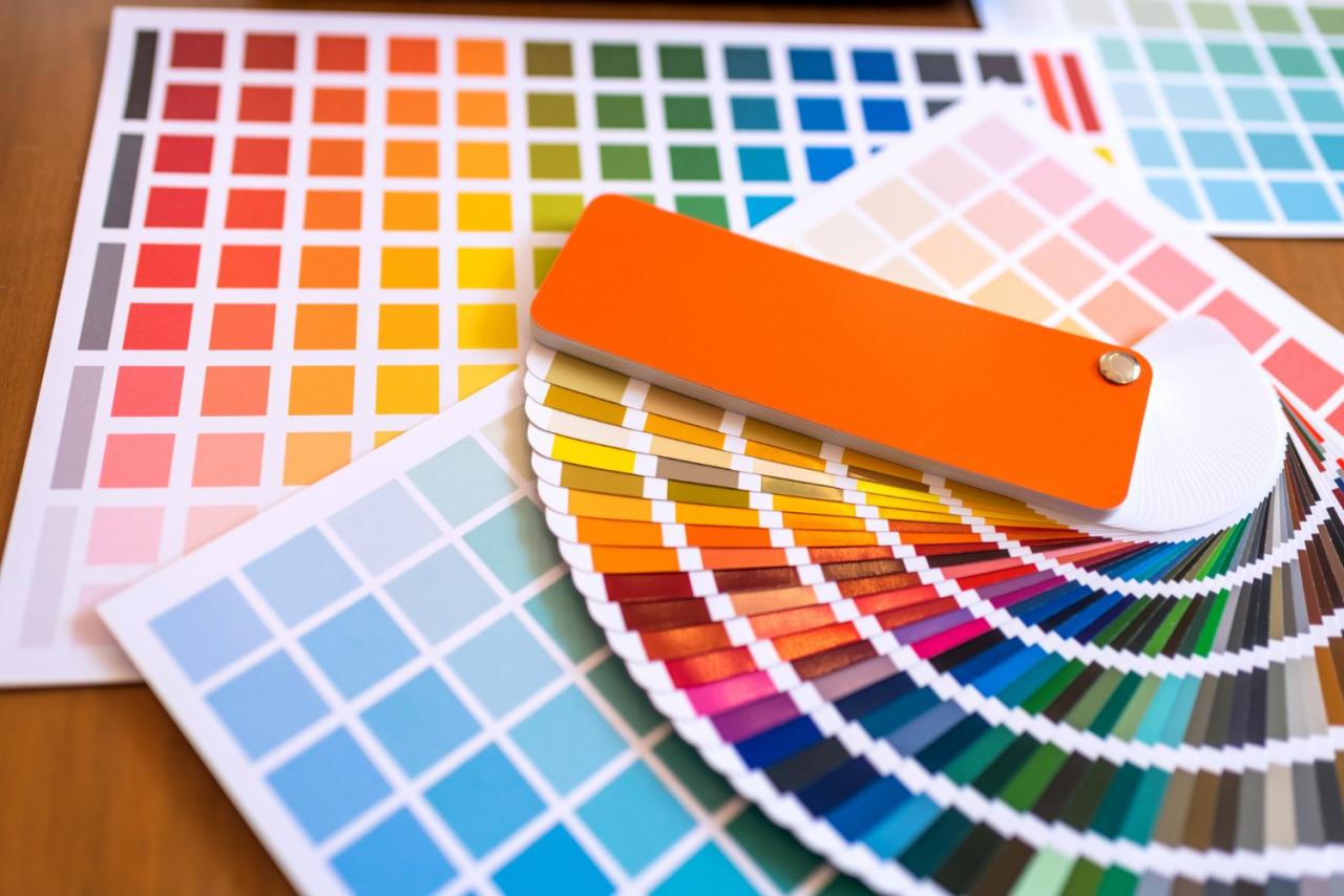
The Psychology of Color in Design: Using Colour In Design

Source: treverkoltys.com
Color is more than just aesthetics; it’s a powerful tool that significantly impacts how users perceive and interact with a design. Understanding the psychology of color is crucial for designers aiming to evoke specific emotions, build brand identities, and ultimately, achieve their design goals. This exploration delves into the nuances of color psychology, examining its influence across cultures and demographics.
Warm vs. Cool Color Families and Their Emotional Impact
Warm colors, encompassing reds, oranges, and yellows, generally evoke feelings of energy, excitement, and warmth. They are often associated with action, passion, and even aggression. Think of a fiery red used in a fast-food logo to convey a sense of speed and urgency. In contrast, cool colors like blues, greens, and purples tend to project calmness, serenity, and trustworthiness.
A calming blue is often used in healthcare branding to inspire confidence and relaxation. The choice between warm and cool palettes dramatically alters the overall mood and message of a design. For example, a website selling adventure gear might use a vibrant orange and red palette, while a spa’s website might opt for soothing blues and greens.
Cultural and Demographic Variations in Color Associations
Color symbolism is far from universal. What signifies prosperity in one culture might represent mourning in another. For instance, white is often associated with purity and innocence in Western cultures, but it symbolizes mourning in many Asian countries. Similarly, red, a symbol of good luck and celebration in China, can represent danger or anger in some Western contexts. Designers must be acutely aware of these cultural nuances to avoid misinterpretations and ensure their designs resonate effectively across diverse audiences.
Ignoring these differences can lead to significant communication breakdowns and even offense.
Using Color to Create Specific Moods and Brand Identities
Color plays a pivotal role in shaping brand identity and evoking specific moods. Consider the instantly recognizable Coca-Cola red, which effectively communicates energy, excitement, and happiness. Conversely, the calming blues used by many technology companies project a sense of reliability and innovation. A luxury brand might employ deep purples and golds to suggest sophistication and exclusivity, while a children’s brand might use bright, playful yellows and greens.
Careful color selection is key to creating a consistent and memorable brand experience.
Mood Board: Emotional Impact of Color Palettes
Imagine a mood board. The top left quadrant displays a palette of deep blues, greens, and muted grays. This evokes a sense of calm, tranquility, and trust – perfect for a meditation app or a spa. The top right quadrant shows a vibrant palette of oranges, yellows, and reds, representing energy, excitement, and enthusiasm – ideal for a sports brand or an amusement park.
The bottom left quadrant features a palette of soft pinks, lavenders, and creams, suggesting gentleness, romance, and femininity, suitable for a cosmetics brand or a wedding website. Finally, the bottom right quadrant showcases a palette of blacks, grays, and metallic accents, conveying sophistication, luxury, and power, fitting for a high-end fashion brand or a luxury car manufacturer. Each palette’s visual impact directly correlates with the emotions it aims to elicit.
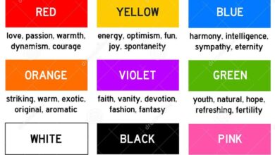
Psychological Effects of Red, Blue, Green, and Yellow
| Color | Psychological Effects | Examples in Design | Considerations |
|---|---|---|---|
| Red | Energy, excitement, urgency, passion, anger, aggression | Fast food logos, warning signs, sale banners | Can be overwhelming in large quantities; use sparingly. |
| Blue | Calmness, serenity, trust, security, stability, coolness | Healthcare brands, technology companies, corporate websites | Can appear cold or uninviting if overused. |
| Green | Nature, freshness, growth, harmony, peace, calmness | Environmental organizations, health food brands, nature documentaries | Can be associated with envy or sickness in some contexts. |
| Yellow | Happiness, optimism, energy, creativity, warmth, caution | Children’s products, school supplies, warning signs | Can be jarring or overwhelming in large quantities. |
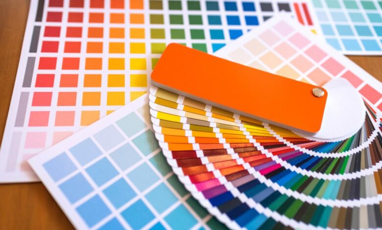
Color Theory and its Application
Understanding color theory is fundamental to effective design. It’s not just about picking pretty colors; it’s about creating visually appealing and emotionally resonant designs that communicate effectively. This section delves into the core principles of color harmony, explores different color models, and demonstrates how to practically apply this knowledge to build compelling color palettes.
Color Harmony Principles
Color harmony refers to the pleasing arrangement of colors in a design. Several principles guide the creation of harmonious palettes. Mastering these principles allows designers to create visual balance and impact.
- Complementary Colors: These are colors opposite each other on the color wheel (e.g., red and green, blue and orange). They create high contrast and visual excitement. Used effectively, they can create a vibrant and energetic feel. Overuse, however, can lead to visual fatigue.
- Analogous Colors: These are colors that sit next to each other on the color wheel (e.g., blue, blue-green, and green). They create a sense of calm and harmony, as they share similar hues. This scheme is often used to create a serene and sophisticated look.
- Triadic Colors: These are three colors evenly spaced on the color wheel (e.g., red, yellow, and blue). They offer a vibrant and balanced palette, providing a good mix of contrast and harmony. This is a versatile option, allowing for varied moods depending on the specific shades chosen.
- Tetradic Colors: These involve four colors forming a rectangle on the color wheel, typically consisting of two complementary pairs. This scheme can be complex but offers a wide range of possibilities for creative expression. Careful balance is needed to avoid visual chaos.
- Monochromatic Colors: This involves using different shades, tints, and tones of a single color. It creates a unified and sophisticated look, emphasizing subtle variations within a single hue. This scheme is often used for branding and to create a sense of elegance.
Examples of Effective Color Schemes
Many successful design projects leverage color theory masterfully. For example, consider the calming blues and greens often used in spa or nature-related websites, reflecting the tranquil atmosphere they aim to evoke. Conversely, a vibrant red and yellow scheme might be employed in a fast-food restaurant’s branding to stimulate appetite and energy. The color choices in Apple’s minimalist designs, often using variations of silver, grey, and white, communicate simplicity and elegance.
Color Models: RGB, CMYK, and HSV
Different color models represent colors in different ways, each suited to specific applications.
- RGB (Red, Green, Blue): This additive color model is used for screens (monitors, TVs, etc.). It combines red, green, and blue light to create a wide range of colors. Each color is represented by a value from 0 to 255, with (0,0,0) being black and (255,255,255) being white.
- CMYK (Cyan, Magenta, Yellow, Key/Black): This subtractive color model is used for printing. It works by subtracting colors from white light, using cyan, magenta, yellow, and black inks. Each color is typically represented as a percentage (0% to 100%).
- HSV (Hue, Saturation, Value): This model represents color in a more intuitive way. Hue refers to the pure color (e.g., red, green, blue), saturation refers to the color’s intensity, and value refers to its brightness or lightness.
Choosing the Right Color Model
RGB is the standard for digital design, while CMYK is essential for print projects. HSV can be useful for selecting and adjusting colors intuitively, often serving as a bridge between creative concept and technical implementation. Understanding the limitations and strengths of each model is key to achieving consistent color representation across different media.
Creating a Visually Appealing Color Palette Using Analogous Colors, Using colour in design
Let’s create a palette using the analogous color principle. We’ll start with a base color of teal (#008080). Moving around the color wheel, we can select analogous colors such as a slightly lighter teal (#40E0D0) and a deeper blue-green (#006464). Adding a muted grey (#A9A9A9) for neutrality creates balance and allows the teal shades to pop. This palette, using variations of cool tones, would be suitable for a calming and serene design, perhaps for a website promoting relaxation techniques or natural products.
The subtle variations ensure visual harmony without being monotonous.
Color Accessibility and Inclusivity
Designing with color is more than just aesthetics; it’s about ensuring everyone can access and understand your designs. Color accessibility is crucial for inclusivity, making your work usable and enjoyable for people with disabilities, particularly those with color vision deficiencies. Ignoring accessibility not only limits your audience but also risks conveying incorrect or confusing information.
WCAG Guidelines and Color Contrast
The Web Content Accessibility Guidelines (WCAG) provide internationally recognized standards for web accessibility. A key aspect is sufficient color contrast between text and background. WCAG recommends a minimum contrast ratio of 4.5:1 for normal text and 3:1 for large text (18pt or 14pt bold). This ensures readability for individuals with various visual impairments, including those with color blindness.
Failing to meet these guidelines can render your content inaccessible to a significant portion of your audience. Tools like WebAIM’s Contrast Checker can help you easily assess the contrast ratio of your color combinations.
Design Solutions for Color Blindness
Addressing color blindness requires moving beyond relying solely on color to convey information. Instead, incorporate multiple cues. For example, use different shapes or patterns in addition to color to differentiate elements. Consider using colorblind-friendly palettes, which utilize colors that are easily distinguishable even with common forms of color blindness (like protanopia and deuteranopia). Providing alternative text descriptions for images that rely heavily on color is also crucial.
Furthermore, offering users the ability to adjust color schemes or contrast levels can significantly enhance accessibility. Think of providing a “high contrast” mode, similar to what many operating systems offer.
Best Practices for Inclusive Color Palettes
Creating accessible color palettes involves careful planning and testing. Start by selecting a base palette with sufficient contrast. Then, expand this palette using a color contrast checker to ensure all combinations meet WCAG guidelines. Prioritize colors that are easily distinguishable even under different lighting conditions. Remember to test your designs with users who have various types of color vision deficiencies to gather real-world feedback.
Online tools and simulators can help, but nothing replaces real-world testing. Consider using a limited color palette to avoid overwhelming users and ensure consistent visual hierarchy.
Color Contrast Ratios and Accessibility
| Contrast Ratio | Accessibility Implications | WCAG Compliance | Example Use Cases |
|---|---|---|---|
| 1:1 | Inaccessible; virtually no contrast | Fails | Never acceptable for text |
| 3:1 | Acceptable for large text (18pt or 14pt bold) | Meets WCAG 2.4.4 (minimum for large text) | Large headings, captions |
| 4.5:1 | Acceptable for normal text | Meets WCAG 2.4.4 (minimum for normal text) | Body text, labels, buttons |
| 7:1 | Excellent contrast, recommended for most situations | Exceeds WCAG requirements; highly recommended | Critical information, warnings |
Icon Design for Color Vision Deficiency
Imagine a set of icons representing different actions: save, delete, edit, and share. Instead of relying solely on color, we can use distinct shapes and patterns. The “save” icon could be a solid square with a downward-pointing arrow, “delete” a solid circle with a cross through it, “edit” a pencil icon with clear lines, and “share” an upward-pointing arrow within a curved Artikel.
While color could still be used for added visual appeal, the core meaning remains clear even without color perception. This ensures the icons are accessible and understandable for everyone, regardless of their color vision. Using a color palette with high contrast between icon and background further enhances accessibility. For instance, using dark icons on a light background or vice versa would be beneficial.
Color in Different Design Disciplines

Source: slidesharecdn.com
Color is a powerful tool across various design disciplines, influencing perception, emotion, and ultimately, user experience. Its application, however, differs significantly depending on the medium and intended outcome. Understanding these nuances is crucial for effective design.
While the fundamental principles of color theory remain consistent, the practical application and challenges vary considerably between web design, graphic design, and interior design. Each discipline presents unique constraints and opportunities related to color selection, reproduction, and overall impact.
Color Selection in Web Design
Web design necessitates a keen awareness of digital color representation (RGB) and its limitations. Color accuracy can vary across devices and browsers, requiring careful calibration and testing. Furthermore, web designers must prioritize accessibility, ensuring sufficient contrast for users with visual impairments. Effective color palettes enhance UX by guiding user navigation, highlighting key information, and creating a cohesive brand identity.
For example, a travel website might use calming blues and greens to evoke a sense of tranquility and adventure, while a tech startup might opt for bold, vibrant colors to convey innovation and energy. Consider the use of color to draw attention to call-to-action buttons, making them easily distinguishable from the surrounding content.
Color Selection in Graphic Design
Graphic design encompasses a wider range of media, including print, packaging, and branding. Print design utilizes CMYK, a subtractive color model, resulting in different color representations compared to digital displays. Accurate color reproduction is paramount, requiring careful consideration of the printing process and paper stock. In graphic design, color choices significantly impact brand identity and visual communication.
A logo’s color palette, for instance, contributes significantly to its memorability and recognition. The use of color in brochures or posters needs to be strategically planned to attract attention, convey specific messages, and align with the overall brand aesthetic. Think of the vibrant, eye-catching colors used in advertising posters compared to the more subdued and sophisticated palette often employed in corporate branding materials.
Color Selection in Interior Design
Interior design focuses on the manipulation of color within physical spaces. Color impacts mood, perception of space, and overall ambiance. Considerations extend beyond aesthetics to include the psychological effects of color on occupants. Warm colors (reds, oranges, yellows) can create a feeling of intimacy and warmth, while cool colors (blues, greens, purples) can promote relaxation and calmness.
The challenge lies in balancing the desired aesthetic with the functional requirements of the space. For example, a restaurant might use warm, inviting colors to stimulate appetite, while a hospital might prioritize calming, neutral tones to promote healing and reduce stress. The impact of natural light on color perception also plays a significant role, requiring careful selection of color palettes that complement the available lighting conditions.
Examples of Effective Color Use
To illustrate the diverse applications of color across disciplines, let’s examine a few projects:
- Project 1 (Web Design): A minimalist e-commerce website for handcrafted jewelry. The color palette consists of muted pastels (soft pinks, light blues, creamy whites) and accents of rose gold, creating a sophisticated and elegant feel that aligns with the product aesthetic. The emphasis is on clean lines and subtle color contrasts to highlight the jewelry pieces.
- Project 2 (Graphic Design): A corporate brochure for a sustainable energy company. The palette incorporates earthy tones (greens, browns) with accents of bright blue, symbolizing environmental responsibility and technological innovation. The use of these colors aims to convey trust and credibility while highlighting the company’s commitment to sustainability.
- Project 3 (Interior Design): A modern apartment living room design. The space utilizes a neutral base of warm grays and whites, accented with pops of mustard yellow and deep teal. This combination creates a balance between calmness and vibrancy, resulting in a stylish and inviting atmosphere.
Color Trends and Forecasting
Source: lvfgcreative.com
Predicting color trends is a fascinating blend of art and science. Designers, trend forecasters, and even large paint companies meticulously analyze societal shifts, technological advancements, and global events to anticipate the hues that will resonate most strongly with consumers in the coming seasons. This involves a complex interplay of factors, resulting in palettes that reflect our collective mood and aspirations.
Current and Emerging Color Trends
Currently, we’re seeing a fascinating juxtaposition of bold statements and calming neutrals. Vibrant, saturated colors like deep blues, rich reds, and sunny yellows are making a comeback, often paired with earthy tones like terracotta, muted greens, and soft creams. This reflects a desire for both expressive individuality and a sense of grounding stability. Emerging trends hint at a move towards more nuanced, complex color combinations – think dusty roses blended with deep teals, or muted oranges paired with charcoal grays.
These more sophisticated palettes often incorporate subtle shifts in tone and saturation to create depth and visual interest.
Factors Influencing Color Trends
Several key factors contribute to the evolution of color trends. Cultural shifts, such as increased awareness of sustainability and social justice, often influence color choices. For example, the growing popularity of earthy tones reflects a connection to nature and a desire for authenticity. Technological advancements also play a significant role; the rise of digital design tools allows for more intricate color manipulations and the exploration of previously unattainable hues.
Furthermore, global events – from economic downturns to major social movements – can subtly (or dramatically) shift the overall aesthetic preferences. The increasing use of AI in design also plays a role, with algorithms assisting in the generation and analysis of color palettes, leading to unexpected and innovative combinations.
Examples of Color Trend Incorporation
Designers are creatively incorporating these trends in various ways. In fashion, we see rich jewel tones paired with neutral knits, reflecting both luxury and comfort. Interior design showcases the use of terracotta accents against creamy white walls, creating a warm and inviting atmosphere. Graphic design utilizes vibrant, saturated colors in bold typography and minimalist layouts, delivering a powerful visual punch.
Digital interfaces often employ muted greens and blues to create a calming and user-friendly experience, reflecting a focus on accessibility and wellbeing. Even product design incorporates these trends, with manufacturers opting for earth-toned packaging and incorporating subtle color gradients into their product lines.
Timeline of Color Trends (Past Decade)
The evolution of color trends over the past decade has been remarkably dynamic.
- 2014-2016: A resurgence of pastel shades, particularly in millennial pink and mint green, reflecting a sense of youthful optimism and playfulness. Muted jewel tones were also popular, adding a touch of sophistication.
- 2017-2019: Ultra Violet (Pantone’s Color of the Year 2018) symbolized innovation and originality, leading to the widespread use of purples and deep blues. Earthy tones, such as terracotta and mustard yellow, gained traction, reflecting a growing interest in natural materials.
- 2020-2022: The pandemic era saw a rise in calming neutrals, such as beige, cream, and gray, offering a sense of security and stability. However, splashes of bright color were also used to inject positivity and optimism into designs.
- 2023-Present: A blend of bold and calming hues is prevalent. Deep blues, rich reds, and sunny yellows are paired with muted greens, creams, and earthy tones, reflecting a desire for both expression and stability.
Predicted Future Color Palette
Based on current trends and emerging influences, a hypothetical future color palette (circa 2026-2028) might include:
- Deep Teal: A sophisticated and calming blue-green, reflecting a desire for tranquility and connection to nature.
- Dusty Rose: A muted pink, offering a touch of softness and warmth without being overly saccharine.
- Warm Gray: A versatile neutral, providing a balanced backdrop for bolder hues.
- Burnt Orange: A vibrant yet earthy shade, injecting energy and warmth into the palette.
- Olive Green: A muted green, representing sustainability and a connection to the natural world.
This palette combines the calming influence of muted tones with pops of vibrant color, reflecting a potential future where both serenity and self-expression are highly valued. The inclusion of earthy shades emphasizes a continued focus on sustainability and a deeper connection to the natural world.
Ending Remarks
Ultimately, mastering the art of using colour in design is a journey of continuous learning and experimentation. It’s about understanding the emotional impact of color, applying color theory effectively, and prioritizing accessibility for a diverse audience. By thoughtfully considering these aspects, you can create designs that are not only visually appealing but also impactful and inclusive. So go forth, experiment with palettes, and let your creativity shine through the vibrant world of color!
Frequently Asked Questions
What is the best way to choose a color palette for my website?
Start by defining your brand and target audience. Then, consider using tools like Adobe Color or Coolors to explore different palettes based on color theory principles. Test your chosen palette with real content to ensure readability and visual appeal.
How can I ensure my designs are accessible to people with color blindness?
Use sufficient color contrast (check WCAG guidelines), avoid relying solely on color to convey information, and test your designs using color blindness simulators.
What’s the difference between RGB and CMYK color models?
RGB (Red, Green, Blue) is used for digital displays, while CMYK (Cyan, Magenta, Yellow, Key/Black) is used for print. They use different color mixing methods.
How do I stay updated on current color trends?
Follow design blogs, publications, and social media accounts dedicated to design trends. Attend design conferences and workshops to learn from experts.