Best Modern Bold Fonts A Designers Guide
Best modern bold fonts aren’t just about making text bigger; they’re about making a statement. This post dives deep into the world of bold typography, exploring what makes a font truly “modern,” the various styles available, and how to use them effectively in your designs. We’ll look at the psychology behind bold choices, practical applications, and even peek into the future of bold font trends.
Get ready to level up your design game!
From understanding the nuances of x-height and stroke weight to mastering the art of pairing bold fonts with other typefaces, we’ll cover it all. We’ll explore different categories of modern bold fonts, providing examples and showcasing their versatility across various design projects. Think logos, website headers, posters – the possibilities are endless!
Defining “Modern Bold Fonts”: Best Modern Bold Fonts
Modern bold fonts represent a significant departure from their traditional counterparts, reflecting contemporary design sensibilities and technological advancements in typography. They retain the boldness associated with their predecessors but achieve it through different means, resulting in a distinct aesthetic. This evolution is driven by factors ranging from screen readability to the broader stylistic trends influencing graphic design.
Modern bold fonts are characterized by a unique interplay of several key elements. The x-height, the height of the lowercase ‘x’, often plays a crucial role. Modern designs frequently favor a higher x-height, contributing to improved legibility, particularly on screens. Stroke weight, the thickness of the font’s lines, is another defining factor. While boldness is inherent, modern bold fonts may employ varying stroke weights within a single letterform, creating a more dynamic and visually interesting appearance.
The presence or absence of serifs (small decorative flourishes at the ends of strokes) also significantly impacts the overall aesthetic. Sans-serif modern bold fonts are prevalent, offering a clean, minimalist look, while some modern designs incorporate subtly refined serifs, balancing boldness with elegance. The overall aesthetic leans towards a clean, geometric precision, often avoiding the ornate or overly decorative elements found in some traditional bold fonts.
Design Principles in Modern Bold Fonts
Several design principles underpin the creation of modern bold fonts. Geometric construction is often employed, resulting in fonts with precise, mathematically-defined letterforms. Optical adjustments, subtle modifications made to improve visual balance and perception, are also frequently used. These adjustments might involve slightly widening or narrowing specific parts of a letter to counteract optical illusions and ensure consistent visual weight across the alphabet.
Finding the best modern bold fonts can seriously elevate your YouTube channel’s branding. To really make your videos pop, though, you need killer visuals, and that’s where learning about video editing comes in – check out this great resource on getting it on with YouTube to level up your game. Then, pair those awesome visuals with strong, bold fonts for titles and graphics, and you’ll have a truly professional-looking channel.
Contrast, the difference in weight between thick and thin strokes (even within a bold font), can be carefully controlled to enhance readability and visual interest. Finally, a focus on clarity and legibility is paramount, ensuring the font remains easily readable even at smaller sizes or in various contexts.
Differences Between Modern and Traditional Bold Fonts
The distinction between modern and traditional bold fonts lies primarily in their approach to achieving boldness and their overall aesthetic. Traditional bold fonts often achieved boldness through a simple increase in stroke weight across the entire letterform, sometimes resulting in a heavy, somewhat clunky appearance, especially at smaller sizes. Modern bold fonts, on the other hand, often utilize more nuanced techniques.
They may incorporate variations in stroke weight within a single letter, use optical adjustments for improved legibility, and emphasize geometric precision in their letterforms. This leads to a bolder font that is also more refined and visually sophisticated. The overall aesthetic shifts from a potentially heavy and less refined look to a cleaner, more contemporary feel. The x-height is typically higher in modern bold fonts, further enhancing readability.
Comparative Table: Modern vs. Traditional Bold Fonts
The following table illustrates the key differences between a representative modern bold font and a traditional bold font. Note that these are examples, and variations exist within each category.
| Font Name | X-Height | Stroke Weight | Serif/Sans-serif |
|---|---|---|---|
| Roboto Bold (Modern) | Relatively High | Varied, with optical adjustments | Sans-serif |
| Times New Roman Bold (Traditional) | Relatively Low | Uniformly thick | Serif |
Popular Categories of Modern Bold Fonts
So, we’ve established what makes a modern bold font, but the world of typography is vast! Let’s dive into some of the most popular categories, exploring their unique characteristics and showcasing examples of their widespread use. Understanding these categories helps you choose the perfect font for your next project, whether it’s a logo, website, or print advertisement.
Geometric Sans-Serif Fonts
Geometric sans-serif fonts are characterized by their clean lines, precise curves, and mathematically constructed forms. They often feel very modern, minimalist, and even futuristic. This precision makes them highly legible and versatile, perfect for situations where clarity is key.
- Futura: A classic example, Futura’s perfectly formed circles and geometric shapes create a timeless, elegant feel. It’s often used in corporate branding, technology, and automotive industries for its sleek and sophisticated appearance.
- Gill Sans: While not as strictly geometric as Futura, Gill Sans displays a strong geometric influence, balancing precision with a touch of warmth. It’s a highly versatile font used in various contexts, from signage to book design.
- Helvetica: Arguably the most famous sans-serif font, Helvetica is known for its neutrality and readability. Its clean, geometric forms make it a go-to choice for corporate branding, wayfinding, and user interfaces.
- Avenir: Avenir offers a slightly more contemporary take on the geometric sans-serif, with subtle variations in stroke weight that add a touch of personality. It’s frequently used in technology, branding, and editorial design.
Geometric sans-serif fonts are exceptionally versatile:
- Branding: Logos, corporate identities, product packaging.
- Website Design: Headings, body text (in appropriate sizes), user interfaces.
- Print Media: Brochures, reports, signage, posters.
Humanist Sans-Serif Fonts
Humanist sans-serif fonts bridge the gap between the geometric precision of their counterparts and the more organic forms of traditional serif fonts. They maintain readability while possessing a warmer, more approachable feel. Their slightly less rigid forms offer a softer, more inviting aesthetic.
- Gill Sans (again!): Its versatility extends to this category too, showcasing its blend of geometric and humanist qualities.
- Optima: Inspired by Roman inscriptions, Optima features subtle curves and variations in stroke weight, giving it a refined, elegant appearance. It is frequently used in high-end branding and luxury goods.
- Sabon: While technically a transitional serif font, Sabon’s modern interpretation and clean lines often place it in discussions about humanist sans-serif influences.
Humanist sans-serif fonts are suited to applications requiring a balance of modernity and approachability:
- Branding: Logos for businesses aiming for a friendly and sophisticated image.
- Website Design: Body text, editorial content, websites requiring a warmer feel.
- Print Media: Books, magazines, brochures emphasizing readability and elegance.
Grotesque Sans-Serif Fonts
Grotesque sans-serif fonts, often considered the precursors to modern sans-serif designs, possess a distinct character marked by their strong, consistent stroke weights and sometimes slightly uneven letterforms. They can appear both bold and unexpectedly versatile.
- Franklin Gothic: A classic grotesque font, Franklin Gothic is known for its bold, sturdy appearance. It is often used in headlines, posters, and signage where a strong visual impact is desired.
- News Gothic: With a slightly more refined appearance than Franklin Gothic, News Gothic is frequently used in newspapers and magazines for its high readability even at smaller sizes.
- Akzidenz-Grotesk: A highly influential font that laid the groundwork for many modern sans-serif designs, Akzidenz-Grotesk exhibits a balance of strength and neutrality.
Grotesque sans-serif fonts are ideal for applications demanding impact and readability:
- Branding: Logos requiring a bold, assertive presence.
- Website Design: Headlines, call-to-action buttons, emphasizing key information.
- Print Media: Posters, flyers, advertisements demanding attention.
Impact of Modern Bold Fonts on Design
Modern bold fonts wield significant power in design, influencing not only the aesthetic appeal but also the psychological response of the viewer. Their strategic use can dramatically alter how a message is perceived, impacting readability, brand identity, and the overall emotional impact of a design. Understanding this impact is crucial for designers aiming to create effective and engaging visuals.
The weight and boldness of a font directly affect readability and the communication of specific moods. Heavily bolded text commands attention, immediately drawing the eye. This is particularly useful for headlines, calls to action, or emphasizing key information within a larger body of text. However, overuse can lead to a cluttered, overwhelming effect, hindering readability and even causing eye strain.
The psychological impact can range from assertive and confident (with a strong, geometric sans-serif bold font) to playful and energetic (with a rounded, more informal bold font). The specific choice directly contributes to the overall tone and feeling of the design.
Bold Fonts in Different Design Contexts
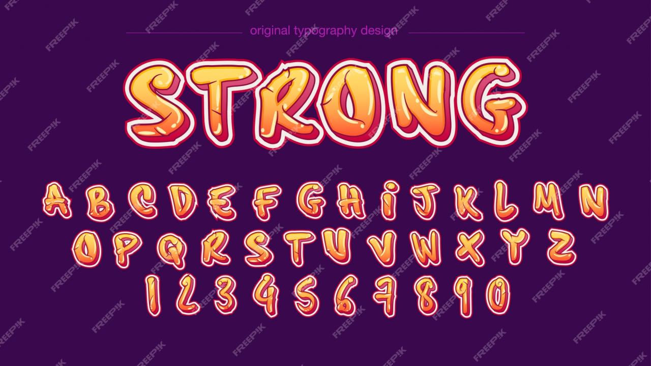
The application of modern bold fonts varies significantly depending on the design context. In headlines, bold fonts are frequently employed to create visual hierarchy and grab attention. A strong, condensed sans-serif typeface, for instance, might be ideal for a corporate website headline, conveying professionalism and authority. In contrast, a more playful, rounded bold font could be perfect for a children’s book cover, adding a sense of fun and energy.
Using the same bold font for body text, however, would likely be detrimental to readability. For body text, a lighter weight or a different font altogether is generally preferred to ensure ease of reading and avoid visual fatigue. The contrast between headline and body text fonts, using bold for headlines and a lighter weight for the body, creates visual clarity and enhances the overall user experience.
Brand Perception and Modern Bold Fonts
The choice of a modern bold font significantly influences the overall perception of a brand or message. Consider a technology company launching a new product. Using a sharp, geometric sans-serif bold font in their marketing materials would likely project an image of innovation, precision, and technological advancement. This choice aligns with the brand’s identity and communicates its core values effectively.
Conversely, a handmade artisan soap company might opt for a more rounded, slightly less severe bold font, conveying a sense of craftsmanship, warmth, and natural appeal. The font becomes a visual representation of the brand’s personality and target audience. A poorly chosen font, on the other hand, can misrepresent the brand and dilute its message, potentially alienating potential customers.
The font choice, therefore, is not just an aesthetic decision but a strategic one, reflecting the brand’s values and aspirations.
Practical Applications and Examples
Source: freepik.com
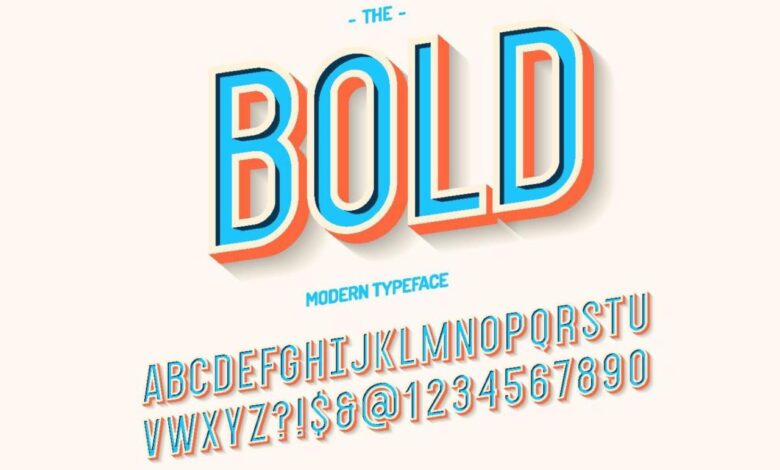
Modern bold fonts, with their striking presence and inherent readability, find diverse applications across various design disciplines. Their versatility allows them to convey a range of emotions and brand personalities, from powerful and authoritative to playful and modern. Let’s explore some practical examples.
Logo Design
Modern bold fonts are frequently chosen for logo design due to their ability to create a memorable and impactful visual identity. A strong, well-chosen typeface can instantly communicate a brand’s core values and aesthetic.
For example, imagine a logo for a new tech startup. A geometric sans-serif font like Montserrat Bold, with its clean lines and confident stance, would project innovation and reliability. The slightly rounded terminals soften the otherwise severe geometry, adding a touch of approachability. Alternatively, a logo for a luxury brand might utilize a bolder, more condensed typeface like Bebas Neue, emphasizing elegance and exclusivity. The extreme weight and condensed nature command attention and exude a sense of high-end quality.
Another example could be a fitness brand using a font like Impact. Its aggressive boldness and strong verticality immediately conveys energy and strength. The simplicity of the font also allows for the integration of other design elements, such as a stylized icon, without overwhelming the overall composition.
Poster Design
The impact of modern bold fonts is amplified in poster design. Their ability to capture attention from a distance makes them ideal for conveying messages quickly and effectively.
Consider a poster for a music festival. A font like Anton, with its chunky, almost hand-drawn aesthetic, could create a playful and energetic feel, complementing the vibrant imagery of the event. The highly contrasting weight of the typeface ensures maximum readability, even from afar. Conversely, a more refined poster for a theatrical production might utilize a bolder version of a classic serif typeface, like Playfair Display Black, to convey a sense of sophistication and drama. The weight and the classic style create an elegant contrast against the poster’s visual elements.
Website Headers
Modern bold fonts are often employed in website headers to create a strong visual hierarchy and establish a clear brand identity. They help draw the user’s eye to the most important information on the page.
A website for a photography studio could effectively use a font like Raleway Bold for its header. Raleway’s geometric shapes and clean lines provide a modern and professional look, perfectly complementing high-quality images. The bold weight ensures that the site’s title is instantly noticeable and establishes a strong first impression. A bold, condensed font like Poppins would also suit a technology company’s website header, reflecting the company’s cutting-edge approach. The condensed nature maximizes space efficiency while maintaining a strong presence.
Websites Showcasing Modern Bold Fonts, Best modern bold fonts
Finding examples of effective use is easy. Many design portfolios and websites showcase the versatility of modern bold fonts. A quick search on sites like Behance, Dribbble, and Awwwards will reveal countless examples across diverse projects. These platforms provide a wealth of inspiration and demonstrate the successful integration of these fonts in real-world applications.
Hypothetical Design Brief: A New Coffee Shop
Let’s say the brief is for a new coffee shop targeting a young, urban demographic. The shop emphasizes ethically sourced coffee and a relaxed, modern atmosphere.The chosen font needs to reflect both sophistication and approachability. A font like Lato Bold would be a strong contender. Its clean lines and friendly curves balance a modern aesthetic with a welcoming feel.
The boldness ensures readability and provides a visually striking header for the shop’s website and menu. The weight and style can also be adjusted for different applications, like a slightly lighter weight for body text to avoid overwhelming the customer. This font choice reflects the shop’s brand personality—modern, sophisticated, yet approachable and inviting.
Future Trends in Modern Bold Fonts
Source: hipsthetic.com
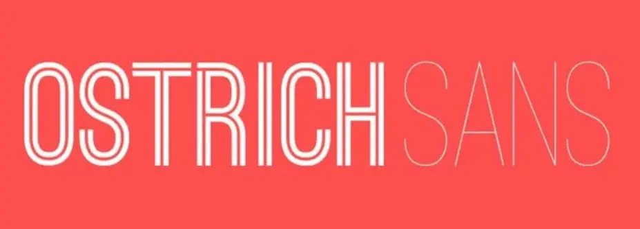
The world of typography is constantly evolving, and modern bold fonts are no exception. Technological advancements, shifting design aesthetics, and the ever-growing demands of digital media are all shaping the future of how we create and use these powerful visual elements. We can expect to see bolder experimentation, more nuanced applications, and a deeper integration of bold fonts within broader design trends.
The coming years will likely witness a fascinating interplay between technological innovation and creative expression in the realm of bold fonts. AI-powered font generation tools are already emerging, promising to automate certain aspects of font design, allowing designers to explore a wider range of stylistic possibilities with greater efficiency. Simultaneously, a renewed focus on accessibility and inclusivity will drive the creation of bolder fonts that are optimized for readability across various platforms and for diverse audiences.
Variable Font Technology and its Impact
Variable fonts offer a significant advancement, allowing for seamless adjustments to weight, width, and other characteristics within a single font file. This means designers can achieve a level of customization previously unimaginable, creating subtle gradations of boldness that precisely match the specific needs of a project. Imagine, for instance, a website header that dynamically adjusts its boldness based on the screen size, ensuring optimal readability on both desktops and mobile devices.
This kind of sophisticated control, enabled by variable fonts, will redefine how we think about and implement bold typography.
AI-Driven Font Design and Personalization
Artificial intelligence is poised to revolutionize font design. AI algorithms can analyze vast datasets of existing fonts, identifying patterns and trends to generate entirely new font styles. While human designers will remain crucial for creative direction and refinement, AI can accelerate the process of exploration and experimentation, leading to the discovery of novel and unexpected bold font designs.
This could lead to the creation of highly personalized fonts, tailored to individual preferences or brand identities, taking customization to a whole new level. For example, an AI could analyze a brand’s existing visual assets and generate a custom bold font that perfectly complements their style guide.
The Rise of Bold Fonts in Motion Graphics and Animation
The increasing popularity of motion graphics and animation is driving demand for bold fonts that can be effectively used in dynamic contexts. We are already seeing a trend towards bolder, more expressive fonts in video titles, animated logos, and other visual media. This trend is likely to continue as designers find new and innovative ways to integrate bold typography into moving images.
For example, imagine a bold font whose weight dynamically changes in sync with the rhythm of music in a video, enhancing the overall emotional impact.
Closure
Source: vecteezy.com
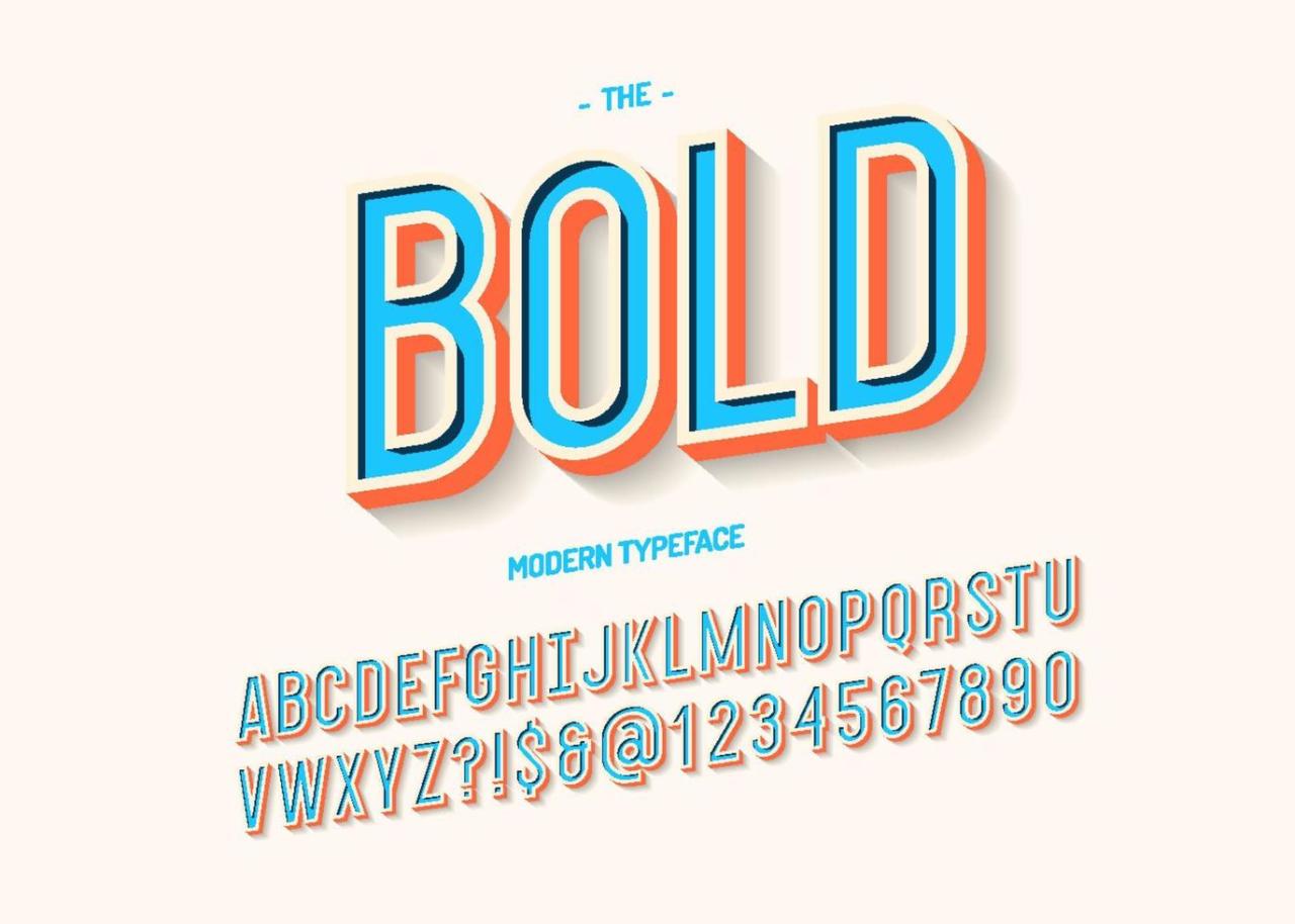
Ultimately, the best modern bold font for your project depends entirely on your specific needs and goals. By understanding the characteristics of different font styles and their psychological impact, you can make informed choices that elevate your designs. Remember, boldness isn’t just about size; it’s about making a memorable impression. So go forth and experiment – the world of modern bold fonts awaits!
Frequently Asked Questions
What’s the difference between a modern and traditional bold font?
Modern bold fonts often prioritize cleaner lines, a more consistent stroke weight, and a contemporary aesthetic. Traditional bold fonts can appear heavier and more condensed, sometimes with a more ornate feel.
How do I choose the right weight for my bold font?
Consider the context. A very heavy bold might overwhelm body text, but it could be perfect for a headline. Experiment with different weights to find the optimal balance for readability and impact.
Where can I find high-quality modern bold fonts?
Many excellent font foundries offer a wide selection of modern bold fonts, both free and commercial. Sites like Google Fonts, Adobe Fonts, and Creative Market are great places to start.
