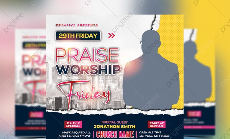
Best Church Flyers Backgrounds Design Inspiration
Best church flyers backgrounds are more than just pretty pictures; they’re the silent storytellers of your message. The right background can instantly communicate the tone and feeling of your event, attracting attention and leaving a lasting impression. From serene watercolor washes to the bold simplicity of a modern minimalist design, the choices are vast and impactful. Choosing wisely can transform a simple announcement into a powerful invitation.
This post dives deep into the world of church flyer design, exploring various background styles, illustrative elements, typography choices, and the psychology of color. We’ll uncover the secrets to creating flyers that resonate with your congregation, whether you’re announcing a youth group event, a special service, or a community outreach program. Get ready to elevate your church’s visual communication!
Popular Background Styles for Church Flyers
Choosing the right background for your church flyer is crucial for attracting attention and conveying the right message. The visual impact of your flyer’s background significantly influences how people perceive your event or announcement. A well-chosen background can enhance readability, evoke the desired emotions, and ultimately, encourage attendance.
Color Palettes for Church Flyers
The color palette you select plays a vital role in setting the tone and mood of your flyer. Different colors evoke different emotions, and choosing wisely can help connect with your target audience on an emotional level. Here are five distinct color palettes, focusing on variations of blue, green, and purple, and their associated emotional impacts:
- Serene Blue: A light, airy blue (#B2EBF2) paired with a soft white (#F8F8FF) creates a feeling of peace, tranquility, and spiritual calm. This palette is ideal for events focused on reflection and prayer.
- Vibrant Teal: A deeper teal (#008080) combined with a warm beige (#F5F5DC) offers a sense of vibrancy, growth, and renewal. This is suitable for events celebrating new beginnings or community growth.
- Tranquil Lavender: A soft lavender (#E6E6FA) coupled with a gentle grey (#D3D3D3) evokes feelings of serenity, spirituality, and wisdom. This palette works well for events emphasizing introspection and spiritual guidance.
- Forest Green: A rich, deep green (#228B22) accented with a creamy white (#FFFFE0) creates a sense of nature, life, and abundance. This is perfect for events connected with nature, environmental themes, or outdoor activities.
- Royal Purple: A regal purple (#800080) paired with a sophisticated gold (#FFD700) conveys a sense of majesty, authority, and tradition. This palette is suitable for formal events, anniversaries, or significant celebrations.
Texture Styles for Church Flyer Backgrounds
Texture adds depth and visual interest to your flyer, making it more engaging and memorable. The texture you choose should complement the overall style and message of your event.
- Watercolor: A watercolor background (imagine soft, blended washes of color) lends a delicate, artistic feel, ideal for events focused on creativity, community art projects, or artistic worship experiences.
- Wood Grain: A wood grain texture (picture the warm tones and natural patterns of wood) provides a rustic, traditional feel, suitable for events celebrating heritage, community gatherings, or events with a traditional church setting.
- Linen: A linen texture (imagine the subtle weave and slightly textured appearance of linen fabric) offers a sophisticated, elegant feel, appropriate for formal events, weddings, or special celebrations.
- Stone: A stone texture (picture the rough, natural look of stone, possibly with subtle color variations) conveys a sense of strength, permanence, and stability, making it ideal for events emphasizing foundations, building faith, or long-term commitment.
- Paper: A slightly textured paper background (imagine the subtle grain of high-quality paper) offers a clean, classic feel, suitable for a wide range of events and generally provides a good neutral base.
Comparison of Background Styles for Different Age Demographics
The suitability of a background style varies depending on the age group you are trying to reach.
| Background Style | Young Adults (18-35) | Adults (36-55) | Seniors (55+) |
|---|---|---|---|
| Modern Minimalist (clean lines, simple color palettes) | Highly Suitable | Moderately Suitable | Less Suitable |
| Classic Traditional (elegant fonts, ornate details) | Moderately Suitable | Highly Suitable | Highly Suitable |
| Rustic (wood grain, natural textures) | Moderately Suitable | Moderately Suitable | Moderately Suitable |
Illustrative Elements and Their Effect
Choosing the right illustrative elements is crucial for creating a church flyer that resonates with your target audience. The visuals you select will significantly impact the overall mood, message, and memorability of your design. A well-chosen image can instantly communicate the spirit and values of your church community.The impact of illustrative elements goes beyond simple aesthetics; they directly influence how people perceive and respond to your message.
A poorly chosen image can detract from the overall effectiveness of the flyer, while a carefully selected image can enhance its impact and make it more memorable. The style of illustration, the symbolic imagery employed, and the way these elements are integrated into the background all play a critical role.
Illustrative Styles and Their Impact
Three distinct illustrative styles—photography, hand-drawn illustrations, and vector graphics—each offer a unique aesthetic and emotional impact. Photography provides a sense of realism and immediacy. Hand-drawn illustrations offer a more personal and artistic touch, while vector graphics provide clean lines and scalability. The choice of style should align with the overall tone and message of your flyer.
- Photography: High-quality photographs of people genuinely engaging in church activities—prayer, fellowship, community outreach—can create a powerful connection with potential attendees. A photo of a smiling congregation singing hymns evokes feelings of warmth and belonging, while a picture of volunteers serving the community conveys a message of compassion and service. The realism of photography lends credibility and makes the message feel relatable.
- Hand-drawn Illustrations: A hand-drawn style, perhaps with watercolor or ink, can convey a sense of warmth, artistry, and personal touch. This style works well for flyers promoting events with a more intimate or artistic focus, like a concert or a small group meeting. The less formal feel can make the flyer feel more approachable and less institutional.
- Vector Graphics: Clean, crisp vector graphics offer a modern and sophisticated aesthetic. They are easily scalable without losing quality, making them ideal for both print and digital formats. Vector graphics can be used to create bold, symbolic imagery or to incorporate intricate designs that would be difficult to achieve with other styles. They lend a sense of professionalism and attention to detail.
Symbolic Imagery and its Interpretation, Best church flyers backgrounds
Symbolic imagery is a powerful tool for enhancing the message and visual appeal of church flyers. Carefully chosen symbols can instantly communicate complex ideas and evoke strong emotions. Using symbols that resonate with your target audience is key to creating a flyer that is both visually appealing and theologically meaningful.
- The Cross: The cross is the most recognizable symbol of Christianity, representing sacrifice, redemption, and faith. A subtly incorporated cross, perhaps integrated into the background design or subtly woven into a pattern, can be a powerful reminder of the church’s central message without being overly overt.
- The Dove: The dove is a classic symbol of the Holy Spirit, representing peace, purity, and the presence of God. A stylized dove image can create a feeling of serenity and spiritual peace. It can be used effectively in flyers promoting events focused on spiritual growth or peacemaking.
- Open Hands: Open hands symbolize welcome, acceptance, and generosity. They represent the church’s embrace of its community and its willingness to serve others. This symbol is particularly effective in flyers promoting outreach programs or community events.
Integrating Illustrative Elements Effectively
The successful integration of illustrative elements depends on maintaining a balance between the image and the background. The goal is to create a visually appealing design that is not cluttered or overwhelming.
Effective integration requires careful consideration of color palettes, font choices, and the overall layout. The illustrative elements should complement the background, not compete with it. A busy background might require simpler illustrations, while a minimalist background might allow for more complex imagery.
Typography and Text Placement on Church Flyer Backgrounds
Choosing the right typography and text placement is crucial for creating a church flyer that’s both visually appealing and easily readable. The goal is to ensure your message is clear, inviting, and reflects the spirit of your church. A well-designed flyer will effectively communicate the event details and create a positive first impression.
The interplay between typography, text placement, and background significantly impacts the flyer’s overall effectiveness. A poorly chosen font or cluttered layout can overshadow your message, while a well-executed design can enhance its impact and leave a lasting impression. This section will explore effective strategies for achieving this balance.
Three Text Placement Layouts
Effective text placement depends heavily on the background image or design. Here are three layout examples, each suited to different background styles:
- Layout 1: Clean & Modern. Imagine a minimalist background featuring a subtle watercolor wash in muted blues and greens. For this, a centered, vertically stacked layout works best. The church name sits at the top in a larger, bold font. Below, the event details (date, time, location) are neatly arranged in a smaller, easily readable font. A call to action (e.g., “Join Us!”) is placed at the bottom, perhaps in a slightly bolder font to draw attention.
- Layout 2: Image-centric. Consider a background image of a diverse group of people joyfully worshipping. Here, the text should complement the image, not compete with it. Use a semi-transparent box or shape to overlay a portion of the image, placing the key information (event name, date, and time) within this box. Keep the font clean and legible, choosing a color that contrasts sharply with the background image to ensure readability.
- Layout 3: Traditional & Elegant. Suppose the background features a classic, ornate design. A more traditional layout would suit this. Use a slightly more formal serif font. Place the church name at the top, possibly in a decorative font, and arrange the event details in columns or sections for a structured look. Maintain ample white space to prevent the design from feeling cluttered.
Font Style Comparison
The choice of font significantly impacts readability and the overall aesthetic. Three common font styles and their suitability for church flyers are:
- Serif Fonts (e.g., Times New Roman, Garamond): These fonts have small decorative strokes at the ends of letters, lending a classic and traditional feel. They are generally highly readable in print but can appear dense on some backgrounds, particularly those with intricate patterns.
- Sans-serif Fonts (e.g., Arial, Helvetica, Open Sans): These fonts lack the decorative strokes, creating a clean and modern look. They are highly versatile and generally offer excellent readability across various backgrounds. They are often preferred for digital displays and contemporary designs.
- Script Fonts (e.g., Edwardian Script ITC, Pacifico): These fonts mimic handwriting, offering a more personal and elegant feel. However, they are generally less readable, especially in smaller sizes or complex backgrounds. Use sparingly, perhaps for the church name or a short tagline, and ensure sufficient contrast.
Best Practices for Text Legibility and Contrast
Ensuring text is easily readable is paramount. These best practices will help:
- Sufficient Contrast: Use a color combination that provides a significant contrast between the text and the background. Tools like a color contrast checker can help determine if the contrast is sufficient for accessibility.
- Appropriate Font Size: Choose a font size large enough to be easily read from a distance. Avoid using fonts that are too small, especially for important information like dates and times.
- Font Weight and Style: Use bold fonts for headings and important information to draw attention and improve readability. Avoid using too many different font styles within a single flyer.
- White Space: Leave sufficient white space around the text to prevent it from feeling cramped or cluttered. White space improves readability and makes the flyer look more professional.
- Keep it Simple: Avoid using too many different fonts, colors, or styles. A simple and clean design is always more effective than a cluttered one.
- Proofread Carefully: Before printing, carefully proofread all text for errors in spelling and grammar. Typos can undermine the credibility of your church.
Color Psychology and its Influence on Design

Source: vecteezy.com
Color is more than just a visual element in church flyer design; it’s a powerful tool that evokes emotions and subtly influences how people perceive your message. Understanding color psychology is crucial for creating flyers that resonate with your target audience and effectively communicate the church’s brand identity. The strategic use of color can enhance the overall impact, making your flyer memorable and engaging.
Warm colors like reds, oranges, and yellows generally stimulate excitement, energy, and enthusiasm. They can be highly effective in conveying a sense of warmth, community, and spiritual passion. However, overuse can lead to feelings of overwhelming or even aggression. Cool colors such as blues, greens, and purples, on the other hand, tend to project calmness, serenity, and trustworthiness. They create a sense of peace and contemplation, ideal for conveying messages of hope, solace, and spiritual reflection.
The key is finding the right balance and understanding how different colors interact to achieve the desired effect.
Examples of Effective Color Use in Church Flyer Design
The successful application of color psychology requires careful consideration of the overall message and the intended emotional response. Here are three hypothetical examples showcasing different approaches:
Example 1: A Youth Group Event Flyer. Imagine a flyer promoting a youth group event. The background uses a vibrant orange gradient, fading into a sunny yellow at the bottom. This warm color palette immediately communicates energy, excitement, and fun, appealing to the target audience of young people. The text, in a crisp white font, stands out clearly against the bold background.
The overall effect is energetic and inviting, encouraging participation.
Example 2: A Service Announcing Peace and Tranquility. For a service focused on peace and reflection, a flyer might employ a calming blue gradient as its background. Subtle shades of teal or light purple could be incorporated to add depth and visual interest. The font would be a serene serif typeface in a soft grey or white. This cool color palette creates a sense of calm and serenity, aligning perfectly with the service’s theme.
The overall mood is peaceful and contemplative, inviting those seeking solace and spiritual rejuvenation.
Example 3: A Community Outreach Event Flyer. A flyer advertising a community outreach program could use a blend of greens and yellows. The green represents growth, stability, and harmony, reflecting the community aspect. Yellow accents add a touch of optimism and warmth, symbolizing hope and support. The text could be in a friendly, approachable sans-serif font.
This palette communicates a message of inclusivity and positive community engagement.
Creating a Color Palette that Reflects Brand Identity and Target Audience
Developing a color palette involves understanding your church’s brand and its target audience. Consider these steps:
First, define your church’s brand personality. Is it modern and contemporary? Traditional and classic? Youthful and energetic? This will guide your color choices.
Next, analyze your target audience. Are you primarily targeting young families? Older adults? A diverse community? Different age groups and demographics respond to colors differently.
Finally, research color associations. What emotions and messages do different colors convey? Combine your brand personality analysis and target audience research with your understanding of color psychology to create a harmonious and effective color palette for your church flyer.
For example, a modern church with a young adult congregation might use a vibrant palette of blues and greens, while a traditional church might opt for more muted tones of browns, golds, and deep blues. Remember that consistency is key; using the same color palette across all your church materials will reinforce brand recognition and create a cohesive visual identity.
Software and Tools for Creating Church Flyer Backgrounds: Best Church Flyers Backgrounds
Choosing the right software is crucial for creating visually appealing and effective church flyers. The software you select will depend on your budget, design skills, and the complexity of the design you envision. Several excellent options cater to different needs and skill levels.
The following section explores five popular software programs and online tools, highlighting their strengths and weaknesses to aid in your selection process.
Finding the best church flyers backgrounds can be tricky! You want something visually appealing to draw people in, and that means understanding how to market your church effectively. To really boost your reach, check out this great guide on getting it on with youtube – it’s all about maximizing your online presence. Once you’ve mastered that, designing stunning church flyers with the perfect backgrounds will be a breeze!
Software and Online Tools for Church Flyer Design
Several software options exist for designing eye-catching church flyers. Each offers a unique set of features and caters to different skill levels and budgets.
- Canva: A user-friendly online design tool with a drag-and-drop interface. Strengths include its intuitive nature, vast library of templates and elements, and affordability. Weaknesses include limited advanced editing capabilities compared to professional software.
- Adobe Photoshop: A powerful industry-standard raster graphics editor. Strengths include unparalleled control over image manipulation and design elements, offering high-quality results. Weaknesses include a steep learning curve and a higher price point.
- GIMP (GNU Image Manipulation Program): A free and open-source alternative to Photoshop. Strengths include its powerful features and affordability. Weaknesses include a less intuitive interface than Canva and a steeper learning curve than Canva, though less so than Photoshop.
- Adobe Illustrator: A vector-based graphics editor ideal for creating scalable designs. Strengths include crisp lines and the ability to resize designs without losing quality. Weaknesses include a steeper learning curve than raster-based programs and a higher price point.
- Microsoft Publisher: A user-friendly program included with some Microsoft Office suites. Strengths include ease of use and integration with other Microsoft products. Weaknesses include limited design capabilities compared to dedicated design software.
Creating a Church Flyer Background in Canva
Canva’s intuitive interface makes it an excellent choice for beginners. The following steps Artikel the process of creating a church flyer background using Canva.
- Choose a Template or Start from Scratch: Canva offers numerous pre-designed templates. Select one that aligns with your church’s style or opt to create a design from scratch using a blank canvas.
- Select a Background: Choose a background color, image, or pattern from Canva’s extensive library or upload your own. Consider using colors and imagery that evoke feelings of peace, serenity, or community.
- Add Design Elements: Incorporate relevant elements such as crosses, religious symbols, or nature-inspired imagery to enhance the background’s visual appeal. Canva offers a vast selection of free and paid elements.
- Adjust Colors and Brightness: Fine-tune the background’s colors and brightness to achieve the desired mood and aesthetic. Canva’s editing tools make this process straightforward.
- Add Text and Images: Once the background is complete, add text and other images to convey the event details. Ensure that the text is legible and visually appealing against the chosen background.
- Download and Share: Once the design is finalized, download the flyer in the desired format (e.g., JPG, PNG, PDF) and share it digitally or print it for distribution.
Comparison of Design Software
The following table compares Canva, Adobe Photoshop, and GIMP based on features relevant to flyer design and pricing.
| Feature | Canva | Adobe Photoshop | GIMP |
|---|---|---|---|
| Ease of Use | Excellent | Moderate | Moderate |
| Template Library | Extensive | Limited | Limited |
| Image Editing Capabilities | Good | Excellent | Excellent |
| Vector Graphics Support | Limited | Excellent | Good |
| Pricing | Free (with paid options) | Subscription-based | Free |
Last Recap
Source: pngtree.com
Creating stunning church flyers is all about thoughtful design choices that reflect your church’s identity and connect with your audience. By carefully considering background styles, illustrative elements, typography, and color psychology, you can craft compelling visuals that effectively communicate your message and inspire action. Remember, your flyer is often the first impression—make it count! So go forth and design flyers that are as inspiring as your community.
Question Bank
What’s the best resolution for a church flyer?
Aim for at least 300 DPI (dots per inch) for high-quality printing. Digital distribution might allow for slightly lower resolution, but always prioritize clarity.
How can I make sure my text is easily readable on a busy background?
Use sufficient contrast between text and background color. Choose fonts that are easy to read, and consider using a drop shadow or Artikel to further enhance readability.
Where can I find free stock photos for church flyer backgrounds?
Websites like Unsplash and Pexels offer many free, high-quality images suitable for various church-related themes. Always check the license to ensure you can use them freely.
What if my church has a specific brand color palette?
Incorporate your church’s brand colors into your flyer design. This helps maintain visual consistency and strengthens brand recognition.