Five Deadly Sins of Logo Design
Five Deadly Sins of Logo Design: Ever wondered why some logos are instantly iconic, while others… well, just aren’t? It’s more than just a pretty picture; a logo is the visual heartbeat of a brand. Get it wrong, and you risk alienating your audience before you even begin. This post dives into the five most common design pitfalls, showing you how to avoid them and create a logo that truly resonates.
We’ll explore everything from originality and typography to scalability and brand identity. We’ll examine real-world examples of both successful and disastrous logo design choices, offering practical advice and actionable tips to help you craft a logo that not only looks great but also effectively communicates your brand’s message and values. Prepare to elevate your logo game!
Poor Originality and Lack of Uniqueness
A truly memorable logo transcends mere aesthetics; it communicates a brand’s identity in a way that’s both instantly recognizable and uniquely its own. Sadly, many logos fall short, succumbing to a lack of originality and becoming indistinguishable from existing brands. This not only dilutes the brand’s message but also undermines its potential for market success. A generic logo fails to leave a lasting impression, hindering brand recall and ultimately impacting its ability to stand out in a crowded marketplace.
The quest for a unique logo often begins with a strong concept, but many designers, either through time constraints or a lack of thorough research, end up creating designs that inadvertently mirror existing brands. This can lead to legal issues, brand confusion, and a general lack of impact. Let’s explore some examples of logos lacking originality.
Examples of Unoriginal Logos
Below are three fictional logo examples demonstrating a lack of originality. Note that these are hypothetical and not intended to represent any real brands. The design choices deliberately echo established brands to highlight the problem of unoriginality.
| Logo | Description | Similar Brand | Explanation of Similarity |
|---|---|---|---|
| Imagine a stylized, slightly tilted apple with a bite taken out, but the apple is green instead of red. The leaf is also slightly different in shape. | A green apple with a bite taken out, featuring a subtly altered leaf design. | Apple | The overall shape and concept directly mimic the Apple logo, relying on the easily recognizable “bite” motif. The color change and minor leaf alteration are insufficient to create a distinct identity. |
| A logo featuring a stylized bird in flight, similar to a well-known social media platform’s bird logo, but with slightly different wing shapes and a more rounded body. The color palette is also different, opting for a teal and purple gradient instead of the original blue. | A bird in flight, using a similar posture and style to a famous social media platform’s logo, but with altered wing shapes and a different color scheme. | Twitter (formerly X) | The fundamental design—a bird in flight—is almost identical, creating an immediate association with the existing brand. The minor stylistic differences are insufficient to differentiate it. |
| A logo showing a swoosh-like shape, reminiscent of a famous sportswear brand, but using a different color (orange instead of the original color) and a slightly altered curve. | An abstract swoosh shape similar in style to a popular sportswear brand’s logo, but with a different color and subtle curve adjustments. | Nike | The core visual element—the swoosh—is directly copied. The color change and minor curve adjustments are superficial and fail to establish a unique identity. |
The Importance of Market Research in Preventing Logo Design Clichés, Five deadly sins of logo design
Thorough market research is paramount in avoiding logo clichés. It involves analyzing competitors’ logos, understanding target audience preferences, and identifying untapped visual territories. By researching existing brands within the same industry and understanding their visual identities, designers can identify potential pitfalls and ensure their logo stands out. This research extends beyond simple visual analysis; it includes understanding the brand’s personality, values, and overall market positioning to inform design decisions.
Ignoring this crucial step can lead to a logo that lacks originality and fails to resonate with the target audience.
Ensuring a Logo’s Unique Selling Proposition is Visually Represented
A logo’s unique selling proposition (USP) should be visually encoded. This means translating the brand’s core values and differentiators into a visual language. For example, a company emphasizing sustainability might incorporate green colors and natural imagery, while a tech startup might use sharp lines and futuristic fonts. Consider a company that prides itself on speed and efficiency; their logo might incorporate a dynamic, fast-moving element.
Alternatively, a company known for its reliability and trustworthiness could utilize a stable, grounded visual metaphor. The key is to create a visual representation that instantly communicates the brand’s USP without the need for textual explanation.
Inadequate Typography and Font Selection: Five Deadly Sins Of Logo Design

Source: animeandgameembroidery.com
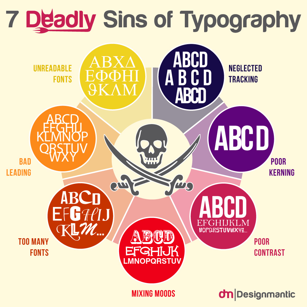
Choosing the right font for your logo is crucial. It’s more than just aesthetics; the typeface significantly impacts readability, brand personality, and overall memorability. A poorly chosen font can undermine even the most brilliant design concept, making your logo difficult to read or conveying the wrong message entirely. The right font, however, can elevate your logo, making it instantly recognizable and resonant with your target audience.The impact of font selection on logo readability and brand perception is profound.
Imagine a tech startup using a heavily ornate script font – it would clash drastically with the brand’s modern image. Conversely, a luxury jewelry brand using a simple sans-serif font might appear underwhelming and lack the sophistication the brand aims to project. Readability is paramount; if your logo’s message is unclear, the entire design fails. The chosen font should be easily legible at various sizes, across different mediums (print, digital), and even when scaled down for smaller applications like social media icons or website favicons.
Logo Font Examples
The following table showcases three logos, each employing a different font style – serif, sans-serif, and script – to illustrate how font choice shapes brand personality.
| Logo | Font Used | Brand Personality | Justification |
|---|---|---|---|
| Imagine a logo for a law firm: A strong, slightly condensed serif font (like Garamond or Times New Roman) forms the firm’s name in a sophisticated, classic style. The logo might incorporate a simple, elegant graphic element, but the focus remains on the typography. | Serif (e.g., Garamond) | Traditional, Established, Trustworthy, Authoritative | Serif fonts convey a sense of history and stability, making them ideal for businesses that want to project an image of reliability and experience. The slightly condensed style adds a touch of modern refinement. |
| Envision a logo for a tech company: A clean, geometric sans-serif font (like Helvetica or Futura) is used for the company name, perhaps with a vibrant color palette. The overall aesthetic is minimalist and modern. | Sans-serif (e.g., Helvetica) | Modern, Clean, Minimalist, Innovative | Sans-serif fonts are associated with modernity, technology, and efficiency. Their clean lines and simplicity make them suitable for brands aiming for a contemporary and sophisticated image. |
| Picture a logo for a boutique bakery: An elegant script font (like Edwardian Script ITC or Pacifico) forms the bakery’s name, with a subtle flourish. The logo might incorporate images of baked goods or other relevant imagery. | Script (e.g., Edwardian Script ITC) | Elegant, Sophisticated, Artistic, Handcrafted | Script fonts convey a sense of personality and artistry. They are ideal for brands that want to project an image of elegance, creativity, and individuality. The flowing nature of the script adds a touch of whimsy. |
Examples of Effective and Ineffective Font Choices
The Coca-Cola logo’s Spencerian script font is a classic example of effective typography. The unique, flowing style perfectly embodies the brand’s playful yet sophisticated personality. It’s instantly recognizable and has remained consistent for decades, contributing significantly to the brand’s enduring success. In contrast, consider a logo that uses a font that is difficult to read at small sizes, or one that clashes drastically with the overall visual style.
Such choices can render the logo ineffective, confusing, and ultimately damaging to the brand’s image. A poorly chosen font can make a logo look amateurish and unprofessional, even if the graphic elements are well-executed.
Ignoring Brand Identity and Target Audience
Source: designmantic.com
Ignoring your brand identity and target audience when designing a logo is a recipe for disaster. A logo is more than just a pretty picture; it’s the visual embodiment of your brand, communicating its values, personality, and target market at a glance. Failing to consider these crucial aspects results in a logo that is not only ineffective but potentially harmful to your brand’s image.Let’s illustrate this with an example.
Avoiding the five deadly sins of logo design is crucial for brand success. A strong visual identity is key, and understanding the nuances of color, typography, and overall impact is essential. To really understand visual impact in a broader context, check out this great article on getting it on with youtube , which highlights how visual appeal translates across different platforms.
Ultimately, mastering these principles helps you create a logo that avoids those design sins and resonates effectively.
Imagine a fictional company called “Peak Performance,” a high-end athletic apparel brand targeting professional athletes and serious fitness enthusiasts.
Logo Design Considering Brand Identity and Target Audience
For Peak Performance, a logo reflecting its brand values of high performance, professionalism, and premium quality would be essential. Imagine a stylized mountain peak, perhaps incorporating a sleek, modern font in a dark, sophisticated color like navy blue or charcoal gray. The overall design would be clean, minimalist, and subtly powerful, communicating a sense of achievement and ambition.
The mountain peak symbolizes the challenge and reward of peak physical performance, while the color palette evokes feelings of trust, authority, and sophistication.
Logo Design Ignoring Brand Identity and Target Audience
Now, let’s design a logo for Peak Performanceignoring* its brand identity and target audience. Imagine a cartoonish, brightly colored mountain with a smiling sun and fluffy clouds, accompanied by a playful, whimsical font. The color scheme might include vibrant yellows, oranges, and pinks. This logo completely misrepresents the brand’s intended image. It’s cheerful and childlike, directly contradicting the sophisticated and professional image Peak Performance aims to project.
The incongruity would alienate the target audience and damage the brand’s credibility.
The Impact of Omitting Brand Identity and Target Audience
The contrast between these two logos highlights the critical importance of considering brand identity and target audience. The first logo, designed with careful consideration, effectively communicates the brand’s values and appeals to its target audience. The second logo, on the other hand, is jarring and ineffective, failing to resonate with the intended consumers and potentially harming the brand’s reputation. It demonstrates how a poorly conceived logo can undermine even the best products or services.
Color Palette and Brand Perception
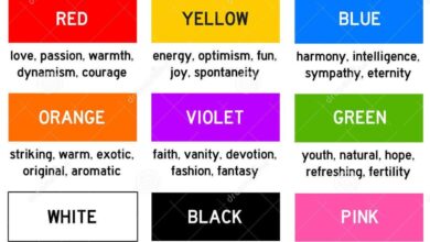
Different color palettes significantly impact brand perception and target audience engagement. For instance, blues often convey trust and stability, making them suitable for financial institutions or technology companies. Reds evoke energy and passion, often used by sports brands or fast-food restaurants. Greens symbolize nature and health, appealing to eco-conscious brands or food companies. Yellows represent happiness and optimism, commonly used by children’s products or entertainment companies.
The choice of color should align directly with the brand’s personality and the desired emotional response from the target audience.
Target Audience and Appropriate Visual Elements
The visual elements in a logo should be tailored to resonate with the specific target audience. Here are five different target audiences and appropriate visual elements for their logos:
- Luxury Goods (High-income individuals): Elegant fonts, sophisticated color palettes (gold, silver, deep blues), minimalist designs, and high-quality imagery.
- Tech Startups (Young professionals, tech-savvy individuals): Modern, geometric shapes, bold colors, clean lines, and a minimalist approach.
- Eco-Friendly Businesses (Environmentally conscious consumers): Natural color palettes (greens, browns), imagery related to nature, and a simple, uncluttered design.
- Children’s Products (Parents and children): Bright, playful colors, cartoonish or whimsical imagery, and easy-to-read fonts.
- Artisanal Food Producers (Foodies and health-conscious consumers): Hand-drawn or vintage-inspired designs, earthy color palettes, and imagery depicting natural ingredients.
Overly Complex or Cluttered Design
A logo’s primary function is to be memorable and easily recognizable. When a logo becomes overly complex, it loses its impact, becoming difficult to reproduce at small sizes, and ultimately failing to communicate the brand’s essence effectively. Simplicity is key, and a cluttered design often signifies a lack of focus during the design process. Let’s explore how to avoid this common pitfall.A cluttered logo often stems from trying to cram too much information into a single visual.
Consider this initial complex logo design: Imagine a vibrant, multi-colored peacock feather, intricately detailed with tiny scales and shading, surrounded by a swirling banner with the company name written in a highly decorative script font. The colors are bright and clashing, and the overall effect is chaotic. To simplify, we’d first remove the swirling banner; the company name can be incorporated more subtly elsewhere.
Next, we’d streamline the feather design, reducing the number of scales and simplifying the shading to a more unified color palette. Finally, we’d choose a cleaner, more legible sans-serif font for the company name.
Simplifying a Complex Logo Design
The simplification process involves a series of strategic decisions focused on clarity and impact. In the example above, the key improvements made were:
- Removed unnecessary elements: The swirling banner was redundant, distracting from the main focus (the feather).
- Simplified the main graphic: The intricate details of the peacock feather were reduced, making it cleaner and more easily recognizable at smaller sizes.
- Improved color palette: The clashing colors were replaced with a more harmonious and cohesive palette.
- Selected a more legible font: The decorative script font was replaced with a clean, modern sans-serif font that is easily readable.
The Importance of Negative Space
Negative space, also known as white space, is the area surrounding the main elements of a logo. It’s not just empty space; it’s a crucial design element that contributes significantly to a logo’s overall effectiveness. Proper use of negative space allows the main elements to breathe, enhancing their visual appeal and making the logo more memorable. It provides visual balance, prevents clutter, and guides the viewer’s eye to the most important aspects of the design.
Negative space can even be used creatively to form shapes or subtly suggest additional meaning, adding layers of sophistication to the logo. Logos that lack sufficient negative space often feel cramped and overwhelming.
Examples of Overly Complex Logos and Suggested Improvements
Here are three examples of logos that suffer from excessive complexity:
- Example 1: Imagine a logo featuring a detailed illustration of a cityscape with numerous buildings, tiny people, and intricate details. Improvement: Simplify the cityscape to a stylized skyline with a few key buildings, emphasizing clean lines and a minimalist approach.
- Example 2: Consider a logo with multiple overlapping images, fonts, and textures, creating a busy and confusing visual. Improvement: Reduce the number of elements, focusing on one or two key images and a simple, clean font. Improve color harmony.
- Example 3: Picture a logo incorporating a complex geometric pattern with various gradients and shading effects. Improvement: Simplify the geometric pattern to a more basic, easily recognizable shape. Use a solid color or a simple gradient instead of multiple gradients.
Lack of Scalability and Versatility
Source: dribbble.com
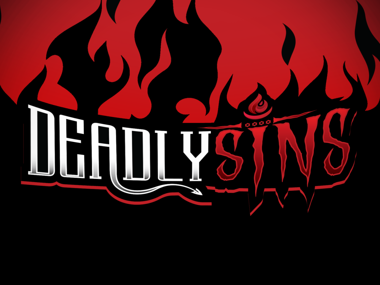
A logo’s longevity and effectiveness depend heavily on its scalability and versatility. A beautifully designed logo that looks stunning on a billboard might appear pixelated and illegible on a small social media icon. This lack of adaptability significantly undermines a brand’s consistent visual identity across various platforms and applications. A truly successful logo seamlessly transitions from large-scale print to tiny digital spaces, maintaining its impact and recognizability.
Logo Scalability: A Case Study
Let’s imagine a logo initially designed with intricate, thin lines and small, detailed elements. This logo, when enlarged, becomes blurry and loses its definition. Conversely, when minimized, the details become indistinguishable, rendering the logo unrecognizable. This illustrates the importance of considering scalability from the outset.
| Application | Original Logo | Redesigned Logo | Explanation of Changes |
|---|---|---|---|
| Website | Imagine a logo with a highly detailed illustration, fine lines, and a complex font. When displayed at a small size on a website, the details become muddled and illegible. | The redesigned logo simplifies the illustration, using bolder lines and a more robust font. The color palette is maintained, but the overall design is cleaner and more easily scalable. | Removed unnecessary details, thickened lines, simplified the illustration, and chose a font with better scalability. |
| Business Card | The original logo, printed small on a business card, loses much of its visual impact due to the loss of detail. | The simplified logo maintains its clarity and impact even at a small size. | The same changes as above ensure readability and impact. The color choice complements the card’s design. |
| Merchandise (T-shirt) | The fine details of the original logo would be lost in the printing process on a t-shirt, potentially resulting in a blurry or indistinct image. | The redesigned logo, with its bold lines and simplified forms, prints clearly and remains easily recognizable even on fabric. | Further simplification was considered to account for the limitations of textile printing. Color choice also considered fabric absorption. |
Designing for Both Color and Monochrome
A truly versatile logo maintains its impact and recognizability in both color and monochrome versions. This is crucial as logos are often used in situations where color printing is not feasible or cost-effective (e.g., fax, black and white print). Consider using strong shapes and silhouettes, and avoid relying solely on color for conveying meaning.
Factors to Consider for Logo Versatility
Designing a versatile logo requires careful consideration of several factors. These factors ensure the logo remains effective across various applications and mediums.
The following list Artikels key considerations for creating a versatile logo:
- Simplicity: Avoid overly complex designs; simpler logos scale better.
- Scalability of Fonts: Choose fonts that remain legible at both large and small sizes.
- Strong Shapes and Silhouettes: The logo should be recognizable even without color.
- Color Palette: Select colors that work well together and translate effectively to monochrome.
- File Formats: Provide the logo in various formats (e.g., vector, raster) to ensure compatibility with different applications.
- Minimum Size Considerations: Determine the smallest size the logo will be used at and ensure readability at that scale.
- Testing Across Mediums: Test the logo on various applications (website, print, merchandise) to ensure its effectiveness.
Conclusive Thoughts
Creating a truly effective logo is a balancing act. It requires originality, thoughtful typography, a deep understanding of your brand and target audience, and a commitment to simplicity and scalability. By avoiding these five deadly sins, you’ll be well on your way to designing a logo that not only looks amazing but also powerfully communicates your brand’s essence and leaves a lasting impression.
So, ditch the clichés, embrace creativity, and design a logo that screams success!
Top FAQs
What if my logo looks great but doesn’t work well in black and white?
This indicates a lack of scalability. Redesign it to ensure strong visual impact regardless of color. Simple shapes and strong contrasts work best.
How do I know if my logo is truly original?
Thorough market research is key. Analyze competitor logos and ensure your design stands out with a unique visual style and personality.
My target audience is diverse; how can I design a logo that appeals to everyone?
Focus on creating a logo that is clean, simple, and memorable. Avoid overly niche or trendy elements. A versatile logo is generally more successful across diverse audiences.


