Dont Let Poor Graphic Design Let Your Website Down
Dont let poor graphic design let your website down – Don’t let poor graphic design let your website down! Your website is your online storefront, your digital handshake – the first impression counts. A visually unappealing site can instantly turn away potential customers, impacting your credibility and bottom line. We’ll explore how effective design boosts engagement, builds trust, and ultimately drives conversions.
From choosing the right fonts to understanding the power of whitespace, we’ll delve into the key elements of compelling web design. We’ll also dissect common design mistakes and provide practical, actionable steps to transform your website from drab to fab. Get ready to level up your online presence!
The Impact of Poor Graphic Design on Website Success
Your website is your digital storefront. A poorly designed website, regardless of its content, can severely hinder its success. Unattractive visuals and confusing layouts drive visitors away, impacting your bottom line. Let’s delve into the specific ways poor graphic design can sabotage your online presence.
Unattractive Visuals and User Experience
Poor graphic design directly impacts user experience (UX). Unattractive visuals, such as clashing colors, low-resolution images, and cluttered layouts, create a negative first impression. This leads to higher bounce rates – the percentage of visitors who leave your site after viewing only one page. A visually unappealing website signals a lack of professionalism and attention to detail, making visitors question the quality of your products or services.
Imagine landing on a website with blurry images and mismatched fonts – you’d likely leave quickly, right? This is precisely the effect poor design has on your potential customers. Studies consistently show a strong correlation between aesthetically pleasing websites and increased user engagement.
Poor Design and Website Credibility
A website’s design plays a crucial role in establishing credibility. A poorly designed site often conveys a lack of professionalism and trustworthiness. Visitors subconsciously associate a well-designed website with a reputable business. Conversely, a website with outdated design elements, broken links, or confusing navigation can damage your brand’s reputation and deter potential customers. This is particularly true for businesses operating in industries where trust is paramount, such as finance or healthcare.
Design Elements that Negatively Impact User Engagement
Several design elements can significantly decrease user engagement. These include: poorly chosen color palettes that are visually jarring or difficult to read against the background; inconsistent fonts and typography that create a chaotic and unprofessional look; low-quality images that appear pixelated or blurry; excessive use of animation or interactive elements that distract from the core content; a cluttered layout with too much information crammed onto a single page; and a lack of clear calls to action (CTAs), making it difficult for visitors to know what to do next.
These issues can frustrate users, leading to a negative experience and ultimately, lost business.
Comparison of High-Converting and Low-Converting Websites
The following table illustrates the key design differences between high-converting and low-converting websites:
| Feature | High-Converting Website | Low-Converting Website |
|---|---|---|
| Visual Appeal | Clean, modern design; high-quality images; consistent branding | Cluttered layout; low-quality images; inconsistent branding; outdated design |
| Navigation | Intuitive and easy to navigate; clear menu structure | Confusing navigation; difficult to find information; broken links |
| Readability | Easy-to-read fonts; sufficient contrast between text and background | Difficult-to-read fonts; poor contrast; excessive use of bold or italics |
| Mobile Responsiveness | Fully responsive design; adapts seamlessly to different screen sizes | Poorly optimized for mobile; difficult to use on smaller screens |
Key Elements of Effective Web Design

Source: wpnewsify.com
A well-designed website isn’t just aesthetically pleasing; it’s crucial for user experience and ultimately, business success. Effective web design seamlessly blends visual appeal with functionality, guiding users intuitively towards desired actions. This involves careful consideration of several key elements, all working in harmony to create a cohesive and impactful online presence.
Typography Selection for Readability
Choosing the right fonts significantly impacts readability and the overall aesthetic. Prioritize clear, legible fonts for body text, avoiding overly stylized or decorative options that can hinder comprehension. A good rule of thumb is to use a maximum of two font families: one for headings and another for body text. For example, a clean sans-serif font like Open Sans for body text paired with a slightly more prominent serif font like Merriweather for headings creates a visually pleasing and easily readable contrast.
Consistency is key; maintain the same font styles throughout the website for a professional and unified look. Ensure sufficient font size for comfortable reading on various devices, and consider using sufficient line spacing to avoid cramped text.
Color Palette for Brand Consistency and Visual Appeal
A thoughtfully chosen color palette is fundamental to brand identity and user experience. Start by selecting a primary color that reflects your brand’s personality and values. Then, choose secondary and accent colors that complement the primary color, creating a harmonious and visually appealing scheme. For instance, a technology company might opt for a primary color of deep blue, representing trust and stability, complemented by a secondary color of teal for a modern feel and an accent color of bright orange to add a touch of energy.
Using a color palette generator tool can help ensure color harmony and accessibility. Maintaining consistency in color usage across all website elements, from buttons and links to backgrounds, reinforces brand recognition and creates a unified user experience.
White Space for Visual Clarity
White space, or negative space, is often underestimated but crucial for visual clarity and user experience. It’s the empty space around elements on a webpage. Effective use of white space prevents a cluttered appearance, allowing users to easily focus on important information and navigate the website intuitively. Adequate margins, padding, and spacing between text blocks, images, and other elements create a sense of breathing room, enhancing readability and reducing visual fatigue.
Consider the use of white space as a design element, strategically placing it to draw attention to specific areas or create visual hierarchy. A well-balanced use of white space can dramatically improve the overall user experience and website appeal.
Effective Use of Imagery for User Engagement
High-quality imagery significantly enhances user engagement and conveys information effectively. Images should be relevant to the content, visually appealing, and appropriately sized to avoid slow loading times. For example, a website selling handcrafted jewelry could feature high-resolution close-up shots of the jewelry pieces, highlighting their intricate details and craftsmanship. A website about sustainable travel might use stunning landscape photography showcasing breathtaking natural scenery.
Images should be optimized for web use, ensuring they are compressed to minimize file size without sacrificing quality. Consider using alt text for all images to improve accessibility for users with visual impairments and to enhance search engine optimization. The use of relevant and high-quality imagery creates a more immersive and engaging user experience, enhancing the overall effectiveness of the website.
Improving Website Design

Source: stunningmesh.com
Revamping your website’s design isn’t just about aesthetics; it’s about boosting user experience and ultimately, your bottom line. A well-designed website is intuitive, engaging, and converts visitors into customers. This section Artikels practical steps to achieve that.
Website Navigation and User Flow
Effective navigation is crucial for a positive user experience. A confusing site structure leads to frustrated visitors and high bounce rates. Improving navigation involves simplifying the site architecture, making information easily accessible, and ensuring a logical flow from one page to another. This is achieved through clear labeling, intuitive menus, and strategically placed internal links. For example, a hierarchical menu structure, where main categories are broken down into subcategories, is far more user-friendly than a single, overwhelming list of pages.
Consider implementing a sitemap to provide a visual representation of your website’s structure and help users quickly locate information. Additionally, employing breadcrumbs (a trail showing the user’s path through the site) further enhances navigation clarity.
Common Design Mistakes and Solutions
Several common design pitfalls hinder website success. One frequent issue is cluttered layouts. Too many elements competing for attention overwhelm visitors. The solution? Prioritize content, using white space effectively to create visual breathing room and guide the eye.
Another common mistake is inconsistent branding. Using different fonts, colors, and imagery across pages creates a disjointed experience. Maintaining a consistent brand identity throughout the website is essential for building a strong brand image and reinforcing recognition. Finally, neglecting mobile responsiveness is a critical error. Websites that don’t adapt to different screen sizes lose a significant portion of their potential audience.
Responsive design ensures your website looks and functions flawlessly on all devices.
Consistent Design Language
A consistent design language, encompassing typography, color palettes, imagery style, and overall layout, creates a unified and professional appearance. This consistency builds brand recognition and trust. Imagine a website with mismatched fonts, jarring color combinations, and wildly different image styles. It would appear unprofessional and confusing. In contrast, a website employing a consistent design language—for instance, using a specific font family throughout, a cohesive color palette reflecting the brand, and a consistent style of imagery—presents a polished and professional image.
This consistency fosters a sense of trust and reinforces brand identity, ultimately improving the user experience and leading to increased engagement.
Tools and Resources for Visually Appealing Websites
Choosing the right tools is paramount for efficient and effective web design.
- Adobe Creative Suite (Photoshop, Illustrator, InDesign): Industry-standard software for creating high-quality visuals and layouts.
- Figma/Sketch: Popular vector-based design tools ideal for UI/UX design and prototyping.
- Canva: User-friendly platform for creating various designs, including social media graphics and website elements.
- WordPress: A popular content management system (CMS) offering numerous themes and plugins to customize website design.
- Google Fonts: A vast library of free, high-quality fonts for web projects.
- Unsplash/Pexels: Resources for free, high-resolution stock photos.
Case Studies
Let’s dive into real-world examples to illustrate the stark contrast between websites with poor and excellent graphic design. By analyzing specific design choices and their impact on user experience, we can better understand the crucial role design plays in website success. We’ll examine how poor design choices can lead to user frustration and lost opportunities, while excellent design fosters engagement and conversions.
Poor Website Design: Example – A Fictional E-commerce Site
Imagine an e-commerce site selling handcrafted jewelry. The website’s background is a jarring, flashing neon pink. Product images are low-resolution and inconsistently sized, making it difficult to appreciate the detail of the jewelry. The navigation is cluttered, with an overwhelming number of poorly labeled categories. The font is illegible, a tiny, ornate script against the bright background.
The checkout process is lengthy and confusing, requiring multiple steps and unnecessary form fields. This overwhelming and visually unappealing experience likely leads to high bounce rates and abandoned shopping carts. Users feel frustrated and overwhelmed, leading to a negative brand perception and lost sales.
Excellent Website Design: Example – Minimalist Portfolio Website
In contrast, consider a minimalist portfolio website for a freelance graphic designer. The background is a clean, off-white color, providing a neutral backdrop that allows the designer’s work to shine. High-quality images of the designer’s projects are prominently displayed, showcasing their skills effectively. The navigation is intuitive and straightforward, with clear labels and a logical structure. The font is clean, modern, and easily readable.
The overall aesthetic is calming and professional, reflecting the designer’s expertise and creating a positive first impression. Users easily navigate the site, find the information they need, and are impressed by the quality of the designer’s work. The site’s design effectively communicates professionalism and skill.
Impact of Design Choices on User Experience
The contrasting experiences highlight the significant impact of design choices on user experience. The poorly designed e-commerce site creates a negative and frustrating experience, leading to user abandonment. Conversely, the well-designed portfolio website provides a positive and engaging experience, fostering trust and encouraging interaction.
Improvements for the Poorly Designed Website, Dont let poor graphic design let your website down
To improve the fictional e-commerce site, several key changes are needed:
- Replace the jarring background with a more calming and appropriate color palette.
- Use high-resolution, consistently sized product images.
- Simplify the navigation, using clear and concise labels.
- Choose a legible and professional font.
- Streamline the checkout process, minimizing the number of steps and form fields.
These improvements would significantly enhance the user experience, leading to increased engagement and sales.
Comparative Table: Poor vs. Excellent Website Design
| Feature | Poor Design (E-commerce Site) | Excellent Design (Portfolio Website) | Impact on User Engagement |
|---|---|---|---|
| Background | Jarring neon pink | Clean off-white | Negative vs. Positive |
| Images | Low-resolution, inconsistent size | High-resolution, consistent size | Difficult to view vs. Easy to appreciate |
| Navigation | Cluttered, poorly labeled | Intuitive, clear labels | Frustrating vs. Easy |
| Font | Illegible, ornate script | Clean, modern, readable | Difficult to read vs. Easy to read |
| Checkout Process | Lengthy, confusing | Streamlined, simple | High abandonment rate vs. High conversion rate |
The Role of Responsive Design in User Experience
In today’s multi-device world, responsive design isn’t just a nice-to-have; it’s a necessity for any website aiming for success. A responsive website seamlessly adapts its layout and content to fit the screen size of any device, from desktop monitors to smartphones and tablets. This ensures a consistent and optimal user experience regardless of how a visitor chooses to access your site.Responsive design significantly impacts user experience across various screen sizes.
A website that looks cluttered and difficult to navigate on a small screen will likely frustrate users and lead to higher bounce rates. Conversely, a well-designed responsive site provides a smooth, intuitive experience, regardless of the device. This translates to increased engagement, longer session durations, and ultimately, higher conversion rates.
Responsive Design and Website Accessibility
Responsive design plays a crucial role in enhancing website accessibility. By adapting to different screen sizes, it inherently improves usability for users with visual impairments or motor skill limitations. Larger text and simplified layouts on smaller screens can make navigation significantly easier for individuals with low vision. Similarly, touch-friendly interfaces are essential for users who rely on mobile devices.
Failing to implement responsive design can create significant barriers to access for a large segment of the population. Consider the challenges faced by someone with limited dexterity trying to navigate a website designed only for large screens – clicking small links becomes nearly impossible. Responsive design helps to eliminate these accessibility issues, ensuring that your website is inclusive and usable by everyone.
Examples of Effective Responsive Design Techniques
Effective responsive design often involves a combination of techniques. Fluid grids, for example, allow website elements to adjust their width proportionally to the screen size, preventing content from overflowing or becoming overly compressed. Flexible images resize automatically to fit their containers, avoiding distortion and maintaining visual appeal. Media queries, a powerful CSS feature, allow developers to apply different styles based on screen size, orientation, and other device characteristics.
For instance, a website might use a three-column layout on a desktop but switch to a single-column layout on a smartphone. This ensures that the content remains legible and navigable regardless of the device. Another common technique is the use of responsive images, which allow the website to serve different image sizes depending on the device’s capabilities, optimizing loading times and bandwidth usage.
Negative Consequences of Neglecting Responsive Design
Ignoring responsive design has significant negative consequences. Firstly, it leads to a poor user experience, resulting in higher bounce rates and decreased conversion rates. Users are far more likely to abandon a website that is difficult to navigate or read on their device. Secondly, it negatively impacts your search engine rankings. Google and other search engines prioritize mobile-friendliness, penalizing websites that are not responsive.
This means that your website will be less visible to potential customers. Thirdly, it can damage your brand reputation. A poorly designed website reflects poorly on your brand and can create a negative perception among users. Finally, it can limit your reach, excluding a significant portion of your potential audience who primarily use mobile devices. In today’s market, neglecting responsive design is simply not an option for businesses that want to thrive online.
Final Conclusion
Source: promodome.in
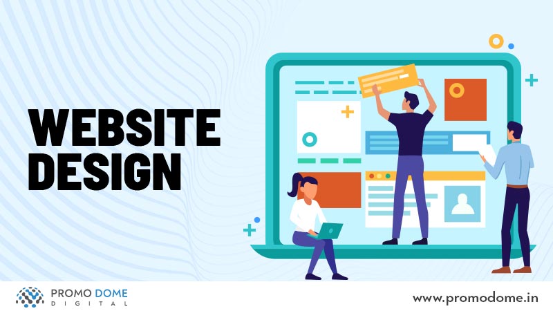
Ultimately, your website’s design is a direct reflection of your brand. Investing in good graphic design isn’t just about aesthetics; it’s about building a strong online identity, enhancing user experience, and driving business success. By understanding and implementing the principles discussed, you can create a website that not only looks great but also converts visitors into loyal customers. So, ditch the outdated visuals and embrace the power of effective design – your website (and your business) will thank you for it!
FAQ: Dont Let Poor Graphic Design Let Your Website Down
What’s the difference between web design and graphic design?
Web design focuses on the structure, functionality, and user experience of a website, while graphic design is more about the visual elements like logos, typography, and imagery.
How much should I budget for website design?
It depends on the complexity and scope of the project. Simple websites can cost a few hundred dollars, while more complex ones can run into thousands.
Can I learn web design myself?
Absolutely! There are tons of free and paid resources available online, including courses, tutorials, and books.
How often should I update my website’s design?
It depends on your industry and goals, but generally, keeping your design fresh and up-to-date with current trends is important for maintaining relevance and user engagement. Consider updating every 2-3 years, or as needed.
