The Psychology Behind Logo Design
The psychology behind logo design sets the stage for this enthralling narrative, offering readers a glimpse into a world where colors, shapes, and fonts whisper unspoken messages. It’s a fascinating exploration of how visual communication subtly influences our perceptions and drives consumer behavior. We’ll delve into the power of first impressions, the impact of color psychology, and the role of archetypes in crafting a brand’s visual identity.
Get ready to uncover the secrets behind some of the world’s most iconic logos and learn how to harness the power of design to create a lasting impact.
From the initial spark of an idea to the final polished design, logo creation is a deeply psychological process. Understanding the principles of visual perception, Gestalt theory, and color psychology allows designers to craft logos that are not only aesthetically pleasing but also deeply resonate with the target audience. We’ll explore how different fonts evoke specific emotions, the importance of symbolism and iconography, and the strategic use of negative space.
Ultimately, we’ll discover how a well-designed logo can become more than just a visual identifier—it becomes a powerful tool for building brand recognition, loyalty, and ultimately, success.
The Power of First Impressions: The Psychology Behind Logo Design
Source: infographicjournal.com
A logo is often the first point of contact a consumer has with a brand. That fleeting initial impression—a mere glance—can profoundly influence whether a customer chooses to engage further. This first visual encounter isn’t just about aesthetics; it’s a complex interplay of visual perception, memory, and emotional response, all subtly shaping brand recall and subsequent consumer behavior.
Understanding these psychological mechanisms is crucial for effective logo design.
The human brain is wired to process visual information rapidly and efficiently. A well-designed logo leverages this innate ability, creating a lasting impression that transcends a simple image. Think of iconic logos like the Apple apple or the Nike swoosh – these aren’t just pretty pictures; they’re instantly recognizable symbols that evoke specific feelings and associations. The speed and efficiency with which we process these visual cues are paramount to a brand’s success in a crowded marketplace.
Gestalt Principles and Logo Memorability
Gestalt principles, originating in psychology, describe how humans perceive visual elements as organized wholes rather than individual parts. These principles are instrumental in creating memorable logos. Proximity, for example, suggests that elements placed close together are perceived as a group. A logo using this principle might group letters tightly to create a cohesive unit. Similarity involves using similar shapes, sizes, or colors to create a sense of unity and coherence, making the logo easier to recall.
Closure refers to our tendency to complete incomplete figures; a logo might utilize this by suggesting a shape without explicitly drawing all its lines, prompting the viewer’s mind to fill in the gaps, thus enhancing memorability. The effective use of these principles makes a logo more easily processed and retained in memory.
Color Psychology and Emotional Response
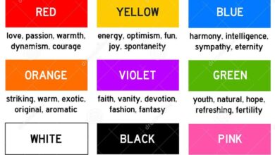
Color plays a pivotal role in shaping the immediate emotional response to a logo. Different colors evoke distinct feelings and associations, influencing how consumers perceive a brand. For example, blue often conveys trust and stability, while red can represent excitement and energy. Careful consideration of color psychology is crucial in aligning the logo’s emotional impact with the brand’s desired identity.
Consider the following table illustrating the psychological effects of different color palettes:
| Color | Emotion | Brand Association | Example Industries |
|---|---|---|---|
| Blue | Trust, Security, Stability | Corporate, Reliable, Professional | Finance, Technology, Healthcare |
| Red | Energy, Excitement, Passion | Bold, Urgent, Exciting | Food, Sports, Entertainment |
| Green | Growth, Nature, Freshness | Eco-friendly, Healthy, Natural | Agriculture, Environmental Organizations, Health Food |
| Yellow | Happiness, Optimism, Creativity | Cheerful, Playful, Approachable | Toys, Children’s Products, Food |
Archetypes and Brand Personality
Source: com.au
Logo design isn’t just about aesthetics; it’s about communicating a brand’s core values and personality to resonate with its target audience. By understanding and leveraging archetypes, designers can create logos that instantly convey a brand’s essence and build a strong connection with consumers. This involves tapping into deep-seated psychological patterns and using visual language to speak directly to the subconscious.Archetypes, as defined by Carl Jung, are universal, symbolic patterns of behavior and personality that exist in the collective unconscious.
These patterns manifest in various forms, including logo design, where they act as powerful tools for shaping brand identity. By associating a brand with a specific archetype, designers can effectively communicate its values, aspirations, and the emotional response it aims to evoke in its audience. This creates a shortcut to understanding, fostering immediate trust and brand recognition.
Common Archetypes and Their Visual Manifestations, The psychology behind logo design
The effective use of archetypes in logo design requires a deep understanding of their visual representations. For instance, a hero archetype often features bold, strong lines and imagery suggesting strength, courage, and leadership. Think of the Nike swoosh – a dynamic, simple, and powerful symbol that embodies athletic achievement and the pursuit of excellence. Conversely, a caregiver archetype might use softer, more rounded shapes and calming color palettes, evoking feelings of nurturing, protection, and trust.
A logo for a children’s hospital, for example, might utilize gentle curves and pastel colors to reflect this archetype. The magician archetype, often associated with innovation and transformation, might incorporate intricate designs, unexpected color combinations, or symbolic imagery representing mystery and intrigue. A technology company aiming for a cutting-edge image might use sharp angles and futuristic imagery to represent this archetype.
Examples of Logos Effectively Communicating Brand Personality
The logo for Dove, with its smooth, flowing lines and gentle curves, effectively communicates the brand’s focus on care, gentleness, and nurturing – aligning perfectly with the caregiver archetype. In contrast, the bold, angular logo of a company like GoPro projects an image of adventure, resilience, and action, resonating with the hero archetype. The logo for Harley Davidson, with its strong, iconic font and imagery of a roaring engine, powerfully communicates freedom, rebellion, and rugged individualism.
This is a prime example of tapping into the outlaw archetype, associating the brand with a sense of independence and a nonconformist attitude.
Logo Design and Brand Storytelling
Logo design is intrinsically linked to brand storytelling. The visual elements of a logo – its shape, color, typography, and imagery – contribute significantly to the narrative a brand wishes to convey. A well-designed logo acts as a visual shorthand for a brand’s story, instantly communicating its values, mission, and personality. For example, a logo with vintage-inspired typography and muted color palettes might suggest a brand with a rich history and tradition, while a logo with modern, minimalist design might communicate innovation and simplicity.
The visual story communicated through the logo forms the foundation upon which a broader brand narrative can be built. Every subsequent marketing effort builds upon this initial visual impression, reinforcing the brand’s personality and creating a cohesive brand experience for the consumer.
Symbolism and Iconography
Logo design isn’t just about aesthetics; it’s about communication. A well-designed logo taps into the subconscious, conveying meaning and building brand recognition through the strategic use of symbols and icons. Understanding the power of symbolism and iconography is crucial for creating a logo that resonates deeply with the target audience and effectively communicates the brand’s essence. This involves considering both universal and culturally specific meanings to ensure the logo’s message is accurately and positively received.The choice between abstract and representational imagery significantly impacts a logo’s effectiveness.
This decision hinges on the brand’s identity and target market. Representational imagery uses recognizable objects or figures to directly depict the brand’s product or service. Abstract imagery, on the other hand, utilizes shapes, colors, and forms to evoke feelings and concepts without explicitly representing anything concrete. The psychological impact of each approach differs substantially, with representational logos often promoting immediate understanding and abstract logos fostering intrigue and memorability.
Abstract, Representational, and Combined Symbolic Approaches in Logo Design
To illustrate the different symbolic approaches, let’s consider three logos for a hypothetical company called “InnovateTech,” a tech startup focused on sustainable energy solutions.
- Abstract Logo: This logo uses a stylized sun icon, depicted as a circular gradient of greens and blues, evolving into a leaf-like shape. The gradient suggests the transition of energy from the sun to sustainable power. The organic form of the leaf symbolizes nature and environmental consciousness, while the circular shape represents wholeness and continuous energy flow. The overall impression is one of clean, modern technology integrated harmoniously with nature, aligning with InnovateTech’s mission.
The psychological impact relies on visual cues and associations rather than explicit representation.
- Representational Logo: This logo features a stylized image of a solar panel integrated within a stylized green leaf. The direct representation of a core product (solar panel) instantly communicates the company’s focus. The green leaf reinforces the environmental aspect. This approach ensures immediate understanding of the company’s business, making it highly accessible to a broad audience. The psychological impact is one of clarity and directness, promoting trust and reliability.
- Combined Approach Logo: This logo combines an abstract symbol – a stylized lightning bolt formed from interconnected green leaves – with a more representational element – a small, subtly rendered solar panel within the lightning bolt’s tip. The lightning bolt represents the dynamic and innovative nature of the company, while the green leaves maintain the environmental focus. The small solar panel provides a clear connection to the company’s product, subtly reinforcing the core business.
This combined approach offers both immediate understanding and a degree of intrigue, balancing clarity with a sophisticated aesthetic. The psychological impact aims for a balanced perception of both innovation and sustainability.
Typography and Readability
The choice of typeface in a logo is far more than just aesthetics; it’s a powerful psychological tool that subtly influences how consumers perceive a brand. Font selection directly impacts readability, and consequently, the overall effectiveness of the logo in communicating the brand’s message and values. A well-chosen font can enhance brand recognition and build trust, while a poorly chosen one can hinder these crucial aspects.Different font styles evoke distinct emotional responses and contribute significantly to a brand’s personality.
The weight, spacing, and overall style of the lettering all play a role in shaping the viewer’s perception. Consider the impact of a bold, sans-serif font versus a delicate, script typeface – the contrast in the feelings they evoke is striking. Understanding this interplay between typography and psychology is key to creating a truly effective logo.
Serif, Sans-serif, and Script Fonts: Emotional Associations
Serif fonts, characterized by small decorative strokes at the ends of letterforms (like Times New Roman or Garamond), often project a sense of tradition, sophistication, and authority. They’re frequently used in logos for established institutions, luxury brands, and businesses that aim to convey a sense of timelessness and reliability. Sans-serif fonts (like Helvetica or Arial), lacking these strokes, generally feel modern, clean, and minimalist.
They are often associated with technology, innovation, and a forward-thinking approach. Script fonts (like Edwardian Script or Pacifico), mimicking handwriting, tend to evoke feelings of elegance, personality, and creativity. They are often employed by brands focusing on artistry, personal touch, or a vintage aesthetic.
Examples of Effective Typography in Logos
The Coca-Cola logo, with its Spencerian script, exemplifies the use of typography to create a sense of nostalgia and approachability. The flowing script contributes to the brand’s friendly, timeless image. In contrast, the Google logo uses a sans-serif typeface, reflecting the company’s clean, modern, and technologically advanced image. The simple, yet distinctive, font is instantly recognizable and reflects the brand’s values of simplicity and accessibility.
The logo for IBM, with its strong, geometric sans-serif typeface, projects an image of stability, power, and corporate authority.
Font Categories and Psychological Associations
It’s important to note that these associations aren’t absolute and can be influenced by other design elements. However, general tendencies exist:
Below is a list of fonts categorized by their typical psychological associations:
- Trustworthy: Times New Roman, Garamond, Didot (Serif fonts often convey a sense of history and reliability).
- Playful: Comic Sans, Bubblegum Sans, KG Happy Vibes (Fonts with rounded shapes and informal styles create a lighthearted feel).
- Sophisticated: Bodoni, Didot, Playfair Display (Elegant serif fonts with high contrast and refined details).
- Modern: Helvetica, Arial, Futura (Clean, minimalist sans-serif fonts communicate a contemporary feel).
- Bold: Impact, Bebas Neue, Montserrat (Strong, condensed fonts that project confidence and power).
- Elegant: Amatic SC, Lobster, Great Vibes (Script fonts often communicate a sense of luxury and grace).
Logo Evolution and Brand Identity

Source: 28lions.com
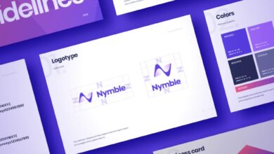
A successful logo isn’t static; it’s a living entity that evolves alongside the brand it represents. Adapting a logo requires a delicate balance: maintaining brand recognition while reflecting the company’s growth, changes in target audience, and shifts in design trends. This process is crucial for sustained brand relevance and continued positive consumer perception. A well-executed logo evolution can reinforce brand identity and even revitalize a brand’s image, while a poorly handled one can lead to confusion and damage brand equity.Successful logo adaptations often involve subtle refinements rather than complete overhauls.
The core elements—the essential visual and symbolic aspects that consumers recognize—are preserved, ensuring continuity and familiarity. Changes are usually incremental, updating aspects like color palettes, typography, or minor stylistic details to reflect modern design sensibilities or a shift in brand messaging. This approach allows for modernization without alienating loyal customers.
Understanding the psychology behind logo design is crucial; it’s all about creating an instant connection with your audience. This is especially important when building your online presence, which is why I found the article on getting it on with youtube so helpful. The principles of effective visual communication, highlighted in that piece, directly translate to crafting a memorable logo that resonates and builds brand recognition.
Ultimately, a powerful logo is a key element in that initial psychological impression.
Successful Logo Redesigns and Their Psychological Rationale
The evolution of the logo for Mastercard provides a compelling example. The original design, featuring interlocking red and yellow circles, was simple and memorable. Over time, the logo has been subtly refined. The circles have become slightly more rounded, the color palette has been tweaked for better screen visibility, and the overall style has become more minimalist.
The psychological reasoning behind these changes lies in maintaining brand recognition while enhancing its contemporary appeal. The subtle adjustments prevent jarring disruption, ensuring consumers still instantly recognize the brand, while the modernized aesthetic keeps the logo feeling fresh and relevant. Similarly, the Pepsi logo has undergone several iterations, each subtly altering the shape and color scheme while preserving the core circular design and its dynamic feel.
These adjustments reflect evolving design trends and cultural shifts, keeping the brand image modern and youthful without losing its fundamental identity.
Challenges in Maintaining Brand Consistency During Logo Adaptation
Maintaining brand consistency during logo evolution presents several challenges. One significant hurdle is striking a balance between updating the logo’s visual elements and preserving its core identity. Overly drastic changes risk alienating existing customers who have grown accustomed to the original design, potentially leading to confusion and a negative impact on brand recognition. Conversely, minimal changes might not effectively communicate the brand’s evolution or its adaptation to a new market or target audience.
Another key challenge lies in adapting the logo for various applications and media. A logo designed for print might not translate effectively to digital platforms, requiring adjustments for different screen resolutions and sizes. Finally, managing the perception of the redesign across different stakeholders, including internal teams and consumers, requires careful communication and a well-defined strategy. Inconsistency in messaging or rollout can damage brand trust and credibility.
The Impact of Negative Space
Negative space, often overlooked, is a powerful tool in logo design. It’s the area surrounding the main elements of a logo, and its effective use can significantly impact a brand’s visual identity, making it more memorable and impactful. Clever manipulation of negative space transforms a simple design into something striking and thought-provoking, fostering a deeper connection with the viewer.
The psychological impact stems from our brain’s natural tendency to fill in gaps and complete incomplete shapes, creating a more engaging and memorable visual experience.The strategic use of negative space simplifies a logo, allowing the core elements to breathe and stand out. This visual clarity improves readability and comprehension, crucial for quick recognition and brand recall. By creating a sense of balance and visual harmony, negative space enhances the overall aesthetic appeal, leaving a lasting impression on the viewer.
A well-designed logo with effective negative space is clean, modern, and sophisticated, projecting professionalism and credibility.
Examples of Negative Space in Logo Design
Several iconic logos effectively utilize negative space to create memorable designs. The FedEx logo subtly incorporates an arrow between the letters “E” and “x,” symbolizing speed and delivery. The NBC peacock logo uses negative space to create the shape of the bird, cleverly utilizing the colors and arrangement of the feathers to suggest the bird’s form. The WWF logo cleverly uses negative space to create the shape of a panda bear, with the black and white areas representing the animal’s distinctive coloring.
These examples showcase how negative space can add layers of meaning and visual interest to a logo, going beyond the immediately apparent design elements.
A Visual Illustration of Negative Space’s Effect
Imagine a simple black circle. This is our primary logo element. Now, imagine this circle placed within a larger, white square. The white space surrounding the circle is the negative space. The viewer’s eye is immediately drawn to the black circle, the positive space, but the negative space, the white square, provides context and balance.
Now, let’s modify this: Imagine the negative space is carefully sculpted to create the subtle Artikel of a face, using only the white area around the black circle. The circle, initially just a circle, now becomes an eye within a face, adding a layer of complexity and intrigue that wasn’t present initially. This subtle manipulation of negative space fundamentally changes the perception of the logo, transforming a simple circle into a far more complex and memorable image.
The psychological effect is the creation of a richer, more layered meaning through the viewer’s subconscious completion of the image. The brain actively participates in interpreting the logo, leading to greater engagement and recall.
Conclusion
So, the next time you see a logo, take a moment to appreciate the psychology behind it. It’s a silent conversation between the designer and the consumer, a carefully orchestrated dance of visual elements designed to evoke specific emotions and associations. Understanding this intricate interplay is crucial for creating effective branding, and hopefully, this exploration has shed light on the powerful, often subconscious, influence of logo design on our minds and hearts.
Remember, a great logo is more than just pretty; it’s a strategic masterpiece.
Helpful Answers
What is the most important aspect of logo design from a psychological perspective?
Creating an immediate and lasting positive emotional response. This hinges on understanding your target audience and using color, shape, and typography to communicate the desired brand personality effectively.
How can I test the effectiveness of a logo’s psychological impact?
User testing is key! Gather feedback from your target audience on emotional responses to different logo options. Eye-tracking studies can also reveal where attention is drawn and how long it’s held.
What’s the role of simplicity in effective logo design?
Simplicity enhances memorability. Uncluttered designs are easier to process and recall, leading to stronger brand recognition.
How often should a logo be redesigned?
There’s no magic number. Redesign should be considered when the brand’s identity shifts significantly or the current logo no longer resonates with the target audience. Sometimes a subtle refresh is all that’s needed.
