Things to Consider When Designing Your Logo
Things to consider when designing your logo? It’s more than just picking pretty colors and a cool font! Your logo is the visual face of your brand, the first impression you make on potential customers, and a silent storyteller of your values. Getting it right is crucial for success, and that means carefully considering everything from your target audience’s preferences to the practical implications of scalability and legal protection.
This journey into logo design will uncover the key elements that will transform a simple image into a powerful brand asset.
We’ll dive deep into understanding your brand identity, exploring different design styles, and navigating the often-overlooked aspects like color psychology and legal considerations. By the end, you’ll have a clear roadmap for creating a logo that not only looks amazing but also effectively communicates your brand message and resonates with your target audience. Let’s get started!
Target Audience & Brand Identity
Designing a logo isn’t just about creating a pretty picture; it’s about crafting a visual representation of your brand’s essence and connecting with your target audience on a fundamental level. Understanding your ideal customer and the brand’s identity is paramount to creating a logo that resonates and effectively communicates your message. A poorly conceived logo can hinder brand recognition and even damage your company’s image.This section will delve into defining your target audience, establishing your brand’s personality, and visualizing the desired aesthetic through a mood board and example logo concepts.
We’ll explore how these elements work together to create a cohesive and impactful brand identity.
Ideal Customer Profile
Let’s imagine we’re designing a logo for a new line of sustainable, ethically sourced coffee. Our ideal customer profile (ICP) is a millennial or Gen Z consumer, aged 25-40, who is environmentally conscious, values fair trade practices, and enjoys high-quality coffee. They are likely digitally savvy, active on social media, and appreciate brands with a strong sense of social responsibility.
They are discerning consumers who are willing to pay a premium for products that align with their values. This detailed understanding of our ICP informs every design decision, from the color palette to the font choice.
Brand Personality, Values, and Mission Statement
Our sustainable coffee brand, let’s call it “Equator Brew,” embodies a personality that is both sophisticated and approachable. It’s adventurous, reflecting the journey from bean to cup, yet grounded in its commitment to ethical sourcing. The brand values sustainability, transparency, quality, and community. Its mission statement is: “To deliver exceptional coffee while fostering a sustainable and equitable coffee industry.” These core values and the mission statement guide the development of the visual identity, ensuring that the logo accurately reflects the brand’s ethos.
Mood Board
Our mood board for Equator Brew would include the following elements:
- Colors: Deep browns and rich creams, representing the earth and the coffee bean, accented with a vibrant green to symbolize sustainability and growth. A touch of a warm, earthy orange adds a hint of warmth and approachability.
- Fonts: A serif font like Garamond for a sophisticated and timeless feel, paired with a clean sans-serif font like Montserrat for readability and a modern touch. The serif font would be used for the brand name, while the sans-serif font would be used for supporting text.
- Imagery: Images of lush coffee plants, hands carefully harvesting beans, and steaming cups of coffee in rustic settings. The overall feel should be natural, authentic, and inviting.
Logo Concepts
Based on the mood board and brand identity, here are three distinct logo concepts:
- Concept 1: A stylized coffee bean incorporating a leaf element, using the deep brown and green from the color palette. The font would be the sophisticated serif font, creating a classic and elegant feel.
- Concept 2: A minimalist design featuring the brand name “Equator Brew” in the chosen fonts, with a subtle graphic element representing a mountain range (symbolizing the origin of the beans) subtly incorporated into the letter “E”.
- Concept 3: A more abstract logo using a circular design representing the world, incorporating the deep brown and green colors. The brand name is placed subtly within the circle, emphasizing the global reach and sustainability aspects of the brand.
Logo Design Elements & Principles

Source: pngegg.com
Creating a truly effective logo goes beyond just a pretty picture; it’s about crafting a visual representation that encapsulates your brand’s essence and resonates with your target audience. This involves careful consideration of several key elements and design principles. A well-designed logo is simple, memorable, and versatile enough to work across various applications, from business cards to websites.Simplicity and memorability are paramount in logo design.
A cluttered or overly complex logo is difficult to recall and reproduce, ultimately undermining its effectiveness. Think of iconic logos like the Nike swoosh or the Apple apple – their simplicity is what makes them instantly recognizable and memorable. A memorable logo helps build brand recognition and recall, which are crucial for long-term success. The goal is to create a visual that sticks in people’s minds, prompting instant association with your brand.
Logo Styles
Different logo styles cater to different brand personalities and target audiences. A minimalist logo, for example, utilizes simple shapes and a limited color palette, conveying a sense of sophistication and modernity. Think of the logos for brands like Adidas or Google. In contrast, a vintage logo might employ distressed textures, retro fonts, and a muted color palette to evoke a feeling of nostalgia and tradition.
Examples include many craft brewery or coffee shop logos. Modern logos often incorporate bold geometric shapes, clean lines, and a contemporary color palette, projecting an image of innovation and forward-thinking. Many tech companies utilize this style. The choice of style should directly reflect the brand’s identity and values.
Font Selection
The typeface used in a logo significantly impacts its overall aesthetic and readability. Choosing the right font is crucial for conveying the brand’s personality. For a brand aiming for a professional and trustworthy image, a serif font like Times New Roman or Garamond could be appropriate. These fonts are classic and easily readable. For a more modern and playful brand, a sans-serif font like Helvetica or Open Sans might be a better choice.
These fonts are clean and versatile. Lastly, a script font like Pacifico or Lobster could add a touch of elegance and personality, suitable for brands focusing on creativity and artistry. However, script fonts can be less readable, so they should be used judiciously and in contexts where readability isn’t paramount.
Color Psychology and Palette Selection
Color psychology plays a vital role in logo design, as different colors evoke different emotions and associations. For instance, blue often represents trust and stability, while green symbolizes nature and growth. Red is associated with energy and excitement, while yellow conveys happiness and optimism. For a hypothetical eco-friendly company, a color palette might incorporate various shades of green and brown to reflect the brand’s commitment to sustainability.
For a tech startup, a palette of blues and grays might convey a sense of innovation and reliability. A fashion brand might opt for vibrant and bold colors to showcase its creativity and style. The selected color palette should be consistent across all brand materials and reflect the brand’s personality and target audience. It’s important to consider color accessibility and ensure sufficient contrast for readability.
Practical Considerations & Scalability
Source: googleapis.com
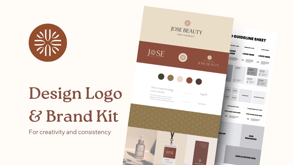
Designing a logo isn’t just about aesthetics; it’s about ensuring its effectiveness across various platforms and sizes. A poorly designed logo can look pixelated on a billboard or illegible on a business card, undermining your brand’s professional image. Therefore, careful consideration of practical aspects and scalability is crucial for a successful logo design.A logo’s longevity and impact depend heavily on its ability to remain clear and recognizable regardless of size or application.
So, you’re thinking about your logo design? Remember, simplicity is key! A memorable logo is crucial for brand recognition, especially when you’re trying to build a following, which is why understanding how to effectively promote your channel, as discussed in this great article on getting it on with youtube , is equally important. A strong logo helps viewers quickly identify your content, making that initial impact even more powerful.
Therefore, choosing the right colors and font are vital steps in the design process.
This is where understanding vector-based graphics becomes vital.
Vector-Based Graphics for Scalability
Vector graphics are created using mathematical equations to define lines, curves, and shapes. Unlike raster graphics (made up of pixels), vector graphics can be scaled to any size without losing quality. This means your logo will look sharp and crisp whether it’s displayed on a tiny website favicon or a massive storefront sign. Using a vector format, such as SVG (Scalable Vector Graphics), ensures your logo remains crisp and clear at any resolution.
Raster images, on the other hand, will become pixelated and blurry when enlarged. This is because they are composed of a fixed number of pixels, and enlarging them stretches these pixels, resulting in a loss of detail and a less professional appearance. Therefore, choosing a vector format is paramount for ensuring the long-term usability and effectiveness of your logo.
Logo Appearance in Different Sizes and Contexts
The following table illustrates how a hypothetical logo—a stylized, abstract tree with green leaves and a brown trunk—might appear in various contexts.
| Size | Context | Image Description | Notes |
|---|---|---|---|
| 16×16 pixels | Website Favicon | A simplified version of the tree, possibly only showing the trunk and a few stylized leaves. Colors would be simplified to ensure clarity at this small size. | Minimal detail is required for small icons; focus on the most recognizable elements. |
| 50×50 pixels | Social Media Profile Picture | A slightly more detailed version, showing more leaves and a clearer trunk shape. Colors remain consistent. | Sufficient detail to be easily recognizable within the square format. |
| 200×200 pixels | Website Header | The full logo, showing the tree in its complete design with detailed leaves and shading on the trunk. | High enough resolution to show the logo’s full detail. |
| Print Size (Business Card) | Business Card | The full logo printed in high resolution, allowing for fine details to be visible. | Ensure the logo is large enough to be clearly seen on the business card and doesn’t appear cramped. |
Logo Usage Guidelines
Maintaining brand consistency is critical. These guidelines ensure your logo is used appropriately across all platforms:Minimum Size: The logo should never be smaller than 50 pixels wide. Below this size, detail is lost, and the logo becomes difficult to recognize.Color Variations: The primary logo uses Pantone 347C (Green) for the leaves and Pantone 1805C (Brown) for the trunk.
A secondary variation uses the same colors but in a slightly desaturated version for use on busy backgrounds. A grayscale version is also available for use where color printing is not feasible.Acceptable Backgrounds: The logo should ideally have a clear, uncluttered background. Busy backgrounds can obscure the logo’s details. Ensure sufficient contrast between the logo and its background.
Logo Versatility Demonstrated, Things to consider when designing your logo
The logo adapts well to different applications. The grayscale version removes color entirely, relying on the shape of the tree for recognition. The inverted color version uses white leaves on a dark brown trunk, ideal for use on dark backgrounds. This maintains the core design elements while offering flexibility for various contexts.
Legal & Copyright Aspects: Things To Consider When Designing Your Logo
Protecting your logo’s intellectual property is crucial for your brand’s success. A well-designed logo is a significant investment, representing your brand’s identity and value. Understanding the legal and copyright aspects involved ensures you can effectively safeguard your investment and prevent unauthorized use. This section Artikels the key considerations for protecting your logo.
Trademarking a Logo Design
Trademarking your logo provides legal protection against others using a confusingly similar logo in the same or related markets. A trademark registration grants you exclusive rights to use your logo in connection with specific goods and services. This means you can prevent others from using a logo that could mislead consumers into believing there’s an affiliation with your brand.
The process involves filing an application with the relevant trademark office (like the USPTO in the US or the IPO in the UK), and demonstrating that your logo is distinctive and not already registered. Successfully registering your trademark gives you a strong legal recourse against infringement, allowing you to take legal action against those who violate your rights.
The duration of a trademark registration varies depending on the jurisdiction but often requires renewal after a certain period.
Copyright Protection for Logo Designs
Copyright protection automatically protects the original artistic expression embodied in your logo design. Unlike trademarks, copyright protects the visual elements of the logo, its artistic style, and arrangement. It doesn’t protect the brand name itself (that’s what a trademark does), but rather the specific artistic rendition of the logo. Copyright protection prevents unauthorized copying, reproduction, distribution, or adaptation of your logo without your permission.
While registration isn’t mandatory for copyright protection, it offers several advantages, including stronger legal standing in case of infringement and the ability to register with international copyright organizations for broader protection. The copyright protection typically lasts for the life of the author plus 70 years, or, for corporate works, 95 years from publication or 120 years from creation, whichever is shorter.
Potential Legal Issues Related to Logo Design and Usage
Several legal issues can arise from logo design and usage. One common problem is trademark infringement, which occurs when someone uses a logo confusingly similar to yours. This could lead to lawsuits, injunctions to stop use, and financial damages. Another potential issue is copyright infringement, where someone copies your logo’s design without permission. This also carries legal consequences.
Passing off is another concern, where a company tries to create a brand identity that deceives customers into believing it’s associated with your brand. Finally, problems can arise from using logos that infringe on existing trademarks or copyrights belonging to other entities, potentially resulting in legal action against your company. Thorough research and professional legal advice are essential to avoid these pitfalls.
Steps to Protect Your Logo’s Intellectual Property
Protecting your logo’s intellectual property requires proactive steps.
- Conduct a thorough trademark search: Before finalizing your logo, search existing trademarks to ensure it’s unique and won’t infringe on others’ rights.
- Create a copyright registration: Register your logo’s copyright with the appropriate copyright office to establish a formal record of your ownership and strengthen your legal position.
- File a trademark application: If you intend to use your logo to represent your brand commercially, file a trademark application to secure exclusive rights to use it in connection with your goods or services.
- Maintain accurate records: Keep detailed records of your logo’s creation, design process, and any modifications, along with evidence of its use. This documentation will be valuable if you ever need to prove ownership or defend against infringement claims.
- Implement a brand usage policy: Create a clear internal policy outlining the proper use of your logo and brand guidelines to ensure consistent application across all platforms and prevent unauthorized use.
- Monitor for infringement: Regularly monitor the marketplace for potential instances of logo infringement and take appropriate legal action if necessary.
Testing & Refinement

Source: pixolabo.com
Getting your logo just right isn’t a one-and-done process. It requires a rigorous testing and refinement phase to ensure it resonates with your target audience and effectively communicates your brand message across various platforms. This iterative process allows for adjustments based on real-world feedback, leading to a stronger, more impactful final design. Think of it as sculpting – you start with a rough idea and progressively refine it until you achieve the desired form.This stage is crucial because even the most brilliant initial design might fall flat if it doesn’t connect with your intended audience or perform well in practice.
Thorough testing ensures your logo is not only aesthetically pleasing but also functional and effective in representing your brand.
Gathering Feedback from the Target Audience
A well-structured feedback plan is essential. Don’t just ask your friends and family; their opinions may not accurately reflect the views of your actual target demographic. Consider using a combination of methods to gather diverse perspectives. For example, you could conduct online surveys using platforms like SurveyMonkey or Typeform, incorporating visual examples of the logo in different applications.
Focus groups, where you present the logo to small groups of your target audience and facilitate a discussion, provide rich qualitative data. A/B testing, presenting two slightly different versions of the logo to different segments, can help determine which design elements are most effective. Remember to clearly define the goals of your feedback gathering – what specific aspects of the logo are you seeking feedback on?
Are you interested in overall appeal, memorability, or clarity of message?
Iterative Improvement Based on Feedback
Once you’ve collected feedback, analyze it systematically. Look for recurring themes and patterns in the responses. Don’t be afraid to prioritize certain types of feedback over others – a small group of negative responses from key stakeholders might outweigh a large number of positive responses from less important demographics. Create a prioritized list of changes based on the feedback received, focusing on the most critical issues first.
Each iteration should be documented, allowing you to track your design choices and their impact. For example, if feedback indicates the logo is too cluttered, you might simplify it by removing unnecessary elements or refining the color palette. If it’s deemed too generic, you might consider incorporating more unique stylistic elements that reflect your brand’s personality.
Testing Logo Effectiveness in Various Applications
Testing the logo’s effectiveness across various applications is paramount. This involves visualizing how the logo will look on different mediums – from business cards and websites to social media profiles and merchandise. Consider its appearance at different sizes and resolutions. Does it still retain its clarity and impact when scaled down for a social media icon or enlarged for a billboard?
Create mockups of your logo in these various contexts to assess its performance and identify any potential issues. For instance, if the logo looks muddled when printed in black and white, you may need to adjust the design to ensure readability and clarity in monochrome. Similarly, check for readability against various backgrounds and color schemes.
Incorporating Feedback and Making Revisions
Incorporating feedback involves carefully considering each suggestion and its potential impact on the overall design. Not all feedback will be equally valuable or feasible to implement. However, even seemingly minor adjustments can significantly improve the logo’s effectiveness. Maintain clear communication with stakeholders throughout the revision process, providing explanations for the design choices you make. This transparency helps build trust and ensures everyone is on the same page.
After implementing revisions, retest the logo to evaluate the impact of the changes. This cyclical process of testing, receiving feedback, revising, and retesting ensures the final design is optimized for maximum impact.
Ending Remarks
Creating a truly effective logo is a journey, not a sprint. It demands careful consideration of your brand, your audience, and the practicalities of its use. From defining your brand personality and choosing the right colors and fonts to ensuring scalability and legal protection, every detail contributes to the final product. Remember, your logo is more than just a pretty picture; it’s a powerful symbol that represents your brand and connects with your customers.
By thoughtfully navigating the considerations Artikeld here, you can craft a logo that truly embodies your brand and drives success.
FAQ Corner
What file formats should I use for my logo?
Always provide vector formats like AI, EPS, or SVG for scalability. Include raster formats like PNG and JPG for web use, but prioritize the vector versions.
How much should I pay for a logo design?
Prices vary widely depending on designer experience and project scope. Research your options and set a budget that reflects the value of a professional design.
How long does it take to design a logo?
A well-designed logo takes time. Allow ample time for brainstorming, design iterations, and client feedback. Expect a process of several weeks, even months.
Can I use a logo I found online?
No. Using someone else’s logo is copyright infringement and can lead to legal issues. Always commission an original design or use royalty-free resources with proper licensing.
