
Top Feminine Cursive Tattoo Fonts
Top feminine cursive tattoo fonts: Ever dreamt of inking a beautiful, flowing script onto your skin? Choosing the perfect font is key to a tattoo that’s both aesthetically pleasing and personally meaningful. This journey into the world of feminine cursive tattoo fonts will explore the nuances of style, placement, and the long-term considerations that go into making this permanent decision.
We’ll delve into popular font choices, design inspiration, and everything you need to know before taking the plunge.
From understanding the characteristics that define a feminine cursive style – the delicate flourishes, the elegant swashes, the perfectly balanced letterforms – to exploring how font weight, x-height, and ascenders/descenders contribute to that overall graceful aesthetic, we’ll cover it all. We’ll also look at how different fonts suit different body placements and text lengths, ensuring your tattoo remains beautiful and readable for years to come.
Get ready to discover the font that perfectly captures your unique personality!
Defining “Feminine Cursive” in Tattoo Fonts
The term “feminine cursive” in tattoo fonts evokes a specific aesthetic, one often associated with elegance, grace, and a sense of delicate artistry. But what exactly constitutes this style? It’s a blend of typographic characteristics that, when combined, create a visually appealing and traditionally “feminine” impression. Understanding these elements is key to choosing the right font for a lasting piece of body art.
Feminine cursive tattoo fonts typically feature flowing, interconnected letters with pronounced curves and graceful flourishes. Think of the elegant loops and swashes characteristic of scripts like Spencerian or Copperplate. These embellishments, extending beyond the basic letterforms, add a sense of movement and fluidity, visually representing the softness often associated with femininity. The letterforms themselves are often characterized by a high x-height (the height of lowercase letters), which contributes to a feeling of openness and airiness, while the ascenders (parts of letters that extend above the x-height, like the top of a ‘d’) and descenders (parts that extend below, like the bottom of a ‘g’) contribute to the overall vertical rhythm and elegance of the script.
A lighter font weight, as opposed to a bold or heavy one, further enhances this delicate aesthetic.
Visual Elements of Feminine Cursive Styles
The visual impact of a feminine cursive tattoo font hinges on several key elements. Flourishes, those decorative strokes extending from the main letterforms, are crucial. They can be subtle, adding a hint of elegance, or more dramatic, creating a visually striking effect. Similarly, swashes, which are extended strokes at the beginning or end of letters, contribute to the flowing, interconnected nature of the script.
Consider the difference between a simple, unadorned cursive font and one with elaborate flourishes and swashes—the latter immediately projects a greater sense of femininity. The overall shape of the letters also plays a role; rounded forms and gentle curves tend to convey a softer, more feminine feel compared to sharper, more angular letterforms.
Comparison of Cursive Styles and Their Perceived Femininity
Different cursive styles have varying degrees of perceived femininity. Spencerian script, for example, with its highly refined and formal style, often evokes a classic, sophisticated femininity. Copperplate, another historical script, shares similar elegance but might be perceived as slightly more restrained. In contrast, a more modern, informal cursive might convey a different kind of femininity—one that’s playful and less formal.
The historical context of these styles also influences their perceived femininity. Spencerian and Copperplate, developed in the 19th century, are associated with a particular era of refined etiquette and social grace, contributing to their elegant image. Modern cursive fonts, on the other hand, often reflect contemporary trends and aesthetics.
Impact of Font Weight, X-Height, and Ascenders/Descenders
Font weight significantly impacts the overall feel of a cursive font. Lighter weights create a delicate and airy appearance, enhancing the feminine aesthetic. Conversely, heavier weights can feel bolder and more assertive, potentially diminishing the delicate femininity. The x-height, as previously mentioned, contributes to the overall openness and readability. A higher x-height creates a more spacious and less cramped look, reinforcing the delicate nature of the script.
Finally, the length and proportion of ascenders and descenders play a role in the vertical rhythm and elegance. Well-proportioned ascenders and descenders create a balanced and visually pleasing composition, further contributing to the overall feminine aesthetic. For example, a script with excessively long ascenders might appear overly dramatic, while short, stunted ascenders and descenders might appear cramped and less elegant.
Popular Fonts for Feminine Cursive Tattoos
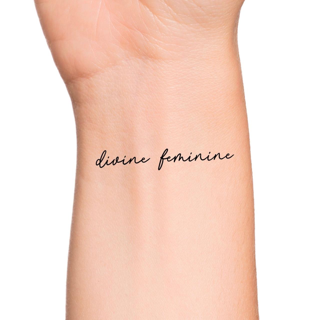
Source: etsystatic.com
Choosing the right font for a cursive tattoo is crucial; it dictates the overall aesthetic and how well the design ages. The perfect font will reflect your personality and the message you want to convey, remaining beautiful and legible for years to come. Many factors influence font selection, including stroke thickness, letterform elegance, and overall readability.
Below, we’ll explore some popular font choices and how they translate into stunning tattoo designs. Remember, always work closely with a skilled tattoo artist to ensure your vision is realized flawlessly.
Popular Feminine Cursive Tattoo Fonts
This table showcases ten popular fonts frequently chosen for feminine cursive tattoos, along with their characteristics and suitability. The “Example Image Description” column offers a visual representation to help you imagine the font’s application in a tattoo context.
| Font Name | Style Characteristics | Suitability for Tattoos | Example Image Description |
|---|---|---|---|
| Edwardian Script ITC | Elegant, flowing, slightly ornate | Medium-thick strokes; works well for larger pieces | A flowing script rendering of a name, perhaps “Eleanor,” with graceful swirls at the beginning and end of the name, the letters slightly elongated and connected for a smooth, elegant look. |
| Script MT Bold | Classic, bold, easily readable | Thick strokes; ideal for smaller text or bold statements | The word “Hope” rendered in bold, slightly condensed letters. The letters are clearly defined, making it easily readable from a distance. |
| Lucida Handwriting | Casual, friendly, slightly informal | Medium strokes; versatile for various text lengths | A quote, “Live your dreams,” written in a relaxed, slightly informal cursive, with a natural, handwritten feel. |
| Bradley Hand ITC | Informal, whimsical, slightly uneven strokes | Variable stroke thickness; best for shorter phrases | A short, playful quote like “Be happy,” with varying stroke weights giving it a handcrafted, artistic feel. |
| Mistral | Playful, romantic, slightly rounded letters | Medium-thin strokes; suitable for names or short quotes | The name “Isabelle” written in a charming, slightly rounded cursive, with delicate connections between the letters. |
| Segoe Script | Modern, elegant, clean lines | Medium strokes; good readability even in smaller sizes | A simple yet elegant rendering of a date, perhaps an anniversary, with clean lines and a modern feel. |
| Curlz MT | Ornate, highly decorative, flowing script | Thin to medium strokes; suitable for names or short words | The name “Amelia” written in a highly decorative cursive, with elaborate flourishes and swirls adding to its ornate appeal. |
| Monotype Corsiva | Classic, elegant, slightly italicized | Medium strokes; versatile for various design elements | A quote, “Follow your heart,” written in a sophisticated cursive, with a classic and elegant feel. |
| Ravie | Playful, whimsical, informal | Variable stroke thickness; best suited for short words | The word “Love” written in a bouncy, cheerful script, with a fun, slightly uneven appearance. |
| Bell MT | Classic, elegant, slightly condensed | Medium strokes; suitable for names or short quotes | A name, perhaps “Grace,” written in a classic cursive, with slightly condensed letters giving it a refined and elegant look. |
Tattoo Design Concepts Using Feminine Cursive Fonts
Here are three tattoo design concepts, each utilizing a different font to showcase the versatility of cursive styles.
Design 1: Using Edwardian Script ITC, a flowing name like “Victoria” would be elegantly rendered, perhaps incorporating a delicate floral element intertwined with the letters. The flowing nature of the font lends itself to graceful curves and embellishments, creating a sophisticated and romantic design.
Design 2: Script MT Bold‘s bold strokes would be perfect for a powerful quote like “She believed she could, so she did.” The bold letters ensure readability, while the cursive style maintains a feminine touch. The quote could be centered, with a simple border for added definition.
Design 3: For a more whimsical design, Lucida Handwriting could be used to create a charming tattoo of a loved one’s name and birthdate. The casual feel of the font allows for a slightly imperfect, more personal touch, representing a cherished memory.
So you’re obsessed with finding the perfect top feminine cursive tattoo fonts, right? I get it – the right script can make all the difference! To really nail that perfect design, though, you might want to check out some tutorials, and for that, I’ve found a great resource on getting it on with YouTube – seriously helpful for visual artists! Once you’ve got your YouTube skills up, you can find even more amazing font inspiration for your next tattoo.
Font Adaptation for Different Tattoo Elements
The versatility of cursive fonts allows for adaptation across various tattoo elements. Names often benefit from elegant, flowing scripts like Edwardian Script ITC or Mistral, showcasing their beauty. Quotes can utilize bolder fonts like Script MT Bold for impact or more delicate fonts like Lucida Handwriting for a softer feel. Symbols, such as hearts or flowers, can be seamlessly incorporated into the flowing curves of the lettering, creating a cohesive and visually appealing design.
Font Size and Placement Considerations for Tattoos: Top Feminine Cursive Tattoo Fonts
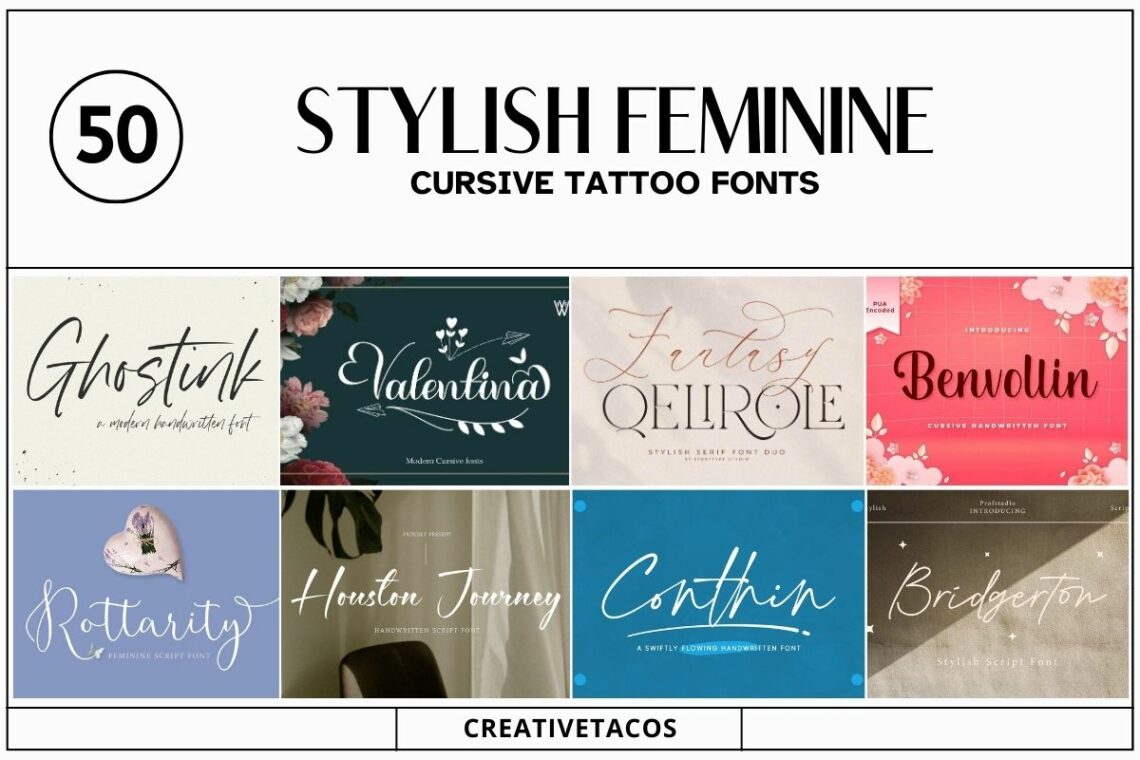
Source: creativetacos.com
Choosing the right font size and placement for your cursive tattoo is crucial for achieving a visually appealing and readable result. A poorly sized or placed tattoo can diminish the overall aesthetic, while a well-considered design can elevate it. This section will explore the interplay between font size, body location, and text length to help you make informed decisions.Font Size and ReadabilityThe size of your font directly impacts readability and the overall impact of your tattoo.
Smaller fonts, while delicate, can become illegible over time due to skin changes and fading. Larger fonts, conversely, might overwhelm a smaller area or appear disproportionate on the body. Finding the right balance depends on several factors, including the length of the text, the intricacy of the font, and the chosen body location. For example, a short quote on the wrist might look beautiful in a smaller size, whereas a longer poem on the back might require a larger font for optimal readability.Placement and Aesthetic ImpactThe placement of a cursive tattoo significantly influences its aesthetic appeal.
Cursive lends itself well to flowing designs, so body parts that allow for this are ideal. For example, a flowing script along the spine or ribcage can create an elegant, continuous line. A smaller, more delicate script might suit the inner wrist or ankle, emphasizing its intimacy and subtlety. Conversely, a bold, larger cursive tattoo on the forearm or thigh can make a powerful statement.
The curves and loops of cursive can be beautifully accentuated by the natural contours of the body. Consider how the placement enhances or complements the style of the lettering. A tightly curled script might look cramped on a broad surface, while a sprawling script might feel lost on a small area.Font Size, Body Placement, and Text Length ConsiderationsThe following table compares three different font sizes and their suitability for different body parts and text lengths.
Keep in mind that these are general guidelines; individual preferences and the specific font used will influence the final outcome. Also, the age and elasticity of your skin will affect how the tattoo ages, so choosing a larger size might be beneficial for longevity of readability.
| Font Size | Body Placement | Text Length | Readability |
|---|---|---|---|
| Small (under 1 inch tall) | Inner wrist, ankle, behind the ear | Short words or phrases (1-5 words) | Can be difficult to read over time; best for very short, delicate designs. |
| Medium (1-2 inches tall) | Forearm, ribcage, collarbone, shoulder blade | Short to medium-length phrases or quotes (5-20 words) | Generally good readability, suitable for a variety of text lengths and body placements. |
| Large (over 2 inches tall) | Back, thigh, chest, calf | Longer quotes, poems, or names (20+ words) | Excellent readability, but may not be suitable for all body parts or styles. |
Illustrative Examples of Feminine Cursive Tattoo Designs
Choosing the right font and design for a feminine cursive tattoo is a deeply personal process. It’s about finding a style that reflects your personality and resonates with your aesthetic sensibilities. The examples below showcase different approaches to achieving a beautiful and meaningful cursive tattoo.
Three Original Feminine Cursive Tattoo Concepts
These three concepts illustrate the versatility of feminine cursive fonts and the possibilities when combined with other artistic elements.
Concept 1: “Wildflower Script” This design features a flowing script font reminiscent of Edwardian calligraphy, slightly embellished with delicate flourishes. The font itself is a deep teal, chosen for its calming and sophisticated feel. The words “wildflower heart” are inked in this script, encircling a small, detailed watercolor painting of a poppy, rendered in shades of crimson, orange, and deep green.
The shading on the poppy utilizes a wet-on-wet watercolor technique, creating soft, diffused edges. The teal script is shaded subtly using a lighter teal, providing depth without overpowering the floral element. The overall style is romantic and whimsical.
Concept 2: “Geometric Grace” This tattoo utilizes a more modern, minimalist cursive font with clean lines and subtle curves. The font is a classic serif style, reminiscent of elegant typography, but with a slightly thinner stroke weight than traditional serif fonts. It’s inked in a deep, matte black, allowing for crisp, sharp lines. The words “serenity now” are inscribed, arranged within a geometric frame composed of thin, intersecting lines.
The frame itself is shaded using a very light grey wash, adding a touch of subtle texture without distracting from the script. The overall style is sophisticated and understated.
Concept 3: “Celestial Script” This design features a flowing, italicized cursive font, almost resembling a hand-drawn script. The font, a soft, dusty rose color, is combined with a constellation-inspired design. The words “follow your star” are written in the cursive, and a small constellation, depicted using tiny, precisely placed dots of shimmering gold ink, is subtly incorporated within the lettering. The shading in this design is minimal, relying on the contrast between the rose and gold to create depth.
The overall style is ethereal and dreamy.
Five Existing Feminine Cursive Tattoo Designs
Analyzing existing tattoos provides valuable insight into successful and less successful design choices.
Design 1: A quote in a classic Spencerian script. Strength: elegant and timeless font choice. Weakness: poor execution led to uneven line weight and slightly blurred lettering.
Design 2: “Believe” in a thin, italicized font with delicate flourishes. Strength: the simplicity and delicate nature perfectly capture the sentiment. Weakness: the thin lines might not age well over time.
Design 3: A name in a bold, rounded cursive font. Strength: strong and legible, good for larger-scale tattoos. Weakness: the boldness might feel overwhelming in a smaller scale.
Design 4: A short poem in a flowing, almost script-like font. Strength: creative use of negative space within the design. Weakness: the style is very intricate, and any imperfections would be highly visible.
Design 5: A single word (“Love”) in a highly decorative, Art Nouveau-inspired font. Strength: unique and visually striking. Weakness: the extreme detail might be difficult to maintain over time.
Color and Shading Techniques in Feminine Cursive Tattoos, Top feminine cursive tattoo fonts
Color and shading play a crucial role in the overall aesthetic of feminine cursive tattoos. A simple black ink tattoo can exude elegance, while the addition of color can add depth, personality, and a wider range of stylistic possibilities.
Subtle shading techniques, like stippling or light washes, can add dimension and texture to the letters without overwhelming the design. Conversely, bold shading can create a dramatic and eye-catching effect. Color choices often reflect the overall mood or theme of the tattoo. Muted tones like pastels or deep jewel tones can create a sophisticated and refined look, while brighter, bolder colors can express vibrancy and energy.
For instance, a tattoo with a soft watercolor effect using pastel shades would project a different feeling than a tattoo using bold, saturated colors like crimson and gold. The skillful use of color and shading transforms a simple cursive script into a truly unique and expressive work of art.
Factors Affecting Tattoo Font Choice
Choosing the perfect font for your cursive tattoo is a deeply personal decision, impacting not only the aesthetic appeal but also the longevity and overall meaning of your body art. Several crucial factors must be considered to ensure your tattoo looks its best for years to come and truly reflects your unique style.
Skin Tone and Body Location
Your skin tone and the placement of the tattoo significantly influence font visibility and how it ages. Lighter skin tones generally show finer details more clearly, allowing for more intricate cursive fonts. Darker skin tones may benefit from bolder, slightly simpler fonts to ensure readability and prevent the details from fading into the skin. Similarly, areas prone to stretching or movement, such as the inner wrist or ankle, may require a sturdier, less delicate font to withstand distortion over time.
A delicate script on a frequently moving body part might blur sooner than a bolder font on a less active area. Consider the natural contours of your chosen body location; a flowing script might look better on a curved surface like the ribcage, while a more structured font might suit a flatter area like the forearm.
Personal Style and Personality
The chosen font should resonate with your individual style and personality. A playful, whimsical script might suit someone with a lighthearted and free-spirited nature, perhaps resembling a font like a stylized “Brush Script MT.” In contrast, a more elegant and refined script, such as a font inspired by classic calligraphy, might be preferred by someone who values sophistication and timeless beauty.
A bold, strong cursive could reflect a confident and assertive personality, while a delicate, flowing script might represent a gentle and artistic spirit. The font acts as a visual representation of your inner self, so selecting one that aligns with your personality is key to long-term satisfaction.
Long-Term Implications of Font Choice
The appearance of a tattoo changes over time due to natural skin aging and exposure to the elements. Sun exposure, for example, can cause fading and blurring, particularly in lighter ink colors. Therefore, selecting a font that is relatively simple and bold will help maintain its readability and aesthetic appeal over the years. Intricate details in a delicate script might lose their definition more quickly than a bolder, more straightforward font.
Skin elasticity also decreases with age, potentially causing stretching and distortion in certain body areas. Choosing a font that is less susceptible to distortion from stretching is crucial for maintaining the tattoo’s integrity. For instance, a thicker stroke weight would be less affected by stretching compared to a thin, delicate script. Regular care, including sun protection and proper hydration, can help minimize these effects, but choosing a font wisely from the start is a proactive step towards preserving the tattoo’s quality.
Final Review
Ultimately, the perfect feminine cursive tattoo font is a deeply personal choice. It’s about finding a style that reflects your personality, complements your body, and stands the test of time. By carefully considering the factors we’ve discussed – from font characteristics and placement to long-term effects – you can confidently choose a font that results in a tattoo you’ll adore for a lifetime.
Remember, it’s a permanent decision, so take your time, do your research, and let your unique style shine through!
Commonly Asked Questions
What if I want a multi-word phrase? How does font size change?
For longer phrases, you’ll generally need a slightly smaller font size to maintain readability. Consider the overall space and adjust accordingly. A skilled tattoo artist can advise on the best size for your chosen phrase and body location.
How much does the artist’s skill affect the final look?
A skilled tattoo artist is crucial! Their expertise in linework, shading, and skin application will significantly impact the final result, regardless of the font you choose. Look for an artist with a strong portfolio of cursive tattoo work.
Can I bring my own font to the tattoo artist?
While you can certainly bring ideas and inspiration, most tattoo artists prefer to work with fonts they’re familiar with and can adapt for the skin. They’ll often have a selection of fonts they can recommend or help you modify.
How do I maintain my cursive tattoo’s appearance over time?
Proper aftercare is key! Follow your artist’s instructions carefully. Using sunscreen and moisturizing lotions will help maintain the vibrancy and clarity of your tattoo for longer.