Types of Business Logo How to Choose
Types of business logo how to choose? Picking the perfect logo for your business feels overwhelming, right? It’s more than just a pretty picture; it’s the visual representation of your brand, the first impression you make on potential customers. This guide dives deep into the world of logo design, exploring different types, helping you understand what works best for your unique brand identity, and ultimately guiding you through the process of selecting a logo that truly resonates.
We’ll cover everything from abstract logos and mascots to emblems and wordmarks, explaining the pros and cons of each style. We’ll also delve into the crucial elements of logo design – color psychology, typography, and imagery – and how these elements contribute to a memorable and effective brand identity. Get ready to learn how to choose a logo that not only looks great but also powerfully communicates your brand message!
Understanding Logo Types
Choosing the right logo is crucial for your brand’s success. A well-designed logo communicates your brand’s identity, values, and personality at a glance. Understanding the different types of logos available allows you to make an informed decision that best reflects your business and target audience. This will help you create a lasting impression and build brand recognition.
Logo Type Categories
Several key categories of business logos exist, each with its own strengths and weaknesses. Selecting the appropriate type depends heavily on your brand’s personality, industry, and target market. A careful consideration of these factors will lead to a more effective and impactful logo design.
Abstract Logos
Abstract logos use abstract shapes, symbols, and colors to represent a brand. They are versatile and memorable, often conveying a modern and sophisticated image. They are less literal than other logo types, allowing for more creative interpretation.
| Logo Type | Description | Industry Examples | Visual Characteristics |
|---|---|---|---|
| Abstract | Uses abstract shapes, symbols, and colors to represent a brand. Often conveys a modern and sophisticated image. | Adidas (three stripes), Pepsi (globe), Twitter (bird) | Simple, clean lines; bold colors; unique shapes; symbolic representation rather than literal depiction. |
| Mascot Logos | Features a cartoon character or animal that embodies the brand’s personality. Often used to create a friendly and approachable image. | KFC (Colonel Sanders), the Michelin Man (Michelin Tires), Ronald McDonald (McDonald’s) | Illustrative style; often friendly and approachable; memorable character design; can be highly detailed or simple. |
| Emblem Logos | Combines a symbol or icon with text within a defined shape, often a badge or crest. Convey tradition, heritage, and authority. | Harley-Davidson (winged logo within a circular badge), Starbucks (siren within a circle), Lacoste (crocodile) | Classic and traditional design; often incorporates detailed elements; strong sense of history and legacy. |
| Wordmark Logos (Logotype) | Uses stylized text to represent the brand name. Focuses on typography and readability. | Google (its name), Coca-Cola (its name), Visa (its name) | Emphasis on typography; clear and legible font; memorable and recognizable lettering. |
Advantages and Disadvantages of Logo Types
Each logo type offers unique advantages and disadvantages, making the selection process critical. Consider the long-term implications of your choice, ensuring it remains relevant and effective across various applications and platforms.
Choosing the Right Logo Style for Your Brand

Source: harshdesigns.com
Your logo is more than just a pretty picture; it’s the visual cornerstone of your brand identity. It’s the first impression you make on potential customers, instantly communicating your brand’s personality, values, and the overall experience you offer. Choosing the right logo style is crucial for establishing a strong and memorable brand presence. A well-designed logo can significantly impact your brand’s success, while a poorly chosen one can hinder growth and confuse your target audience.A company’s brand identity and its logo style are intrinsically linked.
Your brand identity encompasses your mission, values, target audience, and the overall feeling you want to evoke. Your logo should seamlessly reflect these aspects, acting as a visual representation of your brand’s essence. Think of it as the face of your company – it needs to be both appealing and representative of your inner workings. Inconsistency between your brand identity and logo style will lead to a diluted brand message and confuse your customers.
Factors Influencing Logo Style Selection
Several key factors need careful consideration when selecting a logo style. Ignoring these can lead to a logo that fails to resonate with your target audience or accurately portray your brand. A thorough understanding of these factors ensures your logo effectively communicates your brand’s message and contributes to your overall marketing success.
- Target Audience: Consider your ideal customer’s demographics, interests, and preferences. A logo designed for a tech startup will differ vastly from one designed for a luxury jewelry brand. For example, a younger audience might respond better to a modern, minimalist logo, while an older demographic might prefer a more classic and established design.
- Industry: Different industries have established visual conventions. A law firm might benefit from a sophisticated and trustworthy logo, while a children’s toy company might opt for a playful and colorful design. Industry norms help create immediate recognition and understanding of your brand’s nature.
- Brand Personality: Your brand personality encompasses the human characteristics associated with your brand. Is it playful, serious, innovative, traditional, luxurious, or approachable? Your logo should embody these traits. A playful brand might use a whimsical font and vibrant colors, while a sophisticated brand might opt for a more elegant and minimalist approach.
- Business Goals: What are you hoping to achieve with your brand? Are you aiming for rapid growth, brand recognition, or a niche market? Your logo should support your overall business objectives. A logo designed for rapid expansion needs to be easily recognizable and adaptable across various platforms.
Comparison of Logo Styles and Their Brand Messages
Understanding how different logo styles convey specific brand messages is essential for making an informed choice. Each style has unique strengths and weaknesses, and the best choice depends on your specific brand needs and goals.
- Minimalist Logos: These logos use simple shapes, clean lines, and minimal color palettes. They convey sophistication, modernity, and timelessness. Think of the Apple logo – simple, iconic, and instantly recognizable.
- Vintage Logos: These logos often feature distressed textures, vintage fonts, and muted color palettes. They evoke a sense of nostalgia, tradition, and craftsmanship. Think of a coffee shop logo featuring a retro design and a classic serif font.
- Modern Logos: These logos typically incorporate geometric shapes, bold colors, and clean typography. They communicate innovation, technology, and forward-thinking. Many tech startups utilize this style to project a sense of cutting-edge innovation.
- Classic Logos: These logos often feature traditional typography, symmetrical designs, and established color palettes. They convey stability, reliability, and trustworthiness. Many financial institutions and law firms use this style to project a sense of authority and security.
Logo Design Elements and Their Impact
A logo’s effectiveness hinges not just on its overall concept but also on the careful selection and integration of its constituent elements. Color, typography, and imagery all play crucial roles in shaping a brand’s identity and communicating its message to the target audience. Understanding how these elements interact is key to creating a truly memorable and impactful logo.
Color Psychology in Logo Design
Color psychology is the study of how colors affect human behavior and emotions. In logo design, color choices are far from arbitrary; they directly influence how viewers perceive a brand. Strategic color selection can evoke specific feelings, build brand associations, and ultimately drive consumer behavior. A well-chosen color palette can instantly communicate a brand’s personality and values, making it instantly recognizable and memorable.
Consider the difference between the calming blues of a spa logo and the energetic reds of a sports brand – the colors themselves communicate core aspects of the brand’s identity.
| Color | Associations | Emotional Impact |
|---|---|---|
| Red | Energy, passion, excitement, urgency | Stimulating, exciting, sometimes aggressive |
| Blue | Trust, stability, calmness, security | Relaxing, trustworthy, dependable |
| Green | Nature, growth, health, freshness | Peaceful, refreshing, environmentally conscious |
| Yellow | Happiness, optimism, creativity, warmth | Cheerful, playful, attention-grabbing |
| Purple | Luxury, royalty, creativity, wisdom | Sophisticated, regal, mysterious |
| Black | Power, sophistication, elegance, mystery | Authoritative, sleek, sometimes ominous |
| White | Purity, simplicity, cleanliness, peace | Clean, minimalist, modern |
Typography in Logo Design
The font, or typeface, chosen for a logo significantly impacts its overall aesthetic and message. Different font styles convey different moods and personalities. A serif font like Times New Roman often suggests tradition and reliability, while a sans-serif font like Helvetica conveys modernity and minimalism. The weight (boldness), size, and spacing of the typeface also play crucial roles in readability and visual appeal.
For instance, a bold, uppercase font might project strength and confidence, while a delicate, lowercase script font could suggest elegance and femininity. The choice of typography should always align with the brand’s identity and target audience.For example, Coca-Cola’s iconic Spencerian script font conveys a sense of classic charm and tradition, while the geometric sans-serif font used by Google reflects its modern and tech-savvy image.
Imagery and Symbolism in Logo Design
Imagery and symbolism in logo design allow for a deeper level of communication, transcending mere words. A well-chosen image or symbol can instantly convey a brand’s core values, mission, or even its products or services. Think of the Apple logo, a simple yet powerful symbol that represents innovation, simplicity, and user-friendliness. Similarly, the Nike swoosh represents speed, movement, and athleticism.
The use of symbolism can add layers of meaning and memorability to a logo, creating a lasting impression on viewers. Effective symbolic representations should be easily understood and relevant to the brand’s identity. Overly complex or obscure symbols may confuse rather than engage the audience.
Practical Steps in Logo Selection
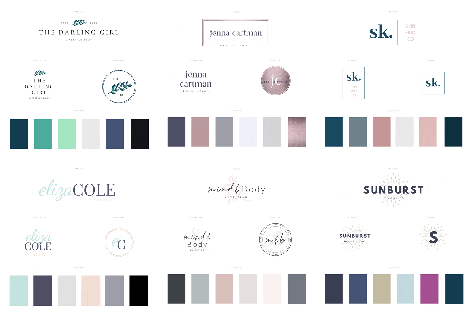
Source: ladybossstudio.com
Choosing the right logo is a crucial step in building a strong brand identity. It’s more than just a pretty picture; it’s the visual representation of your company’s values, mission, and personality. This process requires careful planning and consideration to ensure the final product resonates with your target audience and effectively communicates your brand message. A well-executed logo design process leads to a logo that’s memorable, versatile, and timeless.
Selecting a logo involves a strategic approach, moving through several key phases from initial brainstorming to final design review. Each step is vital in ensuring the logo effectively represents your brand and meets your business objectives. This systematic process helps avoid costly mistakes and ensures a logo that’s both aesthetically pleasing and strategically sound.
Brainstorming and Initial Concepts
The initial phase involves generating a wide range of ideas. This isn’t about creating perfect designs yet; it’s about exploring possibilities. Consider your brand’s personality, target audience, and industry. Think about s associated with your brand. What images or symbols immediately come to mind?
Sketch out rough ideas, even if they seem imperfect. The goal is to generate a diverse pool of concepts to refine later.
Market Research and Competitor Analysis
Thorough research is critical. Analyze your competitors’ logos to understand existing trends and identify opportunities for differentiation. Examine successful logos in your industry and note what elements contribute to their effectiveness. Research your target audience’s preferences through surveys or focus groups to gauge their response to different design styles and concepts. This data-driven approach helps ensure your logo resonates with your intended market.
Logo Design and Refinement
Based on your brainstorming and research, begin developing more refined logo concepts. Experiment with different typography, color palettes, and imagery. Consider the scalability of your logo – how will it look on a business card versus a billboard? Seek feedback from colleagues, potential clients, and design professionals. Iterative refinement is key to achieving a polished and impactful design.
This phase often involves multiple revisions and adjustments to ensure the final product is visually appealing and strategically effective.
Design Review and Finalization
Before finalizing your logo, conduct a comprehensive review. Ensure your logo is versatile enough for various applications (website, social media, print materials). Test its readability and memorability. Confirm that it aligns with your brand guidelines and overall marketing strategy. Obtain legal clearance to ensure your logo doesn’t infringe on any existing trademarks.
This thorough check prevents potential issues down the line.
Checklist of Key Questions
Before committing to a final logo design, a comprehensive checklist helps ensure you haven’t overlooked crucial aspects. Addressing these questions ensures a logo that’s both aesthetically pleasing and strategically sound.
- Does the logo accurately reflect our brand values and mission?
- Is the logo memorable and easily recognizable?
- Is the logo versatile and scalable across various platforms?
- Is the logo legally sound and free from trademark infringement?
- Does the logo resonate with our target audience?
- Is the logo simple, clean, and timeless in its design?
- Have we received sufficient feedback from internal and external stakeholders?
- Does the logo effectively communicate our unique selling proposition?
Logo Selection Flowchart
A flowchart visually represents the decision-making process involved in logo selection. It ensures a structured and logical approach, minimizing the risk of overlooking crucial steps.
Imagine a flowchart starting with “Brainstorming & Initial Concepts”. This leads to “Market Research & Competitor Analysis”. The results feed into “Logo Design & Refinement”, followed by “Design Review & Finalization”. A “Yes” answer to “Does the logo meet all requirements?” leads to “Logo Approval & Implementation”. A “No” answer loops back to “Logo Design & Refinement” for further iterations.
This cyclical process ensures thorough evaluation and refinement before final approval.
Choosing the right business logo is crucial; you need to consider your brand’s personality and target audience when deciding between a minimalist logo, a mascot, or an abstract design. But getting your brand noticed also requires a strong online presence, which is why I recommend checking out this awesome guide on getting it on with youtube to boost your visibility.
Once you’ve nailed your YouTube strategy, your perfectly chosen logo will shine even brighter across all your platforms.
Logo Usage and Maintenance
Your logo is more than just a pretty picture; it’s the visual embodiment of your brand. Consistent and correct usage across all platforms is crucial for building brand recognition and trust. Ignoring this aspect can lead to a diluted brand image and confusion among your target audience. Proper maintenance ensures your logo remains relevant and effective over time.Maintaining brand consistency in logo usage is paramount for building a strong brand identity.
Inconsistent application of your logo can lead to a fragmented and unprofessional image, undermining your marketing efforts and confusing your customers. A unified visual presence across all platforms strengthens brand recall and reinforces your message.
Best Practices for Logo Usage, Types of business logo how to choose
Maintaining a consistent brand image requires careful consideration of how your logo is used across different mediums. Inconsistency can lead to a diluted brand identity and confuse your target audience. This section details best practices for achieving visual harmony. Your logo should always be presented clearly and professionally, reflecting the quality and values of your brand.
- Website: Use your logo prominently on your website’s header, footer, and potentially other key areas. Ensure the logo is high-resolution and correctly sized for optimal display on various devices (desktops, tablets, and smartphones). Maintain consistent spacing and placement across all pages.
- Social Media: Use your logo as your profile picture and cover image on all social media platforms. Maintain a consistent style and color scheme across all profiles. Ensure the logo is appropriately sized for each platform’s guidelines.
- Print Materials: When using your logo in print, such as brochures, business cards, and letterheads, use high-resolution vector files to ensure crisp and clear reproduction. Maintain consistent color accuracy and ensure sufficient spacing around the logo to prevent it from appearing cramped.
- Email Signatures: Incorporate your logo into your email signature for a professional touch. Ensure the logo is appropriately sized and does not disrupt the readability of your email content.
- Merchandise: If you use your logo on merchandise, ensure the reproduction quality is high and the logo is clearly visible. This reinforces your brand presence in a tangible way.
Logo Revision and Updating
A logo, while designed to be enduring, may require updates over time to reflect changes in your brand, market trends, or simply to maintain a fresh and modern aesthetic. However, these updates should be approached carefully and strategically to avoid alienating your established customer base. The process should be gradual and maintain a visual connection to the original design.
- Assess the Need for Revision: Begin by critically evaluating your current logo. Is it outdated? Does it accurately reflect your brand’s current values and target audience? Are there any technical limitations preventing optimal use across platforms?
- Define Objectives: Clearly articulate the goals for the logo update. Are you aiming for a more modern look? Increased brand recognition? Improved versatility across different applications?
- Research and Brainstorm: Explore current design trends and gather inspiration from competitors and successful brands in your industry. Brainstorm potential design directions while staying true to your brand’s core identity.
- Develop Design Concepts: Create several design concepts that address the identified objectives. Seek feedback from your team and target audience to gauge reactions and preferences.
- Select and Refine: Choose the most effective design concept and refine it based on feedback. Ensure the updated logo maintains a consistent visual identity with your previous logo, allowing for a smooth transition.
- Implement and Test: Roll out the updated logo across all platforms. Monitor customer feedback and make any necessary adjustments to ensure the logo effectively communicates your brand’s message.
Illustrative Examples of Successful Logo Choices

Source: co.uk
Choosing the right logo is crucial for brand success. A well-designed logo instantly communicates a company’s values, personality, and target audience. Let’s examine three successful logos to understand how design elements contribute to brand recognition and memorability. These examples showcase the power of thoughtful design in creating lasting impressions.
Apple Logo
The Apple logo, featuring a stylized, bitten apple, is arguably one of the most recognizable logos globally. Its simplicity is its strength.
The logo’s design is incredibly minimalist. The monochromatic color palette, primarily using a silver or occasionally a rainbow-colored gradient, is sophisticated and timeless. The sans-serif typeface used in conjunction with the logo is clean and modern, reflecting Apple’s focus on sleek technology. The bitten apple itself is a simple yet intriguing image, sparking curiosity and interpretation. The choice of a fruit, surprisingly, suggests approachability and a natural, user-friendly feel, contrasting with the often complex technology it represents.
The logo’s effectiveness stems from its memorable simplicity and consistent application across all Apple products and marketing materials. This consistency reinforces brand recognition and builds a strong association between the logo and the brand’s high-quality, innovative products.
Nike Logo
The Nike swoosh, a simple curved checkmark, is a powerful example of a logo that transcends its visual simplicity.
The logo’s minimalist design is immediately recognizable. The color palette traditionally uses a bold, vibrant crimson red (often referred to as “Nike Red”), representing energy, passion, and movement. No typography is directly integrated with the swoosh itself; the brand name is usually placed separately, allowing the iconic swoosh to stand alone as a powerful visual identifier. The swoosh’s dynamic curve suggests speed, motion, and athleticism, perfectly aligning with Nike’s brand identity as a leading sportswear company.
Its memorability is unparalleled, and it transcends cultural and linguistic barriers, instantly conveying the brand’s essence. The simple, yet powerful, design is highly versatile, working effectively across various mediums and sizes.
Coca-Cola Logo
The Coca-Cola logo, with its distinctive Spencerian script, is a classic example of a logo that has stood the test of time.
The logo’s Spencerian script is elegant and timeless, conveying a sense of history and tradition. The color palette, predominantly using a deep red, white, and black, is bold and instantly recognizable. The red color evokes feelings of excitement and energy, while the white and black provide a clean contrast that makes the script stand out. The specific script typeface is unique and highly stylized, instantly connecting with consumers on an emotional level.
The logo’s enduring success lies in its consistent application and strong brand association. It has remained largely unchanged for over a century, reinforcing its iconic status and creating a strong emotional connection with consumers. The consistent visual identity across packaging, advertising, and other marketing materials has ensured the logo’s enduring memorability and global recognition.
Ending Remarks
Creating a successful business logo is a journey, not a race. By carefully considering your brand identity, target audience, and industry, and by understanding the nuances of logo design, you can create a visual identity that resonates with your customers and sets your business apart. Remember, your logo is more than just a symbol; it’s a powerful tool for building brand recognition and driving business success.
So take your time, explore the options, and choose a logo that truly reflects the heart and soul of your brand. Happy designing!
FAQ Overview: Types Of Business Logo How To Choose
What if I can’t decide between two logo designs?
Get feedback! Show both designs to your target audience and see which one resonates more. Consider A/B testing different versions on your website or social media.
How much should I pay for a logo design?
Prices vary widely depending on the designer’s experience and the complexity of the design. Expect to invest a reasonable amount – a well-designed logo is a long-term investment in your brand.
How often should I update my logo?
Generally, logos don’t need frequent updates. However, if your brand undergoes a significant change or your target audience shifts drastically, a logo refresh might be necessary.
Can I design my own logo?
You can try, but professional designers possess the skills and experience to create a logo that is both aesthetically pleasing and strategically effective. Consider your budget and time constraints.


