Typography in Branding Design Shaping Brand Identity
Typography in branding design isn’t just about choosing pretty fonts; it’s the backbone of a brand’s personality and communication. The right typeface can instantly convey sophistication, playfulness, or trustworthiness, shaping how customers perceive your brand. From the subtle curves of a serif font to the clean lines of a sans-serif, every typographic choice contributes to a cohesive brand identity, influencing everything from logo design to website readability.
This exploration delves into how typography impacts brand recognition, communication, and overall aesthetic, offering insights into creating a visually consistent and memorable brand experience.
We’ll explore the different typeface classifications and their impact on brand personality, demonstrating how brands like Coca-Cola and Apple effectively leverage typography to communicate their core values. We’ll also cover the crucial role of typographic hierarchy in guiding the reader’s eye and ensuring clear communication across various brand applications, from print materials to digital platforms. Finally, we’ll discuss maintaining typographic consistency across all brand touchpoints to create a unified and professional image.
The Role of Typography in Brand Identity: Typography In Branding Design
Source: medium.com
Typography is far more than just choosing pretty fonts; it’s a fundamental element in crafting a brand’s visual identity and communicating its core values. A well-chosen typeface can instantly convey a brand’s personality, influencing how consumers perceive and interact with it. The right typography can build trust, evoke emotion, and ultimately, drive brand recognition and memorability. Conversely, poor typography choices can undermine a brand’s message, leaving a negative and unprofessional impression.
Typefaces and Brand Personality
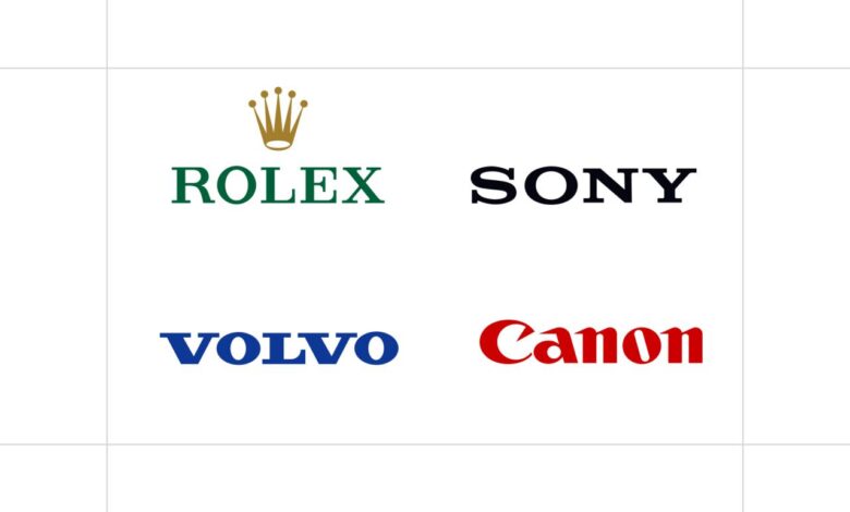
Different typeface classifications contribute significantly to establishing a brand’s personality. Serif typefaces, characterized by small decorative strokes at the ends of letters, often project a sense of tradition, sophistication, and authority. Sans-serif typefaces, lacking these strokes, tend to feel modern, clean, and minimalist. Script typefaces, mimicking handwriting, evoke feelings of elegance, personality, and sometimes even playfulness. Other classifications, like display typefaces, offer a wide range of stylistic options to create strong visual impact and convey specific moods.
The careful selection and application of these typefaces are crucial for aligning the visual language with the brand’s desired image.
Examples of Successful Typography in Branding
Many brands successfully leverage typography to communicate their core values. The following table illustrates how different typefaces contribute to distinct brand personalities:
| Brand Name | Typeface Used (or Style) | Brand Personality | Justification for Typeface Choice |
|---|---|---|---|
| Coca-Cola | Spencerian Script (a variation) | Classic, playful, optimistic | The flowing script evokes a sense of nostalgia and happiness, aligning with the brand’s long history and cheerful image. The specific design is instantly recognizable. |
| Product Sans (custom sans-serif) | Modern, clean, approachable | The custom sans-serif typeface is clean, legible, and easily scalable across various platforms, reflecting Google’s focus on simplicity and accessibility. | |
| Times | Times New Roman (serif) | Traditional, authoritative, trustworthy | The classic serif typeface conveys a sense of authority and reliability, fitting the image of a long-established and reputable newspaper. |
| Netflix | Netflix Sans (custom sans-serif) | Modern, bold, friendly | The custom sans-serif typeface is clean and modern, reflecting Netflix’s position in the entertainment industry, while the weight and style also communicate friendliness. |
Typography’s Impact on Brand Recognition and Memorability
Effective typography significantly impacts brand recognition and memorability. A unique and well-executed typeface can become a key visual identifier, instantly connecting consumers with the brand. Think of the instantly recognizable Coca-Cola script or the distinctive Google logo font. These typefaces aren’t just visually appealing; they’re integral parts of the brand’s identity, contributing significantly to their lasting impression on the consumer’s mind.
Consistent use of the brand’s typography across all platforms further reinforces this recognition and strengthens brand recall. Conversely, inconsistent or poorly chosen typography can lead to confusion and dilute brand identity, making it harder for consumers to remember and connect with the brand.
Typography and Brand Communication
Typography is more than just pretty letters; it’s a powerful tool that shapes how your brand is perceived and understood. The fonts you choose, their size, weight, and spacing, all contribute to the overall brand experience, influencing everything from initial impressions to long-term customer loyalty. A well-chosen typeface can enhance readability, convey a specific brand personality, and ultimately, drive engagement.
Conversely, poor typography choices can lead to confusion, frustration, and a damaged brand image.Typography choices significantly impact readability and user experience across various brand applications. On a website, for example, clear and legible typography ensures easy navigation and information absorption. A poorly chosen font can strain the eyes, making the website difficult to use and potentially driving users away.
Similarly, on packaging, typography needs to be easily readable from a distance, conveying essential product information clearly and concisely. A logo, meanwhile, relies heavily on typography to establish visual identity and memorability; a strong, well-designed typeface can make a logo instantly recognizable and memorable.
Choosing the right typography is crucial for any brand; it sets the tone and personality. This is especially true when you’re expanding your reach, like building a strong YouTube presence. For tips on maximizing your YouTube impact, check out this awesome guide on getting it on with youtube , then remember to carry that consistent brand voice, including your chosen fonts, over to your channel design for a cohesive brand experience.
Typography in Different Brand Applications
The impact of typography varies depending on the medium. On a website, the focus is often on web-safe fonts that are easily rendered across different browsers and devices. Legibility is paramount, and designers often use a combination of fonts – a clear, sans-serif font for body text and a more distinctive serif or display font for headings – to create visual hierarchy and improve readability.
In contrast, print media allows for a wider range of typographic possibilities, with more specialized fonts and printing techniques often employed to achieve specific aesthetic effects. Packaging design, like website design, prioritizes readability, but also considers the physical limitations of the space and the need to communicate concisely. Logos often utilize custom-designed typefaces or carefully selected existing ones to convey the brand’s unique personality and message.
Typography in Print Versus Digital Media
Print and digital media present distinct challenges for typographic design. Print allows for finer control over detail and color reproduction, enabling the use of more intricate typefaces and sophisticated printing techniques. However, print design is often more static, less adaptable to different screen sizes and resolutions. Digital design, on the other hand, must be responsive and adaptable to various screen sizes and devices.
Web-safe fonts are crucial for ensuring consistent rendering across different platforms, and designers must consider factors like screen resolution, font rendering engines, and accessibility guidelines.
Hypothetical Logo Design: “Evergreen Organics”, Typography in branding design
Let’s imagine designing a logo for “Evergreen Organics,” a company specializing in sustainable and ethically sourced produce. For this brand, I would choose a custom variation of a serif typeface, specifically drawing inspiration from classic serif designs but with a modern, slightly rounded feel. The typeface would be slightly condensed, with a slightly higher x-height to improve readability even at smaller sizes.
The letterforms would be designed to feel natural and organic, with subtle variations in stroke weight to create a sense of hand-crafted quality. The logo itself would incorporate a simple, stylized leaf icon subtly integrated within the letter “E” of “Evergreen.” The color palette would be earthy greens and browns, complementing the organic theme. The overall effect would be a logo that is both sophisticated and approachable, conveying the brand’s commitment to quality, sustainability, and natural goodness.
The typeface choice, in particular, supports the overall design by emphasizing the brand’s sophisticated yet approachable nature. The slightly rounded, custom-designed serif adds a touch of elegance and timelessness, reflecting the enduring quality of the products, while the slightly condensed and slightly higher x-height ensures readability, which is critical for a brand focused on transparency and communication.
Typography and Brand Hierarchy
Effective brand communication relies heavily on a well-defined visual hierarchy. Typography plays a crucial role in establishing this hierarchy, guiding the reader’s eye and ensuring key messages are immediately understood. Without a clear typographic hierarchy, your brand messaging can become muddled and ineffective, leaving your audience confused and disengaged. A strong hierarchy ensures that the most important information is prominent, while supporting details are appropriately de-emphasized.
Typographic hierarchy uses visual cues like font size, weight (boldness), style (italic, uppercase), and spacing to create a clear visual order. This order dictates the importance of different elements within a design. Larger, bolder fonts naturally draw the eye first, communicating priority. Subheadings and body text are then sized and styled to complement the main message, ensuring a smooth and logical reading experience.
This isn’t just about aesthetics; it’s about clear and efficient communication of your brand’s message.
Demonstrating Typographic Hierarchy
The following example demonstrates how different typographic elements can be used to create a hierarchy. Notice how the size, weight, and style of the fonts guide the reader through the information.
-
Headline: Introducing Our New Product!
(Large, Bold, Sans-serif font)
-
Subheading: Experience Unparalleled Performance
(Smaller, Bold, Sans-serif font)
-
Body Text: Our revolutionary new product is designed to exceed your expectations. It combines cutting-edge technology with sleek design for a user experience unlike any other. Key features include enhanced speed, improved efficiency, and intuitive controls. Learn more and order yours today!
(Standard size, Regular weight, Serif font)
-
Call to Action: Shop Now
(Slightly larger than body text, Bold, Sans-serif font)
Best Practices for Consistent Typographic Hierarchy
Maintaining a consistent typographic hierarchy across all brand touchpoints is crucial for building a strong and recognizable brand identity. Inconsistency can confuse your audience and weaken your brand’s message. Here are some key best practices:
- Develop a Brand Typography System: Create a style guide that defines the fonts, sizes, weights, and styles to be used across all platforms (website, social media, print materials, etc.). This ensures consistency and a unified brand experience.
- Limit Font Choices: Using too many different fonts can create visual clutter and weaken your hierarchy. Stick to a maximum of two or three fonts that complement each other. One for headings, one for body text, and perhaps one for accents.
- Use White Space Effectively: Proper spacing between lines, paragraphs, and elements is essential for readability and hierarchy. Adequate white space prevents visual clutter and allows the eye to easily scan the information.
- Prioritize Readability: Ensure your chosen fonts are easily readable across different devices and sizes. Consider font legibility at smaller sizes, particularly for online use.
- Test and Refine: Regularly review your typographic hierarchy to ensure it remains effective and aligns with your brand’s evolving needs. Gather feedback from your target audience to identify areas for improvement.
Typography and Brand Aesthetics
Typography isn’t just about readability; it’s a fundamental building block of a brand’s visual identity, deeply intertwined with its overall aesthetic. The right typeface, combined with a carefully chosen color palette, can instantly communicate a brand’s personality, values, and target audience. A poorly chosen font, on the other hand, can undermine even the most carefully crafted brand strategy.The relationship between typography and color is symbiotic.
Color evokes emotion and sets the tone, while typography provides structure and personality. A bold, sans-serif typeface paired with vibrant colors might suggest a modern, energetic brand, while a classic serif font with muted earth tones could communicate sophistication and tradition. The interplay between these two elements is crucial in creating a cohesive and memorable brand aesthetic.
Typography’s Role in Visual Identity
A brand’s visual identity encompasses all the visual elements that contribute to its recognition and perception. This includes logo design, color palettes, imagery, and, critically, typography. Typography acts as a unifying element, weaving together the various visual components to create a consistent and memorable brand experience. Consider the iconic Coca-Cola logo: the Spencerian script is instantly recognizable and inextricably linked to the brand’s history and personality.
It’s not just the script itself, but the specific weight, spacing, and even the slight variations in the lettering that contribute to its unique appeal. Similarly, the clean, minimalist typography of Apple conveys its focus on simplicity and elegance. The choice of typeface is not arbitrary; it’s a deliberate decision that reflects the brand’s core values and target audience.
Mood Board: A Minimalist Tech Brand
Imagine a mood board dominated by a muted, almost monochromatic color palette. Think deep blues, charcoal grays, and accents of a soft, almost metallic silver. The typography is key: a clean, geometric sans-serif font like Futura or Helvetica Neue is used for headings and body copy, maintaining a consistent weight and spacing throughout. A slightly bolder version of the same typeface is used for the logo and key brand elements. The imagery is minimal and high-quality, focusing on clean lines and technological elements. The overall effect is one of sophistication, reliability, and modern innovation. The color palette reinforces the feeling of technological precision and stability, while the typography provides a sense of clarity and professionalism. The contrast between the dark background and light text ensures readability while maintaining a modern and sophisticated look. This is further enhanced by the use of negative space, avoiding clutter and reinforcing the sense of minimalism. The consistent use of the sans-serif typeface creates a cohesive and professional brand identity, emphasizing clarity and functionality.
Typography and Brand Consistency
Source: uxcel.com
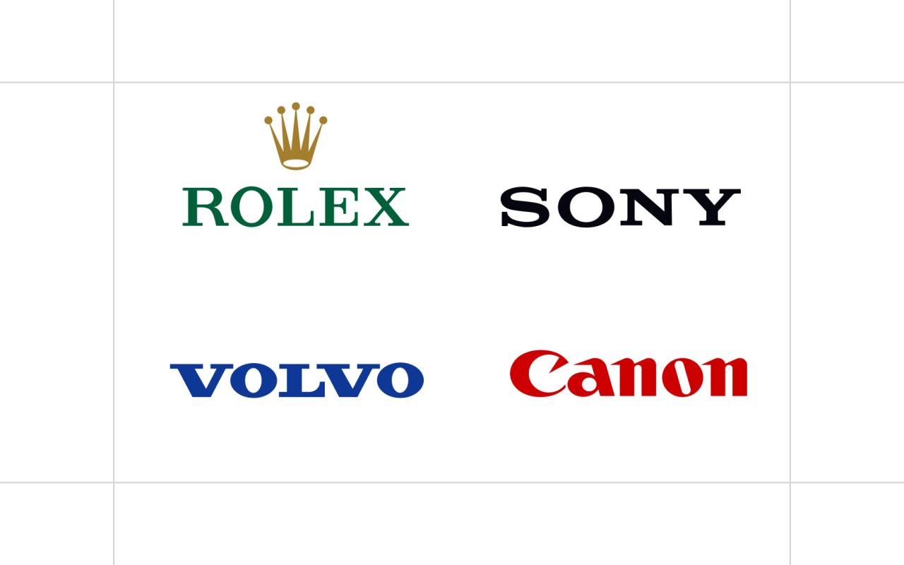
Maintaining a consistent typographic voice across all brand applications is crucial for building a strong and recognizable brand identity. Inconsistency, on the other hand, can dilute your message and confuse your audience, ultimately harming your brand’s credibility. A well-defined typography system ensures that your brand’s personality shines through, regardless of the platform or medium.Consistent typography creates a unified experience for your audience.
Whether they encounter your brand on a website, social media, or printed materials, the familiar fonts and styles reinforce brand recognition and build trust. This consistency extends beyond simply using the same fonts; it also encompasses consistent font sizes, weights, spacing, and overall visual hierarchy.
Maintaining Typographic Consistency Across Platforms
Achieving consistency requires careful planning and execution. A comprehensive brand style guide is essential. This document should clearly define the approved typefaces, their appropriate sizes and weights for different applications, and guidelines for spacing and kerning. For example, your primary headline font might be used consistently for all major headings across your website, social media posts, and printed brochures.
Similarly, body text should maintain the same font, size, and line height for a seamless reading experience. This requires meticulous attention to detail during the design and implementation phases. For instance, ensuring that the web developer uses the correct font embedding techniques and that the print designer adheres strictly to the style guide’s specifications.
Challenges of Using Multiple Typefaces
While a single typeface often provides the most consistent look and feel, using multiple typefaces can be advantageous for creating visual hierarchy and distinguishing different content sections. However, this introduces challenges. The key is to select typefaces that complement each other, sharing similar characteristics in terms of style and weight. For example, pairing a serif typeface like Garamond for body text with a sans-serif typeface like Helvetica for headings can create a balanced and sophisticated look.
However, using too many typefaces or choosing fonts that clash visually can lead to a chaotic and unprofessional appearance. Careful consideration of typeface pairings and their application within a clear hierarchy is essential to avoid this pitfall. It’s vital to establish clear rules in the style guide about which typeface should be used for what purpose, and to strictly adhere to those rules.
Example Brand Style Guide: “CoffeeCraft”
The following table Artikels a hypothetical style guide for a coffee brand named “CoffeeCraft.” This demonstrates how a brand can effectively define its typographic system for consistent application.
| Element | Typeface | Size | Usage Guidelines |
|---|---|---|---|
| Headings (H1-H3) | Playfair Display | H1: 48px, H2: 36px, H3: 24px | Use for main titles, section headings, and prominent calls to action. Maintain consistent spacing above and below. |
| Body Text | Lora | 16px | Use for all paragraph text, ensuring consistent line height and letter spacing. |
| Captions & Labels | Open Sans | 14px | Used for image captions, menu items, and other small text elements. |
| Buttons & Calls to Action | Roboto | 16px (bold) | Use for all interactive elements, maintaining consistent padding and button styles. |
Epilogue
Mastering typography in branding design is about understanding the subtle yet powerful influence of fonts on brand perception. By carefully selecting typefaces, establishing a clear typographic hierarchy, and maintaining consistency across all platforms, you can craft a brand identity that resonates with your target audience and leaves a lasting impression. Remember, typography isn’t just about aesthetics; it’s a strategic tool for building a strong and memorable brand.
So, take the time to choose your fonts wisely – they are a fundamental building block of your brand’s success.
Questions and Answers
What’s the difference between serif and sans-serif fonts?
Serif fonts have small decorative strokes at the ends of letters (like Times New Roman), often conveying a classic or traditional feel. Sans-serif fonts lack these strokes (like Arial), typically appearing modern and clean.
How many fonts should I use in my branding?
Ideally, stick to 2-3 fonts maximum for consistency. One for headings, one for body text, and perhaps a third for accents.
How do I choose the right font for my logo?
Consider your brand’s personality and target audience. A playful brand might use a script font, while a corporate brand might opt for a clean sans-serif.
What is kerning and why is it important?
Kerning is adjusting the space between individual letters to improve readability and visual appeal. Proper kerning makes your typography look professional and polished.
