
UI Design Mistakes Beginners Make
UI Design Mistakes Beginners Make: Stepping into the world of UI design is exciting, but it’s easy to stumble. This post dives into common pitfalls new designers fall into, from ignoring user research to neglecting mobile responsiveness. We’ll explore practical solutions and best practices to help you avoid these mistakes and create user-friendly interfaces from the start. Understanding these early on will save you headaches (and possibly your sanity!) down the line.
We’ll cover crucial areas like user research, visual hierarchy, consistent branding, color and typography choices, gathering user feedback, navigation design, and mobile responsiveness. Each section will offer clear examples and actionable advice, transforming potential pitfalls into opportunities for growth and improvement. Get ready to level up your UI design skills!
Ignoring User Research and Accessibility
Ignoring user research and accessibility is a common pitfall for beginner UI designers, often leading to frustrating and unusable interfaces. A well-designed UI should be intuitive, efficient, and accessible to everyone, regardless of their abilities. Failing to consider these crucial aspects results in a poor user experience and can even have legal ramifications.
The Importance of User Research in Preventing UI Design Mistakes
User research is the cornerstone of effective UI design. It involves understanding your target audience’s needs, behaviors, and pain points. By conducting thorough user research, you can identify potential usability issues early in the design process, preventing costly mistakes down the line. Methods like user interviews, surveys, and usability testing provide invaluable insights into how users interact with your design and what improvements can be made.
For example, user testing might reveal that a specific button is poorly placed or that the navigation is confusing, allowing you to address these issues before the design is finalized. Without this crucial step, designers risk creating a product that simply doesn’t meet the needs of its users.
Consequences of Neglecting Accessibility Guidelines in UI Design
Neglecting accessibility guidelines excludes a significant portion of the population from using your product. This not only impacts user experience but can also lead to legal issues, particularly in regions with strong accessibility legislation. Users with disabilities, such as visual, auditory, motor, or cognitive impairments, rely on accessible design principles to interact with digital products. Failing to provide sufficient contrast, keyboard navigation, or alternative text for images, for instance, creates barriers to access.
The consequences range from lost potential customers to legal repercussions and damage to your brand’s reputation.
Examples of Accessible UI Design Elements and Their Benefits
Accessible design isn’t about creating separate experiences; it’s about creating a better experience for everyone. Consider these examples:
- Sufficient color contrast: Using colors with enough contrast between text and background makes it easier for users with low vision to read the content. For example, using dark text on a light background, or vice versa, with a contrast ratio of at least 4.5:1.
- Keyboard navigation: Ensuring all interactive elements can be accessed and used solely with a keyboard allows users with motor impairments to navigate the interface effectively. All interactive elements should be reachable through tab order.
- Alternative text for images: Providing descriptive alternative text for images allows screen reader users to understand the image’s content. Instead of an image of a button simply showing a shopping cart, the alt text should say “Add to cart button”.
- Clear and concise language: Using simple and straightforward language makes the interface easier to understand for everyone, including users with cognitive impairments. Avoid jargon and overly complex sentence structures.
Designing a User Persona and Informing UI Design Choices
Let’s create a user persona: Name: Sarah Miller Age: 35 Occupation: Marketing Manager Goals: Efficiently manage marketing campaigns, track results, and collaborate with her team. Tech Skills: Proficient with various software but prefers user-friendly interfaces. Accessibility Needs: Mild color vision deficiency.Sarah’s needs would inform several design choices. For example, the use of color should be carefully considered to ensure sufficient contrast for her color vision deficiency.
The interface should be intuitive and easy to navigate, minimizing the need for extensive training. Information architecture should be clear and logical to facilitate efficient task completion.
Accessible vs. Inaccessible UI Design Elements
| Feature | Accessible Design | Inaccessible Design |
|---|---|---|
| Buttons | Clearly labeled, sufficient color contrast, distinct visual feedback on hover/click, keyboard accessible | Poor color contrast, unclear labels, no visual feedback, not keyboard accessible |
| Forms | Clear labels, error messages, input validation, sufficient space for input, keyboard accessible, accessible error messages | Unclear labels, missing error messages, no input validation, cramped input fields, not keyboard accessible, cryptic error messages |
Overlooking Visual Hierarchy and Readability: Ui Design Mistakes Beginners

Source: designveloper.com
A well-designed user interface guides the user effortlessly through the information, achieving its purpose efficiently. Ignoring visual hierarchy and readability, however, creates a jarring experience, leaving users confused and frustrated. A poorly structured interface hinders navigation and comprehension, ultimately impacting the success of your design. This section explores how to create a visually appealing and easily navigable interface through effective use of visual hierarchy and readability techniques.
Visual hierarchy is the arrangement of elements on a screen to guide the user’s eye in a specific order, emphasizing important information and de-emphasizing less critical details. Think of it as a visual roadmap for the user. Without a clear hierarchy, users struggle to find what they need, leading to increased bounce rates and a negative user experience.
Readability, on the other hand, focuses on how easily the text can be read and understood. This involves careful consideration of font choice, size, color, spacing, and contrast. Both aspects are crucial for creating a user-friendly and effective interface.
Techniques for Improving Text Readability in UI Design
Effective text readability hinges on several key factors. Choosing an appropriate font is paramount; sans-serif fonts like Arial or Helvetica are generally preferred for online readability due to their clean lines. Font size should be large enough to be easily read, especially on smaller screens. Adequate line spacing (leading) and letter spacing (tracking) improve readability by preventing text from appearing cramped.
Finally, sufficient contrast between text color and background color ensures legibility, especially for users with visual impairments. For instance, using dark text on a light background, or vice versa, with sufficient contrast ratio is crucial.
Best Practices for Using Typography to Guide the User’s Eye
Typography plays a crucial role in establishing visual hierarchy. Using different font weights (bold, regular, light) and sizes helps to prioritize information. Headings should be significantly larger and bolder than body text, while subheadings can bridge the gap in size and weight. Consistent use of these typographic elements creates a visual rhythm that guides the user’s eye through the content.
For example, a website’s main navigation menu might use a larger, bolder font than the secondary navigation or footer links. Furthermore, using different font styles (italics, small caps) sparingly can also add emphasis but should be used judiciously to avoid overwhelming the user.
Examples of Effective and Ineffective Use of Visual Hierarchy in Website Navigation
Consider two hypothetical navigation menus. An ineffective menu might cram all links together in the same font size and color, making it difficult for users to quickly scan and identify the desired link. In contrast, an effective menu uses visual cues such as different font sizes and weights, color coding, or even visual separators to distinguish between major sections and sub-sections.
The effective menu might use a larger, bolder font for main categories and a smaller, lighter font for sub-categories, guiding the user’s eye efficiently. A clear visual separation between navigation items is also crucial.
Design Principles that Improve Readability
Several design principles directly impact readability. Applying these principles consistently ensures a clear and accessible user experience.
- Sufficient Contrast: Ensure enough contrast between text and background colors to enhance readability. Tools exist to measure contrast ratios and ensure accessibility compliance.
- Appropriate Font Size: Use a font size large enough for easy reading, considering the target audience and device screen size.
- Consistent Font Family: Maintain a consistent font family throughout the interface to avoid visual clutter and confusion.
- Effective Line Spacing: Use adequate line spacing (leading) to prevent text from appearing cramped and improve readability.
- Appropriate Letter Spacing: Adjust letter spacing (tracking) to prevent letters from crowding together, particularly in all-caps text.
- Whitespace Utilization: Use whitespace strategically to separate content blocks and improve visual clarity. Avoid cramming too much information into a small space.
Inconsistent Design and Branding

Source: fexle.com
A cohesive and consistent brand identity is crucial for a positive user experience. Inconsistent design and branding can lead to confusion, distrust, and ultimately, a decline in user engagement. Think of it like this: if a company’s website looks completely different from its mobile app, users might question its legitimacy or professionalism. Maintaining a consistent brand across all touchpoints is essential for building a strong and recognizable identity.
Key elements of consistent branding in UI design include a unified color palette, consistent typography, a defined logo usage, and a consistent style for imagery and iconography. These elements work together to create a visual language that users quickly recognize and associate with your brand. The impact of consistent branding is a stronger sense of trust and recognition, leading to increased user loyalty and brand recall.
Inconsistent branding, on the other hand, can create a fractured user experience, undermining trust and making it harder for users to understand and engage with the brand.
Maintaining Brand Consistency Across UI Elements
Maintaining brand consistency requires careful planning and execution. It starts with a well-defined brand style guide, a document that serves as a single source of truth for all design decisions. This guide Artikels the specific rules and guidelines for using brand assets, ensuring consistency across all platforms and interfaces. For example, the style guide might specify the exact Pantone codes for primary and secondary colors, the preferred font families and sizes for headings and body text, and the proper usage of the logo and other brand assets.
By adhering to the style guide, designers can ensure that all UI elements maintain a consistent look and feel, strengthening brand recognition and user trust.
Example Style Guide for “CoffeeCraft” Brand
Let’s create a style guide for a fictional coffee shop brand called “CoffeeCraft.”
This style guide will define the visual elements that contribute to CoffeeCraft’s brand identity across all its digital interfaces.
| Element | Specification | Example |
|---|---|---|
| Primary Color Palette | #A0522D (Sienna), #F5F5DC (Beige), #8B4513 (Saddle Brown), #FFFFFF (White) | Imagine a color swatch showing these colors. Sienna as a main accent, beige as background, saddle brown for secondary elements and white for text. |
| Secondary Color Palette | #DEB887 (BurlyWood), #BC8F8F (RosyBrown), #FFE4C4 (Bisque) | Imagine a color swatch showing a softer, warmer palette than the primary colors. These colors would be used sparingly, for instance, in subtle background elements or icons. |
| Typography | Headings: Playfair Display (serif); Body Text: Lato (sans-serif) | Imagine a sample text showing Playfair Display in a large, bold font for headings and Lato in a readable size for body text. |
| Iconography | Simple, line-art icons related to coffee, such as coffee beans, mugs, and cafe settings. Consistent line weight and style. | Imagine several small icons, all with a similar style, representing coffee-related items. These should be simple and easily recognizable. |
| Logo Usage | The CoffeeCraft logo should always be placed prominently, maintaining a consistent size and spacing. The logo should not be distorted or altered in any way. | Imagine the CoffeeCraft logo, which could be a stylized coffee bean or cup, shown in its proper size and proportions, with consistent spacing around it. |
Using a Style Guide to Ensure Design Consistency
The CoffeeCraft style guide ensures consistent application of the brand across all digital products. Designers reference the guide to make informed decisions about color, typography, and iconography. This prevents inconsistencies and maintains a unified brand experience. For example, when designing a new mobile app for CoffeeCraft, the designers would consult the style guide to ensure that the color palette, typography, and iconography align with the established brand guidelines.
This systematic approach prevents visual fragmentation and reinforces the brand’s identity across various platforms. Regular updates and adherence to the style guide are crucial for long-term brand consistency.
Misuse of Color and Typography
Color and typography are often overlooked aspects of UI design, yet they significantly impact user experience. A poorly chosen color palette can evoke negative emotions, while illegible typography frustrates users and hinders navigation. Mastering these elements is crucial for creating a visually appealing and user-friendly interface.
The psychological impact of color on users is profound. Different colors trigger different emotional responses. For example, blues and greens often convey calmness and trustworthiness, while reds and oranges can stimulate excitement or even aggression. Understanding these associations is critical for choosing colors that align with the brand and the desired user experience. Consider a banking app: blues and greens might be preferred to create a sense of security and stability, while a gaming app might leverage vibrant reds and yellows to convey energy and excitement.
Color Psychology and User Behavior
The effect of color extends beyond simple emotional responses. Color can influence user behavior, guiding their attention and influencing their decisions. For instance, strategically using contrasting colors can highlight call-to-action buttons, improving conversion rates. Conversely, using too many vibrant colors can be overwhelming, leading to user fatigue and reduced engagement. A well-defined color palette ensures that visual elements are used effectively to guide the user and achieve design goals.
Appropriate Font Choices for Readability
Typography plays a vital role in readability and overall user experience. Choosing appropriate font sizes, styles, and weights is crucial for ensuring text is easily legible across different screen sizes and devices. Using excessively small fonts, or fonts with intricate designs, makes it difficult for users to read the content. Conversely, overly large or bold fonts can look unprofessional and disruptive.
Examples of Accessible and Aesthetic Color Palettes
Creating a visually appealing and accessible color palette requires careful consideration. A good starting point is to select a base color, and then choose complementary colors that offer sufficient contrast for readability. For example, a website using a dark blue as a base color could use light gray for text and a bright orange for call-to-action buttons. Tools like Adobe Color or Coolors can help generate aesthetically pleasing and accessible color palettes.
One example of an accessible and aesthetically pleasing palette is a combination of a muted teal (#008080), a warm beige (#F5F5DC), and a deep charcoal (#36454F). This palette provides sufficient contrast while maintaining a sophisticated and calming feel.
Color Palette for a Mobile Application Targeting Young Adults
A mobile application targeting young adults might benefit from a vibrant and modern color palette. A palette incorporating shades of bright coral (#FF7F50), a deep teal (#008080), and a soft lavender (#E6E6FA) could create a youthful and energetic feel, while maintaining sufficient contrast for accessibility.
Choosing Fonts that Complement Each Other and Improve Readability
Selecting fonts that work well together is crucial for creating a cohesive and visually appealing design. Generally, it’s best to use no more than two or three different font families in a single design. One font family should be used for headings and titles (a bold sans-serif font, for instance), and another for body text (a clean and legible serif or sans-serif font).
The key is to ensure that the fonts are visually distinct but still harmoniously complement each other.
For example, pairing a geometric sans-serif font like Open Sans for body text with a slightly more stylized sans-serif font like Montserrat for headings creates a modern and clean look. The contrast in style adds visual interest without compromising readability. It is essential to test different font combinations to see how they look together and ensure sufficient contrast for readability.
Poor Navigation and Information Architecture
Lost in a digital maze? Poor navigation and information architecture are common culprits behind frustrating user experiences. A well-designed website guides users effortlessly to their desired information, while a poorly designed one leaves them feeling confused and overwhelmed, often leading to abandonment. This section explores the critical aspects of creating intuitive navigation and effective information architecture.
Website Navigation Mistakes
Cluttered navigation menus, illogical page organization, and a lack of clear pathways are significant obstacles to user experience. Many websites suffer from including too many options in their main navigation, leading to decision paralysis for the user. Others fail to group related content logically, forcing users to hunt for information across disparate sections. Inconsistent use of terminology across the site also adds to confusion, making it difficult for users to understand the site’s structure and find what they need.
For example, a website might use “Products,” “Shop,” and “Our Offerings” interchangeably, creating a jarring and disorienting experience. Furthermore, neglecting to provide a sitemap or a robust search function prevents users from easily navigating the website’s vast content.
Creating Intuitive Information Architecture
Intuitive information architecture is the backbone of a user-friendly website. It’s about organizing content in a logical and predictable manner, making it easy for users to find what they’re looking for. This starts with thorough user research to understand how users think and what they expect to find on the site. Card sorting exercises, for example, can help determine the most logical grouping of content.
Once a clear organizational structure is defined, a sitemap can be created to visualize the website’s hierarchy and navigation pathways. Clear and concise labels for menu items and pages are essential, using consistent terminology throughout the site. Finally, implementing a robust search functionality allows users to quickly find specific information, even if they are unsure of the exact location within the website’s structure.
Examples of Effective and Ineffective Navigation Menus
An effective navigation menu is concise, clear, and intuitive. Consider a website like Amazon, where the main navigation clearly presents categories like “Shop by Department,” “Today’s Deals,” and “Customer Service.” Each category leads to further sub-categories, allowing for easy browsing. This is in stark contrast to a poorly designed menu with an overwhelming number of options, unclear labels, and inconsistent terminology, leaving users feeling lost and frustrated.
Imagine a website with a navigation bar containing items like “Stuff,” “Things,” “Products,” and “More,” offering little guidance to the user.
Sitemap for an E-commerce Website
A well-structured sitemap for an e-commerce website typically includes categories such as “Home,” “Shop” (with sub-categories for product types), “Account,” “Cart,” “Checkout,” and “Contact Us.” The “Shop” section could be further broken down into specific product categories, subcategories, and individual product pages. Each product page should have clear descriptions, images, and customer reviews. This hierarchical structure allows users to easily navigate through the product catalog and complete their purchases.
The sitemap also guides the internal linking strategy, ensuring a logical flow between pages.
Comparison of Navigation Patterns
Mega menus, which expand to display a large number of sub-categories, can be effective for websites with extensive product catalogs, but they can become overwhelming if not designed carefully. Breadcrumbs, which display a user’s current location within the website’s hierarchy, provide context and allow for easy navigation back to previous pages. Both patterns, when used appropriately, can enhance user experience.
However, overuse of mega menus can lead to visual clutter, while poorly implemented breadcrumbs can be confusing. The best approach depends on the specific needs and content of the website. For instance, a website with a limited number of products might not need a mega menu, while a large e-commerce site would benefit from it, provided it’s well-organized and visually appealing.
Ignoring Mobile Responsiveness
In today’s mobile-first world, ignoring mobile responsiveness is a cardinal sin in UI design. A website or application that isn’t optimized for various screen sizes and devices risks alienating a significant portion of its potential user base, leading to lost conversions and a damaged brand reputation. Users expect a seamless experience regardless of whether they’re using a smartphone, tablet, or desktop computer.
Failing to deliver this expectation can lead to frustration, abandonment, and ultimately, failure.The importance of designing for multiple screen sizes and devices cannot be overstated. Consider the sheer diversity of devices available: various iPhone models, Android phones with differing screen resolutions, tablets ranging from small 7-inch devices to large 12-inch ones, and even laptops with varying screen sizes.
So many beginner UI designers fall into the trap of cluttered interfaces and inconsistent layouts. It’s a common problem, and sometimes a little outside perspective helps. That’s why I found the tips in this article on getting it on with youtube surprisingly relevant – understanding visual hierarchy and user engagement translates directly to UI/UX. Learning to prioritize elements, just like creating a successful YouTube channel, is key to avoiding those early UI design mistakes.
Each device has unique characteristics that impact the user experience, including screen size, resolution, pixel density, and input methods (touchscreen vs. mouse and keyboard). A design that works flawlessly on a large desktop monitor might be completely unusable on a small phone screen.
Challenges in Creating Responsive UI Designs
Creating truly responsive UI designs presents several challenges. One significant hurdle is managing the complexity of different layouts and content adjustments required for various screen sizes. This often involves intricate CSS media queries and a deep understanding of flexible layouts. Another challenge is ensuring consistent branding and visual appeal across all devices, while maintaining usability and performance.
Balancing the need for a streamlined mobile experience with the richness of a desktop experience can also be difficult. Finally, thoroughly testing the responsive design across all target devices is crucial but can be time-consuming and resource-intensive. For example, a perfectly aligned design on one Android phone might be misaligned on another due to variations in screen density.
Best Practices for Consistent User Experience Across Devices, Ui design mistakes beginners
Prioritizing a mobile-first approach is a highly effective strategy. Start by designing the user interface for the smallest screen size first (usually a smartphone) and then scale up to larger screens. This ensures that core functionality and essential content are always accessible, regardless of the device. Using flexible layouts based on percentages and relative units (like `em` and `rem`) rather than fixed pixel values allows elements to adapt gracefully to different screen sizes.
Employing responsive images that scale appropriately based on screen resolution prevents blurry or distorted visuals. Thorough testing on a wide range of devices and browsers is essential to identify and fix any responsiveness issues.
Responsive Layout for a Product Page
Imagine a product page showcasing a stylish watch. On a large desktop screen, the page might feature a large hero image, detailed product specifications in a sidebar, customer reviews, and related products displayed in a grid. On a smaller phone screen, the hero image could be reduced in size, the sidebar elements might be stacked vertically below the main product image, and related products could be presented as a carousel.
The key is to prioritize the most crucial information (product image, price, buy button) and gracefully adapt the less essential content for smaller screens. The layout would use a flexible grid system, allowing elements to reflow and rearrange seamlessly based on the available screen width.
Implementing Responsive Design Using CSS Media Queries
A step-by-step guide to implementing responsive design with CSS media queries involves the following:
1. Define a baseline stylesheet
Create your CSS stylesheet for a default layout (often suitable for larger screens).
2. Use media queries
Employ `@media` queries to target specific screen sizes and apply different styles. For example: `@media (max-width: 768px) /* Styles for tablets and smaller screens/ `.
3. Adjust layout and content
Within each media query, modify styles such as element widths, margins, padding, and display properties to optimize the layout for the targeted screen size. Consider using techniques like flexbox or grid for efficient layout management.
4. Test thoroughly
Test your design across various devices and browsers to ensure it functions correctly and looks visually appealing on all target platforms.
Epilogue
Mastering UI design takes time and practice, but recognizing common beginner mistakes is the first step to creating truly exceptional user experiences. By focusing on user research, visual clarity, consistent branding, and iterative feedback, you can build a strong foundation for your design career. Remember, every mistake is a learning opportunity – embrace the process, and watch your designs flourish!
Query Resolution
What are some quick wins for improving UI design?
Prioritize clear visual hierarchy, use consistent branding, and always test your designs with real users. Even small improvements can make a big difference.
How can I learn more about accessibility in UI design?
Explore resources like the Web Content Accessibility Guidelines (WCAG) and conduct regular accessibility audits of your designs. Many online courses also offer in-depth training.
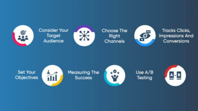
What’s the best way to get user feedback?
Use a combination of methods: A/B testing, user surveys, usability testing sessions, and heatmaps can provide valuable insights into user behavior and preferences.
How important is color psychology in UI design?
Very important! Colors evoke emotions and influence user behavior. Choose colors carefully to align with your brand and target audience, ensuring accessibility for all users.


