UI vs UX Design Whats the Difference?
UI vs UX design – two terms often tossed around together, but are they really the same thing? Not quite! While deeply intertwined, UI (User Interface) and UX (User Experience) design represent distinct yet complementary disciplines. Understanding their differences is crucial for anyone involved in creating digital products, from websites to mobile apps, because a seamless user journey relies on both.
UI design focuses on the look and feel – the visual elements users interact with directly. Think buttons, menus, typography, and overall aesthetics. UX design, on the other hand, takes a broader perspective, encompassing the entire user journey. It’s about understanding user needs, conducting thorough research, and crafting intuitive and enjoyable experiences. Getting both right is the key to a truly successful product.
Defining UI and UX Design: Ui Vs Ux Design
UI and UX design are often used interchangeably, but they represent distinct yet complementary disciplines crucial for creating successful digital products. Understanding their differences and how they work together is key to building user-centered and engaging experiences.
Core Principles of User Interface (UI) Design
UI design focuses on the look and feel of a digital product. It’s about creating an aesthetically pleasing and intuitive interface that allows users to easily interact with the product’s functionality. Key principles include visual hierarchy, using whitespace effectively, consistent typography and color palettes, and ensuring accessibility for users with disabilities. Good UI design is immediately noticeable; it’s the first impression a user has of a product, and it directly impacts their initial engagement.
A poorly designed UI, no matter how functional the underlying UX is, will likely frustrate users and lead to a negative experience.
Key Aspects of User Experience (UX) Design
UX design is a broader field encompassing the entire user journey. It’s about understanding user needs, behaviors, and motivations to create products that are useful, usable, and desirable. Key aspects include user research (understanding user needs through surveys, interviews, and usability testing), information architecture (organizing content in a logical and intuitive way), interaction design (defining how users interact with the product), and usability testing (evaluating the effectiveness and efficiency of the design).
A well-designed UX ensures that the product is easy to learn, efficient to use, and enjoyable to interact with.
Comparison of UI and UX Design Methodologies
UI and UX design methodologies often overlap, but their focus differs. UX designers employ research methods like user interviews and usability testing to understand user needs and inform design decisions. They create user flows and wireframes to map out the user journey and structure of the product. UI designers, on the other hand, focus on the visual aspects of the interface, translating UX designs into high-fidelity mockups and prototypes.
Both disciplines iterate on their designs based on feedback and testing. The collaboration between UI and UX designers is crucial for creating a successful product. One informs the other; a strong UX informs a beautiful and functional UI, while a well-executed UI reinforces the positive UX.
Examples of Successful UI and UX Design Implementations
Consider the design of popular apps like Slack or Notion. Slack’s UI is clean and intuitive, with a clear visual hierarchy that makes it easy to find channels and messages. Its UX is designed around efficient communication and collaboration, with features like threaded conversations and file sharing. Notion, similarly, boasts a clean and customizable UI, but its UX excels in its flexible approach to note-taking, task management, and knowledge organization.
Both demonstrate how strong UI and UX can work together to create a highly successful and widely adopted product. These are just two examples, and many others exist showcasing the importance of combining both UI and UX considerations.
UI and UX Design Roles and Responsibilities
| Role | Responsibility | Tools | Focus |
|---|---|---|---|
| UI Designer | Visual design, interaction design elements, prototyping, and ensuring accessibility | Figma, Sketch, Adobe XD | Visual appeal and usability of the interface |
| UX Designer | User research, information architecture, user flows, wireframing, usability testing, and overall user experience strategy | Miro, Mural, Optimal Workshop | User needs, usability, and overall user journey |
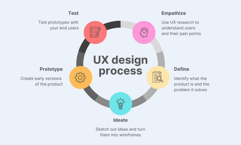
The Design Process

Source: hankgrebe.com
UI and UX design, while intertwined, follow distinct yet complementary design processes. Understanding these differences is crucial for creating effective and user-friendly digital products. A successful project relies on a smooth workflow that incorporates research, ideation, prototyping, and testing.The UI design process focuses primarily on the visual elements and the interactive aspects of the interface. UX design, on the other hand, takes a broader, more strategic approach, prioritizing user needs and experience throughout the entire product lifecycle.
UI Design Workflow
A typical UI design project follows a structured workflow, starting with the established UX framework. The UI designer takes the approved wireframes and user flows and translates them into a visually appealing and functional interface. This process often involves multiple iterations and revisions based on feedback and testing. The key phases typically include: receiving design specifications (including wireframes and user flows from the UX team), creating mockups and prototypes, testing the interface, and making revisions based on feedback, before finally handing over the assets for development.
The iterative nature ensures that the final product meets both functional and aesthetic goals.
User Research in UX Design
User research forms the cornerstone of UX design. It involves systematically investigating users’ needs, behaviors, and motivations to inform design decisions. This process aims to deeply understand the target audience, ensuring that the product caters to their specific requirements and expectations. This can involve various methods, such as conducting user interviews, surveys, usability testing, and analyzing user data.
The goal is to gather insights that can be used to create a product that is not only functional but also intuitive and enjoyable to use. For example, a team designing a new mobile banking app might conduct user interviews to understand users’ pain points with existing banking apps, and then use this information to design a more user-friendly interface.
User Testing Methods in UX Design
Several user testing methods help UX designers evaluate the usability and effectiveness of their designs. These methods allow for direct observation of users interacting with the product, providing valuable feedback for iterative improvements.
- A/B testing: Comparing two versions of a design element (e.g., button placement, color scheme) to determine which performs better.
- Usability testing: Observing users as they complete tasks within the interface, identifying pain points and areas for improvement. This often involves think-aloud protocols, where users verbalize their thoughts and actions while interacting with the product.
- Eye-tracking: Monitoring users’ eye movements to understand their attention and focus while interacting with the interface. This can reveal areas of the design that are particularly engaging or confusing.
- Card sorting: A method for organizing information architecture by having users group and label cards representing different features or content.
Iterative Design Process: UI vs UX
Both UI and UX design employ iterative processes, but the focus differs. UX design iterations center around user feedback and testing, refining the overall user experience. UI design iterations focus on refining the visual aspects and interactive elements based on UX guidelines and feedback, ensuring consistency and visual appeal. This means that a UX iteration might involve significant changes to the information architecture or user flow, while a UI iteration might involve subtle adjustments to color palettes or button styles.
Both processes are cyclical, constantly refining the design based on data and feedback.
Steps in a Typical UI/UX Design Project
A typical UI/UX project involves a series of well-defined steps. The sequence may vary slightly depending on the project’s complexity and the specific methodologies used, but the core stages remain consistent.
- Research and Planning: Defining project goals, target audience, and conducting user research.
- Information Architecture: Structuring and organizing content for optimal user navigation.
- Wireframing: Creating low-fidelity visual representations of the interface.
- Prototyping: Developing interactive prototypes to test user flows and functionality.
- UI Design: Designing the visual elements and interactive components of the interface.
- Usability Testing: Evaluating the design through user testing and gathering feedback.
- Iteration and Refinement: Making necessary changes based on testing results.
- Development and Launch: Handing off the design assets to developers for implementation.
Tools and Technologies
The digital landscape of UI/UX design is brimming with powerful tools, each offering unique capabilities to streamline the design process. Choosing the right tools depends heavily on project needs, team expertise, and budget. This section will explore the software commonly used in UI and UX design, highlighting their strengths and weaknesses, and focusing on their application within the design workflow.
Common UI Design Software
UI design software facilitates the creation of visually appealing and user-friendly interfaces. These tools range from vector-based graphics editors to specialized interface design applications. A well-chosen tool significantly impacts the efficiency and quality of the final product.
UI design focuses on the look and feel, while UX design prioritizes the user experience. Think about how intuitive and enjoyable a YouTube channel is – that’s UX! To learn more about optimizing your YouTube presence and boosting engagement, check out this fantastic guide on getting it on with youtube. Ultimately, great UI and UX work together to create a seamless and satisfying user journey, just like a well-designed YouTube channel should.
- Adobe XD: A comprehensive vector-based design tool specifically geared towards UI/UX. It offers features for prototyping, collaboration, and asset management, making it suitable for both individual designers and large teams. Its strength lies in its intuitive interface and seamless integration with other Adobe Creative Cloud applications.
- Figma: A cloud-based collaborative design tool that’s become increasingly popular. Its real-time collaboration features and ease of use make it ideal for teams working remotely. Figma also boasts a large and active community, providing access to numerous plugins and resources.
- Sketch: Primarily used on macOS, Sketch is a vector-based design tool favored for its speed and efficiency. It’s particularly popular amongst designers creating mobile apps and web interfaces, known for its smooth performance and robust plugin ecosystem.
- Adobe Photoshop: While not strictly a UI design tool, Photoshop’s powerful image editing capabilities make it invaluable for creating high-fidelity mockups and manipulating visual assets. Its raster-based nature makes it suitable for creating detailed visuals but less ideal for scalable vector graphics.
UX Research and Prototyping Tools
Effective UX design relies heavily on research and iterative prototyping. These tools help gather user feedback, test design decisions, and refine the user experience before development.
- UserTesting.com: This platform facilitates the collection of user feedback through recorded usability tests. Designers can observe real users interacting with their prototypes and gather valuable insights into their behavior and pain points.
- Optimal Workshop: Provides a suite of tools for conducting various UX research activities, including card sorting, tree testing, and first-click testing. These methods help designers understand user mental models and information architecture.
- Hotjar: Offers heatmaps, session recordings, and feedback polls to visualize user behavior on websites and applications. This data provides valuable insights into user engagement and areas for improvement.
- Axure RP: A powerful prototyping tool allowing for the creation of high-fidelity interactive prototypes. It’s particularly useful for complex interactions and dynamic content, allowing designers to simulate realistic user flows.
- InVision: A collaborative prototyping platform that enables designers to share and test prototypes with stakeholders and users. It provides features for commenting, feedback collection, and version control.
The Role of Prototyping in UI and UX Design
Prototyping serves as a critical bridge between concept and implementation. It allows designers to test assumptions, identify usability issues, and refine the design before committing to development. In UI design, prototyping helps visualize the look and feel of the interface, while in UX design, it enables the testing of user flows and overall experience. Prototypes can range from low-fidelity sketches to high-fidelity interactive simulations, each serving a different purpose in the design process.
Early-stage prototypes often focus on functionality and user flow, while later-stage prototypes prioritize visual fidelity and detailed interactions. The iterative nature of prototyping ensures continuous refinement and optimization of the design.
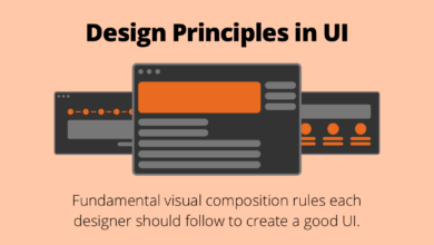
UI Design Elements and Principles
Effective UI design hinges on a deep understanding of visual hierarchy, typography, color theory, and whitespace. These elements work in concert to create a user interface that is not only aesthetically pleasing but also intuitive and efficient to navigate. Mastering these principles is crucial for creating a positive user experience.
Visual Hierarchy in UI Design
Visual hierarchy dictates the order in which a user’s eye scans a page. It guides the user’s attention, ensuring important information is easily noticed and less critical elements are subtly presented. This is achieved through size, color, contrast, and positioning. For instance, a larger, bolder headline immediately grabs attention, while smaller, less prominent text provides supporting details.
Effective visual hierarchy prevents visual clutter and ensures a clear path for user interaction. A poorly designed interface with no clear hierarchy can lead to user frustration and confusion.
Typography and its Impact on User Experience
Typography plays a significant role in UI design, affecting both readability and overall aesthetic appeal. Choosing appropriate font families, sizes, weights, and spacing is essential. Serif fonts (like Times New Roman) are generally considered more readable for large blocks of text, while sans-serif fonts (like Arial or Helvetica) are often preferred for headings and shorter text snippets due to their cleaner appearance on screens.
Consistent font usage throughout the interface creates a sense of unity and professionalism. Incorrect font choices can lead to strained eyes and decreased comprehension, negatively impacting the user experience. Furthermore, sufficient line height and letter spacing improve readability, particularly on smaller screens.
Homepage Mock-up: Visual Hierarchy and Intuitive Navigation
Imagine a simple e-commerce homepage. At the top, a large, high-resolution image showcasing a featured product occupies the full width. Below this, a concise and bold headline, “Discover Our New Collection,” is centered. Beneath the headline, three smaller, equally sized images representing different product categories (e.g., clothing, accessories, home goods) are arranged horizontally, each with a short descriptive caption.
Below the category images, a section with customer testimonials appears, using a slightly smaller font size than the category captions. Finally, a footer at the bottom contains copyright information and links to social media pages, presented in a small, unobtrusive font. Navigation is simple: a horizontal menu bar at the top provides links to key sections (Shop, About Us, Contact).
Color Theory in UI Design
Color psychology significantly influences user perception and emotion. Choosing the right color palette is vital for creating a brand identity and conveying the desired mood. Warm colors (reds, oranges, yellows) can evoke excitement and energy, while cool colors (blues, greens, purples) often convey calmness and trustworthiness. Contrast is key – sufficient color contrast ensures readability and accessibility, especially for users with visual impairments.
Consider using a color wheel to understand color harmonies (complementary, analogous, triadic) to create visually appealing and balanced designs. For example, a website selling organic products might utilize greens and earthy tones to project a sense of naturalness and sustainability.
Effective Use of Whitespace in UI Design
Whitespace, or negative space, is the area around design elements. It is not empty space; rather, it is a powerful tool for improving readability and creating visual breathing room. Effective use of whitespace prevents clutter and guides the user’s eye, enhancing the overall aesthetic appeal. For example, ample whitespace around text blocks improves readability, while strategically placed whitespace can highlight key elements and create visual separation between different sections of a webpage.
Websites that are overcrowded with elements can feel overwhelming and difficult to navigate. Conversely, well-utilized whitespace creates a clean, modern, and user-friendly experience.
UX Design Principles and Best Practices
Source: website-files.com
Effective UX design isn’t about aesthetics alone; it’s about creating intuitive and enjoyable experiences that meet user needs. This involves understanding user behavior, employing established principles, and iteratively improving the design based on user feedback. This section delves into key principles and best practices for crafting exceptional user experiences.
User-Centered Design
User-centered design (UCD) places the user at the heart of the design process. Every decision, from the initial concept to the final polish, is guided by a deep understanding of the target audience’s needs, behaviors, and goals. This approach involves extensive user research, including surveys, interviews, and usability testing, to inform design choices and ensure the product resonates with its intended users.
For example, designing a mobile banking app using UCD would involve observing how users currently manage their finances, identifying their pain points, and incorporating those insights into the app’s features and interface. This ensures the app is not only functional but also intuitive and enjoyable to use, leading to higher user satisfaction and engagement.
Usability Testing in UX Design
Usability testing is a crucial component of UCD. It involves observing real users interacting with a prototype or a finished product to identify usability issues. This process provides valuable, objective data on how users navigate the interface, complete tasks, and perceive the overall experience. By watching users, designers can identify areas of confusion, frustration, or inefficiency, allowing them to refine the design and improve the user experience.
For instance, A/B testing different button placements on an e-commerce website can reveal which placement leads to higher conversion rates, demonstrating the effectiveness of usability testing in optimizing the design for better user outcomes.
Common Usability Heuristics
Usability heuristics are established guidelines that help designers create user-friendly interfaces. Jakob Nielsen’s 10 heuristics are widely recognized and provide a valuable framework for evaluating and improving usability. These include principles like visibility of system status, match between system and the real world, user control and freedom, consistency and standards, error prevention, recognition rather than recall, flexibility and efficiency of use, aesthetic and minimalist design, help users recognize, diagnose, and recover from errors, and help and documentation.
Applying these heuristics ensures that the design is intuitive, efficient, and error-tolerant, leading to a more positive user experience. For example, clear error messages that guide users towards a solution instead of simply stating “error” are a direct application of the error prevention and recovery heuristics.
Accessibility in UX Design
Accessibility in UX design focuses on creating interfaces usable by people with disabilities. This includes considerations for users with visual, auditory, motor, and cognitive impairments. Designing for accessibility ensures inclusivity and expands the potential user base. Techniques include providing alternative text for images, using sufficient color contrast, offering keyboard navigation, and designing for users with various cognitive abilities.
For instance, ensuring that all interactive elements have sufficient color contrast meets WCAG (Web Content Accessibility Guidelines) standards, making the interface usable for users with low vision. This commitment to accessibility not only benefits users with disabilities but also improves the overall user experience for everyone.
Creating User Personas for Effective UX Design, Ui vs ux design
User personas are fictional representations of target users, based on user research and data. They provide a concrete picture of the user’s demographics, goals, behaviors, and motivations. Creating detailed personas helps designers empathize with their users and make design decisions aligned with their needs. A well-defined persona might include details such as name, age, occupation, tech proficiency, and typical tasks performed within the application.
For example, a persona for a fitness app might be “Sarah,” a 32-year-old working mother who values convenience and personalized workout plans. This persona helps designers prioritize features that align with Sarah’s needs and preferences, resulting in a more user-friendly and engaging application.
Case Studies
This section delves into two compelling case studies, one showcasing exceptional UI design and the other highlighting superb UX design. By examining these examples, we can better understand the distinct roles of UI and UX and how their effective integration leads to successful products. We will analyze their approaches, identify key success factors, and ultimately draw valuable insights applicable to your own design projects.
Website with Exceptional UI Design: Mailchimp
Mailchimp, an email marketing platform, stands out for its intuitive and visually appealing interface. The color palette is consistent and pleasing, using a vibrant yet professional combination of primarily orange and white. Navigation is exceptionally clear, with a prominent menu bar offering easy access to key features. The overall design is clean and uncluttered, prioritizing readability and ease of use.
The use of whitespace effectively separates elements, preventing visual overload. Forms are straightforward and well-labeled, minimizing user confusion. The inclusion of helpful tooltips and micro-interactions further enhances the user experience, providing subtle guidance and feedback. The consistent use of visual cues, such as icons and typography, reinforces the overall branding and creates a cohesive user experience. The design successfully balances aesthetic appeal with functionality, creating a user-friendly platform that is both visually engaging and highly efficient.
Application with Excellent UX Design: Duolingo
Duolingo, a language-learning app, exemplifies excellent UX design through its gamified approach to learning. The app cleverly incorporates elements of game mechanics, such as points, streaks, and leaderboards, to motivate users and encourage consistent engagement. The learning process is broken down into manageable lessons, making it less daunting and more rewarding. Progress tracking is clear and readily available, providing users with a sense of accomplishment.
The app’s simplicity is a key strength; its interface is minimal and uncluttered, focusing on the core learning experience. The feedback mechanism is immediate and effective, providing users with instant correction and reinforcement. The app is designed to be accessible and intuitive, even for users with limited technical skills. The seamless integration of various learning techniques, such as spaced repetition and gamification, contributes significantly to its effectiveness and user retention.
Comparison of UI and UX Design Approaches
Mailchimp’s success stems from its meticulous attention to UI details, creating a visually appealing and highly functional interface. Duolingo, on the other hand, prioritizes UX, leveraging gamification and intuitive design to enhance user engagement and learning outcomes. While Mailchimp focuses on the visual appeal and ease of navigation, Duolingo focuses on the user’s journey and overall experience within the app.
Both, however, demonstrate a deep understanding of their target audience and their respective needs. The key difference lies in their primary focus: aesthetic appeal and functionality for Mailchimp versus user engagement and learning effectiveness for Duolingo.
Key Factors Contributing to Success
Mailchimp’s success is attributed to its clean, intuitive interface, consistent branding, and effective use of visual hierarchy. Duolingo’s success hinges on its gamified approach, clear progress tracking, and focus on user engagement. Both companies have successfully translated their understanding of user needs into compelling design solutions.
Key Takeaways from Case Studies
| Feature | Mailchimp (UI Focus) | Duolingo (UX Focus) |
|---|---|---|
| Primary Design Goal | Visually appealing and functional interface | Engaging and effective user experience |
| Key Design Elements | Clean layout, consistent branding, clear navigation | Gamification, progress tracking, intuitive interaction |
| Success Factors | Ease of use, visual appeal, brand consistency | User engagement, effective learning, motivation |
| Target Audience | Businesses and marketers | Language learners |
Epilogue
Ultimately, UI and UX design are two sides of the same coin. A stunning UI is useless without a solid UX foundation, and a fantastic UX can be undermined by a poorly designed interface. The best digital products are those that seamlessly blend beautiful aesthetics with intuitive functionality, creating a truly memorable and positive user experience. So, next time you’re designing something, remember to consider both the “how it looks” and the “how it feels” – your users will thank you for it!
Question & Answer Hub
What’s the salary difference between UI and UX designers?
Salaries vary widely based on experience, location, and company size. Generally, senior UX designers tend to earn more than UI designers due to the broader scope of their responsibilities.
Can I be both a UI and UX designer?
Absolutely! Many designers excel in both areas, often specializing in one while maintaining proficiency in the other. It’s a valuable skillset to have.
Which is more important, UI or UX?
Both are crucial. A great UX is wasted without a good UI, and a beautiful UI is useless if the user experience is poor. They are interdependent.
What are some entry-level jobs in UI/UX?
Entry-level roles might include UX/UI intern, junior designer, or design assistant. Building a portfolio is key to landing these positions.
