Web Design Data Fonts A Deep Dive
Web design data fonts are more than just pretty letters; they’re the unsung heroes of user experience. Choosing the right fonts isn’t just about aesthetics; it’s about impacting website performance, boosting engagement, and ultimately, driving conversions. This post delves into the fascinating world of data-driven font selection, exploring how careful analysis can transform your website’s success.
We’ll cover everything from analyzing font usage trends and understanding the psychology behind font choices to optimizing font performance for lightning-fast load times and ensuring accessibility for all users. Get ready to level up your web design game with the power of data!
Data-Driven Font Selection for Web Design
Source: spark.app
Choosing the right font isn’t just about aesthetics; it’s a critical decision impacting website performance and user experience. The seemingly small detail of typeface significantly influences how visitors interact with your site, affecting key metrics like bounce rates, time on site, and ultimately, conversion rates. This data-driven approach ensures we optimize font choices for maximum impact.
Font Choice and Website Performance Metrics
Font selection directly impacts website loading speed. Heavier fonts, especially those requiring external downloads, can noticeably slow down page load times. This, in turn, affects core web vitals, impacting search engine rankings and user satisfaction. Conversely, using lightweight, system-based fonts minimizes loading times, contributing to a faster and more responsive user experience. Studies have shown that even a slight increase in loading time can lead to a significant drop in conversions.
For example, a study by Google found that a one-second delay in page load time can result in a 7% reduction in conversions. This highlights the importance of selecting fonts that prioritize performance without sacrificing readability.
Font Legibility and User Engagement
Legibility is paramount. A poorly chosen font, regardless of its aesthetic appeal, can hinder readability, leading to frustration and higher bounce rates. Users are more likely to leave a website if they struggle to read the content. Conversely, a highly legible font enhances user engagement by making the content easily accessible and enjoyable to consume. For instance, using a serif font for body text might improve readability compared to a sans-serif font, especially for longer articles.
However, the optimal choice depends on factors like screen size, font size, and background contrast. A/B testing is crucial in determining the best font for specific content and target audiences.
A/B Testing Font Combinations for Conversion Rate Optimization
A/B testing allows for a controlled comparison of different font combinations. By presenting two versions of a webpage – one with Font A and another with Font B – you can track key metrics like click-through rates, conversion rates, and time spent on page. This data-driven approach helps determine which font combination resonates best with your target audience and maximizes conversions.
For example, you might A/B test a headline in a bold sans-serif font against a more elegant serif font to see which drives more clicks. The results will provide concrete evidence to inform future design decisions. Tools like Google Optimize or VWO (Visual Website Optimizer) simplify the A/B testing process.
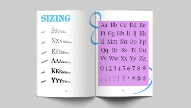
Comparison of Popular Web Fonts
Choosing the right font requires considering load time, readability, and accessibility. Below is a comparison of some popular web fonts based on these criteria. Note that these scores are subjective and can vary depending on context and implementation.
| Font Name | Load Time (estimated) | Readability Score (1-5, 5 being best) | Accessibility Rating (1-5, 5 being best) |
|---|---|---|---|
| Roboto | Fast | 4 | 4 |
| Open Sans | Fast | 4 | 4 |
| Lato | Fast | 4 | 4 |
| Times New Roman | Fast (system font) | 3 | 3 |
Analyzing Font Usage Trends in Web Design
The world of web design is constantly evolving, and font choices are no exception. Understanding current trends in font usage is crucial for designers aiming to create visually appealing and effective websites. This analysis will explore the prevalent font styles across various industries, the powerful connection between typography and brand identity, and the practical steps involved in selecting fonts that perfectly embody a brand’s aesthetic.Current trends reveal a move away from overly stylized fonts towards cleaner, more legible typefaces.
This shift reflects a growing emphasis on user experience, prioritizing readability and accessibility. However, this doesn’t mean a lack of creativity; instead, designers are cleverly using subtle variations in weight, spacing, and pairing to achieve visual interest without sacrificing clarity.
Choosing the right web design data fonts is crucial for readability and visual appeal. But even the best typography needs a platform to shine, which is why I recently dove into improving my video presence by checking out this awesome guide on getting it on with youtube to better showcase my web design projects. Understanding YouTube’s visual language helped me appreciate how font choices translate across different media, ultimately informing my web design data font selections.
Font Choice and Brand Identity
The relationship between font choice and brand identity is paramount. A well-chosen font can instantly communicate a brand’s personality, values, and target audience. For example, a tech startup might opt for a geometric sans-serif font to convey modernity and innovation, while a luxury brand might favor a classic serif typeface to project elegance and sophistication. The font becomes a visual element that reinforces the brand’s overall message, creating a cohesive and memorable experience for users.
Inconsistent or poorly chosen fonts can dilute brand messaging and confuse the audience.
Researching and Selecting Fonts for Brand Aesthetics
The process of selecting fonts starts with a deep understanding of the brand’s identity. This involves analyzing the brand’s mission statement, target audience, and competitive landscape. Designers should create mood boards and explore various font styles that align with the desired brand personality. Consider factors such as font weight, x-height, and character spacing, as these elements contribute significantly to readability and overall aesthetic.
Once a shortlist of potential fonts is created, rigorous testing is essential. This involves reviewing the fonts across different screen sizes and devices to ensure optimal readability and visual appeal.
Resources for Finding and Evaluating Web Fonts
Finding suitable web fonts is simplified by the abundance of online resources available. Several websites specialize in providing high-quality, commercially licensed, and open-source fonts.
A few notable examples include:
- Google Fonts: A vast library of open-source fonts, offering a wide range of styles and easy integration into web projects.
- Adobe Fonts: A subscription-based service providing access to a comprehensive collection of high-quality fonts, including many classic and contemporary typefaces.
- Font Squirrel: A resource featuring a curated selection of free and commercial fonts, many of which are specifically designed for web use.
- Typewolf: A blog and resource that showcases beautiful typography on websites, offering inspiration and guidance for font selection.
When evaluating fonts, consider factors like licensing, cross-browser compatibility, and accessibility features. Ensure the chosen font is optimized for web use, offering a balance between aesthetics and performance.
Accessibility Considerations for Web Fonts
Source: dreamstime.com
Choosing the right web fonts is crucial for a positive user experience, but it’s especially important to consider accessibility for users with disabilities. Selecting fonts that are easy to read and understand ensures inclusivity and makes your website usable for everyone. Ignoring accessibility can lead to exclusion and a diminished user experience for a significant portion of your audience.
Readability for Users with Visual Impairments, Web design data fonts
Many visual impairments affect the ability to discern fine details in text. Therefore, font selection plays a critical role in ensuring readability. Fonts with high x-height (the height of the lowercase letters) and clear, distinct letterforms are generally more readable. Serif fonts, with their small decorative flourishes at the ends of strokes, can improve readability for some users, as the serifs can help guide the eye along the lines of text.
However, sans-serif fonts, lacking these flourishes, are often preferred for their clean and simple design, especially on screens. Specific examples of fonts known for their high readability include Open Sans, Verdana, Arial, and Roboto. These fonts are often chosen for their clear letterforms and generous spacing, which makes them suitable for users with low vision.
Color Contrast Between Text and Background
Sufficient color contrast between text and its background is paramount for accessibility. Low contrast makes it difficult for users with visual impairments, such as low vision or color blindness, to read the text. Web Content Accessibility Guidelines (WCAG) provide specific contrast ratios that must be met to ensure sufficient contrast. WCAG recommends a minimum contrast ratio of 4.5:1 for normal text and 3:1 for large text (18pt or 14pt bold).
Tools are available online to check contrast ratios between color combinations, ensuring your website meets these standards. For example, a dark grey text on a light grey background would likely fail WCAG contrast requirements, whereas black text on a white background easily surpasses them. Proper contrast also aids users with photosensitivity, reducing eye strain.
Accessibility Checklist for Web Font Selection
Before finalizing your web font choices, review this checklist to ensure accessibility:
- Font Choice: Select fonts known for their high readability, such as Open Sans, Verdana, Arial, or Roboto. Consider the x-height and overall clarity of letterforms.
- Font Size: Ensure sufficient font size (at least 16px) for comfortable reading. Consider providing options for users to adjust font size.
- Line Height (Leading): Use appropriate line spacing to avoid cramped text and improve readability. Generally, a line height of 1.5 times the font size is recommended.
- Letter Spacing (Tracking): Avoid excessively tight or loose letter spacing.
- Color Contrast: Verify that the contrast ratio between text and background colors meets WCAG guidelines (4.5:1 for normal text, 3:1 for large text) using a contrast checker tool.
- Font Weight: Use a font weight that is easily readable. Avoid overly thin or light weights.
- Fallback Fonts: Always include fallback fonts in your CSS to ensure text is displayed even if the primary font isn’t available on the user’s system.
Optimizing Font Performance for Web Pages
Choosing the right fonts is crucial for web design, but selecting them is only half the battle. How quickly those fonts load significantly impacts your website’s performance and, ultimately, the user experience. A slow-loading font can lead to frustrating delays, impacting bounce rates and conversions. This section dives into practical techniques to optimize font loading and ensure a smooth, speedy experience for your visitors.
Font Loading and its Impact on Page Speed and User Experience
Font loading directly affects perceived page speed. Users see a blank space where the text should be until the font downloads and renders. This delay, even for a fraction of a second, can feel significant to the user, leading to a negative perception of your site. A slow-loading website is not only frustrating but also detrimental to , as search engines prioritize fast-loading pages.
The cumulative effect of slow-loading fonts across multiple websites can drastically affect overall internet browsing experience. For example, imagine a news website with many articles; slow font loading on each page would add up to a considerable delay for a reader wanting to scan several articles.
Techniques for Optimizing Font Loading: Font Subsetting and Preloading
Several techniques can significantly improve font loading times. Font subsetting involves including only the characters needed for your website’s content within the downloaded font file. This reduces the file size, leading to faster downloads. For example, if your website uses only uppercase letters and numbers, you don’t need to include lowercase characters in the font file. Preloading, on the other hand, instructs the browser to prioritize the download of critical fonts, ensuring they’re available as soon as possible.
This is typically done using the ` ` tag in your HTML. This tag allows you to specify the font file and give the browser a hint to prioritize its download before other resources.
Different Font Formats and Their Impact on Performance
Different font formats offer varying levels of compression and browser support. WOFF2 is generally considered the best option, offering excellent compression and wide browser compatibility. WOFF (Web Open Font Format) is also widely supported, but WOFF2 is superior in terms of file size. TTF (TrueType Font) and OTF (OpenType Font) are older formats and generally larger than WOFF2, leading to slower download times.
While they offer good compatibility, their larger file sizes make them less efficient. Therefore, prioritizing WOFF2 is usually the best strategy for optimal performance.
A Step-by-Step Guide for Optimizing Web Font Performance
Optimizing web font performance involves a multi-step process:
- Choose the Right Font Format: Always prioritize WOFF2. If browser compatibility is a concern (though unlikely these days), include WOFF as a fallback. Avoid TTF and OTF unless absolutely necessary.
- Use Font Subsetting: Employ tools or techniques provided by your font management system to subset your fonts, including only the necessary characters.
- Implement Font Preloading: Use the ` ` tag in your HTML header to tell the browser to prioritize the download of your critical web fonts. For example: ` `
- Optimize Font File Size: Explore techniques to further reduce the size of your font files, such as using font compression tools. Even small reductions can accumulate into significant performance gains.
- Use a CDN (Content Delivery Network): Distribute your font files across multiple servers geographically closer to your users, reducing latency and improving download speeds.
- Test and Monitor: Regularly test your website’s loading speed using tools like Google PageSpeed Insights and address any bottlenecks you identify.
Visual Hierarchy and Font Selection

Source: delightfuldesignstudio.com
Choosing the right fonts is crucial for effective web design, but it’s not just about aesthetics. Fonts play a vital role in establishing a clear visual hierarchy, guiding the user’s eye through the information presented on the page. A well-defined hierarchy ensures that important content stands out, while less crucial information remains easily accessible but less prominent. This improves readability and the overall user experience.Fonts, through their size, weight, and style, directly influence how users perceive and interact with the content.
Strategic font selection can transform a chaotic jumble of text into a well-organized and easily navigable webpage. Understanding the principles of typography is key to mastering this aspect of web design.
Font Size, Weight, and Style in Establishing Hierarchy
Effective visual hierarchy relies on careful manipulation of font attributes. Larger font sizes naturally draw the eye, making them ideal for headlines and main titles. Bold weights (e.g., 700) add emphasis, suitable for subheadings or important calls to action. Italics can be used sparingly to highlight specific words or phrases, creating subtle emphasis. Consider the example of a news article: the main headline might be a 48px, bold sans-serif font, while subheadings could be 24px, semi-bold, and the body text a 16px regular weight.
This clear differentiation in size and weight instantly establishes a hierarchy, guiding the reader’s attention from the most important information to the supporting details.
Principles of Typography and Their Application in Web Design
Several core typographic principles contribute to effective visual hierarchy. These include contrast (using different font sizes, weights, and styles to differentiate elements), proximity (grouping related elements together), alignment (using consistent alignment to create order), and repetition (using consistent fonts and styles throughout the site for visual unity). For instance, consistent use of a specific font family across headings and body text creates a sense of cohesion, while varying the weight and size of that font family allows for clear visual distinction between headings and body text.
Consider the use of a clean sans-serif font for body text and a slightly more decorative serif font for titles – this creates contrast while maintaining a sense of visual unity.
Visual Representation of Font Weight and Size Hierarchy
Imagine a webpage section. At the top, a bold headline in a 36px sans-serif font reads “Our Latest Products.” Below this, three subheadings, each in a 24px semi-bold sans-serif font, introduce three different product categories: “Smartwatches,” “Fitness Trackers,” and “Headphones.” Under each subheading, a brief description of each product category is presented in a 16px regular weight sans-serif font.
Finally, calls to action (“Learn More”) for each category are in a 14px bold sans-serif font. This layered approach, using varying font sizes and weights, creates a clear visual path for the user, guiding them seamlessly from the main topic to supporting information and finally to engaging with the content further. The decreasing font sizes and weight changes visually represent the decreasing importance of the information, creating a natural flow for the user’s eyes.
The Impact of Font Psychology on Web Design: Web Design Data Fonts
Choosing a font is more than just picking something that looks pretty; it’s about understanding how typography influences user experience and aligns with your brand’s message. Fonts evoke specific emotions and associations, subtly shaping how visitors perceive your website and interact with its content. A well-chosen font can enhance readability, build trust, and even drive conversions. Conversely, a poorly chosen font can alienate users and damage your brand’s image.
Font Styles and Their Psychological Impact
Different font styles possess distinct personalities. Serif fonts, with their small flourishes at the ends of strokes, often project a sense of tradition, sophistication, and authority. Sans-serif fonts, clean and minimalist, tend to convey modernity, simplicity, and approachability. Script fonts, with their flowing, handwritten appearance, evoke feelings of elegance, personality, and artistry. The careful selection of a font family directly impacts how users interpret your brand’s identity and the information presented on your website.
| Font Style | Associated Emotion | Suitable Website Type | Example Use Case |
|---|---|---|---|
| Serif (e.g., Times New Roman, Garamond) | Traditional, sophisticated, authoritative, trustworthy | News websites, legal firms, academic institutions | A law firm’s website using Garamond to project professionalism and trustworthiness. |
| Sans-serif (e.g., Arial, Helvetica, Open Sans) | Modern, clean, simple, approachable, friendly | Tech companies, e-commerce sites, blogs | An e-commerce website using Open Sans for its clean and easy-to-read product descriptions. |
| Script (e.g., Edwardian Script ITC, Pacifico) | Elegant, artistic, personal, whimsical | Wedding websites, invitation sites, creative portfolios | A wedding invitation website using a script font to create a romantic and elegant atmosphere. |
| Display (e.g., Impact, Bebas Neue) | Bold, attention-grabbing, powerful, dramatic | Headlines, posters, marketing materials | A marketing campaign using Impact for its headline to create a strong visual impact. |
Influencing User Perception and Behavior Through Font Choice
The impact of font psychology extends beyond mere aesthetics. Consider a website selling luxury goods. Using a serif font like Garamond would likely enhance the perception of high quality and exclusivity. In contrast, a playful sans-serif font might be more suitable for a children’s toy website, creating a sense of fun and approachability. The selection of a font directly impacts the user experience, influencing their engagement, time spent on the site, and ultimately, their purchasing decisions.
A well-chosen font contributes to a positive and memorable user experience.
Closure
Mastering the art of web design data fonts is a journey, not a destination. By understanding the interplay between aesthetics, performance, and accessibility, you can create websites that are not only visually stunning but also highly effective. Remember, the right font can make all the difference – so choose wisely, test rigorously, and watch your website flourish!
Expert Answers
What are the best tools for A/B testing fonts?
Several tools offer A/B testing capabilities, including Google Optimize, Optimizely, and VWO. The best choice depends on your specific needs and budget.
How often should I update my website’s fonts?
There’s no hard and fast rule, but it’s a good idea to review your font choices periodically (e.g., annually) to ensure they still align with your brand and current design trends. Major redesigns may warrant more frequent updates.
Can using too many fonts hurt my website’s performance?
Yes, using too many different font families can increase page load times and negatively impact performance. Stick to a limited palette of fonts for optimal results.