Website Design Graphic Concepts A Visual Guide
Website design graphic concepts are the heart and soul of a successful online presence. They’re not just about making things pretty; they’re about crafting an experience that resonates with your audience, builds brand recognition, and ultimately drives conversions. From understanding the fundamental principles of visual hierarchy and color theory to exploring current design trends and mastering responsive design, this journey into the world of web graphics will equip you with the knowledge to create truly captivating websites.
We’ll delve into the practical application of these concepts, exploring how typography, whitespace, and imagery work together to create a cohesive and engaging user experience. We’ll also look at different graphic styles, the importance of high-quality visuals, and the crucial role of user-centered design in creating websites that are both beautiful and functional. Get ready to unlock your website’s full visual potential!
Understanding Design Principles in Website Graphic Concepts
Creating a visually appealing and user-friendly website requires a deep understanding of fundamental design principles. These principles aren’t just about aesthetics; they directly impact user experience, brand perception, and ultimately, the success of your website. Ignoring these principles can lead to a confusing and frustrating experience for visitors, driving them away before they even get a chance to engage with your content.
Visual Hierarchy in Website Design, Website design graphic concepts
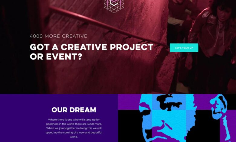
Visual hierarchy guides the user’s eye through the webpage, prioritizing information and creating a clear path to follow. It’s about strategically arranging elements to control the order in which users perceive and interact with the content. This is achieved through the use of size, color, contrast, and placement. For example, a large, bold headline immediately draws attention, while smaller, less prominent text provides supporting details.
Effective visual hierarchy ensures that important calls to action (like “Shop Now” buttons) are easily noticeable, while less crucial information is relegated to a secondary position. A poorly designed website, lacking visual hierarchy, might present all information with equal weight, leading to user confusion and difficulty in navigating the site.
The Impact of Color Theory on User Experience and Brand Perception
Color psychology plays a significant role in shaping user experience and brand perception. Different colors evoke different emotions and associations. For example, blue often conveys trust and stability, while red can represent excitement or urgency. Consistent use of brand colors throughout a website reinforces brand identity and creates a cohesive visual experience. Consider how Apple consistently uses shades of gray and silver to project a sense of sophistication and minimalism.
Conversely, a vibrant, colorful website might be suitable for a brand targeting a younger, more playful audience. Careful consideration of color palettes is crucial for creating a website that aligns with the brand’s personality and resonates with its target audience. Inconsistent or poorly chosen colors can create a jarring and unprofessional impression.
Typography Choices and Their Contribution to Readability and Aesthetic Appeal
Typography, the art of selecting and arranging typefaces, significantly impacts readability and aesthetic appeal. Choosing the right font family, size, weight, and spacing is crucial for creating a comfortable reading experience. Legible fonts, like Arial or Calibri, are suitable for body text, while bolder fonts can be used for headings and titles to create visual hierarchy. The spacing between lines (leading) and characters (kerning) also impacts readability.
Too much or too little spacing can strain the eyes and make the text difficult to read. A website with poorly chosen typography might appear unprofessional and difficult to navigate, leading to user frustration and a negative brand perception. For instance, using a script font for large amounts of body text would be detrimental to readability.
So you’ve nailed the website design graphic concepts, got your branding spot on, and now you need to get those visuals out there. A killer YouTube presence is key, which is why understanding how to getting it on with youtube is crucial. Think of your YouTube channel as an extension of your website design – consistent branding and engaging visuals are just as important there to maintain a cohesive online identity.
Effective Use of Whitespace and Negative Space in Web Design
Whitespace, or negative space, is the empty space surrounding design elements. It’s not simply about leaving blank areas; it’s a powerful tool for improving readability, creating visual balance, and enhancing the overall aesthetic. Effective use of whitespace allows the eye to rest, preventing visual clutter and making the content easier to digest. It also provides visual breathing room, emphasizing important elements and preventing them from feeling crowded.
| Whitespace Technique | Description | Visual Impact | Example |
|---|---|---|---|
| Margin | Space around the outside of an element. | Creates separation and breathing room. | A large margin around a main heading makes it stand out. |
| Padding | Space within an element, between the element’s content and its border. | Provides visual breathing room within elements. | Padding around a button makes it easier to click. |
| Gutter | Space between columns or elements in a layout. | Improves readability and visual organization. | Adequate gutter between columns in a multi-column layout improves readability. |
| Line Height | Space between lines of text. | Enhances readability and visual appeal. | Appropriate line height prevents text from appearing cramped. |
Exploring Graphic Styles and Trends in Website Design: Website Design Graphic Concepts

Source: behance.net
Website design is a constantly evolving landscape, with new graphic styles and trends emerging regularly. Understanding these trends is crucial for creating websites that are not only visually appealing but also effective in communicating a brand’s message and engaging its audience. This exploration delves into several current trends, contrasting design philosophies, and examining the role of illustrations and specific graphic styles.
Current Graphic Design Trends Influencing Website Aesthetics
Several key graphic design trends are shaping the look and feel of modern websites. These trends often intertwine and influence each other, creating a dynamic and diverse range of website aesthetics.
- 3D Elements and Depth: Websites are increasingly incorporating subtle or dramatic 3D elements to add depth and visual interest. This might involve subtly raised buttons, layered text effects, or even more complex 3D models integrated into the design. The effect is often one of sophistication and modernity.
- Bold Typography: Experimentation with fonts is prevalent. Websites are using bolder, more unconventional typefaces to make a statement and convey personality. This can involve using custom fonts or creatively utilizing existing fonts in unexpected ways.
- Muted Color Palettes: A move away from overly bright and saturated colors is noticeable. Muted, earthy tones, and pastel shades are gaining popularity, creating a sense of calm and sophistication. This approach complements minimalist designs particularly well.
- Asymmetrical Layouts: Rigid, symmetrical layouts are giving way to more dynamic and visually interesting asymmetrical designs. This approach can create a more engaging and less predictable user experience.
- Motion Graphics and Micro-interactions: Subtle animations and micro-interactions are being used to enhance user engagement and provide visual feedback. This might include subtle hover effects, smooth transitions between pages, or animated loading indicators.
Minimalist Design versus Maximalist Design
Minimalist and maximalist design represent contrasting approaches to website aesthetics. Minimalist design prioritizes simplicity, using a limited color palette, clean typography, and a sparse layout. This approach focuses on highlighting essential content and creating a clean, uncluttered user experience. Examples include websites for technology companies or minimalist fashion brands. In contrast, maximalist design embraces complexity and visual richness, utilizing bold colors, intricate patterns, and abundant imagery.
This style aims to create a visually stimulating and memorable experience. Websites for art galleries or creative agencies might adopt this approach. The choice between these approaches depends heavily on the brand’s identity and the nature of the content being presented.
Effective Use of Illustrations and Iconography in Web Design
Illustrations and iconography play a crucial role in enhancing website design, improving user experience, and reinforcing brand identity. They can simplify complex information, add personality, and create a more engaging visual experience.
- Improved User Understanding: Illustrations can clarify complex processes or concepts, making information more accessible and easier to understand. For example, a website explaining a technical process might use illustrations to visually represent each step.
- Enhanced Brand Identity: Custom illustrations can create a unique and memorable visual identity for a brand. A consistent illustration style throughout a website can reinforce brand recognition and create a cohesive brand experience.
- Increased Engagement: Well-designed illustrations and icons can make a website more visually appealing and engaging, encouraging users to spend more time on the site and interact with its content. For instance, a children’s website might use playful illustrations to capture their attention.
- Improved Navigation: Icons can simplify website navigation by providing clear visual cues for different sections or features. A shopping website might use icons for categories such as “Clothing,” “Shoes,” and “Accessories.”
Application of Different Graphic Styles
Different graphic styles, such as flat design and skeuomorphism, offer distinct aesthetic qualities and are suitable for various types of websites.Flat design, characterized by its minimalist aesthetic, uses two-dimensional shapes, clean lines, and a limited color palette. It is often used for websites that need to appear modern, clean, and uncluttered. Examples include many SaaS applications and e-commerce platforms.Skeuomorphism, on the other hand, uses visual elements that mimic real-world objects or textures.
This style can create a more familiar and intuitive user experience, but it can also appear dated in some contexts. Early mobile operating systems frequently employed this style, but it has become less prevalent in modern web design. The choice between flat design and skeuomorphism, or a blend of both, depends on the specific website’s goals and target audience.
A website for a handcrafted goods business might benefit from skeuomorphic elements, while a tech startup might prefer the clean lines of flat design.
Analyzing the Role of Imagery in Website Graphic Concepts
Imagery is the silent storyteller of your website. It’s the first thing visitors see, often before they even read a single word. A well-chosen image can instantly communicate your brand’s personality, values, and the quality of your products or services. Conversely, poor imagery can damage credibility and drive visitors away. Understanding the power of visual communication is paramount to effective website design.
Header Image Design Examples for an E-commerce Website
Let’s imagine we’re designing an e-commerce website for a company selling handcrafted artisanal soaps. We’ll create three header images, each with a different brand message.
- Image 1: Rustic Charm. This image features a close-up shot of several bars of soap, arranged artfully on a weathered wooden surface. The color palette is warm and earthy, incorporating shades of brown, beige, and muted greens. Natural light illuminates the scene, highlighting the textures of the soaps and the wood. The overall mood is rustic, authentic, and inviting, emphasizing the handcrafted nature of the products.
This image appeals to customers who value natural, sustainable products.
- Image 2: Modern Minimalism. This image uses a clean, minimalist approach. A single bar of soap is displayed on a stark white background. The color palette is limited to the soap’s color (perhaps a vibrant teal) and the pure white. The composition is simple and uncluttered, focusing solely on the soap’s shape and color. The mood is sophisticated, modern, and clean, appealing to customers who appreciate simple elegance and high-quality design.
This image targets a more contemporary and design-conscious audience.
- Image 3: Lush Abundance. This image shows a variety of soaps arranged in a visually appealing, almost overflowing display. Bright, saturated colors are used – vibrant yellows, deep reds, and calming blues. The background is subtly blurred, keeping the focus on the soaps themselves. The mood is cheerful, abundant, and playful, emphasizing the variety and luxury of the product line.
This image targets customers who appreciate a wide selection and a sense of joyful indulgence.
Optimal Image Formats for Web Use
Choosing the right image format is crucial for balancing image quality and file size. Smaller file sizes lead to faster loading times, improving the user experience.
- JPEG: Excellent for photographs and images with many colors and smooth gradients. Offers good compression, resulting in smaller file sizes, but can cause some loss of image quality at high compression levels.
- PNG: Ideal for images with sharp lines, text, and logos, and images that need transparency. Provides lossless compression, preserving image quality, but generally results in larger file sizes than JPEGs.
- WebP: A newer format offering superior compression compared to JPEG and PNG, resulting in smaller file sizes without significant quality loss. Supports both lossy and lossless compression and transparency. Browser support is increasing but not yet universal.
Importance of High-Quality Imagery and its Impact on User Engagement
High-quality imagery is not just aesthetically pleasing; it directly impacts user engagement. Crisp, clear images enhance the overall professionalism of your website, building trust and credibility. Blurry, pixelated, or low-resolution images can make your website look unprofessional and untrustworthy, potentially deterring customers. High-quality images also improve the overall user experience, making your website more enjoyable to browse and increasing the likelihood of conversions.
Resources for Finding Royalty-Free Images
Several excellent resources provide high-quality royalty-free images for website design. Choosing a reputable source ensures you avoid copyright infringement and obtain images suitable for commercial use.
- Unsplash: Offers a vast collection of high-resolution, free-to-use images contributed by a community of photographers.
- Pexels: Similar to Unsplash, providing a large library of royalty-free photos and videos.
- Pixabay: Another popular resource with a diverse range of images, illustrations, and vector graphics available for free.
Creating Engaging User Interfaces through Graphic Design
Source: icebergwebdesign.com
A website’s success hinges not just on its content, but crucially on how easily and enjoyably users can interact with it. Engaging user interfaces (UI) are the key to converting visitors into customers, fostering brand loyalty, and ensuring a positive online experience. This involves a careful blend of visual appeal and intuitive functionality, guided by the principles of user-centered design.Effective UI design leverages the power of visual communication to guide users seamlessly through a website’s features and information.
This goes beyond mere aesthetics; it’s about creating a clear visual hierarchy, employing intuitive navigation, and using interactive elements to enhance engagement and provide satisfying feedback. By prioritizing the user’s needs and expectations, we can create websites that are not only visually stunning but also highly functional and user-friendly.
Interactive Elements and Visual Appeal
Interactive elements significantly boost a website’s visual appeal by adding dynamism and encouraging user participation. Think of hover effects that subtly change button colors or image opacity, providing visual feedback to the user’s actions. Animated transitions between pages create a smoother, more engaging experience compared to abrupt jumps. These small details contribute to a more polished and professional feel, keeping users actively involved and less likely to navigate away.
For instance, a subtle animation of a loading icon can transform a potentially frustrating wait into a visually interesting moment. Similarly, a well-designed progress bar can provide visual feedback and build anticipation.
User-Centered Design Principles and Website Graphics
User-centered design (UCD) places the user at the heart of the design process. Every graphic element, from color palettes to typography, should contribute to a clear and intuitive user experience. This involves thorough user research to understand user needs, behaviors, and preferences. For example, understanding a target audience’s age range can inform choices regarding font size and readability.
Similarly, considering user tasks and goals can inform the organization and visual hierarchy of information on the page. By consistently applying UCD principles, designers ensure the website’s visual design actively supports the user’s goals, leading to increased satisfaction and engagement.
Effective Use of Animation and Micro-interactions
Animation and micro-interactions can subtly enhance the user experience without being overwhelming. Well-executed animations provide visual feedback, guide users’ attention, and create a sense of delight. Micro-interactions, such as a subtle bounce when a button is pressed or a smooth transition when a menu expands, add personality and responsiveness to the interface. Consider the example of a shopping cart icon subtly animating to indicate an item has been added; this provides clear visual feedback without interrupting the user’s flow.
Overuse of animation, however, can be distracting and detract from the user experience. The key is to use animation sparingly and purposefully, only when it enhances usability and engagement.
Example Website Navigation Menu
Designing an intuitive navigation menu is crucial for user experience. A poorly designed menu can frustrate users and lead to them abandoning the site. Here’s a mock-up of a navigation menu, emphasizing visual clarity and intuitive design:
- Design Choice: A horizontal menu placed at the top of the page.
Rationale: This is a conventional and widely understood placement, easily accessible to users. - Design Choice: Clear, concise menu labels using a consistent font style.
Rationale: This ensures readability and prevents confusion. The font should be legible and match the overall website aesthetic. - Design Choice: Sub-menus are revealed using a hover effect, showing a subtle animation to indicate interactivity.
Rationale: This reduces clutter while providing access to secondary navigation options. The animation should be smooth and unobtrusive. - Design Choice: Use of contrasting colors for menu items and background to ensure visibility.
Rationale: High contrast improves readability, especially for users with visual impairments. - Design Choice: The active menu item is highlighted with a subtle change in color or background.
Rationale: This provides clear visual feedback to the user about their current location within the site.
Responsive Design and Adaptability of Graphic Concepts
In today’s multi-device world, responsive design is no longer a luxury—it’s a necessity. A website that looks stunning on a desktop but is unusable on a mobile phone is a failed website. This section explores the crucial role of responsive design in ensuring a consistent and positive user experience across all platforms. We’ll delve into practical techniques for adapting graphic elements to different screen sizes and resolutions, maintaining visual appeal and functionality regardless of the device.Adapting graphic elements to various screen sizes requires a strategic approach that prioritizes user experience.
Simply shrinking a desktop design won’t suffice; it often leads to illegible text, awkwardly placed elements, and a frustrating user journey. Instead, a responsive design uses flexible layouts, scalable images, and media queries to tailor the presentation to the specific device and screen size. This ensures optimal readability and usability across all platforms, improving user engagement and satisfaction.
Image Optimization for Different Screen Resolutions and Bandwidths
Optimizing images is critical for responsive design. Large, high-resolution images can significantly slow down page loading times, particularly on mobile devices with limited bandwidth. Several techniques can mitigate this. Firstly, using appropriately sized images for each device is key. Instead of using one massive image for all devices, create multiple versions optimized for different screen sizes.
For example, a high-resolution image for desktop users and a smaller, compressed version for mobile users. Secondly, image compression techniques, such as using lossy compression formats like JPEG for photographs and lossless compression formats like PNG for graphics, can significantly reduce file sizes without drastically impacting visual quality. Finally, responsive images, using the ` ` tag, allow the browser to automatically select the most appropriate image based on the device’s screen resolution and capabilities. This ensures fast loading times and a sharp, clear visual experience for all users.
Responsive Image Scaling Techniques
The following table demonstrates various techniques for responsive image scaling:
| Technique | Description |
|---|---|
max-width: 100%; height: auto; |
This CSS rule ensures the image scales proportionally to fit within its container, maintaining its aspect ratio while never exceeding the container’s width. The height adjusts automatically to maintain the aspect ratio. This is a widely used and generally reliable approach. |
width: 100vw; height: auto; |
This uses the viewport width (vw) unit, making the image always span the entire width of the viewport. The height again adjusts automatically to preserve the aspect ratio. This approach can be useful for hero images that should always fill the screen width, but be cautious as it might cause some overflow on very small screens. |
object-fit: cover; |
This CSS property covers the entire container with the image, potentially cropping parts of the image to maintain the aspect ratio. Useful for background images where filling the entire space is prioritized over showing the entire image. |
srcset |
This allows specifying multiple image sources with different sizes and resolutions. The browser selects the most appropriate image based on the device’s capabilities. This offers the most control and efficiency in delivering optimized images. For example: ` |
Final Conclusion
Mastering website design graphic concepts isn’t just about following trends; it’s about understanding the underlying principles and applying them creatively to achieve your specific goals. By understanding visual hierarchy, color psychology, and the power of imagery, you can create websites that are not only visually stunning but also highly effective.
Remember, your website is often the first impression you make on potential customers – make it count! So go forth and create something amazing!
Helpful Answers
What’s the difference between UI and UX design in the context of websites?
UI (User Interface) design focuses on the visual elements and interactions, like buttons and menus. UX (User Experience) design focuses on the overall user journey and ensuring the website is easy and enjoyable to use.
How important is (Search Engine Optimization) to website design?
is crucial. Good website design contributes to by improving site speed, making content easily accessible, and ensuring a positive user experience, all of which search engines value.
What are some common mistakes to avoid in website design?
Common mistakes include poor readability, inconsistent branding, ignoring responsive design, and using low-quality images. Prioritizing user experience and testing your design are key to avoiding these pitfalls.
What software is commonly used for website design?
Popular options include Adobe Photoshop, Illustrator, Figma, Sketch, and various WordPress page builders.