What is Y2K Design?
What is Y2K design? It’s more than just a nostalgic throwback; it’s a vibrant aesthetic born from the turn of the millennium, a collision of tech optimism and pop culture excess. Think bright, bold colors, playful typography, and a healthy dose of glitter – all reflecting the anxieties and exuberance of a generation on the cusp of a new era.
This unique style, deeply rooted in the late 90s and early 2000s, is experiencing a major resurgence, influencing everything from fashion and music to web design and beyond.
From its origins in the burgeoning digital landscape and the rise of pop icons like Britney Spears and Christina Aguilera, Y2K design has evolved, constantly being reinterpreted and reimagined for contemporary audiences. We’ll dive deep into the key elements that define this style, exploring its color palettes, typography, patterns, and textures, and how it’s manifested across various media. Get ready for a visual journey through the iconic and often surprisingly relevant world of Y2K!
Defining Y2K Aesthetics
Y2K aesthetics, a nostalgic throwback to the turn of the millennium, is more than just a fleeting trend; it’s a complex visual language reflecting the anxieties and aspirations of a generation on the cusp of a new technological era. It’s a vibrant collision of futuristic optimism and the lingering echoes of the 90s, resulting in a style both playful and slightly unsettling.
Key visual elements defining Y2K design include a heavy reliance on bright, often clashing colors – think bubblegum pink, electric blue, and lime green. These are often paired with metallic accents, particularly silver and gold, creating a sense of futuristic glamour. Graphics are heavily stylized, often incorporating low-resolution imagery, pixel art, and bold typography reminiscent of early computer interfaces and video games.
Think chunky, sans-serif fonts, playful text overlays, and the ubiquitous use of gradients. Patterns are frequently bold and repetitive, ranging from geometric shapes to floral prints, often applied liberally across garments and accessories. The overall effect is one of playful maximalism, a deliberate rejection of minimalism in favor of an abundance of visual stimuli.
Cultural Influences on Y2K Aesthetics
The Y2K aesthetic was profoundly shaped by several key cultural forces. The rise of the internet and early personal computing played a pivotal role, influencing the use of digital imagery and a distinctly technological aesthetic. The burgeoning popularity of pop culture icons like Britney Spears and Christina Aguilera, with their iconic fashion choices and music videos, significantly impacted the style’s development.
Technological advancements in music production, reflected in the prevalent use of synthesizers and electronic sounds, further contributed to the overall aesthetic. Furthermore, the anxieties surrounding the Y2K bug, a potential global technological catastrophe, paradoxically contributed to a sense of playful rebellion and carefree optimism in the face of uncertainty. This is reflected in the bright, almost defiant use of color and pattern.
Evolution of Y2K Design
Y2K design originated in the late 1990s, drawing inspiration from the then-emerging digital culture and the pop-culture trends of the time. Initially, it manifested primarily in fashion and music videos, characterized by bold colors, playful graphics, and a futuristic vibe. As technology advanced and social media emerged, Y2K design began to evolve, incorporating elements of early internet culture, such as GIFs and pixel art, into its visual vocabulary.
In recent years, a revival of Y2K aesthetics has been observed, with contemporary designers reinterpreting and updating classic elements for modern audiences. This reinterpretation often involves a more refined and sophisticated approach, incorporating vintage Y2K elements into contemporary designs while maintaining a fresh, updated feel. The core principles remain, however: bold colors, playful graphics, and a sense of futuristic optimism.
Comparison of Y2K Design with Other Design Movements
| Feature | Y2K | 90s Grunge | Early 2000s Pop |
|---|---|---|---|
| Color Palette | Bright, often clashing colors; metallic accents | Muted tones, earth colors, blacks, greys | Bright, bold colors; pastel shades |
| Graphics | Low-resolution imagery, pixel art, bold typography | Distressed textures, ripped fabrics, minimalist graphics | Bold graphics, playful imagery, often cartoonish |
| Silhouette | Bodycon dresses, low-rise jeans, crop tops | Oversized clothing, layered pieces, distressed denim | Fitted clothing, revealing styles, playful accessories |
| Overall Aesthetic | Playful maximalism, futuristic optimism | Rebellious, anti-establishment, raw | Glamorous, upbeat, commercially driven |
Y2K Color Palettes and Typography
Stepping back into the vibrant digital landscape of the late 90s and early 2000s, we find a unique visual language defined by bold color choices and distinctive typography. Y2K design wasn’t just about aesthetics; it reflected a culture embracing technology and a playful, optimistic spirit. Understanding the color palettes and typography is key to truly grasping the essence of this iconic era.Y2K design often prioritized bright, saturated colors, a stark contrast to the more muted palettes of previous decades.
This boldness reflected the excitement surrounding the new millennium and the burgeoning digital world. The use of color wasn’t arbitrary; it played a crucial role in conveying specific moods and messages, enhancing the overall user experience (or, in the case of print media, the viewer experience).
Common Y2K Color Palettes
The vibrant and often contrasting color schemes of Y2K design are instantly recognizable. Think bright, almost neon, hues alongside softer pastels. Common palettes included:
- Bright primary colors: Bold reds, blues, and yellows often featured prominently, sometimes in combination with neon pink or green.
- Pastel accents: Lighter shades of pink, blue, green, and lavender were used to soften the intensity of the brighter colors, creating a playful and slightly whimsical feel.
- Metallic accents: Silver and gold were often incorporated to add a sense of luxury and technology, reflecting the era’s fascination with futuristic aesthetics.
- Complementary contrasts: The juxtaposition of contrasting colors, like bright pink and electric blue, was a hallmark of Y2K style. This high-contrast approach helped create a visually stimulating and energetic aesthetic.
These palettes weren’t always perfectly balanced; a key aspect of Y2K was its embrace of a slightly chaotic and unapologetically bold aesthetic.
Characteristic Y2K Typographic Styles
Typography in Y2K design was as distinctive as its color palettes. The fonts often reflected the era’s technological advancements and playful spirit.
- Sans-serif fonts: Clean, geometric sans-serif fonts like Arial, Verdana, and Tahoma were prevalent, reflecting the digital age’s focus on efficiency and readability on computer screens.
- Bold and playful fonts: Fonts with rounded edges, playful curves, and a slightly “cartoony” feel were also common, adding a sense of fun and energy to designs.
- Use of multiple fonts: Y2K designs often featured a combination of different fonts, sometimes within the same design element, to create visual interest and highlight specific information. This approach, while sometimes clashing by today’s standards, reflected the experimental and energetic spirit of the time.
- Large, bold text: Large font sizes were frequently used to draw attention to headlines and key information, reflecting the bold and unapologetic nature of the aesthetic.
Sample Y2K-Inspired Webpage Design
Imagine a webpage with a background gradient shifting from bright pink to electric blue. The header features the title “CyberSpace Rendezvous” in a bold, rounded sans-serif font like Comic Sans (a font heavily associated with the era, though often criticized today). Smaller text, in a contrasting pastel blue, details the site’s content. Navigation links are displayed in a bright yellow, metallic-looking font.
Images might feature heavily saturated colors and a slightly grainy, almost pixelated quality, reminiscent of early digital cameras and internet graphics. The overall effect is playful, energetic, and visually striking, a perfect reflection of the Y2K aesthetic. This design utilizes the contrasting color palette and varied typography to create a dynamic and engaging visual experience. The use of bright, bold colors and a playful font conveys a sense of fun and excitement, while the metallic accents hint at a futuristic aesthetic.
Color and Typography in Conveying Mood and Message
The use of color and typography in Y2K design was never arbitrary. For example, bright, saturated colors were often used to convey energy and excitement, while pastel shades might suggest a more playful or whimsical mood. The choice of font could also contribute to the overall message. A bold, sans-serif font might suggest modernity and technology, while a playful, rounded font could convey a sense of fun and approachability.
Websites for online games, for instance, often employed bright, almost neon colors and playful fonts to create an exciting and engaging atmosphere, while e-commerce sites might have used a combination of bright and pastel colors to create a balance between energy and approachability.
Patterns and Textures in Y2K Design
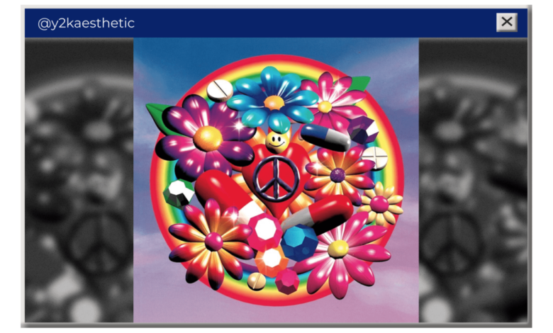
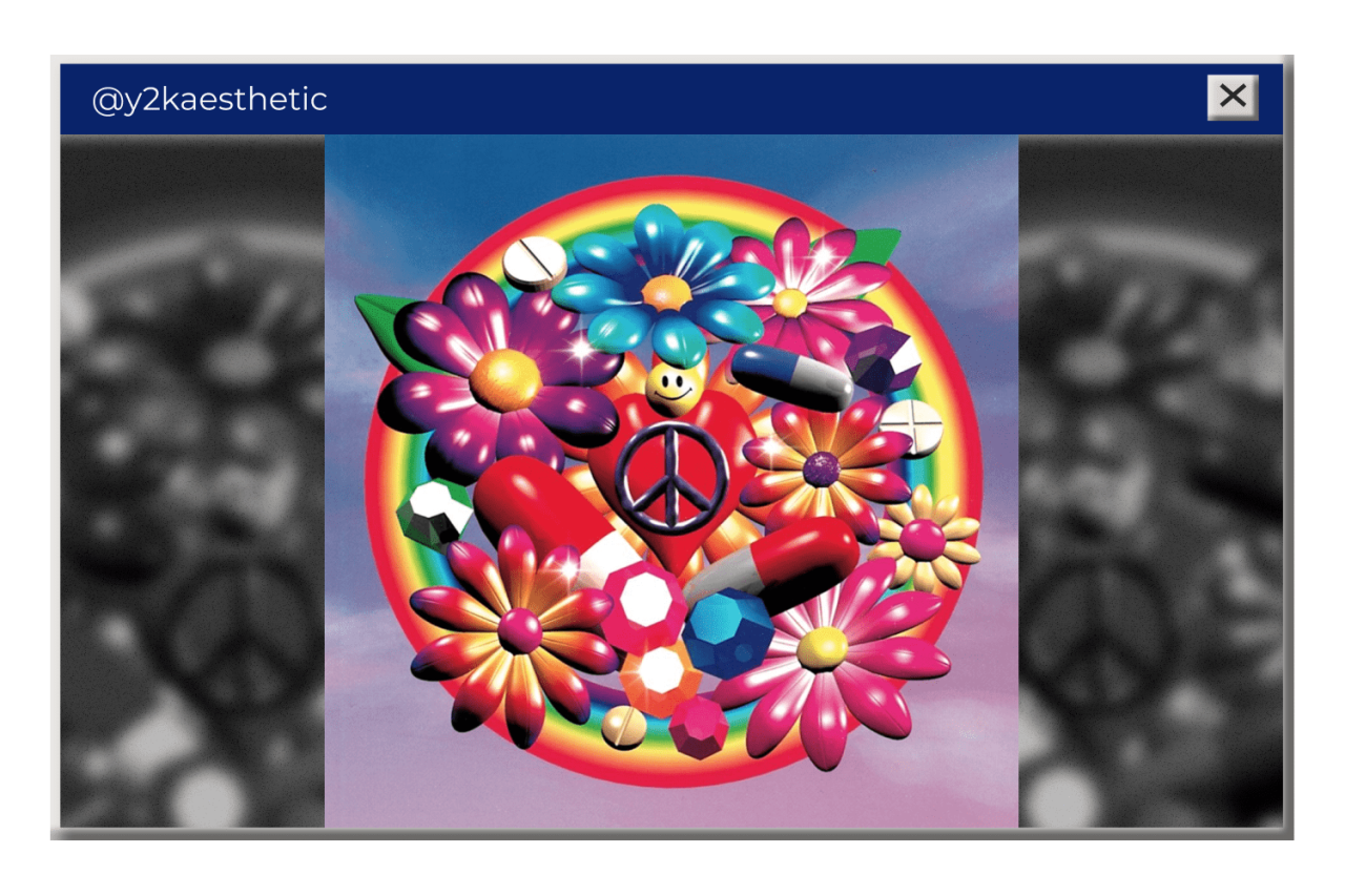
Y2K design, a vibrant reflection of the turn-of-the-millennium era, wasn’t just about bold colors and futuristic silhouettes; it was deeply rooted in a distinctive interplay of patterns and textures. These elements played a crucial role in creating the era’s unique aesthetic, a blend of playful optimism and technological advancement. Think less about subtle nuances and more about unapologetically bold statements.The use of bold patterns and textures was key to the visual impact of Y2K style.
It wasn’t about subtlety; it was about making a statement, creating a look that was instantly recognizable and undeniably fun. This approach permeated both fashion and graphic design, resulting in a visually exciting and often overwhelming aesthetic.
Recurring Patterns in Y2K Fashion and Graphic Design
Y2K patterns were characterized by their playful and often chaotic nature. They weren’t shy; they were loud, proud, and unafraid to clash. This created a sense of energy and excitement, reflecting the optimistic spirit of the time.
- Geometric Patterns: Bold geometric prints, such as intersecting lines, chevrons, and sharp angles, were ubiquitous. Think of brightly colored, oversized argyle patterns or sharply defined stripes in contrasting colors.
- Floral and Nature Prints: While often stylized and oversized, floral and nature-inspired prints were common, but with a twist. Think less delicate botanical illustrations and more bold, almost cartoonish representations of flowers and foliage, often in vibrant, unrealistic colors.
- Animal Prints: Animal prints, particularly leopard, zebra, and snakeskin, were hugely popular, often appearing in unexpected combinations or in unconventional colorways (like a neon pink leopard print).
- Abstract Prints: Psychedelic and abstract designs, featuring swirling patterns and bold color blocking, were also prevalent, adding a layer of visual complexity and movement.
- Logo and Graphic Prints: The rise of pop culture and branding led to the incorporation of logos and graphic elements into clothing and accessories, often in a playful and ironic way. Think of clothing featuring repeated cartoon characters or brand logos.
Recurring Textures in Y2K Fashion and Graphic Design
The textures of Y2K design were just as bold and expressive as its patterns. These textures further amplified the overall aesthetic, adding depth and dimension to the already vibrant visuals.
- Metallic Fabrics: Shiny, metallic fabrics like silver, gold, and chrome were highly sought after, reflecting the era’s fascination with technology and futuristic aesthetics. These fabrics often appeared in clothing, accessories, and even graphic design elements, adding a futuristic sheen.
- Sequins and Glitter: Sequins and glitter added a sense of sparkle and glamour, frequently used to embellish clothing and accessories, creating a dazzling and eye-catching effect. This texture added a playful and celebratory feel.
- Faux Fur and Leather: Faux fur and leather added texture and visual interest, often in bright colors or unexpected patterns. This reflected a certain level of playful rebellion and experimentation with materials.
- Plastic and Vinyl: The use of plastic and vinyl, materials associated with technology and futuristic design, added a unique tactile and visual element to Y2K fashion and graphic design. This emphasized the era’s embrace of synthetic materials.
Examples of Y2K Patterns and Textures
Imagine a graphic tee featuring a chaotic mix of neon geometric patterns layered over a bold animal print, all rendered with a glossy, almost plasticky texture. Or consider a pair of jeans embellished with strategically placed sequins, creating a shimmering, futuristic effect. Think of a handbag made of shiny vinyl with an oversized floral print in electric blue and pink.
These examples highlight the exuberant and often unexpected combinations that defined Y2K’s aesthetic.
Y2K Design in Different Media
Source: masterbundles.com
Y2K design, a vibrant reflection of the late 1990s and early 2000s, wasn’t confined to a single medium. Its bold colors, playful typography, and futuristic aesthetic permeated various creative outlets, from graphic design and fashion to web design and advertising. Examining its application across these different media reveals the multifaceted nature of this iconic style and its enduring influence.
Y2K Aesthetics Across Graphic Design, Fashion, and Web Design
Y2K’s impact is strikingly evident in the comparison of its application across graphic design, fashion, and web design. Graphic design of the era showcased bold, often clashing colors, playful typography (think Comic Sans and Papyrus), and the liberal use of gradients and textures. Think of early computer game artwork or the covers of teen magazines – vibrant, almost overwhelming in their visual density.
Fashion mirrored this, with low-rise jeans, crop tops, brightly colored clothing, and metallic accents defining the silhouette. Web design, still in its nascent stages, embraced similar aesthetics: bright neon colors, flashing animations, and a general sense of playful chaos dominated early websites. While graphic design focused on print and static imagery, fashion prioritized three-dimensional form and movement, and web design emphasized interactivity, all three shared a common thread of energetic visual stimulation and a futuristic outlook.
The Legacy and Revival of Y2K Design
The early 2000s, a time of dial-up internet, chunky cell phones, and frosted lipstick, left an indelible mark on popular culture. While initially dismissed as a fleeting trend, Y2K aesthetics have experienced a remarkable resurgence, captivating a new generation and influencing contemporary design. This revival isn’t simply nostalgia; it’s a complex interplay of factors reflecting broader societal shifts and a desire for playful, optimistic design.The recent resurgence of interest in Y2K aesthetics stems from several key factors.
Firstly, a cyclical nature of fashion and design inevitably brings back past trends, often reinterpreted for a modern audience. Secondly, Gen Z and Millennials, who grew up experiencing or witnessing the Y2K era, find its vibrant energy and unapologetic style appealing in contrast to the minimalist trends that preceded it. This nostalgic connection is amplified by the readily available digital archives of the period, allowing for easy access and inspiration.
Finally, the inherent optimism and playful experimentation of Y2K design offer a welcome counterpoint to the often-serious and austere tones of contemporary design.
Contemporary Reinterpretations of Y2K Design
Contemporary designers are not simply replicating Y2K styles; they are selectively incorporating and updating its key elements. The bold colors, playful graphics, and low-poly 3D elements are being refined and integrated into modern design contexts. For example, the characteristically bright, saturated color palettes are being used in more sophisticated ways, often combined with muted tones or earthy palettes to create a more balanced aesthetic.
So, you’re wondering, “What is Y2K design?” It’s all about that early 2000s aesthetic – think bright colors, chunky fonts, and a whole lot of playful graphics. If you’re looking to create some seriously retro YouTube content, check out this awesome guide on getting it on with YouTube to learn how to make your videos pop.
Understanding how to leverage this style will help you create truly authentic Y2K designs for your videos.
The playful, almost cartoonish graphics are being used to create striking visuals for brands aiming for a younger demographic. Similarly, low-poly 3D models, once a technical limitation, are now stylistic choices, used to create unique and eye-catching visuals.
A Modern Design Incorporating Y2K Elements, What is y2k design
Imagine a website landing page for a sustainable fashion brand. The background features a gradient shifting from a vibrant millennial pink to a soft lavender, reminiscent of Y2K’s love for bold color combinations. Superimposed on this gradient is a series of low-poly 3D models of clothing items – a sleek jumpsuit, a flowing skirt, and a stylish top – rendered in a slightly muted palette of greens, blues, and creams.
These 3D models aren’t photorealistic; instead, they maintain a slightly cartoonish, almost playful quality, consistent with the Y2K aesthetic. The typography utilizes a sans-serif font with rounded edges, characteristic of early 2000s web design, but in a clean and contemporary style. The overall effect is a visually striking and engaging page that successfully blends the playful energy of Y2K design with the sophistication and minimalism favored in contemporary web design.
The design choices prioritize clarity and accessibility, ensuring the core message of the brand is communicated effectively, while still maintaining the distinctive Y2K vibe.
Brands and Artists Utilizing Y2K-Inspired Designs
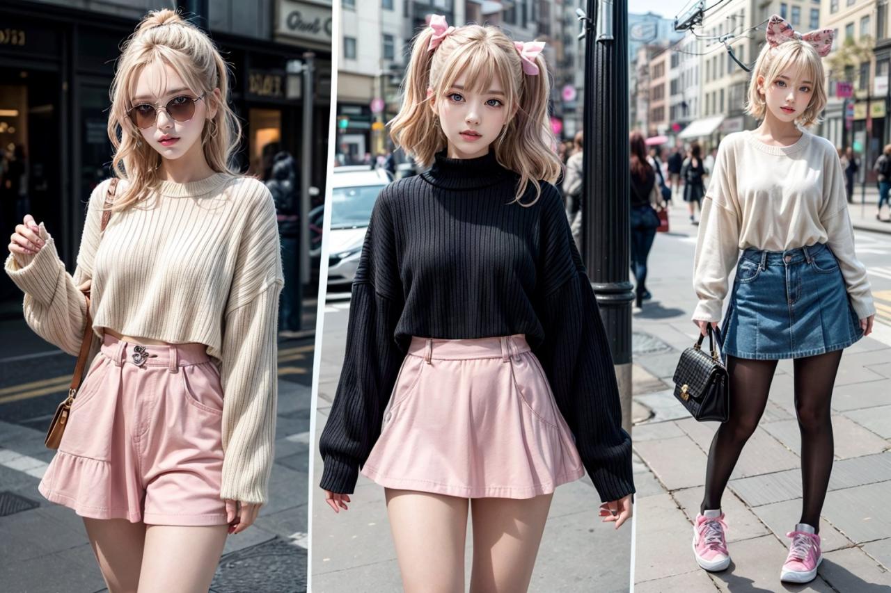
Several brands and artists are currently incorporating Y2K-inspired designs into their work. For example, many clothing brands are reviving iconic Y2K silhouettes and patterns, such as low-rise jeans, baby tees, and tracksuits, but with updated fabrics and fits. Graphic designers are using Y2K-inspired color palettes and typography in branding and marketing materials, creating visually engaging designs that resonate with younger audiences.
Musicians and visual artists are also drawing inspiration from the era, creating music videos, album art, and digital artwork that feature the distinctive visual language of Y2K. These examples demonstrate the widespread and continuing influence of Y2K aesthetics across various creative fields.
Final Review: What Is Y2k Design
So, what have we learned about Y2K design? It’s a captivating blend of optimism and anxiety, reflected in its bold aesthetics. Its recent revival isn’t just a trend; it’s a testament to its enduring appeal and its ability to be reinterpreted for modern sensibilities. Whether you’re a designer seeking inspiration or simply a curious observer of cultural shifts, understanding Y2K design offers a fascinating glimpse into the past and a compelling vision for the future of creative expression.
Its playful energy and unique visual language continue to resonate, proving that some trends are timeless.
Commonly Asked Questions
Is Y2K design only for digital spaces?
No! While it’s heavily associated with digital media, Y2K aesthetics are prevalent in fashion, graphic design, and even architecture.
How can I incorporate Y2K elements into my modern designs without it looking dated?
Use Y2K elements as accents rather than overwhelming the entire design. A pop of color, a specific font, or a carefully chosen pattern can add a touch of Y2K flair without feeling overly retro.
What are some common Y2K design mistakes to avoid?
Overusing glitter or overly bright colors can easily look tacky. Strive for balance and a modern twist on the classic Y2K style.