Whats Trending in Web Design
Whats trending in web design – What’s trending in web design? It’s a question on every designer’s mind, and the answer is constantly evolving! This year, we’re seeing a fascinating blend of established best practices and exciting new technologies shaping the digital landscape. From the continued dominance of mobile-first design to the rise of AI-powered tools and the ever-increasing focus on accessibility, the web design world is a dynamic place.
Let’s dive into the key trends that are defining 2024 (and beyond!).
We’ll explore the top trends impacting websites today, examining how AI is influencing aesthetics, and highlighting websites that are successfully implementing these cutting-edge designs. We’ll also delve into the crucial aspects of mobile-first design, the power of typography and visual hierarchy, the psychology of color choices in branding, and the essential balance between UI and UX design. Finally, we’ll touch on the exciting potential of emerging technologies like Web3, AR, and VR in shaping the future of the web.
Current Web Design Trends
The world of web design is in constant flux, with new trends emerging and evolving at a rapid pace. Understanding these shifts is crucial for designers aiming to create engaging and effective online experiences. This exploration delves into the top trends shaping the digital landscape, examining their impact and illustrating their application through real-world examples.
Top Five Prevalent Web Design Trends
Several key trends are currently dominating the web design sphere. These trends reflect a shift towards user-centricity, accessibility, and innovative technological integration. Understanding these trends is vital for designers aiming to create modern, engaging websites.
- Minimalism: A focus on clean layouts, ample white space, and a streamlined user experience. This trend prioritizes functionality and clarity, avoiding unnecessary clutter.
- Dark Mode: Increasingly popular due to its aesthetic appeal and reduced eye strain, dark mode inverts the traditional color scheme, using dark backgrounds with light text.
- 3D and Motion Graphics: Adding depth and dynamism to websites through subtle animations and 3D elements enhances user engagement and creates a more immersive experience.
- Bold Typography: Using distinctive and unconventional fonts to create visual impact and convey brand personality is a significant trend. This involves experimenting with font weights, sizes, and styles.
- AI-Powered Personalization: Leveraging artificial intelligence to tailor website content and design to individual user preferences enhances user experience and engagement.
Impact of Artificial Intelligence on Web Design Aesthetics
AI’s influence on web design aesthetics is profound and multifaceted. AI tools are used for various tasks, from generating design layouts and selecting color palettes to personalizing content and optimizing website performance. This leads to more efficient design processes and highly customized user experiences. For example, AI can analyze user behavior to predict preferences and automatically adjust website layouts or suggest relevant content, resulting in a more personalized and intuitive online experience.
This automation allows designers to focus on higher-level creative tasks, resulting in more innovative and visually appealing websites.
Examples of Websites Effectively Using Current Trends
Several websites effectively showcase these trends. For instance, Apple’s website exemplifies minimalism with its clean layout, simple navigation, and focus on high-quality product imagery. The website uses a predominantly white background with strategically placed product images and minimal text, enhancing product visibility and creating a clean, uncluttered look. In contrast, Spotify’s dark mode interface reduces eye strain and enhances the overall listening experience, particularly in low-light environments.
The dark background creates a visually appealing contrast with the light text and colorful album art, making the interface easier to navigate and more enjoyable to use. Furthermore, many e-commerce sites are incorporating AI-powered personalization, suggesting products based on user browsing history and preferences, leading to increased sales and customer satisfaction.
Comparison of Three Prominent Trends
The following table compares and contrasts three prominent web design trends: Minimalism, Dark Mode, and the use of 3D and Motion Graphics.
| Trend | Strengths | Weaknesses | Example Website (Illustrative) |
|---|---|---|---|
| Minimalism | Clean, uncluttered, user-friendly, fast loading | Can feel sterile, limited visual interest, may require careful planning | Apple.com |
| Dark Mode | Reduced eye strain, aesthetically pleasing, energy saving on some devices | Can make some text difficult to read, not suitable for all content | Spotify.com |
| 3D & Motion Graphics | Engaging, immersive, adds visual interest | Can be resource-intensive, may slow down loading times if overused, requires careful implementation to avoid being distracting | Many gaming websites |
Impact of Mobile-First Design
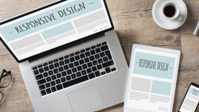
The rise of smartphones and tablets has fundamentally reshaped how we interact with the digital world. No longer a niche market, mobile devices are the primary access point for the internet for a significant portion of the global population. This shift has propelled mobile-first design from a trendy approach to a crucial necessity for any website aiming for success.
It’s no longer enough to simply make a website “responsive”; a truly successful online presence needs to prioritize the mobile experience from the very beginning of the design process.Mobile-first design, in its essence, prioritizes the user experience on smaller screens first. This approach ensures core functionality and essential content are readily accessible on mobile devices before expanding to larger screens.
The evolution has been remarkable, from clunky mobile versions of websites to sophisticated, seamless experiences optimized for touch interaction and limited screen real estate. This shift reflects a broader understanding of user behavior and the need to provide a streamlined and intuitive experience regardless of the device.
Challenges and Advantages of Designing for Various Screen Sizes
Designing for a multitude of screen sizes presents both challenges and advantages. The challenges lie primarily in balancing functionality and visual appeal across vastly different resolutions and aspect ratios. Maintaining a consistent brand identity while adapting the layout for small, medium, and large screens requires careful planning and often necessitates a flexible, modular design system. However, the advantages are significant.
A well-executed mobile-first approach results in a superior user experience across all devices, leading to increased engagement, higher conversion rates, and improved rankings. Furthermore, a mobile-first design often results in a cleaner, more efficient design for larger screens as well, streamlining the overall user experience.
Best Practices for Optimal User Experience Across Devices
Several best practices contribute to creating a seamless user experience across various devices. Prioritizing clear and concise content is paramount; avoid overwhelming users with excessive text or complex layouts on smaller screens. Using responsive images that scale appropriately to the device’s screen size is crucial for performance and visual appeal. Implementing intuitive navigation, such as a hamburger menu for smaller screens, ensures users can easily find what they need.
Thorough testing across a range of devices and browsers is essential to identify and resolve any compatibility issues. Finally, focusing on fast loading times is critical, as users are less tolerant of slow-loading websites, especially on mobile.
Mobile-First Layout for a Hypothetical E-commerce Product Page
Imagine an e-commerce product page for a stylish pair of sunglasses. A mobile-first approach would begin by focusing on the most essential elements: a prominent product image, a concise product title, a brief description highlighting key features, and a clear “Add to Cart” button. On smaller screens, these elements would be stacked vertically, prioritizing ease of access. As the screen size increases, additional information such as detailed specifications, customer reviews, and similar product suggestions could be incorporated seamlessly, perhaps using a horizontally scrolling carousel for similar products.
The overall design would emphasize clean lines, ample white space, and intuitive tap targets to optimize the user experience on touchscreens. The color scheme would be consistent with the brand’s identity, but the font size and layout would adapt dynamically to ensure readability and usability across all screen sizes. This approach ensures that even on the smallest mobile screen, the user can quickly and easily view the product, read its description, and add it to their cart.
Typography and Visual Hierarchy
Source: webdorks.com
Typography and visual hierarchy are often overlooked but incredibly powerful tools in web design. They’re not just about making your website look pretty; they directly impact user experience and the overall success of your online presence. Effective use of typography and a well-defined visual hierarchy guide users seamlessly through your content, improving readability and engagement. A poorly implemented approach, however, can lead to confusion and frustration, ultimately driving visitors away.
Visual hierarchy, in essence, is the arrangement of elements on a page to emphasize certain aspects over others. This is achieved through a variety of techniques, including size, color, contrast, and whitespace, all working in conjunction with carefully chosen typography to create a clear path for the user’s eye. Typography plays a crucial role in this hierarchy, with different font weights, sizes, and styles contributing to the overall visual flow and message.
Key Elements of Effective Typography in Web Design
Effective web typography hinges on several key elements. Legibility is paramount; choosing fonts that are easily readable across different devices and screen sizes is crucial. Readability is enhanced by appropriate line-height and character spacing, preventing cramped text that is difficult to decipher. Consistency is also vital; using a limited number of font families helps to maintain a cohesive and professional look.
Finally, consider the overall tone and style you want to convey; a playful script font might suit a children’s website, while a bold sans-serif might be more appropriate for a corporate site.
The Importance of Visual Hierarchy in Guiding User Navigation
A well-structured visual hierarchy is essential for guiding users through a website. By strategically emphasizing key elements like calls to action (CTAs), navigation menus, and important content blocks, designers can control the user’s journey and encourage desired actions. For instance, a larger, bolder headline immediately draws the eye, while strategically placed buttons with contrasting colors guide users towards specific actions.
Poor visual hierarchy, conversely, can lead to users feeling lost or overwhelmed, resulting in higher bounce rates and reduced engagement. Imagine a website where every element is the same size and color – the user would have no clear indication of where to start or what to focus on.
Font Pairings and Their Impact on Website Aesthetics
Selecting appropriate font pairings is a delicate balance between aesthetics and functionality. Generally, it’s recommended to use no more than two or three font families on a single website to maintain consistency. A common approach is to pair a serif font (like Times New Roman or Georgia) for body text with a sans-serif font (like Arial or Helvetica) for headings.
The serif font provides a more traditional and often more readable feel for larger blocks of text, while the sans-serif font offers a cleaner, more modern look for headlines and other prominent elements. Consider the contrast between the fonts; a strong contrast ensures readability while a subtle contrast creates a more refined aesthetic. For example, pairing a thin sans-serif with a bold serif can create a visually striking, yet harmonious, effect.
Conversely, using two very similar fonts can lead to a monotonous and less engaging design.
Best Practices for Selecting and Implementing Typography
Implementing effective typography requires careful planning and execution. Here are some best practices to follow:
- Prioritize legibility: Choose fonts that are easy to read on various devices and screen sizes.
- Maintain consistency: Use a limited number of font families to create a cohesive design.
- Consider contrast: Ensure sufficient contrast between text and background for optimal readability.
- Use appropriate font sizes: Larger font sizes for headings and smaller sizes for body text enhance readability.
- Optimize line height and letter spacing: Adjust these settings to improve readability and visual appeal.
- Test across devices: Ensure your typography looks and functions well on different browsers and devices.
Color Psychology and Branding
Color is more than just aesthetics in web design; it’s a powerful tool that directly impacts user experience and profoundly shapes brand perception. The strategic use of color psychology can significantly influence user emotions, behaviors, and ultimately, conversions. Understanding how colors evoke specific feelings allows designers to craft websites that resonate with their target audience and effectively communicate brand values.Color palettes are the foundation of a brand’s visual identity.
A consistent and well-chosen palette contributes to instant brand recognition and fosters a sense of trust and familiarity. The colors used should reflect the brand’s personality, values, and target market, creating a cohesive and memorable experience across all platforms. Inconsistent or poorly chosen colors can lead to confusion and dilute brand messaging, ultimately hindering its success.
Color Psychology’s Influence on User Experience
Different colors evoke distinct emotional responses. For example, blue often conveys trust and stability, making it a popular choice for financial institutions. Red, on the other hand, stimulates excitement and urgency, frequently used in call-to-action buttons. Green represents growth and nature, while yellow suggests happiness and optimism. Understanding these associations allows designers to guide user behavior and create a positive and engaging online experience.
For instance, using calming blues on a healthcare website can foster a sense of trust and security, while employing vibrant reds on an e-commerce site might encourage impulsive purchases.
Color Palettes and Brand Identity
A strong brand identity relies heavily on a cohesive color palette. Consider Coca-Cola’s iconic red – it’s instantly recognizable and associated with happiness and energy. Similarly, Tiffany & Co.’s signature robin’s egg blue evokes luxury and sophistication. These brands have successfully leveraged color to create a unique and memorable visual identity, fostering strong brand recognition and loyalty.
Choosing a color palette involves considering not only individual color meanings but also their combinations and the overall mood they create. A well-defined palette ensures consistency across all brand touchpoints, reinforcing brand recognition and enhancing user experience.
Examples of Effective Color Use in Web Design
Spotify utilizes a vibrant green, representing growth and music’s energetic nature. Their website consistently uses this green, reinforcing their brand and creating a positive, engaging user experience. Conversely, the minimalist design of Apple’s website, predominantly using white and gray with occasional accents of their signature silver, creates a clean, sophisticated feel that aligns perfectly with their brand’s premium image.
The contrast between Spotify’s lively green and Apple’s minimalist palette perfectly demonstrates how different color choices can reflect diverse brand personalities and effectively communicate their unique value propositions.
Mood Board: Illustrative Color Palettes
Imagine a mood board with four distinct sections, each representing a different brand personality. The first, for a tech company, features cool blues and grays, evoking innovation and reliability. The second, showcasing a playful children’s brand, uses bright, cheerful yellows, oranges, and greens, representing fun and energy. A third section, representing a luxury fashion brand, utilizes sophisticated blacks, golds, and deep purples, projecting elegance and exclusivity.
Finally, a fourth section, for an eco-friendly company, incorporates calming greens, earthy browns, and soft blues, communicating nature and sustainability. Each section’s color palette effectively communicates the specific brand personality, demonstrating the power of color in shaping brand perception.
User Interface (UI) and User Experience (UX) Design
Source: notiontechnologies.com
UI and UX design are two distinct but inextricably linked disciplines crucial for the success of any website. While often used interchangeably, they represent different facets of the user’s interaction with a digital product. Understanding their relationship and applying best practices in both areas is paramount to creating a website that is not only aesthetically pleasing but also highly functional and user-friendly.UI design focuses on the visual elements of a website – the look and feel.
This includes everything from the layout and typography to the buttons, images, and overall aesthetic. UX design, on the other hand, encompasses the entire user journey, from initial interaction to achieving their goal on the site. It considers the overall usability, accessibility, and effectiveness of the website in meeting user needs. A well-designed UI enhances the UX, making the website enjoyable and intuitive to use, while a strong UX ensures users can easily accomplish their tasks.
Current Trends in UI/UX Design
Current trends in UI/UX design emphasize simplicity, personalization, and seamless user experiences. Micro-interactions, subtle animations that provide feedback to user actions (like a button subtly changing color on hover), are becoming increasingly popular. These small details significantly enhance the user experience by providing clear visual cues and creating a more engaging and responsive interface. Furthermore, the use of realistic illustrations and 3D elements are trending, adding visual interest and depth to otherwise static layouts.
These design choices contribute to a more visually appealing and engaging experience.
Best Practices for Creating Intuitive and User-Friendly Interfaces, Whats trending in web design
Creating an intuitive and user-friendly interface requires a deep understanding of user behavior and expectations. Prioritizing clear navigation is essential; users should easily find what they need without frustration. This involves using clear and concise labels, logical information architecture, and consistent design patterns. Another critical aspect is accessibility; designing for users with disabilities, such as those with visual or motor impairments, is not only ethically responsible but also expands the potential user base.
This involves adhering to accessibility guidelines like WCAG (Web Content Accessibility Guidelines). Finally, conducting thorough user testing throughout the design process is vital to identify and address usability issues before launch. Iterative testing and feedback incorporation are key to refining the interface and ensuring a positive user experience.
Application of UX Principles in Website Navigation
Consider a simple e-commerce website selling handmade jewelry. A strong UX design would prioritize ease of navigation to product categories (e.g., earrings, necklaces, bracelets). The main navigation menu would be clearly visible and easily accessible, perhaps located at the top of the page. Each category page would then logically present the products, allowing users to filter by price, material, or style.
A clear search function would enable users to quickly find specific items. The checkout process would be streamlined and intuitive, minimizing the number of steps required to complete a purchase. A well-placed FAQ section and readily available customer support contact information would further enhance the user experience, addressing potential questions or issues promptly. This structured approach ensures a seamless and enjoyable shopping experience, increasing the likelihood of conversions and repeat visits.
Accessibility and Inclusivity in Web Design
Source: ytimg.com
Creating websites that are accessible to everyone, regardless of ability, is not just ethically sound; it’s crucial for reaching a wider audience and fostering a truly inclusive online experience. Ignoring accessibility limits your potential reach and can even lead to legal repercussions. A well-designed accessible website benefits everyone, improving usability for all users.
Accessibility in web design ensures that people with disabilities—including visual, auditory, motor, and cognitive impairments—can perceive, understand, navigate, and interact with your website. This means providing alternative ways to access information and interact with your site’s functionality, making it usable for everyone.
WCAG Principles
The Web Content Accessibility Guidelines (WCAG) are internationally recognized standards for web accessibility. They provide a framework for creating websites that are usable by people with a wide range of disabilities. WCAG 2.1, the current version, Artikels four key principles: Perceivable, Operable, Understandable, and Robust. Each principle is further broken down into specific success criteria, which detail the technical requirements for achieving accessibility.
Examples of Accessible Design Elements
Implementing accessible design involves thoughtful consideration of various elements. For example, providing alternative text (alt text) for images allows screen readers to describe the image to visually impaired users. Alt text should concisely describe the image’s content and purpose. For example, instead of “image of a cat,” a more descriptive alt text would be “A fluffy tabby cat sitting on a windowsill, looking out at a garden.”
Another crucial element is keyboard navigation. All interactive elements, such as buttons and links, must be navigable using only a keyboard, eliminating the need for a mouse. This is essential for users with motor impairments. Clear and consistent labeling of form fields ensures users understand what information is required and how to input it. For example, using placeholder text within form fields provides clear instructions without requiring users to click into each field to understand what type of input is expected.
Furthermore, sufficient color contrast between text and background is essential for users with low vision. WCAG provides specific guidelines for minimum color contrast ratios. Using captions and transcripts for audio and video content makes your content accessible to deaf and hard-of-hearing users. These elements ensure that all users can access and understand the information presented on your website.
Accessibility Best Practices Checklist
Following these best practices ensures your website is more inclusive and user-friendly for everyone:
- Provide alternative text for all images and non-text content.
- Ensure sufficient color contrast between text and background.
- Make all interactive elements keyboard navigable.
- Use clear and concise language.
- Structure content logically using headings and lists.
- Provide captions and transcripts for audio and video content.
- Use ARIA attributes where appropriate to enhance accessibility for assistive technologies.
- Regularly test your website with assistive technologies.
- Follow WCAG guidelines for all aspects of your website design.
- Consider users with cognitive disabilities by using clear and simple language, consistent navigation, and avoiding distractions.
Emerging Technologies in Web Design
The digital landscape is constantly evolving, and emerging technologies are rapidly reshaping the way we design and experience websites. Web3, augmented reality (AR), and virtual reality (VR) are no longer futuristic concepts; they are actively influencing current web design and hold immense potential for the future. This section explores the impact of these technologies and examines potential future trends they will shape.
Web3’s Influence on Web Design
Web3 technologies, encompassing blockchain, decentralized applications (dApps), and the metaverse, are fundamentally altering the internet’s architecture and user interaction. This shift necessitates a reimagining of web design principles. Instead of centralized platforms controlling data and user experiences, Web3 emphasizes user ownership, transparency, and community governance. This translates into websites that are more interactive, personalized, and secure. For example, NFTs (non-fungible tokens) are being integrated into websites to offer unique digital assets to users, creating new revenue streams and fostering community engagement.
Decentralized storage solutions offer improved data security and resilience, reducing reliance on single points of failure. The metaverse presents opportunities for immersive brand experiences, extending beyond traditional website formats.
Augmented Reality (AR) and Virtual Reality (VR) in Web Experiences
AR and VR technologies are enhancing user engagement by blurring the lines between the digital and physical worlds. AR overlays digital information onto the real world, enhancing website experiences through interactive elements and contextual information. Imagine a furniture website that allows users to virtually place furniture in their living rooms using their smartphones before purchasing. This improves the user experience significantly, reducing uncertainty and increasing purchase confidence.
VR, on the other hand, creates fully immersive digital environments. This technology enables the creation of virtual showrooms, interactive product demonstrations, and engaging brand experiences that go far beyond the limitations of traditional websites. For instance, a travel agency could use VR to let potential clients experience a destination before booking a trip.
Future Trends in Web Design Based on Emerging Technologies
The convergence of these technologies will likely lead to several key future trends. We can expect to see a rise in personalized and adaptive websites that leverage AI and machine learning to tailor content and functionality to individual user preferences. Immersive web experiences utilizing AR and VR will become more commonplace, offering richer and more engaging interactions. The increased adoption of Web3 principles will lead to more decentralized and user-centric website architectures, empowering users with greater control over their data and online identities.
Furthermore, the integration of the metaverse will create new opportunities for virtual commerce, social interaction, and brand storytelling. The demand for designers skilled in these technologies will also increase significantly.
Conceptual Futuristic Webpage
Imagine a webpage accessed via a neural interface. The background is a constantly shifting nebula of vibrant colors, reflecting the user’s emotional state in real-time. Information appears as holographic projections, floating and interacting dynamically. Navigation is intuitive and subconscious, guided by the user’s thoughts and intentions. Data is presented as elegant, minimalist visualizations, tailored to the user’s specific needs and preferences.
The user can seamlessly transition between different virtual environments, exploring interactive 3D models of products or engaging in collaborative projects within a shared virtual space. This seamless integration of technology and user experience creates an environment that is both informative and emotionally resonant, exceeding the capabilities of current web design.
Epilogue: Whats Trending In Web Design
So, what have we learned about what’s trending in web design? The key takeaway is that design is not just about aesthetics; it’s about creating seamless, accessible, and engaging experiences for users across all devices. By embracing mobile-first principles, leveraging the power of color psychology, and prioritizing user experience, designers can create websites that are not only beautiful but also highly effective.
The future of web design is bright, fueled by innovation and a commitment to inclusivity. Stay tuned for the next wave of exciting developments!
Popular Questions
What is mobile-first design, and why is it important?
Mobile-first design prioritizes the mobile user experience. Since most users access websites via smartphones, this approach ensures a smooth, efficient experience on smaller screens, which then scales up effectively for larger devices. It improves user experience and search engine optimization.
How can I improve the accessibility of my website?
Prioritize clear and concise text, use sufficient color contrast, provide alt text for images, and ensure keyboard navigation is possible. Adhering to WCAG guidelines is a great starting point.
What are some examples of effective typography in web design?
Using a clear, legible font for body text paired with a complementary heading font creates visual hierarchy and enhances readability. Consider using Google Fonts for a wide selection of free, high-quality fonts.
How can AI impact my web design workflow?
AI tools can assist with tasks like generating design ideas, optimizing images, and personalizing user experiences. They can streamline the design process and improve efficiency.
