
The Dinner Ladies, a prominent Australian provider of ready-to-heat comfort meals, has officially launched a comprehensive corporate rebrand. The initiative, executed in collaboration with design agency Universal Favourite, aims to modernize the company’s visual and verbal identity while preserving its heritage as a home-grown business. This strategic pivot comes at a time when the pre-prepared meal delivery market is experiencing rapid expansion, driven by shifting consumer preferences toward convenience and high-quality, home-style nutrition.

Historical Context and Evolution
Founded in 2007 by two entrepreneurs in a backyard shed in Sydney, The Dinner Ladies began with a simple mission: to alleviate the pressure of the "dinner time rush" for busy families. Over the past 17 years, the company has transitioned from a small-scale local operation into a significant player in the national frozen meal delivery market. Throughout this period of organic growth, the brand’s visual identity underwent numerous iterative changes, which stakeholders noted had resulted in a dilution of the brand’s original, distinct "anti-mumsy" character and bold, audacious market positioning.

The decision to undergo a full-scale rebrand was predicated on the need to align the company’s external image with its current scale and operational capabilities. By reviewing historical design assets, including early hand-drawn logos and previous website architectures, the design team sought to distill the essence of the company’s origins into a more robust and scalable brand identity.

The Landscape of the Meal Delivery Sector
The current Australian market for pre-prepared meal delivery is characterized by high levels of saturation and intense competition. Data from industry analysts suggests that the sector has become increasingly crowded with providers employing standardized, "same-same" messaging that prioritizes generic claims of health, convenience, and culinary excellence.

This environment has created a gap for brands that can offer a more distinct personality. The Dinner Ladies have positioned themselves to fill this niche by rejecting the over-sincerity and "fake friendliness" often found in the industry. Instead, the company has adopted a tone of voice that balances empathetic care with a "bull-free" and slightly irreverent perspective, aiming to resonate with time-poor customers who value authenticity and straightforward communication over corporate jargon.

Strategic Design and Visual Identity
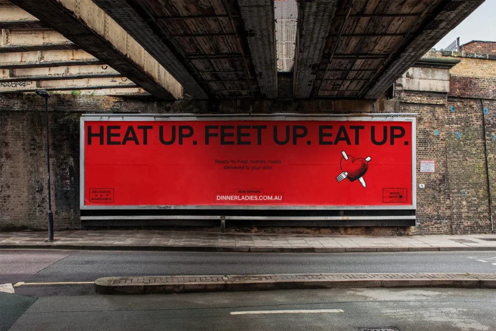
The rebrand process involved a meticulous audit of existing brand elements. A key priority was the refinement of the company’s logo. The design team opted to decouple the brand’s signature heart icon from its script wordmark. This separation provides greater flexibility, allowing for improved readability and scalability across diverse digital and physical touchpoints. Illustrator Jake Foreman was commissioned to redraft these elements, incorporating a gritty, stippled texture that pays homage to traditional tattoo art styles—a nod to the brand’s history of "rough-around-the-edges" flair.

The color palette was also strategically updated. While retaining the brand’s established red—a hue that carries significant recognition in the category—the designers introduced a more vibrant, modern iteration. This is supported by a secondary palette consisting of warm, retro-inspired tones designed to enhance digital visibility and consumer engagement.

Typography plays a critical role in the new identity, with the selection of the "Denim" typeface family from Displaay Type Foundry. The use of "Denim Wide" for headings is intended to command attention and project confidence, while the regular version ensures legibility for body copy and subheadings, facilitating a balance between bold expression and functional utility.

Operational and Packaging Enhancements
Recognizing that the user experience for frozen meals is often defined by urgency, the rebrand included a functional overhaul of product packaging. A new color-coded system was introduced to allow for immediate differentiation between various protein groups. This design choice is intended to reduce the cognitive load for the consumer, facilitating faster identification of meals within a crowded freezer, thereby reinforcing the brand’s core value proposition of convenience.

The Role of Authentic Photography and Narrative
To emphasize its commitment to "food from the heart," the brand has moved away from overly polished, artificial food photography. The new imagery, captured by photographer Alana Dimou and styled by a multidisciplinary team, focuses on the "authentic messiness" of real life. By depicting the reality of domestic environments—including remnants of past meals or the raw, unposed interactions of family life—The Dinner Ladies aim to create a deeper emotional connection with their target demographic.

This visual strategy is complemented by a revamped verbal identity, developed in partnership with copywriter Cat Wall. The new copy style is designed to be joyful and comforting without resorting to patronizing stereotypes, ensuring the brand maintains its standing as a "charming rebel" within the culinary space.

Market Implications and Future Outlook
The transition represents more than a mere aesthetic update; it is a fundamental repositioning intended to secure the company’s competitiveness for the next decade. By formalizing a flexible design system, The Dinner Ladies are now better equipped to maintain brand consistency as they expand their product offerings and digital footprint.

From an analytical standpoint, this rebrand underscores a broader trend in the food-tech sector: the move away from commoditized marketing toward brand storytelling rooted in specific, relatable human experiences. As consumers become more discerning, the ability of a brand to synthesize its history with a clear, functional, and bold identity is likely to become a key differentiator.

For The Dinner Ladies, the successful implementation of this new identity provides the necessary scaffolding for continued scaling. As they move forward, the focus remains on leveraging this updated brand presence to communicate their core mission: helping families navigate the complexities of daily life by providing high-quality, convenient dinner solutions that are both honest and flavorful. The company’s ability to successfully navigate the transition from a "backyard shed" startup to a modern, structured national entity will likely serve as a case study for other growth-stage businesses in the subscription food service industry.