
Henri & Hélène stands as a compelling case study in how modern hospitality brands can effectively marry historical nostalgia with contemporary design sensibilities. Inspired by the quintessential neighborhood cafés of Paris, the restaurant is more than a dining destination; it is a meticulously crafted sensory experience centered on the fundamental human act of gathering around a table. By naming the establishment after the chef’s two children, the brand imbues itself with a personal narrative that translates into a warm, playful, and effortlessly welcoming atmosphere. The visual identity, developed by the design firm Goodside, serves as the primary conduit for this brand story, utilizing a sophisticated blend of vintage French aesthetics to distinguish the bistro in a competitive, often saturated, market.
The Intersection of Heritage and Modernity
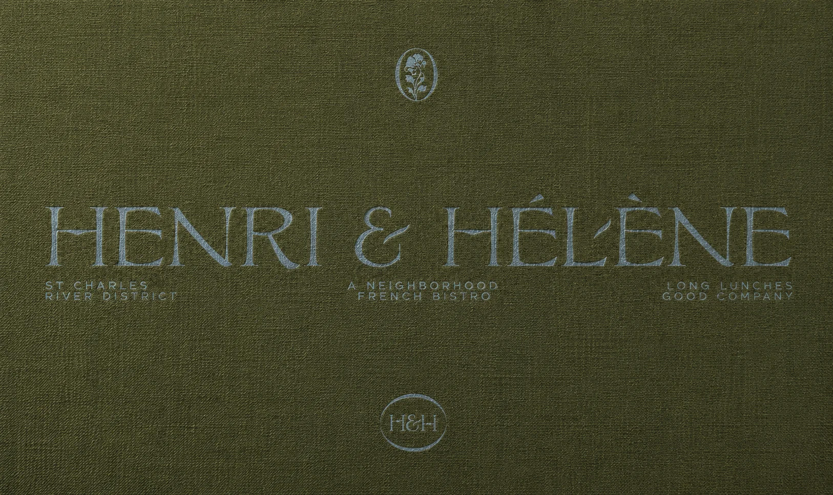
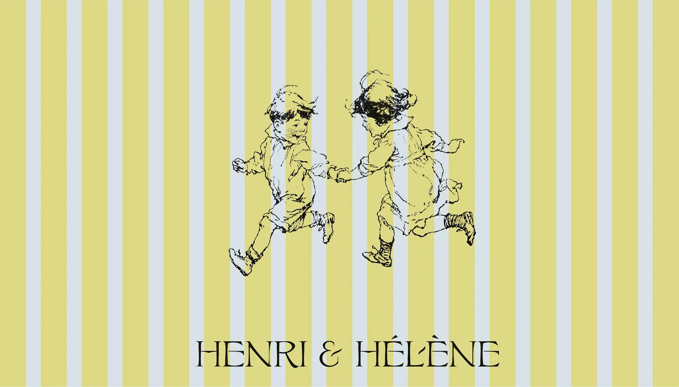
The conceptual framework behind Henri & Hélène rests on the dual pillars of authenticity and accessibility. In an era where many fine-dining establishments lean toward minimalism or industrial coldness, this bistro opts for a "soft" approach. The design team at Goodside drew heavy inspiration from the Belle Époque period, an era defined by optimism, regional travel, and the proliferation of café culture. By incorporating typography and motifs reminiscent of this golden age, the restaurant creates an immediate sense of place and time, even while serving a contemporary, elevated menu.
The color palette is particularly noteworthy for its strategic use of the French coastline’s natural tones. Rather than opting for the high-contrast, aggressive branding often seen in modern urban bistros, Henri & Hélène utilizes muted, organic hues that evoke the feeling of a seaside retreat. This color theory is designed to lower the psychological barrier to entry, signaling to the prospective guest that the experience will be one of comfort and relaxation rather than stiff, formal formality.
A Chronology of Concept Development
The realization of the Henri & Hélène brand followed a phased approach common in high-end restaurant development. Initial conceptualization began with the chef’s desire to move away from the impersonal nature of modern dining, shifting the focus toward the "table as a hearth."
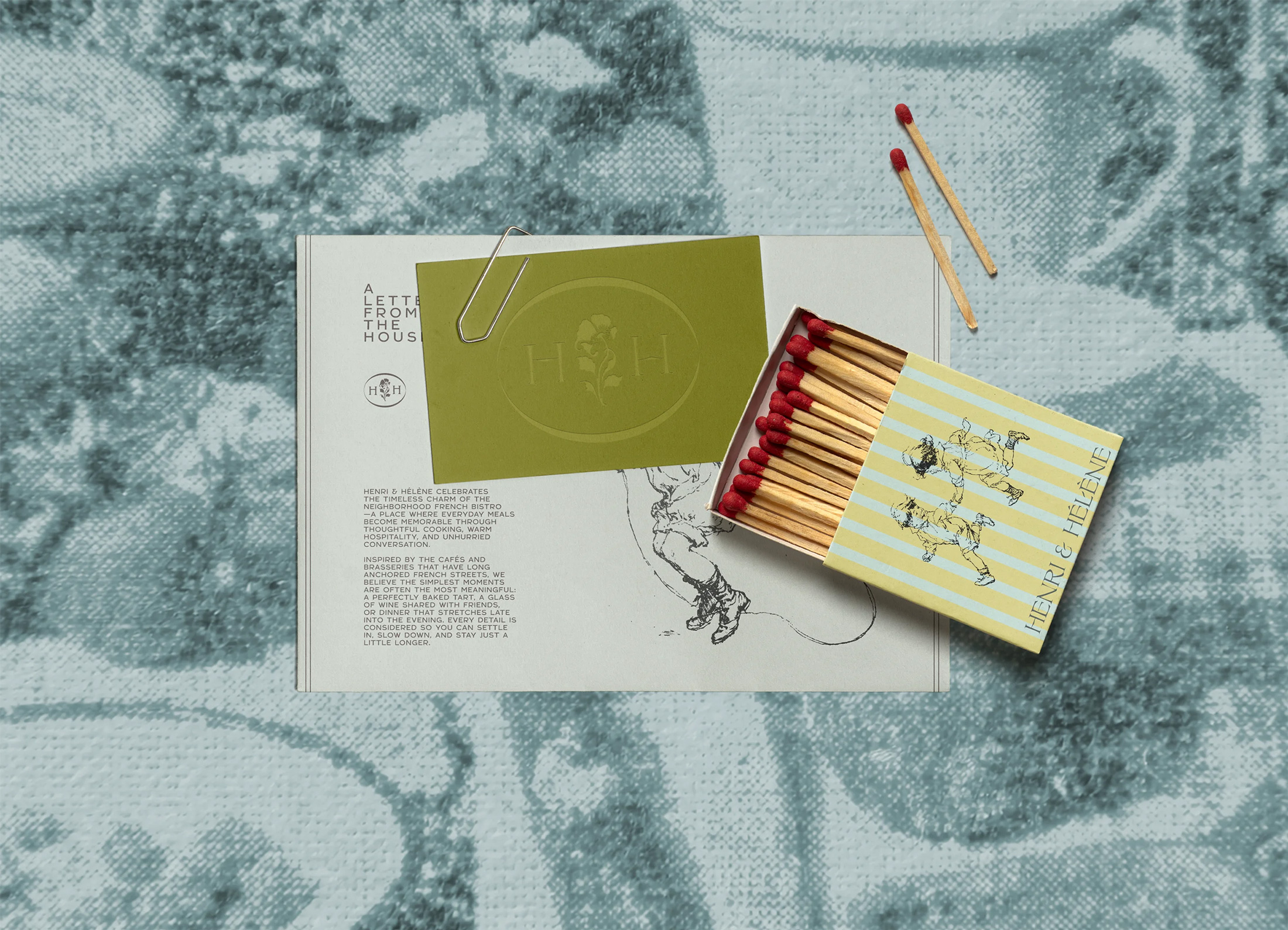
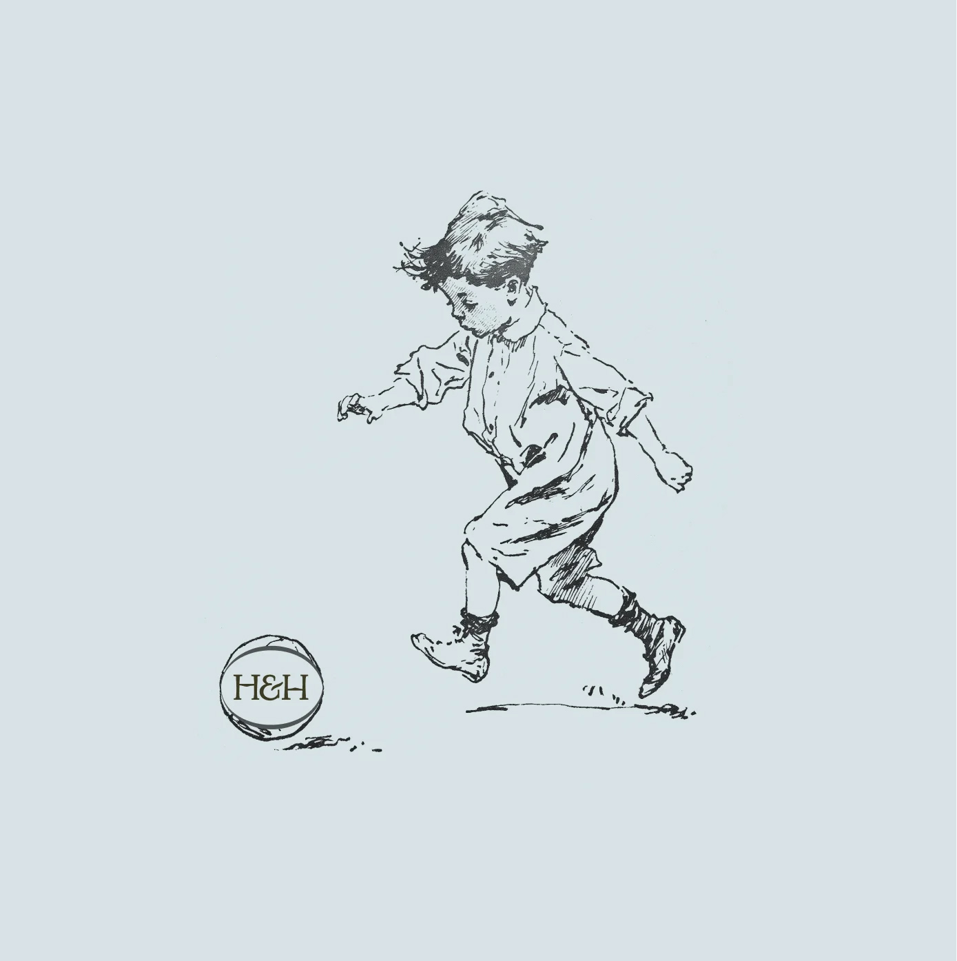
In the first phase of development, the core brand identity was established, centered on the personal naming convention. This move served two purposes: it solidified the familial commitment of the founder and created a shorthand for the brand’s intimacy. Following the naming, the second phase involved the design firm Goodside, which conducted an audit of French printing history. They identified that hand-drawn engravings—a hallmark of late 19th-century book illustrations—could serve as the foundational visual language for the bistro.
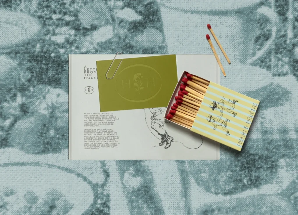
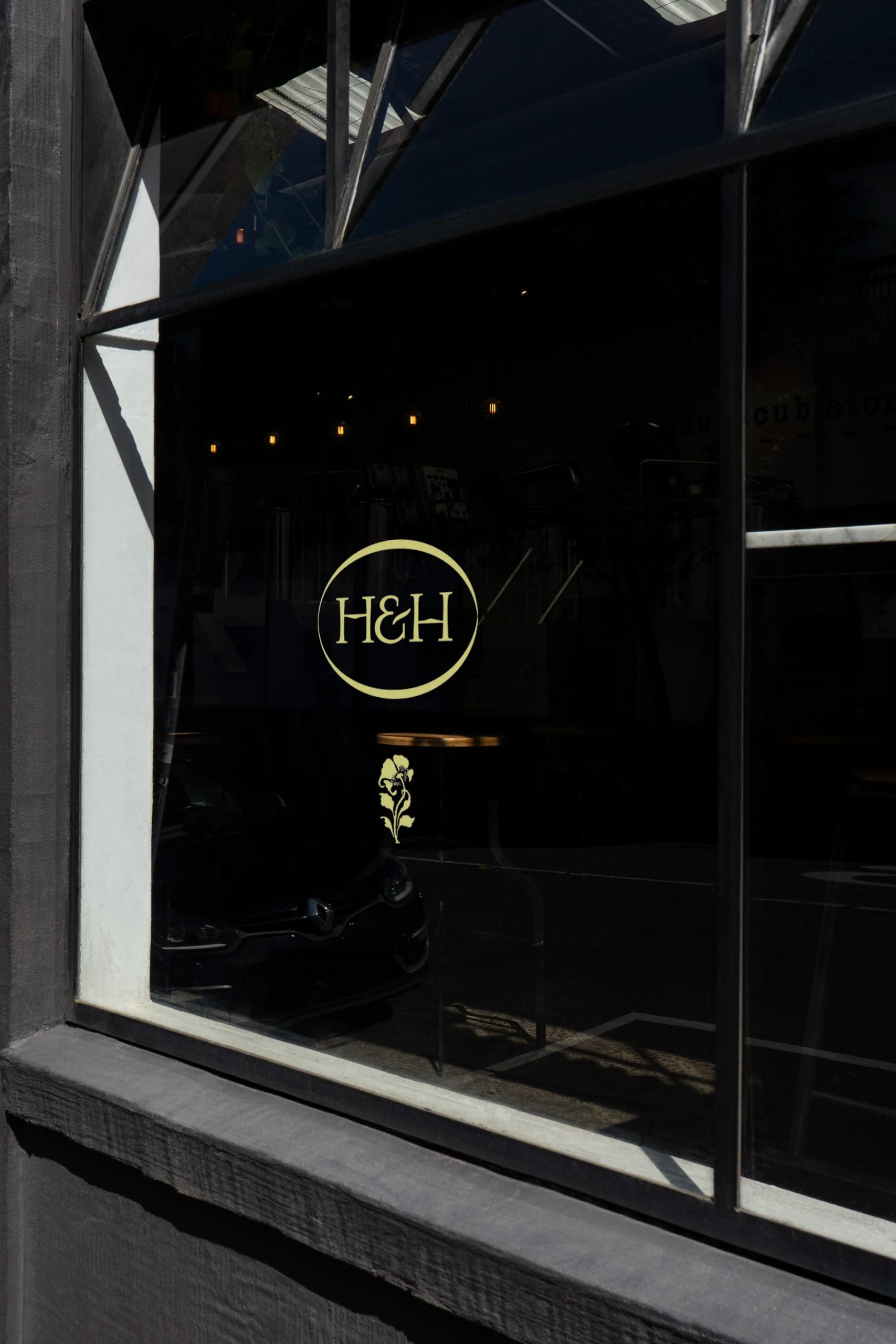
By the third phase, these visual elements were integrated into the physical space. Unlike many restaurants that treat branding as a secondary concern, Henri & Hélène ensured that every touchpoint—from the menus and matchbooks to the coasters and signage—was treated as a canvas for the brand’s narrative. The final phase involved the curation of printed ephemera, ensuring that even the most fleeting interaction, such as receiving a bill or a takeaway bag, felt like a deliberate extension of the restaurant’s story.
Visual Language and the Art of Detail
The efficacy of the branding lies in its consistency. The hand-drawn engravings, which feature subtle nods to the children for whom the restaurant is named, provide a sense of discovery for the diner. When a guest sits at a table, they are not merely observing a logo; they are interacting with an illustrated ecosystem.
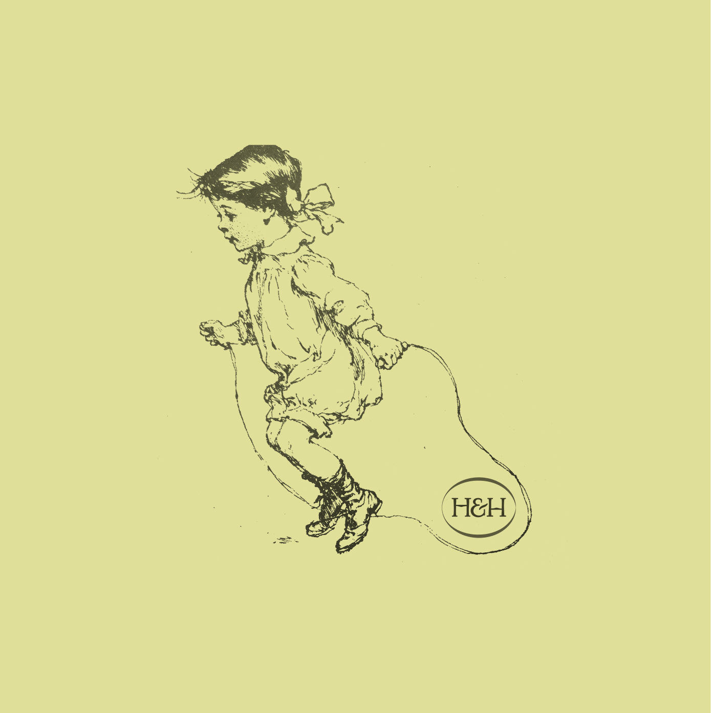
Goodside’s approach to typography is equally rigorous. The use of Belle Époque-inspired fonts serves to ground the brand in historical significance without veering into pastiche. This is a difficult balance to maintain; often, historical references can make a brand feel dusty or outdated. However, by pairing these vintage styles with modern, airy layouts and a clean, contemporary spatial design, the restaurant feels "refreshingly contemporary," as described by industry observers.
Supporting Data and Industry Trends
The success of Henri & Hélène coincides with a broader shift in the global hospitality market. According to recent industry data, there has been a marked increase in consumer preference for "hyper-local" and "narrative-driven" dining experiences. A 2024 survey of urban diners indicated that 68% of respondents prioritize a restaurant’s atmosphere and brand story as heavily as the menu offerings when deciding on a venue for a special occasion.
Furthermore, the "bistro-revival" trend, which emphasizes smaller, community-focused eateries over large-scale dining halls, has seen a growth rate of 4.2% annually in major metropolitan areas. Henri & Hélène occupies this specific niche, offering a space that is intimate enough for regular neighborhood visits but premium enough for destination dining. The use of high-quality, tactile materials in their printed ephemera also reflects a shift away from digital-only menus, which consumers have increasingly reported finding "sterile" or "unwelcoming."
Official Perspectives and Design Philosophy
While the restaurant itself focuses on the guest experience, the designers at Goodside have been vocal about the importance of cohesive identity systems in hospitality. In discussions surrounding the project, representatives from the studio emphasized that "a restaurant’s visual identity is its silent host."
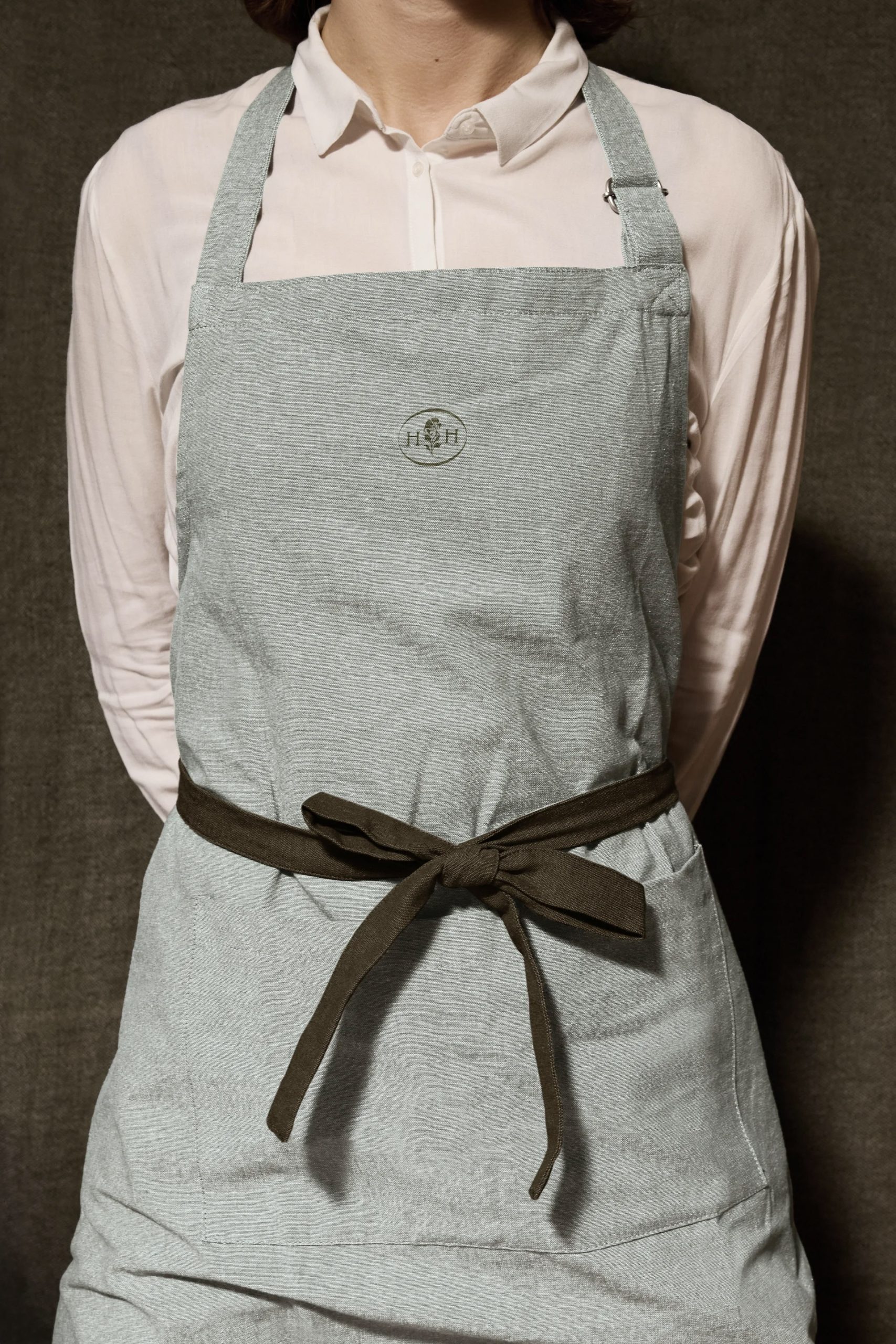
The design philosophy adopted here suggests that when the visual cues—the signage, the weight of the paper in the menu, the texture of the coasters—align with the physical environment and the culinary output, the customer experiences a phenomenon known as "brand congruence." This congruence reduces cognitive load, allowing the guest to settle into the environment more quickly and, ultimately, to enjoy the meal more thoroughly. By removing the friction between the brand’s promise and its delivery, Henri & Hélène has created a frictionless experience that feels both familiar and special.
Broader Impact and Market Implications
The implications of the Henri & Hélène model for the wider hospitality sector are significant. It challenges the notion that a restaurant needs to be hyper-modern or minimalist to be relevant. Instead, it suggests that there is a significant, under-served market for "nostalgic modernism."
Furthermore, the restaurant’s reliance on hand-drawn, artisanal visual assets provides a blueprint for other independent businesses looking to differentiate themselves in a digital-heavy world. As AI-generated graphics and stock photography become increasingly common, the investment in custom, hand-drawn design serves as a powerful signal of quality and care. It tells the customer that the restaurant owner cares about the details, which, by extension, implies they care about the ingredients and the service as well.
Conclusion: A Blueprint for the Future
Henri & Hélène succeeds because it treats branding as a form of hospitality. It is not simply about having a logo or a color scheme; it is about creating a cohesive, immersive environment that respects the history of the neighborhood bistro while addressing the requirements of the modern diner.
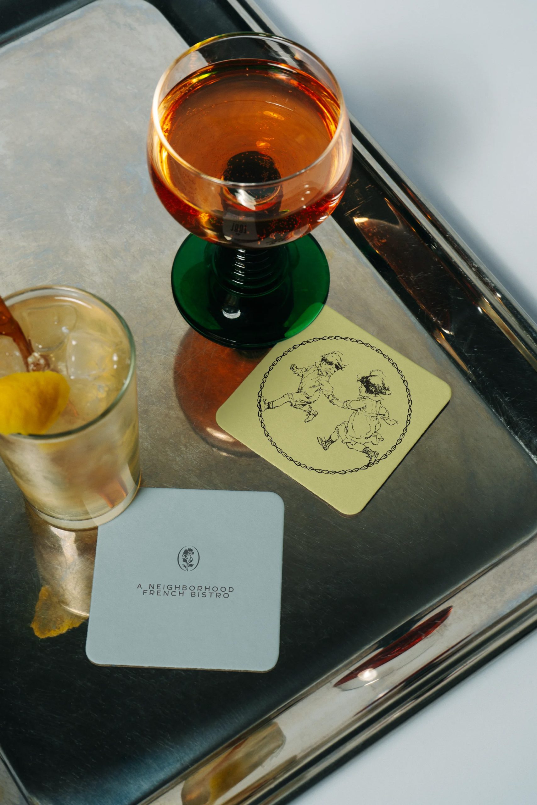
By grounding its identity in the personal story of the chef and the timeless aesthetic of the Belle Époque, the bistro has managed to create something that feels like it has always been there, yet is entirely new. As the restaurant industry continues to evolve in the face of shifting consumer habits and technological advancements, the approach taken by Henri & Hélène—prioritizing human connection, tactile detail, and narrative depth—serves as a compelling and sustainable model for future growth. It is a reminder that in an increasingly complex world, the most successful businesses are often those that remember the simple pleasure of gathering around a well-set table.