Tag: typeface

  • The Type Directors Club’s 25th Typeface Design Competition Embraces Global Expansion and Inclusivity

    The Type Directors Club’s 25th Typeface Design Competition Embraces Global Expansion and Inclusivity

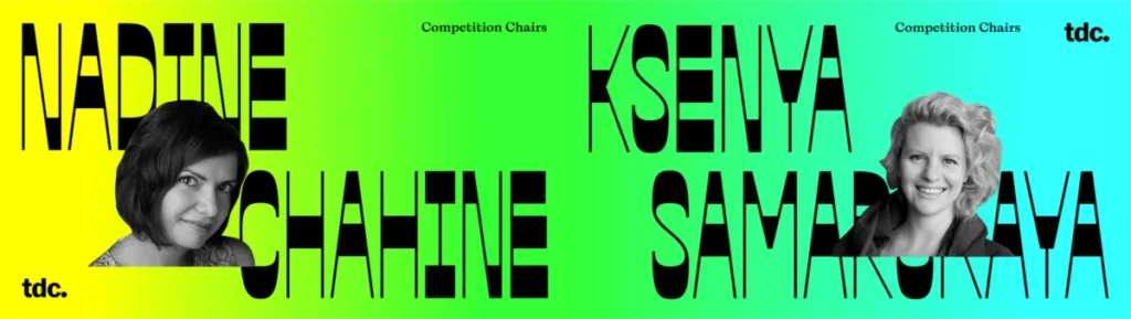
    Written by Tanya George on December 8, 2021, the Type Directors Club (TDC) has unveiled significant transformations for its 25th Typeface Design Competition, signaling a robust commitment to global inclusivity and a broader definition of typographic excellence. Co-chaired by renowned type designers Nadine Chahine and Ksenya Samarskaya, this year’s competition aims to dismantle traditional gatekeeping in design contests and champion a more diverse range of scripts and voices.

    Evolving the Landscape of Design Competitions

    Historically, design competitions, particularly within the specialized field of typography, have often served as markers of prestige and established taste. However, these platforms have also been critiqued for reinforcing existing hierarchies and inadvertently creating barriers for participation based on geography or financial resources. The TDC’s strategic shift, spearheaded by Chahine and Samarskaya, directly addresses these concerns, seeking to reframe the competition as a space for shared abundance rather than exclusive victory.

    Chahine & Samarskaya Cochair TDC’S 25th Type Design Competition

    "Competitions can at times act as a fig leaf for a sort of geographic and monetary gatekeeping that deters participation," the article notes. "How can one judge excellence if a competition doesn’t allow all of the players onto the field?" This question underpins the core motivation behind the TDC’s evolving approach.

    A New Era for the TDC Competition

    Nadine Chahine and Ksenya Samarskaya, in their conversation with Tanya George, detailed the genesis of these changes. Chahine, a long-standing figure in the type design community, has a history with the TDC dating back to her first competition submission in 2003. Her journey progressed through attending exhibitions, speaking engagements, judging, and ultimately, joining the TDC’s board. Samarskaya’s engagement also deepened through judging and eventually chairing previous competitions, leading to insightful discussions about the evolving landscape of global scripts within the contest.

    The impetus for this year’s significant revisions was not a singular event but rather a culmination of observations and a shared vision for a more equitable field. Both Chahine and Samarskaya identified a growing volume of entries from diverse scripts and a corresponding increase in the proportion of winners from these backgrounds. This trend indicated a natural evolution within the industry that the TDC competition needed to reflect.

    Chahine & Samarskaya Cochair TDC’S 25th Type Design Competition

    Addressing Past Challenges and Embracing Future Growth

    The interview also touched upon the well-documented challenges the TDC faced in the period preceding this organizational shift, including accusations of racism and financial insolvency. Both Chahine and Samarskaya, who were not on the board during those specific difficulties, emphasized their external perspective. They noted that the board at the time took the accusations seriously and demonstrated a commitment to finding resolutions, including the establishment of the TDC’s Anti-Racism Pledge, which is now prominently featured on their website. This commitment to introspection and change was a crucial factor in their decision to continue their involvement and drive forward the organization’s evolution.

    "It’s a complicated, nuanced, tangled situation on how to deal with global typography, how to judge it fairly and accurately, how to give everyone a voice," Samarskaya stated, highlighting the industry-wide nature of these challenges.

    Expanding Categories and Specialized Judging

    A key structural change for the 25th Typeface Design Competition is the expansion of categories to specifically include global scripts such as Arabic, Indic, and CJK (Chinese, Japanese, Korean). This strategic move acknowledges the burgeoning talent and output in these areas, which have seen remarkable growth over the past two decades. Chahine, an Arabic type designer herself, expressed the profound significance of this recognition from a leading institution. "It means so much when the TDC says that we have a special category for Arabic or a special category for Indic or a special category for CJK," she remarked. This dedicated focus aims to provide specialized platforms for nuanced evaluation, moving away from a potentially Latin-centric approach.

    Chahine & Samarskaya Cochair TDC’S 25th Type Design Competition

    The selection of judges has also undergone a significant revision. Chahine and Samarskaya emphasized the importance of assembling a diverse panel representing a wide array of voices, experiences, and perspectives. This includes balancing experienced, mature designers with younger talents, ensuring representation across genders, styles, backgrounds, and geographical locations. The goal is to foster a richer dialogue among judges, leading to a more comprehensive and insightful evaluation of submissions.

    The Art and Science of Judging Typefaces

    The evaluation of a typeface is inherently subjective, yet the TDC’s approach seeks to establish clear, albeit layered, criteria. Chahine outlined a hierarchical framework for assessing typefaces:

    • Quality of Drawing: The fundamental technical execution, including the precision of lines, curves, and overall craftsmanship.
    • Inter-letter Relationships: The coherence and harmony between individual characters, ensuring they form natural and legible words and paragraphs.
    • Functional Fit: The typeface’s ability to effectively serve its intended purpose, whether for text, display, or specific applications.
    • "Je Ne Sais Quoi": The ineffable quality that elevates a typeface beyond mere functionality, imbuing it with a unique mood, character, and expressive power that resonates with the message.

    Samarskaya added that excellence is often the baseline, with deeper consideration given to how a typeface contributes to the broader cultural conversation, influences its surrounding ecosystem, and pushes creative boundaries. The emphasis is on typefaces that reflect and enrich cultural output, a crucial aspect often overlooked in predominantly Latin-script focused competitions.

    Chahine & Samarskaya Cochair TDC’S 25th Type Design Competition

    Keeping Competitions Relevant and Accessible

    A perennial question in design competitions is how to prevent them from becoming mere showcases for well-designed specimens. Both Chahine and Samarskaya acknowledged that presentation is an important aspect, but stressed that the core functionality and integrity of the typeface must remain paramount. For global scripts, where technical behaviors like reordering are common, the expertise of specialized judges becomes indispensable. This highlights the necessity of the expanded categories and expert panels.

    The benefits of winning a TDC medal extend beyond international recognition. For designers in regions where the TDC may not be widely known, a TDC award serves as a powerful endorsement from a globally respected institution. It can open doors to new markets, clients, and professional opportunities. The organization is also actively working to make participation more accessible. Entry fees have been reviewed and adjusted, with significant discounts for students and a tiered pricing structure for countries with lower per capita GDP. This addresses previous concerns about financial barriers to entry.

    Building a Global Community

    The TDC’s ambition extends beyond its annual competition. Chahine, as a board member, has been a driving force in advocating for the organization’s growth beyond its New York and US roots, aiming to promote typographic excellence globally. While the TDC has historically operated with a strong New York focus, the increasing digitalization of events and discourse has facilitated broader international engagement. The "Meet the Judges" series, for example, features panelists from diverse time zones and regions, underscoring this global outreach.

    Chahine & Samarskaya Cochair TDC’S 25th Type Design Competition

    However, the organization, largely run by unpaid volunteers, relies on active engagement from its members worldwide to truly become a global force. The growth of local communities and initiatives is seen as crucial for the TDC’s continued expansion and relevance.

    Addressing Logistical and Financial Considerations

    The perceived cost of participation and the logistics of submitting physical entries were points of discussion. Samarskaya clarified that the competition has moved entirely to online submissions, eliminating the need for printing and shipping physical copies for initial entry. Furthermore, the "hanging fees" for winners have been removed, simplifying the pricing structure and making it more equitable. The entry fees, while necessary to sustain the organization’s operations, including its paid director, archives, exhibitions, and publications, are designed to be among the lowest in the industry, with substantial discounts for students and developing economies.

    The TDC’s role as a non-profit organization is framed as akin to an industry union, fostering rigorous discourse and advocating for the advancement of typography as an art form and a critical component of culture. Supporting the TDC through participation fees is seen as an investment in the industry’s integrity and its capacity for independent, culturally driven dialogue, free from undue corporate influence.

    Chahine & Samarskaya Cochair TDC’S 25th Type Design Competition

    Future-Proofing the Competition

    Looking ahead, the TDC is actively considering how to adapt its categories and evaluation frameworks to accommodate emerging technologies and trends, such as variable fonts. While variable fonts represent a technological evolution, Chahine noted that they do not fundamentally alter the core principles of typeface design, which remain rooted in the mastery of form and concept. The organization is exploring new methods for showcasing the dynamic nature of variable fonts, potentially through GIFs or animations, to enhance the submission process. The overarching strategy is to maintain the TDC as a "living, breathing organization," adaptable and responsive to the evolving landscape of type design.

    The 25th Typeface Design Competition represents a significant step in the TDC’s journey towards greater inclusivity, global reach, and a more comprehensive understanding of typographic excellence. The commitment to diverse voices, expanded categories, and accessible participation signals a promising future for the organization and the broader field of type design.

  • Hot Type Unveils Groundbreaking Exat Microsite: A New Paradigm for Interactive Typeface Showcases Inspired by Croatian Modernism

    Hot Type Unveils Groundbreaking Exat Microsite: A New Paradigm for Interactive Typeface Showcases Inspired by Croatian Modernism

    In a significant stride forward for digital typography and web experience design, Hot Type, a renowned name in the type design industry, has recently unveiled the promotional microsite for its latest and most ambitious typeface, Exat. Developed in close collaboration with the innovative digital agency RISE2 Studio, the microsite redefines the conventional typeface specimen, transforming it into a dynamic, scroll-driven journey that actively engages users with the intricate logic, structure, and vibrant energy of the Exat typographic system. This innovative approach moves far beyond static presentations, positioning typography itself as the primary interface element and offering an immersive exploration of a font deeply rooted in historical and cultural significance.

    The Genesis of Exat: Bridging Heritage and Modernity

    At its core, Exat is not merely a collection of fonts but a comprehensive 21-style, 1,715-glyph typographic system meticulously crafted to reflect the principles of Croatian modernism and the avant-garde EXAT 51 art collective. The EXAT 51 group, active in Zagreb from 1951 to 1956, championed abstract art, geometric forms, and a synthesis of various artistic disciplines, striving for a universal visual language. Their philosophy emphasized experimentation, structural integrity, and a dynamic interplay of elements, principles that Hot Type sought to embed within the very DNA of the Exat typeface. This historical grounding provides Exat with a unique narrative, lending it both intellectual depth and a distinctive aesthetic that stands apart in the contemporary typographic landscape.

    The challenge for Hot Type was clear: how to communicate the profound inspirations, the systemic complexity, and the flexible utility of Exat – particularly as a modern variable font – through a digital medium. Traditional specimen pages, often characterized by static text blocks and simple character displays, were deemed insufficient to convey the inherent dynamism and the expansive potential of a typeface designed with such rich context and technical sophistication. The vision was to create a digital experience that would not just show Exat but allow users to interact with its essence, thereby deepening their understanding and appreciation.

    A New Vision for Typeface Showcases: Interaction as Information

    The collaborative effort between Hot Type and RISE2 Studio culminated in a microsite that treats typography not as a passive element but as an active participant in the user experience. The site eschews the conventional separation of "content" and "interaction," instead fusing them into a seamless narrative where the typeface reacts, shifts, and transforms in response to user input. This radical approach sets a new benchmark for how type foundries can present their creations, emphasizing experiential learning over mere visual display.

    The design intent behind every interaction was meticulously considered. Motion and interaction are not decorative flourishes but integral tools for communicating the typeface’s system. The site’s structure is a continuous vertical experience, carefully paced to prevent visual fatigue. Calmer sections, ideal for reading and direct comparison, are strategically interspersed with denser, more expressive segments. This dynamic rhythm ensures that users remain engaged, absorbing the font’s multifaceted range without being overwhelmed. Scroll becomes more than just a navigation tool; it is a structural mechanism, directly tying progress through the site to user movement, thereby creating a controlled and predictable experience even amidst complex visual transformations.

    Anatomy of Interaction: Deconstructing the Exat Experience

    The Exat microsite is a masterclass in interactive storytelling, featuring several distinct yet interconnected modules that highlight different facets of the typeface:

    1. The Glyph Grid: Proximity-Based Discovery: The initial entry point to the Exat universe is a captivating glyph grid. A field of lowercase characters responds immediately to the cursor’s position, altering their weight and color based on Euclidean distance. This immediate, intuitive interaction serves multiple purposes: it demonstrates Exat’s variable font capabilities, showcases its diverse range of weights, and introduces the typeface as a responsive, living system. The absence of explicit instructions underscores the design team’s confidence in the interaction’s inherent readability. On touch devices, where cursor-based interaction would be impractical, the grid gracefully defaults to a static, yet visually rich, fallback, ensuring a consistent user experience across platforms. The underlying mechanics involve real-time calculation of distances from the cursor to each character’s center, applying styles via CSS custom properties based on predefined concentric "rings" of influence, creating a vibrant, pulsating field of text.

    2. Subtle Motion as Context: Temporal Depth and Engagement: Not every interaction is designed for overt user input. In various sections, large numerals subtly undulate in slow sine-wave patterns. These movements are directly synchronized with scroll speed: when scrolling pauses, the motion settles; when it accelerates, so does the oscillation. The genius of this "subtle motion" lies in its ability to add temporal depth and prevent the page from feeling static during moments of pause. It’s an ambient layer of activity that keeps the page alive without competing with the primary typographic content, reinforcing the idea of a dynamic system.

    3. Variable Font Exploration: Controlled Comparison: The "Design Space" section provides a focused environment for exploring Exat’s variable font capabilities. Users can hover over style names, triggering smooth, continuous morphing of specimen text between various weights and widths in real-time. This controlled comparison allows users to grasp the fluid relationships between different typographic extremes, rather than perceiving them as isolated, fixed presets. The interaction is intentionally limited to one text block and one axis at a time, prioritizing clarity and deep understanding over an abundance of choices.

    4. Scroll-Driven Panels: Progressive Revelation: To systematically present Exat’s numerous font weights and key characteristics, the microsite employs stacked panels within a pinned scroll section. As users scroll, these panels seamlessly replace one another vertically, guiding them through a clear, sequential progression of information. Crucially, each panel’s internal text animations are triggered only when it enters the viewport, ensuring that attention remains focused on the currently active content and preventing visual clutter. The full reversibility of scroll direction is a key design choice, allowing users to move backward and restore previous states, thereby reinforcing the concept that scroll position directly equates to the current state, rather than merely a linear sequence.

    5. Expressive Typography Moments: Punctuation and Homage: Certain pivotal statements within the microsite are given a distinct, expressive treatment. Large typographic lines perform dramatic three-dimensional rotations along the X-axis as they enter the viewport, eventually settling into their final positions. These impactful moments are used sparingly, serving as powerful punctuations within the narrative. Their role is not just aesthetic; they subtly reference the experimental and avant-garde spirit of the EXAT 51 collective, ensuring that the site’s dynamic nature never overshadows its foundational artistic inspirations.

    Behind the Scenes: Collaboration and Technological Prowess

    The successful execution of the Exat microsite is a testament to the close collaboration between Hot Type and RISE2 Studio, where design and development evolved in parallel. This integrated approach allowed performance considerations to inform design decisions from the earliest stages, particularly crucial for sections involving numerous simultaneous animations.

    The technical stack deployed for the project is robust and cutting-edge, carefully selected to deliver both high performance and visual fidelity:

    • Nuxt: Providing a powerful, server-side rendered Vue.js framework for robust web application development.
    • GSAP (GreenSock Animation Platform): A industry-standard JavaScript library renowned for creating high-performance, complex web animations with precision and reliability.
    • WebGL (Three.js): Leveraged for rendering sophisticated 3D graphics and intricate visual effects, particularly for elements like the expressive typographic rotations and potentially for the more complex glyph grid calculations, though CSS custom properties are primarily cited.
    • CSS Custom Properties: Used extensively for dynamic styling, allowing for real-time manipulation of font weights, colors, and opacities in response to user interaction.
    • WebGL Compute Shader: While not explicitly detailed in its application, the mention of a compute shader suggests the use of GPU acceleration for complex calculations, likely contributing to the smooth, real-time responsiveness of elements like the glyph grid.

    A paramount focus on performance was woven into the fabric of the design system, rather than being an afterthought. This commitment manifests in several key optimizations: motion loops and interactions automatically pause when off-screen, reducing CPU/GPU load; smooth scrolling is applied selectively to enhance specific user flows; and on mobile devices, interactions are thoughtfully simplified rather than merely replicated, ensuring a fluid and accessible experience across diverse platforms. This holistic approach underscores a deep understanding that cutting-edge visuals must never come at the expense of user experience or accessibility.

    Industry Reception and Future Implications

    The Exat microsite represents more than just a promotional tool; it is a profound statement on the potential of interactive web design to elevate and communicate complex creative endeavors. Industry experts and typography enthusiasts are already hailing the project as a new benchmark for typeface specimens. "This isn’t just a website; it’s an educational tool that allows designers to truly feel the typeface’s capabilities," commented a leading web design critic, praising the intuitive nature of the interactions. Another prominent typographer noted, "Hot Type and RISE2 Studio have brilliantly distilled the essence of EXAT 51 into a digital experience, proving that web design can be as expressive and structured as the type it showcases."

    The implications of this project extend beyond the immediate sphere of typeface promotion. It serves as a compelling case study for designers and developers seeking to push the boundaries of digital storytelling and interactive content. By demonstrating how motion and interaction can serve as core communicative elements rather than mere embellishments, the Exat microsite inspires a re-evaluation of how digital products can convey depth, context, and functionality. It reinforces the idea that user experience, when thoughtfully integrated with robust technical execution, can transform passive consumption into active discovery.

    In conclusion, the Exat microsite stands as a powerful testament to the synergy between innovative typography and cutting-edge web development. By presenting Exat not as a static artifact but as an active, responsive system, it allows users to experience its structure, range, and behavior directly. This groundbreaking specimen not only celebrates Hot Type’s ambitious typeface but also illuminates a compelling path forward for the entire digital creative industry, proving that the most effective way to communicate a product’s essence is often through direct, immersive interaction.

  • Cal Sans UI Free Font: A Variable Typeface with GEOM Axis

    Cal Sans UI Free Font: A Variable Typeface with GEOM Axis

    The digital design and open-source communities are abuzz with the release of Cal Sans UI, a groundbreaking variable typeface commissioned by Cal.com, the rapidly expanding open-source scheduling platform. Developed by Mark Davis of WORDMARK, this new font family is more than just another user interface (UI) typeface; it represents a significant stride in typographic flexibility and integration, offering designers unprecedented control over stylistic expression through its unique GEOM axis. Released under the permissive SIL Open Font License, Cal Sans UI is immediately available for both personal and commercial projects, signaling Cal.com’s deep commitment to contributing high-quality design assets back to the global open-source ecosystem.

    A New Paradigm in Typographic Flexibility: The GEOM Axis

    At the core of Cal Sans UI’s innovation is its custom GEOM axis, which allows for a continuous interpolation between distinctly humanist and strictly geometric letterforms. Ranging from 0 to 100, this axis transforms the very character of the typeface. At GEOM 0, the letterforms exhibit organic, flowing humanist curves, reminiscent of traditional calligraphic influences and prioritizing natural readability. As the axis slides towards GEOM 100, these same letters progressively resolve into precise, angular, and highly structured geometric proportions, embodying a modern, technical aesthetic. This dynamic capability provides designers with a powerful tool to fine-tune the visual tone of their interfaces, brand identities, and textual content, from warm and inviting to sharp and contemporary, all within a single font file.

    The commissioning of Cal Sans UI by Cal.com underscores the increasing importance of bespoke typography in establishing strong brand identity and enhancing user experience, particularly for platforms deeply embedded in the digital realm. Cal.com, with over 50,000 GitHub stars, has cultivated a robust community of developers and users who value efficiency, customization, and open collaboration. The decision to invest in a custom variable typeface reflects a strategic understanding of how visual consistency and aesthetic nuance contribute to a superior product experience.

    The Genesis of Cal Sans UI: Cal.com’s Vision and WORDMARK’s Expertise

    Cal.com’s journey began as an ambitious open-source project aimed at democratizing scheduling and appointment management. Its rapid ascent to prominence, evidenced by its substantial GitHub star count, speaks volumes about its utility, flexibility, and the power of community-driven development. As the platform matured and its user base diversified, the need for a distinctive and highly functional visual language became apparent. A generic UI typeface, while functional, could not fully encapsulate Cal.com’s ethos of innovation, precision, and user-centric design.

    This led Cal.com to collaborate with Mark Davis, a renowned typographer, and his practice, WORDMARK. Davis’s reputation for crafting typefaces that blend aesthetic appeal with rigorous technical execution made him an ideal partner for this ambitious project. The brief was clear: to create a typeface that was not only optimized for digital interfaces but also possessed a unique expressive range, reflecting the dynamic nature of Cal.com itself. The result, Cal Sans UI, stands as a testament to this collaborative vision, marrying cutting-edge variable font technology with a deep understanding of typographic principles.

    Technical Architecture: Families, Weights, and Seamless Integration

    Cal Sans UI ships not as a singular entity, but as three distinct yet harmonized families: Cal Sans UI, Cal Sans UI Text, and Cal Sans UI Geo. Each family maintains a consistent weight axis, spanning from Light to Bold, offering a comprehensive range for hierarchical typography. This tripartite structure allows for nuanced application:

    Cal Sans UI Free Font: A Variable Typeface with GEOM Axis
    • Cal Sans UI: Likely the default for interactive elements, buttons, and short labels, optimized for quick readability in interface contexts.
    • Cal Sans UI Text: Tailored for longer passages of text, where sustained readability and comfortable reading rhythm are paramount. It might feature slightly different proportions or optical corrections to enhance legibility at smaller sizes and in continuous blocks of copy.
    • Cal Sans UI Geo: Potentially designed for display purposes, headlines, or specific brand elements where the geometric character is emphasized, allowing for a stronger, more assertive visual statement.

    This thoughtful segmentation ensures that designers have the right tool for every typographic challenge within an interface, without compromising the overall aesthetic unity.

    A critical aspect of Cal Sans UI’s design is its optimization for modern digital interfaces. It has been meticulously crafted for optimal rendering at 14–15 pixels on high-density screens, a common benchmark for UI elements across contemporary operating systems and web applications. This optimization ensures crisp, clear letterforms, mitigating issues like pixelation or blurriness that can plague poorly designed fonts on high-resolution displays.

    Furthermore, the typeface boasts vertical metrics that align seamlessly with industry-standard UI fonts such as Inter, Geist, and Roboto. This seemingly technical detail holds immense practical significance for developers and designers. It means that integrating Cal Sans UI into an existing codebase or design system often requires no layout adjustments. Fonts with misaligned vertical metrics can cause text to jump, reflow, or require manual padding adjustments, leading to frustrating inconsistencies and increased development overhead. By adhering to established standards, Cal Sans UI significantly reduces friction in the implementation process, making it an attractive option for projects seeking to upgrade their typography without extensive re-engineering.

    The typeface further demonstrates its robustness with support for over 100 languages. This extensive glyph coverage is crucial for global platforms like Cal.com, which cater to a diverse international user base. Implementing a font that handles a wide array of scripts, diacritics, and special characters natively ensures consistent visual presentation and avoids the need for fallback fonts, which can disrupt the user experience and brand continuity.

    The Rise of Variable Fonts and Their Impact on Design

    The advent of variable font technology, formalized with the OpenType 1.8 specification in 2016, marked a pivotal moment in digital typography. Prior to variable fonts, designers relied on static font files, with each weight, width, and style requiring a separate file. This often led to bloated web pages, limited design flexibility, and complex font management. Variable fonts consolidate multiple styles into a single, highly efficient font file, allowing for infinite interpolation along defined axes (like weight, width, slant, and in Cal Sans UI’s case, GEOM).

    The benefits of variable fonts are manifold:

    1. Reduced File Sizes: A single variable font file can replace numerous static files, significantly reducing bandwidth consumption and improving page load times.
    2. Enhanced Design Flexibility: Designers gain unparalleled control, allowing them to fine-tune typography with extreme precision to match specific branding requirements, screen sizes, or user preferences.
    3. Responsive Typography: Variable fonts enable text to adapt dynamically to different screen dimensions and orientations, making responsive design more fluid and aesthetically pleasing.
    4. Creative Possibilities: The ability to animate font axes opens up new avenues for interactive and engaging user interfaces.
    5. Improved Accessibility: Variable fonts can be leveraged to offer users more control over their reading experience, allowing for personalized adjustments to contrast, weight, or width that can aid readability for individuals with specific visual impairments.

    Cal Sans UI capitalizes on these advantages, particularly with its custom GEOM axis, which pushes the boundaries beyond standard variations. It offers a unique expressive range that goes beyond mere weight or width adjustments, enabling a deeper level of stylistic customization.

    Chronology of Development and Anticipated Milestones

    The journey of Cal Sans UI from concept to release is intertwined with Cal.com’s own growth trajectory. As Cal.com scaled its operations and user base, the strategic importance of a unique and adaptable brand identity became increasingly clear. The decision to commission a custom typeface likely emerged from internal discussions about enhancing user experience and solidifying brand presence in a competitive market.

    Cal Sans UI Free Font: A Variable Typeface with GEOM Axis

    While a precise timeline for the font’s development isn’t fully detailed, the process typically involves:

    1. Conceptualization and Briefing: Cal.com’s design team and leadership outlining their needs and vision to Mark Davis.
    2. Design and Iteration: Davis and WORDMARK developing initial sketches, glyphs, and proof-of-concept variable axes, followed by rounds of feedback and refinement.
    3. Technical Implementation: Building the variable font infrastructure, ensuring cross-platform compatibility and optimization for UI environments.
    4. Testing and QA: Rigorous testing across various devices, operating systems, and browsers to identify and rectify rendering issues.
    5. Documentation and Release: Preparing the font files, specimen site, and open-source licensing documentation for public release.

    Following its initial release on GitHub and npm, Cal Sans UI is poised for broader recognition. The article notes that Creative Boom has already heralded it as one of the best new typefaces of April 2026, a remarkable pre-emptive accolade that speaks to its innovative design and potential impact. This forward-looking recognition underscores the industry’s excitement for what Cal Sans UI brings to the table. Furthermore, submissions to major font platforms like Google Fonts and Adobe Fonts are pending. Inclusion in these widely used libraries would significantly amplify Cal Sans UI’s reach and accelerate its adoption among designers and developers globally, solidifying its position as a go-to resource for modern interface typography.

    Inferred Statements and Industry Reactions

    While direct quotes from Cal.com’s leadership or Mark Davis are not provided in the initial release, one can logically infer the sentiments surrounding such a significant launch.

    A spokesperson for Cal.com, perhaps its CEO or Head of Design, might articulate: "Cal Sans UI is more than just a font; it’s a manifestation of our core values. We believe in providing powerful, flexible, and open tools, and this typeface embodies that philosophy perfectly. Its unique GEOM axis allows us to express our brand’s adaptability, from precise functionality to human-centric design, and by releasing it under the SIL Open Font License, we’re empowering the entire design community to benefit from this innovation, further enriching the open-source ecosystem."

    From the perspective of Mark Davis, the principal designer at WORDMARK, the creative challenge would likely be highlighted: "Crafting Cal Sans UI, particularly the GEOM axis, was an incredibly rewarding journey. The goal was to bridge the perceived gap between the organic warmth of humanist forms and the stark efficiency of geometric design, offering a continuous spectrum. This allows designers to dial in the exact expressive quality they need, whether for a highly functional interface component or a brand-defining headline. We focused intensely on UI optimization and seamless integration, ensuring it not only looks exceptional but also performs flawlessly in demanding digital environments."

    Industry experts and the broader design community are likely to welcome Cal Sans UI with enthusiasm. Typography consultant, Sarah Jenkins, commenting on the significance of such releases, might observe: "The open-source design movement gains a substantial asset with Cal Sans UI. Its combination of a novel variable axis, meticulous UI optimization, and a permissive license makes it incredibly valuable. For designers, the GEOM axis is a genuine game-changer, offering a level of stylistic control previously unavailable in open-source fonts. For developers, the alignment with existing UI font metrics is a huge win for efficiency and consistency."

    Broader Impact and Implications

    The release of Cal Sans UI carries significant implications for the open-source design community, UI/UX practices, and the future of digital branding.

    1. Strengthening Open-Source Design: By offering a high-quality, professional-grade variable font under a free and open license, Cal.com sets a precedent and significantly enriches the open-source design toolkit. This encourages other projects and companies to contribute similarly, fostering a more robust and diverse ecosystem of free design resources. It demonstrates that open-source doesn’t mean compromising on design quality.

      Cal Sans UI Free Font: A Variable Typeface with GEOM Axis
    2. Elevating UI/UX Standards: Cal Sans UI pushes the boundaries of what’s expected from UI typefaces. Its GEOM axis encourages designers to think more deeply about the emotional and functional impact of letterforms. This nuanced control can lead to more expressive, accessible, and user-friendly interfaces across a multitude of applications. The focus on vertical metrics compatibility will also subtly influence best practices for future UI font development, promoting easier integration.

    3. Future of Dynamic Branding: The variable nature of Cal Sans UI, especially its GEOM axis, offers immense potential for dynamic branding. A brand could, for instance, subtly shift the geometricity of its typeface based on user interaction, screen size, or even time of day, creating a living, responsive visual identity that feels more engaging and contemporary. This allows for a consistent brand voice with adaptive visual expression.

    4. Accessibility Innovations: While not explicitly stated as an accessibility feature, the flexibility of a variable font can inherently support accessibility initiatives. Fine-tuning weight, width, or even the humanist-geometric balance can assist users with varying visual needs by optimizing readability for their specific conditions. This granular control moves beyond simple bold/regular options.

    5. Empowering Developers and Designers: The availability via GitHub and npm, coupled with easy integration due to standard vertical metrics, significantly empowers developers to adopt and customize the typeface with minimal effort. The interactive specimen microsite further enhances this by allowing real-time exploration, bridging the gap between design vision and technical implementation.

    Cal Sans UI is not merely a new typeface; it is a statement about the evolving landscape of digital design, the power of open collaboration, and the continuous pursuit of expressive and functional excellence in user interfaces. Its innovative approach to variable typography, combined with a commitment to the open-source ethos, positions it as a significant contribution that will likely shape how designers and developers approach visual communication for years to come.

    Availability and Exploration

    The Cal Sans UI free font is readily accessible through several channels, ensuring broad adoption and ease of integration for the global design and development communities. It can be downloaded directly from its official GitHub repository at https://github.com/calcom/sans-ui, providing transparent access to its source files and facilitating community contributions. For developers, the typeface is also available via npm as @calcom/cal-sans-ui, allowing for seamless integration into modern web development workflows.

    To fully appreciate the dynamic capabilities of Cal Sans UI, an interactive specimen microsite has been launched at https://cal.com/font. This dedicated platform allows designers to live-test the typeface, manipulating both the GEOM and weight axes in real-time. This interactive experience is invaluable for understanding the font’s full expressive range before committing to download and implementation. As the design world increasingly embraces open-source solutions, Cal Sans UI stands as a beacon of innovation, usability, and community-driven design.

Grafex Media
Privacy Overview

This website uses cookies so that we can provide you with the best user experience possible. Cookie information is stored in your browser and performs functions such as recognising you when you return to our website and helping our team to understand which sections of the website you find most interesting and useful.