
Microinteractions, though often subtle and easily overlooked, are potent interaction-design elements that profoundly influence how users engage with digital products. These critical components are instrumental in crafting user-friendly and highly engaging digital experiences, moving beyond mere functionality to foster delight and intuitive interaction. This article delves into the foundational concept of microinteractions, elucidates their significant role in enhancing user experience, and provides practical guidelines for their effective incorporation into product designs. Furthermore, it examines real-world applications that underscore the transformative impact these minute design features can have on overall user satisfaction and product success. By mastering the art of microinteractions, designers and businesses can significantly boost user engagement, improve retention rates, and carve out a distinct competitive advantage in today’s crowded digital marketplace.
The Genesis and Evolution of Microinteractions in Digital Design
The journey of digital interface design has steadily progressed from rudimentary, text-based systems to the sophisticated, visually rich environments we interact with daily. In the early days, user interaction was largely functional, focusing on task completion with minimal aesthetic or emotional consideration. The advent of graphical user interfaces (GUIs) in the 1980s marked a pivotal shift, introducing visual metaphors and direct manipulation that made computers more accessible. However, the nuances of subtle feedback and proactive guidance were often secondary to core functionality.
It wasn’t until the early 21st century, with the proliferation of web and mobile applications, that the importance of refined, almost imperceptible design details began to gain formal recognition. The term "microinteraction" was popularized and thoroughly defined by design expert Dan Saffer in his influential 2013 book, Microinteractions: Designing with Details. Saffer’s work provided a much-needed framework for understanding and intentionally designing these small, single-purpose moments that, collectively, shape the user’s perception and efficiency. This formalization acknowledged that user experience extends beyond macro-level design to encompass the smallest interactions, transforming them from accidental occurrences into strategic design decisions. This period marked a transition in UX philosophy, moving from merely functional design to an emphasis on creating delightful, intuitive, and emotionally resonant experiences.
Defining Microinteractions: The Art of Subtle Communication

At their core, microinteractions are small, single-purpose interactions that occur within a digital product as part of a larger user journey. They are the blink-and-you-miss-it moments that provide immediate feedback, communicate status, or guide users through an action. Consider the gentle shake animation of a form field when an incorrect password is entered, instantly signaling an error without requiring a separate pop-up message. Or, in an email application, the brief appearance of a red dot next to a message’s subject line, indicating its unread status. These seemingly minor interactions, while individually insignificant, cumulatively play a pivotal role in shaping the overall user experience, often dictating the flow, clarity, and enjoyment of an interface.
The essence of a microinteraction lies in its embodiment of the "less is more" principle. By adding subtle, context-aware details, these elements enhance how people experience an application, website, or any other digital product without overwhelming them. They act as silent communicators, providing crucial information and reassurance that an action has been registered, a process is underway, or an error has occurred, all while maintaining a smooth and uninterrupted user flow.
The Indispensable Role of Microinteractions in User Experience
In an increasingly competitive digital landscape, where users have elevated expectations for seamless and engaging experiences, microinteractions have become an indispensable element of superior UX design. Their importance is multifaceted, impacting everything from user satisfaction to business metrics.
-
Enhanced Usability and Clarity: Microinteractions act as intuitive guides, providing immediate feedback that clarifies the system’s status and the results of user actions. This reduces cognitive load, minimizes confusion, and helps users navigate complex interfaces effortlessly. For instance, a subtle animation confirming an item has been added to a cart is far more effective than a static text message.
-
Increased Engagement and Retention: Products that incorporate thoughtful microinteractions often foster a deeper connection with users. The small moments of delight, the feeling of control, and the clear communication contribute to a more enjoyable experience, encouraging users to return. Industry data frequently highlights a correlation between superior UX and higher user retention rates; some studies suggest that well-designed interfaces can lead to a 200% increase in conversion rates and a 400% improvement in customer satisfaction.

-
Building Trust and Brand Perception: Attention to detail signals professionalism and care. When a digital product responds intelligently and pleasantly to user input, it builds trust and reinforces a positive brand image. This meticulous approach differentiates a product in a crowded market, positioning it as superior and user-centric.
-
Error Prevention and Recovery: Microinteractions can proactively guide users away from errors or provide immediate, constructive feedback when mistakes occur. The shaking password field is a prime example of instant error notification, preventing frustration and guiding the user toward a quick resolution. This proactive approach significantly enhances user satisfaction and reduces support inquiries.
-
Emotional Connection and Delight: Beyond mere functionality, microinteractions inject personality and charm into a digital product. A celebratory animation after completing a task or a playful loading spinner can evoke positive emotions, transforming routine interactions into moments of delight. This emotional resonance is crucial for fostering loyalty and making a product memorable.
These are not minor considerations that UX designers or product developers can afford to overlook. Strategic implementation of microinteractions can elevate a product, mobile app, or website from merely functional to an exceptional, next-level application that captures and retains users.
Deconstructing Microinteractions: Saffer’s Four Pillars
Dan Saffer’s seminal work, Microinteractions: Designing with Details, meticulously breaks down these small interactions into four fundamental components, providing a blueprint for their effective design. Understanding these pillars is crucial for any designer aiming to implement microinteractions strategically.
1. Triggers: The Initiation
Triggers are the catalysts that initiate a microinteraction. They can be either user-initiated or system-initiated. User-initiated triggers occur when a user actively performs an action, such as clicking a button, swiping an element, or typing into a field. For example, a "Submit" button becoming enabled only after all required form fields are correctly filled is a user-initiated trigger. Similarly, a "Join" or "Accept" button becoming clickable once a user scrolls to the end of a terms and conditions document is another example. System-initiated triggers, conversely, are activated by the application or system itself, often based on pre-defined conditions, time, or external data. An excellent example is a pop-up appearing after a user lands on a specific web page or an alert notifying the user of a new message.
2. Rules: The Structure
Once a trigger initiates a microinteraction, a set of defined rules dictates precisely what happens next. These rules govern the logic, sequence, and parameters of the interaction. They answer questions like: "What is allowed to happen?" and "In what order should things occur?" For instance, if a user double-taps a post in a social media feed (the trigger), the rules dictate that this action translates into a "like," which then displays a heart graphic and incrementally increases the post’s like count. The rules ensure predictability and consistency, making the interaction intuitive and reliable.
3. Feedback: The Response
Feedback is arguably the most critical component, as it is how the system communicates the result of a microinteraction to the user. This response can be visual (animations, color changes, text updates), auditory (sound cues), or tactile (vibrations). Feedback is where the "magic" of microinteractions truly shines, confirming that the user’s action has been registered and its outcome. For example, when a user clicks a "Join" button for a public group on a platform like Facebook, the button instantly transforms into a "Joined" button, simultaneously providing access to the group’s content. This immediate, clear feedback confirms the success of the user’s action and reinforces a sense of control and accomplishment.
4. Loops and Modes: The Overall Experience
Loops and modes define the meta-rules of microinteractions, determining how they evolve or behave over time and in different states. Loops define the duration and repetition of a microinteraction, indicating how long it lasts or if it should repeat. A common example is a loading spinner that appears while a page or content is fetching data; it continuously loops until the process is complete. Modes, on the other hand, apply to infrequent actions or specific states within the product. Toggling between a light mode and a dark mode in an application or on a webpage is a classic example of a mode microinteraction, where the system switches to a distinct visual state based on user preference.
Putting Everything Together: A Contact Form Example
To illustrate these four components in unison, consider a user filling out an online contact form. After entering all personal details, the user clicks the "Submit" button. This click is the trigger. The rules of the interaction then dictate that the form data is validated, processed, and sent to the brand’s database. Upon successful submission, a concise "Thank You! Your message has been sent" message appears on the screen, possibly accompanied by a brief animation. This visual confirmation is the feedback, assuring the user that their action was successful. Following this, a loop might engage, presenting an option like "Send another message" or "Explore our articles while our team reviews your inquiry," thereby keeping the user engaged and offering further interaction points. Understanding these interconnected components is paramount for designing purposeful and effective microinteractions that truly enhance user journeys.

Strategic Implementation: 7 Best Practices for Microinteractions
To harness the full potential of microinteractions, their implementation must be deliberate and aligned with overarching UX goals. The following best practices are crucial for integrating them effectively into any digital product.
1. Purpose-Driven Design
Every microinteraction must serve a specific, identifiable purpose and add tangible value to the user experience. Designers should resist the temptation to add animations purely for aesthetic appeal. Instead, each microinteraction should aim to provide feedback, communicate status, prevent errors, or guide users. Unnecessary or distracting animations can create dissonance and discomfort, detracting from the primary user task. UX strategists consistently advise against gratuitous design elements, emphasizing that clarity and utility should always precede ornamentation.
2. User-Centered Approach
Designing microinteractions necessitates a deep understanding of the target audience. Tailor interactions to the specific needs, behaviors, and preferences of your users. This requires rigorous user research, including creating detailed user personas that encapsulate your audience’s motivations, pain points, and digital literacy. Businesses and UX designers can develop blind spots, leading to solutions that fail to meet user expectations. By anchoring microinteraction design in user-centered insights, designers can create experiences that resonate authentically with their audience, fostering greater engagement and satisfaction.
3. Consistency Across the Ecosystem
Maintaining a consistent visual and interactive language throughout a product is vital. Use similar styles, timings, and animations for related interactions to build familiarity and predictability. Consistency not only streamlines the application of microinteractions but also helps users intuitively understand how different elements of the product function together. This uniformity creates a sense of reliability and comfort, encouraging deeper engagement and reducing the learning curve for new features. Design systems and brand guidelines play a crucial role in enforcing this consistency.
4. Simplicity and Subtlety
The "micro" in microinteraction is there for a reason. These elements should be simple, subtle, and unobtrusive. They are intended to enhance the user experience without overwhelming or distracting the user from their primary task. Loud, complex, or superfluous animations can be counterproductive, increasing cognitive load and potentially frustrating users. The goal is to provide just enough feedback to be informative and delightful, without drawing undue attention away from the core content or functionality.

5. Accessibility for All Users
Ensuring that microinteractions are accessible to all users, including those with disabilities or who use assistive technologies, is a non-negotiable best practice. This multifaceted consideration involves several key areas:
- ARIA (Accessible Rich Internet Applications) Attributes: Use ARIA labels and roles to convey the purpose and state of dynamic elements to screen readers, ensuring that visually impaired users receive the same critical feedback as sighted users.
- Contrast Ratios: Maintain sufficient contrast between foreground and background elements for visual feedback to be discernible by users with low vision. Provide options for users to adjust contrast settings.
- Keyboard Navigation: Ensure all interactive elements triggered by microinteractions are fully navigable and operable via keyboard, accommodating users who cannot use a mouse.
- Reduced Motion Options: Offer settings to reduce or disable animations for users who are sensitive to motion or prone to motion sickness. This is a critical WCAG (Web Content Accessibility Guidelines) recommendation.
- Alternative Feedback: Wherever possible, provide multiple forms of feedback (e.g., visual and auditory, or visual and haptic) to ensure that information is conveyed effectively to users with diverse sensory capabilities.
6. Optimized Performance
Microinteractions, particularly animations, must be optimized for performance to avoid slowing down a product’s speed and responsiveness. Poorly implemented animations can consume excessive system resources, leading to lag, stuttering, and a perception of a sluggish application. This can negate any positive impact the microinteraction might have had. Designers and developers must collaborate to ensure animations are lightweight, efficiently coded, and do not introduce performance bottlenecks. Prioritize smooth transitions and quick rendering to maintain a fluid user experience.
7. Rigorous Testing and Iteration
Even the most experienced UX designers can misjudge user reactions. Therefore, implementing optimal microinteractions necessitates rigorous usability testing. Invest in usability-testing platforms and methodologies to gather empirical data. Invite real users to interact with your design solutions, provide feedback, and describe their actual experiences. A/B testing different microinteraction designs can also yield valuable insights into which approaches are most effective. Continuous testing and iteration are paramount to refining microinteractions, ensuring they genuinely enhance navigation, engagement, and other key user experience factors.
Real-World Applications: Microinteractions in Action
Examining successful implementations of microinteractions provides tangible insights into their power.
1. Reddit: Animation While Scrolling
The community-driven platform Reddit showcased an exemplary microinteraction within its "Recap" experience. As users scrolled down the page, small animations and smooth transitions between sections created a fluid, interactive, and aesthetically pleasing journey. The subtle movement of carousel indicators (progress dots) on the right side of the screen visually reinforced progress, making the navigation feel intuitive and engaging. This demonstrates how dynamic feedback during content consumption can enhance delight and manage user expectations.

2. Pinterest: Save Confirmation
Pinterest offers a clear and effective microinteraction when a user saves a pin. Upon clicking the "Save" button, it instantaneously changes from red to black, and its text updates from "Save" to "Saved." Concurrently, a small, transient notification appears near the button, stating "Saved to [board name]" and featuring an "Undo" option. This multi-layered feedback system confirms the action, provides contextual information (board name), and offers an immediate recovery option, embodying clarity, consistency, and user control.
3. Facebook: Like Reactions
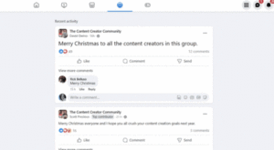
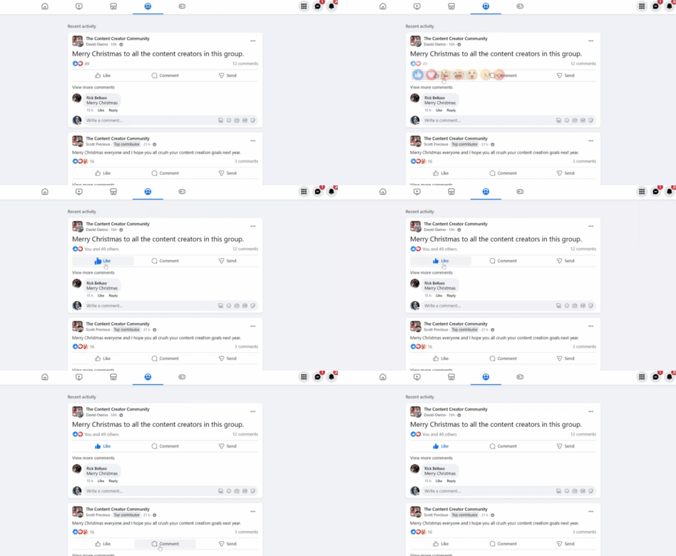
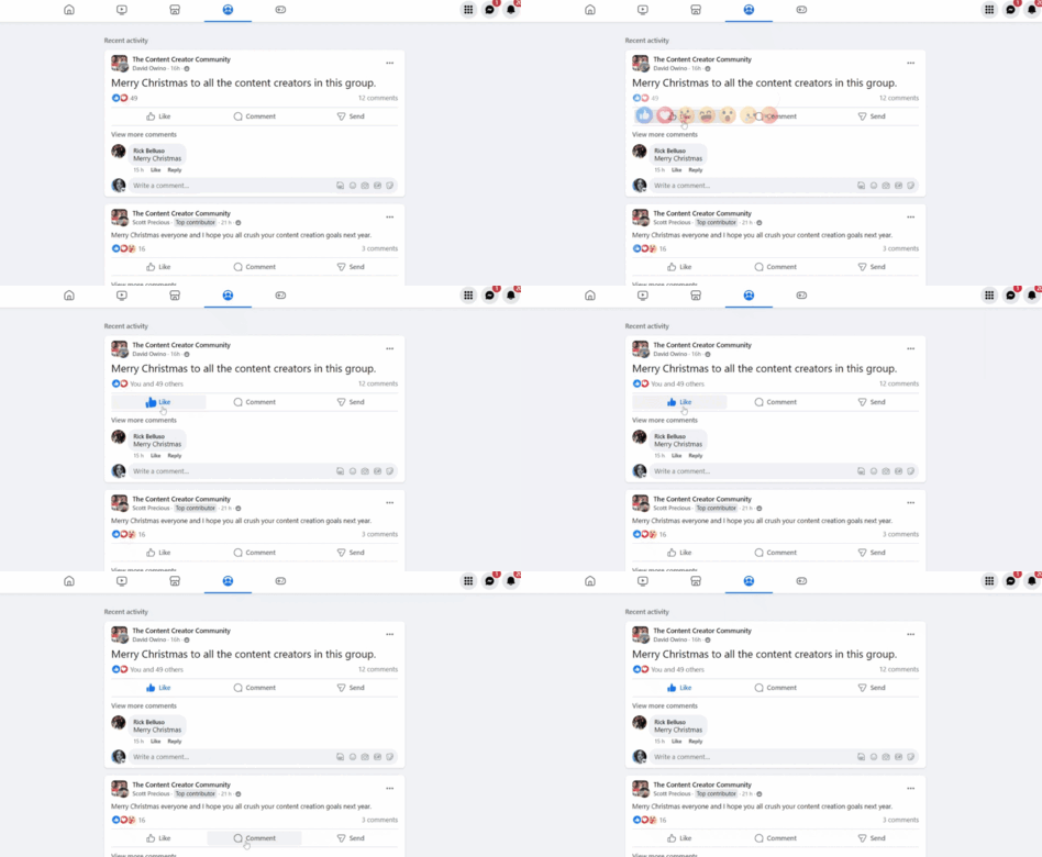
Facebook’s "Like" interaction is a classic example of a microinteraction that combines visual feedback with emotional resonance. When a user clicks "Like," the icon undergoes a subtle color change and a slight animation, such as a brief pulse or expansion. This immediate, understated movement confirms the user’s engagement and adds a layer of positive feedback to the post, contributing to the platform’s engaging and social nature.
4. TrustPulse: Exit-Intent Triggers
Microinteractions can also be powerful conversion tools. TrustPulse utilizes an exit-intent pop-up as a strategic microinteraction. When a user navigates through a homepage and moves their mouse cursor toward the browser’s exit button, a system-initiated trigger activates a pop-up form. This provides a crucial last-chance opportunity to capture user interest, offering an opt-in for newsletters or special offers before they leave the page. Here, the trigger is the user’s intent to exit, and the outcome is a potential conversion point.
5. Indicating Form-Field Errors
Thoughtful microinteractions are invaluable for error identification and correction. In a registration form, if a user types an email address in an incorrect format, an instant, clear error message appears in red text below the field. This immediate visual feedback quickly draws the user’s attention to the specific error, explains what is wrong, and guides them toward a swift correction. This type of informative, yet simple, communication significantly smooths the user experience by preventing frustration and expediting task completion.
6. Canva: ToolTips and Loading Graphics
Canva, renowned for its user-friendly interface, masterfully employs microinteractions throughout its platform. When a user hovers over the "+" symbol on the design canvas, a "ToolTip" appears, providing context and guidance. Furthermore, when a new design requires time to load, a floating Canva logo animation appears, gracefully managing user expectations during the waiting period. These seemingly minor additions reduce cognitive load, guide users through functionalities, and mitigate frustration during necessary delays.
7. Google Docs: Checkmark for Settings
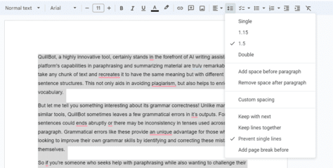
Google Docs provides a simple yet highly effective microinteraction in its settings menus. When a user applies a specific setting, such as enabling "Print Layout" or "Suggestion Mode," a clear checkmark appears next to that option. This visual cue immediately indicates which settings are currently active, preventing users from redundant selections and ensuring clarity about the interface’s current state. This small detail significantly contributes to a smoother and more confident user experience.
The Broader Impact: Beyond the Pixel
Microinteractions are far more than mere embellishments; they are fundamental to creating effective, empathetic, and engaging digital products. They subtly guide users through their journey, serving as the connective tissue that transforms a collection of features into a cohesive and intuitive experience. Beyond their aesthetic appeal, microinteractions facilitate essential communication between the system and the user, making digital interactions feel more human, responsive, and easy to understand.
The psychological impact of well-designed microinteractions is profound. They leverage principles of operant conditioning by providing immediate positive reinforcement for user actions, fostering a sense of accomplishment and control. They reduce cognitive load by presenting information contextually and proactively, minimizing mental effort. Furthermore, they contribute to the concept of "affordance," making it intuitively clear what actions are possible and how they will unfold.
As digital interfaces continue to evolve, the importance of microinteractions will only grow. Future trends suggest an increasing integration of haptic feedback, more personalized and AI-driven adaptive microinteractions that learn from user behavior, and their expansion into voice user interfaces (VUIs). The mastery of these small, nearly invisible details will remain a cornerstone of exceptional user experience, driving both user delight and commercial success. When designing the next generation of digital products, leveraging the immense potential of microinteractions will be key to creating truly outstanding and memorable user journeys.