
The landscape of Canadian fast-casual dining is defined by institutions that often struggle to reconcile their storied pasts with the rapidly shifting expectations of the contemporary consumer. For Ashton, the pioneer of the Canadian poutine chain, the challenge was particularly acute. Founded in 1969, the brand became synonymous with Quebec’s culinary identity, yet by the early 2020s, the weight of that legacy had become an anchor. With 23 locations across the province, the brand faced a critical juncture: innovate or risk irrelevance. In 2022, a leadership transition initiated a comprehensive structural and aesthetic overhaul, tasking the creative agency LG2 with the monumental objective of transforming a regional icon into a modern, exportable powerhouse.
A Legacy at a Crossroads: The Need for Transformation
For over half a century, Ashton Leblond’s creation served as a cornerstone of the Quebec snack bar experience. However, by the time Émily Adam and Jean-Christophe Lirette assumed control of the company in 2022, the business environment had evolved drastically. The brand was grappling with the "stagnation trap"—a phenomenon where a company’s historical success blinds it to the necessity of incremental evolution.
Internal assessments conducted at the time of the acquisition highlighted three primary vulnerabilities. First, the physical infrastructure of the restaurants had fallen behind modern safety, accessibility, and aesthetic standards. Second, the demographic profile of the customer base was aging; while loyal, the core clientele was not being replenished by younger generations who prioritize digital integration and modern dining aesthetics. Finally, the recruitment of younger staff, essential for the high-turnover nature of the fast-food industry, was hampered by an outdated brand image that failed to resonate with Gen Z and Millennial workers. The imperative was clear: Ashton needed a brand refresh that respected its origins while aggressively pursuing a contemporary market position.

The Strategic Vision of the 2022 Acquisition
The acquisition of the chain by Adam and Lirette was not merely a change in ownership; it was a pivot in corporate strategy. The new leadership recognized that the value of the brand lay in its "nostalgia equity." Unlike newer competitors, Ashton possessed a genuine, tangible history. The strategy, therefore, was not to discard the past, but to sanitize and elevate it.
This process began with a rigorous audit of the customer experience. Leadership identified that the "Ashton experience" was inconsistent across the 23 locations. The goal was to establish a "flagship" prototype that could serve as a blueprint for the entire chain. This blueprint was designed to be modular and scalable, ensuring that the brand could eventually expand into new territories without losing the specific "snack bar" DNA that defined its success in Quebec.
The LG2 Collaboration: Redefining the Visual Identity
The partnership with LG2, a renowned creative agency, marked the beginning of a systematic visual and experiential rebranding. The creative brief centered on "striking the right balance"—a delicate task of maintaining traditional diner codes while stripping away the visual clutter that had accumulated over decades.
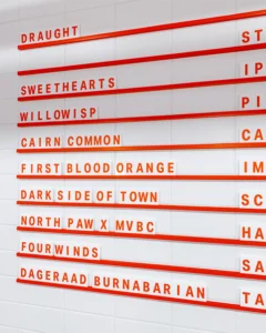
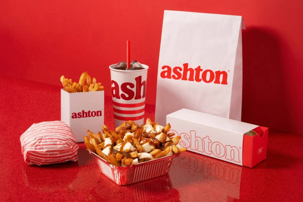
The resulting design language is a study in intentionality. The signature red color, which had become faded and inconsistent over the years, was updated to a richer, more vibrant hue. This color was then applied with surgical precision across a new graphic system. Central to this was the introduction of a "triple red line" motif, a subtle nod to the iconic neon lighting that once illuminated the original 1969 Ashton food truck. This motif now serves as a unifying visual thread, appearing on everything from employee uniforms and branded merchandise to the structural elements of the physical restaurant interiors.

Typography also played a crucial role. LG2 developed a customized, bold typographic signature designed to evoke a sense of abundance and indulgence, reflecting the caloric and emotional satisfaction of a classic poutine. Furthermore, the incorporation of illustrative elements reminiscent of the original 1969 logo created a "retro-modern" aesthetic that appeals to older patrons through familiarity and to younger patrons through the current trend of vintage revivalism.
Architecture and Interior Design: The Return to Roots
The spatial redesign of the flagship restaurant was perhaps the most radical departure from the status quo. The design team sought to evoke the comfort of the original snack bar culture, focusing on the tactile elements of the space. The renovation introduced sweeping, curved edges and a distinct architectural profile that pays homage to the tin-roofed snack bars of the late 20th century.
The interior layout was reconfigured to prioritize flow and social interaction while maintaining the presence of the traditional banquettes that have defined the brand’s dining experience for decades. By integrating a monochrome red border that traverses the room, the designers created a visual continuity that makes the space feel cohesive. This layout is not merely aesthetic; it is highly functional. Because the design is standardized, it is easily replicable, allowing the chain to roll out these updates to its other 22 locations with minimal architectural friction over the coming years.
Quantitative Outcomes: A Data-Driven Success
The impact of these changes was immediate and quantifiable. Within the first 30 days of the launch of the renovated flagship location, the brand observed performance metrics that exceeded internal projections.

- Traffic Growth: The renovated site saw a 35% increase in foot traffic compared to the same period in previous years.
- Revenue Impact: Sales figures at the location surged by 34%, indicating that the new environment was not only attracting more visitors but also encouraging higher average ticket sizes.
- Digital Engagement: The brand’s online presence saw a 40% increase in traffic, suggesting that the rebranding campaign successfully piqued the curiosity of a broader, digitally active audience.
These figures represent a significant turnaround for a legacy brand. The data suggests that the "new" Ashton has effectively bridged the gap between its established customer base and a new generation of food enthusiasts who view the brand as a "retro-contemporary" destination.
Market Implications and Future Outlook
The revitalization of Ashton provides a case study in how heritage brands can navigate the "innovation gap." By investing in a holistic brand experience—one that encompasses physical space, graphic identity, and digital presence—Ashton has effectively insulated itself against the threat of obsolescence.
From a broader market perspective, the success of the Ashton transformation indicates a shifting trend in the quick-service restaurant (QSR) sector. Consumers are increasingly moving away from the "sterile" minimalism that dominated the 2010s in favor of brands that offer a sense of place, history, and personality. Ashton’s ability to lean into its identity as a "poutine pioneer" while upgrading its operational efficiency demonstrates that a brand does not need to abandon its roots to appeal to the modern palate.
As the company continues to implement this design language across its network, the focus will likely shift to operational scaling. The challenge moving forward will be maintaining the high standard set by the flagship location as the brand expands into new, perhaps more competitive, geographic markets.

Conclusion: The Recipe for Longevity
The transformation of Ashton is not a story of a business being reinvented, but rather one of a business being rediscovered. By stripping away the layers of wear and tear that had obscured its original mission, the current leadership and the creative team at LG2 have restored the brand to its rightful place in the Quebec culinary lexicon. The "secret sauce," as it were, was the recognition that the past is a powerful tool for building the future, provided it is polished and presented with a modern lens. With a 34% increase in sales and a reinvigorated identity, Ashton has proven that while the recipe for poutine may be simple, the recipe for a lasting brand is anything but. The chain has successfully secured its loyalty with legacy fans while opening the door to a new generation of customers, ensuring that the brand remains a vital, relevant, and iconic feature of the Canadian landscape for years to come.