
Nestled within the rugged landscape of Hope, British Columbia, Mountainview Brewing Co. has emerged as a cornerstone of the local economy and a critical destination for travelers navigating the mountain passes of the Pacific Northwest. Established in a repurposed mechanic garage, the brewery has successfully bridged the gap between a community-centric local hub and a high-traffic stopover point for those venturing through the iconic Cascade foothills. The facility, which pays subtle homage to the town’s cinematic history—most notably as the 1982 filming location for the blockbuster film Rambo: First Blood—represents a strategic blend of heritage, industrial reclamation, and modern design.

The Genesis of a Local Landmark
The conceptualization of Mountainview Brewing Co. began with the necessity to revitalize a dormant commercial space, transforming an automotive garage into a functional brewery and hospitality venue. For the design team at Memory, the project required an identity that could balance the grit of a former mechanic’s workshop with the sophisticated, clean aesthetic required by the modern craft beer market.
From the project’s inception, the collaborative effort between the brewery founders and the creative team focused on establishing a visual identity that was both timeless and highly functional. The brewery’s interior, signage, and collateral were developed to accommodate two distinct demographics: the local residents seeking a neighborhood gathering space and the transient highway traffic seeking a reprieve before heading into the interior of British Columbia. This dual-purpose environment necessitated a brand identity that was as durable as it was welcoming.

Chronology and Development
The development of the Mountainview brand occurred in several distinct phases, each designed to ensure a cohesive experience for the consumer. The project timeline can be categorized into four primary developmental stages:
- Foundational Strategy (The Pre-Launch Phase): The initial stage involved defining the brand voice and core values. The primary objective was to align the brewery’s mission—to produce both "crushable" staples and innovative, experimental small-batch beers—with a visual language that reflected the natural geography of the Cascade range.
- Identity Synthesis: During this period, the design team selected Aktiv Grotesk by Dalton Maag as the primary typeface. Chosen for its clean, geometric, and highly legible qualities, the typeface provided a modern, neutral foundation that allowed the brewery’s packaging and signage to remain readable in various environments, from low-light taprooms to bright, outdoor transit settings.
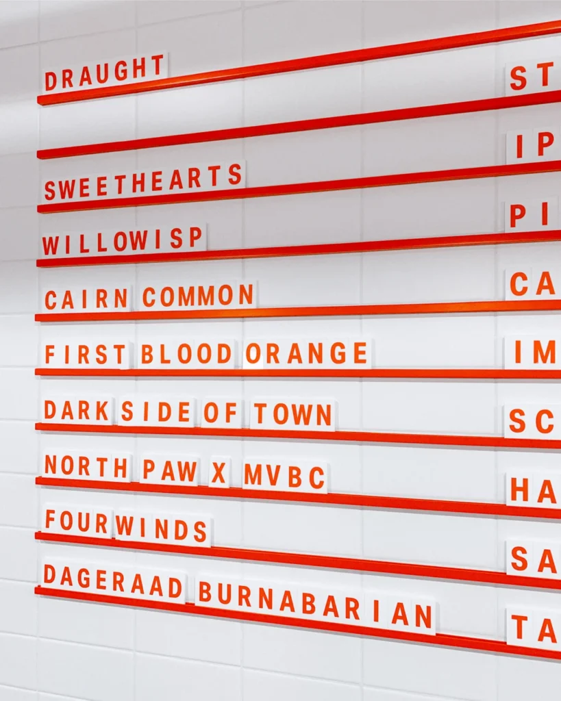
- Environmental Integration: The transition from identity to physical space was marked by the installation of wayfinding systems and interior collateral. This phase included the design of custom tasting flight trays and flexible menu systems, which allowed the brewery to update its rotating tap list with minimal friction—a necessity for a business dealing with frequent inventory changes.
- Market Penetration: The final stage involved the rollout of consumer-facing merchandise and packaging. By extending the brand identity to include apparel, coasters, and retail cans, the brewery effectively created a secondary revenue stream and enhanced its brand recognition beyond the physical walls of the brewery.
Strategic Design Elements and Technical Specifications
The aesthetic success of Mountainview Brewing Co. lies in its restraint. By utilizing Aktiv Grotesk, the brand ensures a consistent visual communication strategy across all touchpoints. This typeface, known for its balanced proportions and lack of unnecessary ornamentation, mirrors the brewery’s commitment to straightforward, high-quality brewing.

The menu systems, specifically, were designed with a modular approach. In the craft beer industry, where tap lists fluctuate based on seasonal availability and experimental batch success, a rigid menu is a operational liability. By implementing a flexible, high-design menu system, Mountainview enabled its staff to manage customer expectations and highlight featured products efficiently. Furthermore, the custom tasting flight trays were engineered to accommodate the specific geometry of the brewery’s glassware, demonstrating an attention to detail that extends from the brand identity to the tactile customer experience.
Economic and Community Context
The choice of Hope, BC, as the site for this endeavor is significant. Historically known for its forestry and, more recently, its film industry legacy, Hope serves as a gateway to the British Columbia interior. As a primary stop for tourists and commercial transport alike, the town experiences significant seasonal shifts in population.

Data from local business development reports suggest that businesses which successfully leverage the town’s historical identity—such as its connection to First Blood—while offering high-quality, modern amenities see a higher rate of repeat patronage. Mountainview Brewing Co. has positioned itself as an essential stop on the Highway 3 corridor. By providing a premium, locally produced alternative to national beer brands, the brewery has tapped into the growing "buy local" sentiment prevalent in Canadian tourism.
The brewery’s impact on the local economy is characterized by:

- Job Creation: The conversion of a mechanic shop into a brewery created specialized roles in brewing science, hospitality, and brand management within the local labor market.
- Tourism Diversification: By providing a cultural destination, the brewery helps extend the duration of traveler stays in Hope, contributing to secondary spending in the local hospitality and retail sectors.
- Infrastructure Revitalization: The adaptive reuse of the garage structure is an example of sustainable urban development, preventing the obsolescence of existing commercial infrastructure.
Perspectives on Brand Identity
Industry analysts have noted that the "brewery-as-brand" model is becoming increasingly competitive. According to recent market analysis from the Craft Brewers Association, the visual presentation of a product is a leading indicator of consumer purchase intent in the craft segment.
"The work done at Mountainview is a prime example of how professional, cohesive design can elevate a small-scale operation," says a representative from the design firm Memory. "By focusing on the integration of wayfinding, product packaging, and the physical taproom experience, the brewery has managed to create a brand that feels established and reliable, despite its relatively recent entry into the market."

Broader Implications for the Craft Brewing Industry
The trajectory of Mountainview Brewing Co. highlights a broader trend within the craft beer industry: the movement away from cluttered, chaotic label design toward a more minimalist, brand-focused aesthetic. As the market reaches a point of saturation, the ability for a brewery to communicate its values—transparency, quality, and community—through its visual identity becomes paramount.
Furthermore, the integration of flexible systems (such as the menu and wayfinding collateral) signifies a maturation in how small businesses approach operations. By investing in professional design at the outset, Mountainview has avoided the common pitfalls of "brand drift," where a business’s visual language becomes inconsistent as it scales.

As the brewery continues to evolve, its reliance on a clear, scalable identity will be its greatest asset. The collaboration with Memory serves as a case study for other craft producers in rural or semi-rural areas: the environment in which a brewery operates need not dictate the level of sophistication of its brand. By prioritizing design as a strategic business function, Mountainview has effectively elevated the standard for commercial hospitality in the Cascade foothills, ensuring its place as a fixture in the Hope community for years to come.
In conclusion, the success of Mountainview Brewing Co. is not merely a result of its product, but a testament to the power of a comprehensive, well-executed brand strategy. Through the intentional use of typography, structural design, and consistent messaging, the brewery has managed to transcend its origins as a converted garage, becoming a landmark that serves both the transient visitor and the permanent resident with equal efficacy.